Key takeaways 🔀 Conversational UX transforms design into a natural and intuitive conversation between the interface and the user. 🔎 Conversational UX is different from traditional UX mainly because it focuses on dialogue rather than navigation. 💁♀️ Conversational UX emerged from social habits and technological advancements, such as artificial intelligence and natural language processing. 🤖… Continue reading Conversational UX: Importance, Examples, Tips, and Challenges
Tag: cases
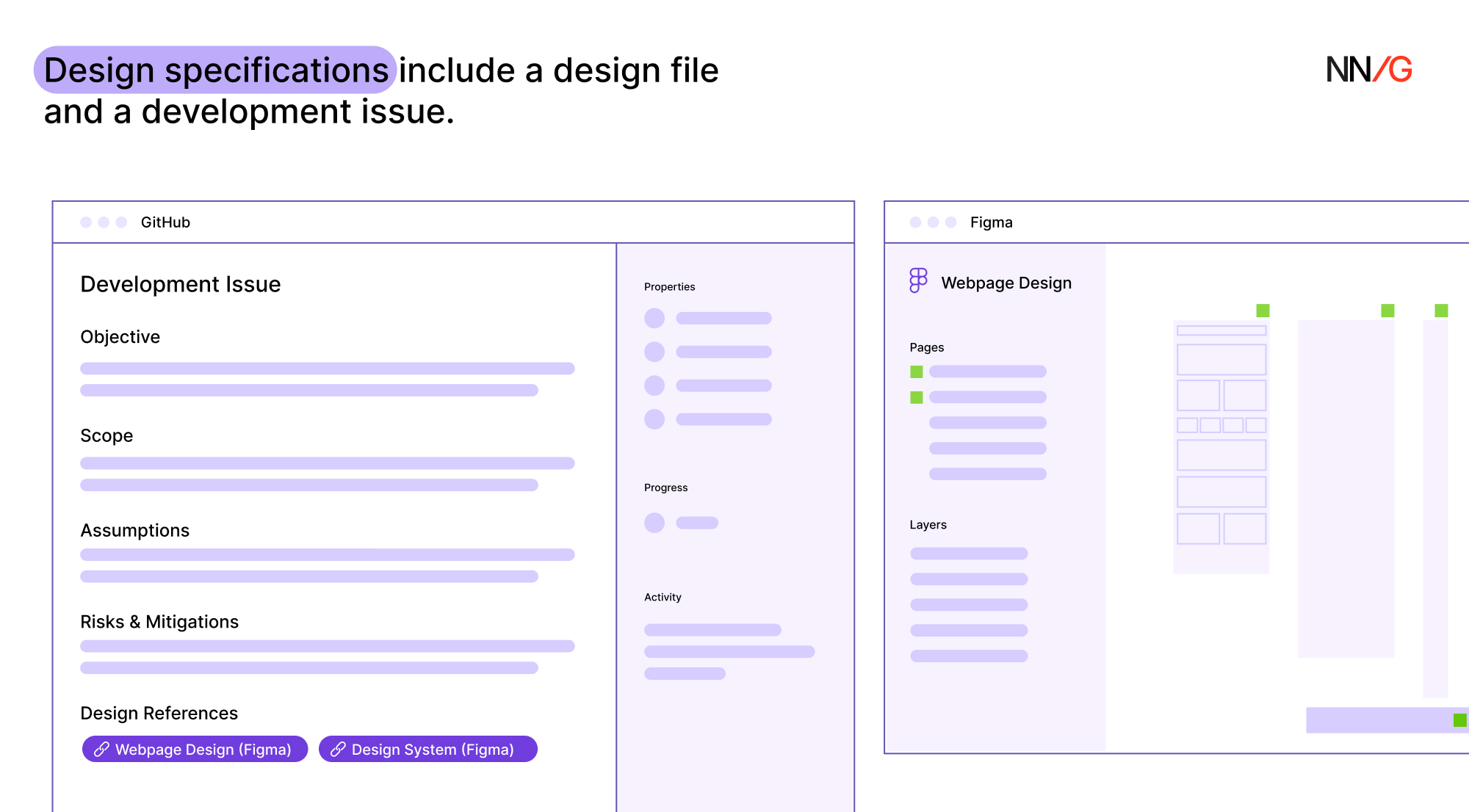
Creating Design Specs for Development
Summary: Design specifications should provide all the relevant information needed to align the design and development teams. You work tirelessly on a new design project. It’s your masterpiece… until the dev team says it isn’t possible. Most designers have experienced this situation at some point in their careers. As frustrating as it may be, there… Continue reading Creating Design Specs for Development
How Design Identity in Medical Devices Builds Trust
Design identity shapes how patients and healthcare professionals perceive medical devices. Colors, shapes, technical aspects, and testing influence trust in high-stakes environments where reliability is paramount. A well-designed device signals safety and competence, while a poor design can raise doubts about quality. In healthcare, where decisions impact lives, the functional design of medical devices plays… Continue reading How Design Identity in Medical Devices Builds Trust
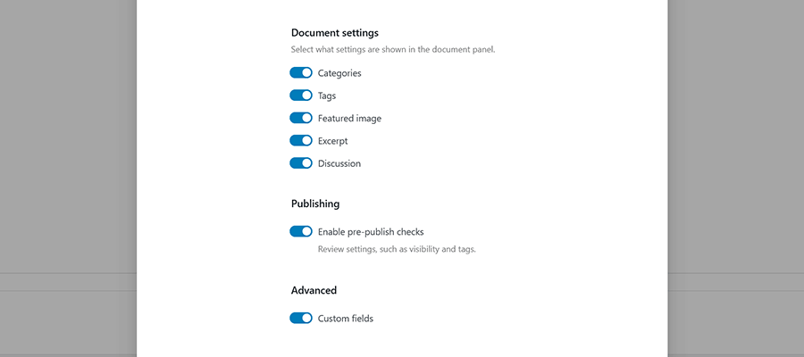
Learn How to Display WordPress Custom Field Data With Blocks — Speckyboy
Custom fields are among WordPress’s most powerful features. They allow us to customize the front and back end of a website, and there are all manner of creative uses for them. Everything from displaying niche content to changing page layouts based on field values is possible. Traditionally, using custom fields meant navigating obstacles. They require… Continue reading Learn How to Display WordPress Custom Field Data With Blocks — Speckyboy
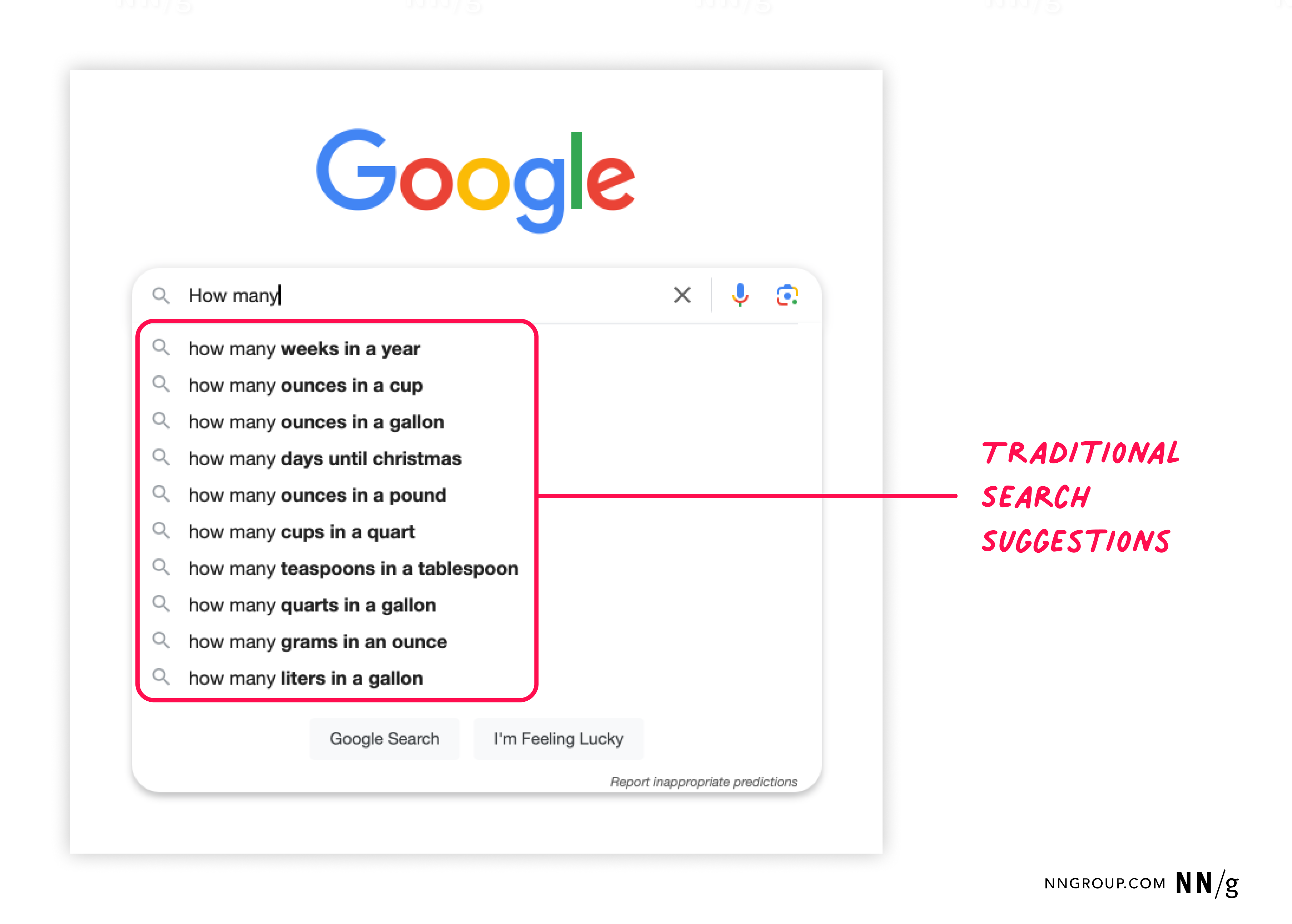
Prompt Suggestions
Summary: System-generated suggestions for AI prompts must be contextually relevant, personalized, and specific to the task and the user’s level of experience. Prompt suggestions are a common design element in AI-chat features, but users often ignore them, especially when they’re not in the right place or don’t feel useful. Done well, though, prompt suggestions can… Continue reading Prompt Suggestions
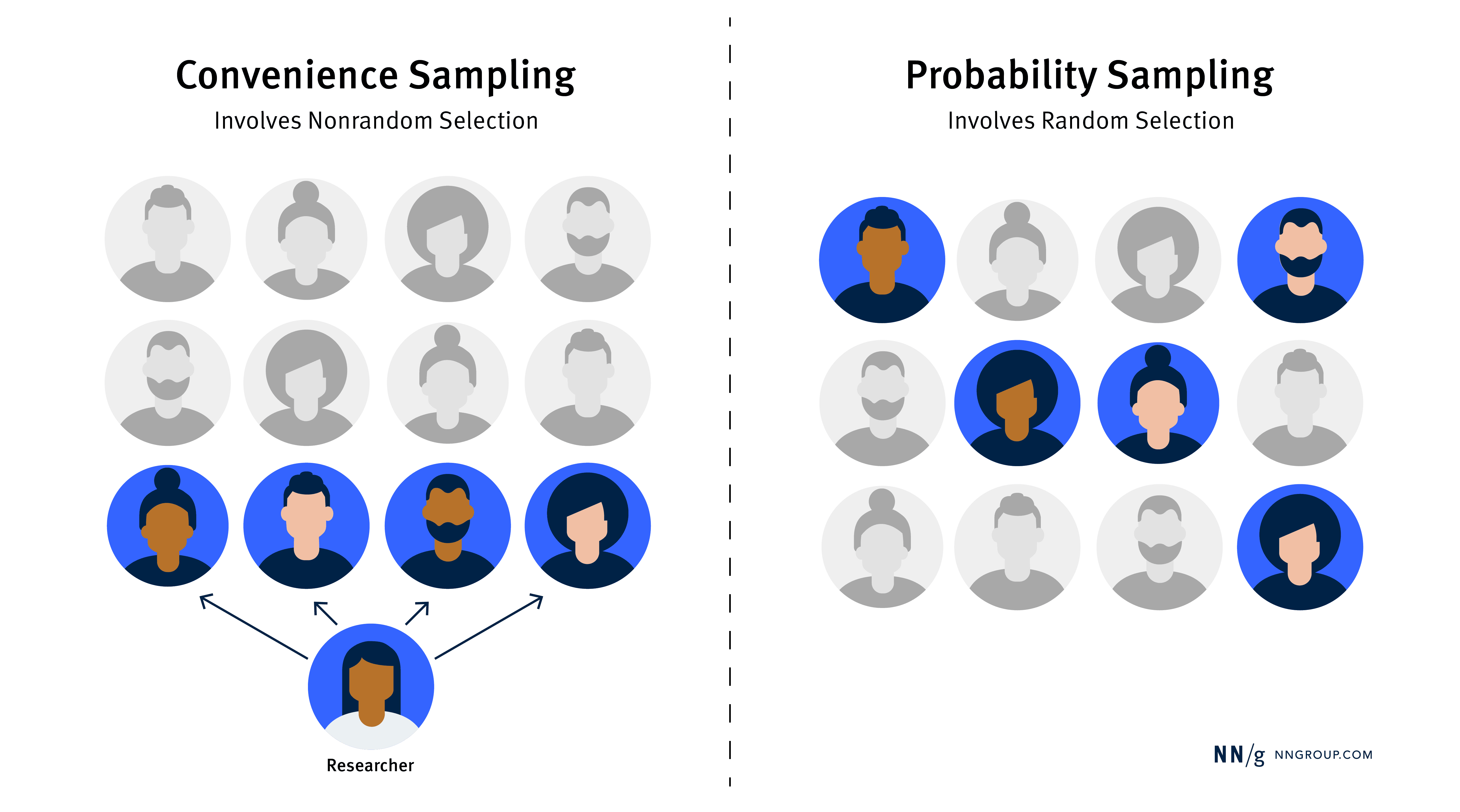
Convenience vs. Probability Sampling in UX Research
Summary: Convenience sampling is quick and cost-effective for UX research, but probability sampling is better when you need representative and generalizable data. When conducting UX research, choosing the right sampling method can ensure that your findings are both useful and reliable. Most UX practitioners use a sampling method called convenience sampling: recruiting participants based on… Continue reading Convenience vs. Probability Sampling in UX Research
Alt Text: Not Always Needed
Summary: Write alt text that communicates an image’s purpose without repeating page content. Focus on meaning rather than visual description. Alt text (or alternative text) is metadata intended to help screen-reader users understand what an image is depicting. Most guidance for writing alt text describes how to make individual web-based images accessible and understandable for… Continue reading Alt Text: Not Always Needed
Axe Reports 2.0: Make better data-driven accessibility decisions at scale
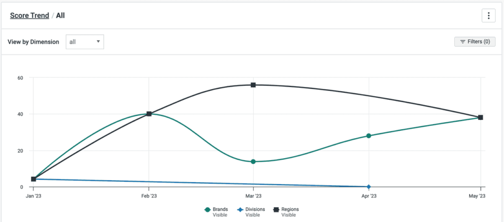
Successful digital accessibility programs run on great data. Without it, you can’t report on your progress or drive the right conversations around accessibility improvements with your stakeholders. That’s where axe Reports comes in. Available in the axe Platform, axe Reports is Deque’s enterprise-ready tool designed to help your organization track progress, pinpoint risks, and quickly… Continue reading Axe Reports 2.0: Make better data-driven accessibility decisions at scale
Top 10 UX Design Agencies to Work With – July 2024
While in-house UX consultants, UI/UX designers, and user researchers continue to gain popularity, some businesses continue to opt for the expertise of specialized UX design firms. Here, we listed user experience consultancies and full-service UI UX design agencies from the US to Europe, with a brief description of each to help you decide. If you… Continue reading Top 10 UX Design Agencies to Work With – July 2024
Feedback: The Foundation of the Designer Communication Toolset
Reality hits as soon as you cut into a piece of wood. First, you might blame the quality of the wood. After countless trials and errors, you slowly begin to realize that using a Ryoba requires practice, patience, and technique. Based on my experience and after a series of internal mentoring at UX studio, I… Continue reading Feedback: The Foundation of the Designer Communication Toolset
Best AI Design Tools: Insights & Tips From 50+ Tools
Impact of AI in design When it comes to design, AI has great creative capacity, given its text generation and text-to-image capabilities. Seeing some photorealistic images generated by AI, we cannot help but wonder what this means for us as designers. Some of the questions that were on our minds: How can we use this… Continue reading Best AI Design Tools: Insights & Tips From 50+ Tools
How to Tackle Prompting Challenges with AI Writing Tools
With the rise of readily available generative AI tools, it is now possible to create large bodies of text in a matter of seconds. However, crafting the right prompts to achieve the desired output can be challenging. In this article, we will examine the complexities of prompting and how AI writing tools can simplify the… Continue reading How to Tackle Prompting Challenges with AI Writing Tools
The power of beauty in communicating complex ideas
Can we defend pursuing beauty when communicating science or innovation? When creating visuals to explain complex ideas, cutting edge innovations or new scientific research we often focus on the images’ ability to carry information. But data visualization, infographics or even schematics have a hidden power we rarely discuss: beauty. Obviously not all images are beautiful. As… Continue reading The power of beauty in communicating complex ideas
Why UI designers should understand Flexbox and CSS Grid
CSS for UI Designer Or bye bye, 12-column grid layout Most designers are familiar with responsive design, a column-based layout approach with fixed breakpoints to cover all screen sizes. However, we can move beyond the rigid structure with modern CSS layouts, crafting flexible and dynamic designs that seamlessly adjust to different screen sizes. Designers and developers having different… Continue reading Why UI designers should understand Flexbox and CSS Grid
Distinguishing between ARIA and native HTML attributes
As a developer, you want to create more inclusive and accessible digital experiences for your users. Great! It’s possible, however, that you might be feeling a bit confused or overwhelmed by the element attributes that can affect the usability for users of assistive technology. ARIA (or WAI-ARIA, Web Accessibility Initiative-Accessible Rich Internet Applications) defines some… Continue reading Distinguishing between ARIA and native HTML attributes
Test smart: How to validate product on a business-facing level?
It took a long time since my story How to Select Testing Techniques for an Agile Team was published (if you ask me what happened in between, the short answer will be: a war in Ukraine and a career pivot). The mentioned story focused on Agile Testing Quadrants, a method presented by Lisa Crispin and… Continue reading Test smart: How to validate product on a business-facing level?
Good design is subjective, contextual, and intentional
Urban planners have been designing for human experiences for nearly 200 years, and UI/UX designers can learn from this. Examples of The Chicago School of Architecture | Photo Credit: Tom Seiple When I finished my graduate degree, I was lucky to find my first job in Chicago. From a very early age, I had always hoped to… Continue reading Good design is subjective, contextual, and intentional
Norman Doors: how do we still get this wrong?
The confusing design of Cybertruck’s doors. Tesla Cybertruck The concept of the “Norman door” is a well-known and widely recognized principle among designers. Named after design guru Don Norman, it describes any door that proves confusing or difficult to use, highlighting a common design flaw. In this article, we will discuss the application of the… Continue reading Norman Doors: how do we still get this wrong?
Using Figma variables for breakpoints
The hunt to find more use cases for local variables. At this point in 2023, almost all UX UI designers who use Figma should know about one of Figma’s biggest features of this year, local variables. Something I have continued to struggle with since its initial launch this past summer is how to actually apply… Continue reading Using Figma variables for breakpoints
Designing for accessibility beyond compliance
Companies approach accessibility as a checklist of standards — but a client with disabilities showed me how to think beyond compliance. Source: Photo by Marcus Aurelius During my time volunteering at Neil Squire Society, and helping Hunter, a client with disabilities, be more comfortable using a computer, I learned a lot about how to better design from three… Continue reading Designing for accessibility beyond compliance
Designing safe and trustworthy AI systems
Designing for safe and trustworthy AI Why human oversight to make up for AI errors doesn’t work and what we can do instead Illustration created by Cara Storath in Midjourney As much as AI is powerful, in some cases it can be misleading or wrong. A realization that came too late to a New York lawyer,… Continue reading Designing safe and trustworthy AI systems
The usability problem with prompt-driven AI
As the GenAI hype dust settles — it’s time to start thinking about usability and the opportunity it presents to address declining engagement and retention. Source: Pexels GenAI represents a new paradigm in User Interface Design and a radical shift from Command-Based Interaction Models and Graphical User Interfaces which have dominated the last 50 years of computing.… Continue reading The usability problem with prompt-driven AI
What should be the contrast level of inactive buttons?
Using the APCA Readability Criterion to improve the accessibility of disabled controls Disabled buttons. They need to look non-interactable. But they also can’t be completely unreadable. How do I find the sweet spot? I spent a few hours in a deep dive going through a bunch of blogs and accessibility guidelines documentation in search for best approaches… Continue reading What should be the contrast level of inactive buttons?
How to create a color ramp used in design systems
Whether you’re a brand designer putting the finishing touches on a color palette or a product designer laying the foundational work for a design system, I will walk you through how to create color ramps utilized in design systems. If you’re new to creating color palettes for digital spaces, check out my previous article, Color for… Continue reading How to create a color ramp used in design systems

