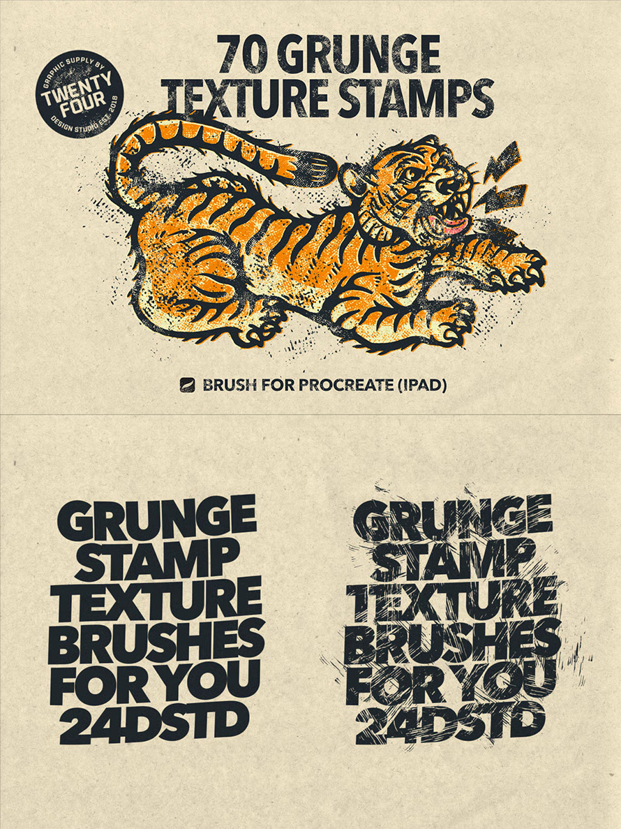
Finding the best Procreate brushes for drawing and illustrations can reshape how you create art. Whether you’re sketching characters or building intricate scenes, the right tools help you draw faster and with more control. This 21 packs of brushes gives you that flexibility, from soft pencils to textured inking and crisp shading. Start with what… Continue reading 21 Best Procreate Brushes for Drawing & Illustrations
Tag: improve
The social significance of Spotify Wrapped
[unable to retrieve full-text content] How the tech industry ended postmodernism and increased individualism Wham!, Coca-Cola commercials, and obligatory family dinners; Western Christmas weeks are very predictable. We even have a new December tradition: the annual Spotify Wrapped. At first glance, the concept seems like a brilliant marketing strategy, but there’s a deeper meaning behind it.… Continue reading The social significance of Spotify Wrapped
How to level up your confidence game?
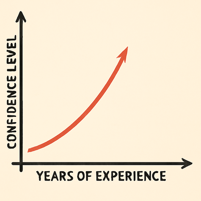
[unable to retrieve full-text content] Confidence level Hi, I’m Hazel. I’m a product designer. Previously, I worked in construction for three years. Here was my day-to-day like: making sense of different drawings, drafting a project timeline. And that’s it! Quite boring. But I’m proud of my experience. Every day, I was problem-solving under pressure, understanding projects… Continue reading How to level up your confidence game?
14 logic-driven UI design tips to improve any interface
[unable to retrieve full-text content] UI design tips to improve your interface designs using logic rather than gut feel. Designing user interfaces is no easy task. With countless choices around layout, spacing, typography, and colour, it’s easy to feel overwhelmed. And when you layer in considerations like usability, accessibility, and human psychology, the challenge only grows. But… Continue reading 14 logic-driven UI design tips to improve any interface
Beginner’s Guide to Iterative Testing w/ Examples
Key takeaways 🔁 Iterative testing is a continuous cycle of testing, learning, and improving products in small steps rather than waiting until the end 👋 Engaging users through iterative testing builds trust, better product adoption, and user advocacy 💡 Effective iterative testing follows four steps: plan with clear goals and real users, run tests and… Continue reading Beginner’s Guide to Iterative Testing w/ Examples
How AI Models Are Trained
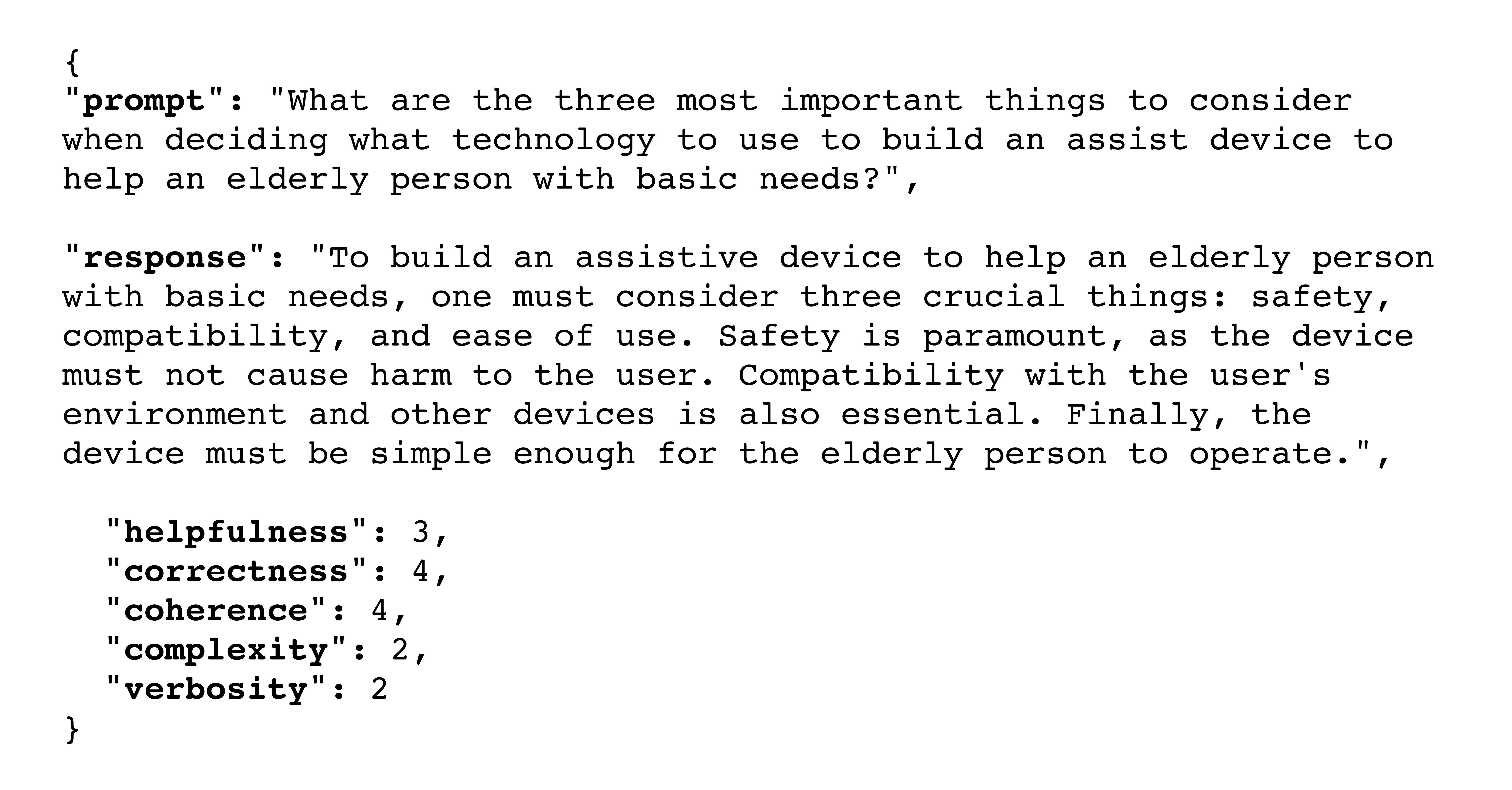
Summary: Training modern LLMs is a costly process that shapes the model’s outputs and involves unsupervised, supervised, and reinforcement learning. By this point, you’ve undoubtedly heard that the large language model (LLM) behind your favorite AI tool has been “trained on the whole internet.” To some extent, that’s true, but after training hundreds of UX… Continue reading How AI Models Are Trained
Prompt Suggestions
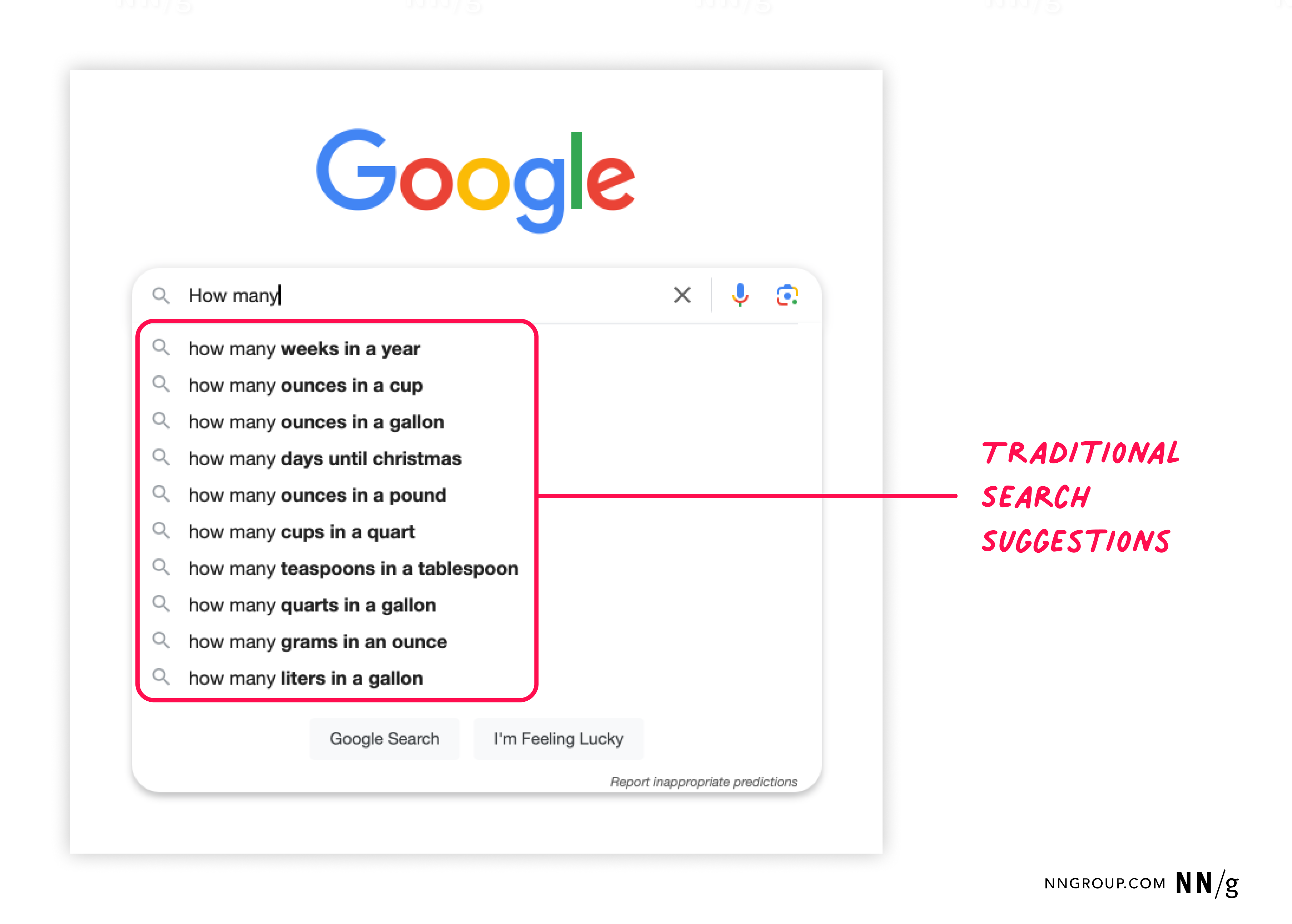
Summary: System-generated suggestions for AI prompts must be contextually relevant, personalized, and specific to the task and the user’s level of experience. Prompt suggestions are a common design element in AI-chat features, but users often ignore them, especially when they’re not in the right place or don’t feel useful. Done well, though, prompt suggestions can… Continue reading Prompt Suggestions
25 Fresh & Free Mockups for Your Design Projects – Download Now
Are you tired of scrolling endlessly through mockup websites, only to find outdated designs or hidden fees? Look no further! We’ve handpicked fresh and free mockups that are perfect for designers, marketers, and creatives alike. Whether you’re showcasing your latest branding project, presenting a website design, or creating eye-catching social media posts, these mockups will… Continue reading 25 Fresh & Free Mockups for Your Design Projects – Download Now
How to Include AI in Your Graphic Design Workflow
The popularity of AI design (and other search-related terms) is at an all-time high now. For the past two years, search interest for this keyword has skyrocketed, with a growth rate of 488% from Jan 2023 to Feb 2025. This means that more and more professionals are leveraging AI design tools for their graphic design… Continue reading How to Include AI in Your Graphic Design Workflow
Top 25 Customer Analytics Software & Tools in 2025
Key Takeaways 📊 Customer analytics software helps businesses collect and analyze user data to improve digital products and understand customer behavior. 🛠️ Different tools offer features such as session recording, heatmaps, and customer segmentation to track interactions and find areas for improvement. 💰 Budget-friendly choices are available, with many tools providing free plans or trials,… Continue reading Top 25 Customer Analytics Software & Tools in 2025
Preparation Tactics for a Tough UX Job Market
Summary: Use these tactics to prepare yourself for a downturn in the UX job market. It’s relatively easy to bask in the glow of a sunny UX job market and its plentiful opportunities. However, coping with a challenging job market is the true test of endurance for the UX professional. This article is the first… Continue reading Preparation Tactics for a Tough UX Job Market
Redesigning Alerts for Life or Death
[unable to retrieve full-text content] A real-time alert on a phone screen — illustrating the critical need for better emergency messaging. How Smart UX Design Can Make Alerts Matter It was 10 AM when my phone blasted what turned out to be a critical Wireless Emergency Alert. Like many of us would, I instinctively swiped it away and… Continue reading Redesigning Alerts for Life or Death
The Rhetorical Triangle for Stakeholders: Make Your Point and Get Your Way
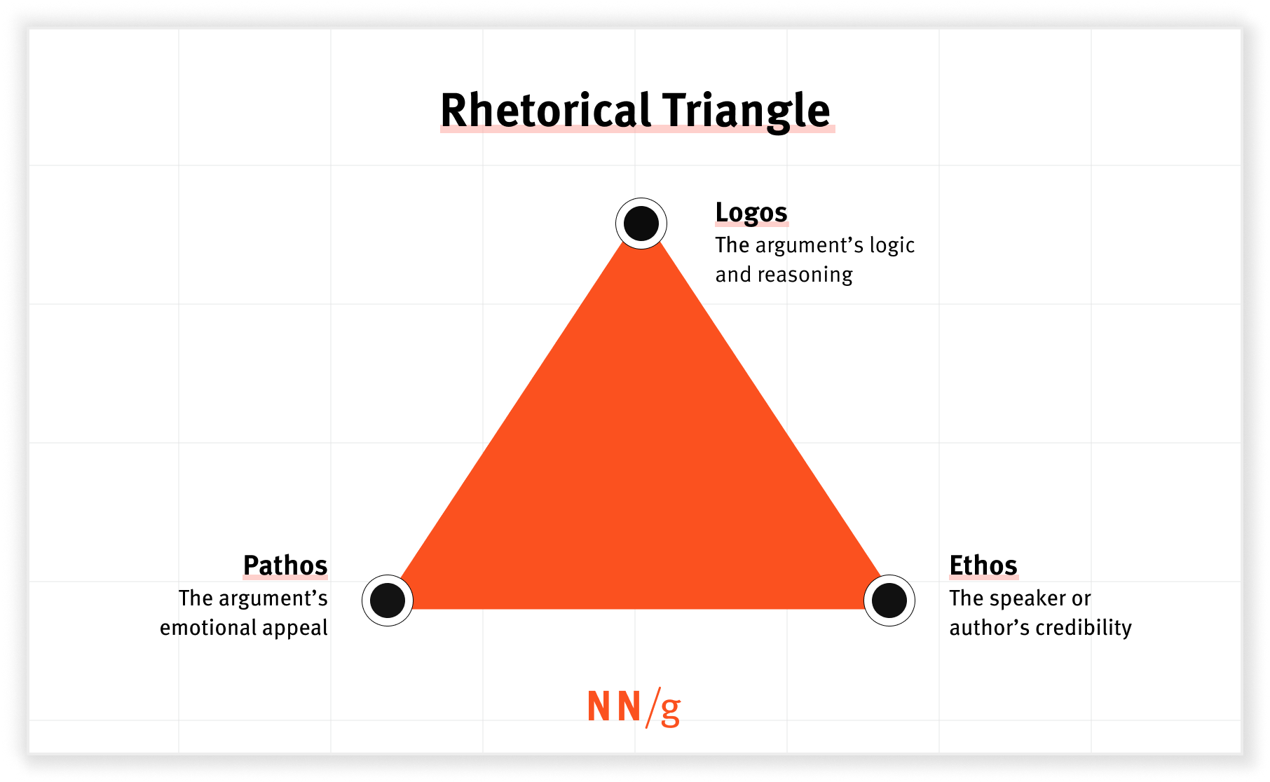
Summary: Ethos, logos, and pathos can help you get buy-in from stakeholders. Communicating with stakeholders has long been a challenge for UX professionals. Luckily, rhetoric provides strategies for navigating these difficult interactions. The Rhetorical Triangle Rhetoric is the art of using language to persuade an audience. The rhetorical triangle (more commonly known as ethos, logos,… Continue reading The Rhetorical Triangle for Stakeholders: Make Your Point and Get Your Way
Test smart: which automation strategy to choose for peace of mind?
[unable to retrieve full-text content] Among diverse approaches, the teams can find a unique way on their test automation journey and select the strategy that matches their needs. So let’s dive deeper into pyramids, diamonds, hourglasses and other interesting objects. In the massive hype around automation in the QA field, it is easy to get… Continue reading Test smart: which automation strategy to choose for peace of mind?
How To Create A Budget-Friendly Sensory Room For Kids
Creating a sensory room for children, especially those who are neurodivergent, can greatly enhance their learning, relaxation, and overall sensory experience. A sensory room is a space carefully designed to stimulate the senses and support sensory processing. Whether your child experiences sensory seeking or avoiding tendencies, a sensory room can help them regulate their environment… Continue reading How To Create A Budget-Friendly Sensory Room For Kids
The Importance of Shopify Web Maintenance for Your Online Store
A Shopify store is the epicenter of your business, especially in the dynamic eCommerce world. It is where customers browse, make purchases, and interact with your brand. Like any technology, a Shopify store requires routine care to function at its best. Here’s when Shopify Web Maintenance comes into the play. Without continuous maintenance, even the… Continue reading The Importance of Shopify Web Maintenance for Your Online Store
Documenting design process with Notion
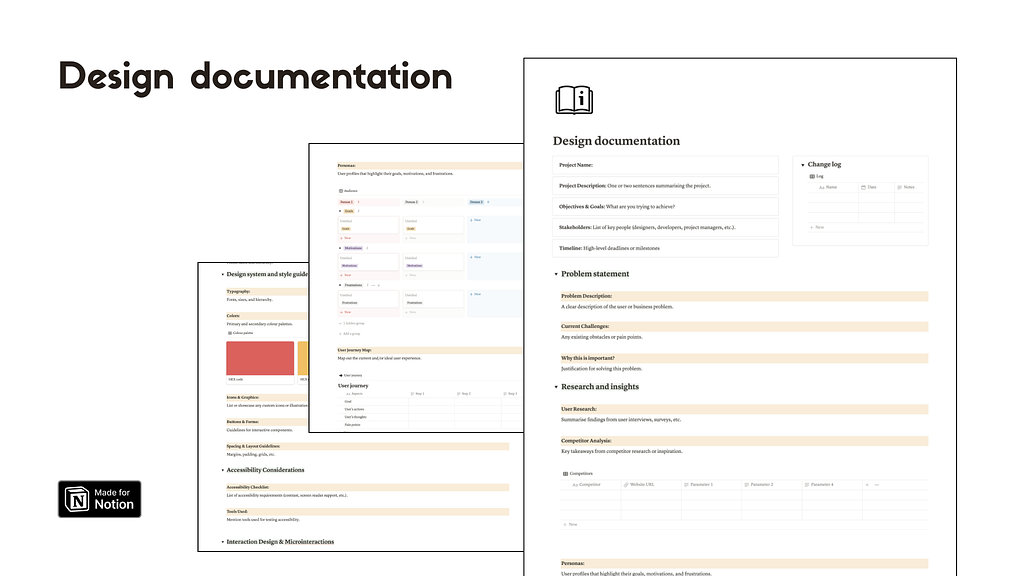
[unable to retrieve full-text content] An ultimate approach to Design Documentation Managing projects efficiently is crucial to keep your work process moving smoothly. Working within a design team, or collaborating with multiple stakeholders, staying organised can be a challenge. This is where a Design Documentation Notion Template comes into play. Design documentation – Notion template A… Continue reading Documenting design process with Notion
Serial Position Effect — How does human memory work while recalling?
[unable to retrieve full-text content] Recently we visited an art gallery, with all its amazing artworks lining the walls. Photo by Eric Park on Unsplash As we walk through the exhibition, we notice the careful arrangement of the artworks and how they evoke different emotions and leave a lasting impression Our eyes are naturally drawn to the… Continue reading Serial Position Effect — How does human memory work while recalling?
A/B Testing 101
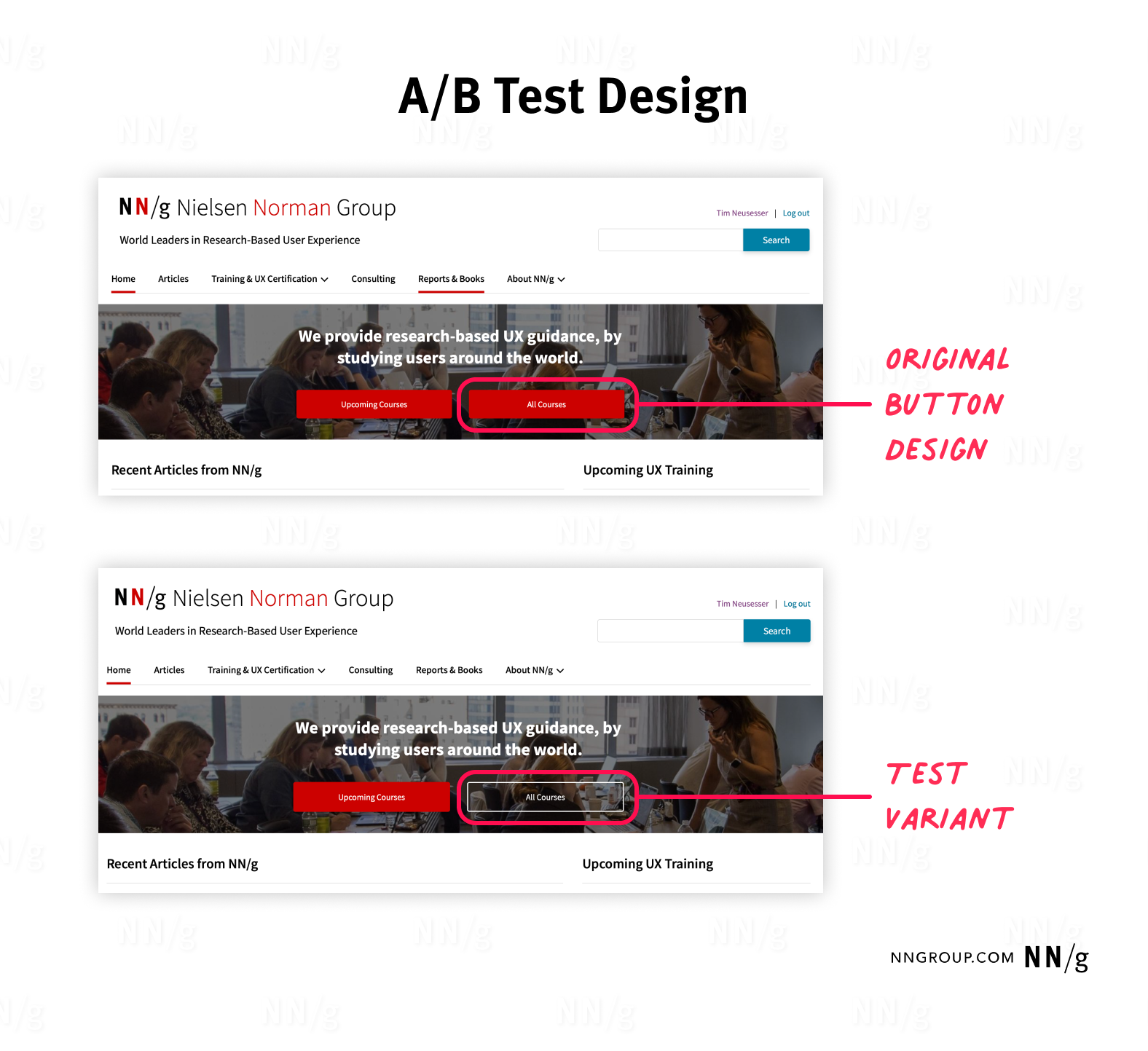
Summary: A/B tests incrementally improve the user experience of a product while effectively reaching business goals. A/B testing (sometimes also referred to as split testing) is a popular UX research method, with widespread adoption across businesses and industries. To ensure reliable, meaningful, and beneficial results for your organization, follow best practices and avoid common mistakes… Continue reading A/B Testing 101
Lyssna (UsabilityHub) Reviews: Pros, Cons & More
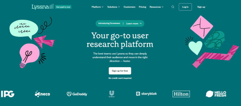
Considering Lyssna for your team’s research but want to weigh the pros and cons? Curious about others’ opinions on this tool? You’re in the right place! This article will explore Lyssna, highlighting its features, identifying any drawbacks, and comparing it to a top alternative. ❕ Important note: This review site presents information relevant… Continue reading Lyssna (UsabilityHub) Reviews: Pros, Cons & More
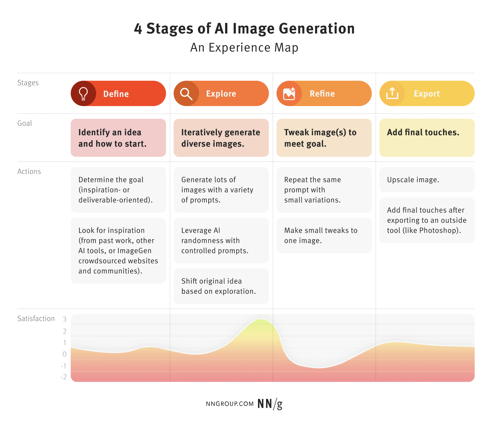
The 4 Stages of AI Image Generation: An Experience Map
Summary: AI image generation users often follow a similar creative process: ideate, generate, refine, and export. Understanding how expert users use AI tools in the process of image generation can help designers and other beginner users get better at using these tools for their projects; it can also inform the future design of such tools.… Continue reading The 4 Stages of AI Image Generation: An Experience Map
Zuko Form Builder: Build Forms with High Conversion Rates
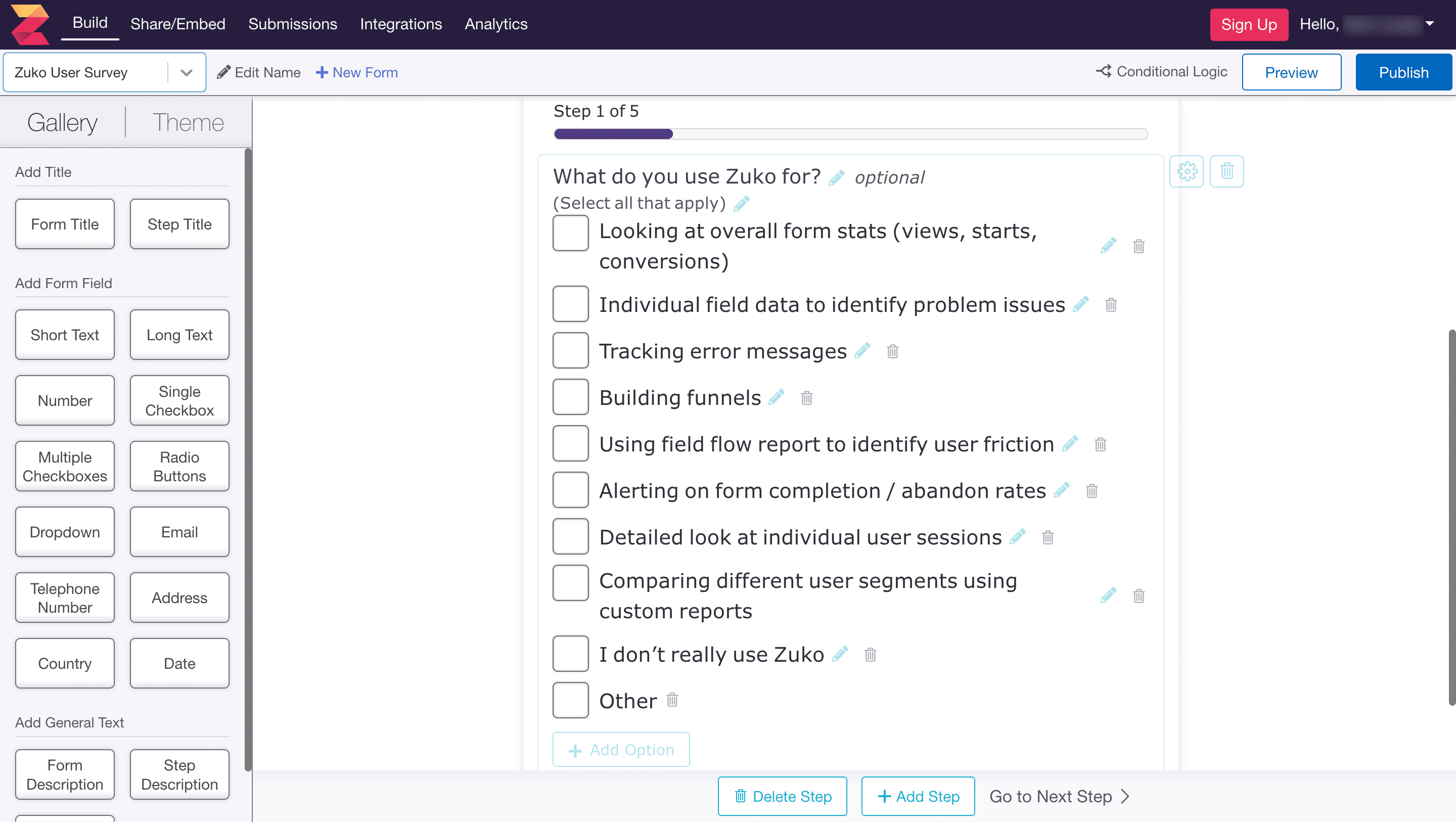
80% of users have abandoned an online form after beginning to fill it out (source). Chances are you’re losing more users on your form than you know. The only way to turn this around is to build a form that delivers a smooth and easy user experience. That’s where Zuko Form Builder can help. Data-Driven… Continue reading Zuko Form Builder: Build Forms with High Conversion Rates
How do I propose to improve the usability of Gymnasium.com
[unable to retrieve full-text content] Photo by Hal Gatewood on Unsplash I pretty much discovered UX Design through their UX fundamentals course while working as a Test Automation Engineer. Although the course material was excellent, covering the fundamentals of UX beautifully, the platform itself had some clear usability issues. Gymnasium features a clean and simple design… Continue reading How do I propose to improve the usability of Gymnasium.com
32 Creative Stationery Mockups That Will Make Your Brand Stand Out
The Power of Presentation: How creative stationery mockups elevate your corporate branding! For graphic designers working on corporate branding, a logo and color palette are just the beginning. A truly cohesive brand identity extends to all touchpoints, including the seemingly small detail of business stationery. But how do you effectively showcase your vision for letterheads,… Continue reading 32 Creative Stationery Mockups That Will Make Your Brand Stand Out
