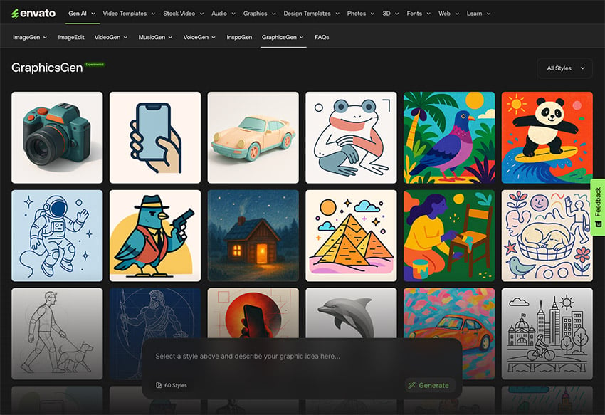
Creating coloring book pages has never been easier thanks to AI-powered design tools. In this tutorial, and transform text prompts into printable line art using Envato’s GraphicsGen—no drawing skills are required! Whether you’re targeting adults seeking intricate, therapeutic designs or children looking for fun, simple illustrations, this tutorial will help you master the process in just… Continue reading How to create a coloring book with AI
Tag: close
10 Clever Instagram Caption Ideas That Spark Emotion and Drive Meaningful Interactions
Instagram caption ideas can help you form deeper connections with your Instagram followers. The right caption doesn’t just sit under your photo—it speaks directly to the person reading. It can make someone pause, reflect, or even feel seen. When used well, captions drive meaningful engagement, encourage conversation, and bring authenticity to your presence online. If… Continue reading 10 Clever Instagram Caption Ideas That Spark Emotion and Drive Meaningful Interactions
Foldable Smartphones: New Devices, New Opportunities
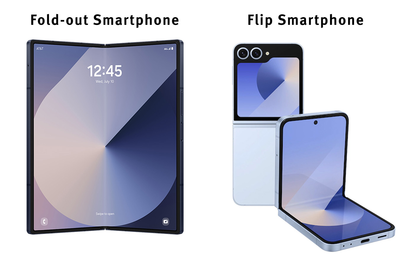
Summary: Two types of foldable smartphones blur the boundaries between traditional device sizes. Fold-out and flip phones create new viewports that hint at future smartphones. Mobile phones have evolved dramatically, with displays growing from 1.5–2.5 inches pre iPhone to 6.1–6.8 inches today. However, this growth has practical limits, as larger screens compromise single-handed use and… Continue reading Foldable Smartphones: New Devices, New Opportunities
Continuous Product Design: Step-by-step Guide
Most IT-supplied products and functions are not used in practice. Resources, applications, and software remain idle. Not all companies consider whether their products are effective for the users. Consequently, 91% of unsatisfied customers don’t complain about their bad experience. They simply leave without giving feedback. A vivid proof is the mobile development market, which has… Continue reading Continuous Product Design: Step-by-step Guide
7 Common Mistakes in Running Workshops
At UX studio, we facilitate and participate in many workshops, so we have that kind of experience, which could be helpful for someone searching for the how-tos. Here comes your guidance on how to run a workshop and how not to. What Are Workshops and Why Do We Run Them Workshops are designed to solve… Continue reading 7 Common Mistakes in Running Workshops
Lyssna (UsabilityHub) Reviews: Pros, Cons & More
Considering Lyssna for your team’s research but want to weigh the pros and cons? Curious about others’ opinions on this tool? You’re in the right place! This article will explore Lyssna, highlighting its features, identifying any drawbacks, and comparing it to a top alternative. ❕ Important note: This review site presents information relevant… Continue reading Lyssna (UsabilityHub) Reviews: Pros, Cons & More
The 4 Stages of AI Image Generation: An Experience Map
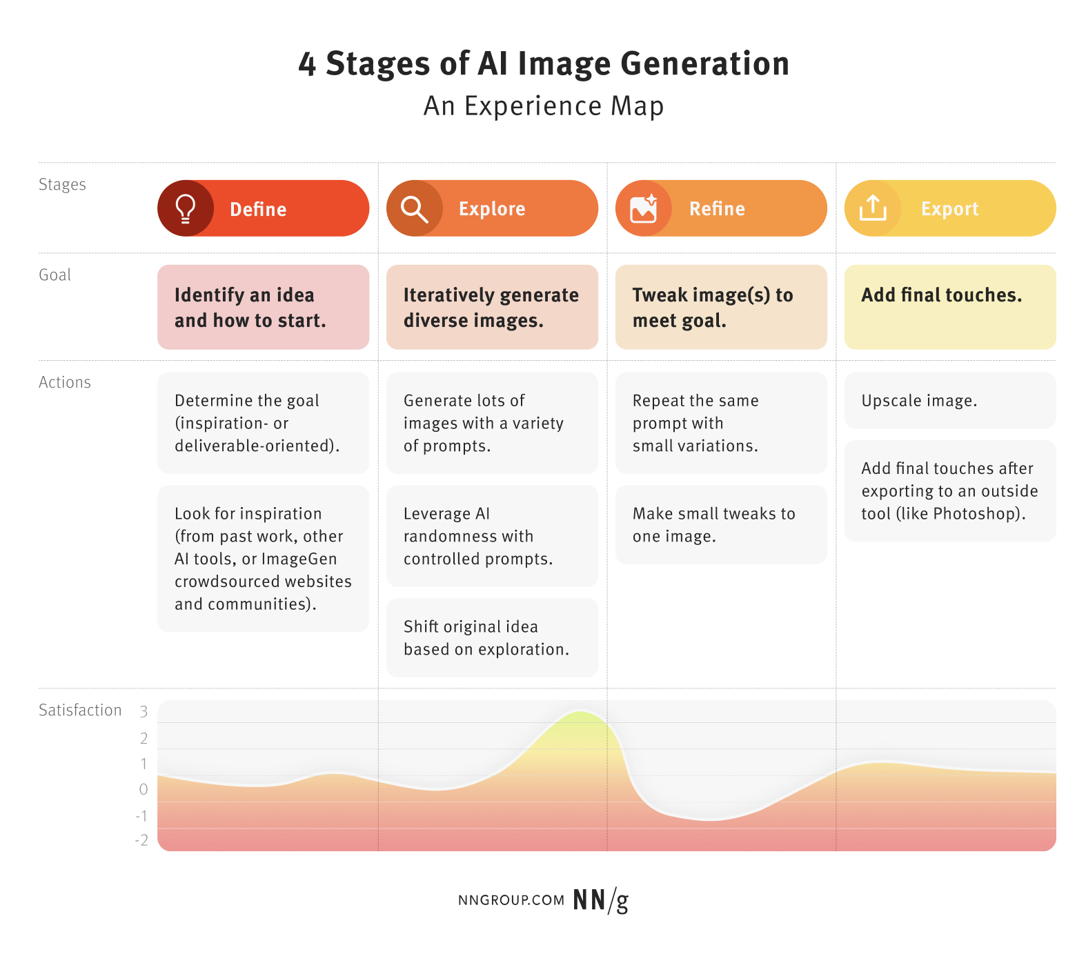
Summary: AI image generation users often follow a similar creative process: ideate, generate, refine, and export. Understanding how expert users use AI tools in the process of image generation can help designers and other beginner users get better at using these tools for their projects; it can also inform the future design of such tools.… Continue reading The 4 Stages of AI Image Generation: An Experience Map
The Power of Checkout Campaign Management
[unable to retrieve full-text content] When it comes to checkout pages, the most frequently cited word is conversion. After all, the main criteria for a successful checkout is its efficiency in terms of successful payments. Conversion can be viewed from many angles, including technical performance and client experience. Still, there are other less obvious components… Continue reading The Power of Checkout Campaign Management
Designer engagement report
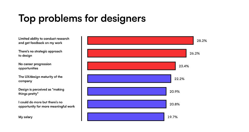
[unable to retrieve full-text content] Top 3 problems for designers: no research, no design strategy, and no career progression Image by Matej Latin (Author) It’s been a horrible year for design. Mass layoffs from 2023 continued and got even worse. AI is threatening to take creatives’ jobs, designers need to go through up to 11 rounds… Continue reading Designer engagement report
7 Tips for Memorable and Easy-to-Understand Imagery
Summary: A few relevant, high-quality visuals placed next to associated text can boost users’ comprehension of your content and its memorability. When implemented strategically, visuals can enhance users’ ability to understand and remember products. Here are seven best practices for memorable visuals. #1 Choose or Create Relevant Visuals Visuals exist alongside other content, and users… Continue reading 7 Tips for Memorable and Easy-to-Understand Imagery
Modernizing LOTO — Prioritizing User Requirements with the Kano Model
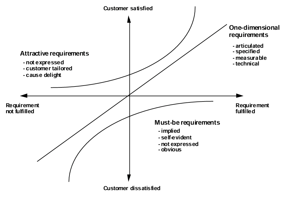
[unable to retrieve full-text content] I worked on this project for nearly 2 years at my previous workplace, and although I can’t dive deep into the technical details due to NDAs, the process itself was an incredible learning journey for me. And that’s what we will be focusing on, the journey not the destination. In… Continue reading Modernizing LOTO — Prioritizing User Requirements with the Kano Model
Why UI designers should understand Flexbox and CSS Grid
CSS for UI Designer Or bye bye, 12-column grid layout Most designers are familiar with responsive design, a column-based layout approach with fixed breakpoints to cover all screen sizes. However, we can move beyond the rigid structure with modern CSS layouts, crafting flexible and dynamic designs that seamlessly adjust to different screen sizes. Designers and developers having different… Continue reading Why UI designers should understand Flexbox and CSS Grid
A proposal for modern UX Researchers
A glimpse of the current standing of UXR and strategy on how to stay relevant with the workforce demand. Photo by Unseen Studio on Unsplash “The UX researcher fallacy: ‘My job is to learn about users.’Truth: ‘My job is to help my team learn about users.’”– Caroline Jarrett As 2024 starts, layoffs are still everywhere, specifically in… Continue reading A proposal for modern UX Researchers
Crafting an effective design system strategy
How to build a strategy, not a roadmap A design system is a product. A product that solves concrete tasks: ensuring consistency reducing development time and much more Most often, the main reason to create a new product is that you want it to be different from the existing ones on the market. After all, why waste time… Continue reading Crafting an effective design system strategy
Why Unique ID Attributes Matter
Ambiguous IDs can cause both your developers and your users a lot of frustration, and may ultimately damage customer relations. A Little Background It’s one of the most common WCAG 4.1.1 violations reported by automated accessibility testing tools such as aXe, and it can cause a fair share of problems for your users. It happens… Continue reading Why Unique ID Attributes Matter
Housing, It’s a Human Right (Part 1)
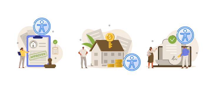
A 3-Part Series on the digital accessibility of the housing process experienced by people with disabilities. In this 3-part series, we will look at the challenges and rewards of the entire experience surrounding the process of acquiring housing for people who live with a disability. We will look at: Buying an existing home Leasing an… Continue reading Housing, It’s a Human Right (Part 1)
Introducing the Next Generation of Mobile Accessibility Testing
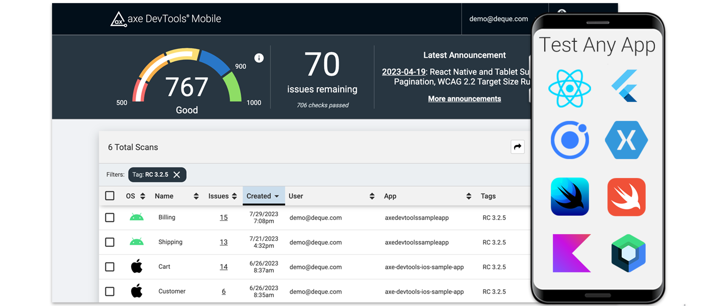
If you can run an app in iOS or Android, now you can test it for accessibility with us. Deque’s axe DevTools Mobile redefines mobile testing for digital accessibility for cross-platform apps, such as those built with React Native. It’s the easiest mobile testing solution to install and run. It also provides clear direction to… Continue reading Introducing the Next Generation of Mobile Accessibility Testing
Innovative Home Decor: How Custom Neon Signs Elevate Interior Design Strategies
“There’s No Place Like Home” LED sign by VoodooNeon.com Introduction to innovative home decor In recent years, the world of interior design has seen a significant shift towards innovative and unconventional home decor ideas. As homeowners, we are always on the lookout for unique ways to express our individuality and creativity in our living spaces.… Continue reading Innovative Home Decor: How Custom Neon Signs Elevate Interior Design Strategies
Using the Popover API: Native Modals for the Web
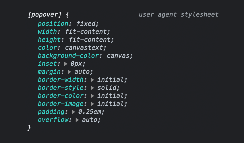
Popovers, a collective term for what you might know as “tooltips”, “overlays”, “modals” or “dialogs”, offer a powerful way to display additional information or actions within a web application. In this tutorial, you’ll learn how to use the new Popover API, a versatile new tool for creating dynamic and customizable popovers. We’ll walk through the basics… Continue reading Using the Popover API: Native Modals for the Web
3 Essential Design Trends, June 2023
That’s a big part of the reason so many designers are stripping down menus to more minimal styles. (Plus, it can create a cleaner, more sleek overall design.) Here’s what’s trending in design this month – and it is all about navigation. 1. Pop-Out Navigation There’s an obvious connection to mobile-friendliness here – website designs that use… Continue reading 3 Essential Design Trends, June 2023
The UX of Sweetgreen
Sweetgreen seems to have its mind in the right place when it comes to embracing present and future technologies to offer an amazing UX. Image by Sweetgreen. Sweetgreen has come a long way since opening its first Washington, D.C. salad bar in 2007. 15 years have passed, and they are now on track to reach over 200… Continue reading The UX of Sweetgreen
Are Modals In Web Design A UX Disaster?
Modals, a nifty little feature that allows you to display different messages at the top of your website, have been touted as extremely useful. Some even claim that they are helpful enough to completely replace the banner ads we all hate so much. But are modals in web design a UX disaster? If you are… Continue reading Are Modals In Web Design A UX Disaster?
Designing for scalable Dynamic Type in iOS
Designing for scalable Dynamic Type in iOS for accessibility When we wanted to implement accessibility settings on our iOS mobile app, I had to figure out where to start. Looking online, I could only find engineering resources. It was all about code and how to implement it with UIKit or SwiftUI with plenty of great… Continue reading Designing for scalable Dynamic Type in iOS
Handling cross-team feedback loops on design work
Escape the siloing trap when you are both part of a design team and a product team, involve people early and often, and foster the right conversation at the right time If you are a designer working in a product organization you are maybe also part of two teams at the same time: a design team… Continue reading Handling cross-team feedback loops on design work
