Designing for scalable Dynamic Type in iOS for accessibility
When we wanted to implement accessibility settings on our iOS mobile app, I had to figure out where to start. Looking online, I could only find engineering resources. It was all about code and how to implement it with UIKit or SwiftUI with plenty of great code blocks and examples, but as a designer, I had a few more questions:
- What do I need to give my engineers?
- Does this change how I need to design and annotate?
- What the heck am I even supposed to be doing to start off with? 😩
After two years of working with Dynamic Type and working closely with my engineers, I’m writing this now to hopefully provide a baseline for other designers who want a starting point to support more accessibility settings.
We’ll cover:
- What are the design deliverables for Dynamic Type?
- What design principles do we need to keep in mind now that text can shift sizes?
- What other considerations do we need to think about before implementing Dynamic Type?
We’ll talk about how to implement Dynamic Type from the perspective of starting a project from scratch, but the same principles and ideas apply if you are updating an existing app.
Most importantly, we’ll discuss how collaboration between everyone is key to make accessibility settings like Dynamic Type possible. This is not something that a designer can tackle on their own.
What is Dynamic Type?
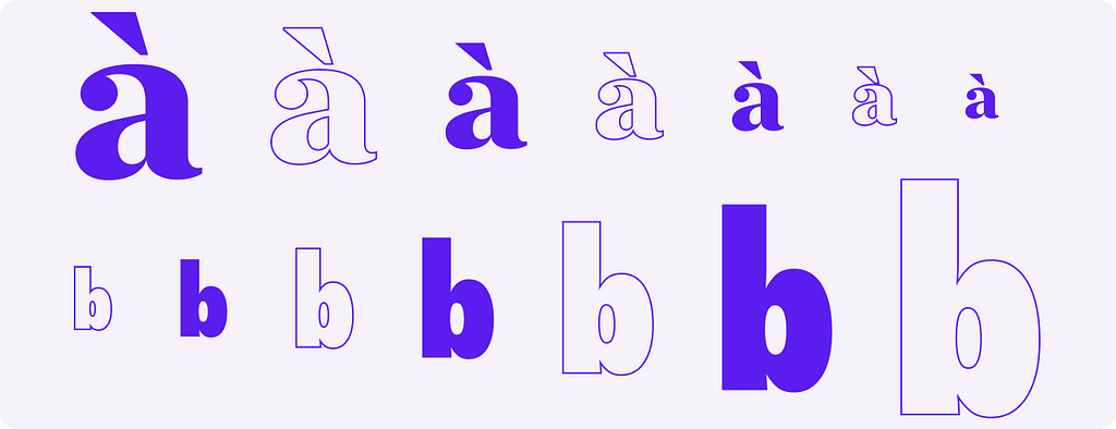
Dynamic Type is an accessibility feature in iOS that scales type in the interface based on a user’s font size selection. Not only is this helpful for people with reduced vision capabilities, but it’s also helpful for users who want to scale down text to be able to see even more content. It can be helpful for users who have to drive often and have their phones mounted.
Everyone benefits from supporting scalable text, not just those with vision impairments.
When Dynamic Type was first introduced way back in iOS 7, implementing it with custom brand fonts was a large lift, and so many apps simply didn’t support it. Starting in iOS 11, Apple introduced a much easier way to support Dynamic Type with custom fonts. That means the effort was lower while the value remained high; the perfect combination to gain support for accessibility options.
It starts with design.
On a new project, designers are laying the groundwork for everything else — fonts, colors, base components, and anything else needed for the brand. Similar to how this is the easiest stage to set up Dark Mode in iOS, this is also the stage where designers set the stage for Dynamic Type. Let’s focus on the typography hand-off.
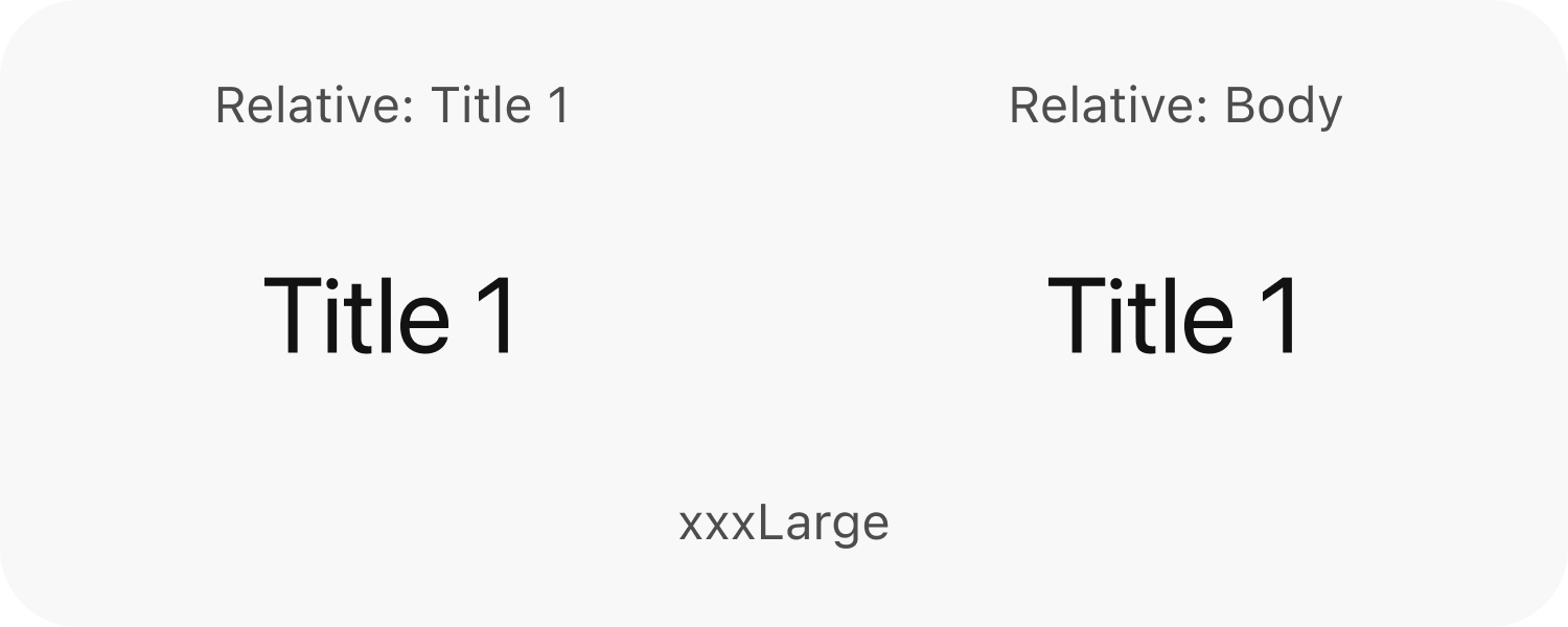
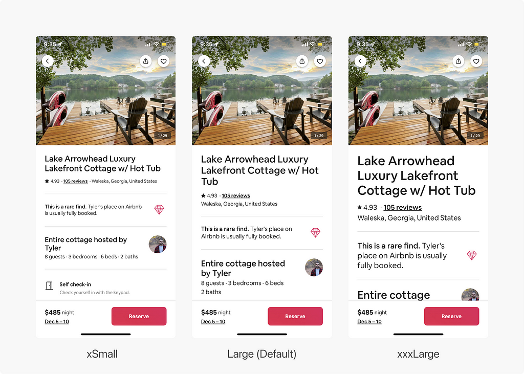
In Apple’s Human Interface Guidelines, there are tables for sizing of all Dynamic Type sizes ranging from xSmall — xxxLarge.
Does a designer need to specify each table for the branded font? Not anymore.
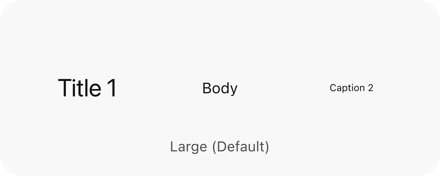
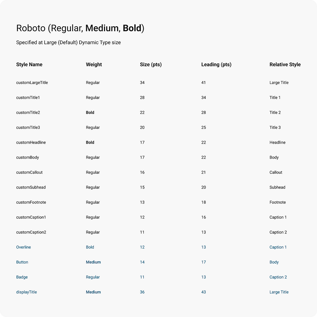
To support Dynamic Type in iOS at its most basic, the only things designers need to hand-off to developers is the fonts at size Large (the default Dynamic Typesetting), and most everything else for scaling will be handled automatically.
In the past, designers would’ve had to specify every size and leading for every single table. That means 7 tables that were handed off in past years. But thankfully, no longer.
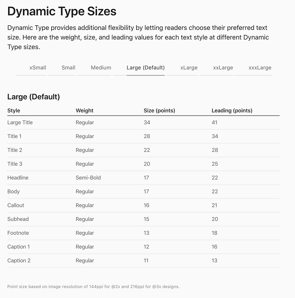
The table shows Apple’s default font styles for San Francisco, also known as system font styles. But since we’re typically using different fonts than San Francisco, you can still follow the table to produce your own styles.
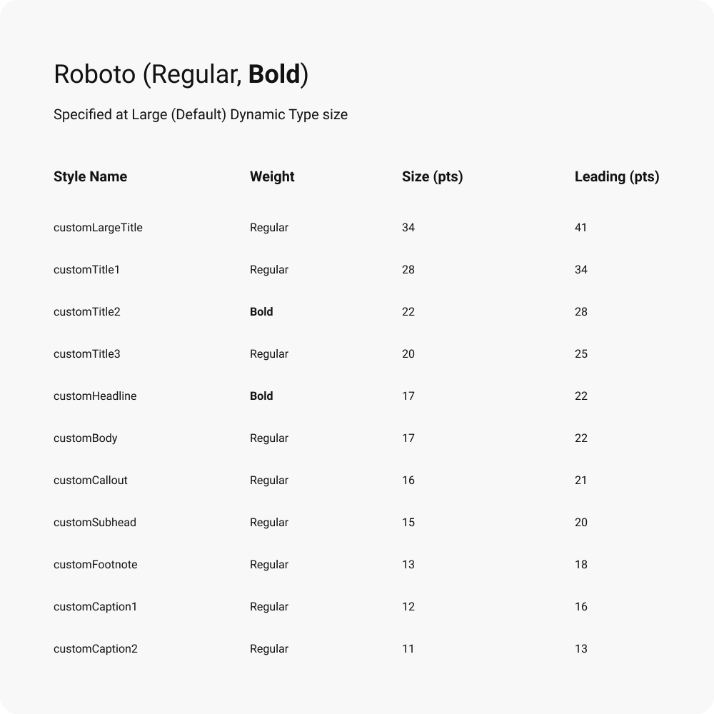
For custom fonts, provide to engineers:
- The style name. You can follow Apple’s hierarchy, but to differentiate you might want to do something like [brandLargeTitle, brandTitle1, etc]. Or, you can name it anything else you want depending on your guidelines.
- Font weights. Make substitutions as needed — not all fonts have Semi-Bold or Ultra Light or Heavy weights.
- Font size. The exact font size doesn’t have to match Apple’s font size; your brandBody does not have to be 17 points. Adjust it as needed, as some fonts render smaller than San Francisco, so your brand font for Caption 2 at 11 points may be too small, and bumping up to 12–13 points may make more sense. Again, use a custom scale if you want.
- Leading. You can stick to the default leading of the font if you want or specify for readability. 1.2x to 1.4x font size is common.
- Font files. For all fonts weights used in your table, engineers will need those font files as well, so don’t forget that.
So your basic hand off might look something like this:
What if I’m using my own type scale that’s not based on Apple’s?
If Apple’s table isn’t enough for you or you’re using your own list of custom styles, you can still add more styles as needed. Simply provide the same information seen previously with an addition: what system style should your custom one scale like?
Styles have different scale factors, e.g. Apple’s system Title 1 scales differently from Body.
Why is this the case? Titles are typically already large and oftentimes a bit shorter than body text. So, if they scaled at the same rate as the other styles, they’d get massive quickly at the larger accessibility sizes and take up way more room.
In code, this element is just a part of UIFontMetric, and it’s simply called “System Style”, which is kinda confusing. So, we’ll refer to it as a relative style (i.e. relative to a system style) for simplicity in this article. A relative style is linked to your custom style that tells it how to scale relative to a system style.
By naming the fonts similarly to system styles, the relative style is easy to know which one to link: customCaption2 is linked to Apple’s system font Caption 2. But when you add more styles or they’re named differently, you will need to be more explicit about what the relative style is to get the scaling just perfect.
You have to determine if this new style is generally going to be handled more similarly to a title, body text, or something smaller like a caption:
- Titles scale larger at a lower rate, especially in the larger size.
- Body style texts are in the middle.
- Captions and other small text styles scale larger quickly, but have a minimum size where they no longer scale downward.
So, if we aren’t using styles that are similar to the existing Apple System Styles, then we’ll want to add in the relative system style. If we didn’t specify, your engineer may leave that attribute at its default, which would scale it relative to Apple’s Body system style. This could lead to issues if it’s a particularly small-sized custom style.
Choose a relative style that scales the way you want it to generally. You don’t have to get super granular — you can stick with broad-stroke styles like Title 1, Body, or Caption 2.
Your final handoff then might look something like this (I’ve highlighted the custom additions in blue):
Now, design has provided everything engineers need to implement Dynamic Type using UIFontMetric at its most basic. Once implemented, we’re done, right?
Not quite. There are some design principles you’ll need to keep in mind.
Dynamic Type principles for design and engineering
Our text now has the capability to dynamically resize itself based on user preference.
It will scale, but it won’t be perfect. If you launched with just this, you’ll notice plenty of things that are broken. We’ll need to design a little bit differently, and we’ll need to approach the way we hand-off differently as well.
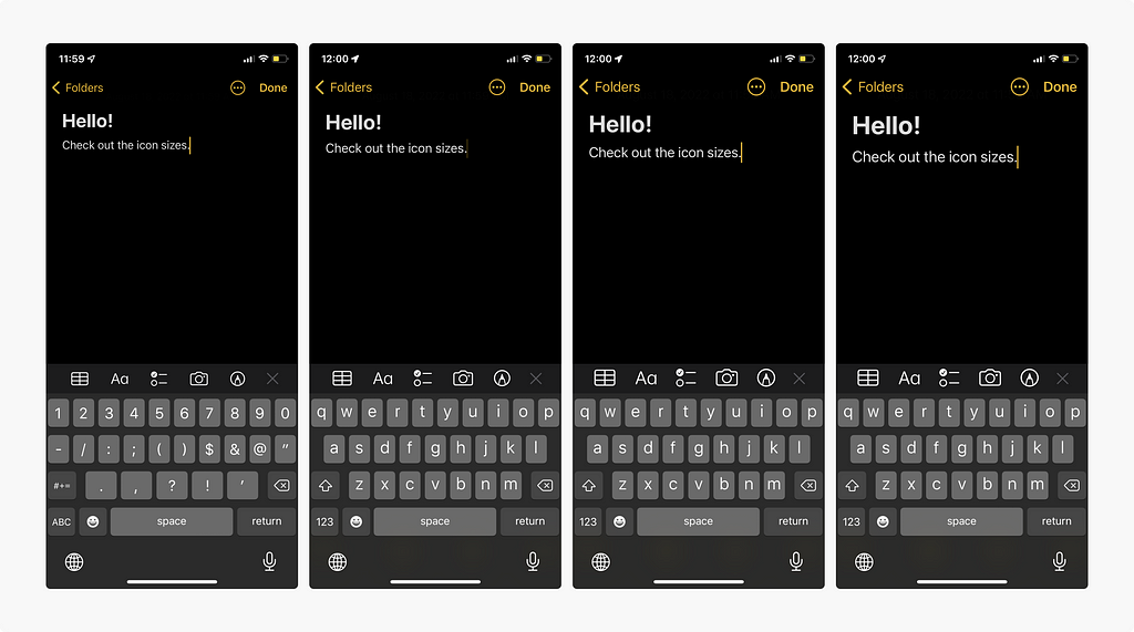
(Almost) Every screen is a scroll view.
To an extent, this was a consideration when designing for multiple screen sizes anyways. Content might be cut off on smaller screens, but there are many instances where the design and content looks perfect on the tiniest screen at default font sizes, and it passed QA.
With Dynamic Type, we found that there were cases where content would be cut off on screens set at a larger Dynamic Type size on a smaller phone, but users weren’t able to scroll to read the rest. Even if it was an empty state with 1 sentence.
Now that text can shrink and grow very large based on user preference, it’s important to make sure all the content is seen not just based on screen size, but also based on type size preference. Think about a person who has a small phone size and a larger Dynamic Type size chosen.
Scrolling is expected with large Dynamic Type sizes. So screens should scroll when necessary, which means that your engineers need to think frequently about scroll views.
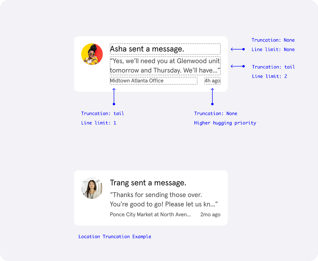
Consider line limits and truncation.
Even at default sizes you typically want to avoid line limits and truncated lines because it hides helpful content. However, sometimes it makes sense to truncate: for example, a snippet of longer content where the user can find the entire text in the next screen.
Let’s say you specify to truncate the tail at 3 lines for a component. Users can still get a good idea of the content that will come at default sizes, but at larger Dynamic Type sizes, you may find that the truncation gives a preview that’s not helpful. That may still be okay for your product, as it’s totally up to you as the designer and the nature of your content.
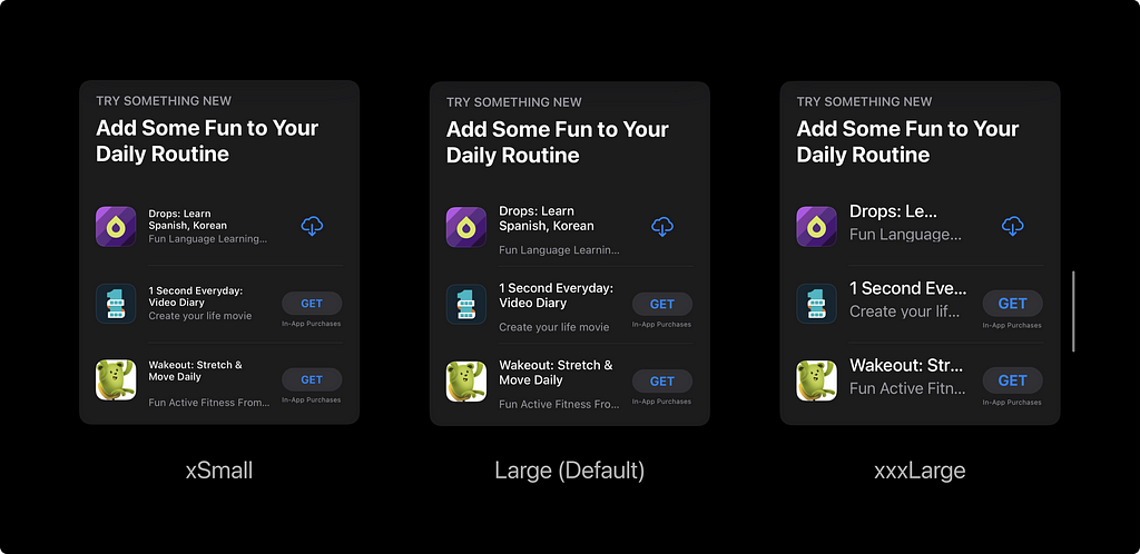
But it’s something to consider with Dynamic Type: if you truncate, larger sizes will show less content. Because of this, it’s helpful to engineers when design specifies truncation and line limits explicitly, even in components where it may not have been a problem initially.
Don’t forget: there’s different types of truncation. Most of the time you’ll use tail truncation, but sometimes middle truncation is good. Think about your content and what’s really important. The beginning of the content, the beginning and the end, or just the end?
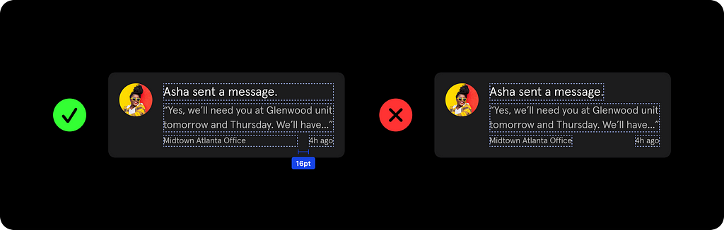
Padding between elements is important.
This flows right from the idea of truncation, and is also already a consideration for varying screen sizes. If you have two labels horizontally stacked, with dynamic type and content, you have to consider that they may collide.
When those two items collide, does one truncate? Or does it wrap? Does one have higher hugging priority (e.g. which truncates first)? Some default components in iOS will truncate by default instead of wrapping, is that something you want?
This is why it’s important to not only annotate line limits, but also to provide the space between elements before they collide. The padding will help keep things readable, as without it the text may run up really close to each other. You’ll want to design text labels in a way that makes sure it fills the entire available width so that engineers will know.
Remember minimum and maximum constraints.
As labels and other text start growing and shrinking: remember minimum and maximum sizes if they are applicable.
You may have a tertiary button with small text in it, but if a user has their dynamic type setting to Extra Small, the tap zone may become too small if no minimums are specified for that button.
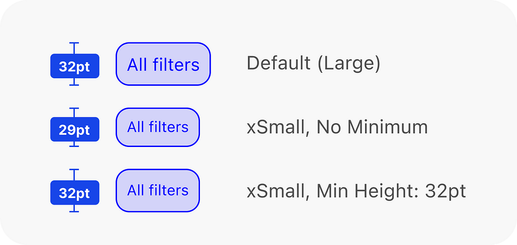
Generally, Apple’s Human Interface Guidelines specifies a minimum touch target of 44pt on phones. Your design system may specify something different, such as Material, where it’s 48dp.
Both platforms regularly break this “rule,” so be sure to determine what’s right for your specific use case. A 32 point button at default text sizes may become much smaller without constraints, making it more difficult to tap.
Typical annotations for new components
With all that in mind, a typical spec that a designer might want to hand-off to a developer for a new component might look like this:
You can continue to design at the default size Large and don’t need to change anything in your workflow. Very, very rarely do I ever create red lines for text at larger scale. If you follow the principles here, the outcome should be expected without needing to create a separate spec for the large-sized text.
You’ll also notice that I didn’t annotate everything. If you’re using Figma or Zeplin, as long as you set up the component correctly with ‘fill container’ labels, your engineers should be able to pull that information without it being annotated. Add in that redline if your engineers aren’t using a tool that lets them pull that information themselves.
And, even though one of our principles is to keep maximums and minimums in mind, sometimes you don’t have to explicitly set those since it doesn’t matter. This component won’t scale too small to interfere with tap zones, and we might be ok with it scaling all the way on a larger screen like on iPad.
Keep the principles we’ve discussed in mind, but don’t feel like you need to annotate everything all the time. Sometimes, the answer is no, minimums don’t apply here.
While we need to keep these principles in mind always, it’s important to be efficient and understand when you’ll need to annotate and highlight it — after all, if we’re resource strapped, we want to make sure the effort vs value is there.
Other considerations with Dynamic Type
How does QA fit into this?
With more functionality means more testing. Implementing Dynamic Type means that it also needs to be checked, and so that needs to be considered in your team workflow. For the most part, following those principles and specifications given earlier, we don’t run into Dynamic Type issues during QA very often, but it will occasionally happen.
iOS engineers also have access to tools such as the Accessibility Inspector, SwiftUI previews, and Swift UI debug preview mode that make it simpler to quickly check their UI in all dynamic font sizes.
Remember: accessibility is a team effort. If you can come to the table having thought about how this prioritization affects every member of your team (and of course, the business), it’s easier to get buy-in.
Some things don’t need to scale all the way.
Navigation bars and tab bars won’t scale really large and sometimes won’t even get any smaller. This is because those areas are often very limiting, and getting really large or small text sizes can end up making it more difficult to use. Additionally, here’s some guidance from Apple:
Prioritize important content when responding to text-size changes. Not all content is equally important. When someone chooses a larger text size, they typically want to make the content they care about easier to read; they don’t always want to increase the size of every word on the screen. For example, when people choose a large accessibility text size, Mail displays the subject and body of the message in the large size, but leaves less important text — such as the date and the sender — in a smaller size.
–
Try it out for yourself. Turn Dynamic Type incrementally to the largest sizes and you’ll notice that top navigation and tab bars don’t change too much.
Think about where in your product where you might want to opt out of dynamic scaling, if any. For the most part, try to avoid forcing text to not scale, but sometimes it may be necessary to do so.
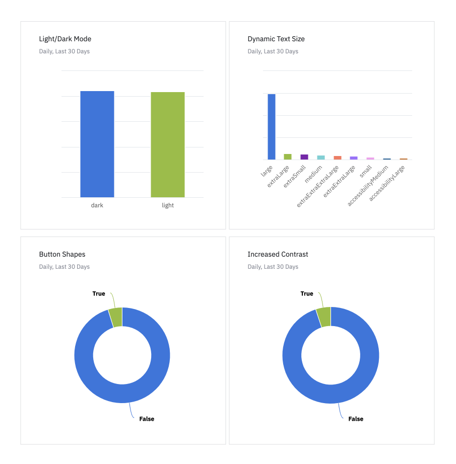
Get buy-in with analytics.
If you’re having trouble convincing people to support Dynamic Type or other accessibility settings, use the data. PSPDFKit showed that 30% of their users had a DT size other than the default.
You can say something like:
“If we don’t support Dynamic Type, we’re not respecting preferences for 30% of the people who use our app.”
Or even better, you can say something along the lines of:
“I’d love to see how we can support accessibility better. Can we add in a story for analytics checks for what type of accessibility settings people have turned on when they’re using our app? It’ll help us prioritize value.”
Then you have something specific to your app to back it up. This is where collaboration with your product manager comes in — they’ll need to prioritize it the work.
It’s straightforward to implement accessibility analytics into your project on iOS, your engineers just have to add in a check in the app for whatever analytics platform you use. It should be a pretty small and straightforward story.
You can do this for not only Dynamic Type, but other accessibility options such as Bold Text, Increase Contrast, Voice Over, etc, so knock them all out at once. The numbers may surprise your team depending on your user base, and they can serve as a starting point for prioritization of accessibility features in the future.
What about smaller Dynamic Type sizes?
We focused a lot on how text scales larger, but you also have to remember that text can scale smaller. As a general rule, scaling downwards creates far, far fewer problems than scaling upwards.
Remember one of our principles: specify minimums. Make sure your buttons and other tap areas don’t get too small.
Other than that, I almost never explicitly think about small sizes. As long as you’re designing with these principles and your handoffs are solid, you shouldn’t encounter issues with small text. In our testing for the past 2 years, I can’t remember a single issue with small text outside of tap targets.
Using SF Symbols will also scale icons dynamically!
Okay, I know that most people aren’t going to use SF Symbols since we have brand icon sets or more diverse icon sets. Everyone wants to design their own check marks. But it’s one of the benefits of using SF Symbols: your icons will scale fluidly with Dynamic Type.
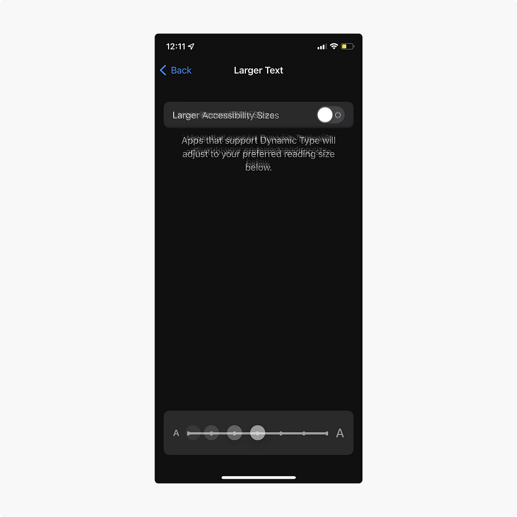
Wait. Where are the Larger Accessibility Dynamic Type sizes?
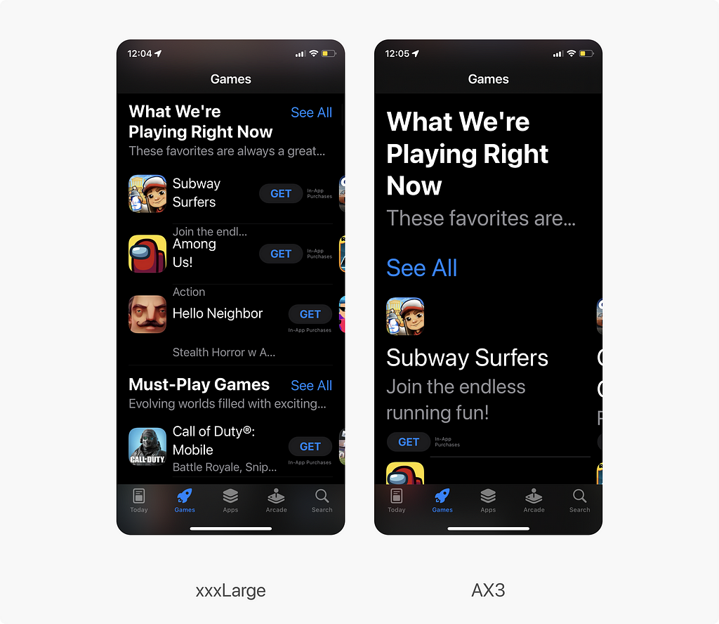
Users are able to go past the basic xxxL Dynamic Sizes into Accessibility (AX) sizes. AX Dynamic Type scales extremely large, which means all things are basically out the window and will often require layout changes if you want it to scale that large.
The user base for these sizes is much smaller, so supporting these levels all the way can be difficult if resources are limited. It takes a lot of effort to shift every single component for everyone: design, engineering, and quality.
In our app, we have a handful of people using up AX1 and AX2, everyone else uses a smaller size, so we made a conscious decision that we can’t support the larger AX sizes yet.
You’ll also have to keep in mind screen size (iPad vs iPhone) and orientation if your app supports it. You can see how this can get much more complicated than regular Dynamic Type quickly.
That doesn’t mean we should forget it. We’re all resource-constrained, and you still want to make it usable.
By following these principles in this article, you will scale pretty cleanly in all of your UI up to about AX2, depending on your type scale. You’ll find that scaling up to AX5 breaks everything, everywhere, all at once, and your app may be near unusable.
One way to get around it is to cap scaling at a specific size (e.g. AX2) if you can’t support the largest AX size.
Even if a person has their phone set at AX5, it’ll scale only to AX2 and won’t make the UI completely unusable.
It’s not perfect, but restricting how far text can scale is one way to get around the issue in a more practical way.
Kevin Hirsch has a good engineering focused article that talks more about adaptable layouts at AX sizes if are interested in learning more about the level of effort it requires.
Wrapping Up
In practice on our projects, we found that supporting Dynamic Type has been really easy and low-effort after the initial set up. It requires a bit of extra work, yes, but for the most part supporting the base levels of Dynamic Type has become straightforward with the advent of SwiftUI.
Again, the same principles and ideas follow if you are using UIKit or updating legacy designs, though you may run into more trouble if you weren’t designing for dynamic type from the start like we were.
The main takeaway from this is that Accessibility options like Dynamic Type require team effort. We’ve focused on design’s role specifically, but the key thing to remember that designers can talk about accessibility all we want, but we need buy-in from others.
It’s not just something that design or engineers handle alone, but it’s a feature that teams work together to accomplish. Product owners need to prioritize it, developers need to implement it, designers have to set the groundwork for it and keep it in mind for all designs, and quality needs to make sure it functions.
With accessibility, design with it in mind from the very beginning, and as such, have these conversations with your team as early as possible. The rest is easy.
Hopefully, this has been helpful for designers to know what to hand-off and for developers to know what they should expect from designers, ideally increasing collaboration between both.
Thank you to Nicole Hinckley, my iOS engineering partner for this, for collaborating with me figure all this out. Couldn’t have done it without you.
Additional Resources
Supporting Dynamic Type at Airbnb
This is a code-based article about some of the challenges for supporting Dynamic Type from the Airbnb team.
Improving Dynamic Type Support (PSPDFKit)
Code-focused article for Dynamic Type, with some analytics of their user data on who’s using it.
Adaptable Layouts by Kevin Hirsch
This is a good overview of adaptable layouts if you’re interested in larger AX Dynamic Type sizes, something that we don’t get in depth here. Also talks about scroll views.
Apple’s Typography Guidelines
See Apple’s tables for the complete Dynamic Type attributes they use at different sizes
Apple’s Dynamic Type Dev Documentation
Code-focused documentation for Dynamic Type
iOS — content hugging and content compression resistance priorities by Abhimuralidharan
This is a good overview of how engineers use hugging priority and compression resistance for truncation
Every Screen in Your App Should be a Scroll View by Michael Amundsen
Great examples as to why you need to think about scroll views.
Designing for scalable Dynamic Type in iOS was originally published in UX Collective on Medium, where people are continuing the conversation by highlighting and responding to this story.