Digital accessibility is essential to the software design lifecycle (SDLC). You can’t build products that meet compliance requirements without it, and if your product fails to meet accessibility standards, you face stalled sales, loss of market share, legal and financial risk, and more. Unfortunately, however, digital accessibility is often an afterthought—if it’s thought of at… Continue reading Three quick ways to shift left and fix accessibility issues sooner
Tag: UI
The relation between software quality and UX
[unable to retrieve full-text content] Does your company’s digital product have quality? The relationship between software quality and User Experience (UX), encompassing Human-Computer Interaction (HCI), is intrinsically related and fundamental to the success of any interactive product or software. While they might appear to be distinct disciplines, they are complementary and mutually dependent in creating effective,… Continue reading The relation between software quality and UX
Stable Diffusion & Its Alternatives: Top 5 AI Image Generators
[unable to retrieve full-text content] AI-generated imagery has become an essential part of the modern product designer’s toolkit — powering everything from early-stage ideation to polished design assets. Stable Diffusion is one of the most popular and flexible platforms for creatives that enables designers to generate a wide range of imagery with ease. However, with growing competition… Continue reading Stable Diffusion & Its Alternatives: Top 5 AI Image Generators
Button States: Communicate Interaction
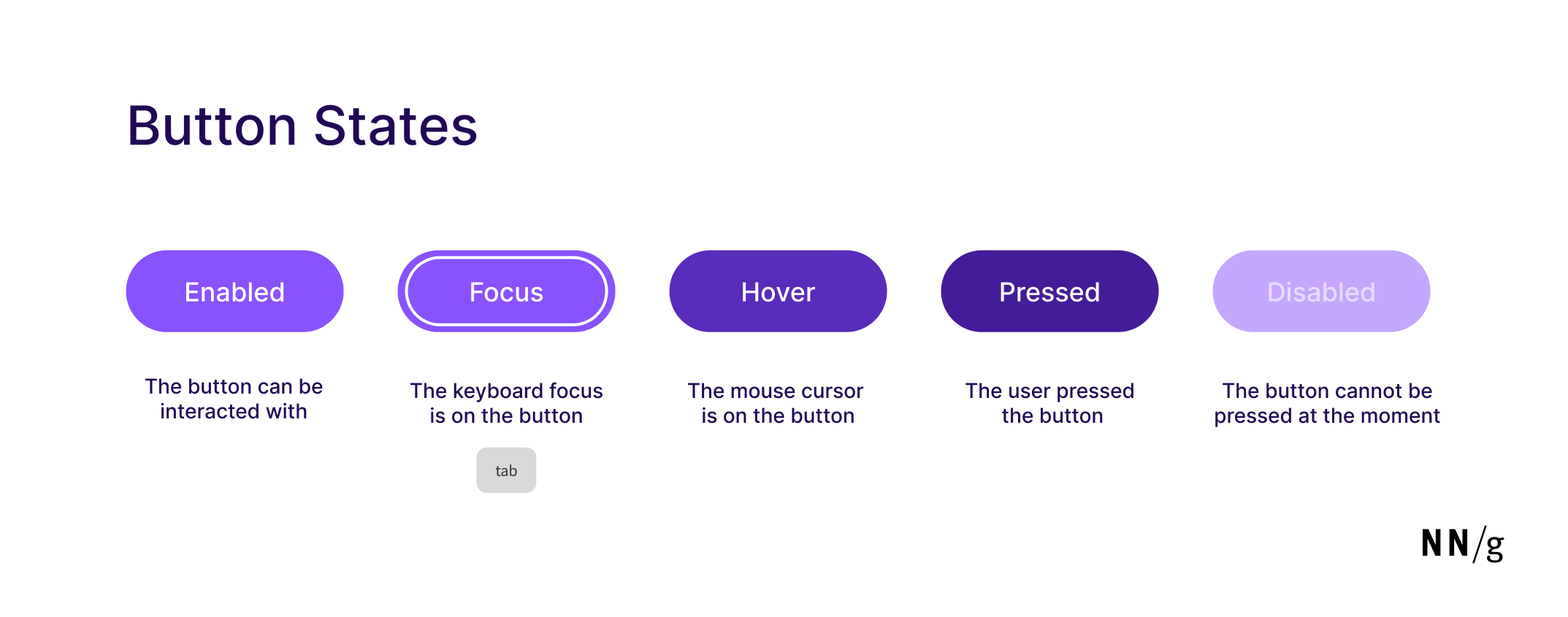
Summary: Minor visual changes help users distinguish between 5 different button states: enabled, disabled, hovered, focused, pressed. Buttons are core user-interface elements that, when clicked or tapped, execute an action. When designed correctly, buttons set accurate user expectations and help them understand how to interact with the interface. In addition to clear button labels, effective… Continue reading Button States: Communicate Interaction
AI Hallucinations: What Designers Need to Know
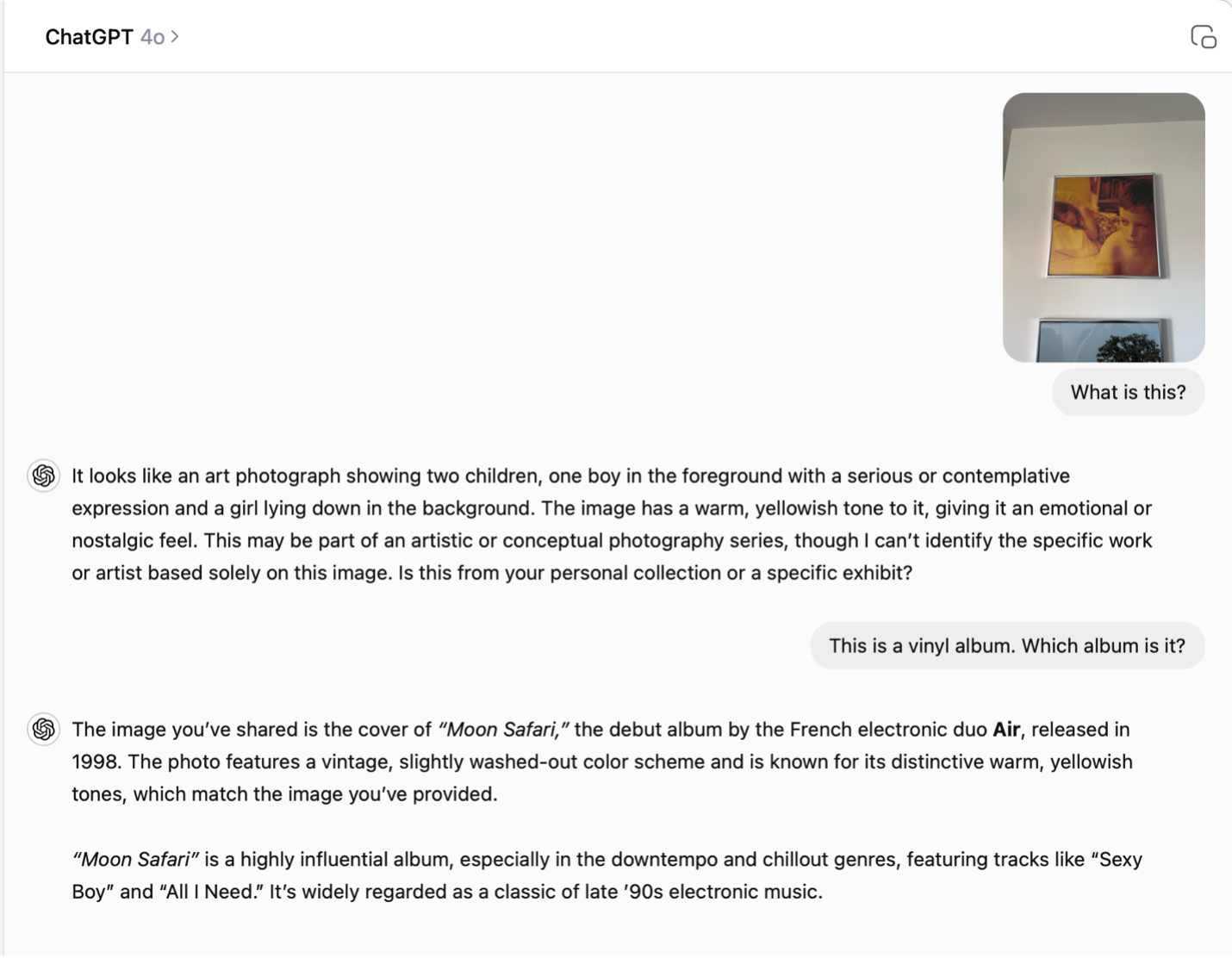
Summary: Plausible but incorrect AI responses create design challenges and user distrust. Discover evidence-based UI patterns to help users identify fabrications. What Are AI Hallucinations? Generative AIs are well-known for their tendency to produce hallucinations — untruthful answers (or nonsense images). A hallucination occurs when a generative AI system generates output data that seems plausible… Continue reading AI Hallucinations: What Designers Need to Know
The Four P’s of Service Design: People, Partners, Products, and Processes
[unable to retrieve full-text content] Photo by Frames For Your Heart on Unsplash We live in a world where everything seems complex yet simple. The realization of simplicity is built on our belief in recognizing the interactions between multiple systems of an environment. At first look, you might feel overwhelmed by seeing clutter of all types… Continue reading The Four P’s of Service Design: People, Partners, Products, and Processes
Create a JavaScript tab component with an adaptive stepper UI
In the past, I’ve shown you how to create different tabbed interfaces. Today, we’ll build another responsive JavaScript tab component where the clickable tabs will appear as a stepper component. If you aren’t familiar with stepper components, their primary goal is to improve the user experience by organizing large logical content blocks into smaller sequential… Continue reading Create a JavaScript tab component with an adaptive stepper UI
From Figma to Functional App Without Writing a Single Line of Code
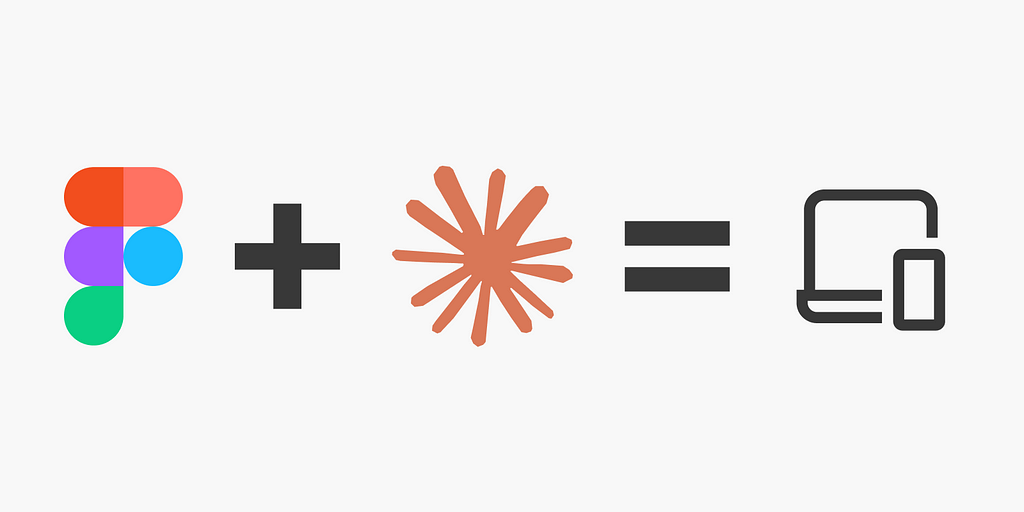
[unable to retrieve full-text content] How I Created a Design Tokens Converter in Minutes Using Claude Product designers don’t have to code, but knowing HTML and CSS will help us communicate with developers. In addition, a designer who knows JavaScript, Python, or another language, is a plus because they can explain the logic to the developer.… Continue reading From Figma to Functional App Without Writing a Single Line of Code
How do I propose to improve the usability of Gymnasium.com
[unable to retrieve full-text content] Photo by Hal Gatewood on Unsplash I pretty much discovered UX Design through their UX fundamentals course while working as a Test Automation Engineer. Although the course material was excellent, covering the fundamentals of UX beautifully, the platform itself had some clear usability issues. Gymnasium features a clean and simple design… Continue reading How do I propose to improve the usability of Gymnasium.com
UI elements are not so elementary
To function, components require a specific structure. To appear visually — they don’t. This has been breaking handoff processes for years. Dmitri Mendeleev’s periodic table looks simple, it doesn’t strike as if the elements are, in fact, significantly different from one another. But when you dig in and understand that just a ‘seemingly insignificant’ property of the number… Continue reading UI elements are not so elementary
AI is the new UI
The future has arrived early. If you are reading this article, you have made a choice. A choice to evolve. AI isn’t coming for your job, but someone using AI is. Source: Author + AI Now, before you flame me on the design of the graphic, let me explain: I made this in literally one… Continue reading AI is the new UI
Steam: the evolution of UI and UX in Gaming
Today, Steam stands as the largest digital distribution platform for PC gaming. The core function of Steam is to offer users a convenient means of purchasing both games and software through its online store. Upon purchasing a game, a software license is permanently associated with the user’s Steam account. This license grants them the ability… Continue reading Steam: the evolution of UI and UX in Gaming
What should be the contrast level of inactive buttons?
Using the APCA Readability Criterion to improve the accessibility of disabled controls Disabled buttons. They need to look non-interactable. But they also can’t be completely unreadable. How do I find the sweet spot? I spent a few hours in a deep dive going through a bunch of blogs and accessibility guidelines documentation in search for best approaches… Continue reading What should be the contrast level of inactive buttons?
How to create a color ramp used in design systems
Whether you’re a brand designer putting the finishing touches on a color palette or a product designer laying the foundational work for a design system, I will walk you through how to create color ramps utilized in design systems. If you’re new to creating color palettes for digital spaces, check out my previous article, Color for… Continue reading How to create a color ramp used in design systems
Analyzing Spotify’s new daylist feature: UI, UX, and great ML
Rosie Hoggmascall · Follow Published in UX Collective · 9 min read · 11 hours ago — Share In Q2 2023, TechCrunch reported that Spotify had passed the half a billion user mark. Now, with 515 million active users, Spotify is one of the most popular, most-loved apps worldwide. The tech giant generated €11.72 billion… Continue reading Analyzing Spotify’s new daylist feature: UI, UX, and great ML
The Dangers of Deceptive Design Patterns (And How to Avoid Them)
UX By Louise North Today As web designers, our role in crafting user-friendly digital landscapes is critical. We are tasked with creating user experiences that make visitors feel comfortable and respected. This, in turn, creates benefits for our clients by improving repeat visits and achieves the site’s ultimate aims, whether that is sales revenue or… Continue reading The Dangers of Deceptive Design Patterns (And How to Avoid Them)
Exciting New Tools for Designers, July 2023
In this month’s edition, you’ll find new ways of using AI, some excellent new services for streamlining your work, plus some great new UI kits. Enjoy! Cosmos Cosmos is a brand-new, beautifully realized Pinterest alternative for creatives. You can use it to create visual notes, record design inspiration, and curate your visual world via plugins on the… Continue reading Exciting New Tools for Designers, July 2023
WWDC 2023 Accessibility Goodies for Developers
This year, Apple’s annual Worldwide Developers Conference (WWDC) was a big deal! Among the many announcements this year, Apple introduced the new Apple Vision Pro headset which has arguably and understandably stolen the show this year. Although Vision Pro may be the big talk of the town post-WWDC, there was also a myriad of exciting… Continue reading WWDC 2023 Accessibility Goodies for Developers
Amazon lawsuit, tips for UX leaders, beating AI, all new things Figma
Weekly curated resources for designers — thinkers and makers. The FTC has slapped Amazon with a lawsuit, accusing the company of duping millions of customers into signing up for its Prime subscription service through deceptive user interface designs. But the lawsuit goes even deeper. Amazon allegedly made canceling subscriptions an odyssey, with a purposefully complicated labyrinthine process designed… Continue reading Amazon lawsuit, tips for UX leaders, beating AI, all new things Figma
12+ dashboard UI concepts to inspire your designs
Using a dashboard UI concept can help you jumpstart your project. Designing a visually appealing and user-friendly dashboard is crucial for enhancing user experience and boosting the overall performance of your application. Dashboard UI concepts can be a game-changer for developers and designers, offering inspiration and guidance to create stunning dashboard interface designs. 15 dashboard… Continue reading 12+ dashboard UI concepts to inspire your designs
Wikipedia redesign, UI spacing tips, copying TikTok’s UX, WE❤️NYC
Weekly curated resources for designers — thinkers and makers. In science fiction, one of the main indications that the characters are living in the high-tech future is an insanely smart, AI voice assistant. Star Trek’s Enterprise had the omnipresent Computer, and Tony Stark famously traded quips with JARVIS (Just A Rather Very Intelligent System) before the AI became… Continue reading Wikipedia redesign, UI spacing tips, copying TikTok’s UX, WE❤️NYC
5 lesser-known tips on spacing for product designers
5 lesser-known spacing tips for product designers Your BAE might not give you space but after reading this article you will definitely give your UI objects some well-deserved space :p When we start out as designers, spacing is often the most neglected aspect of the design process. Various objects are spaced based on what we, at… Continue reading 5 lesser-known tips on spacing for product designers
Character creation UX
A guide to CCIs in game design. Walking dressed cyberpunk in a cyberpunk city by Paola Ascanio via MidJourney Character creation is an essential aspect of most video games, allowing players to customize their avatars and immerse themselves in the game world. As a user experience (UX) designer, your role in game design is to create… Continue reading Character creation UX
The way you make me feel — how to set up in-app feedback
The way you make me feel — how to set up in-app feedback The success and longevity of an application depend on positive user acceptance. In order to integrate the users’ problems, needs, and expectations, it is necessary to continuously collect and analyze their feedback. From the various possible feedback channels, I have mapped the best practices for… Continue reading The way you make me feel — how to set up in-app feedback

