To function, components require a specific structure. To appear visually — they don’t. This has been breaking handoff processes for years.
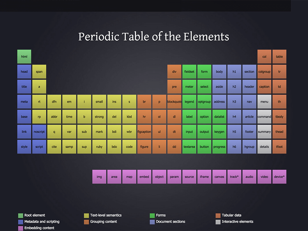
Dmitri Mendeleev’s periodic table looks simple, it doesn’t strike as if the elements are, in fact, significantly different from one another. But when you dig in and understand that just a ‘seemingly insignificant’ property of the number of electrons and protons makes for a vast difference in the way each element acts and reacts in proximity to others — you get a taste of how a harmless looking list can hide all the relevant complexity.
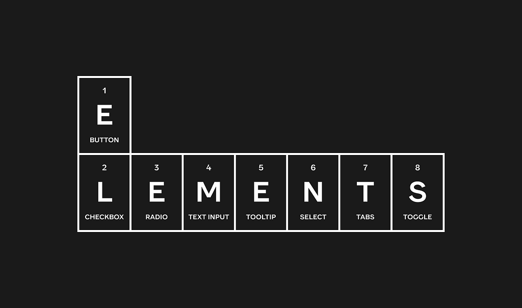
Interactive elements — the building blocks of websites and applications — have the same illusive property. If you look at any of the ‘checklist’ websites, repositories, posts on social media and blogs — you might have the impression that it’s all just arrangements of frames, icons and text. That would miss most of the complexity.
In this post (part 1) I am going to show some examples of the divergence between how code and visual design tools treat interactive elements and components in general.
Curiously, the root of the problem often remains hidden from both the siloed designers and developers and only becomes apparent when you try to compare and communicate about it. This post is one example of such effort.
Simple but with quirks
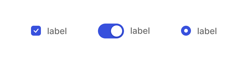
As an example, let’s look at three super simple elements — a checkbox, a radio button, and a toggle switch:
Since the web version of all these elements was created in the beginning of the web itself, some 30+ years ago, there were a lot of defaults that were decided upon for overall use, so to this day, if you want to style a checkbox or a radio button end-to-end in a custom way that differs much from the browsers defaults you’d have to do a few surprising things:
- You would have to use a container (usually a <label> to house everything you want to activate it to be within)
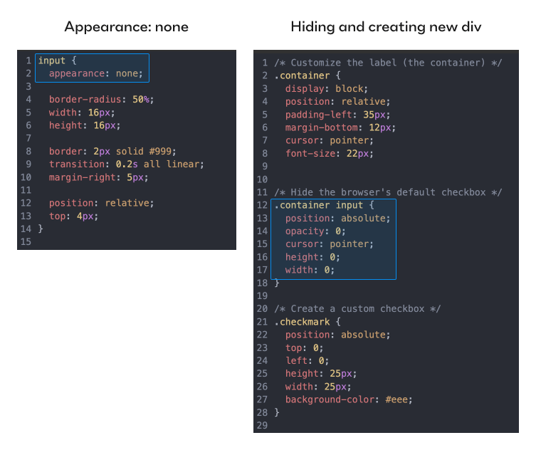
- To make the actual default appearance of the [input-type =radio] hidden from the users you can be forced to do either of 2 things: reducing opacity and size to 0 when you need to create a new div with content instead of the actual input; or in simpler cases use ‘appearance: none’ (appearance property controls the set of default styling of browsers in different operating systems Chrome/Firefox, macOS/Windows will affect it) if you only need to restyle the input itself (might be enough for radio buttons, but not checkboxes).
- Either restyle in case you’re using ‘appearance:none’, or recreate the design you want with a div and a custom icon.
Only then will your design be both on-brand, custom and persistent across devices, browsers and operating systems. You’d have to use the input node itself only for its embedded functionality that browsers automatically recognize and afford the user to interact with.
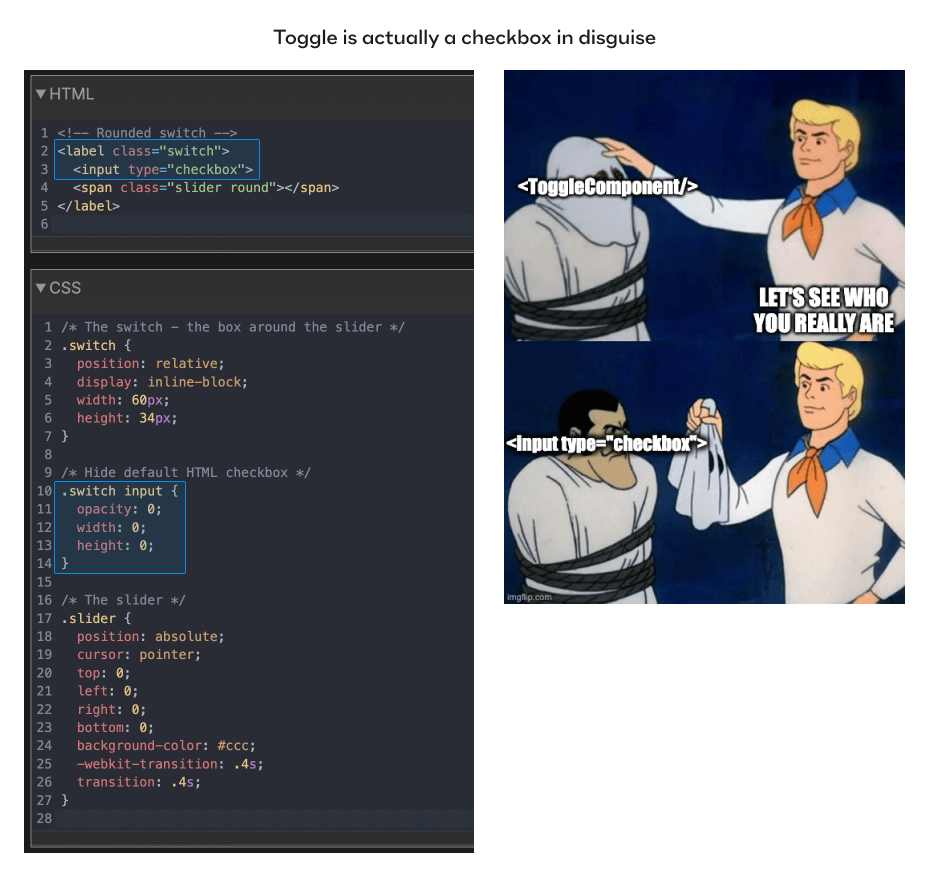
It’s even more non-trivial with toggle buttons, since they don’t actually exist as a standalone web element. Using much the same hiding tactics — every time you’ve toggled something online, you were pressing a hidden [input-type=checkbox] inside. Yep, all toggles are actually redesigned checkboxes as far as the browser is concerned.
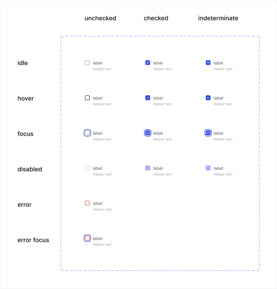
The states of these basic elements are specific, and are baked in by the functionality of the web itself (checked/unchecked). Their names are set and permanent and they are not variants of the same checkbox, as size and color would be.
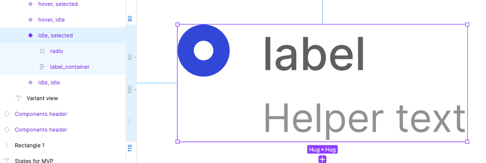
Contrast this with how a designer approaches these 3 elements in a vector based design tool. What’s a checkbox visually? A frame with an icon. The different states are just variants, indistinguishable from other potential visual variants. To add labels and helper text you’d probably want to house them together in a frame, use auto layout in 2 stages and be done.
A radio button is even easier — you don’t even need a vector icon inside, just the rim.
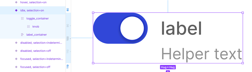
A toggle has no checkbox inside, just a toggle frame and a knob. You might forget states like focus and disabled, and most designers forget to include the ‘indeterminate’ state when designing them.
There’s more complication still: For the real product code, you’d really have to decide what is placed inside or outside the <label> container since it’s going to affect where the actual ‘click’ is going to affect the state of the checkbox/radio/toggle so the layout itself will be guided by functionality, not by how comfortable it is to express something using auto-layout.
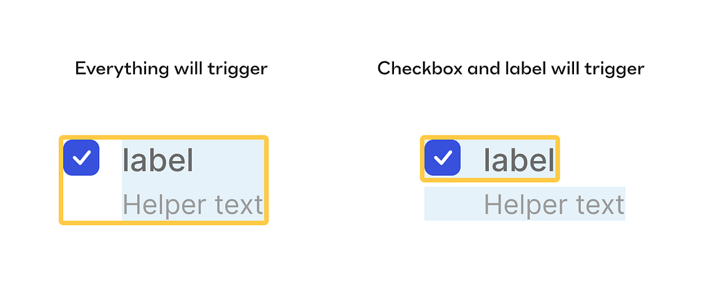
In our example here, it’s more comfortable to put the label and the helper text in the same frame but in terms of functionality you might not want your helper text to also trigger the checkbox state, so you’d have to re-arrange the layout to make the helper out of the <label> and therefore not affecting the selection.
It’s usually the case that a designer will structure the element as it makes sense in a visual design tool, and afterwards hand the designs over to the devs. The devs will most likely look at the visual final result, inspect measurements, download relevant assets if needed, look at the layer structure, see that it’s not helpful for them, disregard and create their own correct structure and try their best to make it visually identical.
More complex — more problems!
To custom-style any element that is a tad more complex such as a select you’d have to hide many more native HTML nodes to style your own instead of them, and you can’t get away with just CSS, you’d have to employ JS to make it work. You also have to take care about a whole slew of interaction design decisions like how the box of options will be positioned over the select itself, what would be the condition when it flips if it can’t be opened to the default side, Is the dropdown multi select or single, how is it sorted, how autocomplete looks, does the box auto focuses on some condition, does the options box has a max height or number of items, etc.
And that’s not just me saying; take a look at this quote from MDN web docs by Mozilla (which is probably one of the most comprehensive and trusted sources documenting Web platform technologies, and is open-source and collaborative). From the section ‘styling with css’ of the select page. [Emphasis mine]:
The <select> element is notoriously difficult to style productively with CSS. You can affect certain aspects like any element — for example, manipulating the box model, the displayed font, etc., and you can use the appearance property to remove the default system appearance. However, these properties don't produce a consistent result across browsers, and it is hard to do things like line different types of form element up with one another in a column. The <select> element's internal structure is complex, and hard to control.
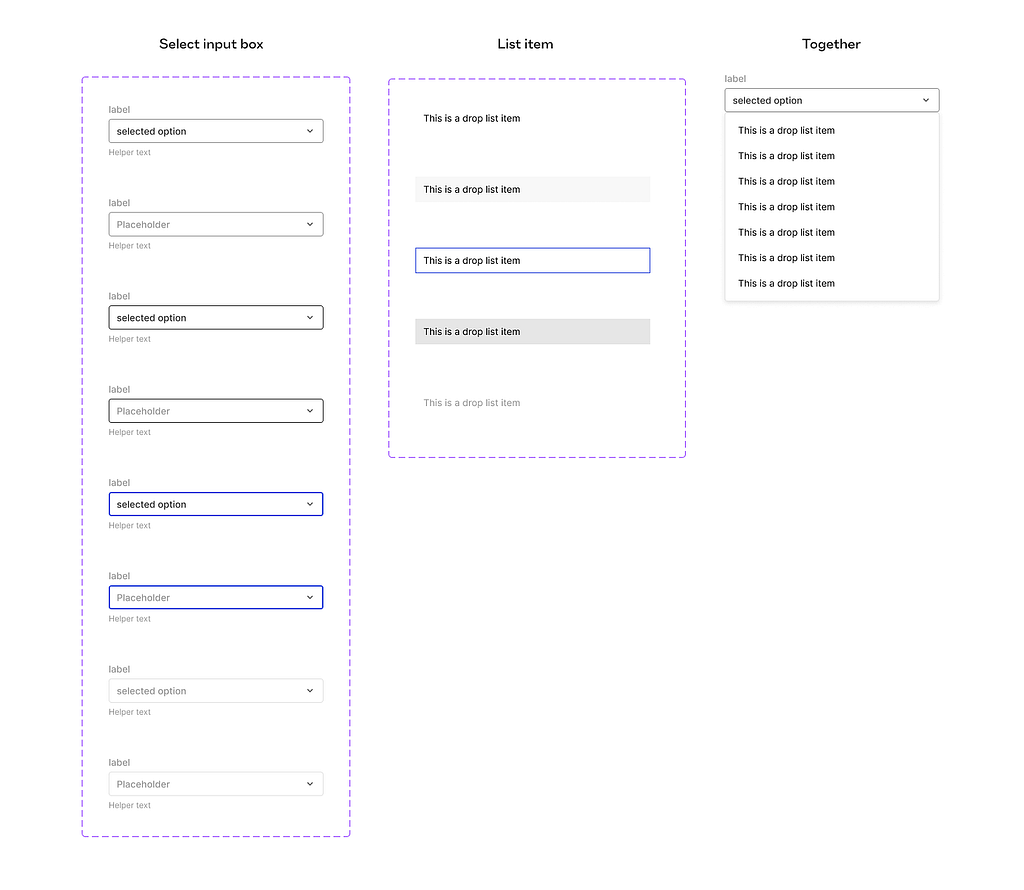
Contrast it with how a designer usually treats select boxes in design tools’ design systems? Just a frame with a text in some variants to specify states (interactive, open, closed) and visual variants (size, style, importance maybe). Designers will compose the box of options as a simple frame of another ‘option’ component with several states — and be done. All fairly ‘what you see is what you get’ here.
How do we define an element, actually?
The taxonomy of the web elements is not completely solved for. There are many commonplace components that were invented much later than the beginning of the web, so they didn’t get to have a very well-defined place in the w3c list of HTML element tags.
Unlike input-type elements like a text input, checkbox etc, think about more complicated things like a time picker, date picker components, or even a wizard or a carousel. Definitely components, complex ones, but are they elements? If yes — why? If not — on which basis? I mean, it’s easy to draw the line arbitrarily anywhere we like, but the whole issue here is that we don’t want this line to be arbitrary, as much as it is possible.
In order to try and draw a more accurate line in this — I might need to summon Brad Frost to remind us of Atomic design:
If atoms are the basic building blocks of matter, then the atoms of our interfaces serve as the foundational building blocks that comprise all our user interfaces. These atoms include basic HTML elements like form labels, inputs, buttons, and others that can’t be broken down any further without ceasing to be functional.
Notice the rule — “can’t be broken down any further without ceasing to be functional” that’s Brad’s rule for being elemental enough. The issue that might be illusive here is what constitutes a function here?
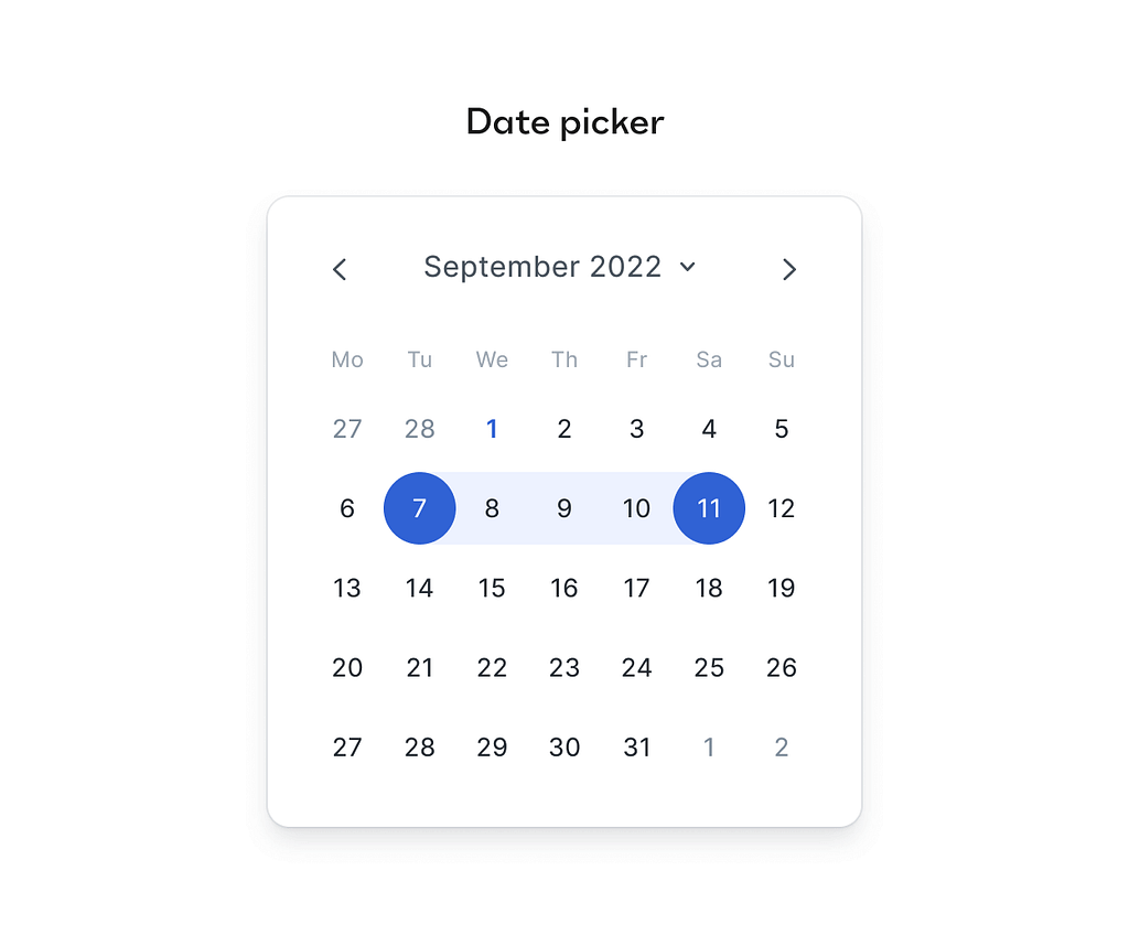
If we take a date picker — I can easily break it down to a bunch of buttons, a carousel to switch between months, so that should disqualify it from being an element — but the function of a date picker is registering a date, or a range of dates in the system, and that is breaking down if you start picking the date picker component apart. So if we allow treating the elements not as nouns but as verbs, an element becomes — the minimum things needed to execute that verb, that function that defines it.
On these grounds a date picker is in fact an element, and the mind bending realization is that an element can contain other elements in it, if they are simpler!
Moreover, when you examine the HTML tags themselves — you’ll see that it has always been like this. What is a <ul> tag? Unordered list — an element. And what does it always have inside of it? <li> — List items. Other elements. So elements inside elements, right there from the beginning of the web itself.
Like oil and water?
All of these differences are just a small example that illustrates why it was basically a rigged game to begin with. Design tools developed to optimize for intuitive expressiveness, ease of ad-hoc manipulation, even at the expense of control, robust modularity and binding rules that mimic the web standards. HTML, CSS and later on React and other JS frameworks developed to achieve effective — sometimes tailored and sometimes generic — methods to express elements and manipulate them as needed. These are completely different properties to optimize for, so no wonder these distinct evolution processes produced very different ways to render the structure of interactive elements.
The more I dive into it, the mere fact that we managed to hand off designs and build something worthy with starting conditions like these — looks more and more like a small miracle to me!
The ‘Delta debt’
At this point, you might think to yourself — so what’s the problem — isn’t that the developers’ job? Well, it is, of course, but this is exactly the moment components start to diverge between design and development. And that’s a big problem en mass because if you have some 30+ elemental components and then some 60+ complex components in your design system, and most of them are not really in sync with code at the level of what each layer represents — when you start implementing wide changes, using tokens and maybe decisions about accessibility (what is clicked and triggering the interaction, which hit area, what is focusable and how etc) a nasty debt starts to grow. I call it the ‘Delta debt’. You know what I’m talking about if you are a product designer with some years under your belt.
That small ‘letting go’ when you do your visual QA, the staging/production versions doesn’t really map 1:1 with the design, and when you inquire it with the devs — you either get a ‘that’s how browsers render things, it’s not up to me, and making a custom patch is dangerous and will take a bite out of our speed, didn’t you want that other feature?’ or maybe something more puzzling like ‘what do you mean, this is exactly according to your specs, to the pixel, I followed Figma perfectly’.
So you make a tactical move and give up, promising to yourself that you’ll let this one slide; it’s probably only you and your sharp eye for design details that this thing is bothering. We have more important things to do now, and you’ll get this later when there is more time. Sadly, there will never be more time. Just more miss-aligned components.
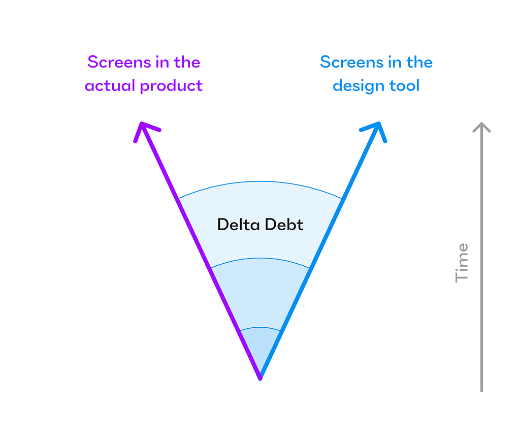
And so that ‘Delta debt’ is only growing with time, and like death by a thousand cuts — you grow your own displeasure with how the actual product looks and behaves and prefer to get back to your beloved, pristine, perfect design files, where your eyes are safe from this irritation. Sometimes the inertia is so strong that there’s nothing you can say that will convince stakeholders that this debt has to be repaid. The only thing you promise yourself is that either on rebrand, or on the next project — you’ll be more assertive from the get-go to make sure the design and the product are exactly aligned. Only for the same circle to be repeated again.
Although frequent, this problem perhaps can be avoided. And there are 2 paths that I see can help bridge this gap. One — is easy to explain but hard to do in practice, the other — is harder to explain but might solve the issue as a bi-product.
Potential paths to solution
1st path
Improve communication to the level that there’s no silo problem, the designer and developer pass a ‘hot potato’ of a task very frequently, until both of them have a very similar mental model of what the design should look like, behave like, built like and perhaps animate like. This is probably the most frequent piece of advice you see people give in podcast interviews about their success (of course), well-meaning and inspiring talks from a stage and heaps of Youtube videos. Alas — what is easy to say to do, is fiendishly hard to actually do. It takes effort and friction to maintain cohesive communication, the fruits of which you don’t always feel as vividly, and in an ever-optimized and measured work environment — it’s the first thing to suffer. Especially as startups grow and expand from seated in a single room to spanning continents and time zones.
2nd path
Construct tools and processes for designers and developers that will make it much harder to not be on the same page. Suppose a design tool would be made out of real elements, with an already existing, verified structure, that is backed by code beneath it all. You mainly see web builders do it today, like Webflow and Framer. When you use an element like a checkbox in these apps, it’s a real, working checkbox. Sadly, there’s no developer to hand it all over to, because builders cater mostly to teams where a designer can handle the whole project end-to-end, with no need for a dev in the loop. Now, imagine something like this for overall product design, web apps, native apps etc.. massive products that cannot be resolved only by a talented designer, but actually have a ton of business logic, state management and data backend stuff to handle. Products that require many front and back end developers. Most SaaS startups products are like that today.
So imagine these teams all use a design + code process and toolset that from the get-go, nudges them to use pre-existing elements and style them as they wish, then pushing the result to front-end developers who don’t need to rebuild it all from scratch, but rather wire it all up with nontrivial extra logic (in their own beloved IDE) and use it together with the backend engineers.
When I think about product design at its best — it’s always better to prevent a problem than trying to help dealing with the problem’s consequences. It would come as no surprise that I much prefer the second path.
Summary
It is a hard problem to solve. And if you zoom out and look at the product design tools and methods industry from above, you’ll see that as time goes by there is an ever-growing thirst by designers to close that gap already. That’s why you see a plethora of plugins for Figma and Sketch that help to ‘translate’ (guess) your visually optimized designs to some or other useable form of code. That’s why design tools adopt more and more features and mechanics that resemble the capabilities of code (like variables that can reference other variables, component API through the use of properties and variant groups, auto layout and absolute positioning in it, truncation in text, conditional logic etc).
Some people believe it’s still all just about communication skills, and the tools themselves don’t matter, some believe that artificial intelligence embedded inside the design tools will help sprinkle some fairy dust on this problem and help designers traverse that chasm, and some, like myself — believe it’s just a matter of building better tools.
In the meantime, the more we know about the different quirks of each element in actual, live products, the easier it becomes to bridge the gap.
Here’s a list of useful places you can learn and dive about the details of the different interactive elements, and improve your handoff:
Radix UI is a great headless UI repository to both use and explore
This is a fantastically deep disambiguation of what people like to call a ‘dropdown’.
Of course the most complete and reliable list of all HTML elements, the MDN website
Small but useful repository of real components — Headless UI
Brad frost’s ‘Atomic design’ and overall blog
And this is an inspiring and informative article on how to structure communication so well that handoff becomes almost risk-free (good luck with actually implementing that, though).
Originally posted on my Substack as 2-part sereis: DesignNuance
UI elements are not so elementary was originally published in UX Collective on Medium, where people are continuing the conversation by highlighting and responding to this story.