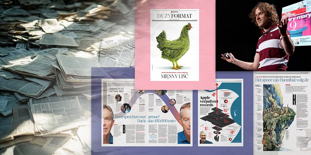
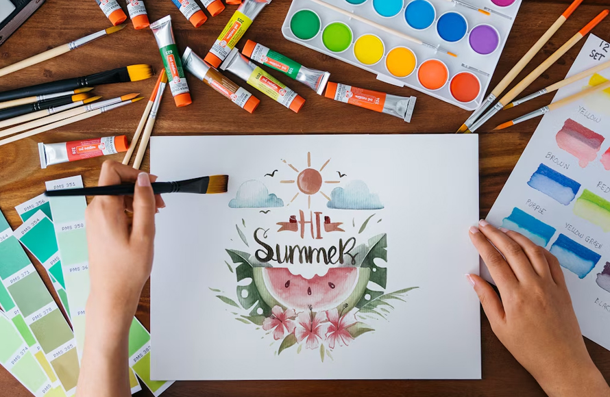
[unable to retrieve full-text content] All it takes is one creative spark to ignite a fire. source: DSRUPTR.com I recently wrote about the 5 powerful business insights that prove the value of design. While it’s incredible to see the business results on the value of design from McKinsey, Harvard, Forbes, and Adobe, I really appreciate the everyday… Continue reading How design radically transformed a dying industry
Tag: visually
Your Design Isn’t Done Until It’s Effectively Presented
[unable to retrieve full-text content] The leap to a larger organization was a significant step in my career, but the initial excitement quickly met a complex reality. In my previous roles, design approval was straightforward. But here it was a negotiation between a host of powerful stakeholders. The Head of Engineering focused on feasibility, the… Continue reading Your Design Isn’t Done Until It’s Effectively Presented
50 Best Logos for Inspiration in 2025
Explore best logos for real-world inspiration. These logo designs show clarity, creativity, and function across industries. Learn what makes them work and how they communicate brand identity clearly. Use these examples to improve your own logo concepts and meet client needs effectively. Logo design in 2025 is driven by clear visual impact, simplified structure, and… Continue reading 50 Best Logos for Inspiration in 2025
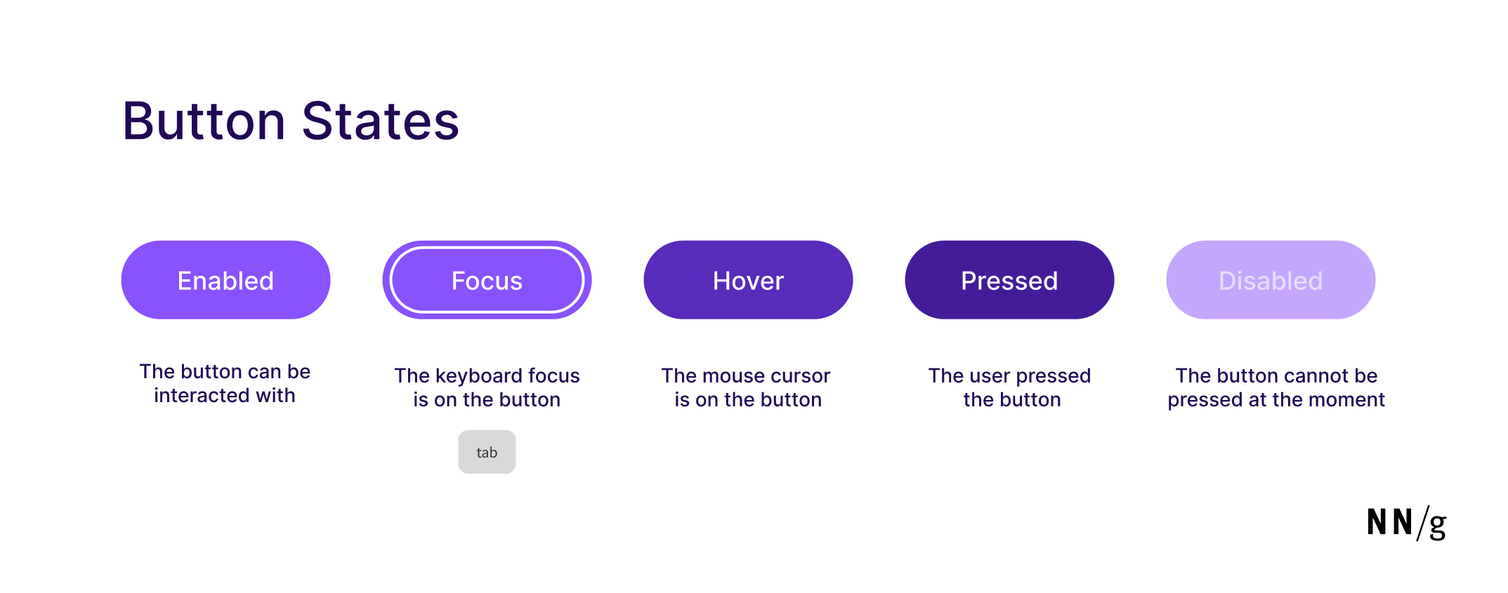
Button States: Communicate Interaction
Summary: Minor visual changes help users distinguish between 5 different button states: enabled, disabled, hovered, focused, pressed. Buttons are core user-interface elements that, when clicked or tapped, execute an action. When designed correctly, buttons set accurate user expectations and help them understand how to interact with the interface. In addition to clear button labels, effective… Continue reading Button States: Communicate Interaction
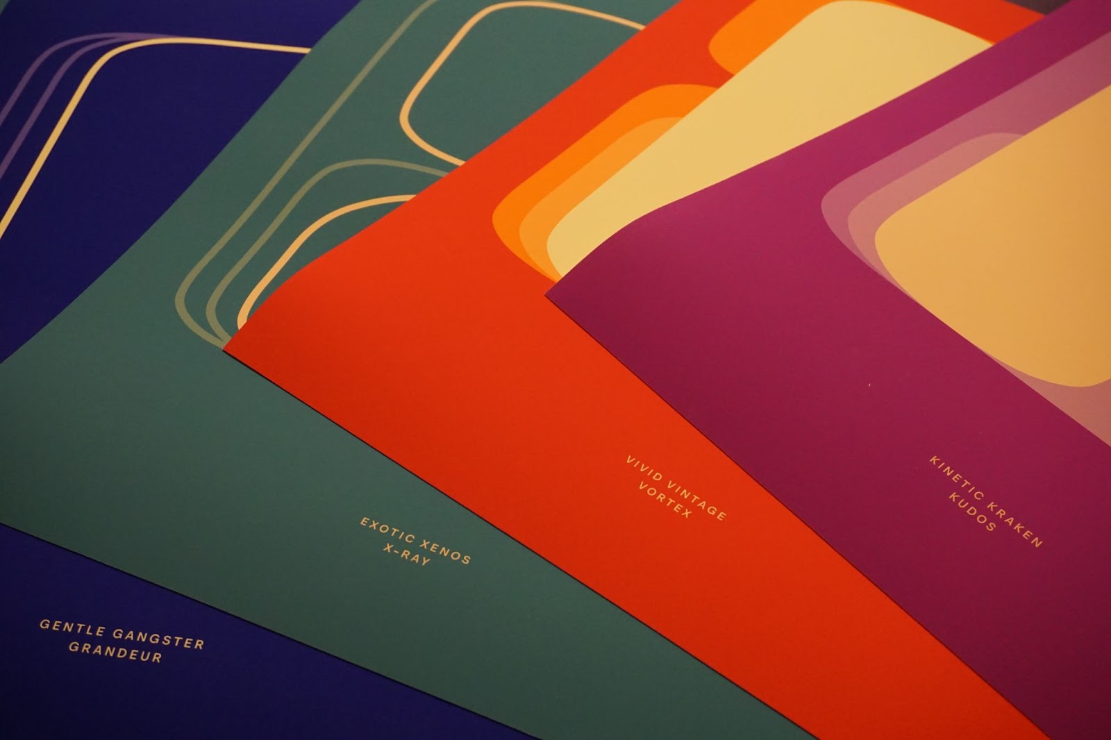
Overnice Squeezy Posters: Variable Font Graphic Design
Explore Overnice’s Squeezy variable font posters. Awesome graphic design merging digital flexibility with print for your next project. Hey design friends! Let’s talk type. For the longest time, fonts felt pretty fixed, right? You picked a weight, and that was that. But things are shifting, literally. Variable fonts have opened up a whole new playground… Continue reading Overnice Squeezy Posters: Variable Font Graphic Design
50+ Eid Mubarak Lettering for Posters, Flyers and Cards
Eid-ul-Fitr, also known as Meethi Eid or Choti Eid, is a time of joy, gratitude, and togetherness. It is a special occasion that marks the end of Ramadan, bringing families, friends, and communities together to celebrate with love and blessings. To make this Eid even more festive, creatively designed Eid Mubarak lettering is a wonderful… Continue reading 50+ Eid Mubarak Lettering for Posters, Flyers and Cards
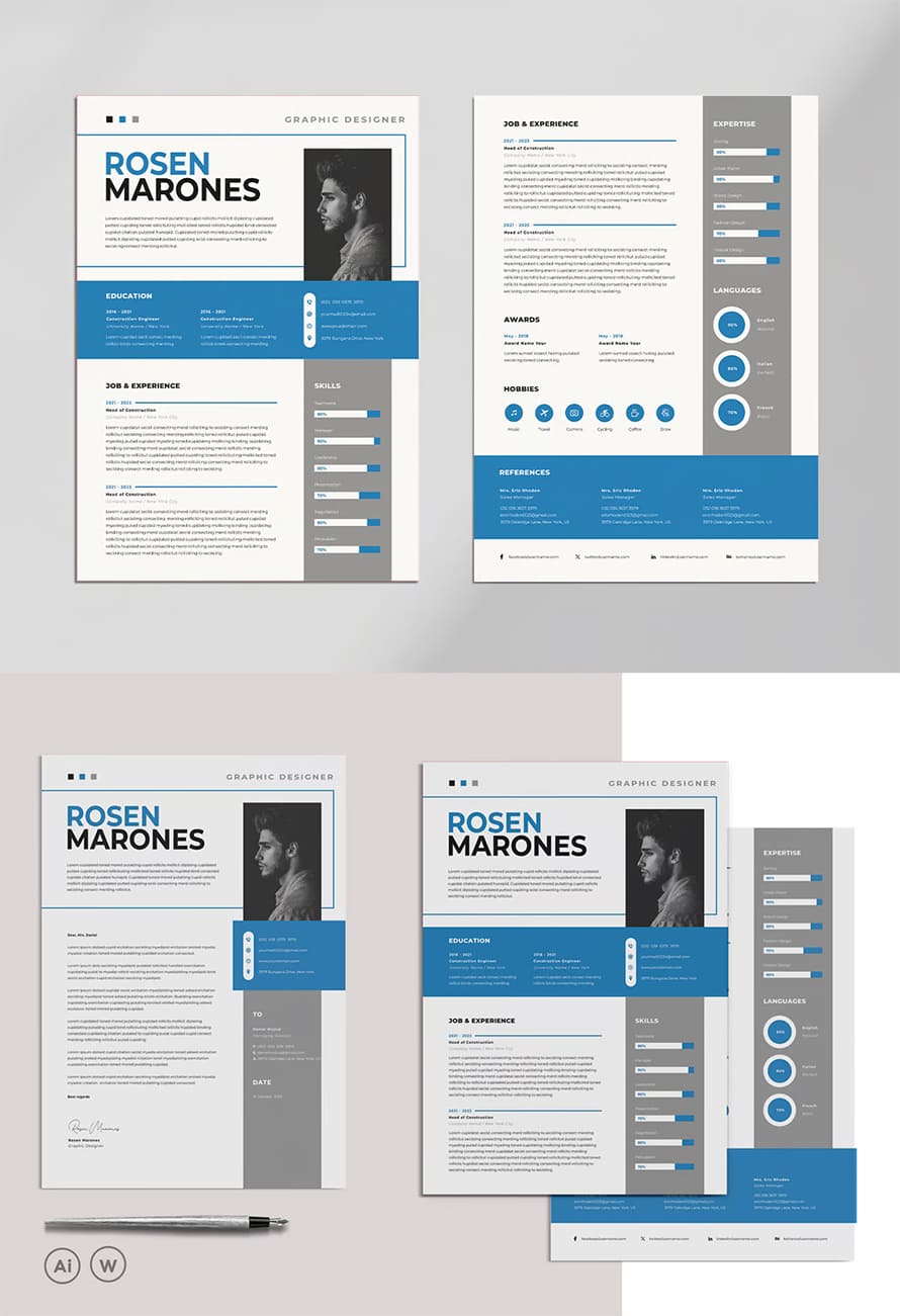
30 Best Word Resume Templates – Easy to Edit & Customize
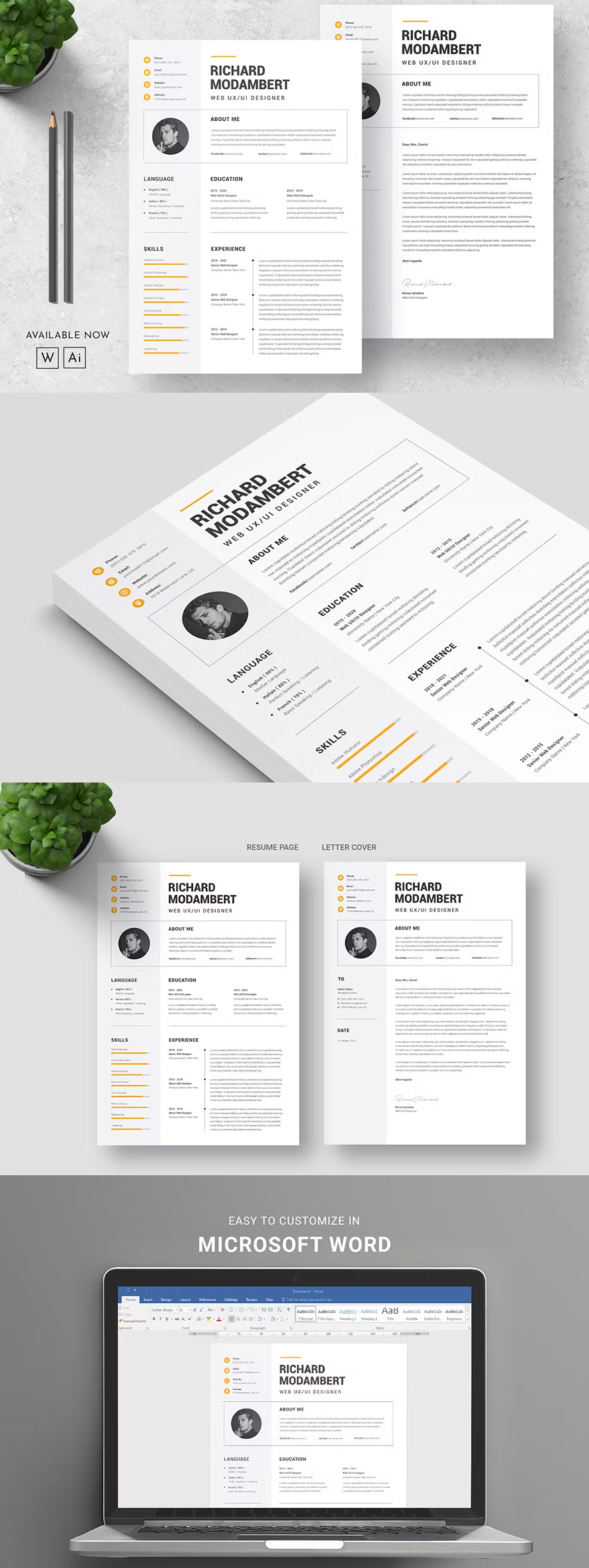
A well-structured resume is essential in today’s competitive job market. With Word resume templates, job seekers can create polished, professional resumes without advanced design skills. These templates offer preformatted layouts that ensure readability, clarity, and a modern aesthetic. Whether applying for a corporate position or a creative role, choosing the right template can make a… Continue reading 30 Best Word Resume Templates – Easy to Edit & Customize
Mastering the Art of Writing a Graphic Design Resume: A Comprehensive Guide
A graphic design resume is not just a summary of your work experience; it is a visual representation of your creativity, skills, and design expertise. As a graphic designer, your resume should be a masterpiece that showcases your unique style and demonstrates your ability to communicate visually. This article will provide you with a step-by-step… Continue reading Mastering the Art of Writing a Graphic Design Resume: A Comprehensive Guide
15 Best Creative WordPress Themes to Showcase Your Digital Agency Portfolio
Responsive and creative WordPress themes for digital agencies that wow your clients are essential for leaving a lasting impression. A well-designed website not only highlights your agency’s expertise but also reflects your creative flair. To make a remarkable online presence, you need the perfect theme tailored to showcase your portfolio and captivate potential clients. A… Continue reading 15 Best Creative WordPress Themes to Showcase Your Digital Agency Portfolio
New Year, New Fonts: Fresh Free Fonts for Graphic Designers
As we usher in the New Year, it’s the perfect opportunity to revamp your design toolkit with a fresh collection of fonts. Typography is a vital element in any creative project, setting the tone and conveying the message with style. This year’s collection offers a range of free fonts tailored for every designer’s needs—whether you’re… Continue reading New Year, New Fonts: Fresh Free Fonts for Graphic Designers
Breathtaking Digital Portrait Illustrations from Top Artists and Designers
Digital portrait illustrations have become a significant art form in today’s creative world. Artists worldwide are pushing the boundaries of digital tools to create stunning, lifelike images that leave a lasting impression. From their unique styles to their intricate details, these artists are redefining what portrait illustrations can achieve. Here are six top artists whose… Continue reading Breathtaking Digital Portrait Illustrations from Top Artists and Designers
How to make interactive charts accessible
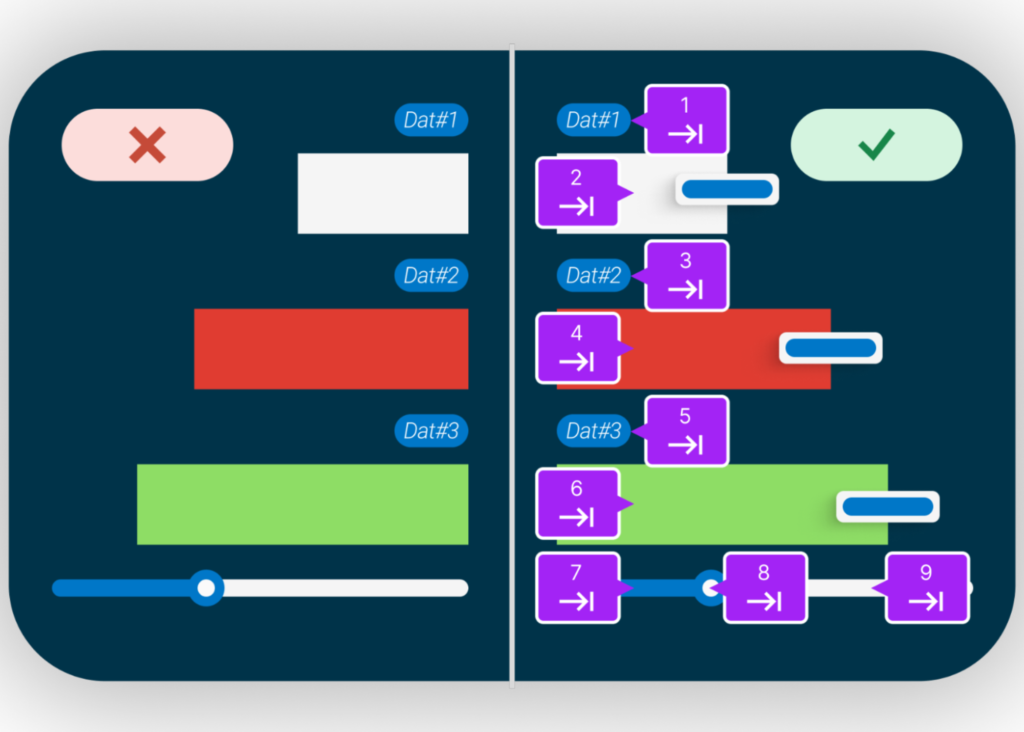
Interactive charts can transform data into compelling stories, offering valuable insights at a glance. But what happens when these visual tools are inaccessible to those with visual impairments? In this post, we’ll show you how to ensure your interactive charts are accessible to all users, regardless of their abilities. Before digging deeper, let’s establish what… Continue reading How to make interactive charts accessible
Continuous Product Design: Step-by-step Guide
Most IT-supplied products and functions are not used in practice. Resources, applications, and software remain idle. Not all companies consider whether their products are effective for the users. Consequently, 91% of unsatisfied customers don’t complain about their bad experience. They simply leave without giving feedback. A vivid proof is the mobile development market, which has… Continue reading Continuous Product Design: Step-by-step Guide
Top Trends in Web Design and Development Every Designer Should Know
The landscape of web design and development is constantly evolving, driven by advancements in technology, changing user preferences, and new design philosophies. Keeping up with the latest trends is crucial for web designers and developers who aim to create innovative, engaging, and effective websites. This article explores the top trends in web design and development… Continue reading Top Trends in Web Design and Development Every Designer Should Know
35+ Clever Negative Space Logos That Will Inspire You
Negative space logos are a unique and compelling design technique that uses the empty spaces within and around a logo to create a secondary image or visual effect. This approach not only adds depth and complexity to the design but also engages the viewer, encouraging them to look closer and discover hidden meanings. These logos… Continue reading 35+ Clever Negative Space Logos That Will Inspire You
Simple and Clean Minimal CV Resume Templates
In today’s fast-paced job market, recruiters often spend mere seconds scanning resumes before deciding on an interview. A cluttered or poorly formatted CV Resume can mean your application gets tossed aside, even if you possess the perfect skillset. This is where the power of minimal CV resumes comes into play. As technology evolves, so too… Continue reading Simple and Clean Minimal CV Resume Templates
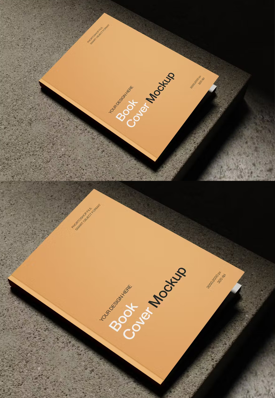
50 Best Book Cover Mockups
For any author, the book cover is the first impression your story makes. It’s the billboard on a crowded shelf, the digital thumbnail that catches a reader’s eye. A well-designed cover can entice readers to delve into your world, sparking their imagination and promising a captivating journey. But crafting the perfect cover can feel daunting,… Continue reading 50 Best Book Cover Mockups
How Digital Design Agencies Craft Iconic Logos Graphic Design Junction
In the world of branding, the logo is more than just a visual mark; it serves as the cornerstone of a company’s identity. A well-crafted logo can communicate the essence of a business, attract new customers, and differentiate it from competitors. This is where the expertise of a digital design agency comes into play, integrating… Continue reading How Digital Design Agencies Craft Iconic Logos Graphic Design Junction
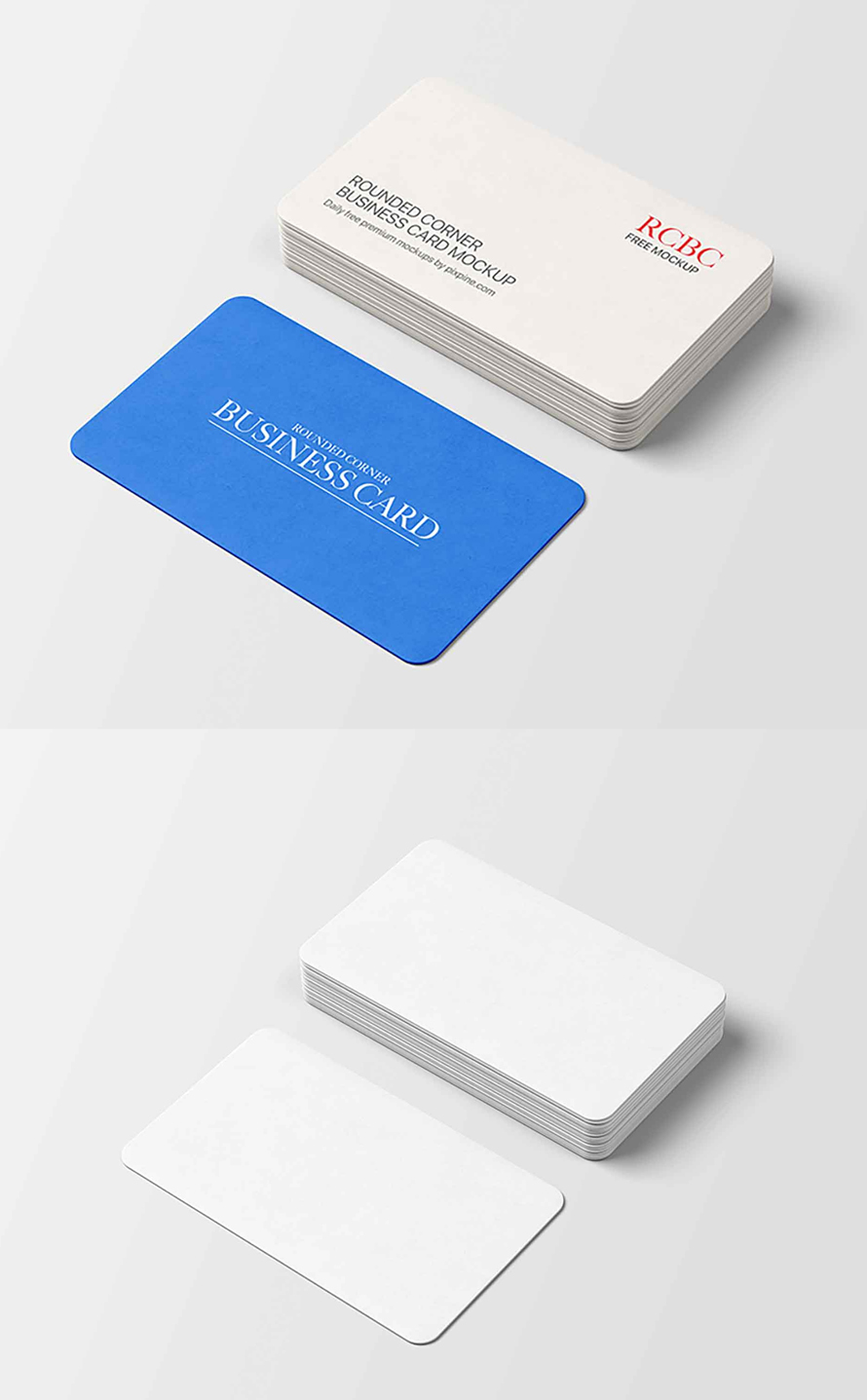
15 Best Free Rounded Corner Business Card Mockups
For graphic designers, corporate branding is a delicate dance. It’s about capturing the essence of a company, translating it into a visual language, and ensuring that message resonates with the target audience. Business cards, those pocket-sized ambassadors, play a crucial role in this symphony. But before sending the final design off to print, there’s a… Continue reading 15 Best Free Rounded Corner Business Card Mockups
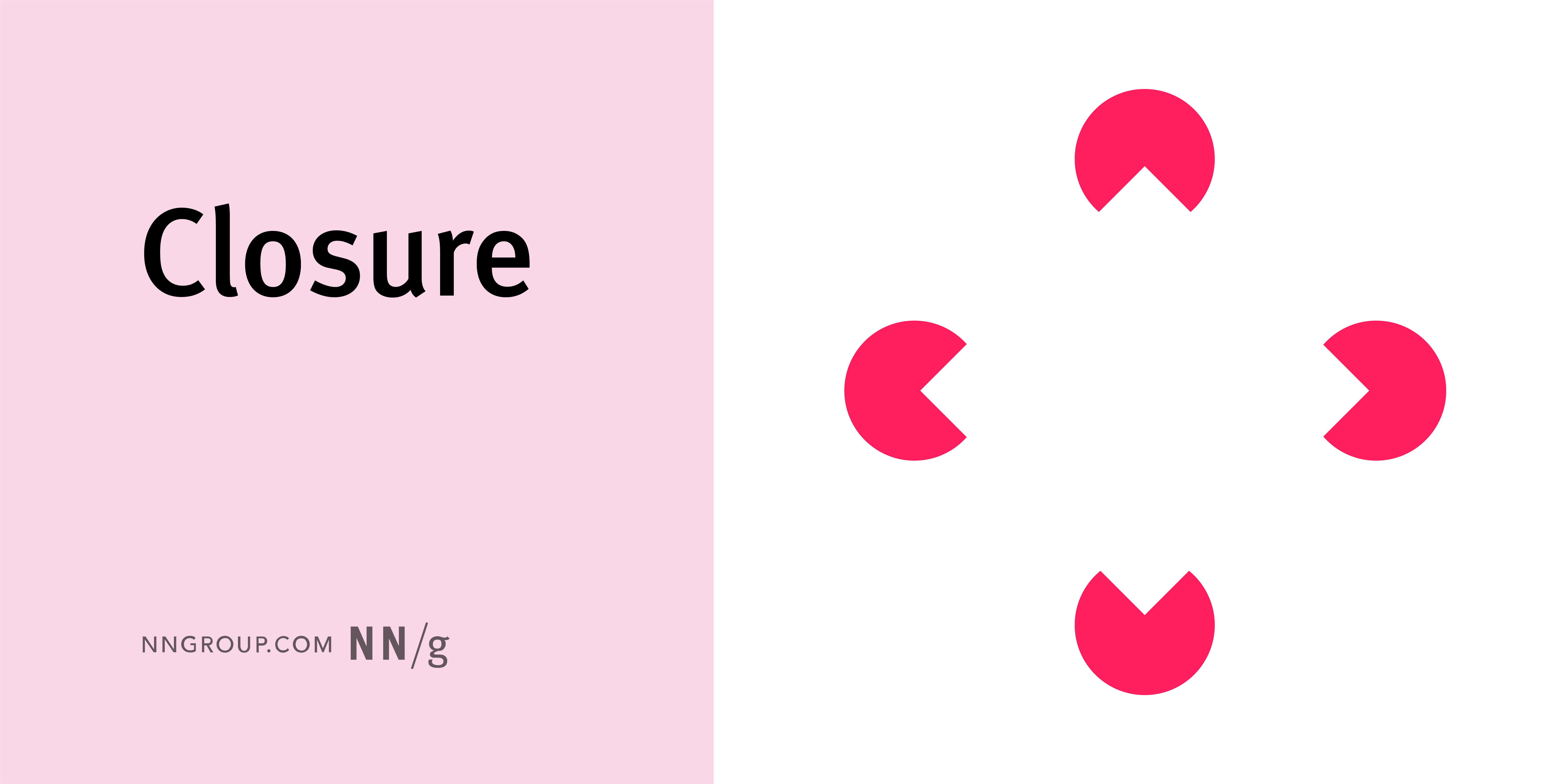
Visual Design: Glossary
Summary: Use this glossary to quickly clarify key terms and concepts related to visual design. Visual design requires knowledge and understanding of many jargon terms. Use this glossary as a reference as you delve into visual and user interface design. Jump to a definition in the table or review the complete glossary. Aesthetic-Usability Effect Users’… Continue reading Visual Design: Glossary
Best AI Design Tools: Insights & Tips From 50+ Tools
Impact of AI in design When it comes to design, AI has great creative capacity, given its text generation and text-to-image capabilities. Seeing some photorealistic images generated by AI, we cannot help but wonder what this means for us as designers. Some of the questions that were on our minds: How can we use this… Continue reading Best AI Design Tools: Insights & Tips From 50+ Tools
Distinguishing between ARIA and native HTML attributes
As a developer, you want to create more inclusive and accessible digital experiences for your users. Great! It’s possible, however, that you might be feeling a bit confused or overwhelmed by the element attributes that can affect the usability for users of assistive technology. ARIA (or WAI-ARIA, Web Accessibility Initiative-Accessible Rich Internet Applications) defines some… Continue reading Distinguishing between ARIA and native HTML attributes
UI elements are not so elementary
To function, components require a specific structure. To appear visually — they don’t. This has been breaking handoff processes for years. Dmitri Mendeleev’s periodic table looks simple, it doesn’t strike as if the elements are, in fact, significantly different from one another. But when you dig in and understand that just a ‘seemingly insignificant’ property of the number… Continue reading UI elements are not so elementary
Making Waves in India 2023: Why Accessibility Deserves a Spot on Tech Giants’ Radar
India has a new rising economy that is catching everybody’s attention with its development, innovation, and growth. But we won’t be talking about what’s out there on the internet. We will be diving deep into a topic that’s making waves and deserves a prime spot on the radar of tech giants – Web Accessibility. Now,… Continue reading Making Waves in India 2023: Why Accessibility Deserves a Spot on Tech Giants’ Radar
