[unable to retrieve full-text content] Why guardrails are an integral part of any AI workflow and how to set them up for your AI agent As with any other type of software, AI agents are vulnerable to various types of threats. Without proper safeguards, they can produce inaccurate, biased, or even harmful outputs — or take unintended actions… Continue reading Guardrails for AI Agents
Tag: Let’s
5 Image Editing Techniques with Google Nano Banana
[unable to retrieve full-text content] Image generated in Google Nano Banana (prompt: friendly banana in pixelated style of old games). Google Nano Banana is the codename for Gemini 2.5 Flash Image, the latest image generation & editing model from Google. This model has a few notable features that make it stand out, such as advanced image… Continue reading 5 Image Editing Techniques with Google Nano Banana
A tailored digital accessibility plan for your organization—in minutes.
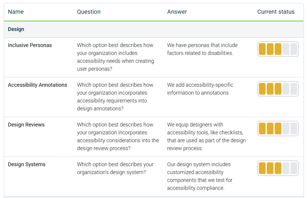
Developing a strategic plan for digital accessibility is one of the most impactful efforts your organization can undertake to create more effective and inclusive customer experiences. Far beyond a legal requirement alone, digital accessibility is a competitive advantage—expanding your reach, improving usability for everyone, and reinforcing your commitment to your customers. With legislation like the… Continue reading A tailored digital accessibility plan for your organization—in minutes.
What’s new in axe Developer Hub: Updates for more flexibility, security, and control
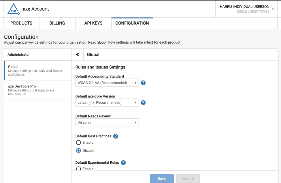
When it comes to digital accessibility, finding issues earlier is always better. You save time and money, and most importantly, you ensure accessible experiences for your users every time. Axe Developer Hub was built so you can effortlessly add automated accessibility testing to your end-to-end (E2E) tests with just a simple configuration, allowing you to… Continue reading What’s new in axe Developer Hub: Updates for more flexibility, security, and control
Professional Google Slides Templates for Any Project
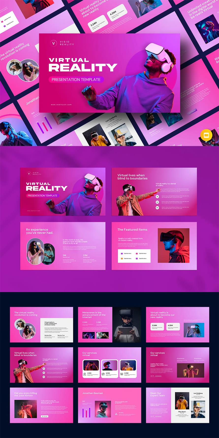
Google Slides has become a go-to tool for creating professional presentations, offering accessibility and real-time collaboration. The professionally designed Google slides templates to enhance your slides with visually appealing and well-structured layouts. Whether you need templates for business, marketing, education, or personal use, these professionally designed themes help you deliver impactful presentations effortlessly. With customizable options, unique… Continue reading Professional Google Slides Templates for Any Project
How Duolingo, Nike, and Amazon use rewards to keep you hooked
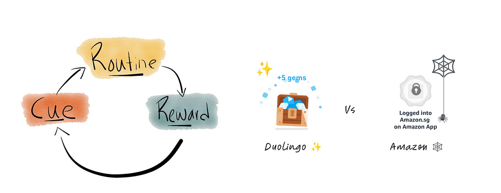
[unable to retrieve full-text content] Why Duolingo turns streaks into addictive habits while Amazon’s badges gather dust The habit loop uses rewards to drive engagement and retention, helping users stay consistent and achieve their goals. Drumroll, please! I recently sold an item on Vinted for the first time — finally, a win! To be honest, I originally downloaded the… Continue reading How Duolingo, Nike, and Amazon use rewards to keep you hooked
Digital accessibility needs for electric vehicle (EV) charging stations
Electric vehicles (EVs) are an increasingly common part of our lives, and based on current predictions, the number of EVs on the road is going to continue going up. This means demand for charging stations will keep rising as well. As with any new, human-centric technology, accessibility is an essential concern. Charging stations present a… Continue reading Digital accessibility needs for electric vehicle (EV) charging stations
Getting into the Discovery Mindset
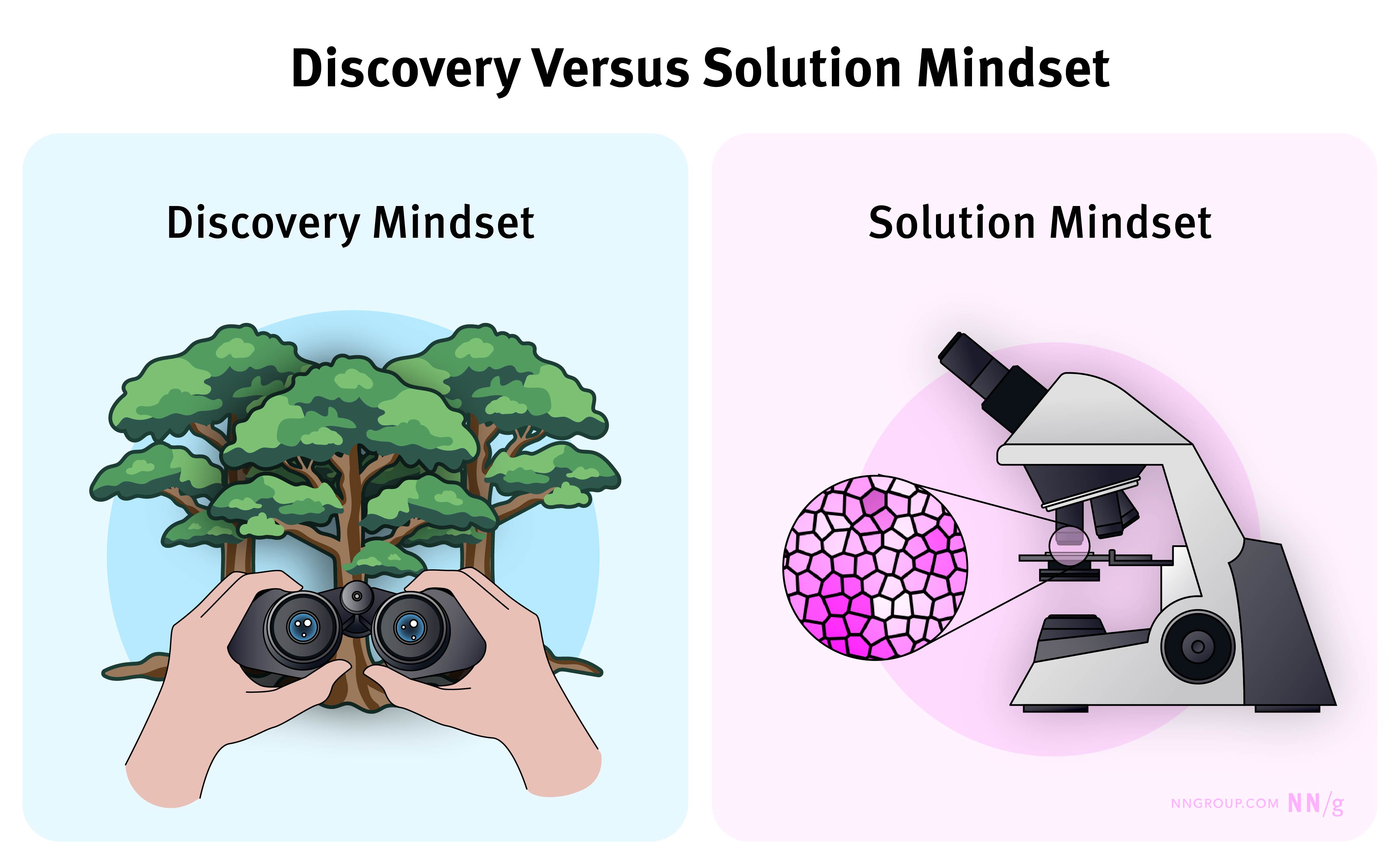
Summary: Successful discovery requires teams to be open to uncovering “unknown unknowns.” Center your discovery efforts around problems rather than solutions. Discovery helps us decide what to build or what direction to pursue. To perform discovery well, we have to adopt a particular mindset: an exploration mindset and an openness to learn new things. The… Continue reading Getting into the Discovery Mindset
Accessible Images For When They Matter Most
<div class=”logo”> <a href=”/” title=”Back to the homepage”> <picture> <source media=”(min-width: 1350px)” srcset=”…/images/logo-full.svg”> <img src=”…/images/logo/logo.svg” alt=”Smashing Magazine”> </picture> </a> </div> Hearing both the phrase “back to the homepage” and “Smashing Magazine” in one feature is OK since each phrase is unique and connected to a different purpose. For more complex alternative text phrases, conduct the… Continue reading Accessible Images For When They Matter Most
UX Design Mistakes of the B2C E-Commerce Galaxy
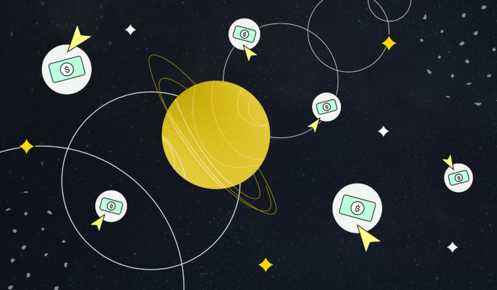
Want to know more? Come with me to meet some design mistakes in the galaxy of e-commerce far, far away. 1. The petrol station approach – main navigation issue Finding the toilet in a petrol station’s cafeteria can be stressful.You enter the main door and find yourself in an open space. While figuring out if… Continue reading UX Design Mistakes of the B2C E-Commerce Galaxy
The software development war
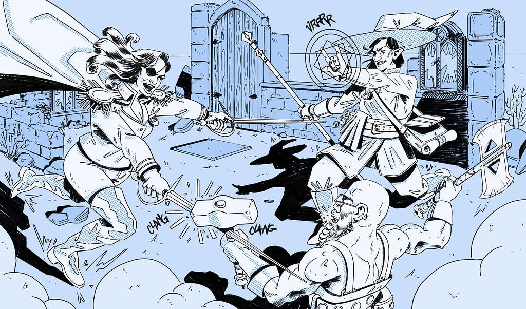
[unable to retrieve full-text content] Fantasy characters face each other in terrible combat. Just how typical stakeholders on a project fight about how best to build their software product. Credit: Me. Turning product managers and engineers from frustrating foes into advocating allies DESIGNERS! TO ARMS!!! Each and every one of our UX compatriots on every software production… Continue reading The software development war
The Power of Checkout Campaign Management
[unable to retrieve full-text content] When it comes to checkout pages, the most frequently cited word is conversion. After all, the main criteria for a successful checkout is its efficiency in terms of successful payments. Conversion can be viewed from many angles, including technical performance and client experience. Still, there are other less obvious components… Continue reading The Power of Checkout Campaign Management
Designer engagement report
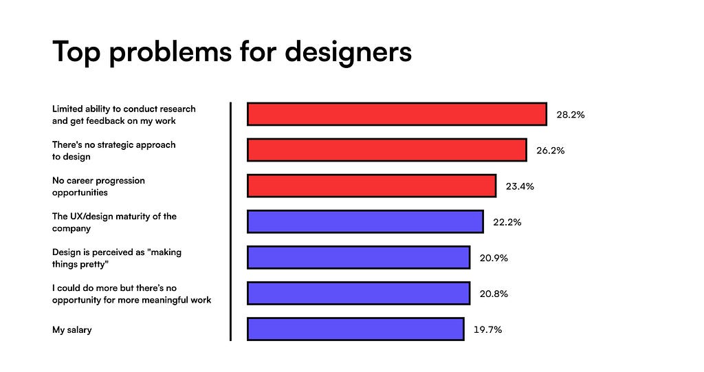
[unable to retrieve full-text content] Top 3 problems for designers: no research, no design strategy, and no career progression Image by Matej Latin (Author) It’s been a horrible year for design. Mass layoffs from 2023 continued and got even worse. AI is threatening to take creatives’ jobs, designers need to go through up to 11 rounds… Continue reading Designer engagement report
Recipe for Success – Design Essentials for Crafting Engaging Meal Plan Graphics Graphic Design Junction
Often, when crafting meal plan graphics, we tend to overlook the fact that our designs need to do more than just convey information – they should feel appealing, trigger emotions, and even stimulate the sense of taste magically. So, let’s explore the recipe for a killer meal plan design. The ingredients? A canny use of… Continue reading Recipe for Success – Design Essentials for Crafting Engaging Meal Plan Graphics Graphic Design Junction
Google Maps: a refreshing turn in the right direction
Finally! Google Maps gets a much-needed makeover… and we’re here for it. Sometimes, a reroute is all it takes to rediscover the joy of the journey — Google Maps’ latest update is a testament to that. What’s New Since My Last Rant A few months back, I ripped into some serious user experience flaws in Google Maps. Google Maps: about that… Continue reading Google Maps: a refreshing turn in the right direction
Good design is subjective, contextual, and intentional
Urban planners have been designing for human experiences for nearly 200 years, and UI/UX designers can learn from this. Examples of The Chicago School of Architecture | Photo Credit: Tom Seiple When I finished my graduate degree, I was lucky to find my first job in Chicago. From a very early age, I had always hoped to… Continue reading Good design is subjective, contextual, and intentional
Norman Doors: how do we still get this wrong?
The confusing design of Cybertruck’s doors. Tesla Cybertruck The concept of the “Norman door” is a well-known and widely recognized principle among designers. Named after design guru Don Norman, it describes any door that proves confusing or difficult to use, highlighting a common design flaw. In this article, we will discuss the application of the… Continue reading Norman Doors: how do we still get this wrong?
3 Common Color Accessibility Issues One Can Easily Avoid
Color is often used to evoke emotions and emphasis. That’s one of the reasons why designers see color as an important element in their work. Colors communicate messages on both psychological and visual level. The importance of color is undeniable, but is basing the message solely on color the right thing to do? This post… Continue reading 3 Common Color Accessibility Issues One Can Easily Avoid
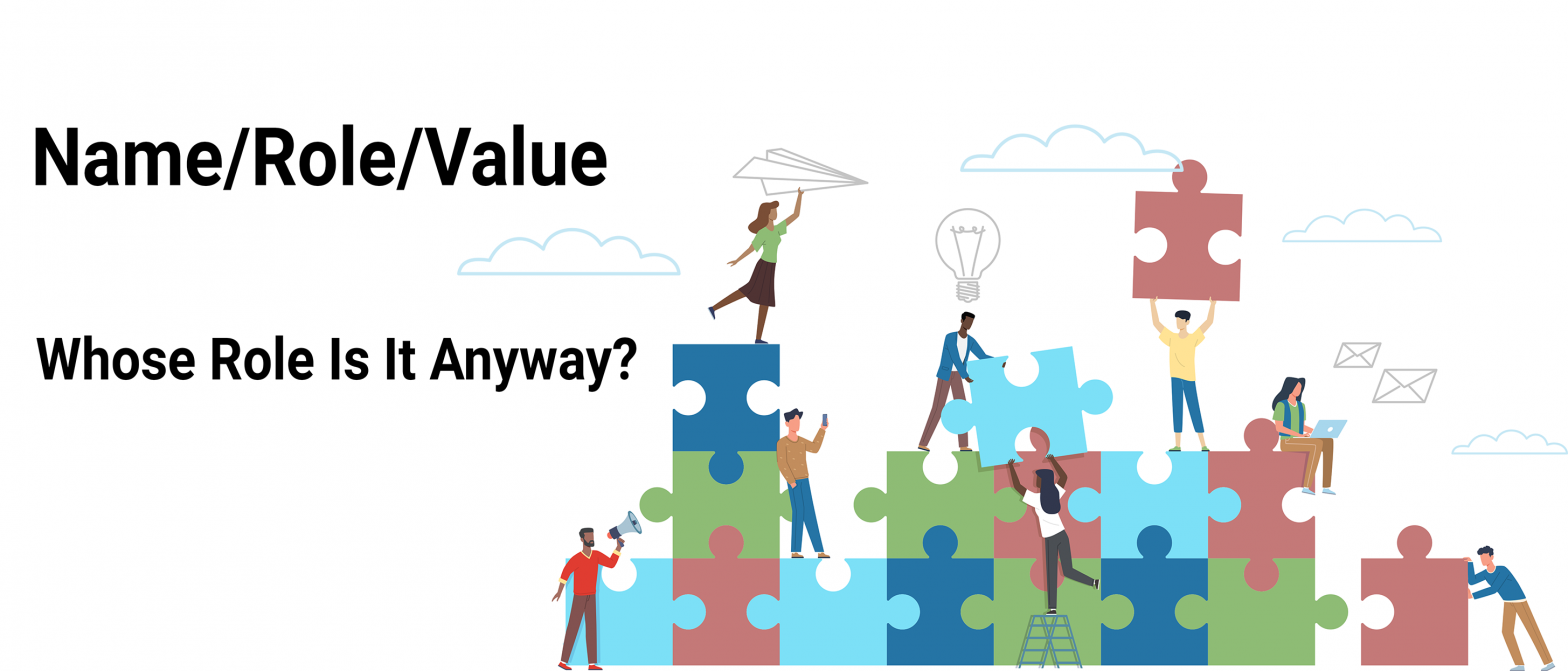
Name/Role/Value – Whose Role Is It Anyway?
Welcome to the next edition of my Design Strategy blog series. Today, I’m sharing a client story with the hope that y’all will focus on thinking about WHY you should do things differently so that your program can rapidly mature and scale quickly. I will once again skip the “how-to” article formula and dry laundry… Continue reading Name/Role/Value – Whose Role Is It Anyway?
How to create a color ramp used in design systems
Whether you’re a brand designer putting the finishing touches on a color palette or a product designer laying the foundational work for a design system, I will walk you through how to create color ramps utilized in design systems. If you’re new to creating color palettes for digital spaces, check out my previous article, Color for… Continue reading How to create a color ramp used in design systems
Introducing the Next Generation of Mobile Accessibility Testing
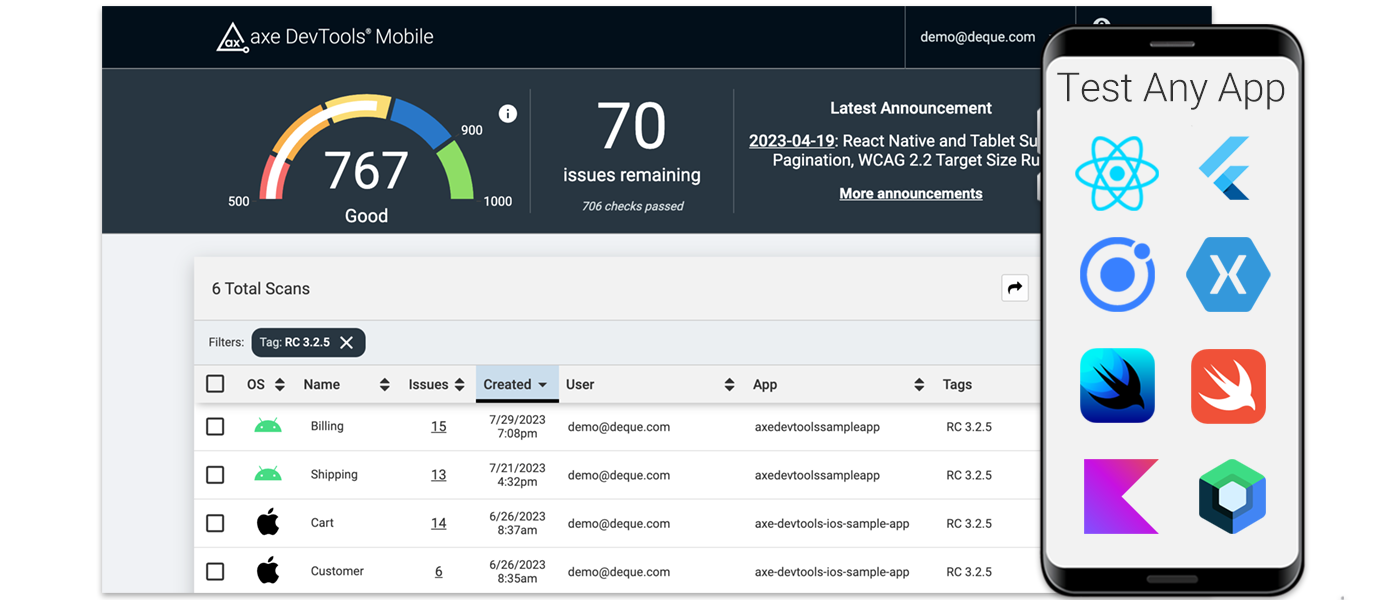
If you can run an app in iOS or Android, now you can test it for accessibility with us. Deque’s axe DevTools Mobile redefines mobile testing for digital accessibility for cross-platform apps, such as those built with React Native. It’s the easiest mobile testing solution to install and run. It also provides clear direction to… Continue reading Introducing the Next Generation of Mobile Accessibility Testing
Think Inside the Box: How Accessibility Shapes Digital Product Design
Think inside the box: How accessibility shapes digital product design How constraints ignite creativity, spark innovation, and why accessibility is a uniquely effective constraint everyone should embrace. “Design depends largely on constraints.” — Charles Eames Access to digital technologies is a fundamental human right¹ and legal obligation². In an ideal world, there would be no need for more justification to… Continue reading Think Inside the Box: How Accessibility Shapes Digital Product Design
What Your Organization Needs to Navigate Canada Digital Accessibility Laws
A comprehensive guide to understanding digital accessibility requirements in Canada Digital accessibility is an integral aspect of equality and inclusivity, providing the same opportunity for all in the modern, digital world. In recognition of this, Canadian federal and provincial governments have implemented various legislative acts to ensure that individuals with disabilities have digital access without… Continue reading What Your Organization Needs to Navigate Canada Digital Accessibility Laws
WWDC 2023 Accessibility Goodies for Developers
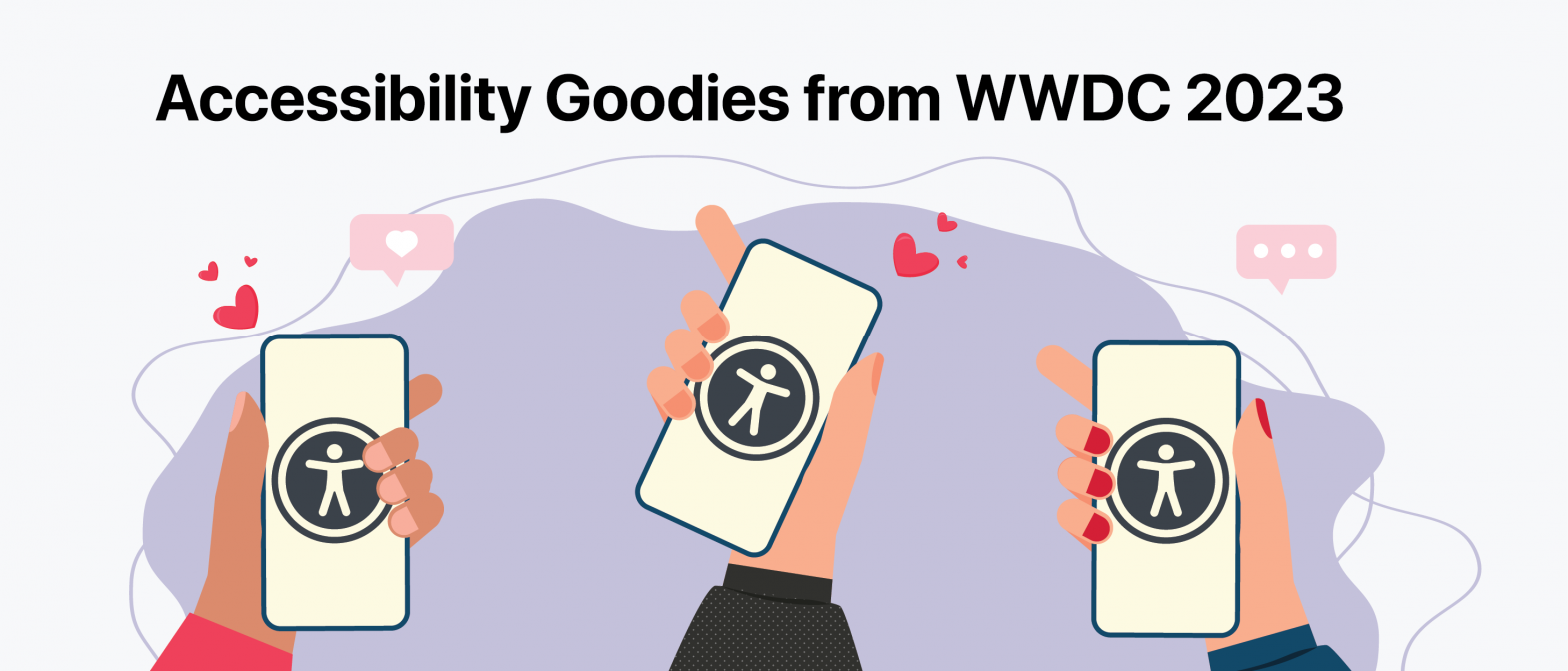
This year, Apple’s annual Worldwide Developers Conference (WWDC) was a big deal! Among the many announcements this year, Apple introduced the new Apple Vision Pro headset which has arguably and understandably stolen the show this year. Although Vision Pro may be the big talk of the town post-WWDC, there was also a myriad of exciting… Continue reading WWDC 2023 Accessibility Goodies for Developers


