Whether you’re a brand designer putting the finishing touches on a color palette or a product designer laying the foundational work for a design system, I will walk you through how to create color ramps utilized in design systems.
If you’re new to creating color palettes for digital spaces, check out my previous article, Color for brand designers working with product teams, for tips on selecting your brand colors.
👉🏻 Follow along in Figma: Community File
What is a color ramp?
A color ramp, also known as a color scale, is a visual representation of how colors transition from light to dark in a smooth and continuous manner. Color ramps are used within a design system to create a color catalog known as color primitives. These values create different UI elements, interactive states, shading for illustration work, and other branded assets.
1. Start with defined brand colors
Once you’ve defined what your brand’s color palette is going to be, you can start creating your color ramps. The goal is not to change the values of your defined brand color, but sometimes, this can be necessary to account for enough contrast between stops and accessibility. Get in the habit of going through this process before the final handoff.
💡 Remember that it’s good to include green, yellow, orange, and red for system messages and actions. e.g., success, warning, and error messages. If you’re already using one of these colors within your defined palette, then there is no need to make an additional one. Products also have a range of use cases for secondary colors, so you’ll likely have a rainbow of colors when all is said and done.
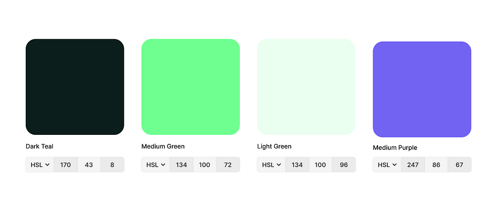
Based on our selections pictured above, we’ll need 3 color ramps to start. Without checking the hue values, I would have guessed only needing 2 color ramps, green and purple. The dark teal hue is different enough to require its own blue color ramp.
2. Adjust for lightness at each step
I have found that 8 stops of each color are sufficient for most design systems and will be enough to create both light and dark modes. Your brand colors will likely fall in the 400–500 range, but not exclusively. Let’s start with our green color ramp since we have 2 brand colors within the same hue.
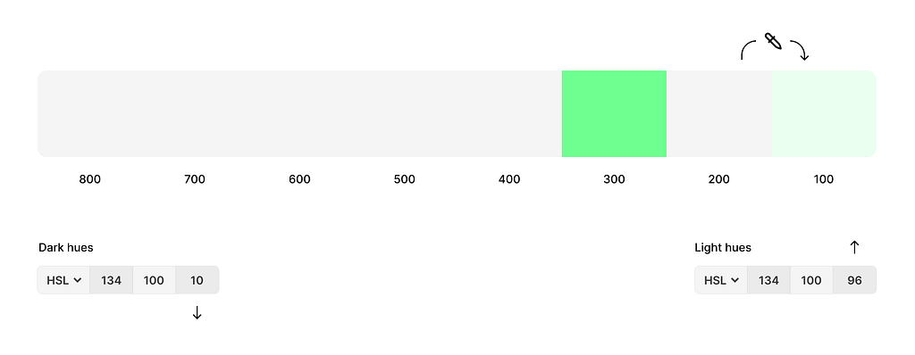
Plot where your brand colors might end up on the scale
These can get moved around as you start to refine the color ramp.
Eye drop neighboring colors
With the 200 selected, eye drop the 100 color.
Adjust the lightness
HSL—hue, saturation, lightness. Increase the third value, lightness, to make the color brighter or decrease it to make it darker. In this case, we need the 200 stop to be darker so we will decrease the value. Aim for a noticeable contrast between each color stop—I find this easier when there are no gaps between swatches.
🔁 Repeat this process for each color stop.
Tip: Many Figma plug-ins are available to jump-start creating your color ramp. My favorite is Supa Palette—I don’t get paid for recommendations either.
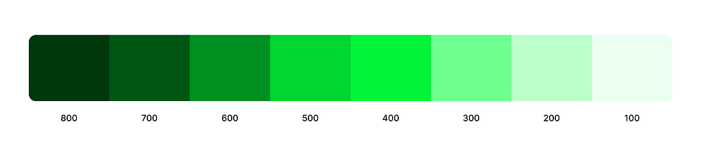
The Result
Above is the result after only making adjustments to lightness. This could be exactly the vibe we are going for, but let’s pretend it’s a bit too saturated for what we are trying to accomplish.
3. Adjust for saturation
We can adjust the saturation if we want more or less color richness. The same principles for adjusting lightness also apply to saturation, although adjustments will likely be more subtle. You’re likely still making slight lightness adjustments as you fiddle with getting it right where you need it. Tedious work, I tell ya!
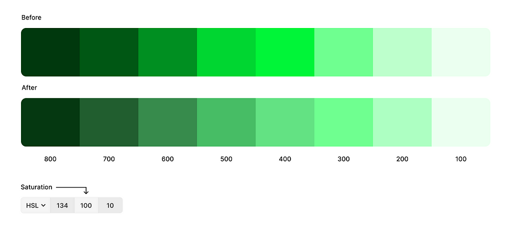
No adjustments made to brand colors
Above, you can see that I have desaturated my 400–800 stops. I wanted a much calmer green throughout but still wanted my lighter colors to have a punch. The contrast between my 300 and 400 will make for an excellent hover state without blinding anyone.
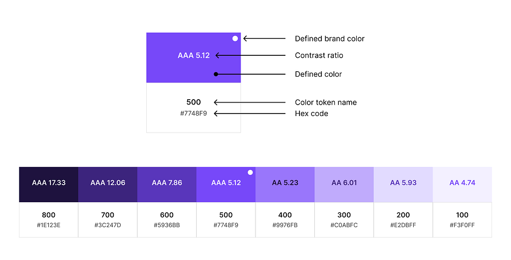
4. Check contrast ratios for accessibility
Hopefully, you haven’t gotten the final sign-off on your final brand colors yet because here is where you may need to adjust your defined brand colors. Of course, it depends on how you want to use those colors. If you plan on the color being used as foreground text or background color for text to sit on, then you need to test each color combination. I use the Figma plug-in, Stark.
Test your extremes
A baseline test I like to do is to find the lightest color of foreground text that can be displayed on top of each color stop within the same color band. This lets me know my limits quickly and if I need to make a further stop adjustment if a combination isn’t working.
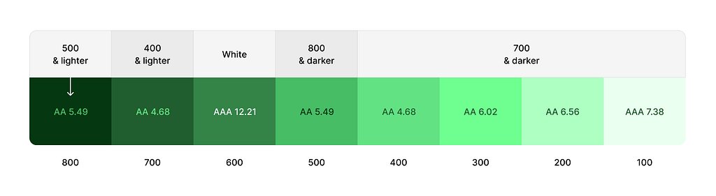
This chart quickly tells me what color combinations I can and can’t do when assigning colors semantically. e.g., defining your primary action color, etc. It’s not telling me what I am required to do, but rather, what boundaries I shouldn’t cross. I prefer to have more contrast than the minimum amount.
5. Repeat for all other colors
Finishing your first color ramp for a brand makes creating the rest a bit easier. You’ll follow the same process but aim for around the same saturation and lightness level for each stop. For example, green.400 and purple.400 will be similar in saturation and lightness, but their hue will differ.
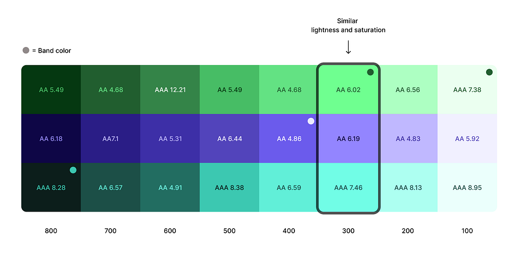
It’s important to note that your semantic color sets will not utilize every single color in your primitives catalog, but should you ever need to introduce new colors or add color variety, the capability is there and is now easy to do.
6. Add new colors as needed
It’s now incredibly easy to add a new color. Let’s add an orange color ramp. We’re going to start with a current color that is closest in hue to what we want our new color to be. Green is closer to orange on the color spectrum, so we’ll duplicate that and adjust the hue value at each color stop.
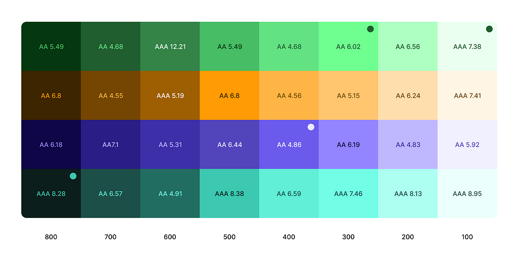
The hue value for our new orange was 36, so I entered that into the hue color field at each stop. I made slight lightness and saturation adjustments to keep the orange from getting too brown too quickly.
In conclusion,
Color ramps are tedious but pivotal in creating a solid foundation for a design system.
- Start with your defined brand colors.
- Adjust lightness at each color stop.
- Adjust saturation as needed.
- Check contrast ratios.
- Repeat for all other colors. Aim for similar lightness and saturation for each stop as the other colors. e.g., 400.
- Easily add colors by adjusting the hue value on a duplicated color ramp.
Next, you’ll want to define how these colors are used! In my next article, I will cover how to make semantic color sets so other designers know exactly how and when to use each color.
🖤 Support free educational content:
I love helping others on their design journey and want to keep the educational content I create free and accessible. If you feel inclined you can support my journey by donating here!
📣 Taking on new work:
By day, I am a Sr. Product Designer at Forge Studio. We are currently taking on new design systems, product design, and branding projects. I would love to sweat all the nerdy details of building a design system for your team so you can operate more efficiently and scale quickly. Learn more about our process on our website!
📍 Where to find me:
Twitter, LinkedIn, Posts, Instagram, Website
How to create a color ramp used in design systems was originally published in UX Collective on Medium, where people are continuing the conversation by highlighting and responding to this story.