Urban planners have been designing for human experiences for nearly 200 years, and UI/UX designers can learn from this.
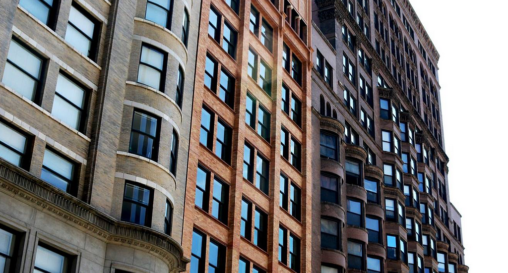
When I finished my graduate degree, I was lucky to find my first job in Chicago. From a very early age, I had always hoped to live in Chicago for a period of my life. I’ve been a lifelong Cubs fan despite being from Cincinnati — talk about controversy! Chicago is a magical city to live and work in if you’re in the architecture, construction, and engineering (ACE) industry. Chicago is the birthplace of the skyscraper, which subsequently manifested the Chicago School architectural style.
The modern skyscraper was born out of necessity. The Great Chicago Fire radically changed building codes in the US and caused the entire nation to reevaluate structural engineering. As Chicago rebuilt and other cities across the US continued to grow, urban land became expensive. Developers and landowners wanted to build up, not out, such that cities could remain dense, preserve mobility, and keep labor readily available. Traditionally, tall buildings used exterior walls to manage load. The taller the building, the thicker the walls needed to be. This effectively limited buildings to about 4 or 5 stories before they became prohibitively expensive. Additionally, the thick walls created dark and unwelcoming lower floors. Thanks to Henry Bessemer, cheap engineered steel became a cost-effective building material in the 1850s. However, it took another 30 years before George A. Fuller discovered how effective these steel beams were at providing a skeleton frame around which a building could be erected. The resulting style of the Chicago School was essentially birthed from this new innovation. At the turn of the century, buildings began reaching heights over 15 floors. To this day, the Chicago School of Architecture dominates a large portion of Chicago’s Loop and South Loop neighborhoods. They’re strong, regal buildings with impressive stone facades and open floorplates.
So, what does the birth of the skyscraper have to do with product design?
While I’ve surely over-simplified the inception of skyscrapers as a technological feat, I think we can learn a lot about how design strives to overcome or adapt to physical, technological, and societal limitations to address the essential needs of users. I mean this in a very practical sense — where designers in the physical world deal with limitations we too can grow from understanding their methods and models for making sense of complexity. Architects and urban designers have building codes to adhere to, yes, but many of us can point to terrible designs that are “technically” up to code. In fact, building code is hardly even a measure of good design; it’s often more focused on safety and engineering needs. Building codes and engineering regulations are utilitarian and rarely user-centric as a result (or at least they only center around user safety, not user enjoyment). Good design is subjective, contextual, and intentional. The Chicago School of Architecture, at face value, addressed these needs at a specific moment in time. They addressed physical needs (tall buildings that allowed for growth and were fire resistant) while also addressing civic and cultural needs (these buildings are objectively beautiful, well built, pleasant to inhabit/work in, and fit the context of their surroundings well). Good design seemingly self-imposes additional limits (or aspirational goals) on itself for the good of the end user.
As with all things in city planning and architecture, I feel the need to caveat generalizations about the design of the past being seen through rose-colored lenses. For example, I adore Central Park and I believe it is an essential service for New York, but we need to remember that the design of the park also required the active displacement of countless minority groups. Frederick Law Olmsted, like so many other designers, created beauty at the expense of other people. I’m sure the Chicago School of Architecture and Chicago’s revival following the great fire is fraught with morally questionable issues, sexism, racism, and so forth.
Utilitarianism vs Deontology
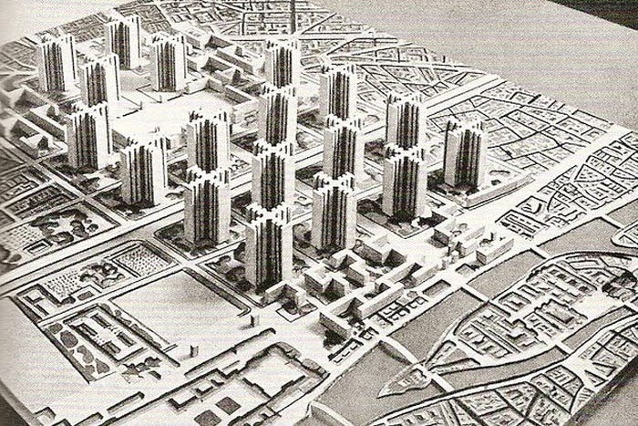
Before discussing these three pillars or frameworks for good design, I think it is first important to understand why design cannot be purely utilitarian. Consider this, if utilitarian design were truly, objectively superior, then we would all live in Le Corbusier’s Tower in the Park. Conceptually, the tower is exceptionally functional and efficient. Every tenant has windows to the outdoors and access to amenities on the lower levels. Labor is carried out on lower levels, where people gather and share ideas while leisure is reserved for the park or individual units. If we imagined humans as monolithic bodies, surely, Le Corbusier’s concept would have worked. Soviet block designs of towers proved how ineffective this design was when people were “subjected” to it. Even Le Corbusier’s original conception of the tower was shrouded in a sort of cultural hegemony. He originally proposed the idea as a replacement for a large portion of Paris. These towers were organizing and taming the wild and inefficient streets of Paris in an effort to create a sort of technocratic utopianism where humans are almost seen as units or impediments.
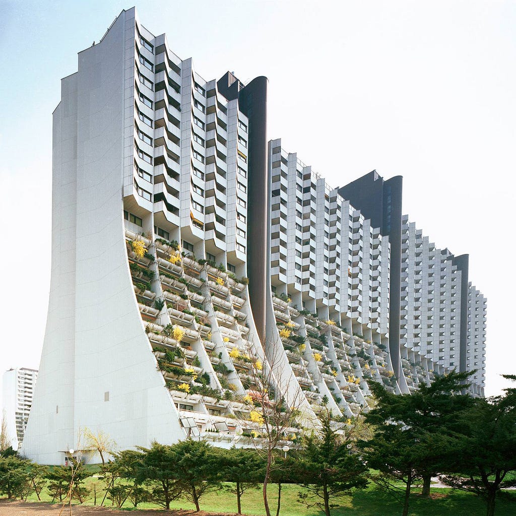
On the contrary, Vienne’s public housing project, Alt-Erlaa municipal housing, is absolutely a manifestation of Le Corbusier’s concept, but in a more deontological approach. Putting the very real challenges of affordable housing aside for a moment, tenants of this “Tower in the Park” love their homes. Many have lived there, happily, for decades. Some may want to chalk this up to choice (Soviet block housing was forced onto people by a violent gesture of the state, whereas Alt-Erlaa’s tenants choose to live there), but I believe that fails to acknowledge that public housing isn’t often a matter of choice. Rather, I think, Alt-Erlaa is built specifically to address the very real needs of low-income, housing insecure residences within the confines of a blended socialist-capitalist economy. Said another way, this building was designed for people, not forced onto them.
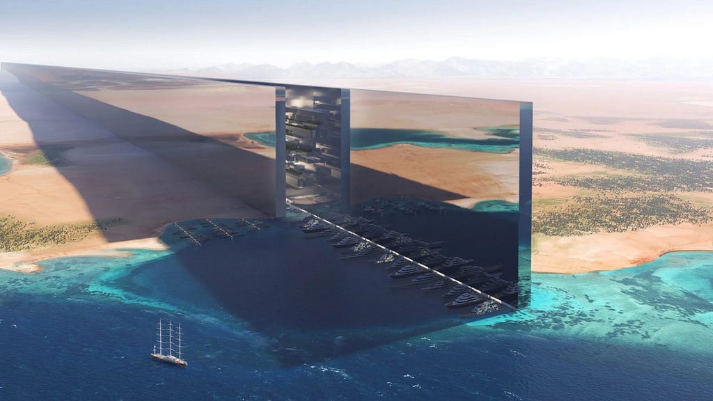
The Saudi Arabian NEOM Line is another perfect example of design being wielded like a blunt weapon. This project has been dominated by futuristic language and slick branding as a means to sell an idea; one I would argue no one wants nor asked for. Despite the idea boasting sustainability, efficiency, and beauty as the very essence of the concept, it is fundamentally anti-human in design. Again, not dissimilar to Le Corbusier, the NEOM Line even suggests replacing New York City with a “Line”. The impressive graphic even shows how space is saved and Manhattan returns to the marshland it once was. It should not be lost on anyone that, once again, we see a sort of authoritarian subjugation of people to an idyllic technocratic utopianism that none of us actually asked for.
Personally, I don’t see these three pillars as exhaustive, but I find the “three-legged stool” model effective in this case. Surely the stool could have more legs, I only argue that the stool cannot stand without at least these three elements. At the risk of being pedantic, I might even argue that these three constraints can be seen as “themes” under which many other concepts could fall. If one considers the Bauhaus School of Design, or IDEO’s approach to design thinking, surely the parallels are clear.
So what are these constraints and mental models then?
Subjective
Subjectivity deals with the variable nature of how people experience their own version of reality. This goes beyond taste in styles or colors. We bring our whole identities into a place, and that informs how we make sense of it. Age, gender, race, ethnicity, religion, place of birth, educational attainment, marriage status, favorite color, musical preferences, hobbies — and so much more — all influence how we make sense of experiences. In that sense, experience itself is objective. Walking to the store or climbing the stairs is theoretically devoid of a subjective element at face value. How we make sense of that experience is subjective and greatly influences our feelings and emotions about the experience. For instance, knowing whether or not a person has a physical disability suddenly changes our understanding of these experiences. Some of these subjective experiences are obvious, but appreciation for subtly is where exceptional design lives. This can also require designs to be malleable or flexible; able to address the needs of many possible experiences, not only a narrow group.
Homi K Bhaba, an Indian-British scholar talks about “Post Colonial” hybridity in culture and how people make sense of it and I think it captures how important this subtly is. Cultural hybridity (whether forced or consensual) creates a cultural third space in which cultural mimicry takes on the melding parts of unique societies. In simpler terms, Bhaba noticed, through his studies and writings, that not only has India taken on British influences, but The United Kingdom has also absorbed Indian cultures. This creates physical and meta-physical hybrids in society that mix and meld the two cultures together. As an overly simplistic example, consider it this way, some of London’s best food is Indian cuisine and many of Mumbai’s buildings reflect Western architectural ideals. As a result, Brits and Indians can experience these many cultural third spaces as neither fully “British” nor fully “Indian”. In many cases, individuals can be absolutely oblivious to their own cultural experiences of third spaces because of how deeply personal these things are. A post-structuralist understanding of space and meta-physical space is invoked here. It is nearly impossible to define the absolute meaning of place and space with such diverse lived experiences and cultural hybridity, but it can be captured in aggregate, usually as generalizations or qualitative research converted to bins or buckets.
Subjectivity in product design is one of the reasons that user testing and UXR are so important. Users are not monolithic, this is why we go through the process of creating personas and jobs to be done; everyone is unique and brings a unique identity to their experience. Designs can address these unique needs in a manner that accommodates everyone, not just a small segment. The way I, as a designer, understand an app looks very different from say, my grandma or my mail carrier. That leads to the next pillar.
Contextual
Contextuality of design attempts to make sense of all other entities or bodies a design both influences and is influenced by. If we think about buildings, infrastructure, systems, governments, cities, homes, and other elements of our physical and meta-physical world, they all have a “gravity” so to speak. Focusing on the physical first, we can transpose our understanding of literal gravity in a metaphorical sense. Let’s revisit your 5th-grade science classes quickly. Earth has a gravitational effect on the Moon which keeps it in orbit. The Moon also has a gravitational effect on Earth, creating tides. The Sun also has gravitational impacts on both bodies along with all other bodies in our immediate solar system.
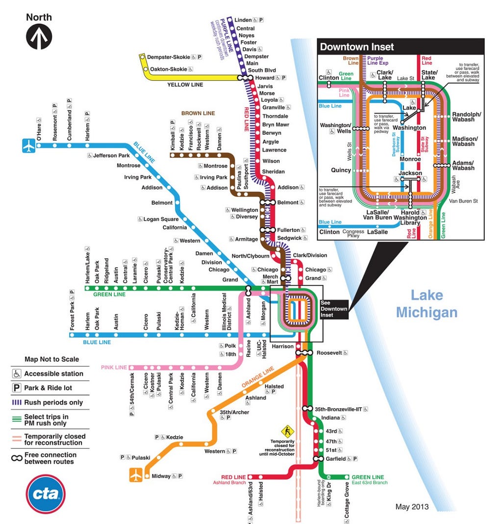
Physical structures have the same impact on the built environment. For example, in Chicago, train stations are placed at high-volume locations, geared towards maximum utility for riders. As a result, many stops have higher building density and height. It’s no surprise Wrigley Field has a stop off the CTA Red Line. There’s also a reason so many stops on the CTA are located in Chicago’s city center where buildings are much taller and most employment occurs. The gravity of all of these objects impacts one another and creates “magnetic” interactions that pull “likeness” together. The strength of gravity begins dictating common needs, functions, and narratives.
There is also regional gravity at play. Chicago, as a city, has a very large gravity that spans most of the Midwest. The city attracts workers and people from the entire region. As you near the city, you can see the impacts of that gravity at work; buildings get taller, density increases, public transit stops become more frequent, and increased automotive congestion is present. We can also see gravity at play in things like systems, government, policy, culture, and other metaphysical bodies.
Gravity is also often accompanied by increasingly complex and delicate systems of operation. Cities often have dozens of complex systems such as sewage systems, roadways, highways, electrical grids, telecommunication infrastructure, school districts, park networks, police jurisdictions, transit networks and so many more. These systems, like naturally occurring ecosystems, are highly interdependent and often build on one another. Places with less gravity may only have a few of these systems. In many cases, their physical or financial size may not support these systems.
These bodies and systems all come together to create context. Chicago is a big city, just like New York, Los Angeles, London, Tokyo or Dubai, but each is uniquely defined by their contexts (climate, topography, demographics, institutions, sports teams, infrastructure, history, culture, and much more). Many of them have similar elements (sewage systems, transit systems, large buildings, international airports, major shipping ports /yards, historic institutions, telecommunication, international corporations, countless dining establishments, and so forth), but each is designed to fit a specific context. Here is where aggregated subjectivity mixes with the literal context to create a regional contextuality. This regional contextuality defines an experience that is easy to identify, making the experience of Chicago distinctly “Chicago”, whereas Tokyo is distinctly “Tokyo”.
Context in product design looks like two things primarily. First, common elements make up our context. The chosen elements of a design system reflect the contextual needs and scale of the product. I have worked for years in data visualization, so I need an extremely wide range of icons and colors to accomplish my tasks for users. An online shop for bespoke denim probably can maintain a relatively simple design system. These contexts are reflected in the users, the volume of traffic, and the tasks needed to be accomplished in a product. It is also reflected in common design language, such as the hourglass icon which is so universally understood, it transcends language globally.
Second, context reflects the shared context of users. Contextuality is a companion to subjectivity in this case; context allows us to parse subjective experience and build themes and shared experience. For instance, TikTok, Instagram, Twitter, and so forth all borrow similar designs and features from one another, but each may implement those features in a context that is more relevant to their users and design system. Direct messaging features exist in every social media app, but they fill different roles in each context. In the built world, public transit stations, across the world all resemble one another in design and function, but each is also unique to their context, as an example.
Intentional
Intentionality is the purposeful recentering of design as a pursuit of a better tomorrow. I suppose one could also call this “awareness” or “consciousness”, but this is sort of the intangible, altruistic, ethical drive many of us have to make the lives of others better. Designers should align with the doctrine of Do No Harm as an ethical code. I would argue it is often better to do nothing than it is to knowingly do active harm.
This is different from subjectivity because we can objectively identify, quantify, and measure harm. Intentional designs don’t hurt people, steal their land, add to traffic congestion, trick users into agreeing to terms they don’t understand, or alienate. Not only this, but they should actively pursue the enrichment of others and the environment. Design should not be passive or neutral, but an active force pushing against harm.
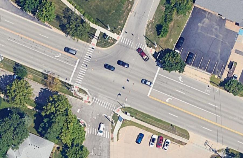
For example, we cannot build an 8-lane street and place a crosswalk in it and expect pedestrians to find this a pleasant experience. To enhance this experience we may add bollards, bike lanes, pedestrian islands, curb bump-outs, and lower speed limits. It may even be that we determine an 8-lane street is simply too detrimental to the pedestrian experience and change our approach altogether. I know that not everyone has the luxury of refusing to cooperate with destructive design, but I believe we have an ethical obligation to stand up and refuse to participate when we can.
All of us have examples of bad city experiences that clearly cut corners to address budget shortfalls or rush projects to completion. I’ve lost count of the number of crosswalks that don’t give you enough time to cross them. As a cyclist, I’ve encountered bike lanes that just end abruptly. Worse still, “sharrows” rarely encourage vehicles to respect cyclists. The massive parking lots outside of big box stores are the product of bad zoning laws and consumerism. My own neighborhood in Ann Arbor has sidewalks that abruptly start and stop and switch which side of the street they are on. I’m sure that no one intended to harm anyone in these processes, but the resulting negligence creates dangerous situations.
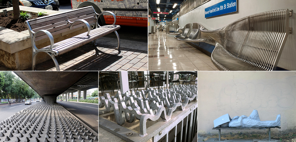
Hostile architecture is another example of designers actively harming people. I’m sure most are familiar with the practices of hostile architecture where public spaces and objects are made uncomfortable in an effort to, most often, deter the unhoused from using it as a temporary shelter. These bench designs, lighting fixtures, bollards, and barbed curbs create unpleasant experiences for everyone and actively treat the unhoused like second-class citizens. It’s fascistic and steals public space away from, well, the public.
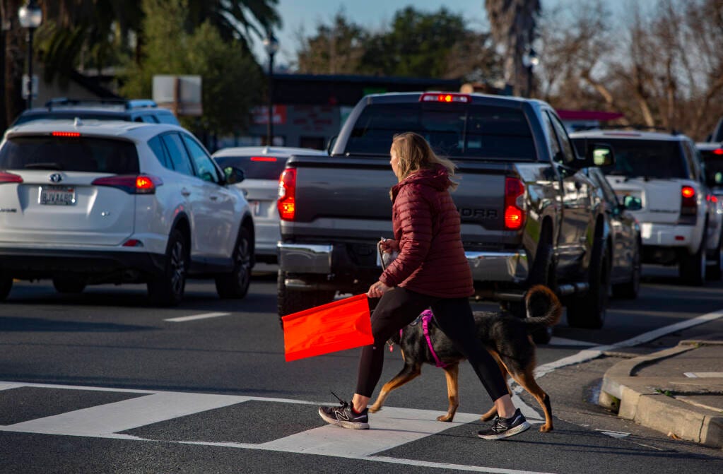
Perhaps one of the most absurd designs I have encountered as of late are “See Me” flags, which are about as stupid as they are dangerous. They’re brightly colored flags sitting in buckets at busy intersections. Pedestrians are supposed to take one and carry it while crossing the street to increase their visibility. Not only do they essentially create legal loopholes for drivers who might hit a pedestrian without a flag, but inevitably all of the flags end up on one side of the street. “See Me” flags are only a symptom of the problem, a metaphorical band-aid for a broken bone, but one has to ask, “how did we even get here?”
All of these issues are failures of design. I understand that not every city is flush with cash to build the best possible urban experiences for citizens, however, many of the examples I mentioned have more to do with solutions that cities have already chosen to implement, but implemented poorly. Even well-implemented strategies can still cause trouble. Subterranean parking is preferable because it reserves above-grade spaces for higher-use structures, but can cause traffic backups as people file in at high volume times. Decentralized, low-density parking, such as street parking, is still preferable, because it distributes parking load, and encourages alternative modes of transit for those who can use it. Intentional design actively seeks out these blind spots and gaps and proactively addresses them.
Switching Gears to Product Design
Digital products benefit from the same principles of Subjectivity, Contextuality, and Intentionality. When we make choices about navigation screens, implement complex back-end services, design a chat feature, or imagine new ways of engaging with a product page we are attempting to create solutions for unseen users and predict how they will behave with them. Further still, urban design does not occur in a vacuum, just like product design. The choices of architects, engineers, and previous urban planners place constraints and create challenges for an urban planner in the same way product designers have to struggle with past iterations of a design system or bad mobile version of a desktop-first experience. The UX design of a new service in an app uses the same principles one might use to design a street or sidewalk network.
For digital designers, I’m tempted to argue that the consequences of bad design are lower than that of physical designers (although, that may not be the case in an increasingly “online” human experience), and this lets many of us get away with bad design or wild assumptions. Physical design is also far harder to “undo” so to speak, and as such, usually receives greater research and testing in a traditional sense. Again, for digital designers, it feels easier to make a choice because there is no concrete to destroy or trees to uproot; it’s all just code, right? Given the nature of our interconnected world and increasing reliance on apps and technologies for large portions of our lives, I do not think we can continue forward on this fantasy that digital design is somehow a field with lower stakes. A bad design solution in a banking app could result in millions of dollars lost. A poorly designed landing page could harm sales. Changes to a medical tracking solution could cost lives. These design solutions matter and deserve just as much attention as their physical counterparts.
So, while designing digital products, how are you working to address these three pillars? Are you conducting user testing across a wide cohort of experiences and backgrounds? Are you testing stakeholder “assumptions” with real users? Are you anticipating dead ends and the questions of confused users? Where are they supposed to go when they need help? How does your product recover after an outage? Can users use alternative routes when services are down? After all, as a designer, you have an obligation to the users of your work.
![]()
Good design is subjective, contextual, and intentional was originally published in UX Collective on Medium, where people are continuing the conversation by highlighting and responding to this story.