Posted · Category: Best Collections, Design, Tools <!– –> When you select a WordPress theme, you will naturally familiarize yourself with the design tools, aids, and other features the theme has to offer. The greater the number of features, it the more a theme should be able to do for you. “More” sometimes means “better”… Continue reading Best WordPress Themes To Try Out in 2025
Tag: levels
Stable Diffusion & Its Alternatives: Top 5 AI Image Generators
[unable to retrieve full-text content] AI-generated imagery has become an essential part of the modern product designer’s toolkit — powering everything from early-stage ideation to polished design assets. Stable Diffusion is one of the most popular and flexible platforms for creatives that enables designers to generate a wide range of imagery with ease. However, with growing competition… Continue reading Stable Diffusion & Its Alternatives: Top 5 AI Image Generators
How to Include AI in Your Graphic Design Workflow
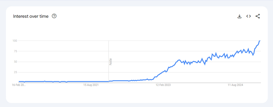
The popularity of AI design (and other search-related terms) is at an all-time high now. For the past two years, search interest for this keyword has skyrocketed, with a growth rate of 488% from Jan 2023 to Feb 2025. This means that more and more professionals are leveraging AI design tools for their graphic design… Continue reading How to Include AI in Your Graphic Design Workflow
Eye Health Tips for Graphic Designers
Today, graphic design work continues to be a competitive career path, with over 21,000 job openings projected yearly, according to the US Bureau of Labor Statistics. As digitization and online marketing continue to be essential elements for businesses and brands worldwide, graphic design talent is in demand. However, graphic designers must maintain their health and… Continue reading Eye Health Tips for Graphic Designers
Axe Reports 2.0: Make better data-driven accessibility decisions at scale
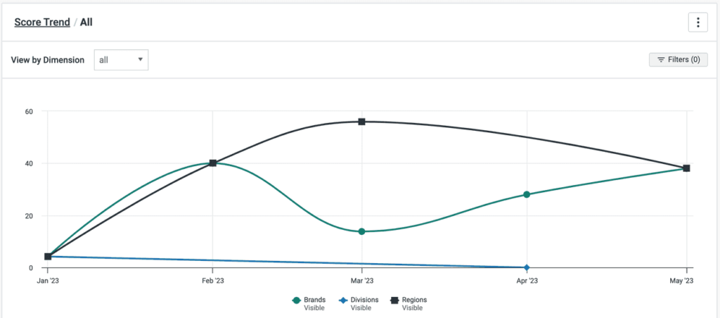
Successful digital accessibility programs run on great data. Without it, you can’t report on your progress or drive the right conversations around accessibility improvements with your stakeholders. That’s where axe Reports comes in. Available in the axe Platform, axe Reports is Deque’s enterprise-ready tool designed to help your organization track progress, pinpoint risks, and quickly… Continue reading Axe Reports 2.0: Make better data-driven accessibility decisions at scale
Why You Should Consider Luxury Vinyl Tiles (LVT)
With a combination of alluring luxury, practicality and functionality, luxury vinyl tiles (LVT) stand as a testament to innovation in flooring technology. It’s quickly emerged as a popular choice for homeowners and designers due to its affordability, durability and aesthetic appeal. Unparalleled Aesthetic Appeal One of the most compelling reasons you should consider luxury vinyl… Continue reading Why You Should Consider Luxury Vinyl Tiles (LVT)
Company culture is more than just office perks
How product culture and company culture are intrinsically related. Image by Creative Lab @ scop.io “Company culture is the backbone of any successful organization.”—Gary Vaynerchuk A goal is something to aim at Company culture is a powerful hiring magnet and a common discussion topic both in- and outside of companies. It starts with providing good environment and… Continue reading Company culture is more than just office perks
Good design is subjective, contextual, and intentional
Urban planners have been designing for human experiences for nearly 200 years, and UI/UX designers can learn from this. Examples of The Chicago School of Architecture | Photo Credit: Tom Seiple When I finished my graduate degree, I was lucky to find my first job in Chicago. From a very early age, I had always hoped to… Continue reading Good design is subjective, contextual, and intentional
Designing a colour system
Building multi-brand colour systems that support light and dark modes with minimum effort. It is all about organizing, naming and choosing the right colour values for the system to work. I would like to share my view on the issue and tell about the methods I choose to make the system. Made with design tokens Design tokens are… Continue reading Designing a colour system
What should be the contrast level of inactive buttons?
Using the APCA Readability Criterion to improve the accessibility of disabled controls Disabled buttons. They need to look non-interactable. But they also can’t be completely unreadable. How do I find the sweet spot? I spent a few hours in a deep dive going through a bunch of blogs and accessibility guidelines documentation in search for best approaches… Continue reading What should be the contrast level of inactive buttons?
How to navigate the insanity of behavioral science
I recently published a scientific paper on the Interactive Behavior Change Model (IBCM). The IBCM is a behavioral science system I developed during my doctorate studies. It is comprehensive, with an intuitive, theory-based structure that is easy to learn and grounded in the science of building digital products. But best of all, it’s an excellent choice… Continue reading How to navigate the insanity of behavioral science
The Dangers of Deceptive Design Patterns (And How to Avoid Them)
UX By Louise North Today As web designers, our role in crafting user-friendly digital landscapes is critical. We are tasked with creating user experiences that make visitors feel comfortable and respected. This, in turn, creates benefits for our clients by improving repeat visits and achieves the site’s ultimate aims, whether that is sales revenue or… Continue reading The Dangers of Deceptive Design Patterns (And How to Avoid Them)
Our desire for certainty can make us terrible planners
Memory, Image Theory, and the empty pursuit of certainty Midjourney Sometimes it feels like all we do is plan — and then plan for more planning. But what are the cognitive mechanisms we use to ‘plan’? and are they optimized for getting things ‘right’? If we were optimized to be right, we probably wouldn’t be so quick to… Continue reading Our desire for certainty can make us terrible planners
Almost Ready! WCAG 2.2 is one small step away from being officially done!
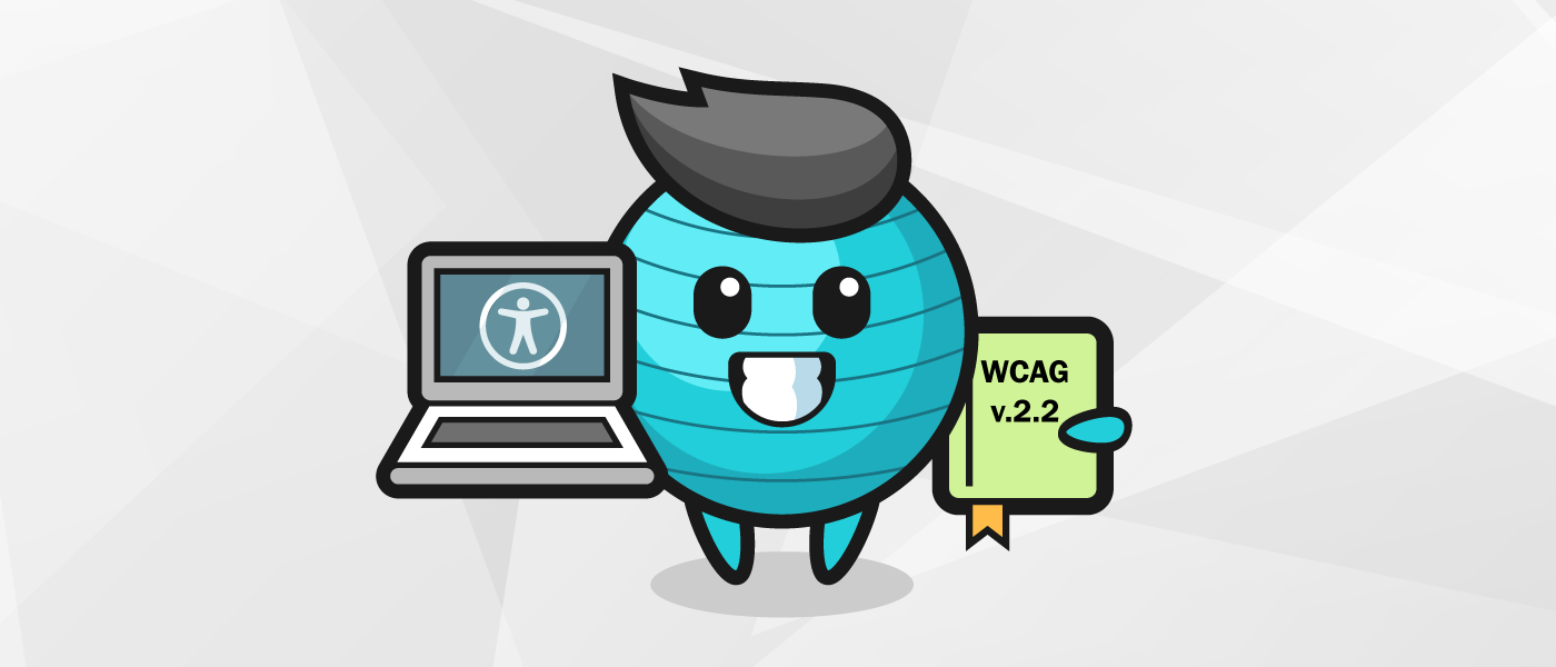
A new version of the Web Content Accessibility Guidelines (WCAG) is almost ready. WCAG 2.2 should be finalized in August 2023. This is a minor version update. If you are already familiar with WCAG 2.0 and/or 2.1, you probably have a number of questions. And we’ve got up-to-date answers! Why isn’t WCAG 2.2 ready yet?… Continue reading Almost Ready! WCAG 2.2 is one small step away from being officially done!
Setting up performance reviews for Product Designers
Take a few shortcuts with my comprehensive guide on evaluating designers Why is evaluating designers so difficult? Evaluating the performance of a product designer within a startup or agency environment is challenging. It involves a mixture of objective and subjective data that is synthesized in an attempt to gauge if someone is to be rewarded,… Continue reading Setting up performance reviews for Product Designers
The purpose of a system is how we shape it
We are not masters of our information, but we can be if we build information systems shaped like human consciousness. Why are our information systems places where ideas go to die? Why are they clogged with shallow, soulless filler? Why can so few of us, and fewer organizations, gain any level of mastery over our… Continue reading The purpose of a system is how we shape it
Are we there yet? WCAG 2.2 is at the Candidate Recommendation v3
If you’re a regular reader of the Deque blog, you may be asking yourself, haven’t I read this already? Well my friend, you may have. In September 2022, WCAG 2.2 reached the Candidate Recommendation (CR) stage for the first time. Then on January 25, 2023, WCAG 2.2 entered a second round of CR. And, you… Continue reading Are we there yet? WCAG 2.2 is at the Candidate Recommendation v3
10 Key Principles of User-Centered Design
Many firms’ design and development decisions are increasingly oriented toward human-centered innovation. Instead of rushing goods to market, these firms are using a user-centered design approach. Design and development teams build high-performing digital products or websites that uniquely meet customers’ demands by concentrating on the user experience. After all, a good web design is helpful… Continue reading 10 Key Principles of User-Centered Design
How does your team measure UX quality?
This year on my team, we had a moment where we realized that our UX quality was slipping. It started with a few surprising feedback tickets, then we noticed some patterns in our dovetail user research sessions, then got some rather harsh NPS scores, until finally we realized we needed to quantify our UX quality… Continue reading How does your team measure UX quality?
Seven mental models for UX Writing
Mental models to help you mature your work and deliverables. This article is part of the UX Translations series. It was originally written in portuguese by Camila Gaidarji via UX Collective 🇧🇷 and was translated to english with the intention of helping more designers and reaching an even wider audience. You can check the original… Continue reading Seven mental models for UX Writing
Disruptive design patterns — an uncharted territory
Disruptive design patterns — an uncharted territory From Apple’s Dynamic Island to TikTok’s vertical video swipe: Are new design patterns going viral faster than ever? Interface design patterns are recurring proven solutions for solving digital experiences. They are a part of a product designer’s menu of possibilities. With the popularity of libraries and design systems, many visual conventions… Continue reading Disruptive design patterns — an uncharted territory
Design systems; the great connector
Like a backwards prism, design systems focus the energy of many teams into a single beam. They spread efficiency and consistency, but they also shape culture and hone brand expression. They’re about bringing it all together, across disciplines, to form alignment and a cohesive outcome. What’s the big deal about design systems, anyways? You might have heard… Continue reading Design systems; the great connector
Storytelling as a service in SaaS
Rather than solely focusing on product characteristics and features, an authentic and creative narrative can convey brand values and connect with the target audience in a more strategic way. We are all the heroes of our own stories, and building a narrative around our experiences courses in our veins. Binging on stories is one of… Continue reading Storytelling as a service in SaaS
How To Design A Website With Security In Mind
There are billions of websites today as companies, small and large, seek online presence. However, this surge in website design and development is confronted by a rise in cyber attacks, prompting a need for cybersecurity. The sophistication of the internet can be rewarding; however, it can also be weaponized by hackers for illegal benefits. Your… Continue reading How To Design A Website With Security In Mind


