[unable to retrieve full-text content] What they are, why they matter and how to evaluate them. Content designers follow best practices. Image by Kit Overview In this article I’ll cover the following: Introduction to design heuristics Critique of existing content heuristics Summary of new heuristics for content design Guide to each content heuristic — including why it matters, how to… Continue reading 12 heuristics for content design
Tag: Making
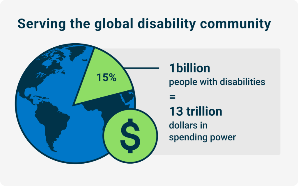
Digital accessibility and the cost of exclusion
In my previous Proactive Perspectives article, I explored lessons from the Accessibility for Ontarians with Disabilities Act (AODA), discussed what to do when digital accessibility goals remain elusive, and shared strategies for managing disruption and keeping your program on track. Today, I want to build on those strategies by looking more closely at opportunities and… Continue reading Digital accessibility and the cost of exclusion
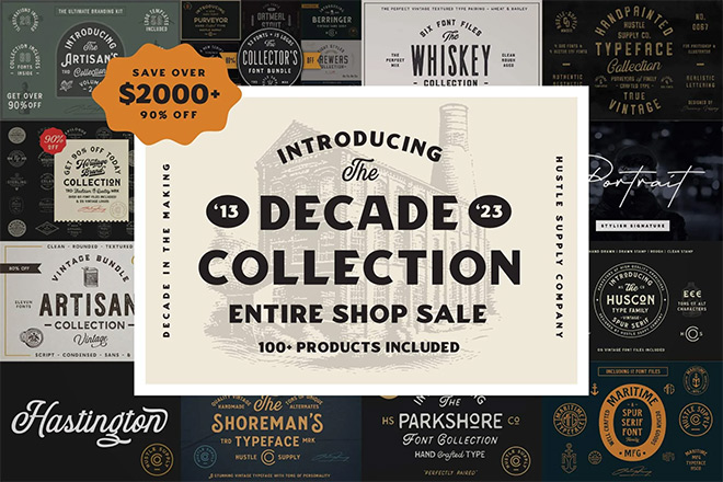
The Decade Collection: 100 Fonts, Less Than $1 a Font! 10 Years in the Making
Prepare for any design project that you might face in 2025 and beyond with a lifetime’s worth of vintage fonts! Over $2000 worth of meticulously crafted vintage fonts are available at the exceptional price of just $99, offering unbeatable value for money. What’s more, Spoon Graphics readers can get an extra 20% off with the… Continue reading The Decade Collection: 100 Fonts, Less Than $1 a Font! 10 Years in the Making
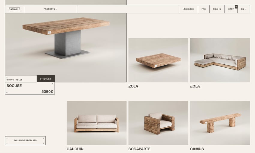
Making the most of the visible grid web design trend
Web design is always changing—trends come and go, but one that’s emerged in recent years is the visible grid layout. This design style takes what was once an invisible structure (the grid) and turns it into a prominent visual feature. It helps organize content clearly and can improve user experience, too. Grids are no longer… Continue reading Making the most of the visible grid web design trend
Why You Should Consider Luxury Vinyl Tiles (LVT)
With a combination of alluring luxury, practicality and functionality, luxury vinyl tiles (LVT) stand as a testament to innovation in flooring technology. It’s quickly emerged as a popular choice for homeowners and designers due to its affordability, durability and aesthetic appeal. Unparalleled Aesthetic Appeal One of the most compelling reasons you should consider luxury vinyl… Continue reading Why You Should Consider Luxury Vinyl Tiles (LVT)
UX leadership is failing, multi-brand design systems, proxies in UX
Weekly curated resources for designers — thinkers and makers. “What is the effect of constant exposure to information on our attention? Who benefits from a dramatic change in our attention, and when and why has this happened? One hypothesis is that companies have created an ecosystem to encourage continual consumption of information, and they profit from our addiction… Continue reading UX leadership is failing, multi-brand design systems, proxies in UX
3 Essential Design Trends, September 2023
Here’s what’s trending in design this month: 1. Monochrome Color Schemes One-color design patterns can be beautiful and somewhat enchanting. With tints and tones of the same base color, there is a certain elegance that comes with a monochrome color scheme. Designers who have worked with color in this way know that while the end result may look… Continue reading 3 Essential Design Trends, September 2023
What it takes to avoid an ADA lawsuit, 33rd-anniversary edition
With the number of digital accessibility lawsuits in 2023 on the rise, it begs the question, “Do I really need to consider the needs of 1 in 4 Americans when it comes to their ability to do business with me?” The increasing litigation says yes. Let’s take a look at how you can minimize your… Continue reading What it takes to avoid an ADA lawsuit, 33rd-anniversary edition
Making websites sharable on social media
A guide on how to include open graph tags to your website, and a svelte template to do so. Continue reading on UX Collective »
Are we going to need food in the Metaverse?
A vision for how the world of food could evolve with web3. I was skeptical. I shouldn’t have been. Last week, I had the opportunity to attend YFood’s Insights & Innovation event, which took a deep dive into rising trends in the food tech space, specifically web3 and automation. As a UX designer, I’m interested in… Continue reading Are we going to need food in the Metaverse?
Wordle is a masterclass in product design simplicity
Some of the most fun I’ve had this year is playing Wordle with my friends and family. But I’m a product designer and a programmer, so as I played, I couldn’t help but notice some strange things about how it was constructed. I was right in the middle of making my own product School Morning Routine,… Continue reading Wordle is a masterclass in product design simplicity
How to Create Metal Textures in Photoshop
What You’ll Be Creating In the following tutorial, I’m going to teach you how to create a metal pattern in Photoshop. You’ll create five different textures with Photoshop filters, gradients, and Blending Modes. You’ll get a cool metal pattern in Photoshop to use in your photo manipulations and digital paintings. Looking to brush up on… Continue reading How to Create Metal Textures in Photoshop
Metaverse UX, designing with data, immature orgs, how to ask for gender
Weekly curated resources for designers — thinkers and makers. “I’m sure that you or someone else you know have worked somewhere in the past where you felt that UX people were out of place. After all, UX is an emerging discipline and a lot of organizations want to hire people from our field because no organization wants to… Continue reading Metaverse UX, designing with data, immature orgs, how to ask for gender
Making design systems flexible with Design Tokens
In this article, we will discover the benefits of using Design Tokens with your own Design System. Continue reading on UX Collective »
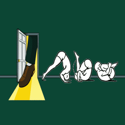
The foot-in-door-somersault-strategy. Making accessibility laws your superpower
The cool kids on the block You know all those movies where the main character first is a nerdy nobody and transforms into someone amazing or popular? Sandy in Grease. Peter Parker in Spider Man. Harry Potter. You get the point! That’s kind of how we feel like at the moment in the accessibility (a11y) community.… Continue reading The foot-in-door-somersault-strategy. Making accessibility laws your superpower
Quick Ways to Make a Webpage More Scannable
In the information age, time is a valuable commodity and something people don’t want to spend too much of. As a result, the average visitor only reads about 20% of the content of a page. For web designers and developers, that means a few things: first, you need to ensure that the web pages you… Continue reading Quick Ways to Make a Webpage More Scannable
How to Make your First App in Java
Are you a budding developer who knows the basics of Java and wants to make their first app using Android Studio? With PlayStore currently hosting 2.89 million Android apps and growing every minute, it is a great decision to learn and eventually master Android apps development. Get Started With Android Studio To make an android… Continue reading How to Make your First App in Java
Building micro-interactions in Adobe XD
[unable to retrieve full-text content] The beauty about micro-interactions is that it’s a digital conversation users can initiate with the system or the system can initiate with the user. Let’s start with what they are Micro-Interactions are a heuristic approach to meaningful feedback responses that let users know when an action is performed. Simply put, the user… Continue reading Building micro-interactions in Adobe XD
5 Secrets to Making an Eye-Catching Logo
A logo is intended to catch the attention of people and make your brand memorable to both prospective customers and clients. In many cases, logos can be more recognizable than the names of the company, along with all of its connotations. This is why you need to make your logo as eye-catching as possible if you… Continue reading 5 Secrets to Making an Eye-Catching Logo
The Future of UI Design for Embedded Systems
The expectations for embedded GUI designs are higher than ever. While the launch of any new embedded device makes the public and developers excited to see if it actually delivers a great UX but simple designs are still prominent in smart fridges, cars, and ovens, etc. Despite the growing need for smartphone-like devices, not all… Continue reading The Future of UI Design for Embedded Systems
15 Top Soft UI and Neumorphic UI Kits
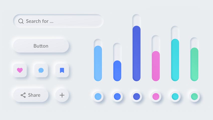
Designers are always in search of unique ways to display content. Yet there is a delicate balance between something that looks good and is both accessible and intuitive. Everything needs to be in harmony, otherwise the end result suffers. Neumorphic UIs can serve as an effective solution. Neumorphism is a design technique that is based… Continue reading 15 Top Soft UI and Neumorphic UI Kits
UX challenge: Teaching a person who is blind to design
[unable to retrieve full-text content] Designing a system for the visually impaired to recognize color. It’s been a year since I published my very first article and it was about solving a problem in accessibility. This problem bothered me for a good half of my life. I finally think that I’ve opened a door to… Continue reading UX challenge: Teaching a person who is blind to design
Lessons from Spotify: using multiple touchpoints to build an identity
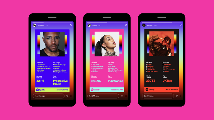
[unable to retrieve full-text content] Digital-first design is well and truly here and COVID-19 has accelerated the trend. Increasingly, people are aware that a digital brand is a brand built on quality experience and design. Today brands literally live and die in the consumer's hands, and often digital experience is baked into the DNA of… Continue reading Lessons from Spotify: using multiple touchpoints to build an identity
CSS Charts: How to Create an Organizational Chart
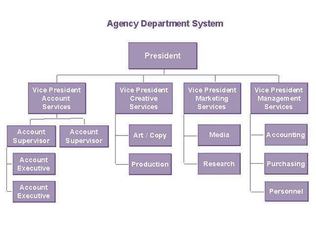
In previous tutorials we’ve learned how to create different types of charts including bar charts, thermometer charts, and donut charts. Today we’ll continue this journey by building a CSS-only organizational chart. Ready to test your CSS skills? The Organizational Chart We’re Building Here’s the CSS chart we’ll be creating: It consists of four levels and… Continue reading CSS Charts: How to Create an Organizational Chart

