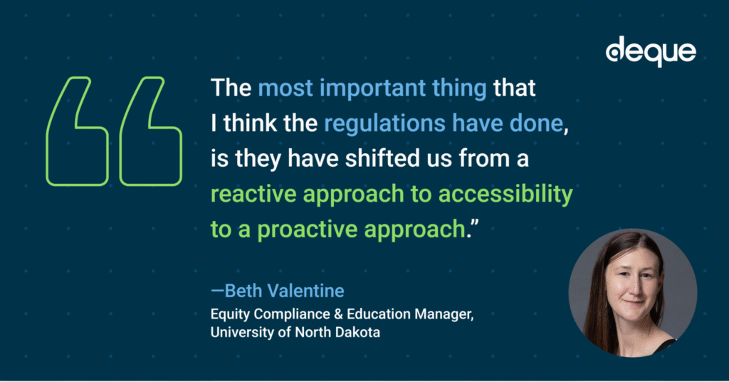
What happens when you combine the passion, experience, and expertise of accessibility practitioners across the globe with world-changing regulatory momentum and transformative breakthroughs in technology? The answer is: Progress! What we are experiencing in this new era is unlike anything we’ve ever witnessed. Today, we have the power, the opportunity, and the technology to accelerate… Continue reading The global community is coming together to accelerate digital accessibility at axe-con 2026!
Category: Accessibility
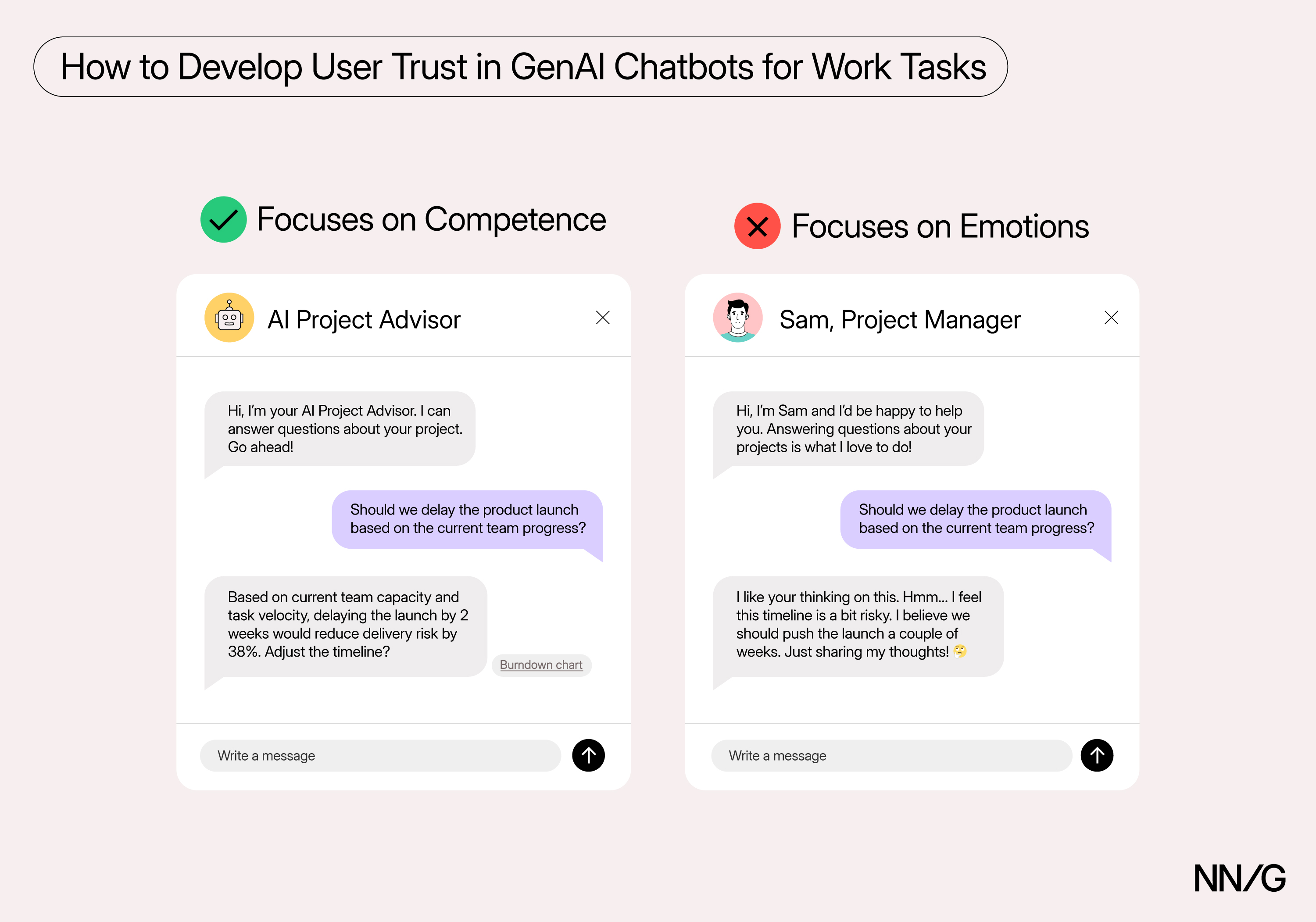
Prioritize Smarts over Sentience to Increase Trust with AI
Summary: People trust AI more when it seems smarter rather than sentient. AI emotions can reduce trust in factual, task-oriented work and reduce AI reliability. A common concern from attendees of our Designing AI Experiences course is how to help users develop trust with artificial intelligence (AI). One technique that designers are frequently tempted to… Continue reading Prioritize Smarts over Sentience to Increase Trust with AI
A Millennial’s DVD Collection: I’m Returning to Physical Discs
Summary: Frustrating streaming apps and smart TV design pushed at least one user (me) back to physical discs for reliability, ownership, and simpler choices. I remember when the first digital-streaming service (Netflix’s) became available. It was such a massive improvement on the user experience of watching a movie — no need to go to a… Continue reading A Millennial’s DVD Collection: I’m Returning to Physical Discs
You need to get started on ADA Title II compliance now: How to strategize funding, slash risk, and ensure ROI
Title II of the Americans with Disabilities Act (ADA) prohibits discrimination against individuals with disabilities by state and local governments, and the ADA Title II compliance clock is ticking. Do you have enough budget set aside? For large entities with populations of 50,000 or more, the deadline is less than nine months away. Fortunately, even… Continue reading You need to get started on ADA Title II compliance now: How to strategize funding, slash risk, and ensure ROI
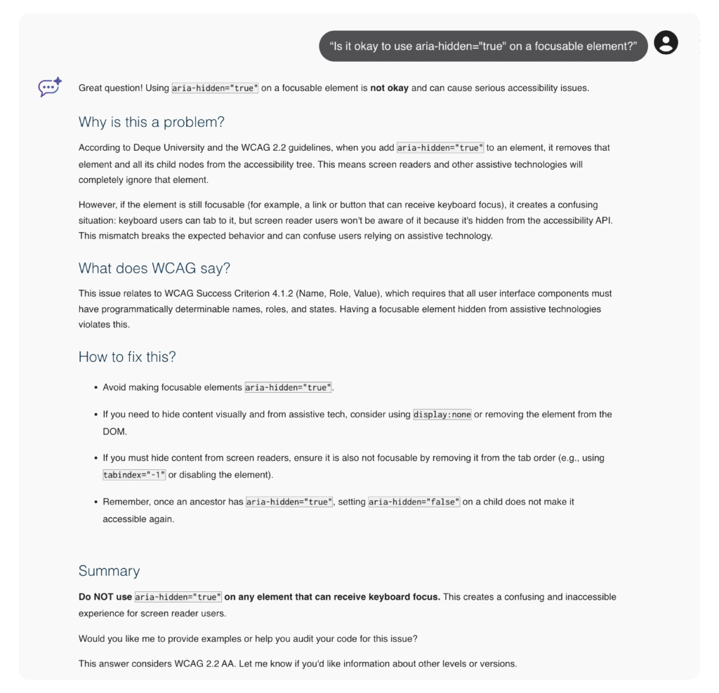
How to eliminate costly rework and fix accessibility issues early with expert guidance from axe Assistant
Engineering teams today are under pressure to deliver high-quality, accessible code quickly, but these teams often lack an immediate channel to accessibility experts who can validate their work in real time. Without that guidance, issues can slip through that can lead to production delays, costly rework, and broken user experiences. That’s why having a reliable,… Continue reading How to eliminate costly rework and fix accessibility issues early with expert guidance from axe Assistant
Introduction to Digital Accessibility
Introduction The dictionary term “Accessibility” means – The ability to acquire, use, understand, or enter into something with ease. Accessibility is a social responsibility. It’s an inclusive approach to creating products, services, and environments that can be used by people of all abilities including people with disabilities. Some examples of accessible solutions include: Wheelchairs Entry… Continue reading Introduction to Digital Accessibility
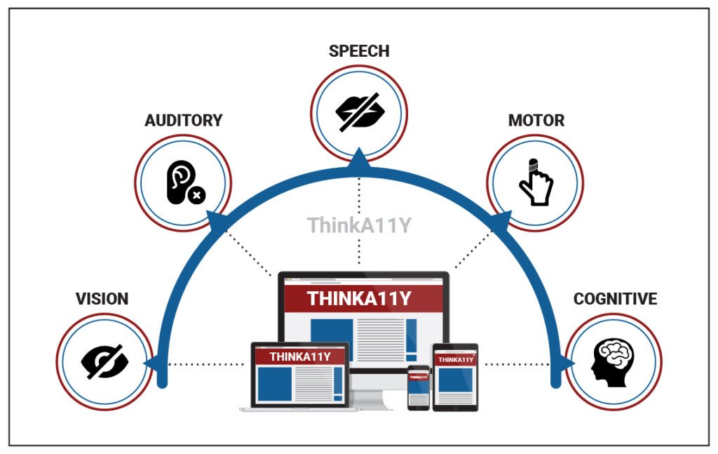
People with diverse abilities
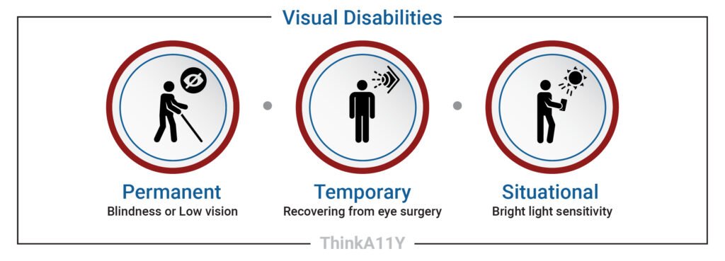
Introduction Accessibility is not just for people with disabilities, it is for everyone. Many of us may find ourselves in temporary or situational limitations on how we use and access content on the web. By creating solutions for users with a permanent disability, we are also helping users with temporary, situational disabilities or users with… Continue reading People with diverse abilities
Mixed-Methods Research: Combining Qualitative and Quantitative Data
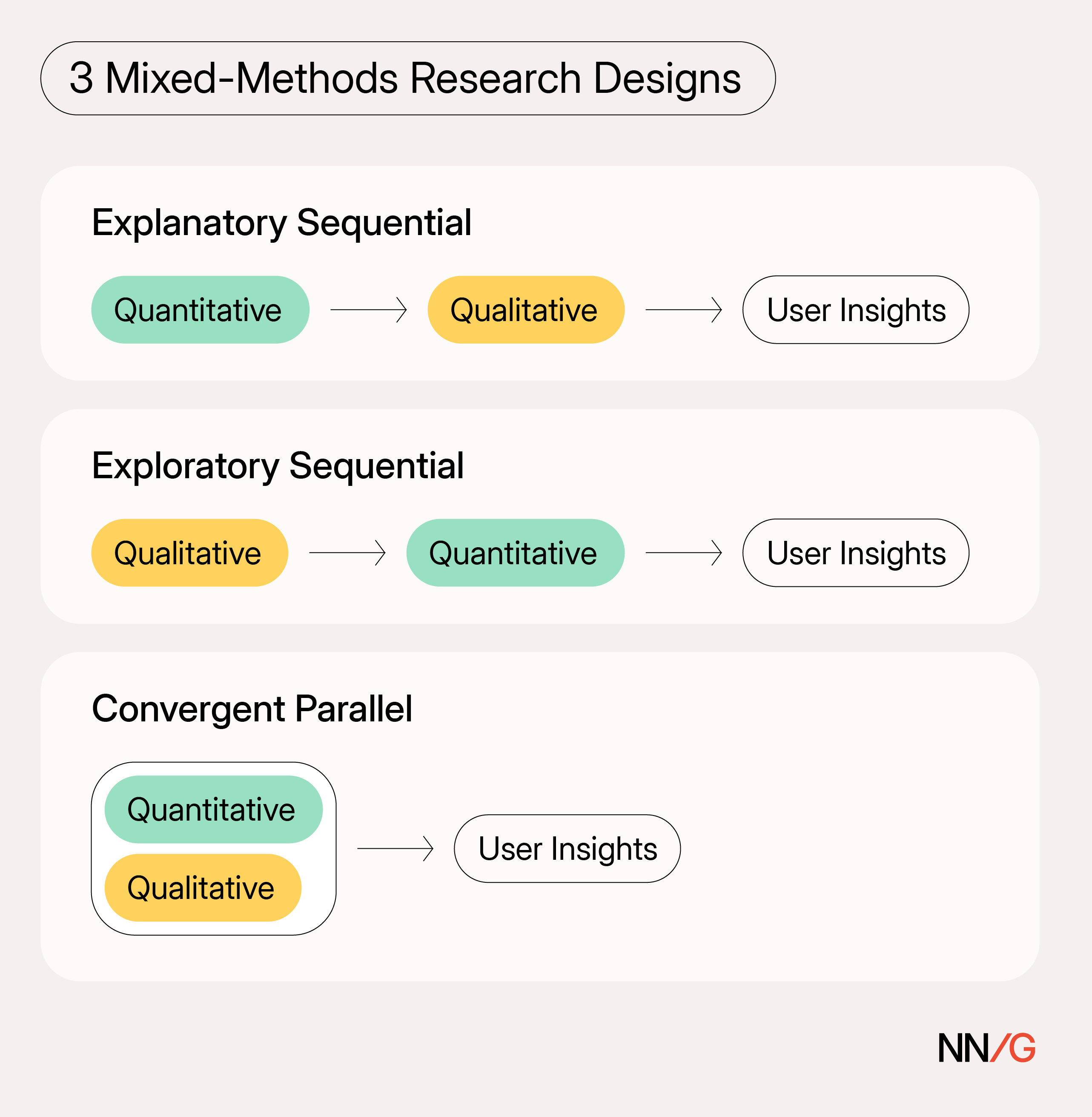
Summary: Mixed-methods research combines qualitative and quantitative methods to explore a single research question. Teams might assume that simply sprinkling in a quantitative survey alongside interviews qualifies as mixed-methods research. In reality, effective mixed-methods research involves more than just ensuring that both qualitative and quantitative methods appear somewhere in the same project. What Is Mixed-Methods… Continue reading Mixed-Methods Research: Combining Qualitative and Quantitative Data
Three quick ways to shift left and fix accessibility issues sooner
Digital accessibility is essential to the software design lifecycle (SDLC). You can’t build products that meet compliance requirements without it, and if your product fails to meet accessibility standards, you face stalled sales, loss of market share, legal and financial risk, and more. Unfortunately, however, digital accessibility is often an afterthought—if it’s thought of at… Continue reading Three quick ways to shift left and fix accessibility issues sooner
The Product Triad: Design’s Role
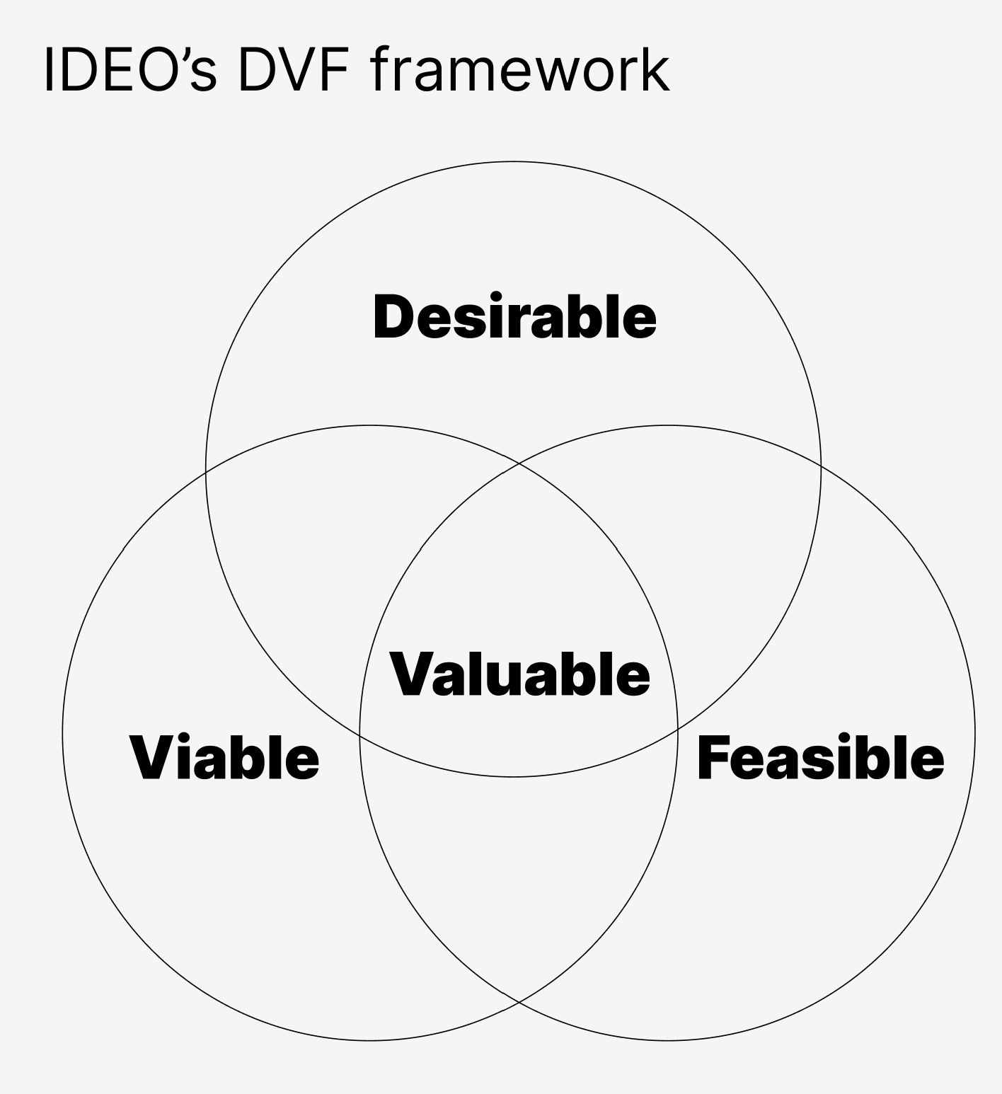
Summary: Effective product teams work across silos to create value. Designers are expected to make products not only desirable, but also viable and feasible. The product triad (also called the product trio or three-legged-stool model) is likely the most common pattern for organizing product teams in Agile organizations. Its fundamental goal is to structure collaboration… Continue reading The Product Triad: Design’s Role
A tailored digital accessibility plan for your organization—in minutes.
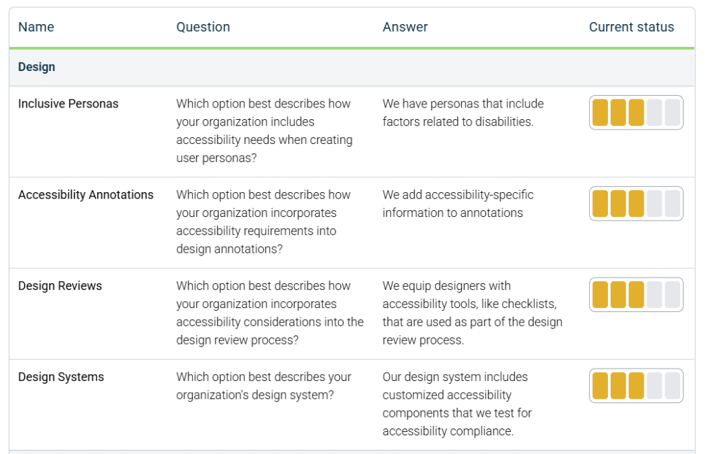
Developing a strategic plan for digital accessibility is one of the most impactful efforts your organization can undertake to create more effective and inclusive customer experiences. Far beyond a legal requirement alone, digital accessibility is a competitive advantage—expanding your reach, improving usability for everyone, and reinforcing your commitment to your customers. With legislation like the… Continue reading A tailored digital accessibility plan for your organization—in minutes.
“Powered By AI” Is Not a Value Proposition
Summary: Achieving product-market fit and practicing user-centered design become difficult when AI is presented as a product’s main value. A Clear Value Proposition Helps Both Users and Product Teams To help make decisions throughout the product lifecycle, designers create principles at the beginning of a project. The value proposition is the foremost of those principles… Continue reading “Powered By AI” Is Not a Value Proposition
The EAA and the new era of digital accessibility
I’ve been working to advance digital accessibility for over twenty years. In that time, I’ve seen both successes and setbacks. But like everyone committed to this mission, I have never wavered in my faith that digital accessibility is the future. Well, that future is here. The European Accessibility Act (EAA) is law as of this… Continue reading The EAA and the new era of digital accessibility
UX Conference September Announced (Sep 6 – Sep 19)
How will the Virtual Event work? Meetings will take place using the video conferencing tool Zoom, collaboration tools (such as group document editing and whiteboarding tools), and the social discussion tool Slack. You’ll also be able to use Slack before, during, and after the event to participate in social events and network with other… Continue reading UX Conference September Announced (Sep 6 – Sep 19)
AI Summaries of Reviews
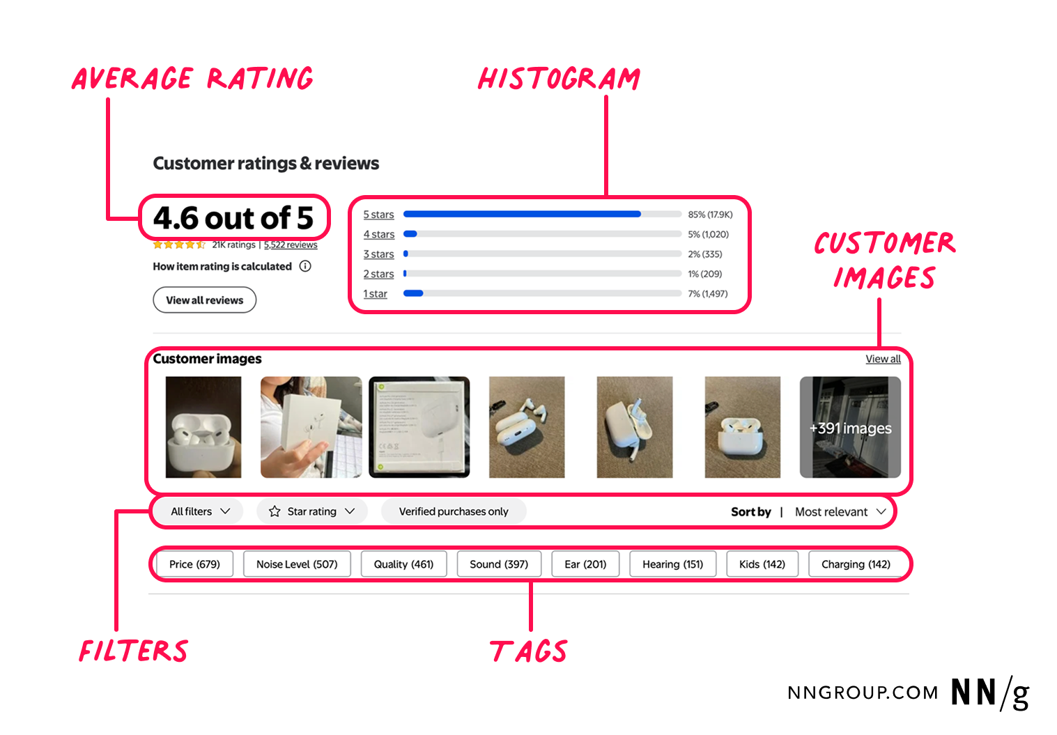
Summary: AI-generated review summaries extract qualitative key themes from customer feedback, helping shoppers quickly assess what purchasers think about the product. When designed well, AI summaries of ecommerce reviews helped our study participants quickly gauge product quality and fit for their needs. But when AI summaries of customer reviews were vague, poorly formatted, or blocked… Continue reading AI Summaries of Reviews
What’s new in axe Developer Hub: Updates for more flexibility, security, and control
When it comes to digital accessibility, finding issues earlier is always better. You save time and money, and most importantly, you ensure accessible experiences for your users every time. Axe Developer Hub was built so you can effortlessly add automated accessibility testing to your end-to-end (E2E) tests with just a simple configuration, allowing you to… Continue reading What’s new in axe Developer Hub: Updates for more flexibility, security, and control
AI as a Creative Teammate
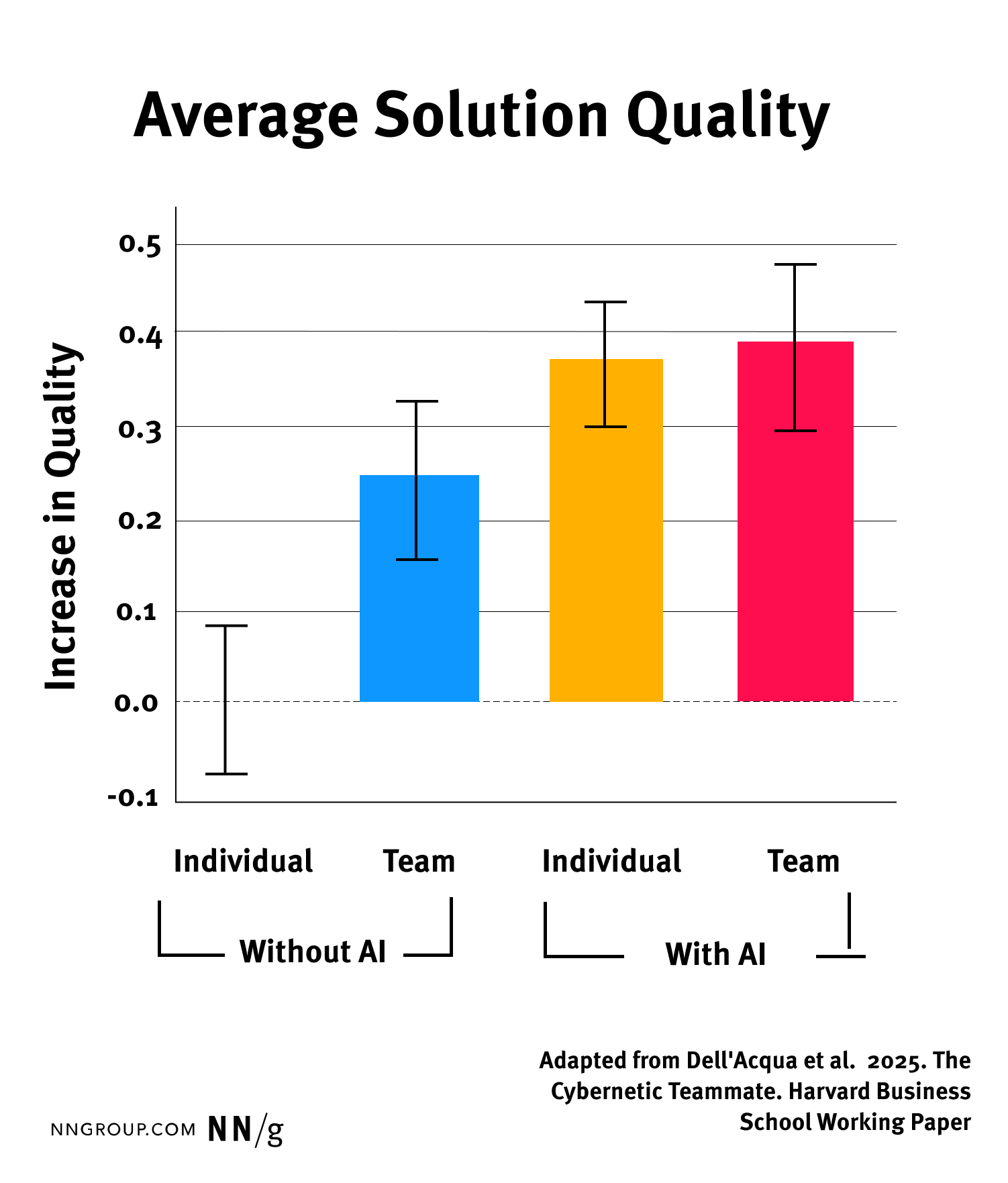
Summary: AI acts as a creative teammate in group settings as it does for solo work. Thoughtful facilitation ensures teams leverage AI effectively in workshops and critiques. I don’t need to tell you that generative AI can be useful for ideation, writing, or communication — you probably already know and believe that. In speaking with… Continue reading AI as a Creative Teammate
Designing for Serial Task Switching
Summary: Serial task switching, or rapidly shifting attention between tasks, is a natural user behavior that lowers productivity and increases stress and the chance of errors. Be honest. How many tabs do you have open right now? If you’re like me, it’s probably more than you’d like to admit. Serial task switching is a natural… Continue reading Designing for Serial Task Switching
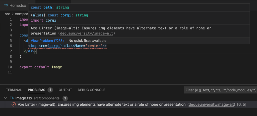
Building accessible apps with Next.js and axe DevTools
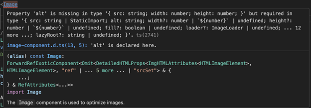
As a developer, you want to build fast, modern, progressive web applications (PWAs) that reach as many users as possible. That’s the goal—and it’s a good one. But if accessibility isn’t part of that process, you could be unintentionally leaving people behind. Accessibility (a11y) is essential to creating inclusive experiences and is a hallmark of… Continue reading Building accessible apps with Next.js and axe DevTools
AI Chatbots Discourage Error Checking
Summary: AI hallucinations threaten the usefulness of LLM-generated text in professional environments, but today’s LLMs encourage users to take outputs at face value. Large language models (LLMs) are being widely introduced into professional workflows through both new standalone software and integrations with existing tools. One of the most important ways that these tools increase users’… Continue reading AI Chatbots Discourage Error Checking
AI Design Tools Are Marginally Better: Status Update
Summary: Despite improvements in narrow-scope AI design tools, most design-specific AI cannot replicate human designers’ output quality. This is a follow-up to the 2024 article AI UX-Design Tools Are Not Ready for Primetime: Status Update. In April 2024, AI-powered design tools were not useful to designers. As of May 2025, their usefulness has improved, but we’re… Continue reading AI Design Tools Are Marginally Better: Status Update
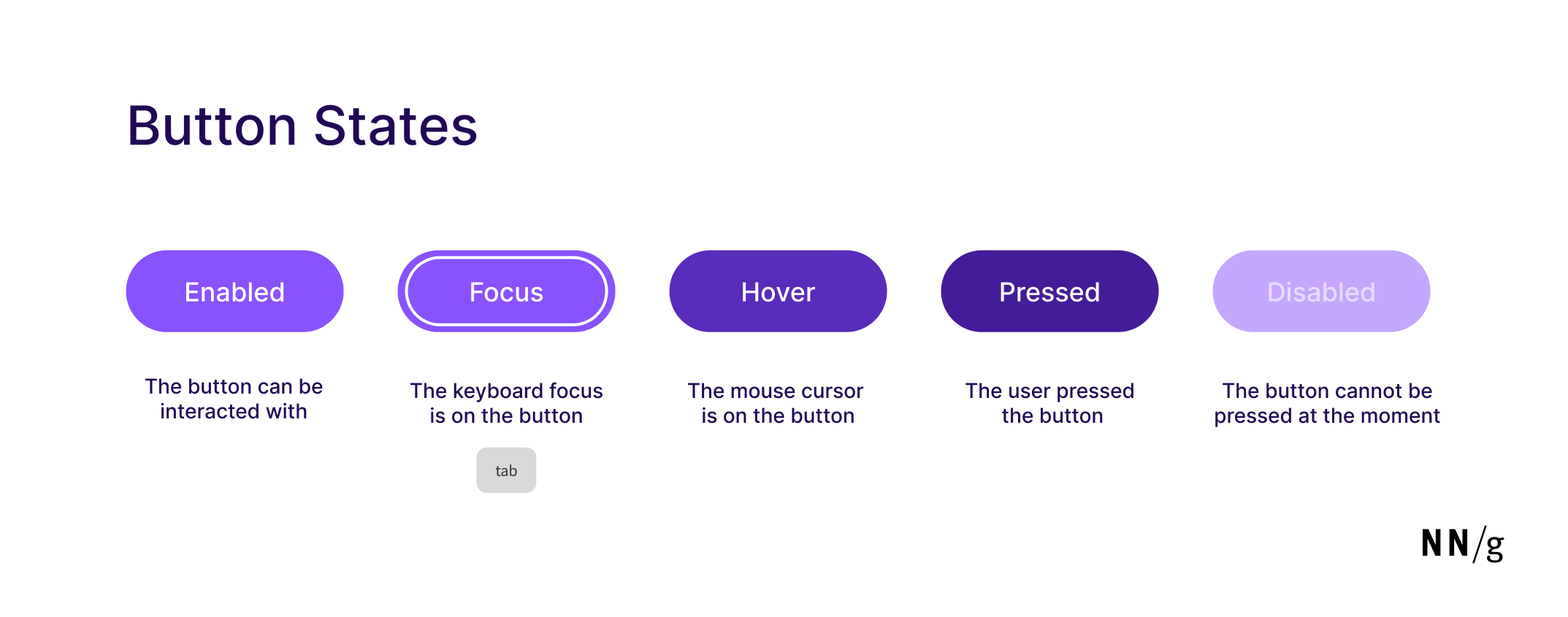
Button States: Communicate Interaction
Summary: Minor visual changes help users distinguish between 5 different button states: enabled, disabled, hovered, focused, pressed. Buttons are core user-interface elements that, when clicked or tapped, execute an action. When designed correctly, buttons set accurate user expectations and help them understand how to interact with the interface. In addition to clear button labels, effective… Continue reading Button States: Communicate Interaction
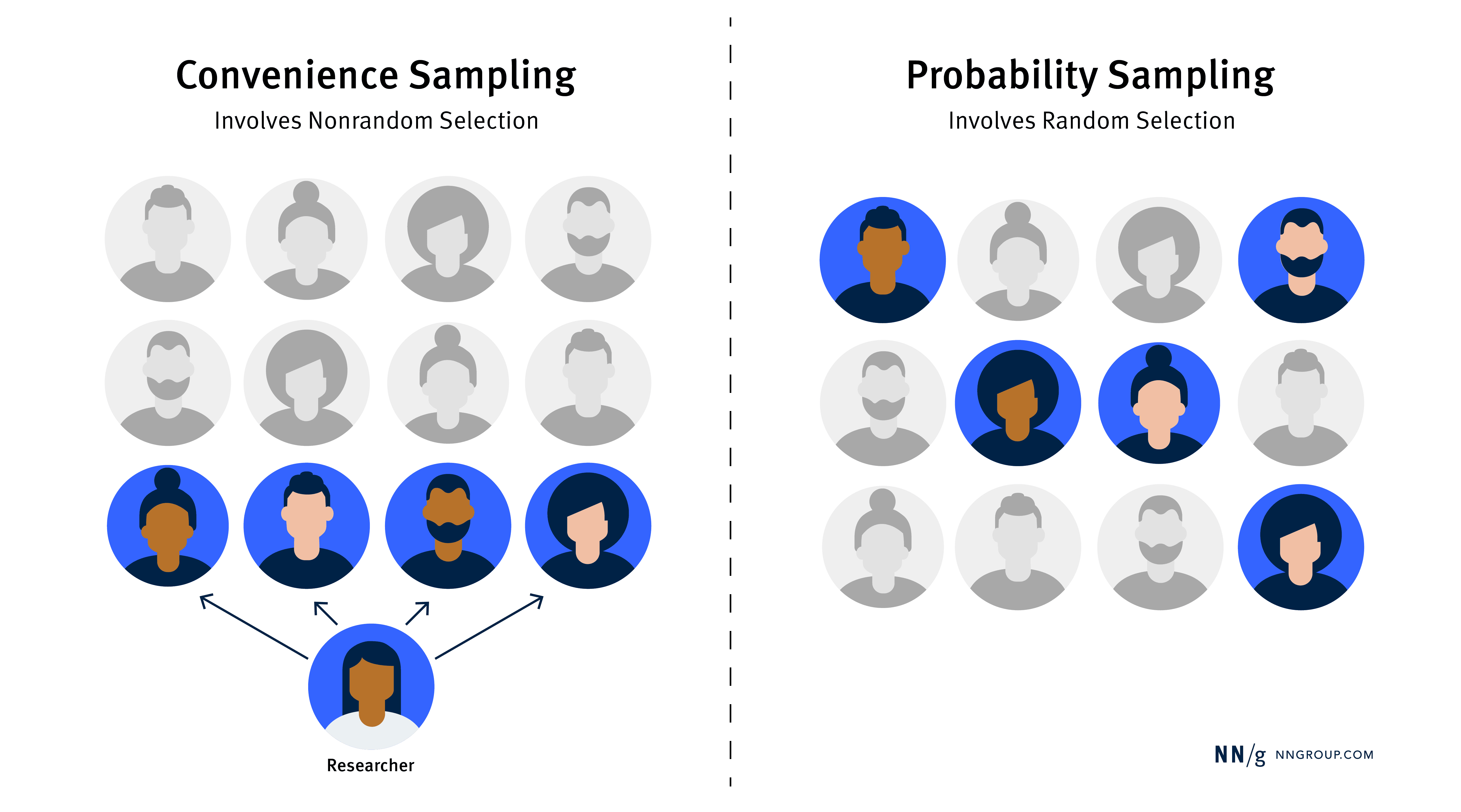
Convenience vs. Probability Sampling in UX Research
Summary: Convenience sampling is quick and cost-effective for UX research, but probability sampling is better when you need representative and generalizable data. When conducting UX research, choosing the right sampling method can ensure that your findings are both useful and reliable. Most UX practitioners use a sampling method called convenience sampling: recruiting participants based on… Continue reading Convenience vs. Probability Sampling in UX Research
Tools of the trade: Getting started with accessibility
I recently gave a talk called “Tools of the trade: Accessibility without the cost” to Accessibility NYC (a11yNYC) in Lower Manhattan. The session focused on accessibility tools—which ones to invest in, how to get the most out of them, and when to consider paid features. In this post, I’ll recap some of the insights I… Continue reading Tools of the trade: Getting started with accessibility

