Summary:
Use the EAS framework — Eliminate first, Automate where possible, and Simplify what remains — to minimize user effort and improve form completion rates.
Filling out a form is rarely anyone’s idea of fun. Users are goal-oriented — they want to accomplish their goals quickly and efficiently. The more effort a form demands, the more likely users are to abandon it midway. Yet, simplifying a form isn’t just about reducing the number of fields. Sometimes, longer forms are necessary to collect essential information. The key is to balance the organization’s information needs with users’ desire for simplicity and efficiency.
There are two ways to improve form usability: make users do less and make what they do easier. In this article, we focus on the first approach — minimizing user effort so they are more likely to complete your forms.
The EAS Framework
The EAS framework — Eliminate, Automate, Simplify — is a structured approach to reducing user effort and increasing form-completion rates. By focusing on efficiency, this method helps streamline forms without sacrificing essential information.
Here’s how it works:
- Eliminate first: Remove questions that are nonessential, nonurgent, or irrelevant.
- Automate where possible: Minimize manual input by leveraging existing or inferable data.
- Simplify what remains: Speed up input with helpful defaults, alternative input, and smart formatting.
In the following sections, we break down each step with practical strategies and real-world examples to help you design effective and efficient forms.
Eliminate First
Building a good form is like managing a bank account of trust. Every question is a withdrawal, and if you ask too many — or ones that feel unnecessary or intrusive — you risk overdrafting trust and losing the user altogether.
Users are more likely to complete forms that feel quick and efficient. The fewer fields they see upfront, the lower the perceived effort. Forms should only ask for essential information — if a question isn’t critical or relevant, eliminate it.
Cut Unnecessary Questions
Begin designing each form by gathering information requirements from stakeholders, clarifying goals, and researching user needs. Stay open to ideas in the early stages — collect input, evaluate suggestions, and make informed decisions about what information is necessary.
Then, organize all the information needs into a prioritized list to identify the core questions necessary for the task. Ask yourself:
- Why is this information needed?
- How will the data be used?
- How does the information support user or business goals?
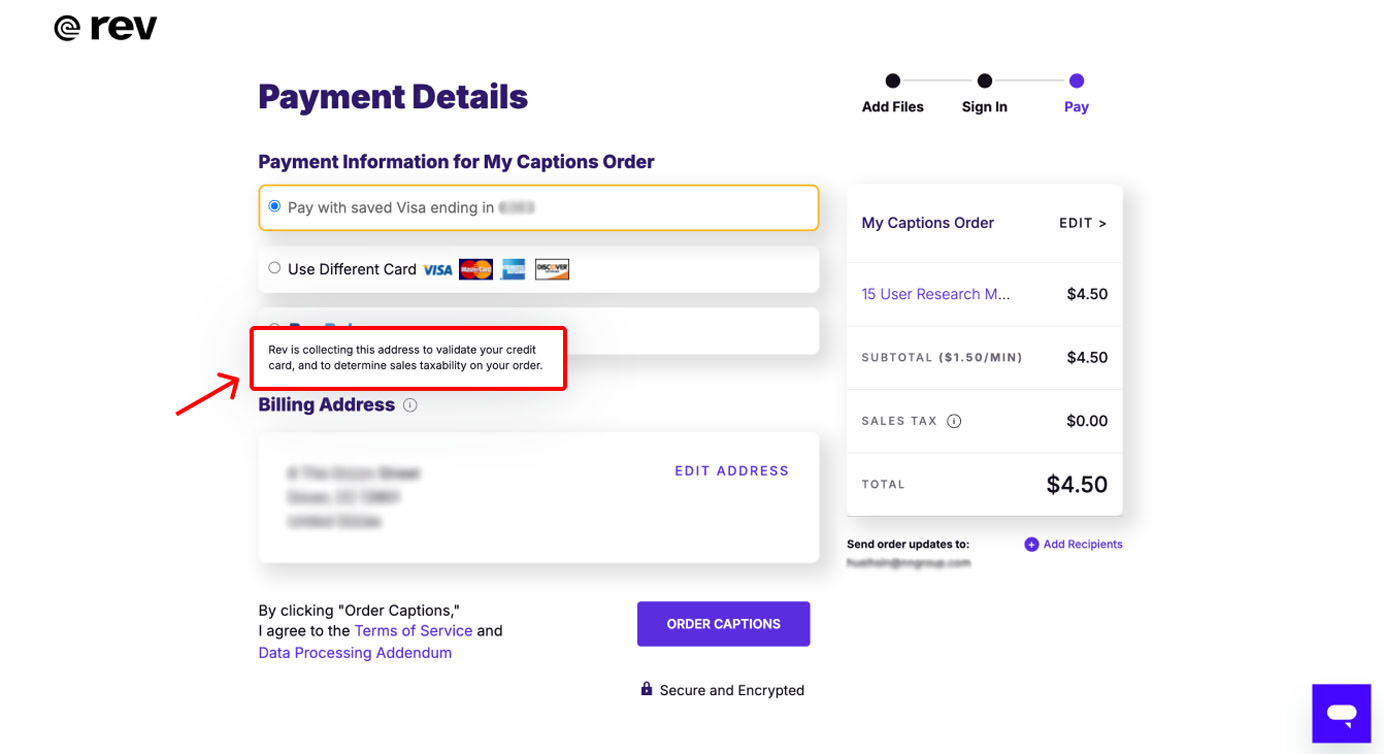
Answering these questions may require tracking down the specific department or people requesting the data to discuss its intended use. If there’s no clear or practical use for the data, reconsider collecting it. Asking for unnecessary information increases user effort and can cause users to question your intentions.
To determine if a question is essential, consider how you would justify it to users — especially if the question is unexpected or sensitive. A simple, clear explanation reassures users, builds trust, and helps them understand the rationale behind each question. Users will be more likely to complete the form when they understand how their data will be used.
If you are unable to provide a good reason for collecting a piece of information, then this question shouldn’t be included in the first place.
Deprioritize Nonurgent Questions
Not every question needs to be asked immediately. Before adding additional questions to your form, ask yourself, “Do we need this information now?” If it can wait, postpone it.
Instead of trying to get all the data you need at once, prioritize and layer your requests. Start by asking for the bare minimum needed at this stage, then gradually request more, to avoid overwhelming users upfront.
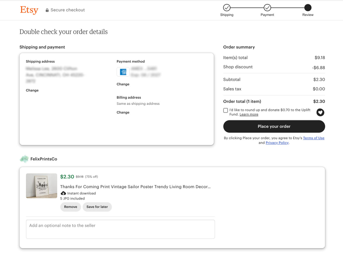
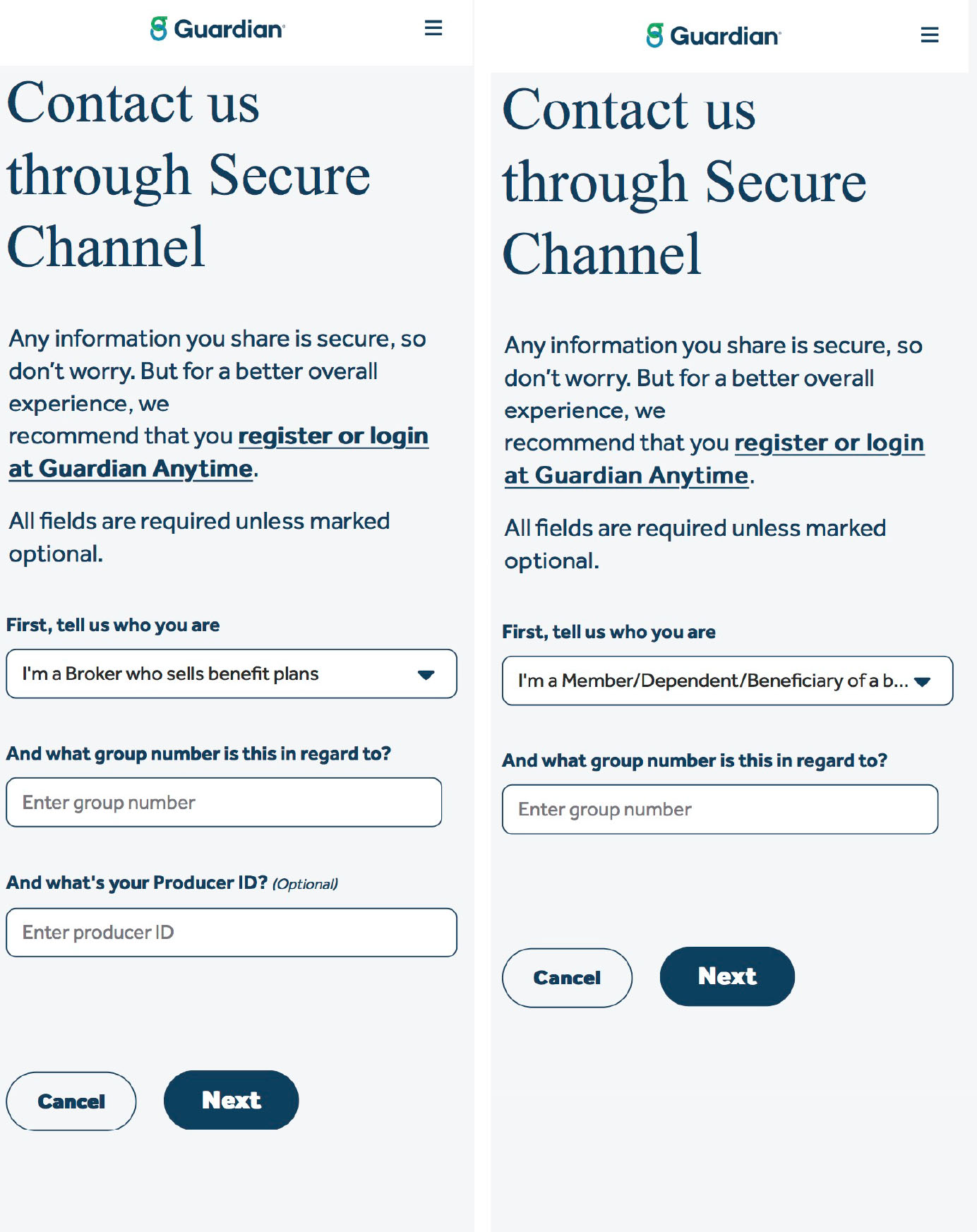
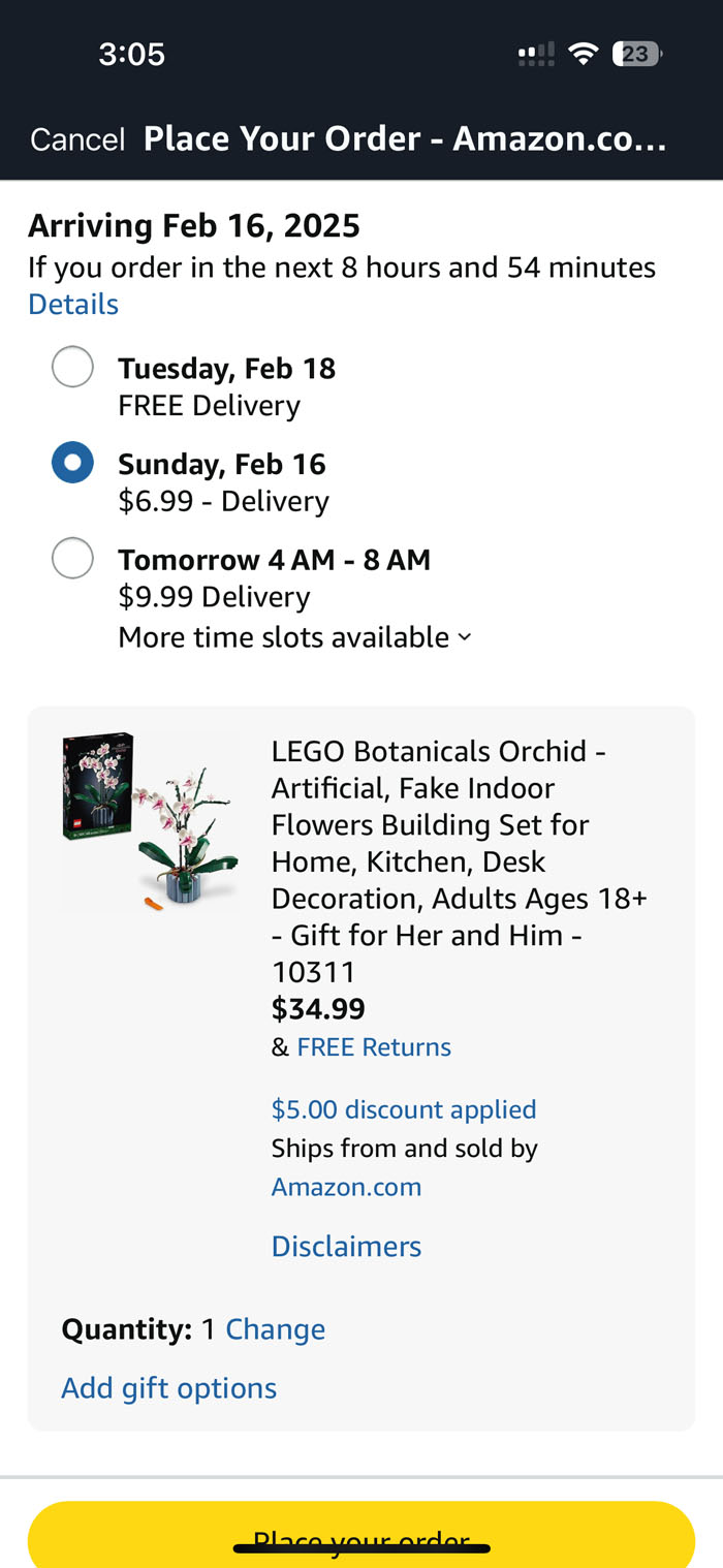
Keep the reciprocity principle in mind — once you’ve established a strong foundation of trust, users will be more open to providing additional information. The login wall commonly violates this principle by asking users to log in or register before proceeding to the main content. It forces people to spend time and effort before they know whether it’s worth it. Unsurprisingly, it often causes users to abandon the site before learning of its offerings. For example, some ecommerce sites require account creation during checkout, assuming they will save users time by reusing stored information like addresses and payment details. However, the added login or account-creation fields are often considered irrelevant to users at this stage and distract from their primary goal of completing the purchase.
A better implementation is to allow the user to check out as a guest and postpone password creation to the confirmation page, after they placed the order. This approach keeps users focused on their goal and makes them more likely to create an account.
Implement Conditional Logic
Avoid asking users questions that don’t apply to them. Use conditional logic to guide users down different paths based on their answers and keep each path as short as possible. If most of your questions are conditional, place the key branching questions early on to direct users to the right branch from the start.
Automate Where Possible
Manually entering data is slow and prone to errors. Instead of putting this burden on the user, let technology do the work whenever possible. Use automation to prefill or suggest inputs and save users from tedious, repetitive work.
Reuse Existing Data
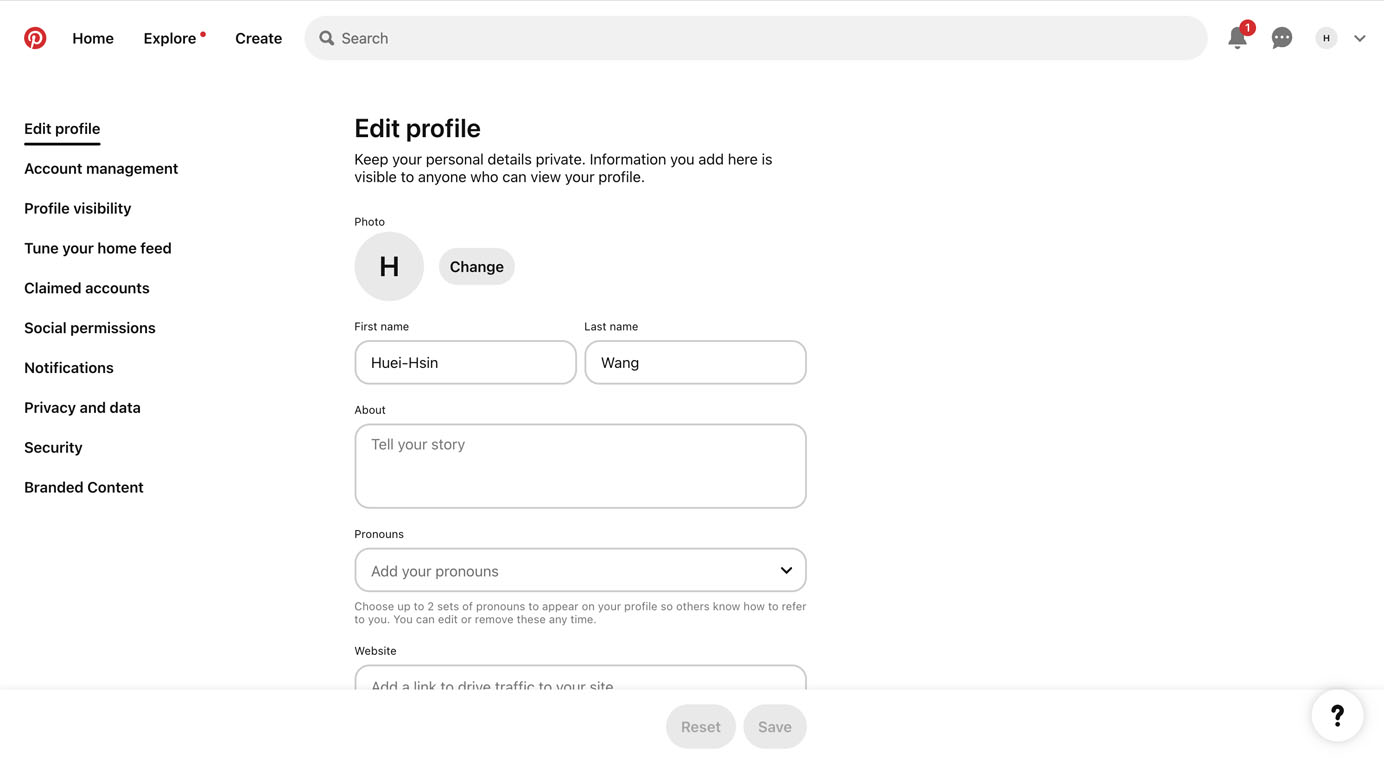
Don’t ask users for information you already have. If your organization has access to existing data — either from integrations or prior user submissions — use it to prefill form fields and allow users to verify or update the information as needed. This approach reduces user effort and minimizes the risk of collecting duplicate data.
Despite the benefits of reusing data, some organizations choose to ask users for additional input to avoid the technical challenges of retrieving data from their systems. However, investing in a single source of truth offers significant long-term benefits. For example, when users manually reenter addresses, small variations can lead to duplicate records if the system fails to detect overlaps, causing inefficiencies and potential errors down the line.
When designing recurring actions for returning users, consider offering an opt-in option to save their input for future use. Always respect user preferences—never assume or automatically store personal information like payment details or addresses without explicit permission.
Infer Data Instead of Asking
Instead of asking users to provide information that can be easily inferred, use automation to streamline the process. For example, derive the city and state from a ZIP code or calculate age based on a birthdate. Doing so reduces redundant work, speeds up form completion, and lowers the chances of input errors.
Simplify What Remains
If you can’t remove the question entirely or eliminate the need for user input, the next best option is to minimize the effort needed to answer it.
Offer Helpful Defaults
Defaults simplify decision making by providing users with a solid starting point. They are especially helpful when a certain option is commonly chosen or when users need guidance in making a selection.
But be careful: users rarely change defaults. A poorly chosen default can feel pushy, intrusive, and lead to errors.
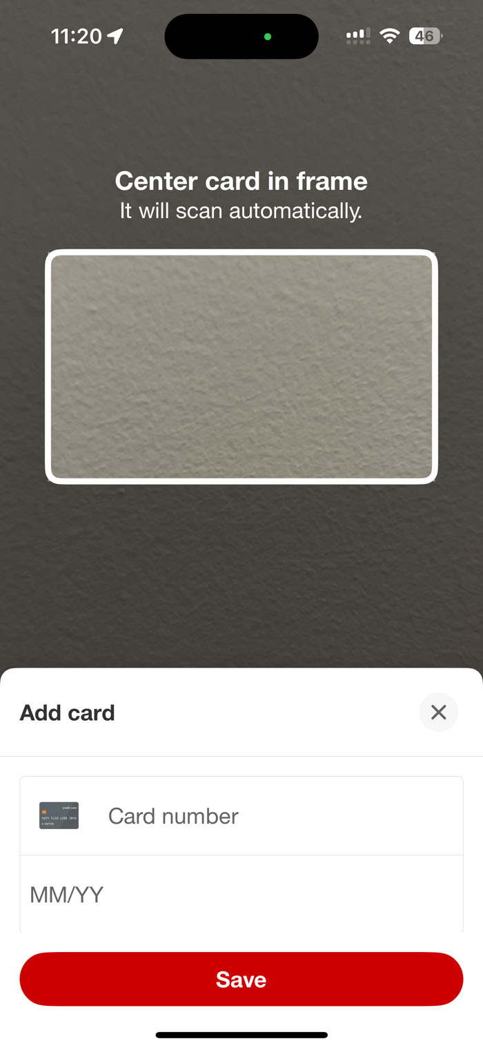
Leverage Built-In Mobile Features
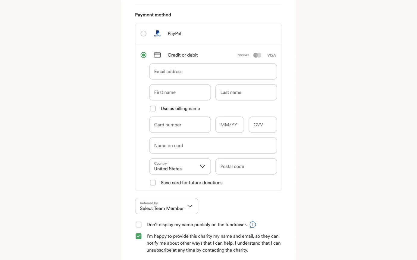
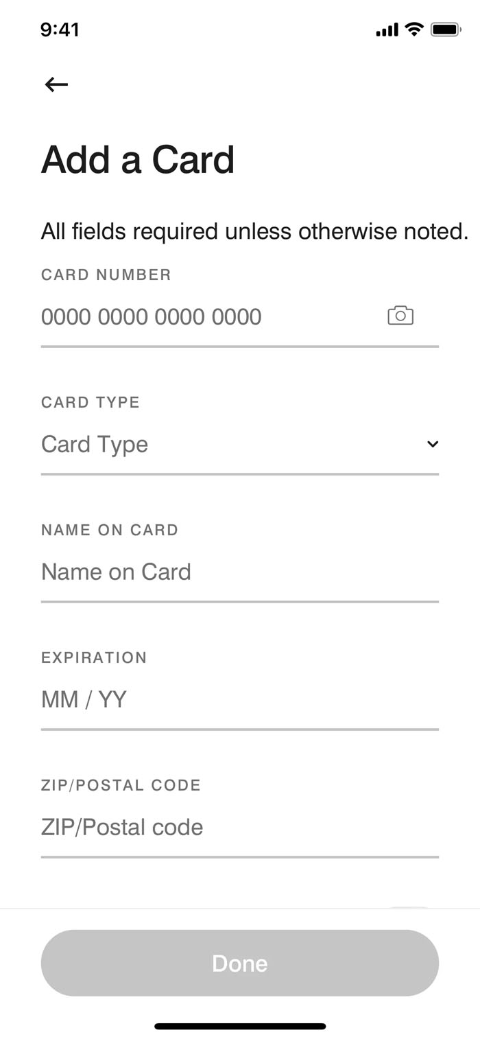
Typing on small screens is difficult. Minimize this effort by leveraging built-in mobile features: use the camera to scan credit cards or IDs, GPS to autofill locations, and voice input as an alternative method. The less users have to type, the easier — and more likely — they are to complete the form.
Be Flexible with Formatting
Some tasks require users to enter data like phone numbers, dates, or addresses in a specific format. But rigid formatting rules increase effort and the chance of errors.
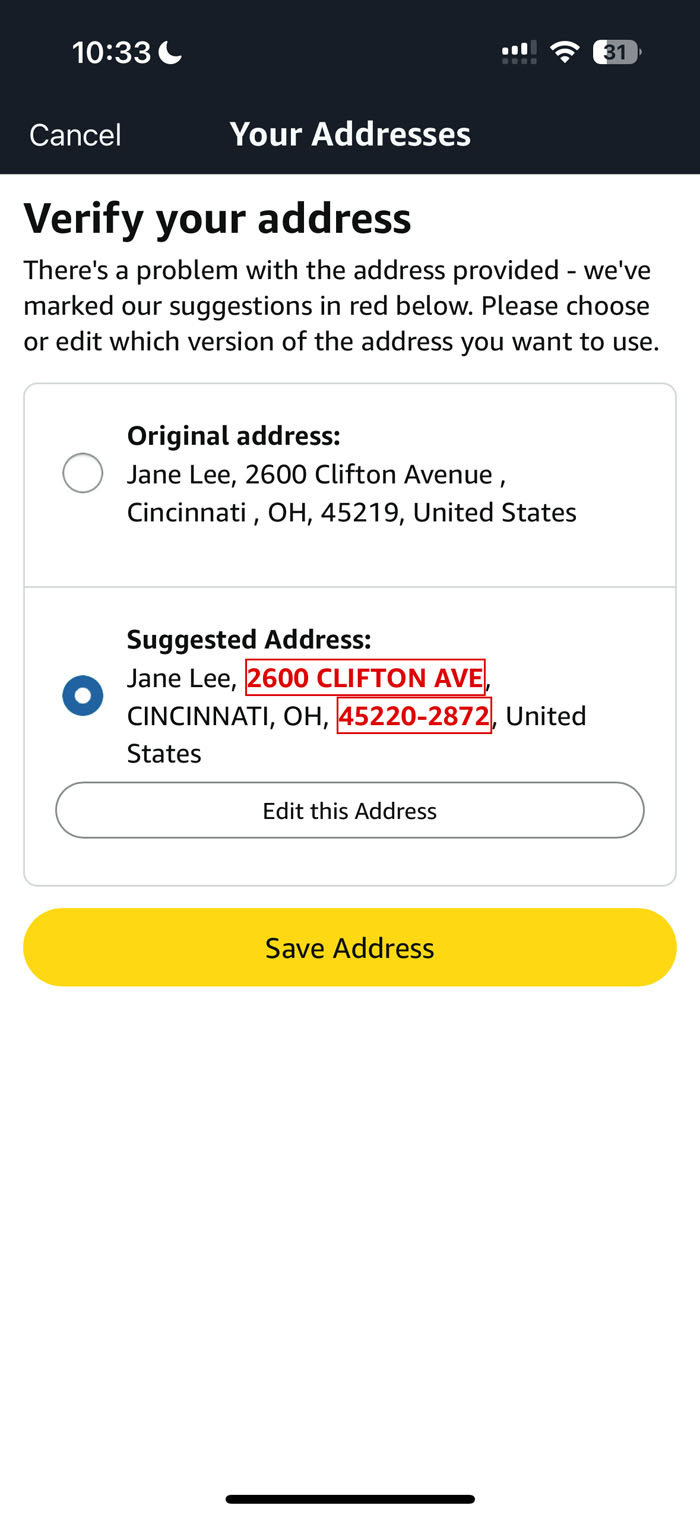
Instead of forcing users to conform to strict input rules and match your system’s expectations, clean up their input behind the scenes by removing unnecessary characters like parentheses or extra spaces, so they can focus on providing information, rather than worrying about the exact formatting.
When formatting adjustments require user confirmation, present a side-by-side comparison of the original input and the suggested format, allowing users to quickly review and approve the change.
Another way to help users with formatting is to use input masks that structure their input as they type. The form automatically adds spaces, parentheses, or hyphens where needed, while ignoring unnecessary characters. Input masks help users understand the correct format, prevent errors, and make it easier to doublecheck their input.
Summary
Forms shouldn’t feel like a chore — but too often, they do. When a form is long or demands too much effort, users abandon it. Every extra field increases the chance they’ll give up. So, use the EAS framework — Eliminate first, Automate where possible, and Simplify what remains — to ensure your forms focus on what truly matters, minimize effort at every step, and support users from start to completion.