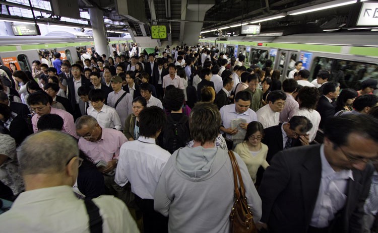
People push past me as I exit the train at Shibuya station, and I start looking for the Hachiko statue. My friends told me to meet there before dinner, but ten minutes later I’m still lost. Thankfully once I slow down and look at my surroundings, I see guides all around me. At its size and complexity, Tokyo is easy to get lost in. But with well-designed navigational aids, you can get un-lost quite easily.
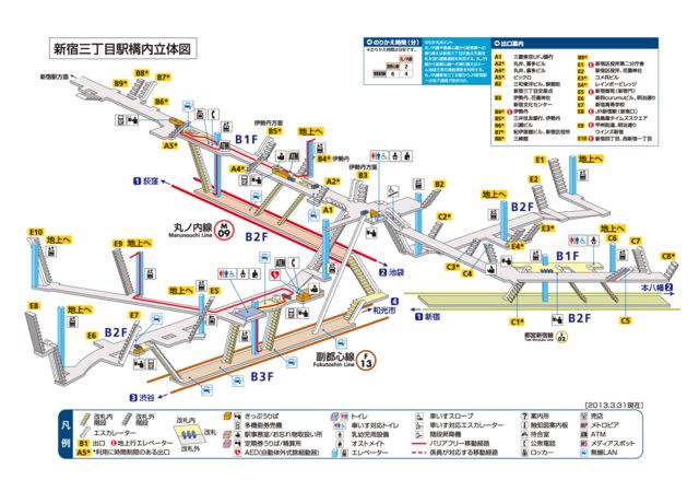
Progressive Disclosure of the Station Guides
When you’re in a train approaching a station, a screen above the door tells you several things. Firstly, it tells you what side will open. This helps a packed train of people orient themselves in the right direction. This shuffling of people notifies others around them to move if they are not leaving.
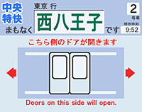
TBH I can’t read all the characters, but I still know what it’s telling me.
The sign also confirms the station, so you know you’re at the right place. Below the station name, it displays a diagram of where you are in the train and it tells you where your position in the train relates to key features of the station.
Stairs, escalators, elevators, and the direction of the train’s movement! So useful.
Knowing what you will be near when you arrive at a station is a common problem where I live in San Francisco. I always get off past the stairs and then have to search for them.
By telling you the information immediately important to you, this sign helps to prevent such confusion.
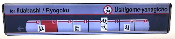
Once you exit the train, you see signs that provide even more directions.
Top: elevator and help; middle: major station features and exits; bottom: exits and destinations.
This sign tells you:
- Where to find assistance and where to find the elevator
- Your location in the station and how to reach other lines
- Main destinations and what exits are closest to them
Progressive Disclosure is the idea that when a user is learning about a new product, you don’t explain or show everything at once. You only explain what’s immediately relevant to the user, and progressively disclose the full product. Together, these signs expand an understanding of commuters’ world: from the train car you’re in, to the train’s position in the station, to the station’s position in the larger world. By disclosing the station at the scale appropriate for the user, it makes learning about the station more manageable.
But, stations are still really complicated.
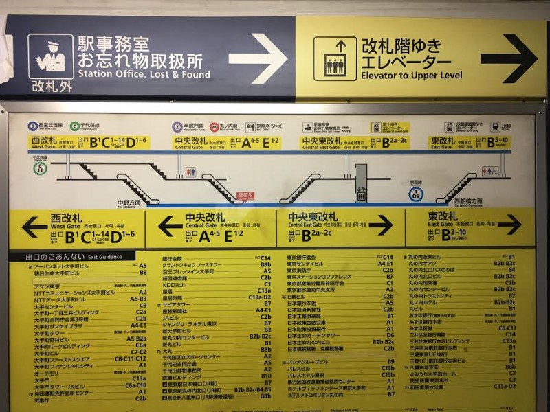
The shortcoming of the sign above is that stations can be really complicated. When you have multiple platforms crossing each other at different angles, a cross-sectional view is not enough. To further assist in understanding the station, pamphlets are available with isometric diagrams of stations.
This is so much. This is so much.
This pamphlet feels like a good idea, but looking at it is kind of overwhelming. There is so much information presented, it’s difficult to locate your position and know where to go. Instead, they should have built navigation directly into the station. I saw a great example of this at the Yahoo! JAPAN office.
Match between System and the Real World at Yahoo! JAPAN
The Yahoo! JAPAN office is large, just like the subways. I got lost several times in it until I realized what the markings on the floor meant. When you exit the elevator, you see this on the ground.
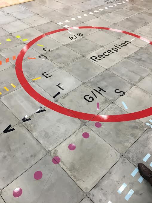
Reminds me of train lines.
So there’s a circle, and lining the inside of the circle are letters with paths extending from the letters. Each letter represents a set of rooms, and each path has its own color and patterns. By following a path, you can reach the corresponding set of rooms. So say you want to find room F7. If you follow the black v’s, you will find F7.
I think what works well about this is that the navigational aid doesn’t require you to mentally project a model of the space onto your surroundings. Instead, it provides concrete directions on what to do.
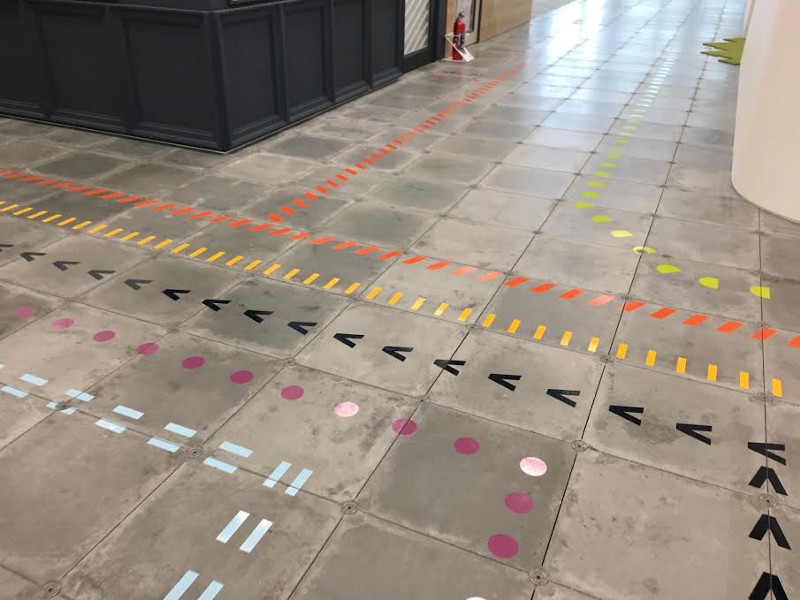
Only problem is when a path splits in two. Which one to go down?
So, one could imagine a similar set of paths in a station leading from each platform to other platforms. However, stations are crowded so you might want to put the paths on the ceiling. This way, they’re always visible and they don’t get removed by the daily onslaught of feet.
With these navigational aids combined, you could have navigation that takes you all the way from inside a train car to the proper exit. It’d be so great! You can have dinner with your friends, stuff your face with chicken sashimi, and guzzle Kirin Ichiban — all without getting lost in the station! This is the future that’s possible with well-designed navigation.
In your experience, what are other examples of well-designed pedestrian navigation?