The lch() color function allows you to pick colors from the CIELAB color space, which is device-independant and covers the entire gamut (range) of human color perception. Currently, the CSS colors we can define are in the sRGB color space. For the longest time, professional monitors weren’t able to display all possible colors in this… Continue reading Day 93: the lch() color function
Tag: color
Top 10 AI Logo Design Tools in 2026
Artificial intelligence has changed the way people create logos. A few years ago, designing a business logo usually meant hiring a designer or spending hours learning graphic design software. Today, AI logo design tools can generate dozens of logo ideas within seconds, making the process much faster for startups, freelancers, and small businesses. The best… Continue reading Top 10 AI Logo Design Tools in 2026
The Core Skill of Design in the AI Era: Critique
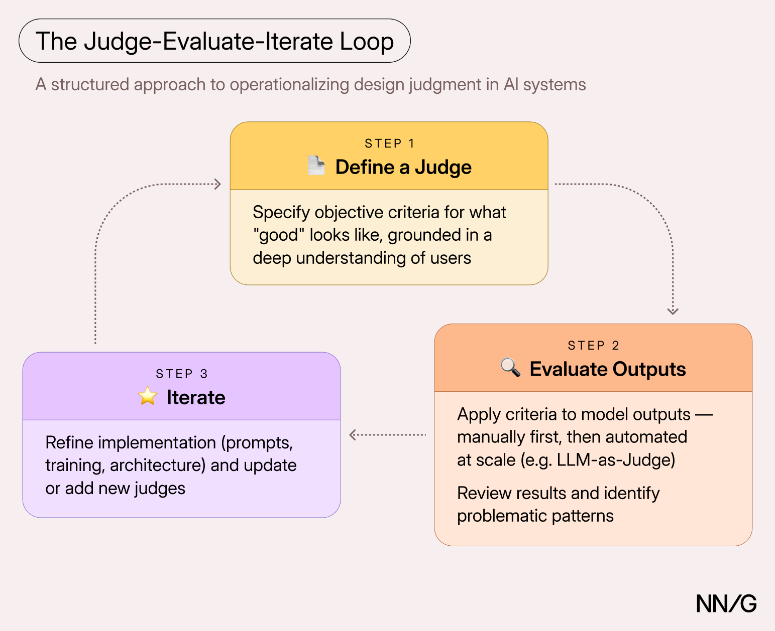
Summary: To build useful and usable AI-powered systems, our understanding of users’ needs and our design judgement must be encoded into well-defined evaluation criteria. Design Decisions in Generative AI Systems Imagine asking a large language model a question like “How’s the weather today?” The response might include too much information (“it’s 72 degrees, and it… Continue reading The Core Skill of Design in the AI Era: Critique
Syntax podcast episode 623: “Nothing in CSS” errata
I just listened to the Syntax podcast for the first time because they were discussing topics near and dear to my heart, HTML and CSS. The episode is called “Nothing in CSS – 0 vs 0px, no, none, hidden, initial and unset”, and they’re talking about all the things that can be 0, none, or… Continue reading Syntax podcast episode 623: “Nothing in CSS” errata
Pros and cons of using Shadow DOM and style encapsulation
When I started to work with web components, I compared different options and decided to go with lit. I knew the extra performance cost would pay off quickly, and it fit into my performance budget. I’m still happy with my decision. .pro { color: green; } .con { color: red; } I was new to… Continue reading Pros and cons of using Shadow DOM and style encapsulation
What Makes a Logo Memorable? (Psychology + Examples)
Every brand needs a logo, but not every logo gets remembered. You have probably seen thousands of logos, on packaging, apps, storefronts, social media, and most of them left no impression at all. That is not because the designers were careless. It is because designing a logo that actually sticks in someone’s memory is harder… Continue reading What Makes a Logo Memorable? (Psychology + Examples)
What Are Brand Guidelines? Complete Guide + Examples & Tips
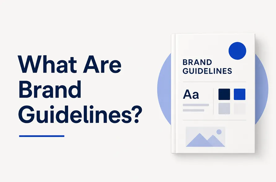
If you have ever seen a company use three different shades of blue on their website, their packaging, and their social media, you already know what happens when a brand does not have guidelines. Brand guidelines are a set of rules that tell everyone how a brand should look, sound, and feel. That is it.… Continue reading What Are Brand Guidelines? Complete Guide + Examples & Tips
Usability, accessibility, and the human-AI paradigm
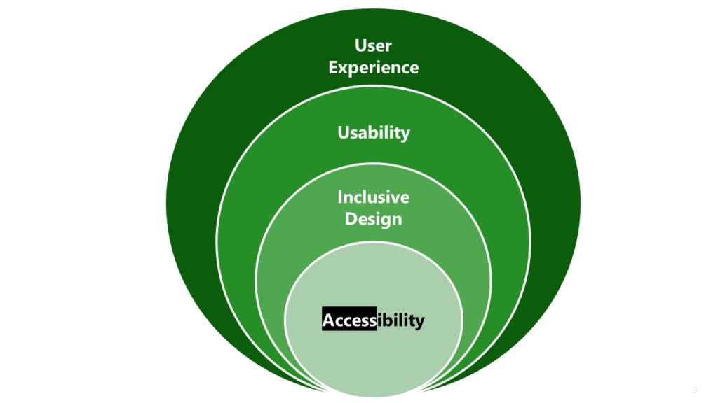
The divergence between usability and accessibility in the age of AI and vibe coding Usability and Accessibility Today, during what began as a routine discussion on accessibility with my Project Manager, the conversation took an unexpected turn. She suddenly looped in a senior member of the development leadership to “help move things forward.” In the middle… Continue reading Usability, accessibility, and the human-AI paradigm
New Free Mockup Templates (20+ Mockups)
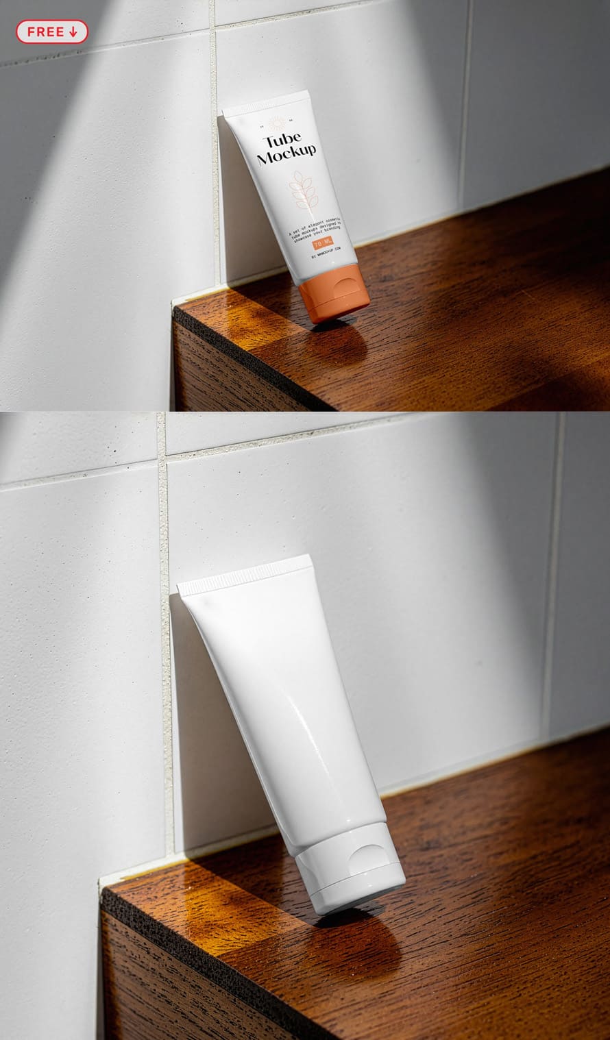
New free mockup templates are very useful for designers who want to show their work in a clean way. A free mockup helps you place your design on real items like posters, phones, or boxes. Many psd mockups come with smart objects, so you can add your design in seconds. You just open the file… Continue reading New Free Mockup Templates (20+ Mockups)
Handmade Designs: The New Trust Signal
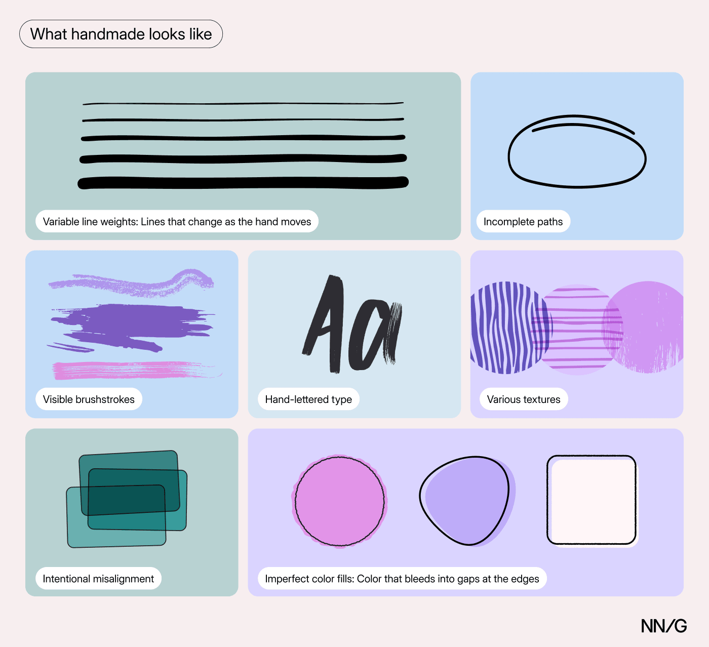
Summary: In an era of AI-generated-everything, AI-fatigued users want designs that look like they were made by a person. People are buying vinyl, dusting off their wired headphones, shooting on film, and opting for things that are slower. Digital fatigue and AI fatigue are changing what resonates, and audiences are gravitating towards designs that look handmade. The Shift… Continue reading Handmade Designs: The New Trust Signal
Good Visual Design, Explained
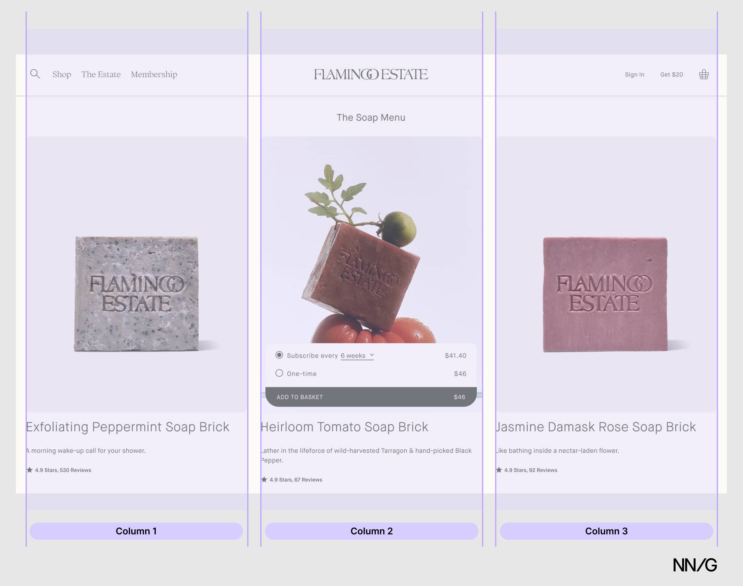
Summary: To create appealing designs, align type and elements to a grid, build a clear visual hierarchy, use color intentionally, and stay consistent with every design choice. In this 3rd article in the anatomy-of-good-design series, I explain visual-design principles that contribute to good-looking designs, with real-site examples. How something looks does affect the perception of… Continue reading Good Visual Design, Explained
Good from Afar, But Far from Good: AI Prototyping in Real Design Contexts
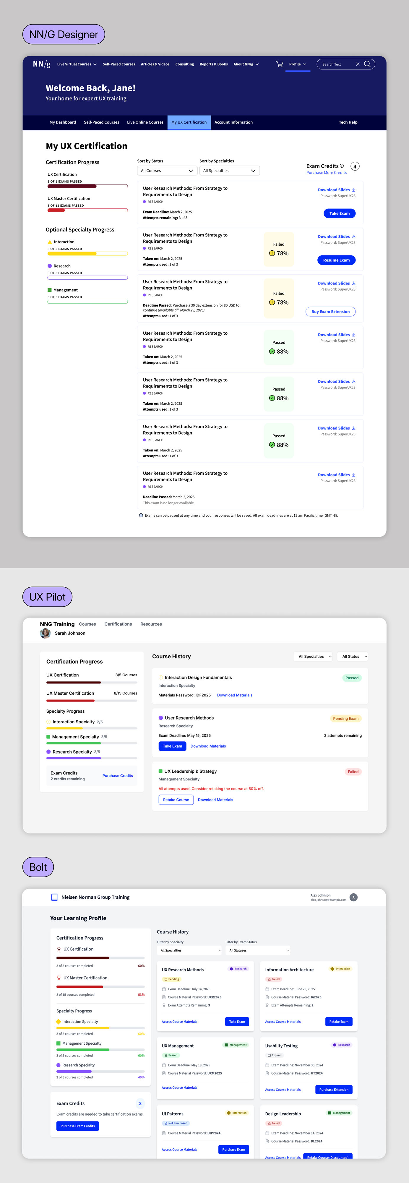
Summary: AI prototyping tools follow general directions but lack the judgment and nuance of an experienced designer. Over the past few months, the UX design field has been flooded with AI-powered prototyping tools that generate interfaces instantly from natural-language prompts. Despite the massive marketing hype, our evaluation with real design scenarios revealed that these tools… Continue reading Good from Afar, But Far from Good: AI Prototyping in Real Design Contexts
Liquid Glass Is Cracked, and Usability Suffers in iOS 26
Summary: iOS 26’s visual language obscures content instead of letting it take the spotlight. New (but not always better) design patterns replace established conventions. With iOS 26, Apple seems to be leaning harder into visual design and decorative UI effects — but at what cost to usability? At first glance, the system looks fluid and… Continue reading Liquid Glass Is Cracked, and Usability Suffers in iOS 26
30 Creative Logo Designs – Inspiration #151
Creative logo designs has long been a central part of branding, with each mark aiming to represent values in a simple, direct way. A strong design emerges when ideas are translated into clean forms that can be easily remembered. Inspiration often comes from observing how skilled designers turn concepts into visual identities that carry both… Continue reading 30 Creative Logo Designs – Inspiration #151
Logo Designer vs. UX Designer: Exploring Roles, Skills, and Collaboration
Explore the creative relationship between logo designer and UX designer by understanding how their goals differ, how they overlap, and how you can benefit from knowing both roles, especially if you’re working on a product, brand guidelines, or interface. Many people confuse the two, but their responsibilities are not interchangeable. Learning the differences helps you… Continue reading Logo Designer vs. UX Designer: Exploring Roles, Skills, and Collaboration
DaVinci Resolve AI workflow: Smart editing, color grading, and audio enhancement
DaVinci Resolve is a bit of a video editing beast! And its latest AI features take things to a whole new level. This isn’t just basic automation, the AI feels like it actually gets what editors are trying to do. It cuts scenes, tracks movement, isolates voices, matches colors and all the stuff that usually… Continue reading DaVinci Resolve AI workflow: Smart editing, color grading, and audio enhancement
The relation between software quality and UX
[unable to retrieve full-text content] Does your company’s digital product have quality? The relationship between software quality and User Experience (UX), encompassing Human-Computer Interaction (HCI), is intrinsically related and fundamental to the success of any interactive product or software. While they might appear to be distinct disciplines, they are complementary and mutually dependent in creating effective,… Continue reading The relation between software quality and UX
Create a color contrast checker with HTML, CSS, and JavaScript
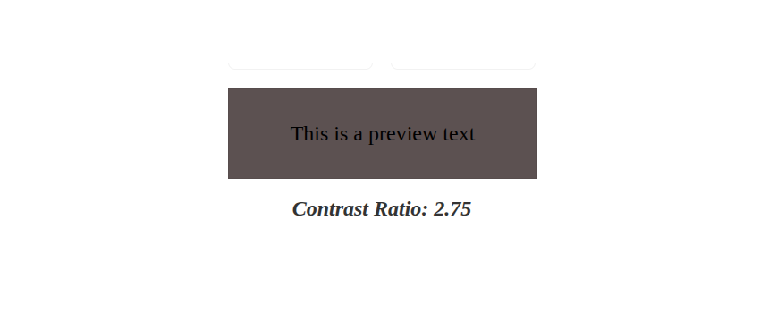
By “color contrast” we’re referring to the difference in brightness between foreground and background colors. In simpler terms, it defines how easy it is for the human eye to recognize text or images on a coloured background. The Web Content Accessibility Guidelines (WCAG) provide specific recommendations regarding color contrast for text to make web content… Continue reading Create a color contrast checker with HTML, CSS, and JavaScript
How Design Identity in Medical Devices Builds Trust
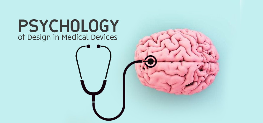
Design identity shapes how patients and healthcare professionals perceive medical devices. Colors, shapes, technical aspects, and testing influence trust in high-stakes environments where reliability is paramount. A well-designed device signals safety and competence, while a poor design can raise doubts about quality. In healthcare, where decisions impact lives, the functional design of medical devices plays… Continue reading How Design Identity in Medical Devices Builds Trust
50 Best Logos for Inspiration in 2025

Explore best logos for real-world inspiration. These logo designs show clarity, creativity, and function across industries. Learn what makes them work and how they communicate brand identity clearly. Use these examples to improve your own logo concepts and meet client needs effectively. Logo design in 2025 is driven by clear visual impact, simplified structure, and… Continue reading 50 Best Logos for Inspiration in 2025
Button States: Communicate Interaction
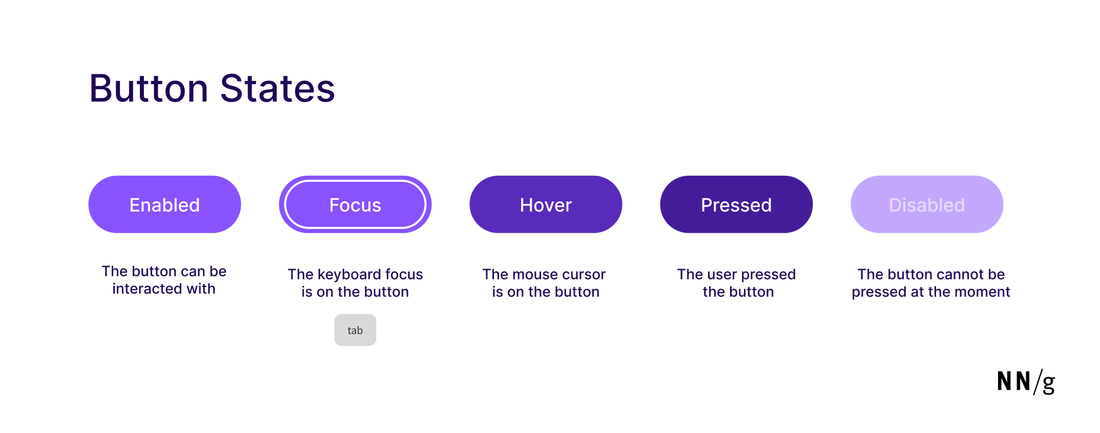
Summary: Minor visual changes help users distinguish between 5 different button states: enabled, disabled, hovered, focused, pressed. Buttons are core user-interface elements that, when clicked or tapped, execute an action. When designed correctly, buttons set accurate user expectations and help them understand how to interact with the interface. In addition to clear button labels, effective… Continue reading Button States: Communicate Interaction
Free Minimal Branding Stationery Mockup Set
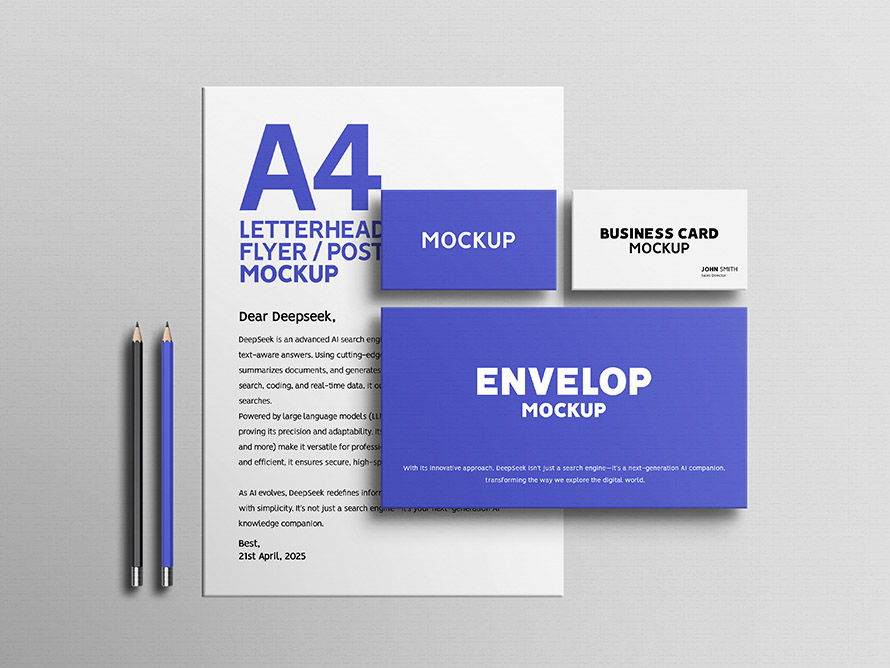
Free simple clean stationery mockup set – perfect for professional branding showcases. This free stationery mockup is the great solution for designers, creatives, and agencies aiming to present their visual identity work. Featuring high-resolution elements like letterheads, business cards, and envelopes, this stationery mockup set offers a realistic, minimalistic scene that highlights your logo and… Continue reading Free Minimal Branding Stationery Mockup Set
How to create cinematic visual effects with AI-powered video tools

This article is for beginners who want to explore how artificial intelligence powered tools can help create stunning video effects with AI, fast. Whether you’re a 3D artist, video editor, animator, or just someone curious about what’s possible, we’ll walk you through how it works, and how to use AI tools to make your videos… Continue reading How to create cinematic visual effects with AI-powered video tools
Visualize Your Brand with Modern Brand Guidelines Templates (20 Designs)
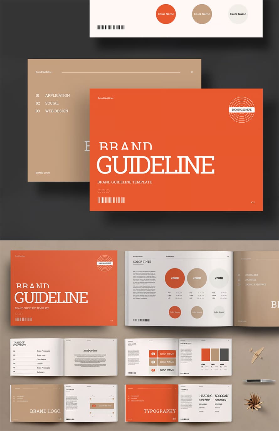
A strong brand identity starts with consistency, and brand guidelines templates make it easier to maintain uniformity across all platforms. These templates define your brand’s visual and messaging standards, ensuring that logos, colors, typography, and other design elements remain cohesive. Whether you’re a designer, business owner, or marketing professional, using professionally designed brand guidelines brochure simplifies… Continue reading Visualize Your Brand with Modern Brand Guidelines Templates (20 Designs)