Summary:
Use this glossary to quickly clarify definitions for key graphical user-interface elements and controls.
UX research and design require knowledge and understanding of many jargon terms denoting various UI components and controls.
Jump to a definition in the table or review the complete glossary.
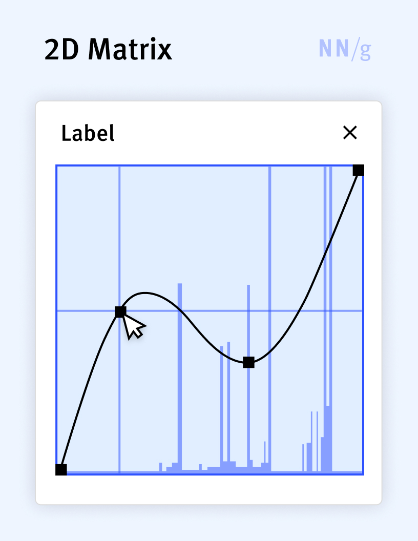
2D-Matrix Input Control
A specialized input control used primarily in complex applications to simultaneously modify multiple related parameters by drawing a complex curve. Interaction with this control typically occurs by clicking on a point on an existing curve, then dragging that point to a new location. 2D matrices are useful when there are two parameters that depend on each other (such as luminance and RGB curves in photo-editing applications) and that will typically be modified together.
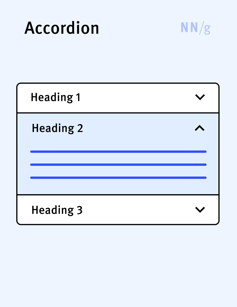
Accordion
A UI element that expands in place to expose some hidden information. Accordions are often used to compress content on a long page and are especially helpful on mobile. Accordions are usually represented by a label and an arrow or a plus sign.
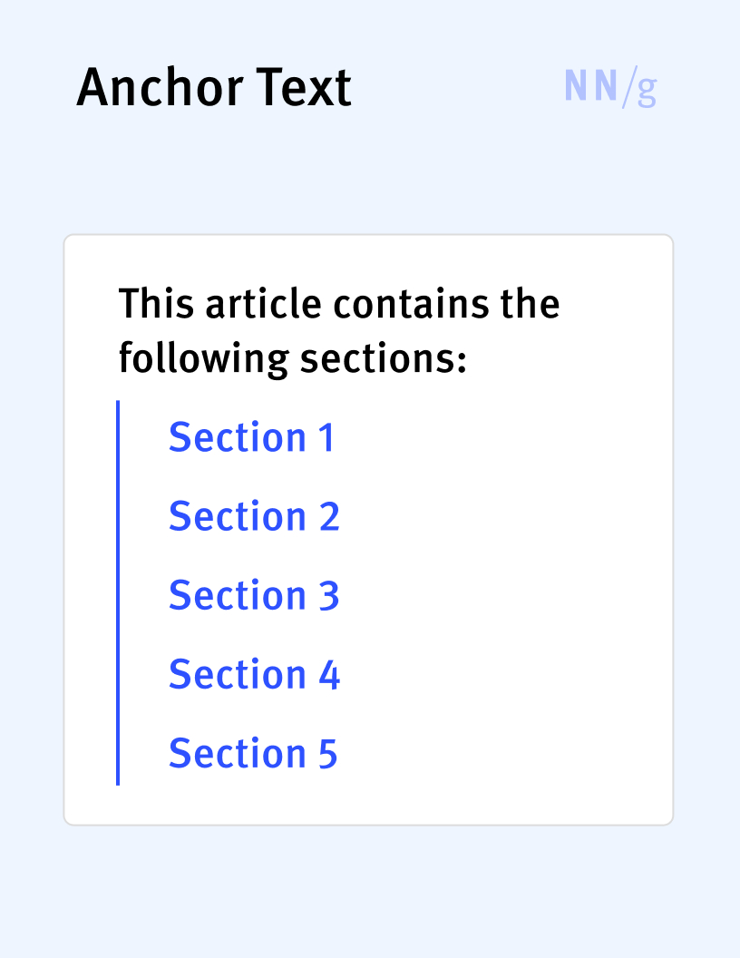
Anchor Link (In-Page Link, Jump Link)
A link that allows users to navigate from one location to another within the same page. Anchor links are often used to implement in-page tables of contents.
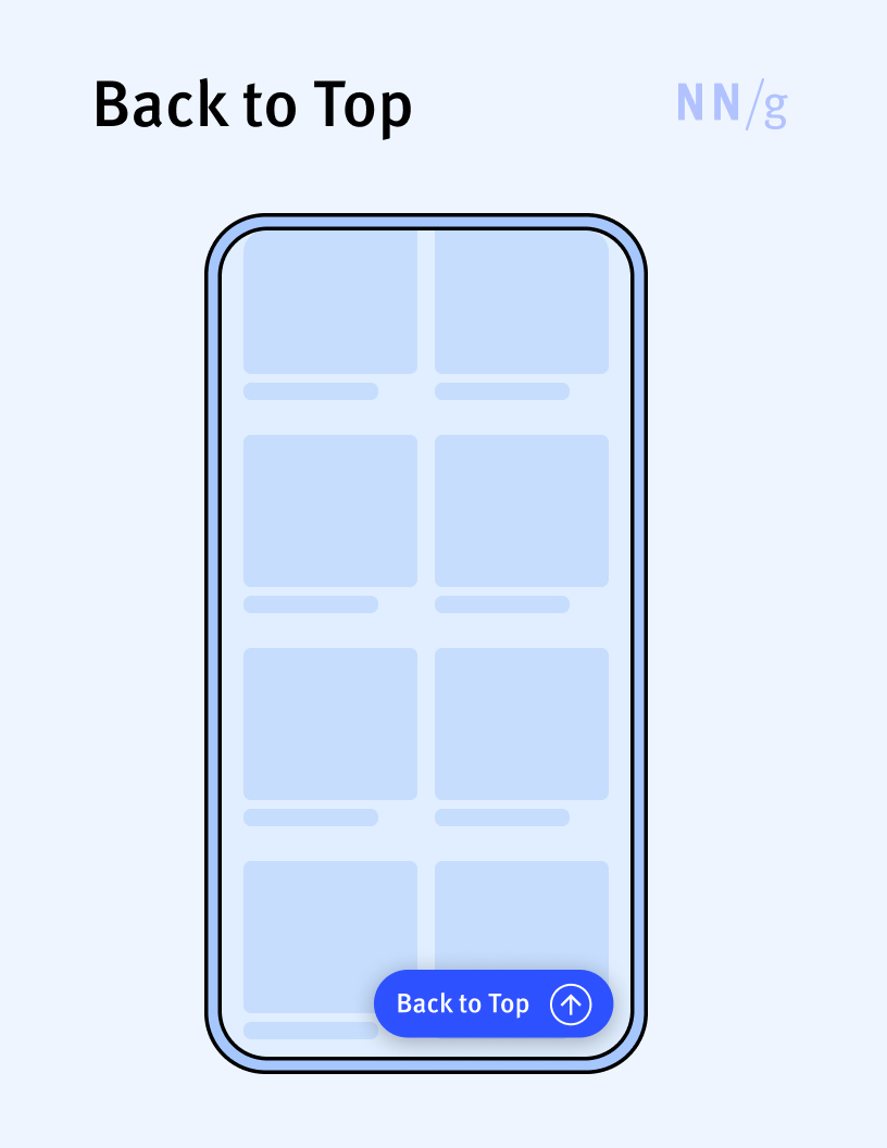
Back-to-Top Button
A button that takes users back to the top of the page, where usually the navigation UI or other important controls are placed. It is usually implemented as a floating button placed in the bottom right corner of the page and is particularly useful on long mobile pages.
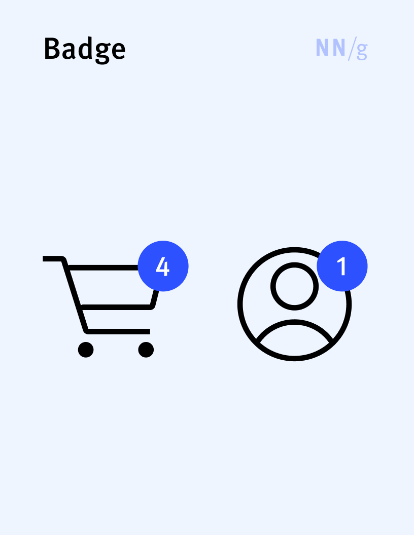
Badge
Indicates a notification (usually as a dot) or an item count (usually as a number). A badge usually appears on top of an icon (such as a shopping cart or messages icon) to direct attention to that element.
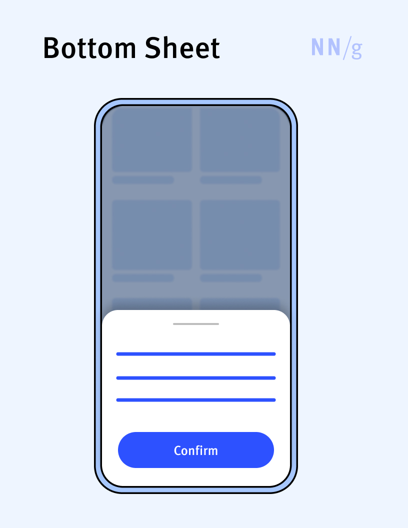
Bottom Sheet
An overlay that is anchored to the bottom edge of a mobile device’s screen and that displays additional details or actions.
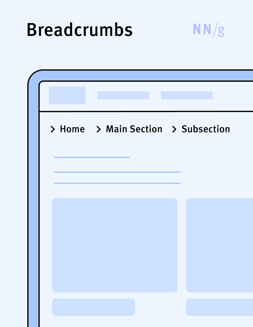
Breadcrumbs
A navigational element that displays a hierarchical sequence of categories (starting from most general to least general) that the current page belongs to, within the information architecture of a site. It is similar to a path in a file system.
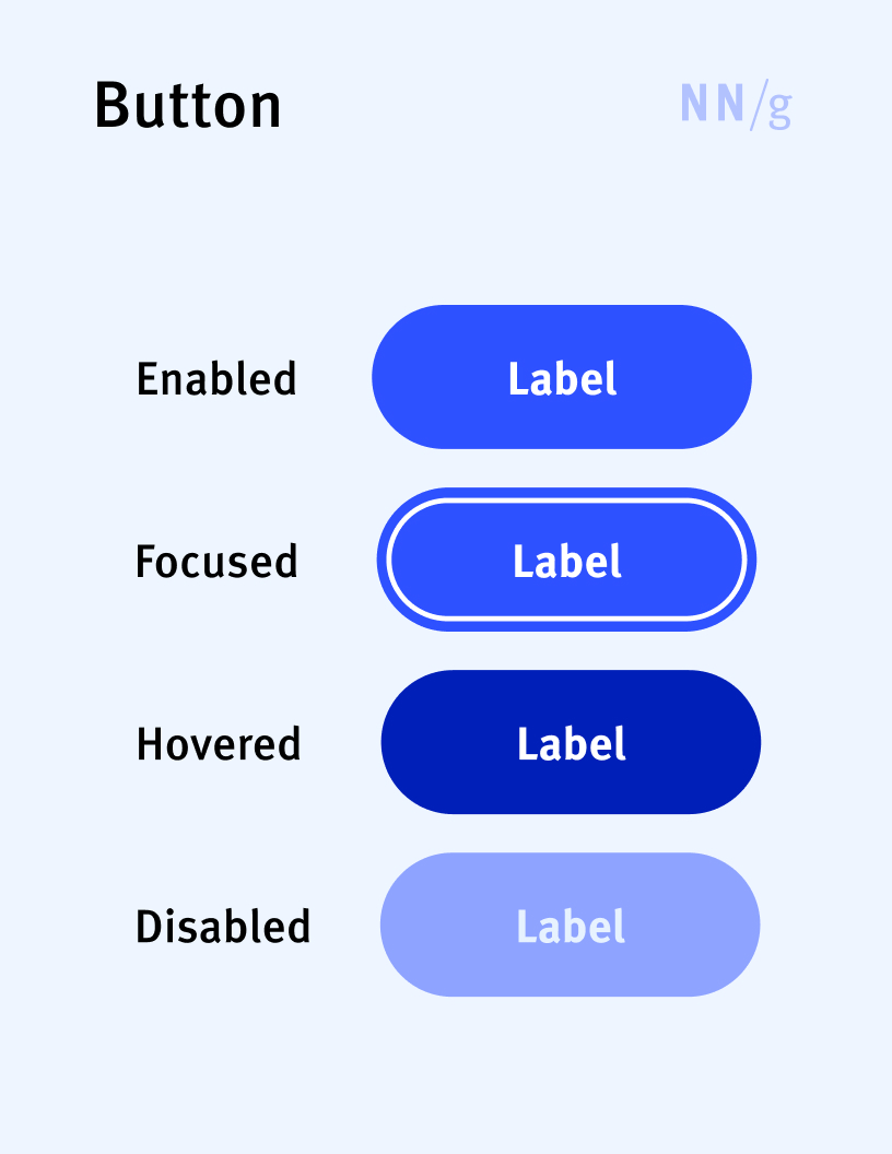
Button
A UI element that will execute a certain action (e.g., submit a form, start a process) when clicked or tapped by users. It is made of a clickable target area with a label that usually describes the action that will be executed. Digital buttons often resemble physical buttons.
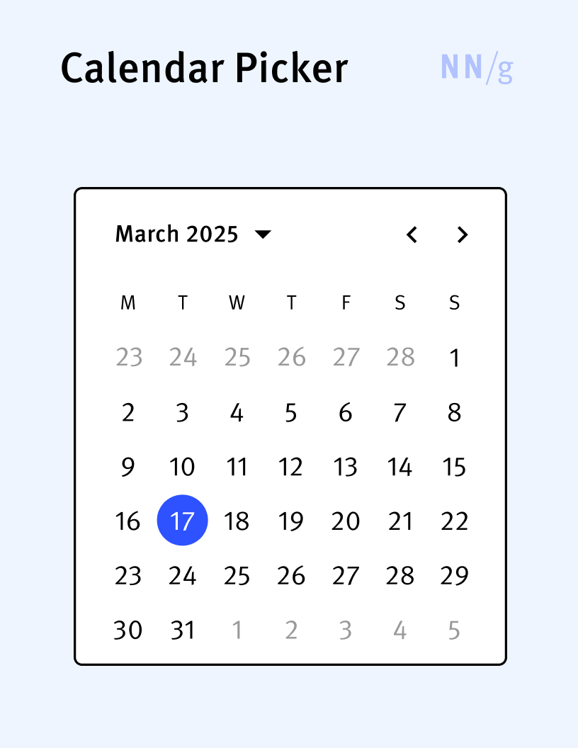
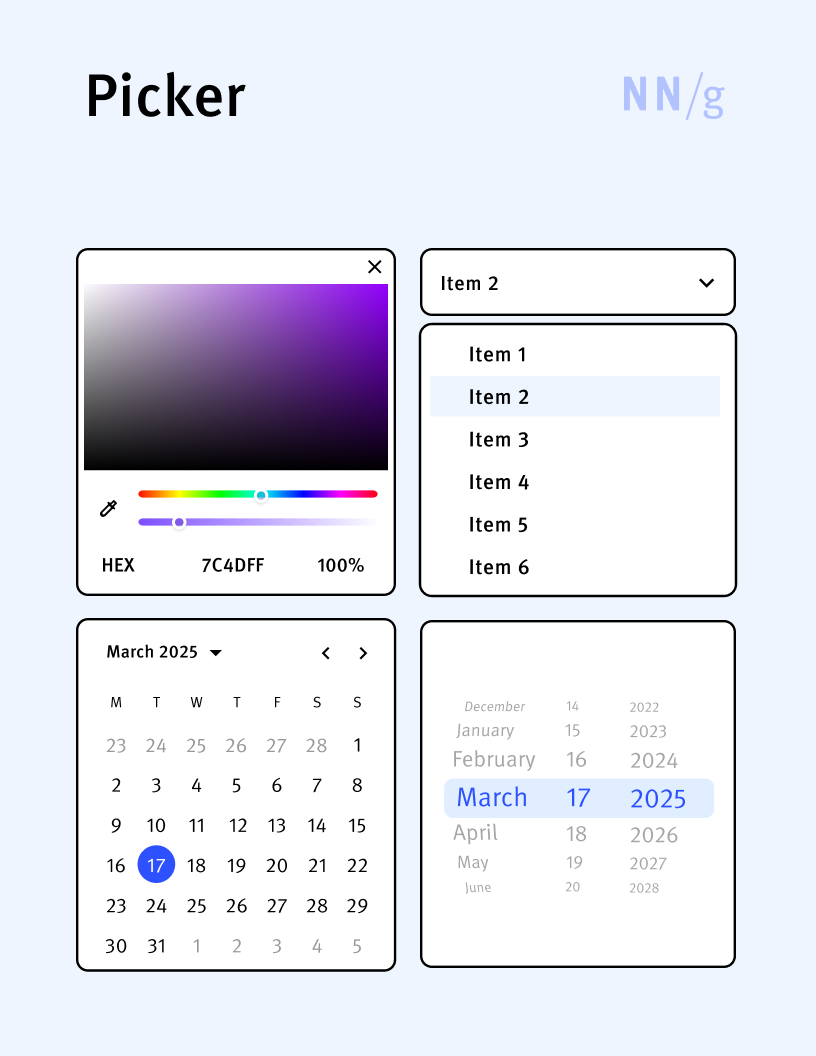
Calendar Picker
A special type of date-input control that allows users to select a date from a visual representation of a calendar. When activated, it typically displays a month-view calendar that users can navigate to choose a specific day, month, and year.
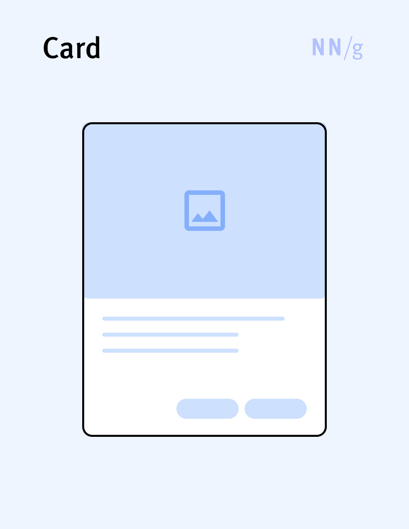
Card
A container for a few short, related pieces of information. It roughly resembles a playing card in size and shape and is intended as a short representation of a conceptual unit.
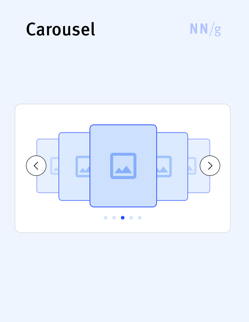
Carousel
A design element that displays a rotating set of items (usually images). Users can navigate through the carousel items manually, by using arrows, buttons, or horizontal scrolling, or the carousel can rotate automatically through the images in its set. Carousels can save screen space as they can fit many items in a small area
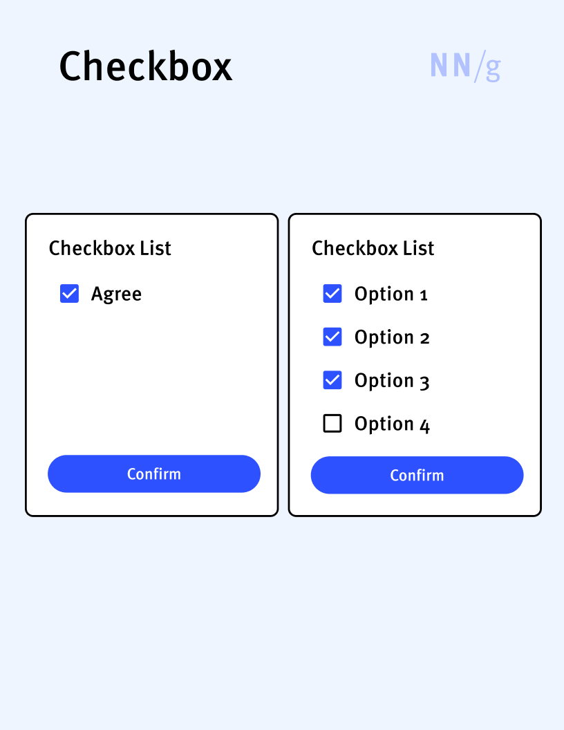
Checkbox
An input control that can appear either by itself or in a list of checkboxes. By itself, a checkbox allows users to select between two states: checked and unchecked. A list of checkboxes is used to select a subset of items from a list. In a list of checkboxes, each box can be selected independently, meaning that selecting one box does not affect the state of the others in the list.
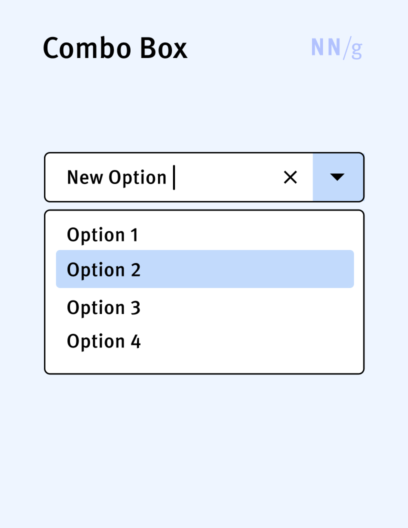
Combo Box
An input control that combines the features of a dropdown list and a textbox, allowing users to either select an item from a predefined list or enter a custom value. It consists of a textbox where the user can type an input and an arrow button that, when clicked, displays a list of options. Users can select an option from the list, which then appears in the textbox, or they can type directly into the text field. Combo boxes are useful when users need the flexibility to choose from a list or input a unique entry not provided in the list.
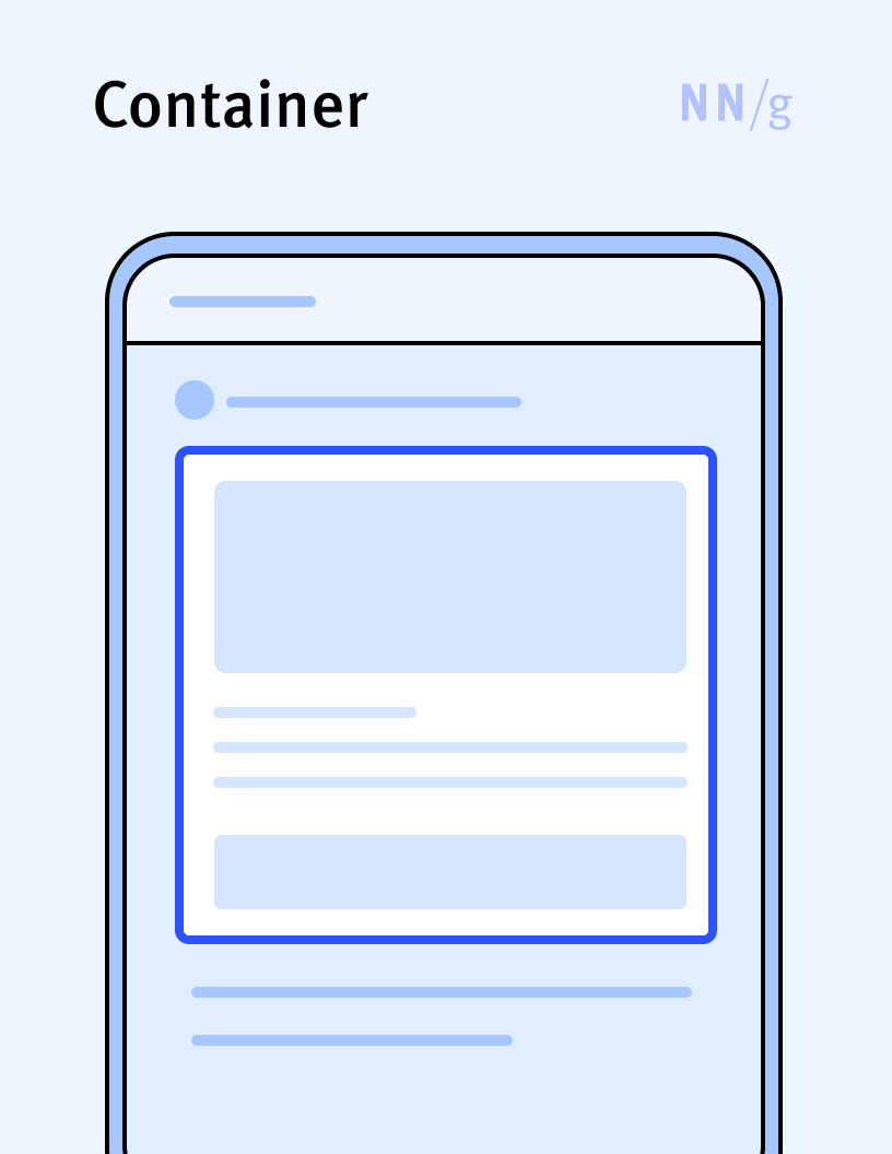
Container
A graphical element used to hold and organize other related UI elements. Containers can include elements such as buttons, words, textboxes, or icons. Containers are usually visually defined through borders, shading, or spacing.
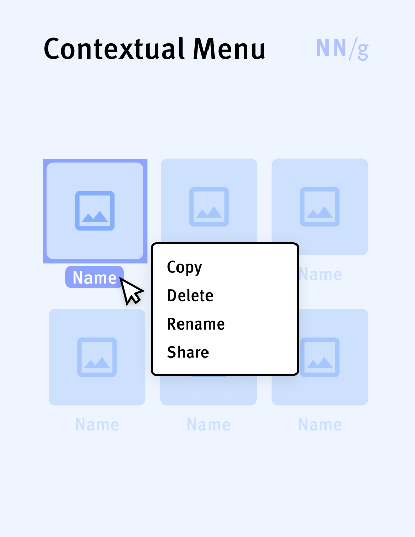
Contextual Menu
A type of menu that appears on demand and contains a small set of relevant actions related to a control, an area of the interface, a piece of data in the application, or a view of the application. In mouse-driven interfaces, contextual menus are often triggered by a right click on an item of interest.
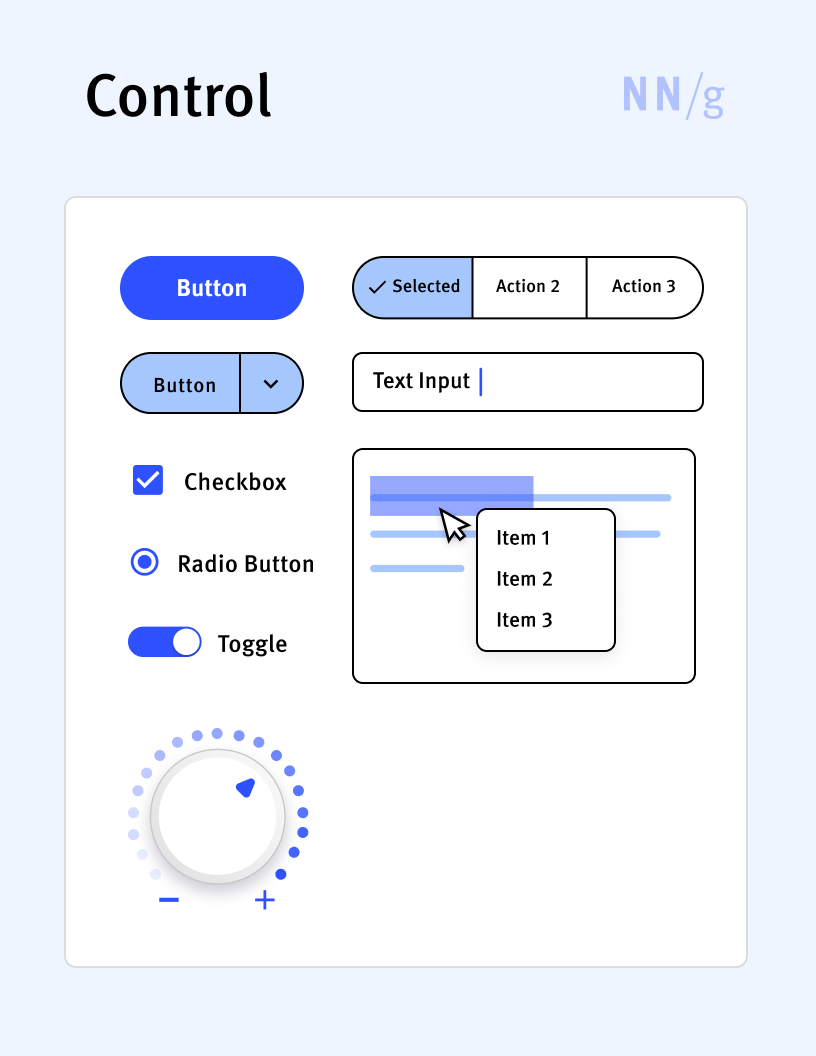
Control
Any interactive UI element that allows users to perform an action or to input data within an application or website. Buttons, textboxes, and menus are all examples of controls.
Date Picker
A date-input control that allows users to select a date. Some date pickers also provide the option to manually enter a date through a text field or to select time in addition to the date. Calendar pickers and wheel-style date pickers are two different types of date pickers.

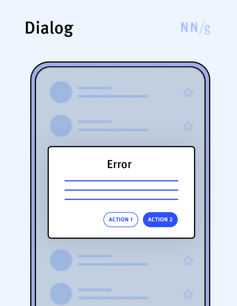
Dialog
A small window appears in front of the main application window to provide users with critical information, ask for input, or force interaction. Dialogs are designed to interrupt the user workflow in scenarios where an immediate decision or action is necessary before the user can proceed (for example, when the user needs to confirm the deletion of a file or when an error has occurred). Dialogs may include elements such as text, buttons, and sometimes input fields or other interactive controls. Dialogs can be modal (if they do not allow users to interact with the underlying content until the dialog is dismissed) or nonmodal.
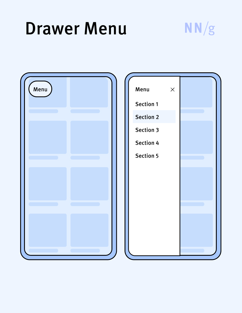
Drawer Menu
A menu that appears in a side sheet, sliding out from the left or right side of the screen. Drawer menus are popular navigation-menu choice in mobile applications.
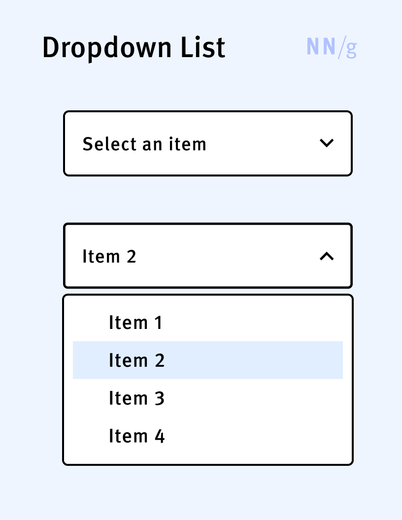
Dropdown List
A type of picker that allows users to select one option from a list of options. It has three components: a label, an arrow button, and a list of options. By default, the list is hidden. When the arrow is clicked, the list is displayed, showing several options that the user can choose from. Once the user selects an item, the list collapses back and the label is replaced with the chosen option. Unlike listboxes, dropdown lists allow users to select a single item from the list.
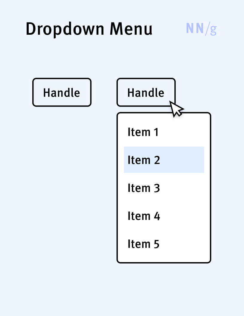
Dropdown Menu (Pulldown Menu, Linear Menu)
A type of expandable menu in which the options are displayed in a list that appears below the menu handle. This type of menu is also called “linear” (because the options are displayed in a list) or “pulldown menu.”
Expandable Menu
A menu in which the collection of options is expandable. The options are exposed when a menu handle (usually an icon, a label, or both) is clicked or tapped. Expandable menus can be classified according to how the options in the collection are displayed (e.g., dropdown menus, megamenus, pie menus, drawer menus).

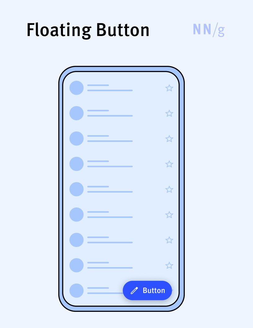
Floating Button (Floating Action Button or FAB)
A button that hovers over the content of a page. A floating button is typically used for the most commonly used and important action on the screen and it persists on the screen when the content is scrolling. Floating buttons are often used on mobile devices, to support quick access to essential actions.
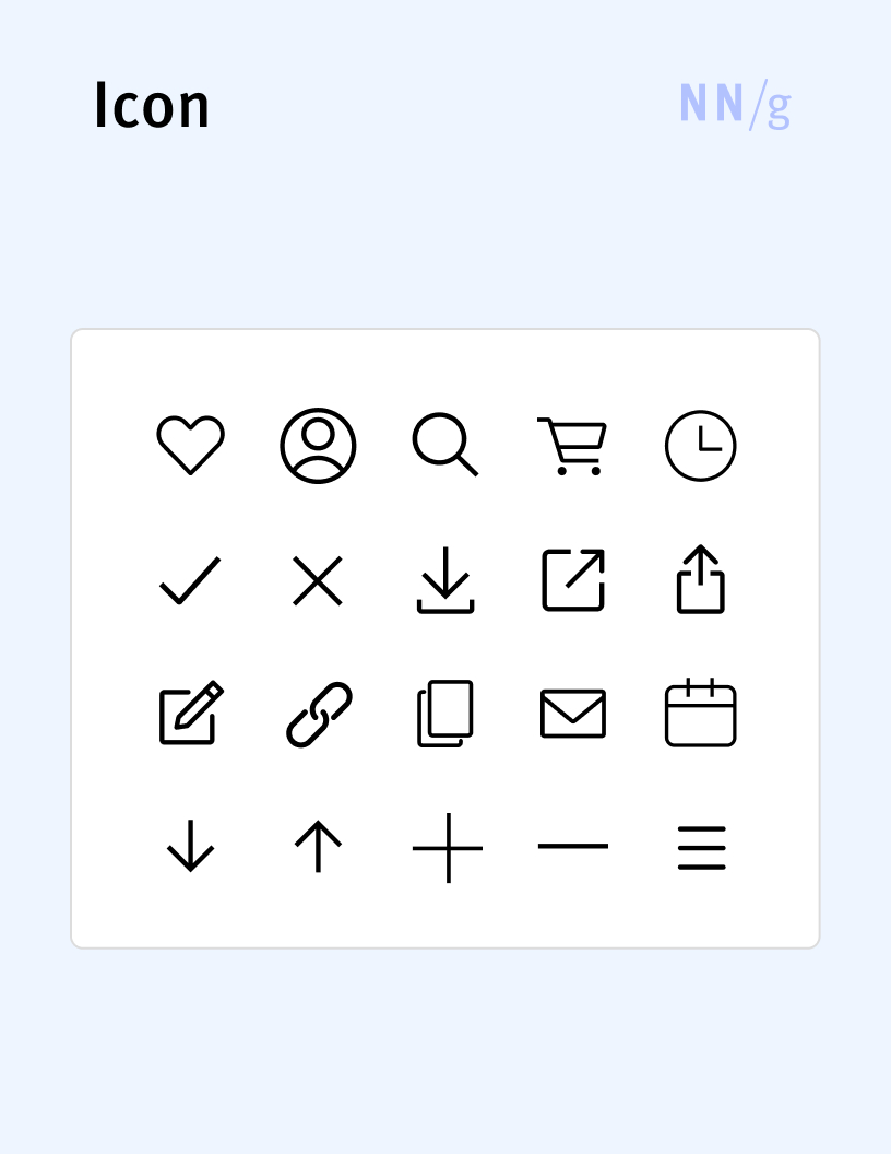
Icon
A small graphic element that is used in user interfaces to visually communicate objects, actions, or ideas. Icons often depict common objects (e.g., a trash can, a pen, a magnifier glass) and are usually meant to represent actions or tools available in the interface (e.g., the trash-can icon stands for delete, the pen icon for edit). Some icons can serve to punctuate information (for example, an exclamation-point icon may appear next to an error message) and attract attention. Most icons should be used in combination with text, to make sure that users recognize what they mean.
Input Control
Any UI component that allows users to input information into a system. Examples include textboxes, checkboxes, radio buttons, sliders, toggles, and pickers.
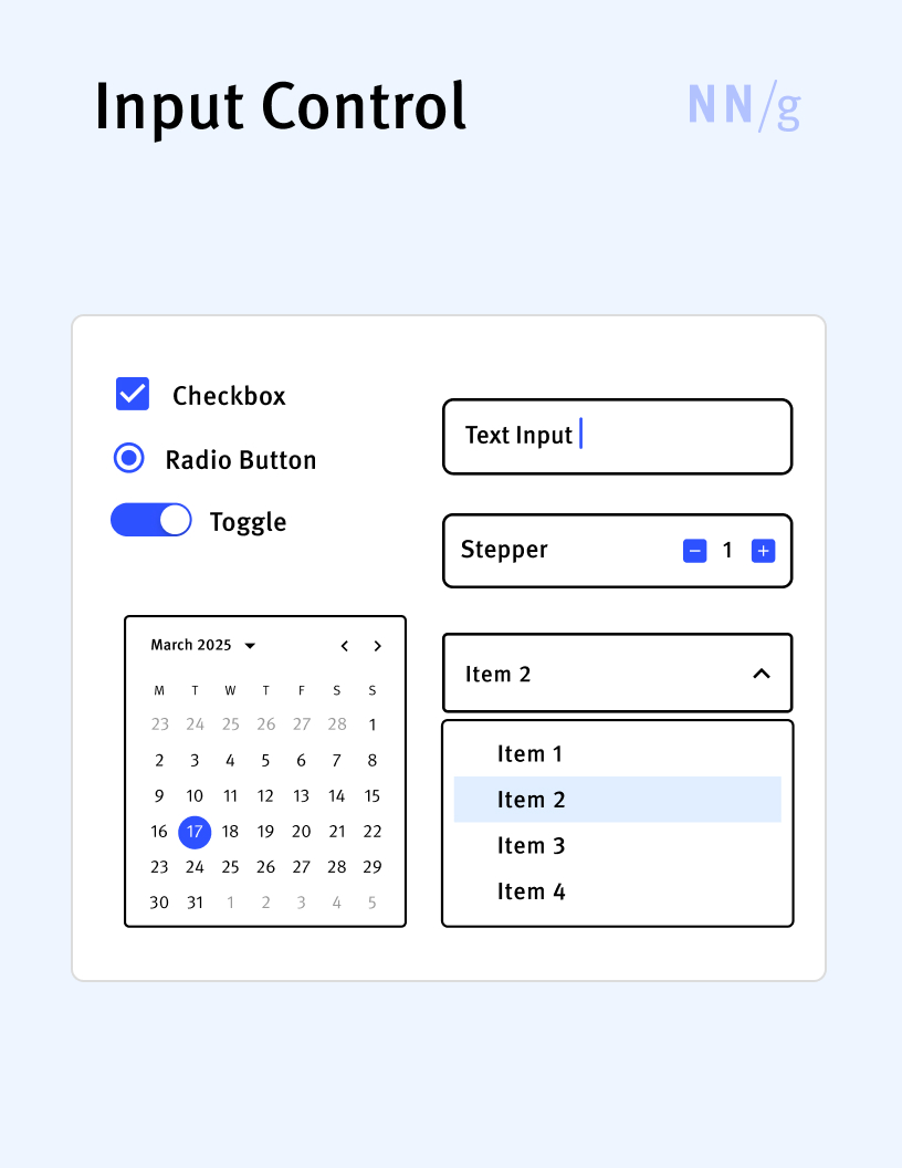
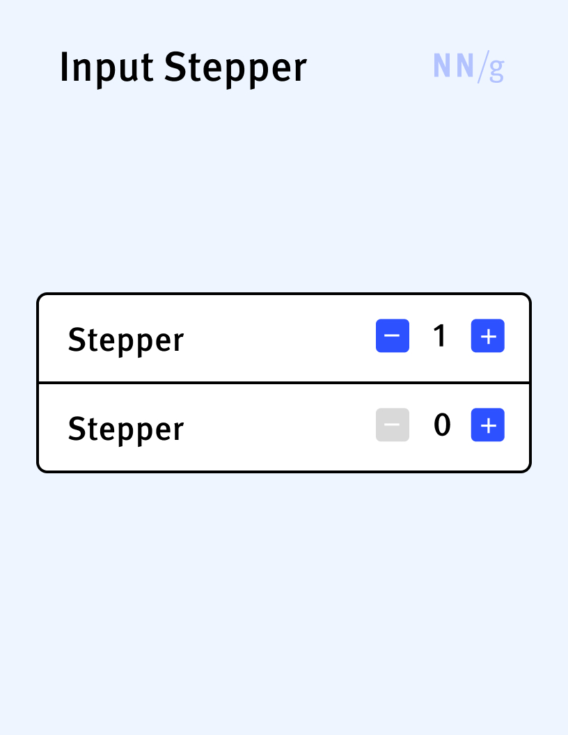
Input Stepper
A UI input control used to incrementally increase or decrease a default numeric value in small, predefined steps. It usually consists of two buttons ( “+” and “-“ or an upward pointing arrow and a downward point arrow) placed on the sides of the numerical value. In addition to the two buttons, some stepper controls display the numerical value in an editable textbox, allowing users to change the default value directly if the desired value deviates too much from the default.
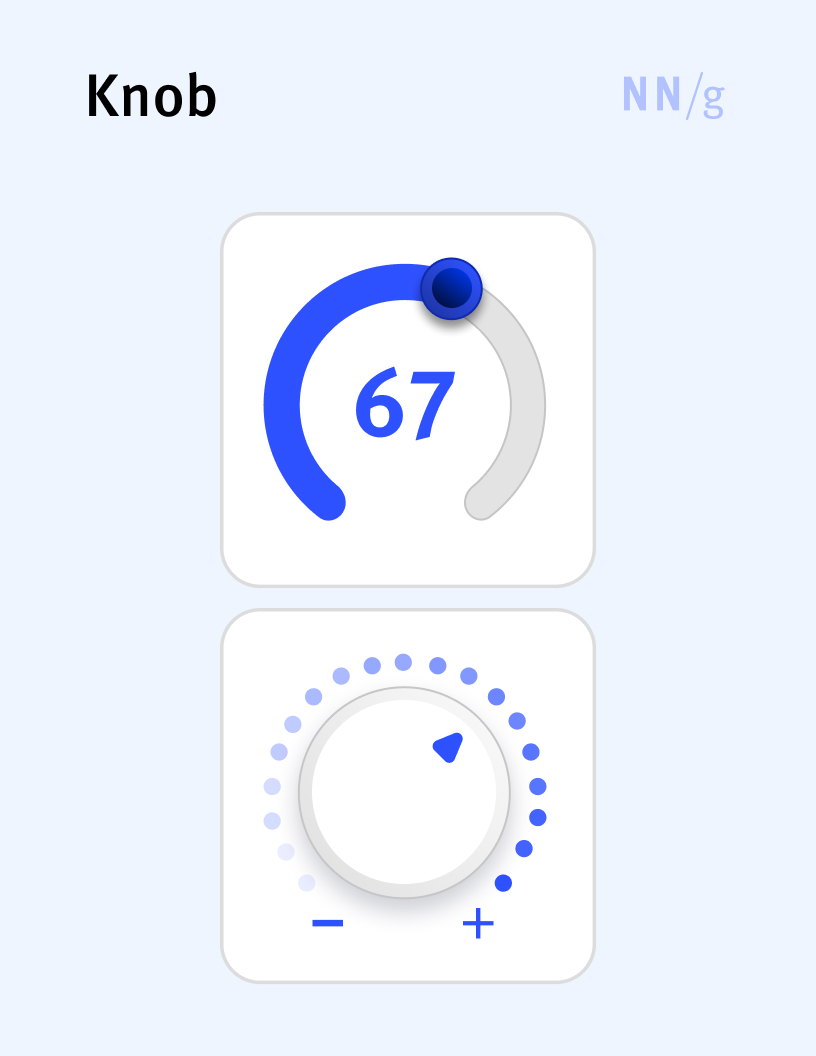
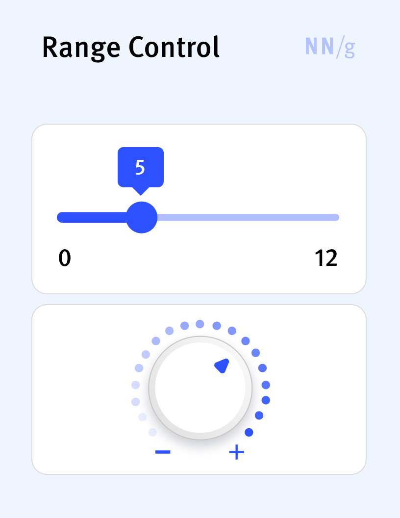
Knob (Virtual Knob)
A type of range control in which the available values are displayed on a circle (or a fragment of a circle). These types of controls are inspired by the knobs used originally in physical audio devices (such as a volume control on a radio set or amplifier).
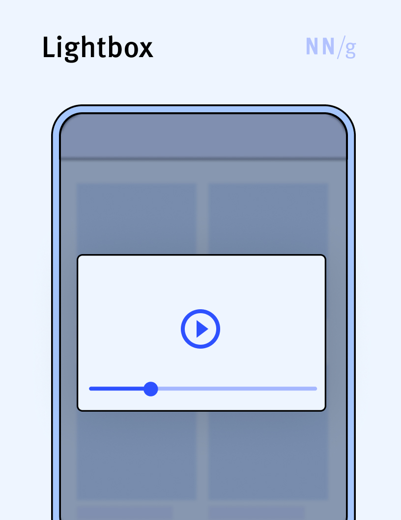
Lightbox
An overlay that does not occupy the full screen. The term is sometimes associated with overlays that display multimedia content (such as an image or a video). Many people use it interchangeably with “overlay” and “popup.”
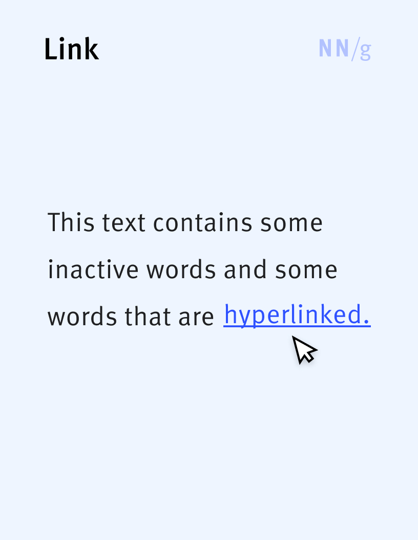
Link (Hyperlink)
A UI element that allows users to jump from one location to another within the same web page, to a different web page, or to a completely different website. Linked text is typically formatted distinctively — usually colored and underlined — to stand out from the rest of the content and indicate clickability.
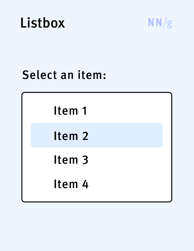
Listbox
A type of input control that displays a list of selectable items in a container. Users can scroll through the listbox to view all the available options, which are usually displayed vertically, one under each other. A listbox can be single-select or multiselect, depending on the number of options users can choose from the list.
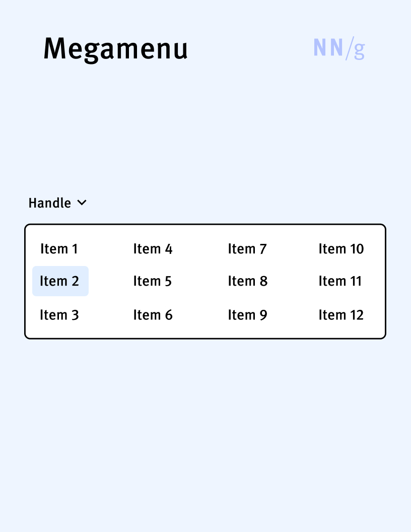
Megamenu (Rectangular Menu, Square Menu)
An expandable menu in which the collection of options is displayed in a rectangle that appears below the handle. Megamenus are primarily used as navigation menus.
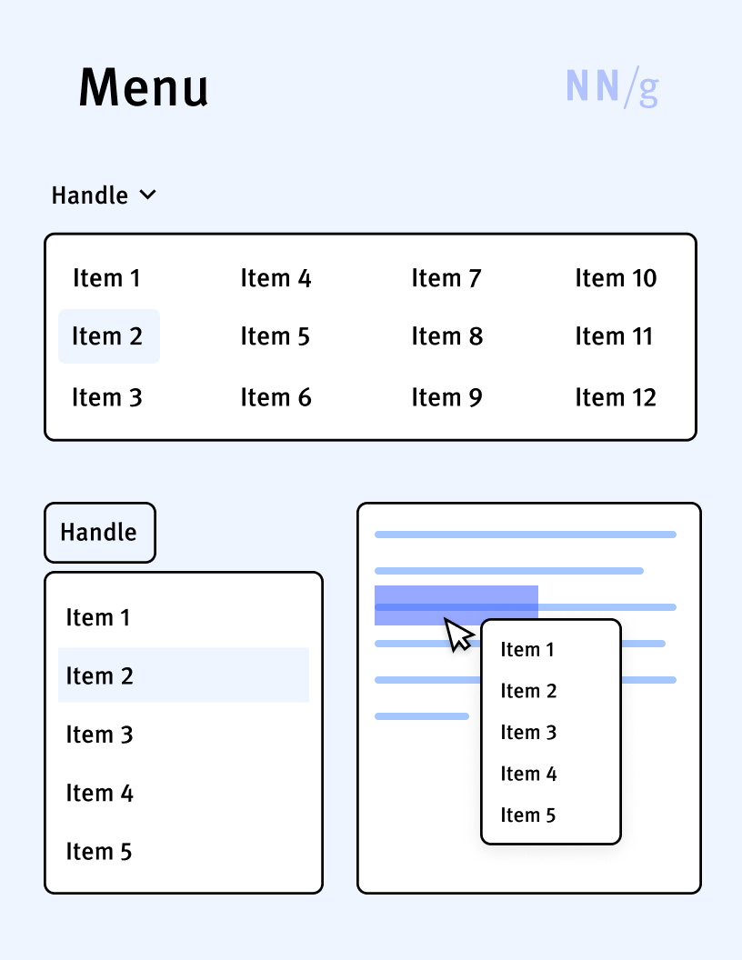
Menu
A collection of options or commands presented to the user, typically used to perform actions or navigate within an application or website. The set of options can be visible at all time (menu bars) or expandable.
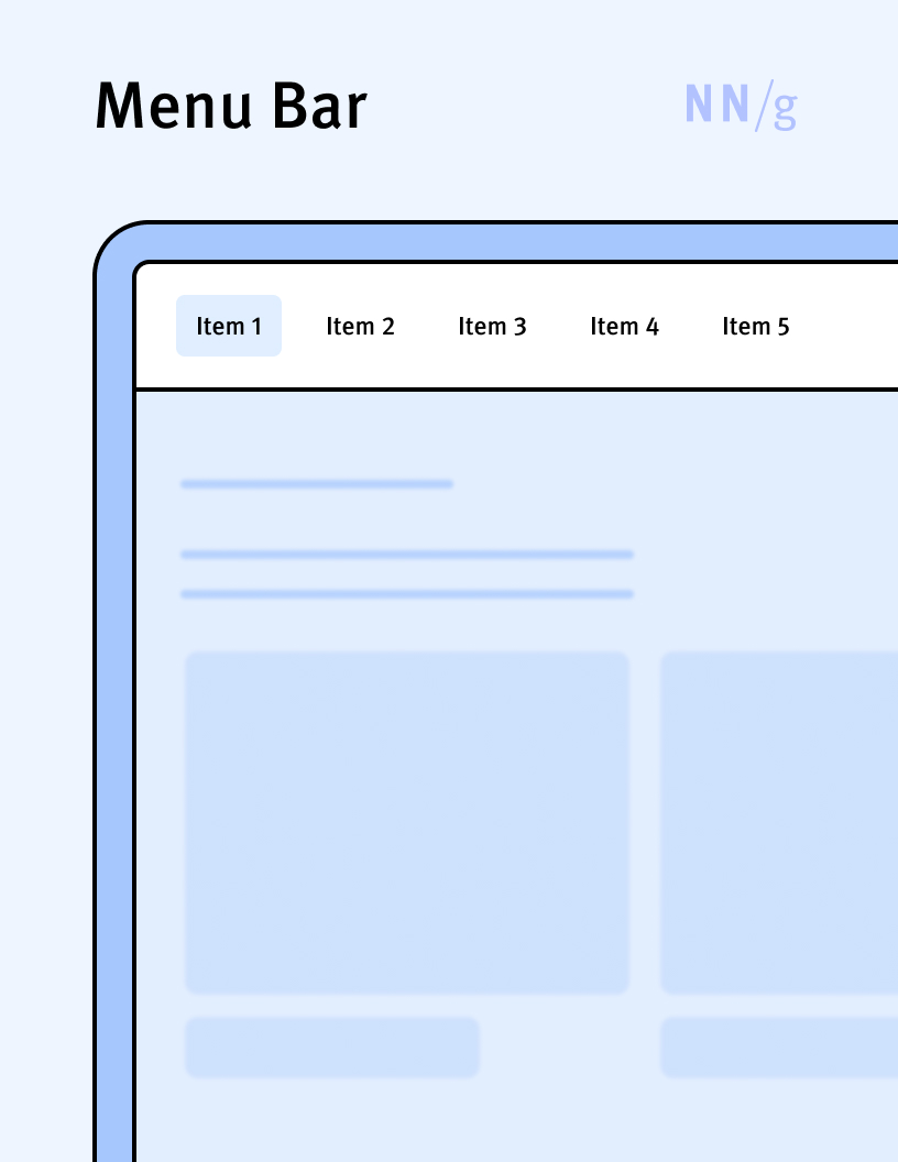
Menu Bar
A type of menu in which the collection of options is visible at all times and displayed in a horizontal or vertical list (bar). Toolbars and navigation bars are examples of menu bars.
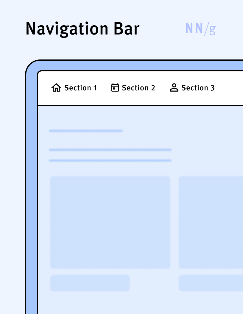
Navigation Bar
A type of navigation menu implemented as a menu bar hosting navigation categories. Navigation bars are among the most common navigation UIs and can appear on both mobile and desktop platforms.
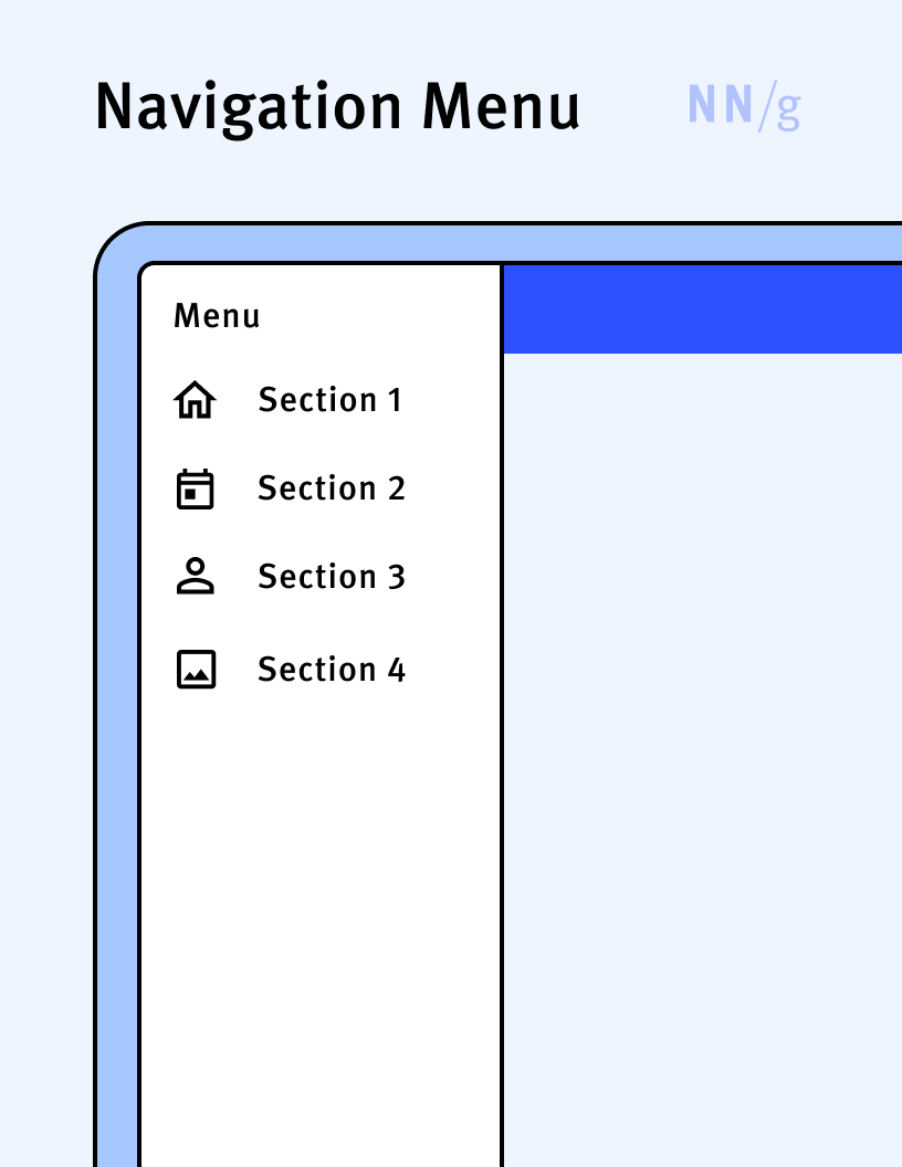
Navigation Menu
A menu that hosts navigation options. Navigation menus can be visible (navigation bars) or expandable.
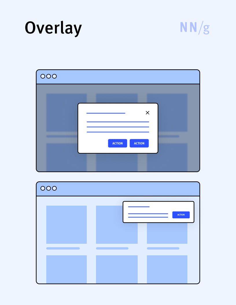
Overlay
A UI element used to display content on top of existing page content. Overlays can be modal or nonmodal and can cover the entire screen or just a part of it (in which case, the background is often dimmed). When they occupy the whole page, overlays can be easily confused with regular web or application pages and cause user disorientation. Often the term is used interchangeably with “popup” and “lightbox.”
Picker
A user-interface element that enables users to select a single value from a set of options. There are many different types of pickers (e.g., dropdown list, radio-button list, wheel-style picker). Some pickers are specialized to the type of data they display (e.g., calendar picker, color picker).
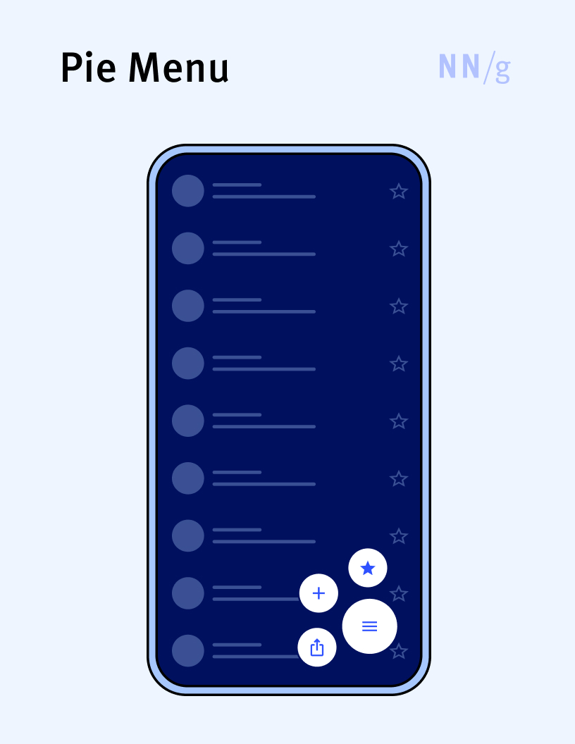
Pie Menu (Radial Menu)
A type of expandable menu in which all the menu options are placed on a circle centered on the menu handle. This type of menu has the advantage that all options inside the menu are equally close to the handle and, thus, the time to reach them is the same. Pie menus were introduced in the late 1980s, but they have never been very popular, even though there have been attempts to use them in mobile apps.
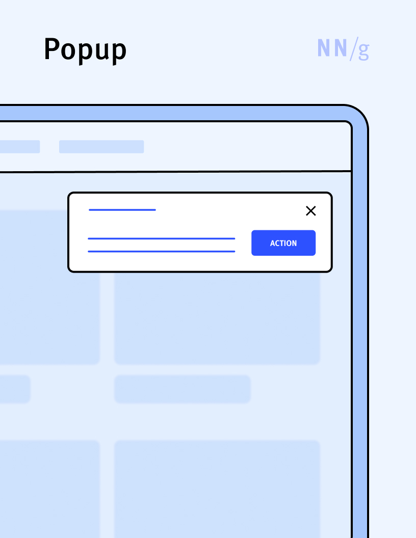
Popup (Popover)
An overlay that does not occupy the whole screen. Often the term “popup” is used interchangeably with “overlay” and “lightbox.” Apple uses “popover” to refer to popups in iOS, iPadOS, and MacOS applications.
Popup Tip
A small overlay displaying a brief, informative message that appears when a user taps on an “I” or “?” icon in a touch interface. The popup tip is the equivalent of a tooltip for interfaces that do not support hover gestures (usually, touchscreen devices).

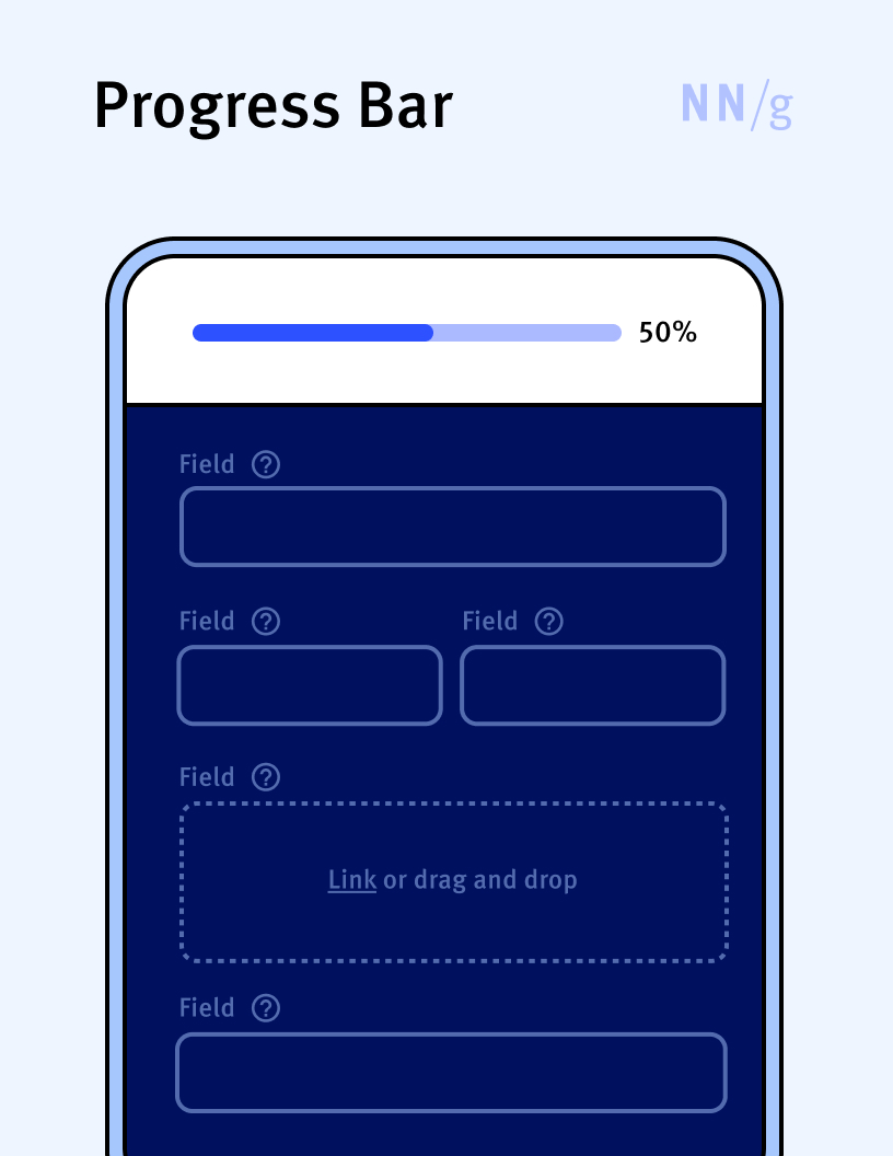
Progress Bar
A special type of progress indicator that displays the advancement of a process toward completion, usually in the form of a horizontal bar that fills up from left to right as the process progresses. The filled-up part of the bar corresponds to the percentage of the task completed. Progress bars are usually recommended for any activity that is expected to take more than 10 seconds.
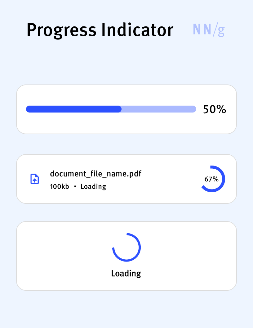
Progress Indicator
A UI element that provides visual feedback on the completion status of an ongoing process, such as downloading a file, loading a webpage, or installing software. Progress indicators set user expectations and reduce uncertainty about the time required for the process to complete and about the state of the system. Progress bars and spinners are two types of progress indicators.
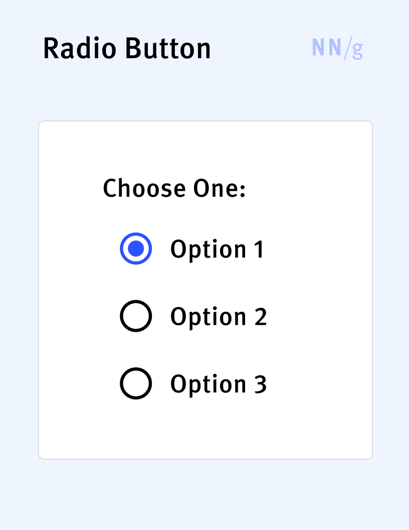
Radio Button
A type of picker that allows users to select one option from a predefined set of mutually exclusive options, each represented by a small circle followed by a label describing it. When a user selects a radio button, any previously selected button in the group becomes deselected, ensuring that only one option can be chosen at a time.
Range Control (Continuous Control)
A type of picker that allows the selection of (almost) any possible value within a predefined range. Sliders and knobs are examples of range controls.
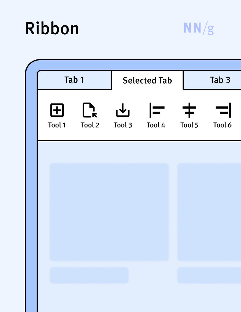
Ribbon
A UI element that presents various controls and tools grouped into a set of tabs. Each tab contains commands specific to a particular activity (for example, the Home tab may contain basic functionality, whereas the Insert tab may include commands related to adding other objects). Within a tab, the commands are typically displayed as a horizontal list.This type of interface is primarily used in applications and was popularized by Microsoft in its Office suite. Its equivalent on the web is the tab bar.
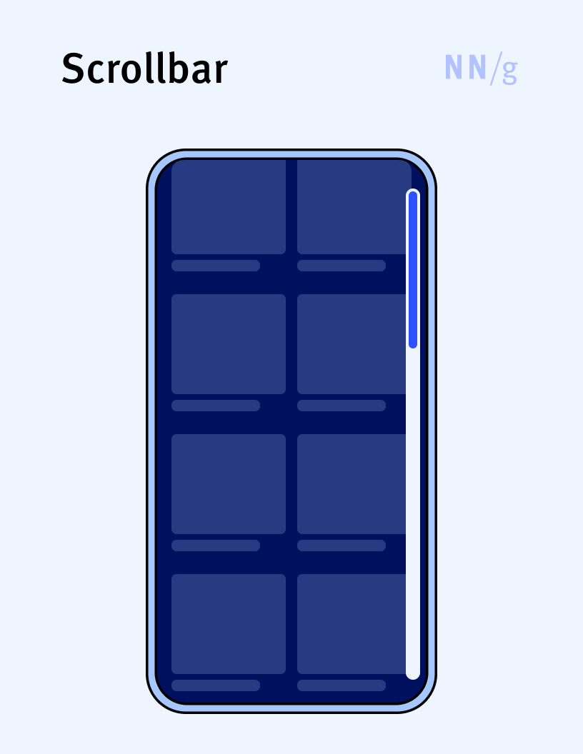
Scrollbar
An element used to indicate and control the portion of a container or page that is visible on the screen. A typical scrollbar consists of a track (the area the scrollbar slides within) and a handle, which can be dragged to scroll through the content. In modern user interfaces, scrollbars often appear only when needed — that is, when the content overflows the current viewable area — and may disappear when the user does not interact with the page. Users can interact with scrollbars by clicking and dragging the handle, clicking on the track to jump to a specific position, or using arrow buttons at the end of the bar for step-by-step navigation.
Scrollbars can be horizontal or vertical, depending on the direction in which the context extends past the viewable area. Vertical scrollbars are used to move up and down through web pages or long documents, while horizontal scrollbars allow movement from side to side, typically used for wide tables or images.
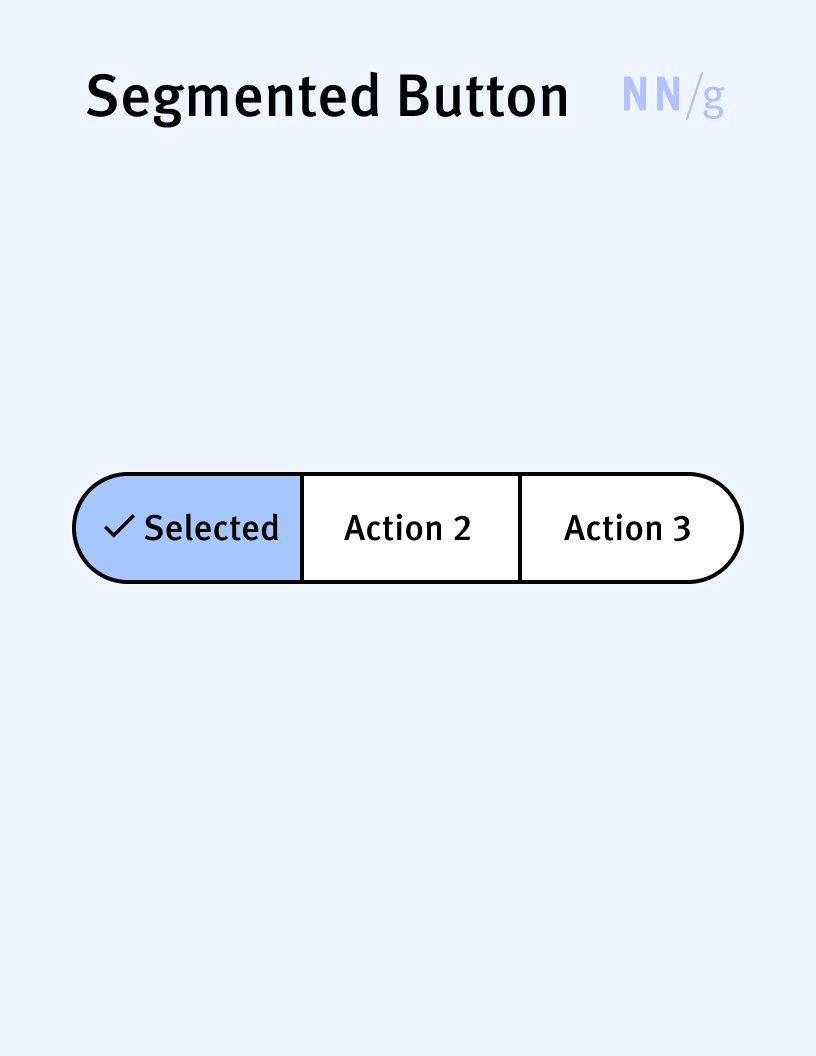
Segmented Button (Segmented Control)
A user-interface element that displays a group of connected buttons laid out in a horizontal row. It allows users to make one or more selections from multiple segmented options, each functioning as a button. This element is often used for toggling between different views of the same data or for filtering content.
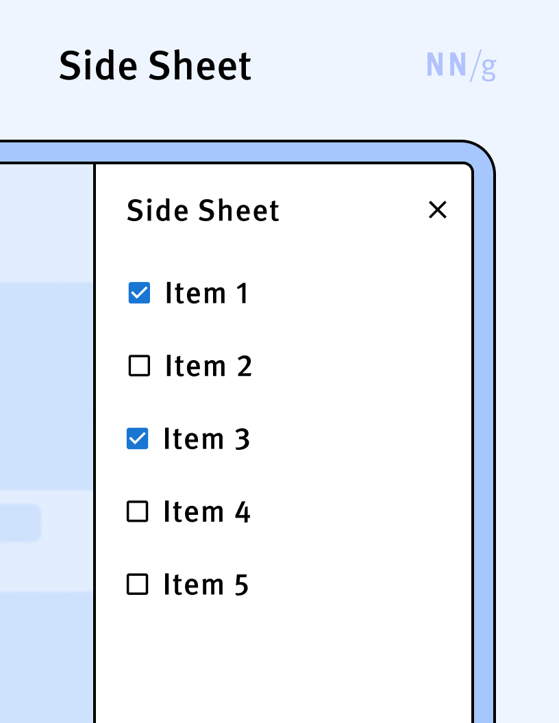
Side Sheet (Drawer, Flyout)
A type of overlay that slides out from the left or right edge of the screen and that usually covers a significant part of the screen. Like bottom sheets (which appear from the bottom edge of the screen), side sheets can be modal (i.e., prevent interaction with background elements until dismissed) or not. A side sheet can contain navigational elements, commands, or content. The terms “drawer” or “flyout” are often used synonymously with “side sheet.”
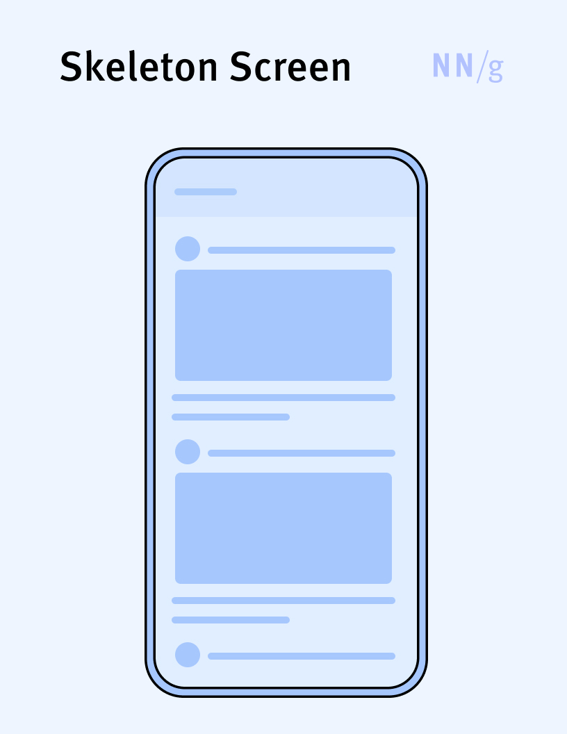
Skeleton Screen
A specific type of progress indicator used exclusively for full-page loads and that provides users with a wireframe-like visual mimicing the layout of the page.
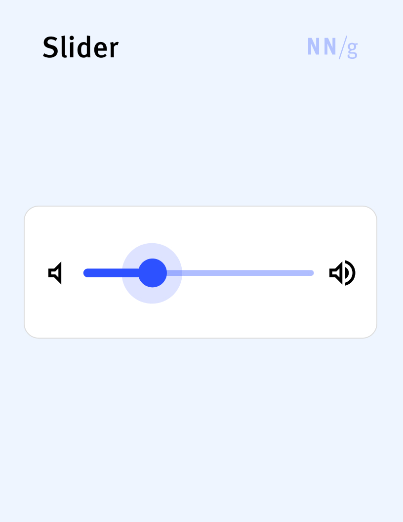
Slider
A UI element that allows users to adjust a value or navigate through a range by moving an indicator, called a handle, along a horizontal or vertical track. Sliders are a type of range control; they are appropriate in situations where the exact value may be hard to quantify for the user (e.g., for volume or brightness adjustments).
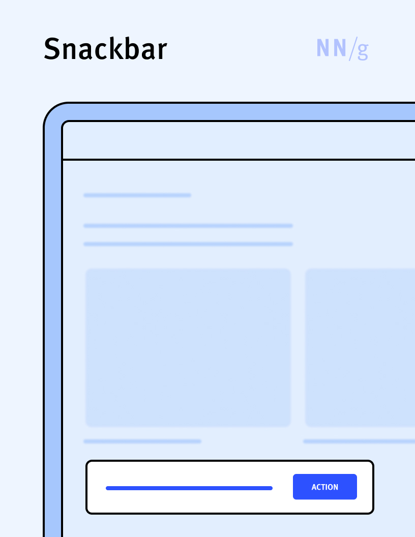
Snackbar (Toast)
A transient nonmodal dialog that usually informs the user about the status of a process and that disappears automatically after a brief amount of time, without requiring user interaction. Often, snackbars are used to confirm the completion of a process (such as the deletion of a file). Some snackbars may include a button that allows the user to perform an action such as undo.
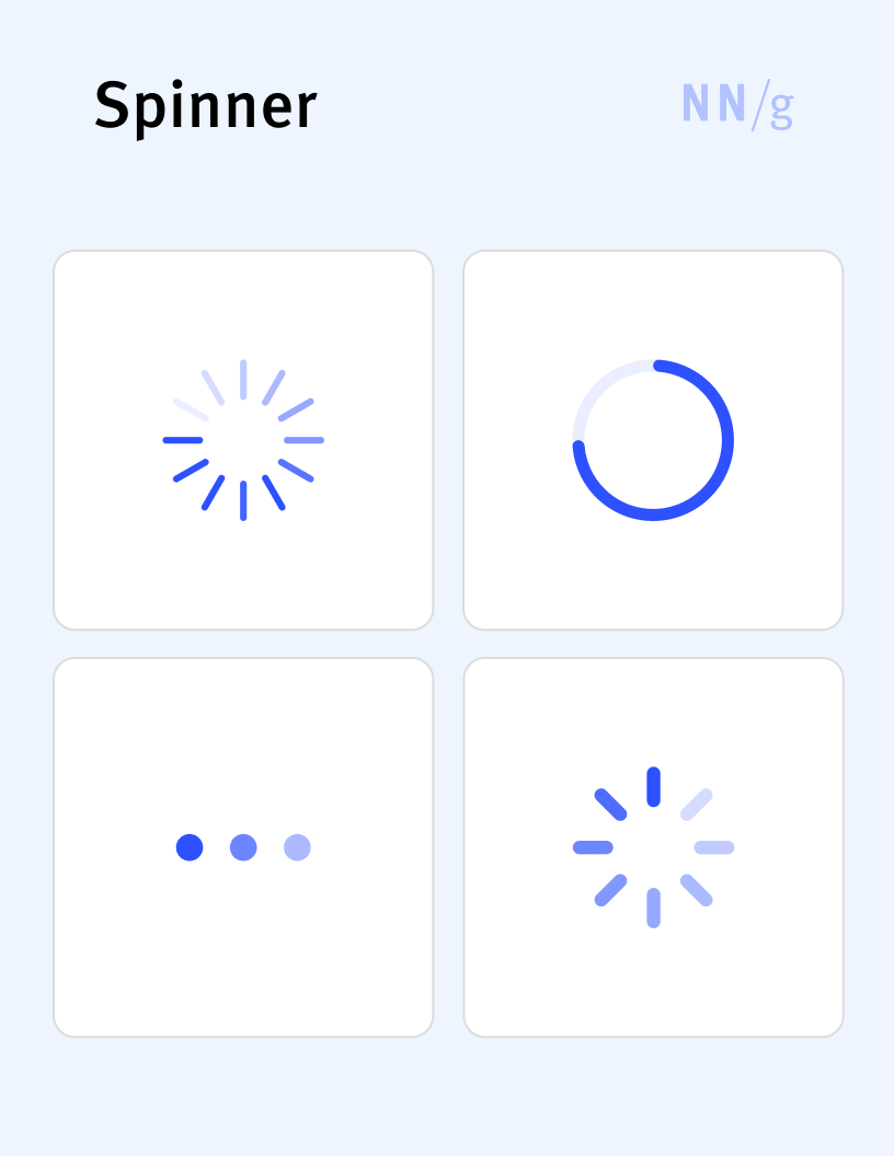
Spinner (Wait Animation, Loading Spinner, Activity Indicator)
A type of progress indicator used to signify that a process is ongoing. It is usually depicted as an rotating circle or another simple animation. Spinners do not give users information about what portion of the process is already completed and how much time they have to wait, so they should be used only for very short processes (with an estimated duration of under 3 seconds).
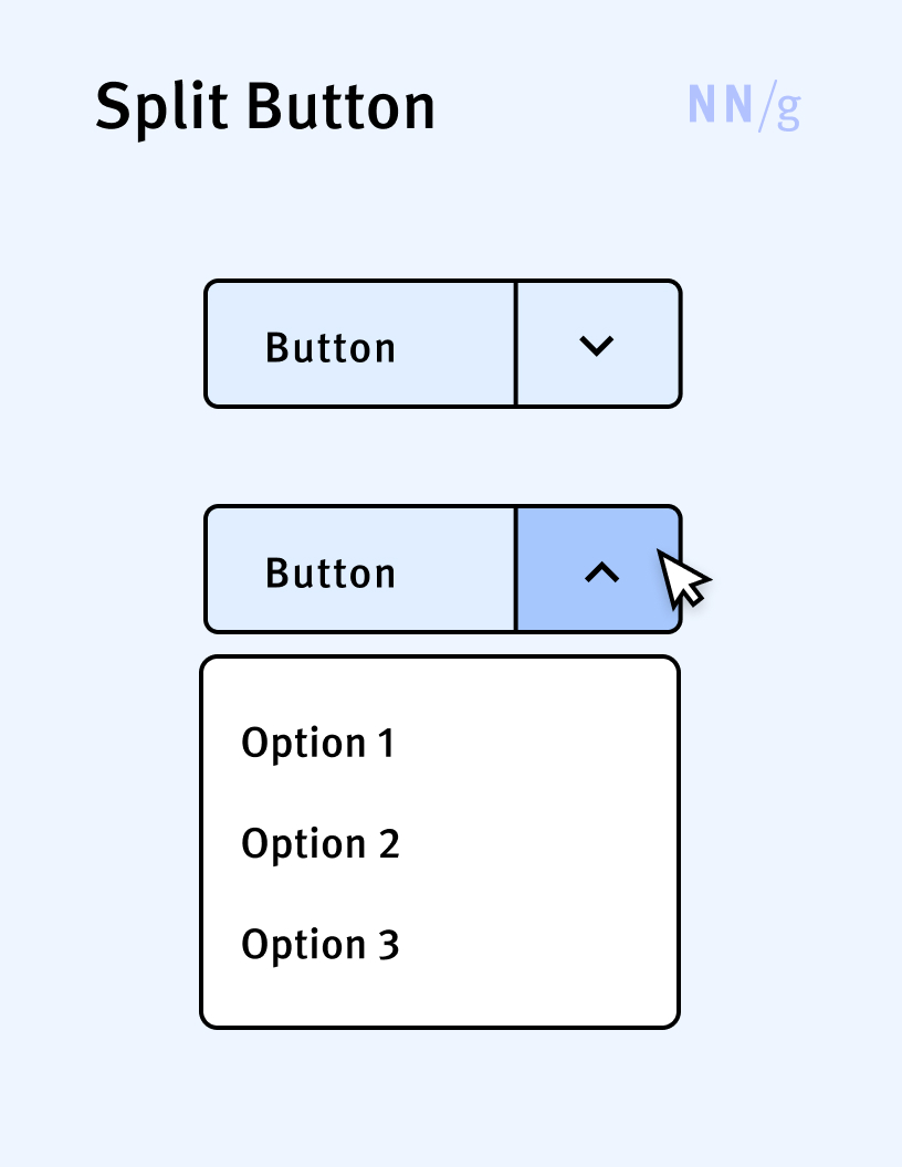
Split Button
A hybrid between a menu and a button. It is usually depicted as a button with two components: a label and an arrow. Clicking on the label selects a default action, and clicking on the arrow opens up a list of other possible actions.
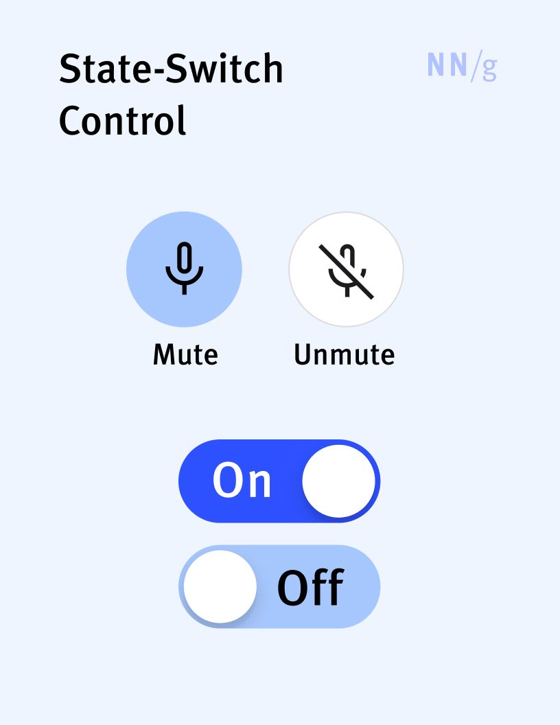
State-Switch Control
A control designed to move the system between two mutually exclusive states (e.g., on/off, muted/unmuted). A toggle is a type of state-switch control, but not all state-switch controls need to be toggles (for example, a Mute button can switch between a muted and unmuted state).
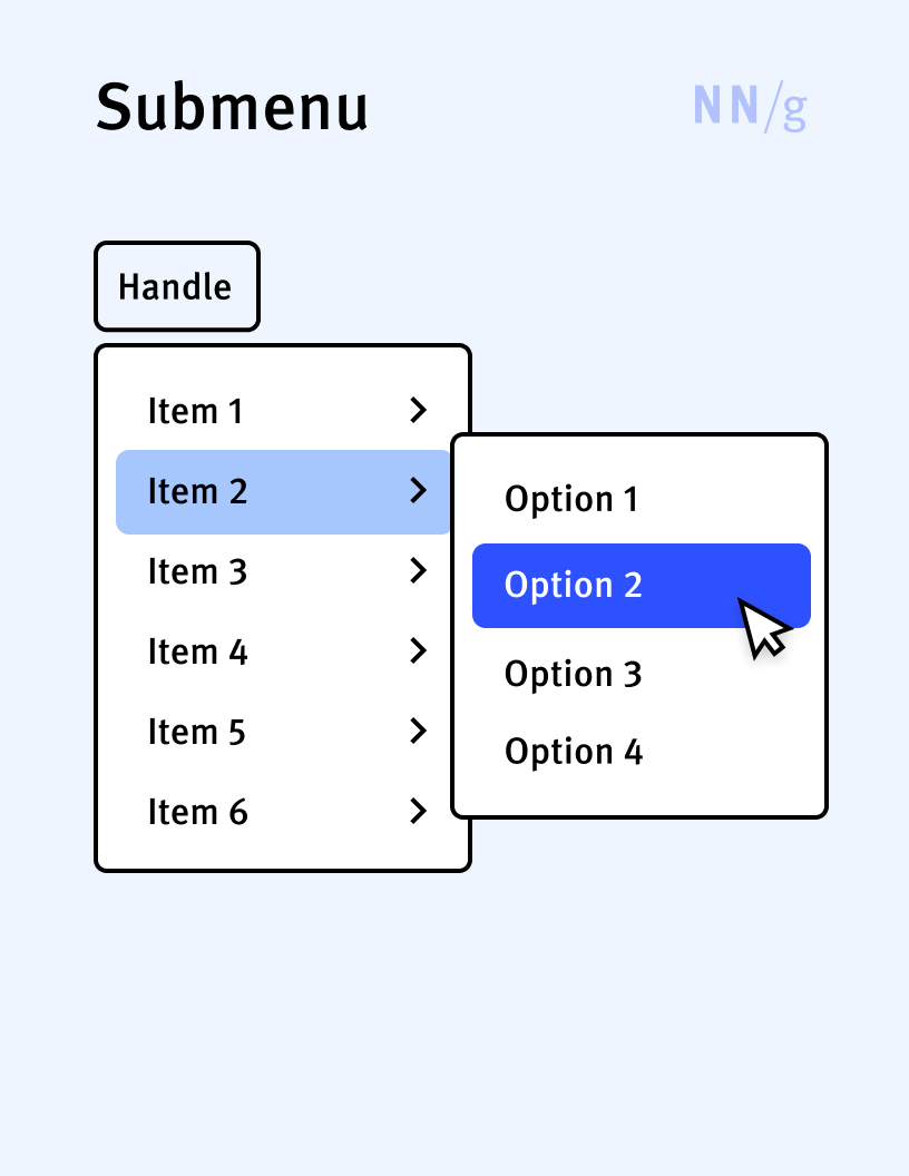
Submenu
A secondary menu that appears as part of a larger menu when a user hovers over or clicks on an item in it. Submenus expand the capabilities of the primary menu items by providing additional choices and hierarchical organization, thus allowing users to navigate through large sets of options without excessively increasing the number of choices in the main menu.
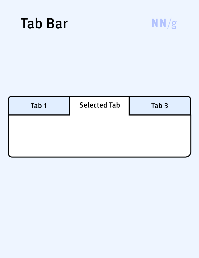
Tab Bar (Tabs)
A user-interface element that allows users to selectively view a single panel of content from among a list of available options (tabs). The list of options (tabs) is traditionally displayed horizontally; each option represents a concise description of the content found in that tab. When the user clicks on a tab, the selected tab’s content appears underneath (or, on mobile, above) the tab bar. Tab bars are like ribbons, but while ribbons are primarily used for organizing commands in applications, tab bars are used for organizing content both on web pages and in applications.
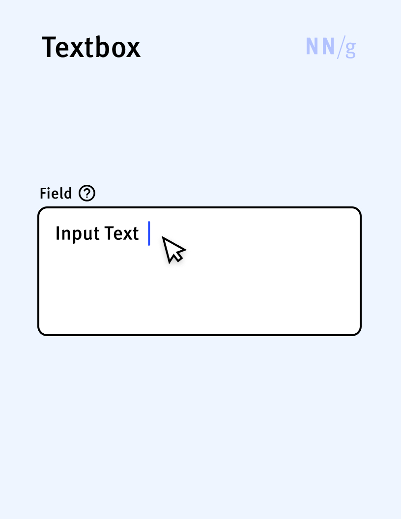
Textbox (Text Field, Input Field)
An input control that allows users to type text within a defined rectangular area. Textboxes are the basic building blocks of forms. They can be configured to accept a single line of text or multiple lines.
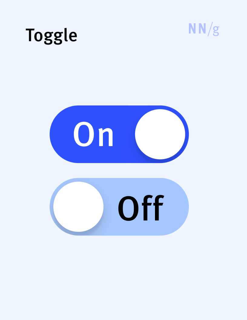
Toggle (Toggle Switch, Switch)
A state-switch control usually depicted as a slider between two positions: on and off. It is the digital equivalent of a physical on-off light switch. Toggles need to clearly indicate the current state through a distinctive color and explicit labeling.
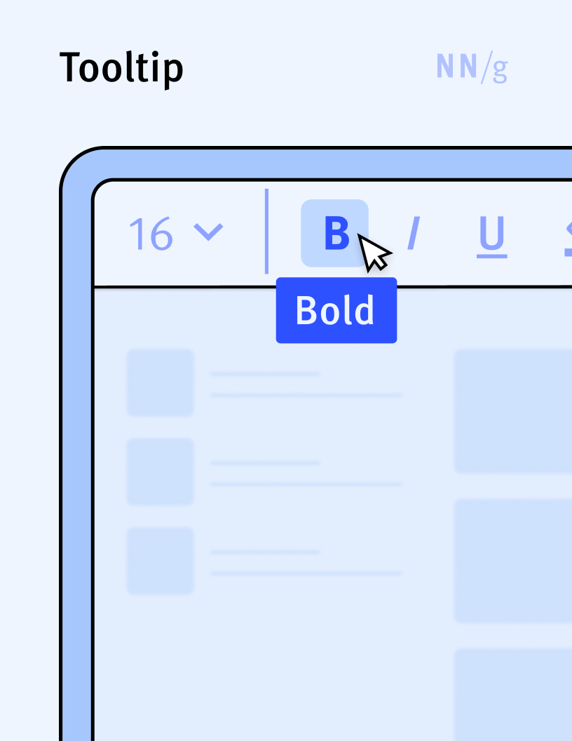
Tooltip
A small overlay displaying a brief, informative message that appears when a user interacts with an element in a graphical user interface. Tooltips are usually initiated through a mouse-hover gesture or through a keyboard-hover gesture.
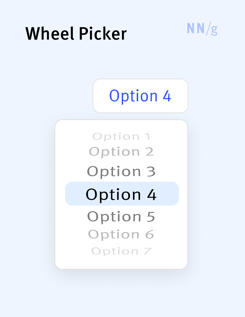
Wheel Picker
An iOS-specific picker that displays the options available for selection using a wheel-like interface.
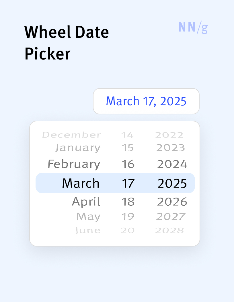
Wheel-Style Date Picker
An iOS-specific date picker that lets users select date and time values using a rotating wheel-like interface. Each component of the date—day, month, and year—and sometimes time, is represented on individual “wheels” that users can spin vertically to select values. Wheel-style date pickers are less usable than calendar pickers because users may have to scroll a lot to reach the date they want to input.