In this article, we’ll explore 15 essential UX research deliverables that can help you effectively communicate user insights and drive alignment across teams.
Key Takeaways
👉 UX research deliverables help connect user needs with stakeholder goals, making it easier to align teams and improve designs.
👉 Clear, simple deliverables show real user insights, helping stakeholders see the value of research and support your ideas.
👉 Adding visuals like charts, boards, or prototypes makes your deliverables easier to understand and more impactful.
🐝 UXtweak offers everything you need to create great UX research deliverables, all in one place.
What are UX research deliverables?
UX research deliverables are documents, insights, or visual aids that communicate findings from user research to help teams make user-centered decisions.
For these deliverables to have any impact, they need to be actionable, user-centered, contextually relevant, and evidence-based—let’s break down what that means:
Actionable
These deliverables should directly inform what teams need to do next. For example, if usability testing shows that users struggle to find the “Add to Cart” button, the deliverable might recommend repositioning it to a more noticeable spot.
User-centered
Good deliverables stay focused on the people who actually use the product. They should reflect real user goals, frustrations, and expectations.
Deliverables often bring this out through tools like personas, journey maps, or even direct quotes from users.
Relevant for specific contexts
Insights need to fit the specific product and its real-world use cases. This ensures that the findings don’t just sound good in theory but apply directly to the situations users will encounter.
Evidence-based
Every point in a deliverable should be rooted in solid research data, whether from interviews, surveys, or usability tests. Having evidence makes these insights reliable and trustworthy.
Why are UX research deliverables important?
UX research deliverables are essential because they turn insights into action. They help teams and stakeholders stay aligned, motivated, and on track.
In an increasingly technological world, designing products with real people in mind helps us make sure that technology integrates in our lives in a human way.
So, let’s see how these deliverables help in the process:
Stakeholder buy-in & confidence
UX research deliverables provide concrete evidence of user needs, making it easier for stakeholders to see the value of UX decisions. When backed by data, these deliverables give stakeholders the confidence that design changes are grounded in real user experiences—not just guesses.
However, a discussion among UX researchers revealed that sometimes researchers don’t get enough power to decide which deliverables to create.
Although this situation is not ideal, sometimes we must adjust and create the deliverables required by stakeholders to secure their buy-in.
💡 Pro Tip
Proving the value of UX research to stakeholders and securing their buy-in is still one of the most common issue for UX pros.
We’ve conducted a survey and summarized the best practices and advice from UX leaders on how to get support for UX research.
👉 Check out the full report here: Dealing with Resistance to UX Research [Report]
Facilitating collaboration
Clear deliverables create a common ground for teams to work from. Designers, developers, and product managers can all refer to the same user insights, which helps avoid misunderstandings.
Tracking progress
Deliverables help teams measure how well they’re addressing user needs over time. By tracking changes and their impact, teams can see what’s working, what needs tweaking, and ensure they’re moving in the right direction.
15 key UX research deliverables
Let’s now look at how these UX research deliverables can help you build stronger designs, while effortlessly convincing stakeholders with clear, data-driven insights:
1. UX research reports
A UX research report is a document that shares what you learn about how users interact with a product or service. It covers the methods you used, like interviews or usability tests, and highlights the key insights about what users need and the challenges they face.
How to create a UX research report
- Define the objectives to clarify the purpose of the research and the key questions to address
- Gather and organize data from user research methods like interviews, surveys, and usability tests
- Summarize findings by highlighting key insights, patterns, and user feedback
- Include visuals such as charts, graphs, and quotes to support your findings
- Provide recommendations based on insights to guide design decisions
- Ensure the report is clear and concise, tailored for your audience’s needs
Main Users of the Deliverable
- Designers use the report to inform their design decisions and create user-centered products
- Product Managers rely on the insights to prioritize features and understand user needs
- Stakeholders review the findings to align on strategy and product direction
- Developers gain a clearer understanding of user requirements to implement effective solutions
Tip for presentation
Make your report clear and engaging. Use visuals like charts or graphs to highlight key points, helping designers and developers understand insights and make user-focused changes.
2. UX personas
UX personas are fictional characters created to represent different user types who might use a product or service.
They help designers and developers understand the needs, behaviors, and goals of their target audience to create user-centered designs.
How to create UX personas
- Define your goals to determine the purpose of the personas
- Gather data through user interviews, surveys, and research to collect insights
- Identify key traits and patterns in user behavior, needs, and demographics
- Create detailed persona profiles that include demographics, goals, challenges, and preferences
- Give each persona a name and backstory to make them relatable
- Use visuals and templates to present personas in an engaging way
Who Uses UX Personas:
- UX Designers: To shape design decisions and focus on user needs.
- Product Managers: To decide which features matter most to users.
- Marketing Teams: To craft messages and campaigns that connect with the audience.
- Developers: To understand what users need and build better solutions.
- Stakeholders: To see user motivations and plan smarter strategies.
Tip for application 💡
Regularly reference and update your personas throughout the design process to ensure your product remains aligned with user needs and goals.
3. User journey maps
A user journey map is a visual representation that captures the steps a user takes to achieve a goal within a product, service, or experience.
It is used to understand and analyze the user’s experience, identify pain points, and find opportunities for improvement.

How to create a user journey map
- Define the scope by identifying the specific user journey you want to map
- Gather user data through interviews, surveys, or analytics to understand user experiences
- Identify key stages in the journey, such as awareness, consideration, and decision-making
- Outline user actions, emotions, and pain points at each stage of the journey
- Create a visual representation using tools like flowcharts or specialized mapping software
- Share the map with your team for feedback and insights, and refine it based on input
Main users of user journey maps
- Product Managers use it to understand user interactions and identify improvement areas
- UX/UI Designers visualize the user experience to create user-centered designs
- Marketers align strategies with customer needs and optimize messaging
- Customer Support Teams anticipate pain points to enhance service
- Developers prioritize features and fixes based on user behaviors
💡 Pro Tip
Mapping out user journeys can get tricky, and it’s easy to miss important details. So, why not make it easier with a user journey map template? It gives you a handy framework to keep things organized, helping you focus on key touchpoints and emotions without getting overwhelmed.
4. Storyboards
Storyboards are visual tools used to plan and illustrate a narrative or sequence of events. They consist of a series of drawings or images arranged in chronological order, typically accompanied by descriptive text or dialogue.
How to create stoyboards
- Clarify the purpose by defining what to convey and identifying your audience
- Gather user research using personas and mapping key touchpoints
- Choose the format by selecting a visual style and appropriate tools
- Outline key scenes by breaking the user journey into 5-10 frames
- Illustrate the story with sketches and add captions for context
- Review and refine by sharing for feedback and making adjustments
Major users of storyboards
- Product managers visualize user flows and align team objectives
- UX/UI designers use storyboards to guide interface design and user interactions
- Developers refer to storyboards to understand user scenarios for feature implementation
- Stakeholders look at them to validate design decisions and gain insights into user experiences
- User researchers illustrate user journeys with storyboards to gather feedback
5. Usability testing reports
Usability testing reports aim to document user interactions, behaviors, and feedback during testing sessions. They provide insights into how real users navigate and use a product, helping teams understand areas that may cause confusion or frustration.
How to create usability testing reports
- Define objectives to clarify the purpose of your testing
- Summarize key findings and highlight major usability issues
- Include quantitative data and qualitative insights for support
- Prioritize issues based on their impact on user experience
- Provide actionable recommendations for improvement
- Visualize information with charts and screenshots for clarity
- Keep it concise for easy readability
- Review and revise based on feedback before sharing
Major users of usability testing reports
- UX Designers use reports to refine designs based on user feedback
- Product Managers rely on insights to prioritize features and enhancements
- Developers reference findings to address usability issues in the product
- Content Creators adjust content strategies based on user preferences and behaviors
6. Affinity maps
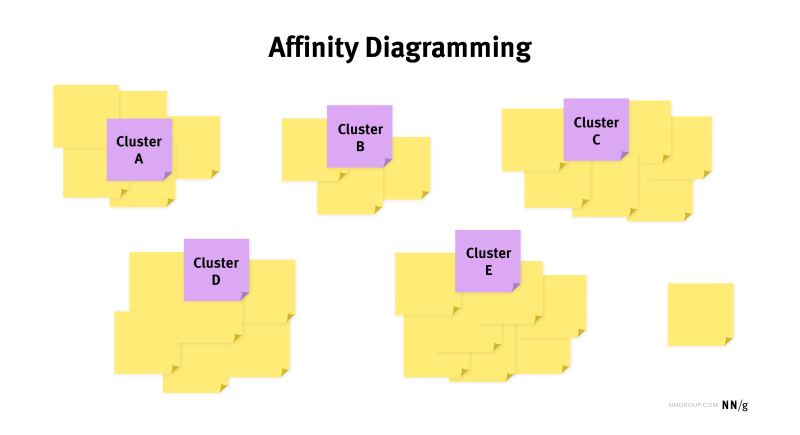
Affinity maps, also known as affinity diagrams, are visual tools used to organize and categorize ideas, insights, or data based on their natural relationships.
These maps are primarily used for in brainstorming sessions, research synthesis, and collaborative design processes.

How to create affinity maps
- Define the purpose to clarify what you want to achieve with the affinity map
- Gather data from sources like user research, feedback, or brainstorming sessions
- Write down individual ideas or insights on sticky notes for easy manipulation
- Group similar ideas together to identify patterns and relationships
- Label each group with a clear theme or category to summarize findings
- Review the map with your team to discuss insights and next steps
Main users of affinity maps
- UX Designers use affinity maps to organize user insights and identify patterns
- Product Managers prioritize features based on grouped user feedback
- Research Teams use them summarize findings from studies and discussions
- Stakeholders gain clarity on user perspectives and inform decision-making
7. Empathy maps
Empathy maps are visual tools used to understand and represent the feelings, thoughts, and behaviors of users or customers.
They help teams gain insights into user experiences by capturing what users say, think, do, and feel in relation to a product or service.

How to create empathy maps
- Define objectives to focus the empathy map on specific user insights
- Gather data from user interviews, surveys, or observations
- Divide the map into sections: Say, Think, Do, and Feel
- Populate each section with insights gathered from research
- Identify patterns and key takeaways to enhance understanding of the user
- Share the map with your team to foster empathy and inform design decisions
Main users of empathy maps
- UX Designers enhance user-centered design by understanding user emotions
- Product Managers align product features with user needs and pain points
- Marketing Teams improve messaging based on user perspectives
- Researchers analyze user behavior to inform future studies
- Stakeholders gain insights into user motivations for strategic decision-making
Pro tip 💡
Use colorful sticky notes for each section to make the map visually engaging and encourage team collaboration
8. Service blueprints
Service blueprints are detailed visual tools that map out how a service operates. They provide a clear view of the interactions between customers and service providers. These blueprints are useful for training staff and ensuring smooth operations.
Key Things to include while creating Service Blueprints
- Customer Actions: What users do while using the service
- Frontstage Interactions: Things that customers see, like employee interactions
- Backstage Activities: Behind-the-scenes processes that customers don’t see but are important
- Support Processes: Systems and resources that help deliver the service
- Physical Evidence: Tangible items customers notice, like brochures or websites
Main users of service blueprints
- UX Designers use service blueprints to visualize user interactions
- Product Managers use it to understand service delivery and improve user experiences
- Operations Teams use them to streamline processes and enhance efficiency
- Stakeholders review them to align on service strategy and objectives
9. UX research presentations
UX research presentations are reports that summarize findings from user experience studies. They highlight user behaviors, needs, and preferences based on research methods. These presentations share insights with team members and stakeholders and help inform design decisions.
How to create UX research presentations
- Decide on key messages to focus the presentation
- Organize findings into clear sections like introduction, methodology, findings, and recommendations
- Use visuals, such as charts and images, to enhance understanding and engagement
- Keep text minimal and focused to avoid overwhelming your audience
- Practice your delivery to ensure clarity and confidence during the presentation
- Gather feedback from peers to identify areas for improvement and make adjustments
Main users of UX research presentations
- UX Designers use presentations to share insights and inform design decisions
- Stakeholders review data to gauge project direction and investment value
- Marketing teams align strategies with user insights
- Developers reference results to ensure technical implementations meet user requirements
Pro tip 💡
Don’t forget to mention relevant UX research methods used, such as user interviews, surveys, usability testing, or observational studies, to support your findings and recommendations.
10. Assumption maps
Assumption maps are visual tools used to identify and prioritize the assumptions behind a project or idea. They help teams figure out what they think they know about their users and the market.
With these assumptions out, you can see which ones need testing or validation. It’s a great way to clarify thinking and guide your research efforts.
How to create an assumption map:
- List assumptions about users, market, and product
- Group assumptions into themes (e.g., user needs, value propositions)
- Rank assumptions by importance and risk
- Develop experiments or research to validate or invalidate assumptions
Main users of assumption maps:
- Product Managers clarify product ideas and prioritize features using assumption maps
- UX Designers understand user assumptions to design better experiences
- Marketing Teams validate audience insights and refine messaging strategies
- Startup Founders identify key risks early to guide development and testing
11. Wireframes
Wireframes are basic visual blueprints of a website or app layout. They outline the structure, content, and functionality without detailing design elements like colors or graphics.
Think of them as a skeletal version of a design that helps teams plan user experience and navigation. They’re useful for getting feedback early in the design process before moving on to more polished visuals.
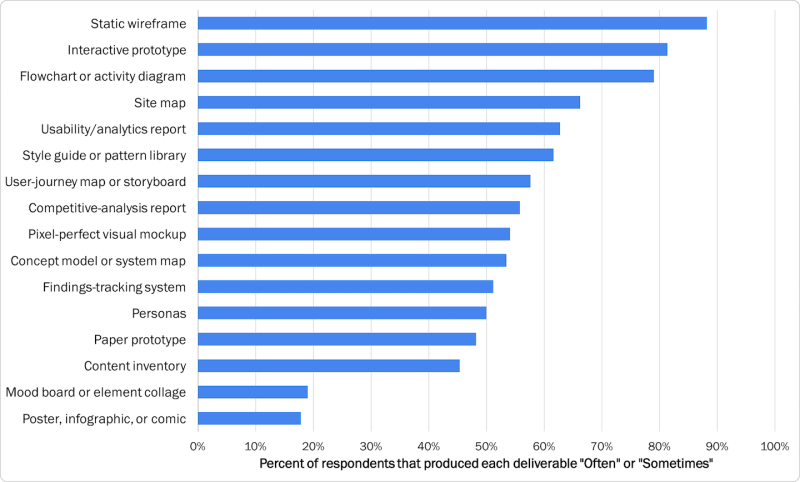
In fact, according to the Nielsen Norman Group, the most commonly created deliverables are static wireframes and interactive prototypes.

How to create wireframes
- Define goals and objectives to guide the wireframe design
- Research user needs through methods like user interviews, surveys, or contextual inquiries
- Sketch low-fidelity wireframes to outline basic structure and elements
- Add details like navigation, content placement, and functionality
- Use design tools to create high-fidelity wireframes for clarity
- Review with stakeholders and gather feedback for improvements
Main users of wireframes
- UX Designers create wireframes to plan layouts and user flows
- Product Managers use wireframes to visualize product features and gather feedback
- Developers refer to wireframes to understand functionality and requirements
- Stakeholders review wireframes to align on project direction and ensure clarity
12. Prototypes
Prototypes are interactive models of a product that simulate user experience and functionality. They range from low-fidelity (like paper sketches) to high-fidelity (like fully clickable digital versions).
Testing prototypes allow designers and teams to test ideas, gather user feedback, and make adjustments before final development.
Steps on creating a prototype:
- State your objectives to clarify what you want to learn or test with your prototype
- Pick your fidelity by deciding whether to create a simple sketch or a detailed, interactive model
- Sketch it out by starting with rough drawings to lay out your ideas
- Build the prototype using a prototyping tool to create an interactive experience
- Test with real users to gather their feedback and insights
- Iterate and improve based on user feedback to enhance your prototype
Main users of prototypes
- UX Designers create prototypes to test and refine user interactions
- Product Managers use prototypes to communicate vision and gather feedback
- Developers refer to prototypes to understand functionality and implementation
- End Users test prototypes to provide feedback on usability and features
Pro Tip 💡
When creating high-fidelity prototypes, focus on details like typography, color schemes, and realistic interactions. This helps stakeholders and users visualize the final product more accurately for a meaningful feedback.
13. User flows
User flows are visual maps showing the steps a user takes to complete a task in a product. They outline the user’s journey, detailing each interaction and decision point.

These flows help designers see how users navigate an interface. This ensures a smooth and intuitive experience while identifying potential pain points.
How to create user flows
- Envision the journey by identifying user goals and main tasks
- Research users to understand their needs and challenges through interviews or surveys
- List the steps outlining key actions users take to achieve their goals
- Map out decisions to highlight choice points and available paths
- Create visuals with flowchart tools to illustrate connections clearly
- Gather team feedback to make necessary improvements
Main users of user flows
- UX Designers create user flows to plan and design user experiences
- Product Managers use them to understand user journeys
- Developers refer to user flows for implementing navigation and functionality
- Stakeholders review user flows to ensure alignment with business goals
14. Site maps
Site maps are visual or text-based representations of a website’s structure and content. They help users and search engines understand the layout of a website, making navigation easier and improving usability.

How to create sitemaps
- Define the scope by determining the website’s main objectives and the content to include
- List all pages and sections of the website, categorizing them into a clear hierarchy
- Choose the format for your sitemap:
- XML Sitemap for search engines to improve SEO
- HTML Sitemap for users to enhance navigation
- Organize the content hierarchically, starting with main categories and subcategories
- Use tools like Google Search Console, Screaming Frog, or online sitemap generators for XML sitemaps
- Create a visual representation for HTML sitemaps using diagramming tools or simple layout designs
- Regularly update the sitemap to reflect any changes in the website’s structure or content
Main users of sitemaps
- UX Designers use them to plan website navigation and user experience
- SEO Specialists rely on XML sitemaps to improve site indexing and visibility
- Content Strategists use them to organize and manage website content
- Web Developers gets a better understanding of site structure during implementation
- Stakeholders gain insights into website layout for informed decision-making
15. User scenarios
User scenarios are narratives that describe how specific users interact with a product or service to achieve a goal. They provide context around user needs, motivations, and behaviors, helping teams understand how users might use a product in real-life situations.
How to create user scenarios
- Identify the target users based on research and user personas
- Define the goals each user wants to achieve when interacting with the product
- Outline the context in which the users will use the product (environment, devices, etc.)
- Create detailed narratives that describe the user’s actions, thoughts, and emotions while using the product
- Include any challenges or pain points the user might encounter in the scenario
- Use visuals or flowcharts to illustrate the scenario and make it more engaging
Main users of user scenarios
- UX Designers use scenarios to create user-centered experiences
- Product Managers prioritize features based on user needs
- Marketing Teams align messaging and campaigns with user motivations
- Developers understand user interactions for better feature implementation
- Stakeholders gain insights into user behavior for informed product strategy
Mistakes to avoid when creating deliverables
Here are some things to steer clear off when creating UX deliverables:
👎 Not connecting research findings to business goals
If your research findings don’t connect to what the business aims to achieve, they can seem irrelevant.
For example, if you conduct user research about a feature but don’t show how it impacts user retention or revenue, stakeholders might not see its importance.
Always clarify how your insights support the company’s objectives to reveal their value.
👎 Overloading stakeholders with information
Piling on too much data can confuse and frustrate your audience. Let’s say you are presenting a 50-slide deck filled with detailed metrics without highlighting the key takeaways.
Stakeholders might lose interest or miss critical points. Instead, focus on the most impactful insights and present them clearly to keep your audience engaged.
👎 Not including the visuals
Visuals can make or break your deliverable. If you provide a dense report full of text without any visuals, it can feel overwhelming.
For instance, a chart showing user growth over time can communicate trends more effectively than paragraphs of text. Use graphs, charts, and images to clarify your ideas and make them stick
👎 Using technical language and jargon
Hiding behind technical terms can alienate your audience. For instance, if you describe a product feature using industry-specific jargon without explaining it, non-technical stakeholders might feel lost.
Aim for clarity and simplicity. Use everyday language so everyone can understand your message and connect with your ideas.
Storing UX research deliverables
Properly storing and organizing UX research deliverables is essential for maximizing their impact and usability. Here’s why it matters:
- Accessibility: A well-organized repository makes it easy for team members to find and reference research insights, ensuring that valuable information is readily available
- Consistency: Standardized formats for storing research help maintain uniformity across deliverables, making it easier to compare and analyze findings over time
- Collaboration: A centralized UX research repository ensures collaboration among team members, allowing for shared knowledge and insights that enhance the overall design process
- Preservation: Storing deliverables in a dedicated repository helps preserve valuable research data and insights for future projects, ensuring that knowledge is not lost over time.
Pro Tip💡
Regularly review and update your repository to ensure that it reflects the latest research and insights. This practice keeps your team informed and engaged with the most relevant information
Wrapping up
Creating effective UX research deliverables is crucial for getting everyone on the same page. They help you win over stakeholders and enhance the user experience. These deliverables are more than just reports. They share valuable insights and explain your design decisions.
To simplify this process, you need a platform that does it all. That’s where UXtweak comes in. With UXtweak, you can conduct user interviews, run usability tests, and evaluate prototypes and websites – all in one place.
With so many tools and templates, your team can focus on what matters most – creating great designs that users will love. Want to learn more about how it can help?

