When discussing accessibility, the first person that pops into the minds of people is probably a person in a wheelchair. Thinking about software accessibility, the next two types of disabilities might come into mind are blindness and deafness.
These are three types of disabilities most people commonly think of when talking about accessibility: blindness, deaf and hard of hearing and mobility impairments. And all three of them are important when optimizing software for accessibility, but there are other ones, and in this article will dive into one that is often forgotten: cognitive disability. There are many kinds of cognitive impairments, to mention some: Dyslexia (difficulty reading), AD(H)D (Attention Deficit Disorder), Autism Spectrum Disorder or Asperger’s. I got my Dyslexia diagnosis as a kid, and not long ago, a lot of things in my life started to make sense with another diagnosis: I have ADHD. And while many people might not see the connection between software accessibility and neurodiversity, I can tell you: there are things we, as UX Designers, can do to make the life for neurodivergent people, like myself, a lot easier. In this article I will focus on (adult) ADHD.

How does ADHD manifest itself?
Please note: it’s hard to put a whole disability into a short article or even one or two paragraphs. Within these constraints, I can only give a brief, simplified summary that represents the core symptom on a very high level, so please keep in mind that ADHD is a lot more complicated than this.
There are three core symptoms of ADHD:
- Attention: difficulties to concentrate and forgetfulness. People with ADHD are especially easy to distract and are easily bored — it’s hard to focus on a task that doesn’t interest them.
- Impulsivity: difficulty to listen to others and holding a thought, interrupting others, problems handling unstructured situations that require reflection and thinking things through.
- Hyperactivity: problems to regulate physical activity like trouble sitting still but also racing thoughts/ a hyperactive mind.
These three symptoms can have many different faces and while some people with ADHD have symptoms from all three categories, others are just affected by one or two of them.
In my opinion, one of the most important steps in UX design is empathizing with the user, so I would definitely recommend you to read a few articles about (adult) ADHD — also if they aren’t related to software. My favorite one is “Living With Adult ADHD: Explained In Comics” by Ana Krajinovic. Also checkout my favorite ADHD Instagram accounts the_mini_adhd_coach and adhd_couple.
Additionally, it’s also worth mentioning that many people with ADHD (especially women) get diagnosed late in life or not at all. I got my diagnosis at 26, and this is not a rarity, as for example Diamond Sharp describes her journey in her article “My ADHD Diagnosis Took Nearly 30 Years”. Therefore, the number of unreported cases of people with ADHD is probably much higher than the official figures.
How might ADHD affect the usage of software?
Example: Forgetting to send a mail
To help you to empathize with adults with ADHD, I have a little software-related example for one of my biggest ADHD problems: forgetfulness. In retrospect it is actually a little funny for me, because I nearly failed to get an ADHD diagnosis because of my ADHD symptoms. But let’s start at the beginning.
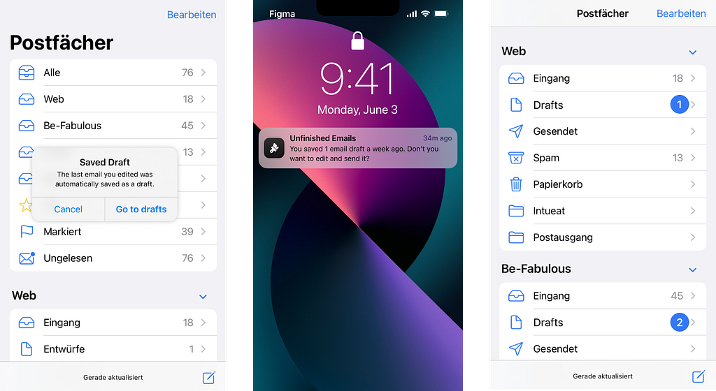
It is extremely difficult to get an appointment for an ADHD diagnosis as an adult in Germany. When I finally got an appointment after two years of searching, only one step separated me from the appointment: I had to plan and confirm it. I received the appointment proposal via mail and of course I was really excited after all this time of searching. So I immediately wrote a reply to it. But I did not send it, because I got distracted by the other steps I had to take: check my private calendar and enter the appointment, do the same with my calendar at work, and I had to apply for leave for the day, because the appointment would last 3 hours. In the end, I never sent the mail because I got distracted beforehand and simply forgot. But since the appointment was in my calendar and the task didn’t appear on any one of my todo-lists or as a reminder, the task was completed for me. Additionally, I was 100% sure that the appointment would take place. But the completely written mail sat in the “drafts” folder of my email inbox for several days. And I finally found it by accident when I created and edited another draft. This was only one day before the actual diagnosis date and I got really distressed because of my error — but at least this story has a happy ending, because I was lucky that they hadn’t given the appointment to someone else.
I chose this example because it involves software (which actually often helps me to handle ADHD a lot better than without it). But in this case my email inbox could have been more helpful if it was considering my core symptom: forgetfulness. And here are a few suggestions:
- When I open the email program, it should tell me that it has automatically put the mail I started, when working with the program the last time, in the drafts.
- I can’t think of any scenarios where it makes sense to leave drafts for several weeks, so push notifications about drafts might make sense — at least as a feature that can be switched on and off.
- Additionally, the number that counts the drafts in the UI could be highlighted.

- Mails that have been answered get a small gray arrow to the left of the recipient in the Apple Mail app. This is a good start but easy to overlook, by a clearer distinction between answered and unanswered mails you could better see at first glance where something is “still open”. Of course not every email needs to be answered, but I definitely think this could be something worth ideating.

I hope this gave you a little insight into the problems I struggle with. I will give smaller examples along the way, but let’s dive into the symptoms that might be issues in regards to software.
ADHD symptoms and ideas for good design
Forgetfulness
Like I said, one of my biggest problems with ADHD is forgetfulness. While software in general currently is my most valuable help to work against forgetfulness — digital todo-lists, calendars and reminders — many software applications could still be improved a lot to help me not to forget important things.
You already read one example above and there are a lot more, e.g. Whatsapp messages I forget to answer until they are covered by so many other chats that I don’t even see them anymore or automatically renewing contracts which have already cost me a lot of money and led to some companies holding my eternal hatred. But speaking on more general terms here are a few ideas for features/ designs that will help people with ADHD to not forget:
- reminders or push notifications for things that shouldn’t be forgotten
- provide visual highlights for important numbers or elements
- avoid dark patterns like automatically renewing contracts without reminders (these might bring in more money for a short time, but in the long run it leads to angry, unhappy users)

Losing things
Closely linked to forgetfulness is losing things — keys, wallets, … I sometimes spend way too much time searching for a thing in my small flat. But let’s get to the digital space, what are things one might lose in software? A few things that come to my mind are passwords, usernames, files… And here are my suggestions:
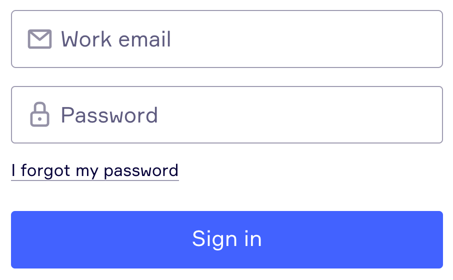
- If it is not 100% necessary to use something other than the email address for login, don’t do it (as it is always the same and easier to remember than the 100th username or id).
- Create an easy way to retrieve a forgotten password (especially don’t use more things that are hard to remember, like the once popular questions like “What was your best friend’s name in elementary school?” with “unique” answers — I for one am quite proud of the fact that I had more than one friend in elementary school)
- If your software works with files, provide an “Open Recent” or “Reopen Project” listing the files that a user recently worked on.

Easily distracted
It’s not uncommon for me to start a task and then get distracted by something else and completely forget what I was doing before. Or to zone out to the beautiful bird in front of my window in the middle of a conversation. In the physical world one of the worst places for me to be with other people is a restaurant or bar with a non-stop running TV, because I can’t stop myself from looking at the TV and getting distracted even though it shows the sports channel and I don’t even like sports. Don’t be this kind of website or application, instead:
- Choose a minimalistic design with only necessary information and don’t overload the screen — it’s ok to scroll, not everything has to fit on one screen. But: too minimalistic can be understimulating — as Sam Skeels describes in his article “New design is now; accessibility and ADHD” — so don’t be afraid to use bold designs, bigger text and color (but please don’t make it blink or move — see below).
- Be sparing with moving elements like gifs or videos on autoplay — I can tell you I’m not able to read e.g. a medium article using gifs, because I just can’t concentrate on the text when there is something moving in my peripheral vision.
- Avoid unnecessary pop ups at random times (like “Do you want to sign up for our newsletter?”), because they will completely kick the user out of their current workflow and distract them.
- Strive for a simple, clear navigation and don’t use super complex menus with too many subitems and branches.
Difficulties with instructions
Many people with ADHD feel overwhelmed by instructions. Too many steps might make them lose sight of the purpose of the task or simply overwhelm them into quitting — a good non-digital example here is complicated German bureaucracy. In the digital world it might be filling out any kind of form like for account creation or checkout in an online shop. Or using software to set something like a new project up. And here are my tips:
- Always, but especially in forms, use easy language throughout your application.
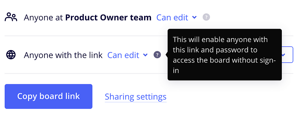
- If things are getting complicated, include additional help to explain them.
- Think through your form structure and try to keep it simple (especially the instructions but also the general structure). Don’t make the user think and help them do everything step by step.

Time-blindness
One problem that many people with ADHD have is time-blindness. When they are excited about something, they quickly disappear into hyperfocus and forget everything around them. While this is a symptom that can have many positive aspects, time blindness is a negative aspect to it that can also have negative consequences, such as fees for missed appointments or social trouble because a friend has been stood up. In a digital context, this often happens to me when watching videos, playing a videogame or even diving into my newest topic of interest. Here are a few ideas how good design could at least help with time blindness:
- Don’t let your application cover the clock of the device (cell phone or PC). Some mobile apps and most video games I know do this, and it really doesn’t help when you are already having problems with time blindness.
- In some applications, it might make sense to remind the user that they have been non-stop using the software for hours. E.g. on my phone, I like to use a native iPhone feature for this, it reminds me every 15 minutes that I have used my “daily limit” of Instagram, and I manually have to unlock the further usage.
Difficulties to wait
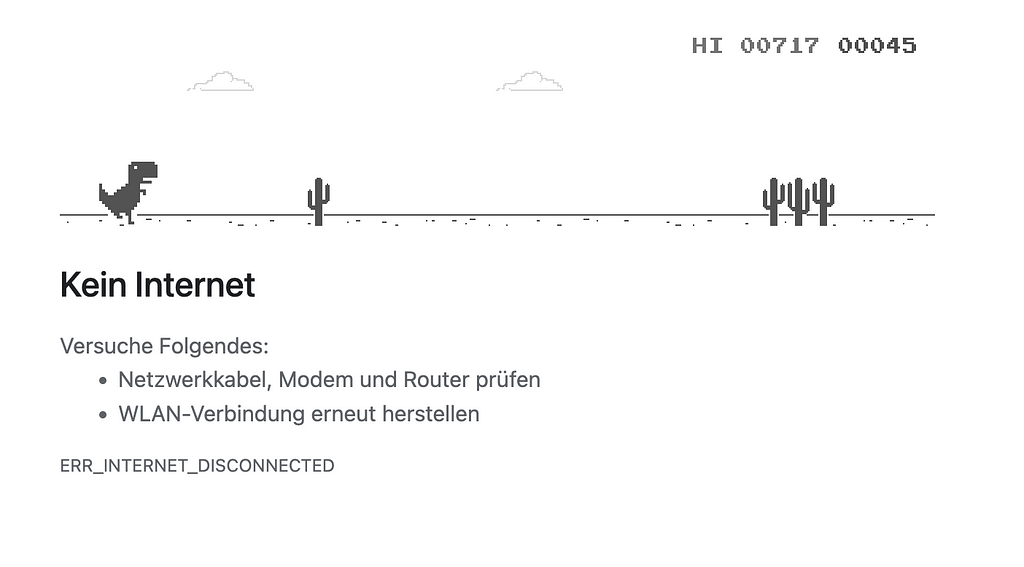
I think nobody really likes to wait, but for people with ADHD it can be really frustrating and even cause them to lose their temper. The most helpful tip in the digital world might be to improve the application's performance. But that’s not all that can be done, the least is a good progress indicator that tells how long something e.g. an update or downloading software will need. An example of the nicest usability for waiting that I know is Google Chrome, where you see a little built-in game — jumping over obstacles with a cute pixel dinosaur — when there is no internet connection and you have to wait until the connection is back.

Sensory overload
This is not an official ADHD symptom, but many people with ADHD report that they are more sensitive to sensory stimulation. This is also a common trait among people diagnosed with Autism Spectrum Disorder (ASD). While many people are mostly really sensitive to sounds, there are a few other senses that can cause overload: Smells, Textures e.g. from clothing, Tastes, Light. In the digital world not all of them are relevant, but here are a few suggestions:
- Provide a dark mode of your software for people that are sensitive to light.
- Don’t automatically start videos with sound on your website/ application when opening it — instead let the user start it manually or at least automatically start it on mute.
As UX designers, product managers and software developers, we have it in our hands to make the digital space accessible for everyone and to even drastically improve the life of users with disabilities with great design. Compared to 10–15 years ago, when digital products were not such an integral part of my life, I am now much better at dealing with my cognitive issues. Software helps me remember things, follow healthy routines, and overall manage my life. Not a day goes by that I don’t use the native features of my digital devices like reminders, the calendar and todo lists. But also smaller apps, like an app that reminds me once an hour to drink enough, are absolute game changers for me.
Let’s work together to make the digital space even better and more accessible to users with (cognitive) disabilities. Here are a few more articles about this topic:
- In “UX Principles that include Cognitive Accessibility” Gareth Ford Williams did “draft a set of principles based on NN Groups Usability Heuristic interpretation of Cognitive Design, but re-imagined from a neurodivergent perspective”.
- “Web accessibility for cognitive, learning and neurological impairments” by Andreea Popescu gives even more tips on good web design for cognitive disability.
And let’s not forget about the other types of disabilities:
- “7 Things Every Designer Needs to Know about Accessibility” by Jesse Hausler
- “Digital accessibility in the UX process” by Oriol Banus
- “Accessibility Handoff: a guide for product designers” by Jahde Vaccani
- “Designing for colorblind access” by Alex Chen
Software accessibility for users with Attention Deficit Disorder (ADHD) was originally published in UX Collective on Medium, where people are continuing the conversation by highlighting and responding to this story.