
In the age of minimal designs and user friendly websites, using a website pop-up may not always seem like a bright idea.
However, the design of your pop-up may just be the difference between a converted used and a user that never returns to your website.
Whether you’re using a website pop-up to improve the effectiveness of a course, trying to make more sales, or simply getting people to download yoou latest ebook, getting the pop-up design right is the key to success.
Without further delay, let us discuss the various elements that make up a conversion-focused pop-up:
Style Of Pop-Up
Before deciding upon the other elements of a pop-up, you must first consider the style of the pop-up. This is an important consideration as certain styles tend to be more effective than others.
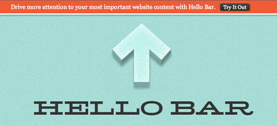
A Sumo study found that email subscription pop-ups have the highest conversion rate (2.9%) while hello bar pop-ups (see example below) have the lowest conversion rate (0.5%).
However, you must not depend entirely on this one study to choose the pop-up style for your website. Think about the overall design of your website and your objectives. Think about the user experience on your website. Think about how different styles improve (or degrade) the user experience.
Let these considerations guide your decision to decide the style of pop-up you will use. However, don’t stick to the first one you develop.
Instead, test different styles against each other to find the right style of pop-up for your website. In fact, testing each element is one of the most common elearning popup banner campaign tips to improve conversions.
Colours
Anyone that works in marketing understands that colours have a significant effect on the human psychology. Understanding the same can effectively guide your choice when it comes to designing a pop-up.
However, it is also important to consider the colour pallette that is already in use on your website (aka, your brand colours). The colours you use in your pop-up should be consistent with the colours visible on other parts of your website.
Content
The message of your pop-up is arguably the most influential element when it comes to conversions. Fortunately, getting the message right is not an insurmountable challenge. Just follow these best practices to get started:
– Use emotional, action-triggering language
– Keep it short, nobody has the time to read a 300-word pop-up
– Highlight the benefits of your offer
– Try to incorporate a sense of urgency in your message
– Make use of headlines, body copy, and a CTA
– Maintain consistency with your brand voice
As mentioned earlier, these are just the best practices to get you started. It is still advisable to develop multiple messages and test them against each other. Moreover, with the right audience data, it is also possible to customise your message for different segments of visitors.
Call-To-Action
Another extremely important element of your website pop-up is the call-to-action. It tells the user what they need to do in order to avail the benefits described in the pop-up.
For this reason, it is important to ensure that the pop-up copy is simple, concise, and describes a clear action that needs to be performed.
Moreover, it is also important to ensure that your call-to-action button stands out. It is a good idea to use contrasting colours on your pop-up. Just keep in mind that the contrast is not messing with the design of your pop-up.
Bringing It All Together (Conclusion)
Finally, when you have perfect each individual element of your pop-up, it is time to bring them together and make sure that they look and feel coherent. It should be easy to follow and should look like an extension of your website instead of a stand-alone element. The text font and size should be easy to read and image (if any) should be high-resolution.