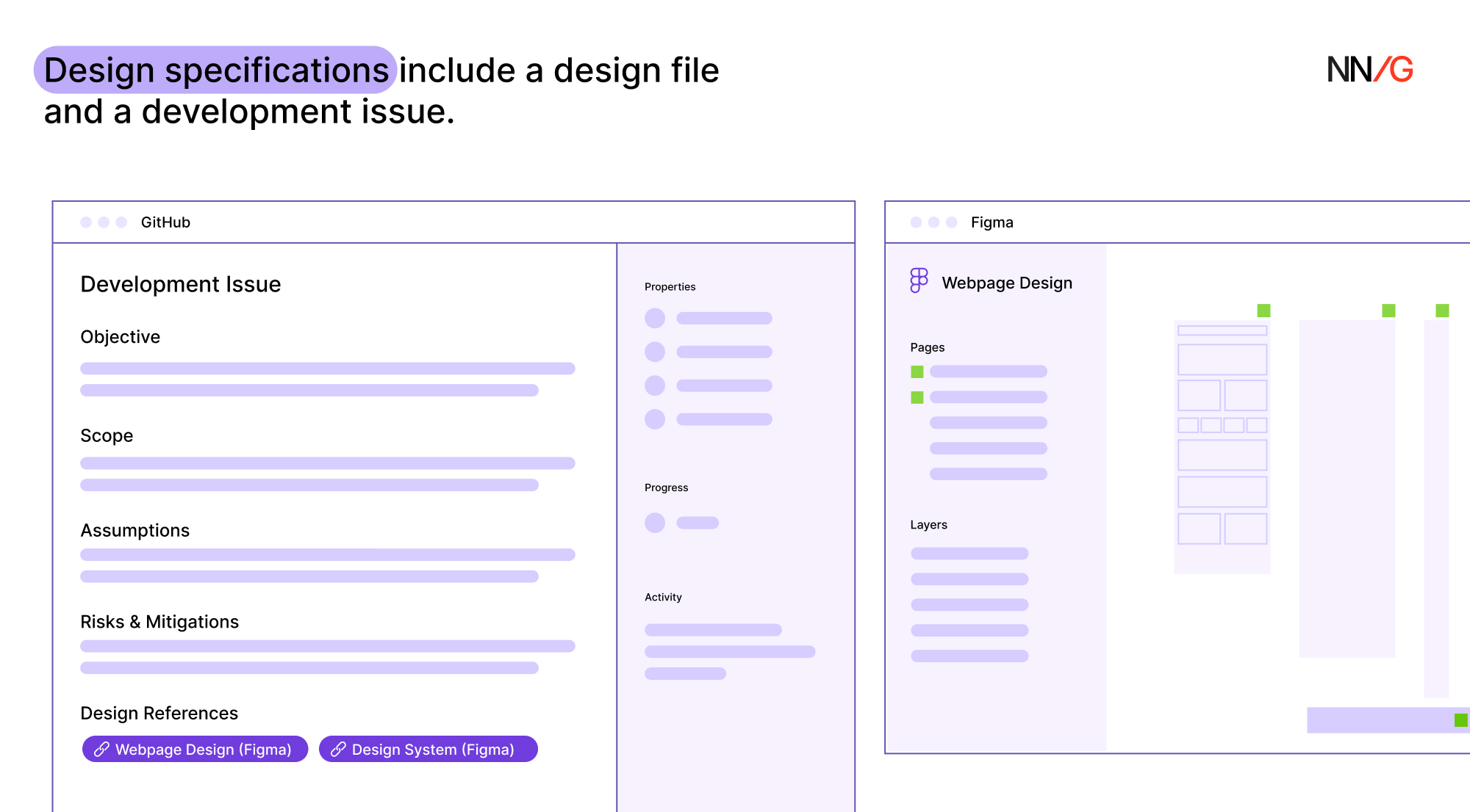
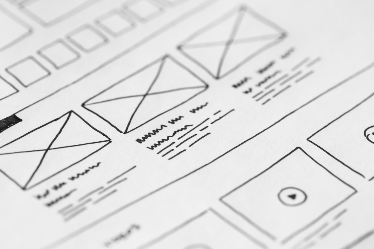
Summary: Design specifications should provide all the relevant information needed to align the design and development teams. You work tirelessly on a new design project. It’s your masterpiece… until the dev team says it isn’t possible. Most designers have experienced this situation at some point in their careers. As frustrating as it may be, there… Continue reading Creating Design Specs for Development
Tag: indicators
Designing for Serial Task Switching
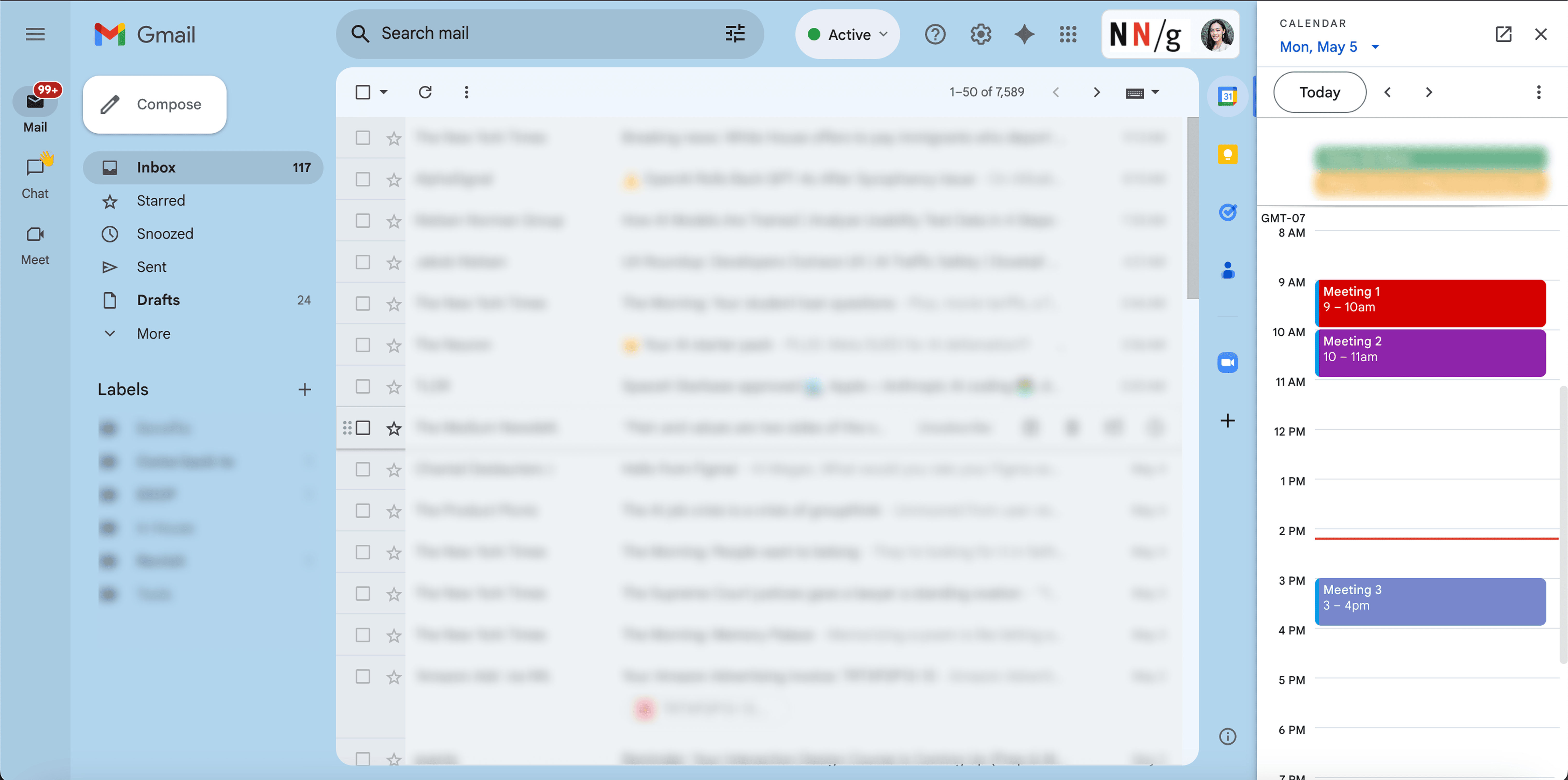
Summary: Serial task switching, or rapidly shifting attention between tasks, is a natural user behavior that lowers productivity and increases stress and the chance of errors. Be honest. How many tabs do you have open right now? If you’re like me, it’s probably more than you’d like to admit. Serial task switching is a natural… Continue reading Designing for Serial Task Switching
How to Create a Reward System That Actually Works
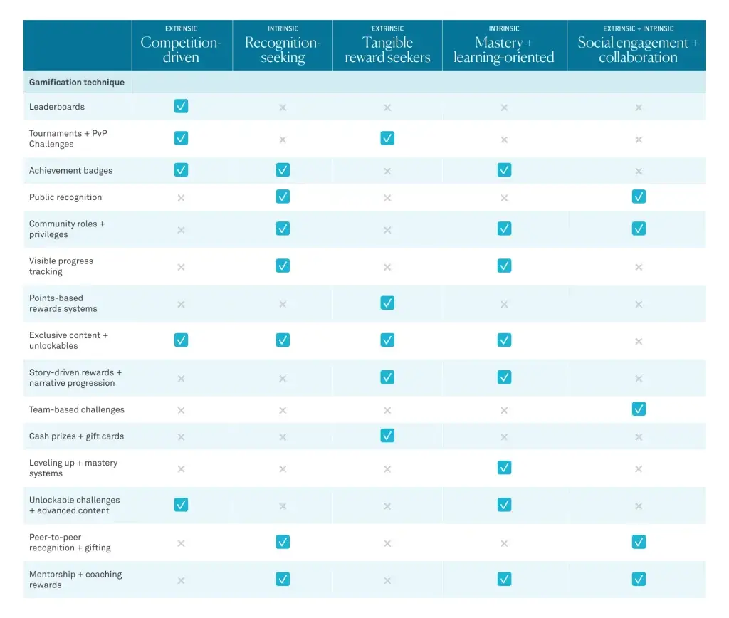
Gamification is everywhere these days—from fitness apps that give you badges for hitting your step goal to language-learning platforms that keep you hooked with streaks and leaderboards. But let’s be real: not all reward systems are created equal. Done right, they can make an experience fun, engaging, and even addictive (in a good way). Done… Continue reading How to Create a Reward System That Actually Works
Developing WP Theme With Interactive Features
In the world of WordPress (WP) theme development, interactivity and functionality are at the heart of a modern, engaging user experience. Today’s web users expect responsive designs, seamless animations, and real-time feedback from the websites they visit. Achieving these interactive elements in WordPress themes requires a solid understanding of front-end development—particularly JavaScript—alongside WordPress’s PHP-based structure.… Continue reading Developing WP Theme With Interactive Features
How do I propose to improve the usability of Gymnasium.com
[unable to retrieve full-text content] Photo by Hal Gatewood on Unsplash I pretty much discovered UX Design through their UX fundamentals course while working as a Test Automation Engineer. Although the course material was excellent, covering the fundamentals of UX beautifully, the platform itself had some clear usability issues. Gymnasium features a clean and simple design… Continue reading How do I propose to improve the usability of Gymnasium.com
Content Standards in Design Systems
Summary: Content standards in design systems support a holistically consistent user experience and efficient collaboration between writers, content, and UI designers. Efficiency and consistency are always at the top of UX practitioners’ minds, especially for teams facing tight deadlines or resource constraints. While design systems commonly prioritize UI design components and patterns, incorporating content standards… Continue reading Content Standards in Design Systems
Designing for accessibility beyond compliance
Companies approach accessibility as a checklist of standards — but a client with disabilities showed me how to think beyond compliance. Source: Photo by Marcus Aurelius During my time volunteering at Neil Squire Society, and helping Hunter, a client with disabilities, be more comfortable using a computer, I learned a lot about how to better design from three… Continue reading Designing for accessibility beyond compliance
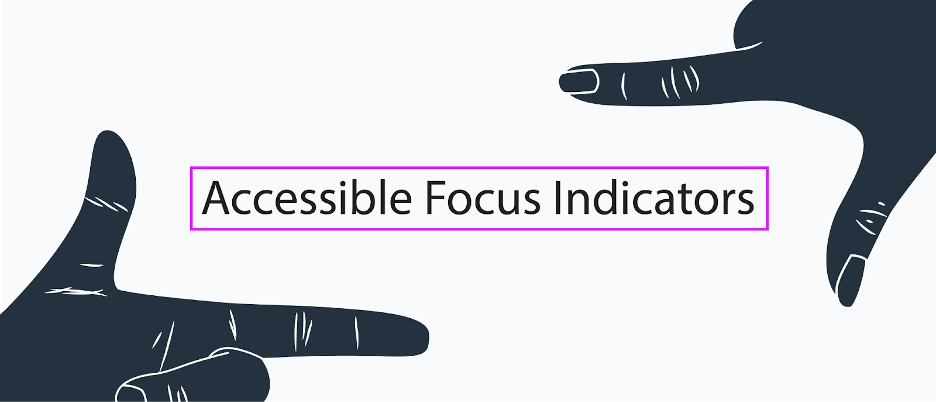
Give Your Site Some Focus! Tips for Designing Useful and Usable Focus Indicators
What Are Focus Indicators? Have you ever noticed the blue outlines that sometimes show up around buttons or form fields? What about when you click on a menu item? Have you ever tried to make those outlines disappear? Here’s a hint: by default, browsers use the :focus css pseudo class to give outlines to form… Continue reading Give Your Site Some Focus! Tips for Designing Useful and Usable Focus Indicators
Exciting New Tools for Designers, September 2021
Since school is back in session, this month’s roundup has a learning focus. In addition to tools, many of the resources include guides, tutorials, and cheat sheets to help make design work easier. Here’s what’s new for designers this month. ScrollingMockup.io ScrollingMockup.io generates high-definition, animated scrolling mockups in minutes. All you have to do is… Continue reading Exciting New Tools for Designers, September 2021
8 Easy Ways to Improve Your Website Typography in Under 30 Minutes
Typography is one of the most important elements of any site, having a measurably large impact on brand and experience. So fundamental is it that making wholesale changes to your typography — opting for a new font, changing the measure, increasing leading — is complex and fraught with potential time-sinks. But there are some simple… Continue reading 8 Easy Ways to Improve Your Website Typography in Under 30 Minutes
The Latest Research for Web Designers, January 2020
One of the most powerful tools we have in web design is consumer and industry data. It’s like a gauge that tells us whether we’re still heading in the right direction or it’s time to change course and adopt a new strategy or approach. Unless you’re combing the web for the latest news and reports… Continue reading The Latest Research for Web Designers, January 2020
How Powerful Micro-Interactions Boost Your UX
Because of the sense of value users perceive from micro-interactions, they not only boost engagement, but also inspire positive feelings towards your brand, and ultimately, influence users’ actions. This article will discuss the basics of micro-interactions and how you can utilize them to enhance your UX design. What Are Micro-Interactions? In digital design, micro-interactions are… Continue reading How Powerful Micro-Interactions Boost Your UX
How to Create the Ultimate Social Media Listening Dashboard for Online Marketing
You can’t go wrong with social media marketing. Whether you’re a digital agency offering logo designs, SEO services, or even an ecommerce website, it pays to have your social media presence up and running and getting attention like a digital peacock. The only problem is, it can be challenging to pull this off with all… Continue reading How to Create the Ultimate Social Media Listening Dashboard for Online Marketing
How to Find the Best SaaS Products for your Company
Are you on the hunt for some software that will help you run your business more smoothly? Whether you’re needing something to help with payroll, project management or HR, we’re living in a time where specialty trade software is growing faster than Jack’s beanstalk. Finding a great third party tool for you business can indeed… Continue reading How to Find the Best SaaS Products for your Company
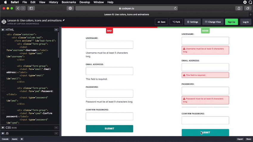
Best Practices for Displaying Form Errors
One of the most important but often neglected aspects of form design is the display of error messages. Helpful and well-designed error messages can improve the user experience, while confusing ones can lead to frustration. Learn how to get it right in our new short course, Best Practices for Displaying Form Errors. What You’ll Learn Submitting… Continue reading Best Practices for Displaying Form Errors
Top 12 Web Design Trends 2018: Space Odyssey Infographics
There’s always been a lot of fuss around web design trends. Some of them live for 2 – 3 years and fade into oblivion. Others don’t die out completely: they evolve and make a comeback in a couple of years. What’s the role of them? Why are they so important? The answer to these questions… Continue reading Top 12 Web Design Trends 2018: Space Odyssey Infographics
UX is a Process. SEO, too.
TL;DR: Most people consider the value of both UX and SEO in the same way. Instead, we need to emphasize that both are about the process and an end result, not a product or deliverable. The Internet is a crazy place. Where else can you find a whirlwind of scholarly papers one minute and an… Continue reading UX is a Process. SEO, too.
Essential design trends, December 2016
Do you ever find yourself noticing that a certain design element just keeps popping up? Even those tiny details that look somewhat insignificant can be indicators of design trends. That is particularly true with the elements in this month’s roundup. Each of these trends—white edges framing a web design, cinemagraphs and tiny loading animations—are seemingly… Continue reading Essential design trends, December 2016
4 fresh alternatives to the hamburger menu
Some say web design has become boring. Current trends and high-end techniques establish the rules for the creatives, playing a low-down trick on the community. Everyone wants to be in the mainstream, and release products that go viral; it means that a million interfaces are likely to have the same features. Of course, content can… Continue reading 4 fresh alternatives to the hamburger menu
An Interactive 3D Mall Map Concept
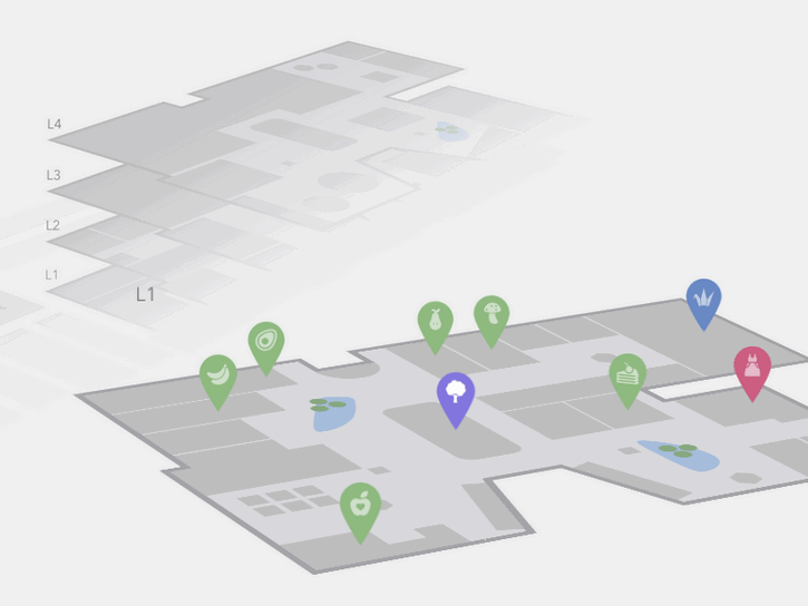
Advertise here via BSA Today Codrops has shared an Interactive 3D Mall Map experiment with us. The idea is to show a mall map with all its floors in perspective. Additionally, we have a search in a sidebar that allows to filter mall spaces. Once a floor is selected, we show some pins as indicators… Continue reading An Interactive 3D Mall Map Concept
Creating an iOS-like Home Screen with CoffeeScript
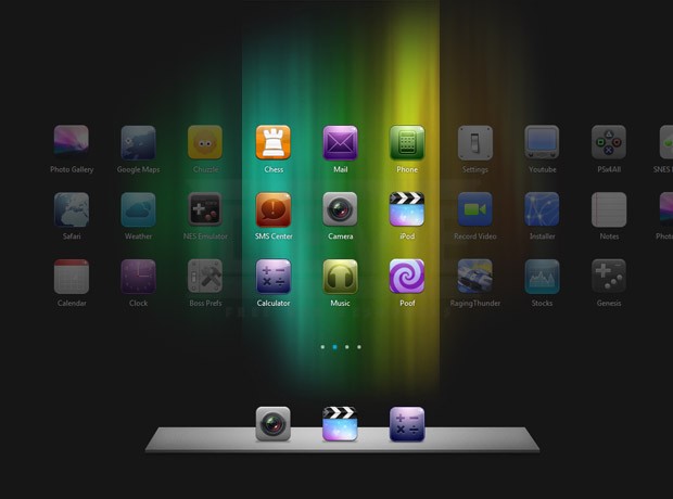
Today we are going to create an iOS-like home screen using CoffeeScript – a new JavaScript based language, and the jQuery library. CoffeScript has a clean syntax that lies somewhere in between Ruby and Python. If you haven’t used any of them, don’t worry – it is not required. However you will need to be… Continue reading Creating an iOS-like Home Screen with CoffeeScript
