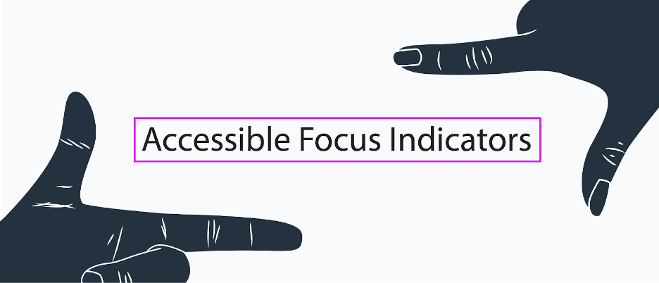
What Are Focus Indicators? Have you ever noticed the blue outlines that sometimes show up around buttons or form fields? What about when you click on a menu item? Have you ever tried to make those outlines disappear? Here’s a hint: by default, browsers use the :focus css pseudo class to give outlines to form… Continue reading Give Your Site Some Focus! Tips for Designing Useful and Usable Focus Indicators
Tag: Internet Explorer
18 Best Contact Form PHP Scripts for 2020
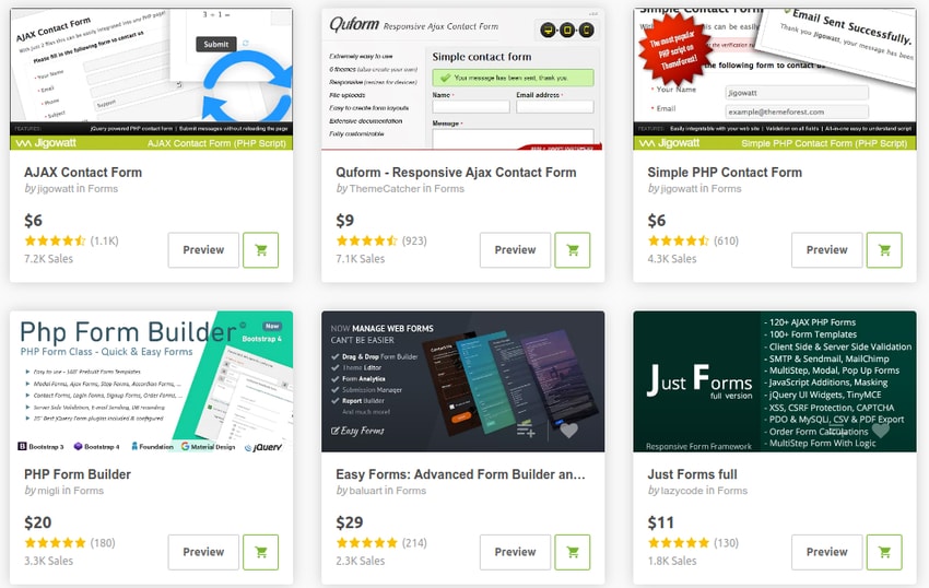
Are you looking for an easy to use contact form PHP script? Contact forms are a must-have for every website. They encourage your site visitors to engage with you, while potentially lowering the amount of spam you get. For businesses, this engagement with visitors increases the chances of turning them into clients or customers and… Continue reading 18 Best Contact Form PHP Scripts for 2020
Comparium: Automated Website Testing Tool
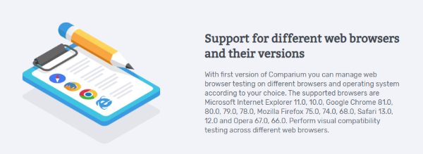
Are you running a business online? And worried about creating the best website for attracting a large number of people? Are you a website developer and need help in designing an error-free website? So you are on the right track as we provide you the complete knowledge of the best tool to test your website… Continue reading Comparium: Automated Website Testing Tool
Would The Web Be Better With One Good Browser?
When Tim Berners-Lee gave us the WorldWideWeb in 1990, it was the first and only web browser. But it didn’t remain alone for long. Even in those early days of the web, there was plenty of competition for web browser market share: Mosaic, MidasWWW, SlipKnot, Arena, Netscape, and Internet Explorer emerged around that time, too,… Continue reading Would The Web Be Better With One Good Browser?
Webster – Responsive Multi-Purpose HTML5 Template
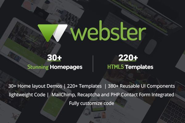
Why settle on one theme and one layout when you can have over 220 HTML5 pages and more than 29 home pages? Yes, Webster is 100% responsive and comprehensive template with cool features like- parallax, smooth scrolling, retina-ready, responsive mega drop-down menu, MailChimp, Recaptcha, PHP contact form, and a bunch of free plugins (Revolutions slider,… Continue reading Webster – Responsive Multi-Purpose HTML5 Template
Getting Started with CSS Grid Layout ― Scotch
.png)
Introduction CSS Grid Layout allows us to construct custom grids with more flexibility and control than ever before. Grid Layout gives us the ability to divide a webpage into rows and columns with simple properties. It also allows us to position and size each element inside the grid using CSS only, without any change to… Continue reading Getting Started with CSS Grid Layout ― Scotch
Weekly Inspiration for Designers #85
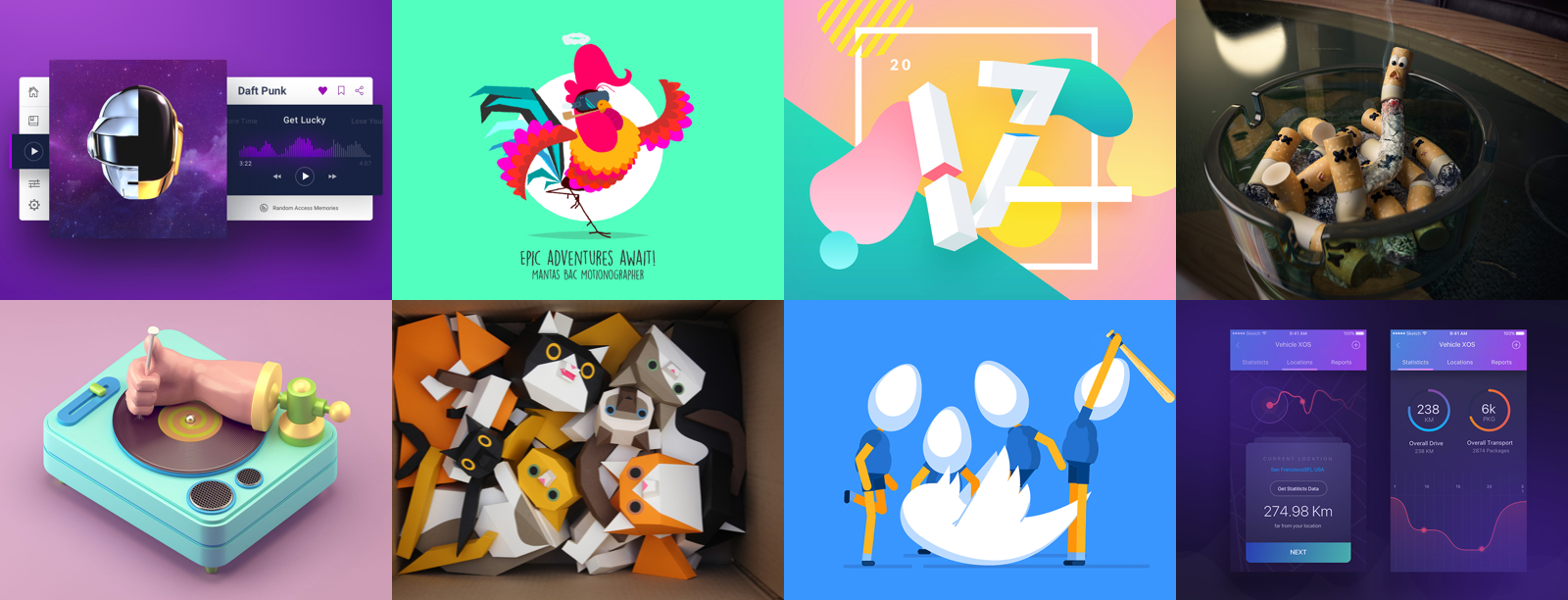
via Muzli design inspiration Illustrator interface by Shan Zi Travel Calendar App by Riko Sapto Dimo Daft punk by Ted Kulakevich for unfold Daily UI #021 Home Monitoring Dashboard by Irene Nam FFM — Music by Messaki Vehicle XOS — Logistics App Screens by Raaz Das Fire Rooster Walk Cycle by Mantas Bačiuška Hungry Dog by Mattia Leoni The gear trio by Tony Babel Twitter: A Few Bad… Continue reading Weekly Inspiration for Designers #85
Cheat Sheets Web Designers Need: CSS3, HTML5 and jQuery
Advertisement When it comes to CSS, HTML or jQuery codes, you just can’t know them all. It’s pretty hard but with the help of these cheat sheets for web designers you can manage to get pretty close to knowing them all, considering that you have everything in from of you and it is easy to… Continue reading Cheat Sheets Web Designers Need: CSS3, HTML5 and jQuery
Quick Tip: Using CSS Counters to Style Incremental Elements
In this quick tip, we’ll cover the very basics of CSS counters; a useful, yet not so well-known CSS feature. When we’re done building our demo, we’ll take a look at some real world examples of sites which take advantage of CSS counters. The Goal: Styling an Ordered List As a first step, let’s look at the… Continue reading Quick Tip: Using CSS Counters to Style Incremental Elements
How to build standards-compliant responsive design using @viewport

One of the key concepts in any responsive design is the change of viewport size. That’s because mobile viewports vary greatly from desktop viewports. To control the viewport size we traditionally use the viewport meta tag. However, the viewport meta tag, like all the worst browser developments of the last forever, isn’t W3C valid. It… Continue reading How to build standards-compliant responsive design using @viewport