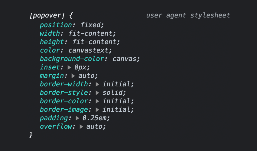
Popovers, a collective term for what you might know as “tooltips”, “overlays”, “modals” or “dialogs”, offer a powerful way to display additional information or actions within a web application. In this tutorial, you’ll learn how to use the new Popover API, a versatile new tool for creating dynamic and customizable popovers. We’ll walk through the basics… Continue reading Using the Popover API: Native Modals for the Web
Tag: Browser
Popular Design News of the Week: November 16, 2020 – November 22, 2020
Every week users submit a lot of interesting stuff on our sister site Webdesigner News, highlighting great content from around the web that can be of interest to web designers. The best way to keep track of all the great stories and news being posted is simply to check out the Webdesigner News site, however,… Continue reading Popular Design News of the Week: November 16, 2020 – November 22, 2020
What Are Android Intents?
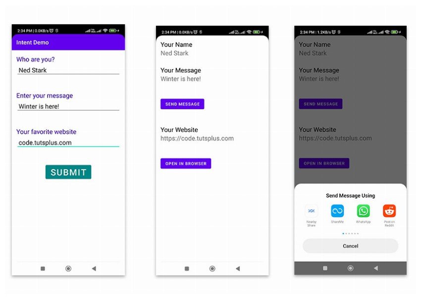
Intents are a fundamental topic for Android developers. It is impossible to build Android applications without coming in contact with intents. In this tutorial, I’ll teach you about intents from A to Z. What Are Intents? In a football match, teammates pass the ball around the field with the aim of sending it into the… Continue reading What Are Android Intents?
Tips for Getting a Web Design from Illustrator into the Browser
Scenario: someone hands you an Illustrator document with their latest web layout and it’s your job to convert it into working HTML and CSS. Let’s take a look how you can do that. Note: The aim of this tutorial is not to perfectly recreate the design for web use. Instead, we’re going to use it… Continue reading Tips for Getting a Web Design from Illustrator into the Browser
Time Saving Synchronised Browser Testing
When you’re making responsive websites, there’s a lot of tweaking and testing to do. BrowserSync makes your workflow faster by synchronising URLs, interactions and code changes across multiple devices. It’s wicked-fast and totally free. Your scroll, click, refresh and form actions are mirrored to browsers while you test. Browsers are automatically updated as you change… Continue reading Time Saving Synchronised Browser Testing
Free PSD Browser Templates
As a web designer, having browser, mobile or other devices templates is a must! These are perfect for showing your client a screenshot of how his/her website will look. Today we selected some great, free PSD browser templates for you to choose from. These are perfect for showcasing your work! Need more useful templates? Try… Continue reading Free PSD Browser Templates
30 Tutorials for Developing HTML5 Web Browser Games
Modern HTML5 specifications allow for a wide breadth of creativity. Web developers have always been toying around with JavaScript games. But nowadays it is so much easier to jump into the process and create something truly magnificent. This gallery is devoted to 30 tutorials you might use to learn about in-browser game development. These techniques… Continue reading 30 Tutorials for Developing HTML5 Web Browser Games
Browser Testing in the Cloud Redux
I’ve written quite a bit about browser testing solutions trying to help identify techniques and tools that make cross-browser development easier. My last article on the subject covered how to use BrowserStack to test any number of browsers all from one central tool; your own browser. I was on a Windows PC back then so… Continue reading Browser Testing in the Cloud Redux
Detect Browser CSS Support With @supports Rule
Since browsers have their own decision of what features to include, we web developers frequently have to identify if the browser supports particular features, then we fill in the gap using Polyfills (if required). The popular way of handling this kind of situation is by using Modernizr but do you know that we can also… Continue reading Detect Browser CSS Support With @supports Rule
How to build standards-compliant responsive design using @viewport
One of the key concepts in any responsive design is the change of viewport size. That’s because mobile viewports vary greatly from desktop viewports. To control the viewport size we traditionally use the viewport meta tag. However, the viewport meta tag, like all the worst browser developments of the last forever, isn’t W3C valid. It… Continue reading How to build standards-compliant responsive design using @viewport
Getting the Hang of CSS3 Columns
A while back CSS3 introduced a new set of properties, which are responsible for creating columns within your layout. You simple apply these to one of your elements in order to divide it up, automatically and hassle free, into a multi-column set up. This property is very easy to comprehend, set up and manipulate. There… Continue reading Getting the Hang of CSS3 Columns
Automatically Detect Browser Language With PHP
Building a Better User Experience by Designing in the Browser
As a web designer at Four Kitchens, part of my job is leading the production team’s visual design objectives. A key part of this process is ensuring the client’s satisfaction with the overall look and feel of the site. Since most of my projects utilize an agile development process, I am no stranger to shifting… Continue reading Building a Better User Experience by Designing in the Browser
Interactive Challenges & Writing jQuery in the Browser
Try jQuery is a combination of videos, interactive console challenges, and writing code in the browser. You’ll need about 2 hours of time to make it through everything. There is a gentle introduction to what jQuery is, and what it can do. It tells you how to search and walk through the DOM with selectors… Continue reading Interactive Challenges & Writing jQuery in the Browser


