Key takeaways 🔑 Product design is about solving problems. It’s not just about looks, but how a product works, feels, and fits into people’s lives. 👥 User-centered design (UCD) is essential. Designing around real users ensures products meet actual needs, not assumptions. 🏆 User-first products win in the market. Products that feel intuitive and valuable… Continue reading How to Design a Product w/ Users at the Heart of Product Design
Tag: Accessibility
Introduction to Digital Accessibility
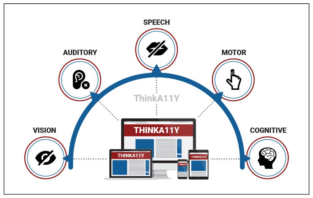
Introduction The dictionary term “Accessibility” means – The ability to acquire, use, understand, or enter into something with ease. Accessibility is a social responsibility. It’s an inclusive approach to creating products, services, and environments that can be used by people of all abilities including people with disabilities. Some examples of accessible solutions include: Wheelchairs Entry… Continue reading Introduction to Digital Accessibility
Three quick ways to shift left and fix accessibility issues sooner
Digital accessibility is essential to the software design lifecycle (SDLC). You can’t build products that meet compliance requirements without it, and if your product fails to meet accessibility standards, you face stalled sales, loss of market share, legal and financial risk, and more. Unfortunately, however, digital accessibility is often an afterthought—if it’s thought of at… Continue reading Three quick ways to shift left and fix accessibility issues sooner
A tailored digital accessibility plan for your organization—in minutes.
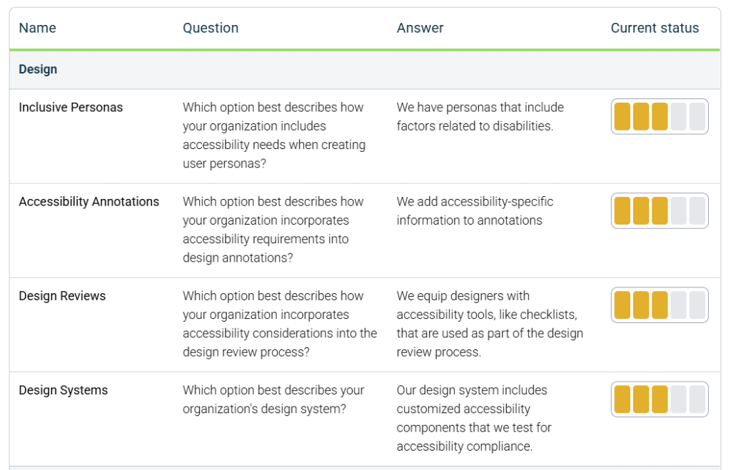
Developing a strategic plan for digital accessibility is one of the most impactful efforts your organization can undertake to create more effective and inclusive customer experiences. Far beyond a legal requirement alone, digital accessibility is a competitive advantage—expanding your reach, improving usability for everyone, and reinforcing your commitment to your customers. With legislation like the… Continue reading A tailored digital accessibility plan for your organization—in minutes.
Accessibility statement for the EAA
TL; DR; The accessibility statement template is based on the demands from the public sector EU web accessibility directive (WAD) and the focus is on assisting the user, rather than merely outlining legal requirements and shortcomings or failures. Even if you cannot do all the recommended things now – add it to your long term… Continue reading Accessibility statement for the EAA
The journey toward a more accessible internet
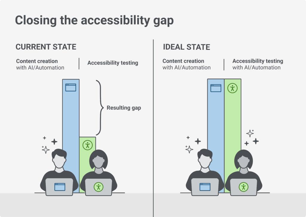
Digital accessibility has come a long way. However, the gap between where we want to be in the future and where we are today is too wide. As of 2024, 96% of the top one million home pages have WCAG 2 failures. Digital content creation is getting easier and faster as content creators increase their… Continue reading The journey toward a more accessible internet
Digital accessibility needs for electric vehicle (EV) charging stations
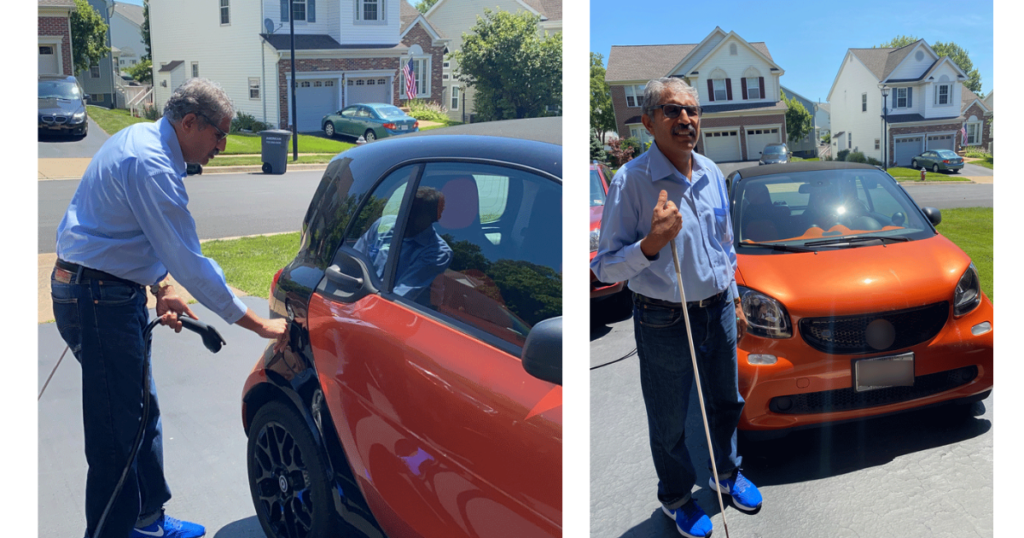
Electric vehicles (EVs) are an increasingly common part of our lives, and based on current predictions, the number of EVs on the road is going to continue going up. This means demand for charging stations will keep rising as well. As with any new, human-centric technology, accessibility is an essential concern. Charging stations present a… Continue reading Digital accessibility needs for electric vehicle (EV) charging stations
Opportunities for AI in Accessibility
In reading Joe Dolson’s recent piece on the intersection of AI and accessibility, I absolutely appreciated the skepticism that he has for AI in general as well as for the ways that many have been using it. In fact, I’m very skeptical of AI myself, despite my role at Microsoft as an accessibility innovation strategist… Continue reading Opportunities for AI in Accessibility
Accessibility and User Experience in WordPress Full Site Editing (FSE)
As we move into 2024, WordPress’s FSE continues to have a real impact on web design, especially in terms of accessibility and user experience. With FSE, customizing every corner of a website is more intuitive, offering an integrated design experience. These innovations are not just enhancing the aesthetic appeal of websites but also their functionality,… Continue reading Accessibility and User Experience in WordPress Full Site Editing (FSE)
Designing for accessibility beyond compliance
Companies approach accessibility as a checklist of standards — but a client with disabilities showed me how to think beyond compliance. Source: Photo by Marcus Aurelius During my time volunteering at Neil Squire Society, and helping Hunter, a client with disabilities, be more comfortable using a computer, I learned a lot about how to better design from three… Continue reading Designing for accessibility beyond compliance
Enhancing Accessibility with AI and ML
There has been a lot of buzz recently about Artificial Intelligence, with some people speculating that we are approaching the long-awaited AI revolution. This hype has been chiefly generated by recent advanced algorithms powering ChatGPT and other language-related models. While I believe that these models are still a far cry from general AI (AI which… Continue reading Enhancing Accessibility with AI and ML
What should be the contrast level of inactive buttons?
Using the APCA Readability Criterion to improve the accessibility of disabled controls Disabled buttons. They need to look non-interactable. But they also can’t be completely unreadable. How do I find the sweet spot? I spent a few hours in a deep dive going through a bunch of blogs and accessibility guidelines documentation in search for best approaches… Continue reading What should be the contrast level of inactive buttons?
Building a Core Accessibility Team: The Keys to the Kingdom
Have you noticed that in today’s digital age accessibility is not just a nice-to-have feature but a fundamental requirement for any product or service? Creating an inclusive user experience is not only ethically responsible but also just makes good business sense. Sustainability in this conquest can be successful or a disaster, depending on how you… Continue reading Building a Core Accessibility Team: The Keys to the Kingdom
Accessibility checklist (Part 2): Four more things usually left out
In a previous article, I listed five things that usually aren’t a part of an accessibility checklist. In that same article, I explained… Continue reading on UX Collective »
Accessibility of the Button: Should We Fix It or the Root Cause Problem?
Let me tell you a story along the lines of…Button, Button, Who’s Got The Button? Typical “how to” articles are dry laundry lists of tactical “do this/don’t do that” mechanics that do nothing to help you think about WHY you should do things differently. Today, I’m going to share a more strategic accessible design approach… Continue reading Accessibility of the Button: Should We Fix It or the Root Cause Problem?
Toggles suck!
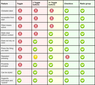
The cookie monster It all started when I wanted to find the best price for a new headset that I needed to perform my online courses for our clients. I went to www.pricerunner.com but I got interrupted by a cookie popup. Knowing that free websites use a lot of dark patterns and tricks to make… Continue reading Toggles suck!
Think Inside the Box: How Accessibility Shapes Digital Product Design
Think inside the box: How accessibility shapes digital product design How constraints ignite creativity, spark innovation, and why accessibility is a uniquely effective constraint everyone should embrace. “Design depends largely on constraints.” — Charles Eames Access to digital technologies is a fundamental human right¹ and legal obligation². In an ideal world, there would be no need for more justification to… Continue reading Think Inside the Box: How Accessibility Shapes Digital Product Design
Accessibility is Officially Recognized as a Cybersecurity Priority
When I joined Deque almost a year ago as the Director of Security, I became acutely aware of the importance of accessibility in cybersecurity. Through my research, I found that not only are cybersecurity solutions in most organizations not accessible for end users, but most tools used by cybersecurity professionals themselves also are not accessible… Continue reading Accessibility is Officially Recognized as a Cybersecurity Priority
Using the Popover API: Native Modals for the Web
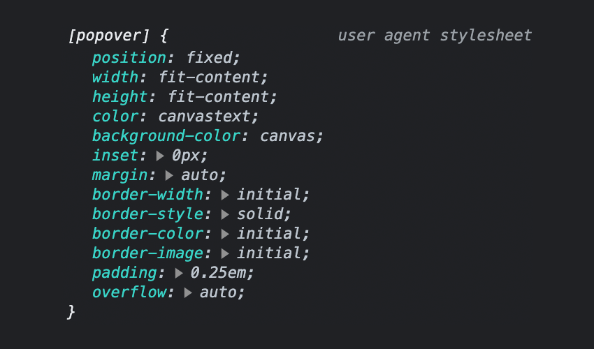
Popovers, a collective term for what you might know as “tooltips”, “overlays”, “modals” or “dialogs”, offer a powerful way to display additional information or actions within a web application. In this tutorial, you’ll learn how to use the new Popover API, a versatile new tool for creating dynamic and customizable popovers. We’ll walk through the basics… Continue reading Using the Popover API: Native Modals for the Web
5 book recommendations to help drive accessibility adoption and strategy
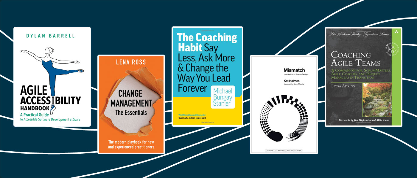
These books helped us help our coaching crews, and they may help you and yours Deque offers a unique accessibility coaching service. We embed coaches in the software development lifecycle (SDLC) across whole teams as well as side-by-side with specific roles. Coaches support teams in incorporating accessibility practices into their design/build/test processes. A coach’s responsibilities… Continue reading 5 book recommendations to help drive accessibility adoption and strategy
Accessibility as an essential pillar in design teams
Creating habits to cultivate the mindset and go from theory to practice It may seem difficult to build a culture of accessibility when that is not the focus of a company or product. There is a myth that accessibility is expensive, demands resources and, above all, time. But what if I tell you it’s possible?… Continue reading Accessibility as an essential pillar in design teams
Measuring Empathy for Accessibility
After my previous blog on the Two Pillars of Accessibility, I was asked on LinkedIn from a peer in the accessibility field how a program could measure and report the empathy pillar of an accessibility program i.e. how much does your company care about accessibility. Measuring the impact of accessibility is relatively easy — you can track… Continue reading Measuring Empathy for Accessibility
Accessibility tools for product teams
Photo by natasaadzic, Getty Images Q: Who in product should be thinking about accessibility? A: Everyone. From product managers, to designers, to developers, to marketers, to care, to the leadership team. Here’s a great overview of the current state of digital accessibility. Right now, just 3% of the internet is accessible. Let me repeat that… Continue reading Accessibility tools for product teams
Accessibility week, low-tech UI, how to ask for a promotion, dark mode
Weekly curated resources for designers — thinkers and makers. “What do we even mean by web3? We have NFTs (non-fungible tokens), cryptocurrencies, the metaverse, blockchain and DAOs (decentralized autonomous organizations). It’s not just one thing we don’t understand. It’s a lot of things we don’t understand. What’s in? What’s out? And how do all of these pieces fit… Continue reading Accessibility week, low-tech UI, how to ask for a promotion, dark mode

