Weekly curated resources for designers — thinkers and makers.

“What do we even mean by web3? We have NFTs (non-fungible tokens), cryptocurrencies, the metaverse, blockchain and DAOs (decentralized autonomous organizations). It’s not just one thing we don’t understand. It’s a lot of things we don’t understand. What’s in? What’s out? And how do all of these pieces fit together?
And then there’s the jargon: Crypto alone has airdrops, altcoins, cold wallets, DeFi, diamond hands, fiat currency, hard forks, gas, hash rate, HODL, private keys, proof of stake, seed phrases, stablecoins and smart contracts to name just a few terms. It’s hard to imagine it now, but there was a time when websites came with instruction manuals. We’ve made a lot of progress since then, and we’re not going back.
We can’t change the world if nobody understands what we’re talking about.”
Web3 has a user experience problem →
By Scott McDonald
The UX Collective is an independent ad-free design publication that elevates unheard design voices, reaching over 500k+ designers every week. Follow us on Medium.
Editors’ picks
Low tech UI →
The forgotten benefits of low-tech user interfaces.
By Jonathan Kendler
How to ask for a promotion →
Self-advocacy with a powerful mindset and quantifiable impact.
By Sam Yuan
Color 102 →
You can learn a lot from a chicken.
By J.R. Spiers

Naming colors in design systems: how language brings logic to a subjective topic.
Jobs
Submit your own job or apply as a candidate
Make me think
The surprising truth about pixels and accessibility →
“If you want to build the most-accessible product possible, you need to use both pixels and ems/rems. It’s not an either/or situation. There are circumstances where rems are more accessible, and other circumstances where pixels are more accessible.”
Have iPhone cameras become too smart? →
“Apple’s newest smartphone models use machine learning to make every image look professionally taken. That doesn’t mean the photos are good.”
Planning for uncertainty →
“Your organization loves timelines. You want your org to plan in a way that acknowledges uncertainty yet provides clarity on how they’ll realize their strategy. What do you do?”
Accessibility week

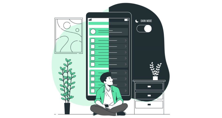
Peering into the accessibility of Dark Mode →
By Dora Cee

How not to do accessible design →
By Carolynn Johnson, Ph.D.

Considering accessibility for people with cognitive disabilities →
By Louise Clark, CPWA

Giving a damn about accessibility →
By Sheri Byrne-Haber, CPACC
Tools and resources
Decentralized design patterns →
Decentralization, off the shelf.
Accessible social →
Make your social media content more accessible.
The component gallery →
An up-to-date repository based on real design systems.
We believe designers are thinkers as much as they are makers. So we created the design newsletter we have always wanted to receive. Feel free to forward this to your friends.
Accessibility week, low-tech UI, how to ask for a promotion, dark mode was originally published in UX Collective on Medium, where people are continuing the conversation by highlighting and responding to this story.