One time, I nearly lost my mind while brainstorming copy for a holiday print ad. I was writing for Havenly, an interior design company, and we were advertising in a popular home decorating magazine. “Keep it simple,” I told myself, “this has been done hundreds of times before.”

An ad that took way too long to write because I was blinded by narcissistic writing. Creative Director & Designer: leigh buck, Copy: Jason Fox
Not only was a simple message about home decor likely to resonate with the audience, but it was also the holiday season. Here I was, with decorating for the holidays as my topic and the readers of HGTV Magazine as my audience. I knew it would take some time to get right, but I certainly wasn’t expecting to perform amazing feats of persuasion. I jumped into my writing process and was feeling good.
And then I got arrogant. Feeling so secure and self-assured about my copy options, I managed to convince myself that I was capable of writing the most amazing holiday decorating advertisement of all time.
I could already hear the praise. I was done for.
What might have been a quick and concise project turned into hours of trying to persuade my colleagues, torturing myself with ideation exercises, and ultimately degrading what could have been an enjoyable experience.
Pitfalls of selective perception
Intuitive and empathic writing is complex. And as writers, we spend a great deal of time thinking about how users might interpret our words. Context-appropriate approaches that are based on empirical testing are typically front and center in our processes.
But we’re writers. We’re creative by nature. So it’s often tempting (and sometimes rewarding) to listen to our gut and forget everything else. Because who knows, maybe this time we’ll buck the trend and pull off the impossible? It rarely works that way, though.
In the case of Havenly’s HGTV Magazine ad, I let a little bit of narcissism creep into my writing process, and it wrecked me.
Narcissistic Copy
Narcissism in writing, as I see it, is when preference is given to a strategy, technique, or style that aligns with personal preference rather than what actually works with a given audience.
This phenomenon might sound like the fringe problem of an over-worked or under-trained copywriter. But it’s actually quite prevalent and often flies below our radars.
Let’s take a look at a few examples of copy in love with itself:
The Confirmshamer
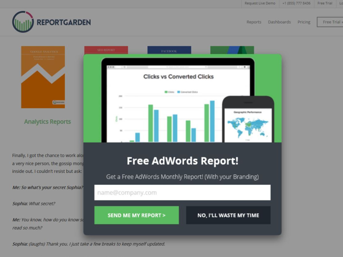
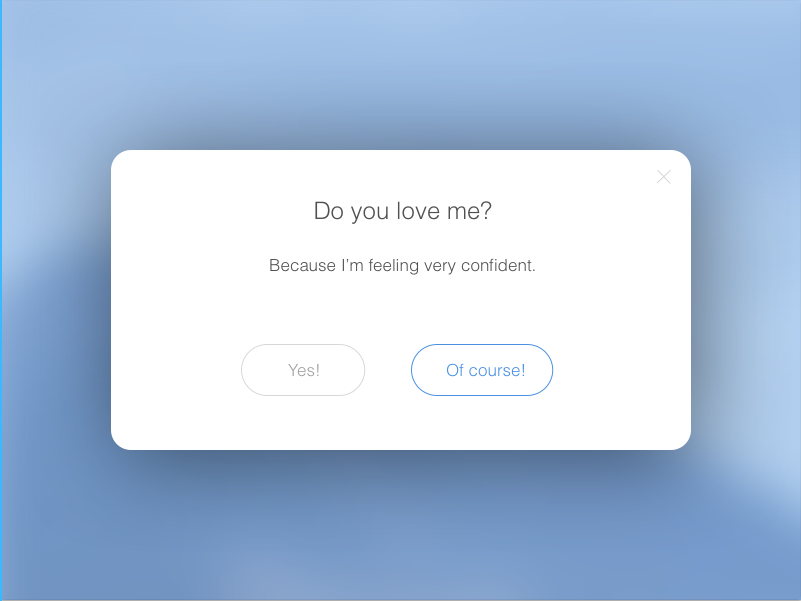
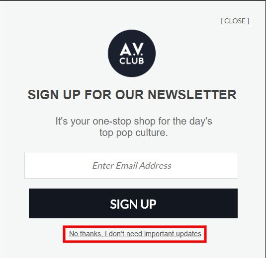
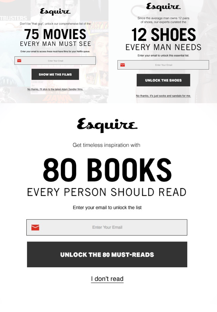
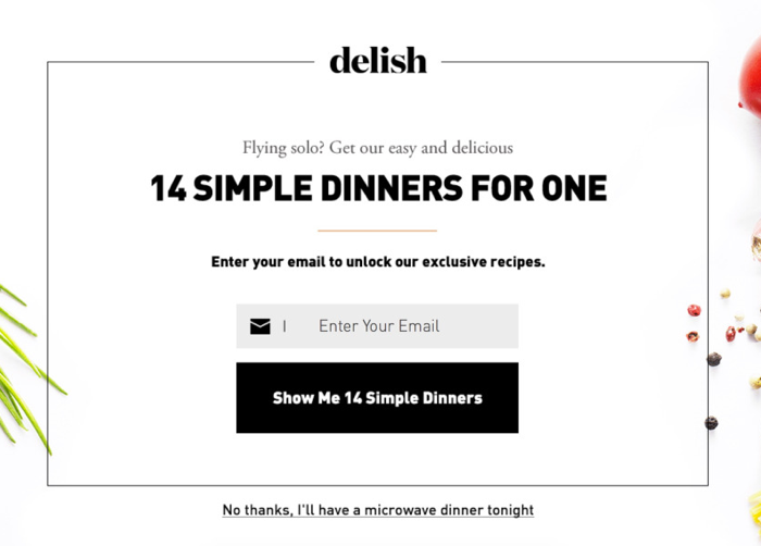
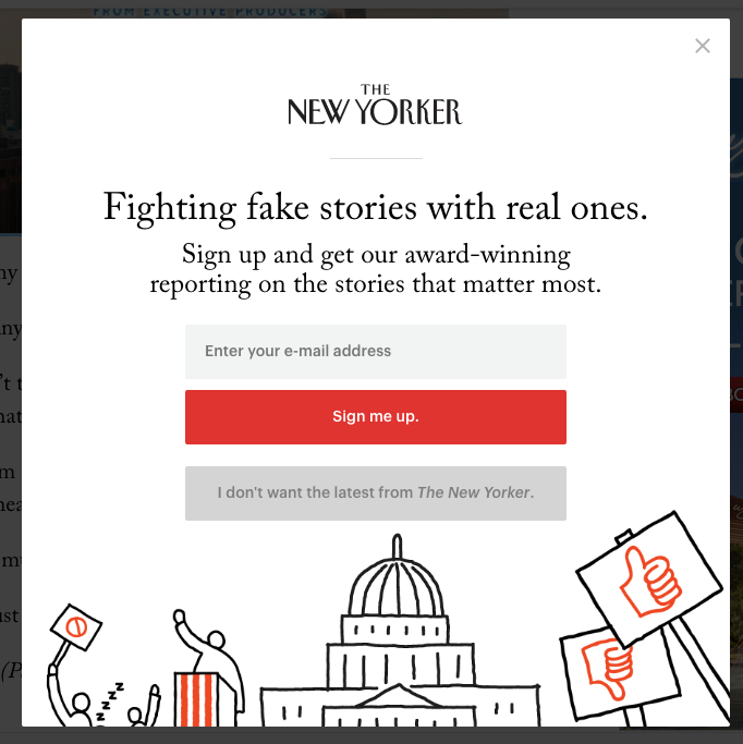
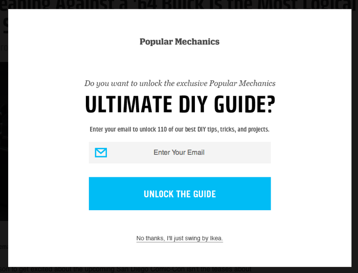
Leveraging guilt in place of empathy seems like the worst idea ever, but confirmshaming is everywhere. And it wouldn’t be such a prevalent dark pattern if not for the irreverent microcopy that accompanies these troublesome dialogues.

I love Gmail. I hate condescension.
I suspect that for every instance of confirmshaming, there’s a gloating copywriter.

Even InVision, a bastion of user-centric design, ships egocentric copy.
It almost feels like it should work. A perfectly-crafted line that cuts to the bone of our user’s soul. “No thanks, I don’t like being a good person!” That’ll show ’em, right?!
Confirmshaming is a more common, mainstream customer acquisition approach than one would hope. — Brandon Dorn, Viget

The Blind Innovator
Innovation for the sake of innovation, even when existing solutions work well and are universally accepted.
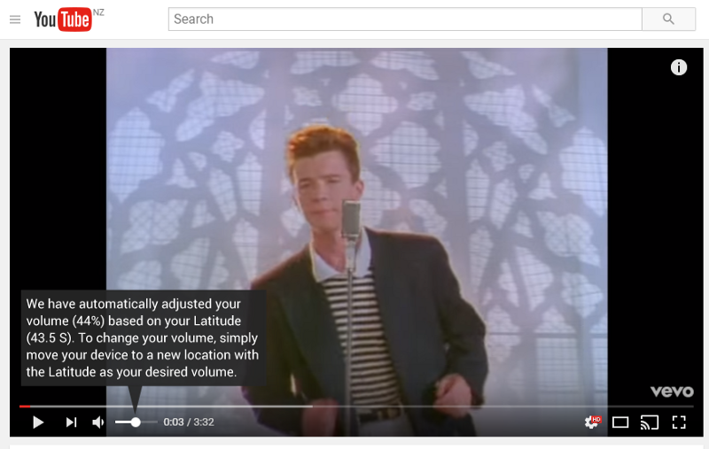
This hilarious experiment in volume control interfaces highlights the issue of blind innovation.
I have been the blind innovator countless times. And whenever I get stuck in this mentality, I feel driven by a need to prove what I can do differently as a writer rather than what I can do consistently for a user.
The problem here is that it’s incredibly appealing to be viewed as an innovative writer. And it can be tempting to treat every piece of new copy as a potential breakthrough. After all, those moments of true copy or content innovation validate all the hours we spend ideating, writing, and editing.
But some copy elements simply don’t require more innovation – not yet anyways.
As an example, let’s compare empty states and sign-in errors:
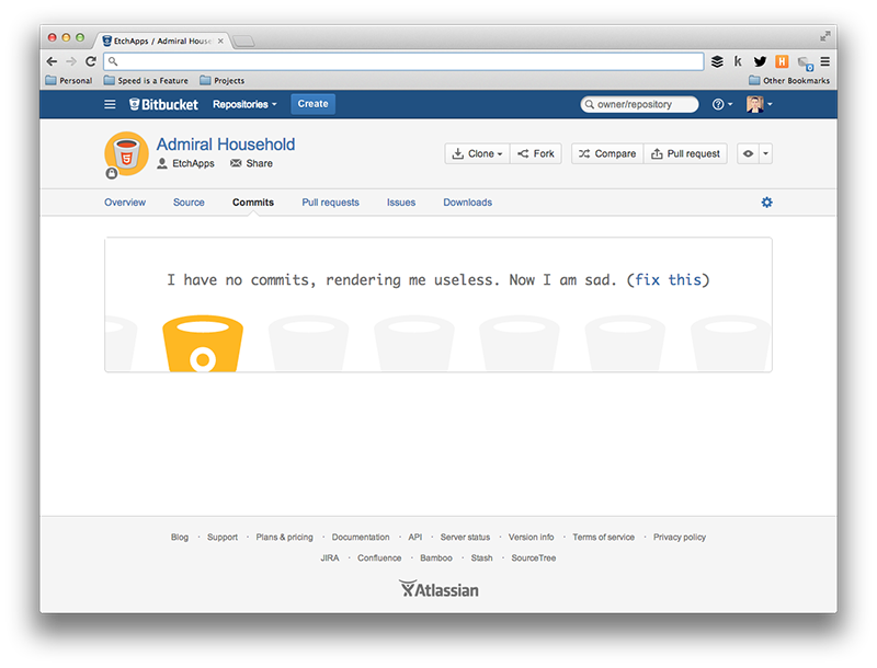
Making your user crack a smile while simultaneously prompting action is a feat worthy of innovation hours. Image source: InVision Blog
Empty states (or zero-data states) are excellent opportunities for innovation. They form first impressions, highlight moments of success, and help users navigate moments of failure. Often at the forefront of user onboarding, empty states are undoubtedly worthy of copy innovation.
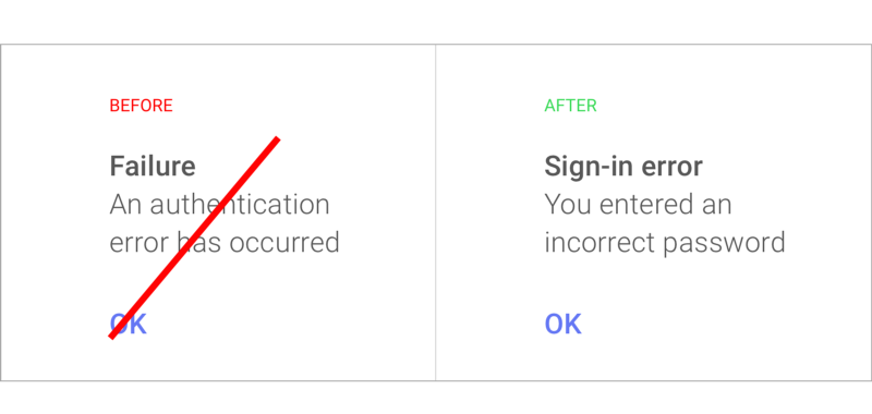
Think you can innovate on “You entered an incorrect password”? Don’t be so vain. Image source: Guy Ligertwood
The modern sign-in error is a thing of iterated beauty. It has grown from a jargony authentication error message to a clear, concise, and contextual call to action. While variations exist, you’d be hard pressed to to innovate on this copy element. But that doesn’t mean you won’t try.
The Expositionist
When you overwhelm your users with a high volume of information for no other reason than you’ve got a lot of information to convey.
While I tend to err on the side of excess when it comes to the early stages of content development, I cherish working with designers and product folk in an effort to help users encode information rather than simply flooding them with content.
Perhaps you’ve encountered Apple Music’s unique form of info overload:
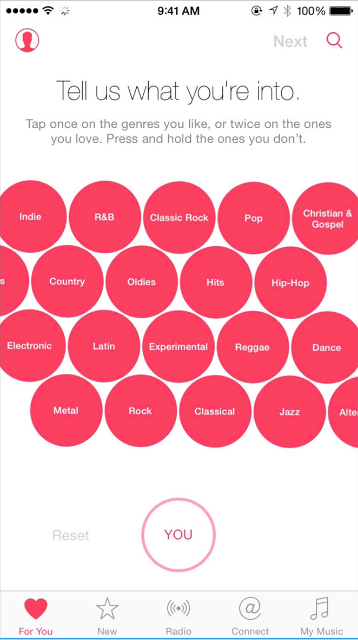
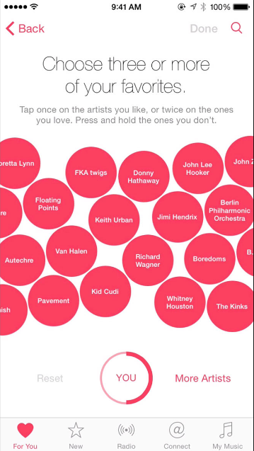
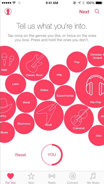
Wait a second, am I providing info or taking a bath in it?
Soliciting information from users is a sensitive task, often requiring copy and design to work in delightful tandem. Easier said than done.
Takeaways
From Hemingway’s prose to Slack’s UX, I am humbled by the simplest language. Perhaps I’m just a sucker for clarity. But there’s something to be said for how simple copy taps into my emotions and influences my decisions.
Yes, I realize it’s an obvious statement to say that emotions influence my decisions. I rely on my own emotions and those of my users to guide many of my copy decisions. I’m a writer, after all, and the creative pursuit is often times centered around emotions. But sometimes my emotions get the better of me (and of my copy). And when I’m deep into my writing process, I sometimes don’t realize when I’m using selective perception.
So I try my best to keep context-appropriate approaches like human-centered design at the top of my mind, at all times. Even when I’m feeling emotional. Not only does it keep vanity at bay, but it keeps my writing honest and transparent.

