Using the APCA Readability Criterion to improve the accessibility of disabled controls
Disabled buttons. They need to look non-interactable. But they also can’t be completely unreadable. How do I find the sweet spot?
I spent a few hours in a deep dive going through a bunch of blogs and accessibility guidelines documentation in search for best approaches for text contrast on disabled actions. This is a summary of what I found, with an example of a test I applied to our Design System button variants to check and improve their contrast and readability.
The problem
It all started when a Front-End developer in our team reached out to the accessibility guild in our company Slack asking for people’s opinion on the readability of some disabled controls from our Design System he was using to build a UI.
The message was specifically pointing at two disabled variants for our outlined buttons, for warning and success (generally used very rarely).
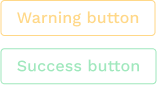
A discussion followed in the thread, on WCAG guidelines, readability, when to avoid using disabled buttons… Everyone wanted to improve these buttons’ readability, but we did not have a clear idea of which colours could be considered acceptable for a disabled button, that didn’t actually end up making it look enabled.
And that’s when I started my research.
The research
WCAG 2.2 contrast levels for inactive UI components
Web Content Accessibility Guidelines (WCAG) 2.2 (latest published version) standards suggest that the minimum (AA) contrast level does not need to be met:
“text or images of text that are part of an inactive user interface component … have no contrast requirement” (source)
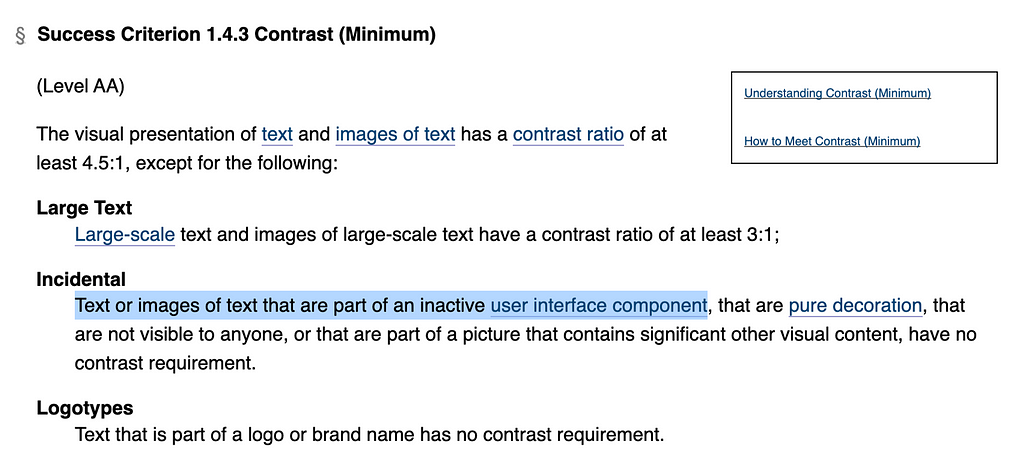
The guideline does not openly specify the “Incidental” use case refers to disabled buttons, leaving this to potentially different interpretations (example of a Stackexchange discussion where commenters have different interpretations for the guideline).
APCA Readability Criterion (ARC) for disabled controls
Note: The ARC document is a draft, so it should be referred to as a work in progress.
The APCA Readability Criterion (ARC) is a modern set of design guidelines or visual content utilizing the Accessible Perceptual Contrast Algorithm (APCA), which is tuned for perceptual uniformity of text and non-text elements, as displayed on a self-illuminated monitor or device. APCA&ARC provide significant improvements over older methods and guidelines such as the Web Content Accessibility Guidelines (WCAG) 2.x. and other similar standards. ARC is intended to eventually integrate into other standards such as ISO and the future WCAG 3.
(From ARC Public Beta Draft 12 March 2023)
From the ARC Visual Readability Contrast guidelines, there are three minimum levels for contrast conformance: Bronze, Silver, Gold (source).
The minimum level of contrast to test depends on three use cases for text: Fluent, Sub-Fluent, Non-Fluent (source).
Use case for text
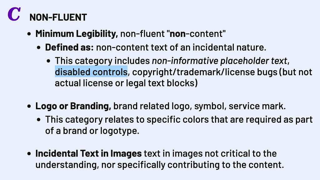
Our use case (disabled button label) falls in the “Non-Fluent” definition, which specifies it’s also for disabled controls.
NON-FLUENT
Minimum Legibility, non-fluent “non-content”
Defined as: non-content text of an incidental nature.
— This category includes non-informative placeholder text, disabled controls, copyright/trademark/license bugs (but not actual license or legal text blocks)
(From ARC documentation)
Lightness contrast (Lc)
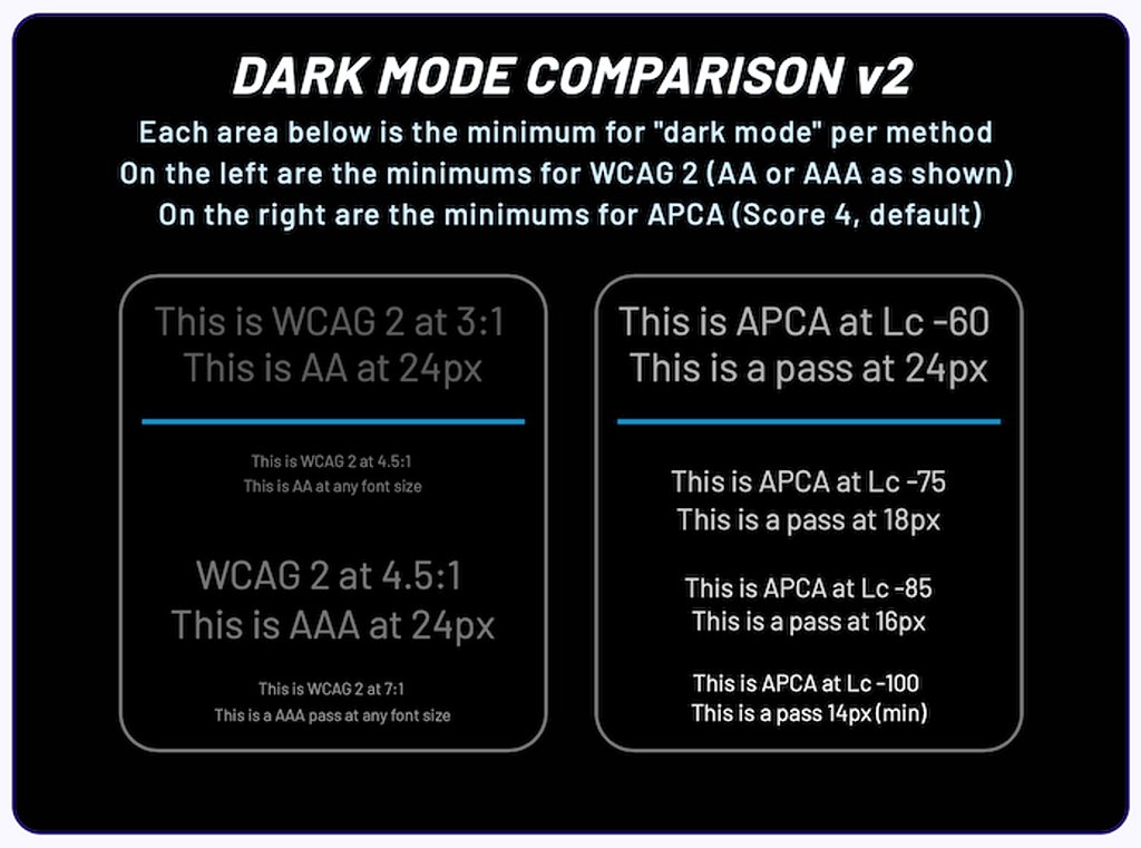
APCA generates a lightness/darkness contrast value (referred to as Lc) that is based on a minimum font-weight/size and colour pair. This value is perceptually based, so a contrast value of Lc 60 represents the same perceived readability contrast across the full range of colours (making it usable for dark modes evaluation too, contrary to WCAG 2.x contrast). (source)
APCA has set levels of Lc related to different use cases (e.g. a text could have Lc 90 as the preferred value and Lc 75 as the minimum for body text).
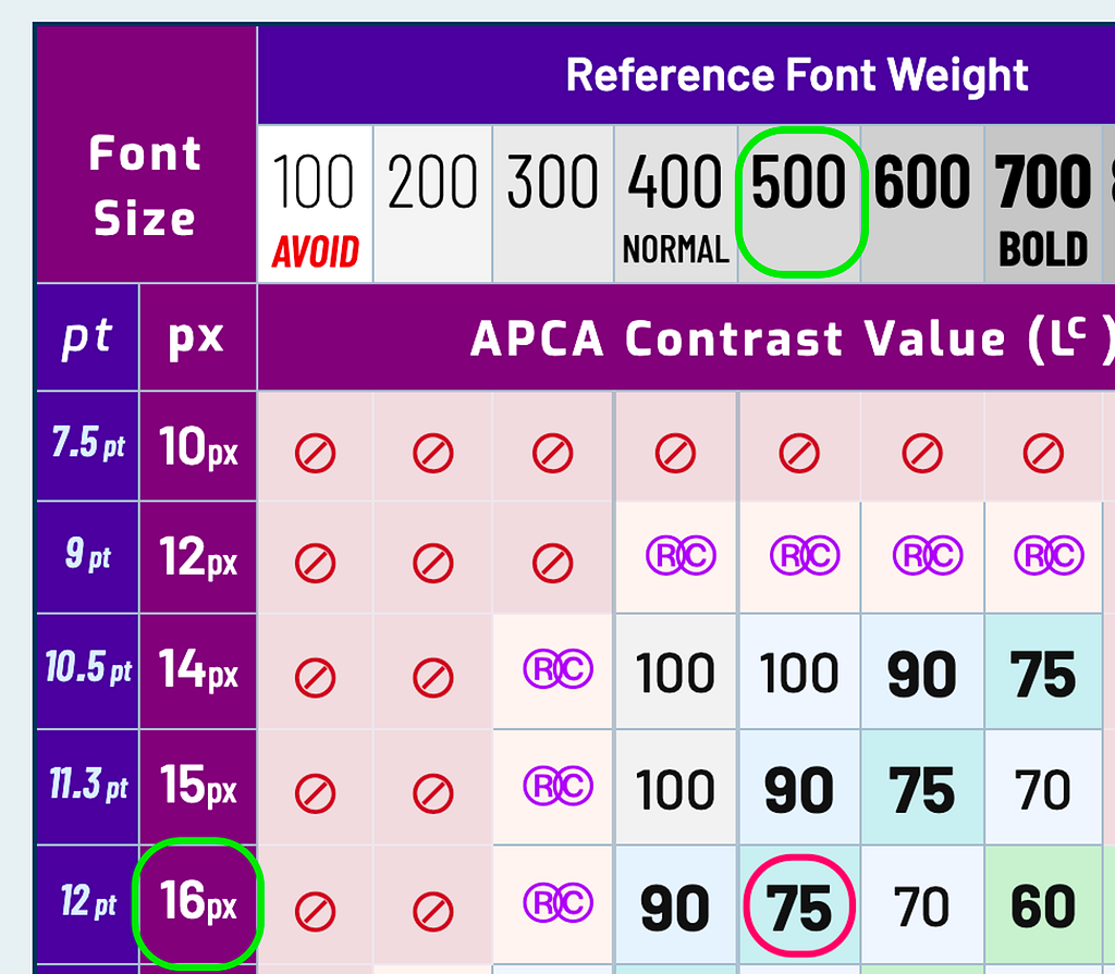
It also offers a lookup table to associate font size, weight and Lc value.
Conformance level
Based on the testing criterion page, the “non-fluent” text use case can be evaluated with the Silver or Gold (enhanced) conformance level.
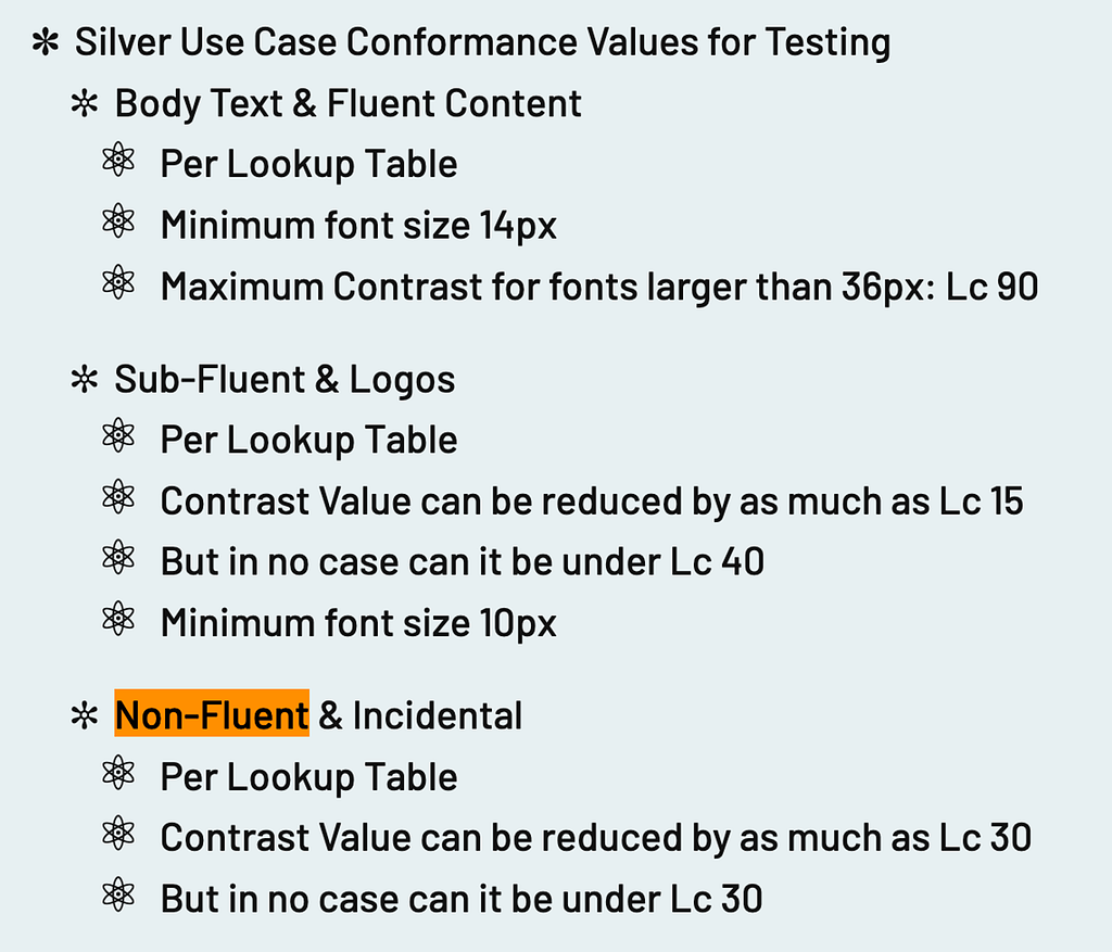
Silver Level Conformance:
- Contrast Value (Lc): per lookup table
- For Non-Fluent (source):
– Contrast Value can be reduced by as much as Lc 30
– But in no case can it be under Lc 30
Gold Level Conformance:
- Contrast Value (Lc): per lookup table
- For Non-Fluent (source)
– Contrast Value can be reduced by as much as Lc 20
– But in no case can it be under Lc 30
APCA Test with our outlined button variants
We’re testing our Design System’s outlined disabled buttons against APCA recommended contrast value (Lc) for text based on the Silver level requirements.
This contrast tool has been used to calculate the Contrast value (Lc).
Our buttons have a font size of 16px and font weight of 500. From the Lookup table for Silver and Gold conformance, the recommended minimum APCA Contrast Value (Lc) based on our font weight and size is 75 Lc (for content text). This will be our baseline to calculate the non-content text Lc values.
From the Silver level conformance guidelines for Non-fluent text:
- Contrast Value can be reduced by as much as Lc 30
→ Lc 75 (our baseline) – Lc 30 = Lc 45 - But in no case can it be under Lc 30
For our test, the contrast value (Lc) should be around Lc 45 or above. It should not in any case be below Lc 30.
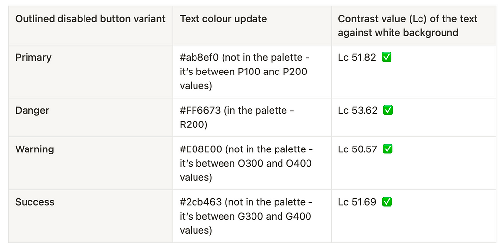
I proceeded with the test: calculated the Lc value of each colour currently used for the text of our disabled button variants. The results are below.
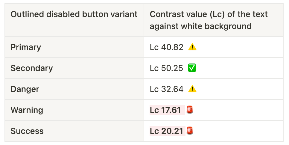
The only variant passing the test with Lc above 45 is Secondary.
The rest is not passing: Primary and Danger are above Lc 30 and Warning and Success are below.
Proposed improvements
At this stage I had a clear and tested idea of where the problem was (and guess what? The two variants incriminated in the Slack message that started this all are at a critically low lightness contrast 🤯) and where to go from there.
I went on and tested out different colours from our Design System palette and outside of it where none was working (in which case I used the HSL value for the colour, kept the Hue and Saturation levels equal and played with lowering or raising the Lightness value). Used the colour checker once again for these values until I obtained values that were above Lc 45 to pass our test. I settled with colours between Lc 50 and 54. Lower but above 45 would be acceptable too.
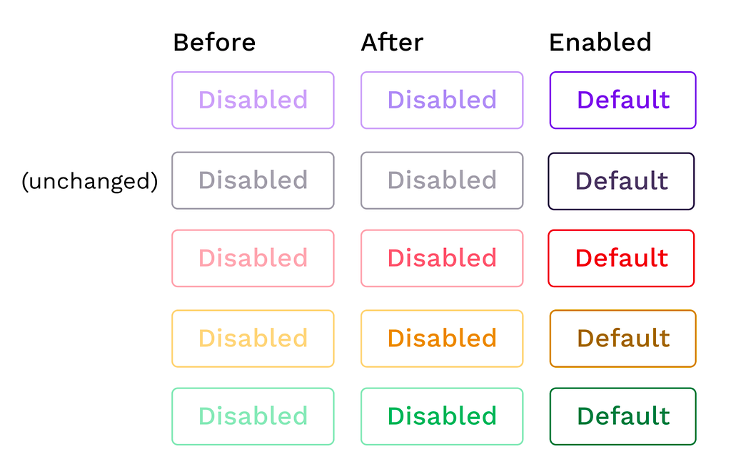
Using a colour blindness simulator tool (like Sim Daltonism) the text readability of disabled buttons seems to be greatly improved for red-green confusion, yellow-green confusion, monochromacy and partial monochromacy. In contrast, the “Before” version (especially for the variants where text contrast is below Lc 30) tends to blend with the background, making the buttons’ labels unreadable or very hard to read.
Feedback from a colour blind person in our team pointed out that the updated colours were much better, and that the “Warning” variant is the only one that “doesn’t look disabled enough in isolation”. I tried updating the value but yellow and orange colours on a white background just do not go hand in hand with readability, so I couldn’t get any passing value that looked much different from the one I found above.
Other general notes on disabled buttons
Contrast
Even adjusting the colours to meet the minimum contrast level for APCA standards for non-fluent text, they still have poor contrast and are not passing WCAG’s AA level. They will therefore not necessarily be readable for all sighted users.
Considering these are disabled buttons, they need to be visually distinct and less readable to be more easily distinguishable from enabled ones.
On the other hand, we need to be careful they don’t reach the degree of “unreadability” where users cannot tell they are buttons at all.
Accessibility
Apart from using contrast as a visual cue for disabled buttons, there are some other recommendations to make disabled buttons accessible (clear labelling, aria roles and attributes, keyboard navigation…).
Some useful resources:
https://css-tricks.com/making-disabled-buttons-more-inclusive/
https://a11y-101.com/development/aria-disabled
How to improve the experience
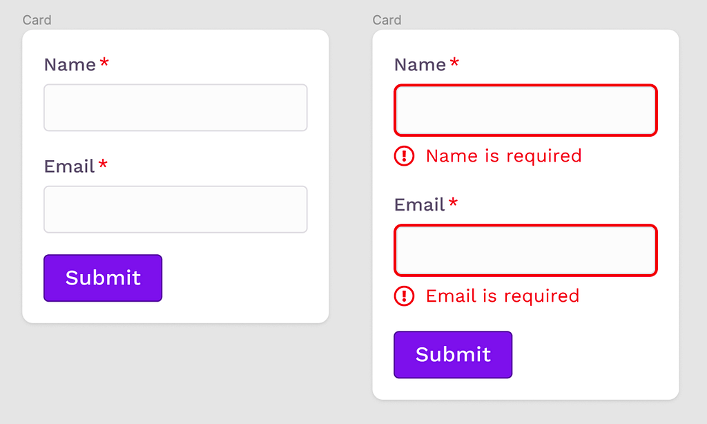
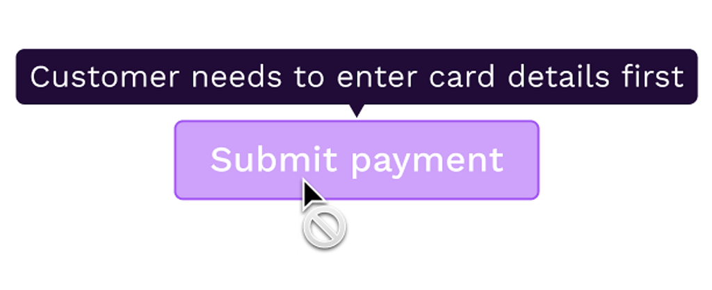
- When possible, avoid disabling buttons. This can be applied, for example, to “Submit” actions. If a form has required fields, instead of disabling the action until all fields are filled in, show the button as enabled. When clicking on it, the validation will be triggered, showing the user exactly what’s missing and how to proceed with the action.
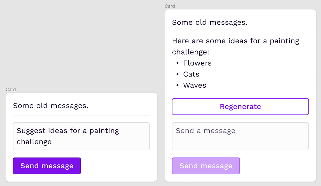
- If the action is disabled most of the time if not for rare occasions, or can only be used after another action is completed, consider not displaying it until it’s available. If the action is only made available in rare conditions or after a part of the workflow is completed, you can reveal the new action when it becomes available. In this scenario, it is recommended to place the button in context with where the user might be already focusing, and in a place where it does not shift the positioning of other fixed actions.
- If disabled buttons are necessary, consider using a tooltip to explain the reason why and how to enable the action. There are still use cases where disabled buttons are necessary, for example when we need to display them in the UI as “visual placeholders” because when they meet certain conditions during the user interaction with the page, they will become enabled. Users familiar with the product will expect those buttons to be there, so not displaying them when disabled would be problematic (they would feel disoriented when not finding them where they expected, might think there’s a bug in the system…). In these use cases, adding a tooltip to display on disabled button hover can help clarify the state. In the tooltip, you can briefly explain why the button is disabled and what needs to be done to enable it.
Summing up
Disabled text readability is surely not an easy problem to solve, especially when WCAG only tells us there is “no contrast requirement” for that.
Luckily APCA’s Readability Criterion (ARC) comes to the rescue with guidelines that finally give us a well defined and researched way to test our text’s legibility, considering all: font size, font weight, colour, use case and more.
ARC is still in beta and under active development so it may change in the future, always check the most up-to-date documentation to make sure you’re working with the right values and latest guidelines.
Here are some of the resources I used and linked throughout this article:
Web Content Accessibility Guidelines (WCAG) 2.2
APCA Readability Criterion
Contrast tool to calculate Lc value
Some interesting articles on the UX of disabled buttons:
Disabled buttons in User Interface
Usability pitfalls of disabled buttons
Hope this article helped you find a way to test and improve the readability of your disabled controls. Please don’t forget to test these updates with users to evaluate the improvements.
Thanks for reading!
What should be the contrast level of inactive buttons? was originally published in UX Collective on Medium, where people are continuing the conversation by highlighting and responding to this story.