As web designers, our role in crafting user-friendly digital landscapes is critical. We are tasked with creating user experiences that make visitors feel comfortable and respected. This, in turn, creates benefits for our clients by improving repeat visits and achieves the site’s ultimate aims, whether that is sales revenue or some less tangible form of metric.
Yet the rise of UX dark patterns, or deceptive patterns as they are more often referred to, poses a significant challenge to maintaining an ethical and user-centric approach in the industry. These tactics breach trust as they are designed to lead users into making unintended decisions, predominantly benefiting the service providers.
The term ’dark pattern’ was first coined in 2010 by UX designer Dr. Harry Brignull, who identified several different types. See how many of these you recognize…
Bait and Switch
‘Bait and Switch’ occurs when users perform an action expecting one thing to happen, but the result is something else. The most famous example is the Windows update fiasco: users clicked the x on a pop-up reminding them to upgrade to Windows 10, intending to close it. Instead, clicking the x started an automatic update.
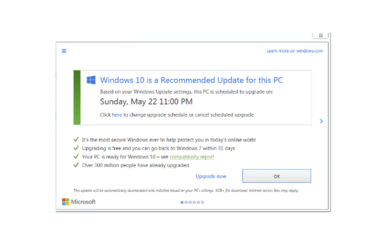
To avoid causing this sort of thing by accident, it’s a good idea to stick to established conventions regarding UI icons and components or make it very clear if you are doing something different.
Disguised Ads
‘Disguised Ads’ are deceptive marketing tactics where advertisements are camouflaged as regular content, making it difficult for users to distinguish between genuine content and promotional material. For instance, an article that seems like an impartial review but is actually a paid promotion for a product.
Adverts that are mixed in with genuine content should always be clearly labeled as adverts, and sponsored content should always be disclosed to preserve user trust and transparency.
Misdirection
‘Misdirection’ occurs when a website or app deliberately leads users away from their intended action, typically to encourage them to engage with specific content or features. Strategically placing pop-up ads or notifications to distract users from finding the ‘skip’ or ‘close’ button, thereby directing their attention to other — possibly monetized — areas, is a common misdirection tactic.
Designers can combat this by adopting a user-friendly layout that clearly distinguishes between different sections and allows users to focus on what they want to.
Roach Motel
‘Roach Motel’ is a term used to describe a situation that is easy to get into but hard to get out of. This is usually a subscription service that allows online sign-up within minutes but is extremely difficult and or time-consuming to cancel.
The cancellation process should always be clearly signposted and no more complicated than the sign-up. Ensuring easy, user-friendly mechanisms for both entry and exit processes will help to foster trust and a positive user experience.
Sneak into Basket
The ‘Sneak into Basket’ is what it sounds like: products or services get automatically added to the user’s shopping cart without their explicit consent. Popular examples are warranties or insurance, particularly with technology items. But some dishonest companies even try to sneak a magazine and a coffee mug into your basket.
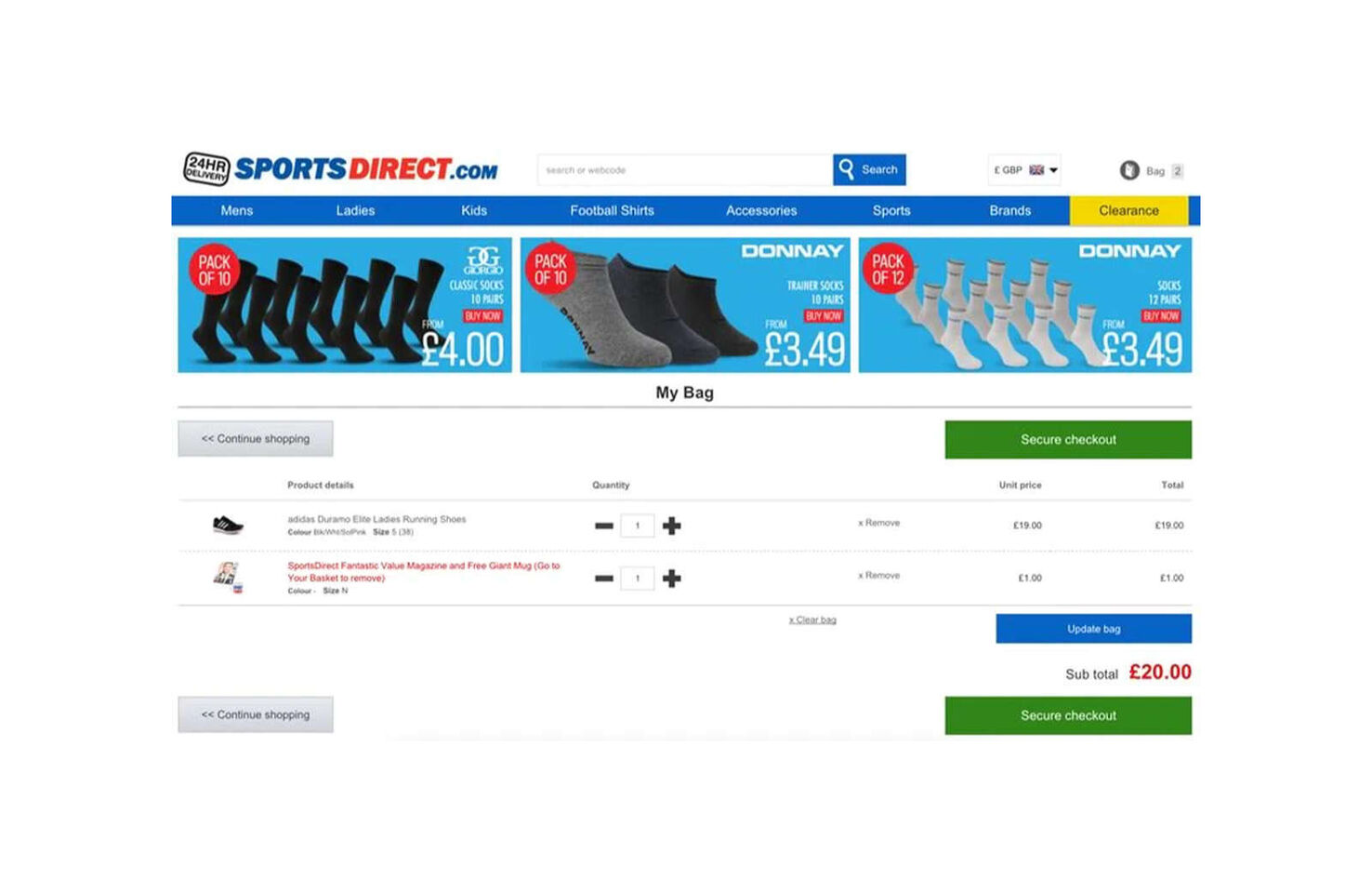
This one will not happen by accident, so as a designer, there’s nothing to watch out for: just don’t do it.
Hidden Costs
The ‘Hidden Costs’ pattern refers to the act of concealing the true cost of a product or service until the final stages of a transaction. Ticketmaster became notorious for this, displaying ticket prices that users accepted as the cost, then adding service charges, venue charges, and delivery charges at the last minute.
An e‑commerce site with good UX should be transparent about all potential costs upfront, fostering a more truthful and straightforward user experience.
If you are displaying the price of something excluding taxes, be clear that this is the case. If you have additional or variable delivery costs, make those easy to find.
Forced Continuity
‘Forced Continuity’ refers to the practice where users are automatically charged for a service after a free trial period ends without an explicit warning or an easy cancellation option. Streaming services are particularly notorious for offering a one-month free trial that requires credit card details and begins billing automatically once the trial expires.
The better alternative is to allow a free trial without asking for payment details and then end the service once the trial period ends if no further action is taken. If that is not possible, reminders should be sent before the trial period ends, and there should be an easy cancellation process.
Friend Spam
The ‘Friend Spam’ pattern involves services accessing the user’s contact list — with permission acquired through misleading means — and then sending unsolicited messages or emails to their contacts, usually in the guise of a personal invitation or message from them — LinkedIn is notorious for this type of interaction.
As a designer, you should prioritize user privacy and consent, ensuring clear communication about how contacts will be used and giving users the control to select who, if anyone, they wish to invite or message.
Confirmshaming
‘Confirmshaming’ is a manipulative tactic where the language used in opt-out messages is designed to shame or guilt-trip users into opting for something they might not necessarily want. A website might present users with a pop-up asking them to subscribe to a newsletter, with the options being “Yes, I want to stay informed” or “No, I prefer to remain ignorant.”
Designers should craft neutral language for opt-out options, fostering a respectful and dignified user experience that respects individual choices without leveraging guilt or shame.
Trick Questions
‘Trick Questions’ is when questions or options are framed in a way that intends to mislead users into making a choice they didn’t originally intend. For example, a website might have a checkbox that says, “Check this box if you do not want to not receive our newsletter,” which uses double negatives to confuse users into opting in.
Aim for clarity and straightforwardness in your language and option layouts, ensuring users can make informed and genuine choices without being manipulated through confusing phrasing or setups.
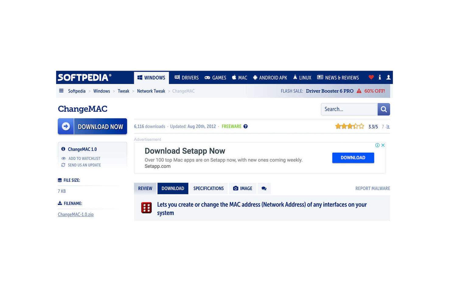
Price Comparison Prevention
‘Price Comparison Prevention’ is employed by businesses to prevent users from easily comparing prices of products or services. It is often achieved by making it very difficult to find the price or not having the price of different services available before the user signs up for a free trial. Many companies also work very hard to obscure the price of their products and services in other regions. In the early days of downloadable software Adobe was infamous for charging different amounts in different territories.
While you are not obligated to compare your prices to a competitor — and this itself could open the door to more dark behavior — you should always make sure that the total cost of each product, service, or bundle is clearly stated.
Cookie Consent Manipulation
This tactic involves manipulating users into accepting cookies or other tracking technologies, often by making it difficult to find or understand how to opt-out. A website might use an obscured, complex, or multi-step process to deter users from declining cookies or pre-tick all consent boxes, banking on the users’ tendency not to change default settings.
The cookie warning usually pops up almost immediately, obscuring part of the page. This irritates the user, and they may click on the accept button (which tends to be dominant) automatically just to get rid of the pop-up quickly.
Providing clear, easy-to-navigate, and transparent consent mechanisms ensuring users have a real choice in managing their data privacy is essential for trust. But it is also worth considering how the cookie consent form appears visually so it is not a buzzing fly to be swatted away.
Nagging
Nagging is a tactic whereby users are persistently reminded or urged to take a specific action, often with repetitive notifications, pop-ups, or messages. Constant reminders to upgrade to a premium version of a free service, or pop-ups urging the user to sign up for a newsletter, or announcements about offers, free downloads, and so on.
Avoid employing this tactic by respecting user choices and limiting the frequency of reminders. If a user dismisses a reminder, message, or notification, it should stay dismissed. Elements like sign-up forms should be well enough positioned and designed so that the user will find them easily, without nagging.
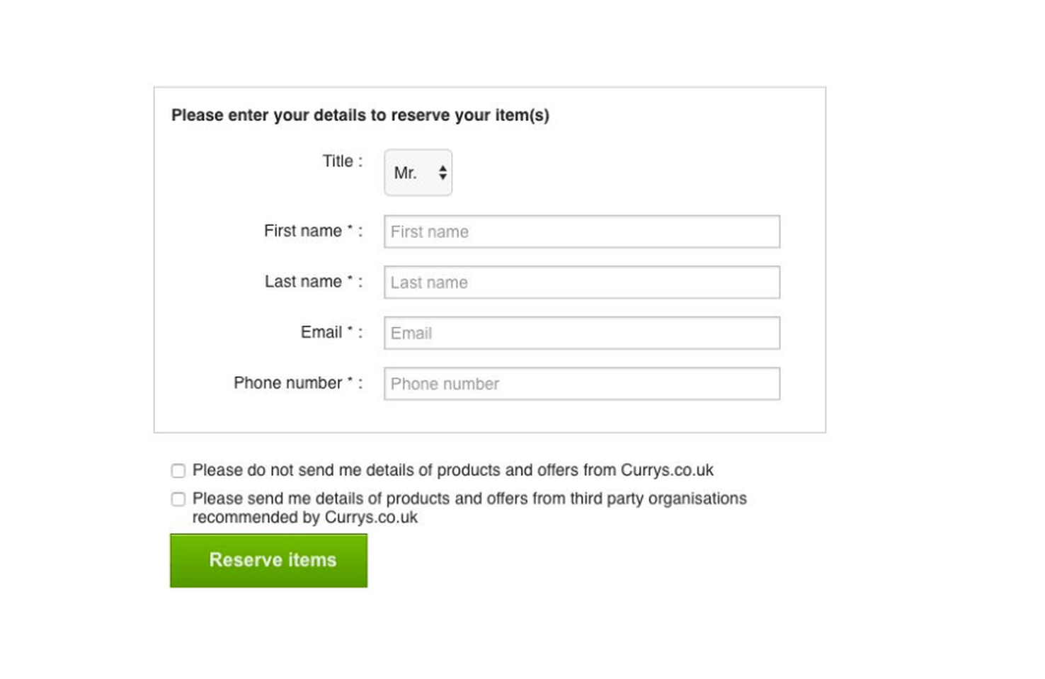
Privacy Zuckering
This deceptive pattern involves misleading users into sharing more personal information than they might otherwise be comfortable with. It is named after Mark Zuckerberg because Facebook led the way in obscuring privacy choices for users, causing them to unknowingly share more data than they intended. This data could then be sold. Of course, Facebook is not the only culprit; just the most shameless.
If you need to collect user data, create transparent, straightforward privacy settings and tools that empower users to have precise control over their privacy and data-sharing preferences. A good rule of thumb is to ensure your site is GDPR compliant, even if you expect it to be outside the territorial scope of that regulation.
High-Pressure Sales
This strategy, also called FOMO (Fear of Missing Out), involves pressuring users into making hurried decisions, usually by creating a sense of urgency or scarcity. For example, an e‑commerce site might display messages such as “Only two items left in stock!” or “Sale ends in 2 hours!” to rush users into purchasing without giving it proper thought.
It can be helpful to inform a user of stock levels as it can assist with decision-making: a customer choosing paint will want to know how many tins are in stock of each color. But this should be done in a neutral, non-pressuring way. And it should be true.
Forced Action
‘Forced Action’ is where the user feels coerced into doing something they do not want to do in order to be able to do something they do want. This can often be sharing on social media or signing up for something they don’t want. It usually involves sharing data of some kind rather than paying. The condition is also often not made clear initially but is only brought up when the user is invested.
If you are offering something for free, it should be free. Asking the user for anything, even their email address, means it’s not free. If you are offering something in return for a sign-up or a social share, that should be clear at the outset.
How Deceptive Patterns Work
Deceptive patterns exploit psychological biases and heuristics to manipulate users into taking actions that may not be in their best interest. These tactics are often meticulously crafted to appear as beneficial features, making them more insidious and potent.
They usually capitalize on users’ tendencies to follow the path of least resistance, often making undesirable outcomes the easier or default option. This plays into the cognitive bias known as the “status quo bias,” where users prefer to stick with pre-set options to avoid the mental effort required to change them.
These patterns may utilize elements of scarcity and urgency, which ramp up the pressure and compel users to make hurried, ill-considered decisions. They prey on the users’ fear of missing out (FOMO), a powerful motivator that can override rational judgment.
They often employ manipulative language or visual designs, which might include using negative wording for opt-out choices (confirmshaming), hiding important information in a sea of text, or employing visually deceptive layouts that misguide users into clicking on certain elements.
Understanding the mechanics behind these deceptive patterns is the first step in recognizing and avoiding them, fostering a more ethical and user-friendly digital landscape.
User Behavior That Deceptive Patterns Rely On
Deceptive patterns often exploit innate human behavioral tendencies and cognitive biases to manipulate users into certain actions.
- Inattention: Many users do not meticulously read through every piece of information presented, especially when it comes to lengthy terms of service or privacy policies. Deceptive patterns capitalize on this lack of attention to sneak in undesirable clauses or consent agreements.
- Decision Fatigue: Users can experience decision fatigue when presented with too many choices or too much information, making them more susceptible to taking the path of least resistance. This can be manipulated to lead to undesirable outcomes.
- Fear of Missing Out: This psychological phenomenon can be exploited by creating a sense of urgency or scarcity, encouraging hurried decisions that may not be in the user’s best interest.
- Conformity and Social Proof: Users are naturally inclined to follow the crowd. Deceptive patterns might use fake reviews, testimonials, or social sharing prompts to create a false sense of popularity or approval for a product or service.
- Anchoring Effect: This is a cognitive bias where users rely too heavily on the first piece of information encountered when making decisions. By setting high initial prices and then offering discounts or presenting a popular choice first, deceptive patterns can manipulate users into making choices that benefit the service provider.
- Reciprocity: Users often feel obliged to give back when they receive something. Offering free trials or gifts can sometimes be a strategy to encourage users to reciprocate by making a purchase or signing up for a service.
The Negative Impact of Deceptive Patterns on User Trust and Brand Reputation
Deceptive design strategies are used because they get results. The results are, however, short-term gains. In the longer term, such strategies can prove incredibly damaging.
- Erosion of Trust: When users realize they have been manipulated into making choices they didn’t intend to, it can severely undermine their trust in the platform. Trust, once lost, is hard to regain.
- Negative Word of Mouth: Users who feel deceived are more likely to share their negative experiences with others, either through personal networks or online reviews, which can deter potential customers and tarnish the brand’s image.
- Legal Repercussions: Increasingly, jurisdictions worldwide are cracking down on deceptive online practices, imposing hefty fines and penalties on companies that employ deceptive patterns. This not only brings financial loss but can also result in negative publicity.
- Increased User Churn: Over time, users tend to abandon platforms that employ manipulative tactics as the annoyance and dissatisfaction accumulate, leading to higher churn rates and a shrinking user base.
- Hinders Long-Term Growth: Loss of trust will prevent the establishment of a loyal customer base, which is vital for sustainable growth.
- Damage to Brand Equity: A brand known for unethical practices will find it difficult to command respect and loyalty from its audience. Brand equity, which includes user perception and brand value, will suffer.
Businesses must recognize the gravity of the negative impact of using these kinds of deceptive design strategies and that they will do the business more harm in the long run.
FAQs
1. What are UX deceptive patterns?
UX deceptive patterns, or dark patterns, are design choices in websites and apps that manipulate users into performing actions they might not have otherwise done willingly. They solely benefit the site owner.
2. How can I recognize deceptive patterns?
You can spot them by looking for misleading language, hidden information, unnecessary urgency, or if you find that it’s challenging to opt-out or cancel a service.
3. Are UX deceptive patterns illegal?
The legality of UX deceptive patterns can vary between jurisdictions. In some regions, regulatory bodies have established rules that make certain deceptive patterns illegal, particularly those involving misleading advertising and user privacy violations. It’s advisable to stay updated with the regulations in your specific region to better understand the legal landscape surrounding deceptive patterns.
4. What impact do deceptive patterns have on businesses?
In the long run, businesses employing deceptive patterns can face a loss of user trust, negative brand reputation, increased user churn, and potential legal repercussions. Adopting ethical practices is morally right and beneficial for sustaining a loyal customer base and fostering positive growth.
5. How can web designers avoid using deceptive patterns?
Web designers can avoid deceptive patterns by adhering to ethical design principles prioritizing user welfare and consent. This includes providing clear information, offering genuine choices, and respecting user autonomy.
6. Are there any regulations governing the use of deceptive patterns?
Yes, there are regulations in place in various jurisdictions that govern the use of deceptive patterns, though the extent and specifics can vary greatly. In the European Union, consumer protection laws such as the Consumer Rights Directive and the General Data Protection Regulation (GDPR) contain provisions that can be used to challenge deceptive patterns, particularly those involving misleading advertising and the mishandling of personal data. In the US, the Federal Trade Commission (FTC) can take action against companies using deceptive or unfair business practices. Moreover, there’s a growing movement to enact more stringent legislation specifically targeting deceptive UX patterns, aiming to foster a safer and more transparent digital environment. It’s recommended to consult with a legal expert to understand the full spectrum of regulations applicable in a particular region or context.
7. How can I report a website or service that uses deceptive patterns?
To report a website or service that uses deceptive patterns, you can follow these general steps:
- Documentation: Firstly, gather evidence of the deceptive patterns. This could include screenshots, URLs, and detailed descriptions of the deceptive behavior witnessed.
- National Regulatory Bodies: Depending upon your jurisdiction, there might be specific governmental bodies where such issues can be reported. For instance, in the US, you can report to the Federal Trade Commission (FTC), while in the UK, the Competition and Markets Authority (CMA) handles such complaints.
- Consumer Protection Organizations: Besides government bodies, you can report to non-governmental consumer protection organizations, which might take up the issue or guide you further.
- Online Platforms: If the deceptive patterns are found on widely used platforms such as Google, Apple’s App Store, or various social media platforms, these companies often have reporting mechanisms for reporting deceitful practices or apps.
- Community Awareness: Raising awareness about deceptive patterns in community forums and social media platforms can sometimes catch the attention of the concerned authorities and pressure the service providers to amend their ways. deceptive.design has a Hall of Shame, where you can see examples of dark patterns at work and submit any you think should be in there.
Understanding UX deceptive patterns is crucial for fostering a responsible and user-centric approach. These unethical design choices erode trust and can significantly tarnish a brand’s reputation, resulting in decreased user satisfaction and even potential legal repercussions.
Designers should be able to identify these deceptive strategies and consciously avoid integrating them into their designs. Incorporating ethics into design thinking means prioritizing the users’ needs and preferences over manipulative tactics to boost short-term gains. Designers can nurture a digital space where users feel valued and respected by creating transparent, respectful, and user-friendly interfaces.
Louise North
Louise is a staff writer for WebdesignerDepot. She lives in Colorado, is a mom to two dogs, and when she’s not writing she likes hiking and volunteering.