 This month we’re taking a close look at above-the-scroll presentation. It’s the first thing you see, and the first impression a user has when they type in your URL. So, it’s a logical place to spot trends in website design.
Here’s what’s trending in design this month.
1. Text That’s Almost Hard to Read
With so much focus on readability and accessibility, this trend might be a little surprising. Designers are experimenting with hero text elements that are difficult to read.
It’s not that the text elements are unreadable; you just have to stop and think about them for a minute.
Why would this technique work? Text in these instances is more of an artistic element, and while the words have meaning, they draw our attention because of visual components. Text is designed to make you look longer on purpose.
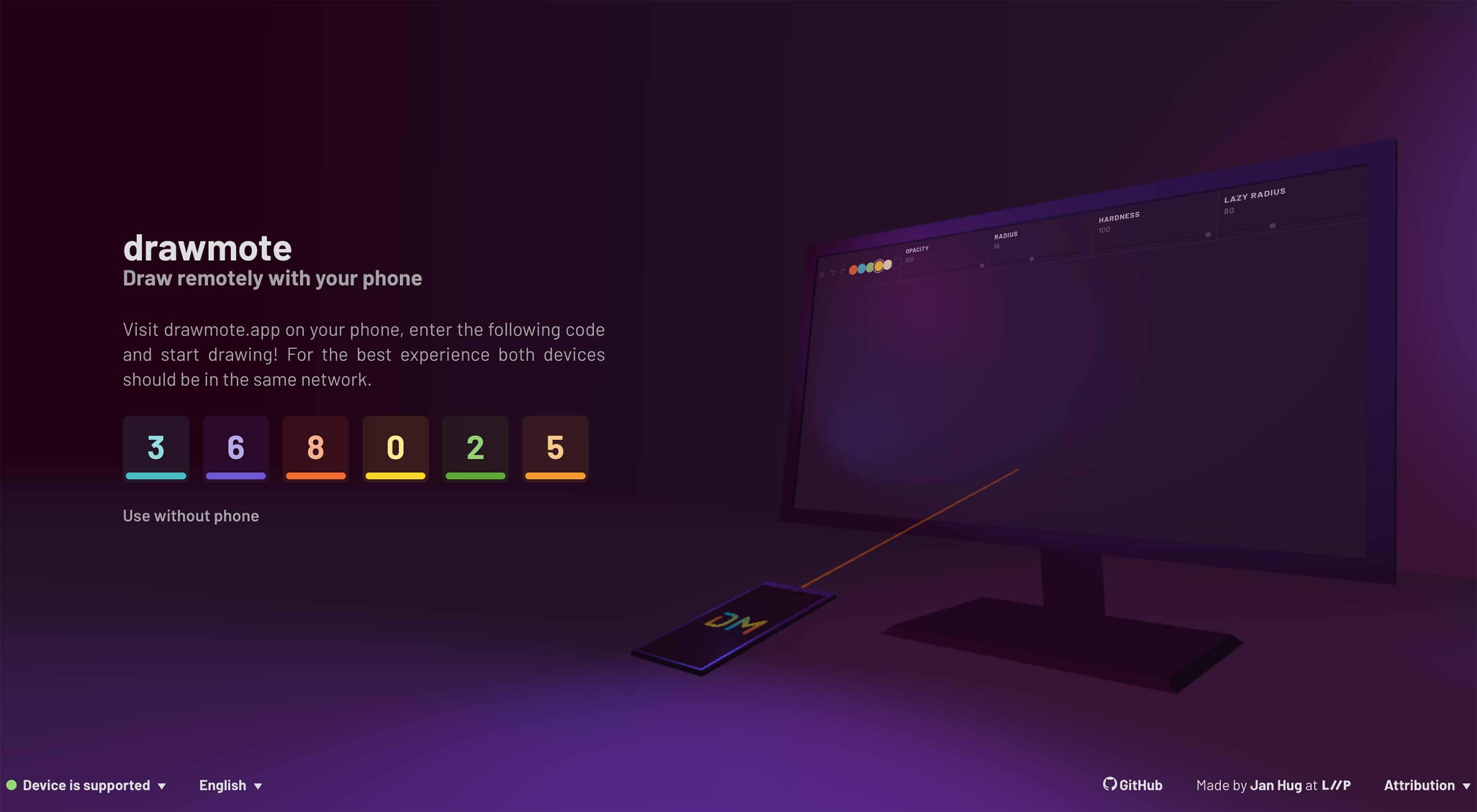
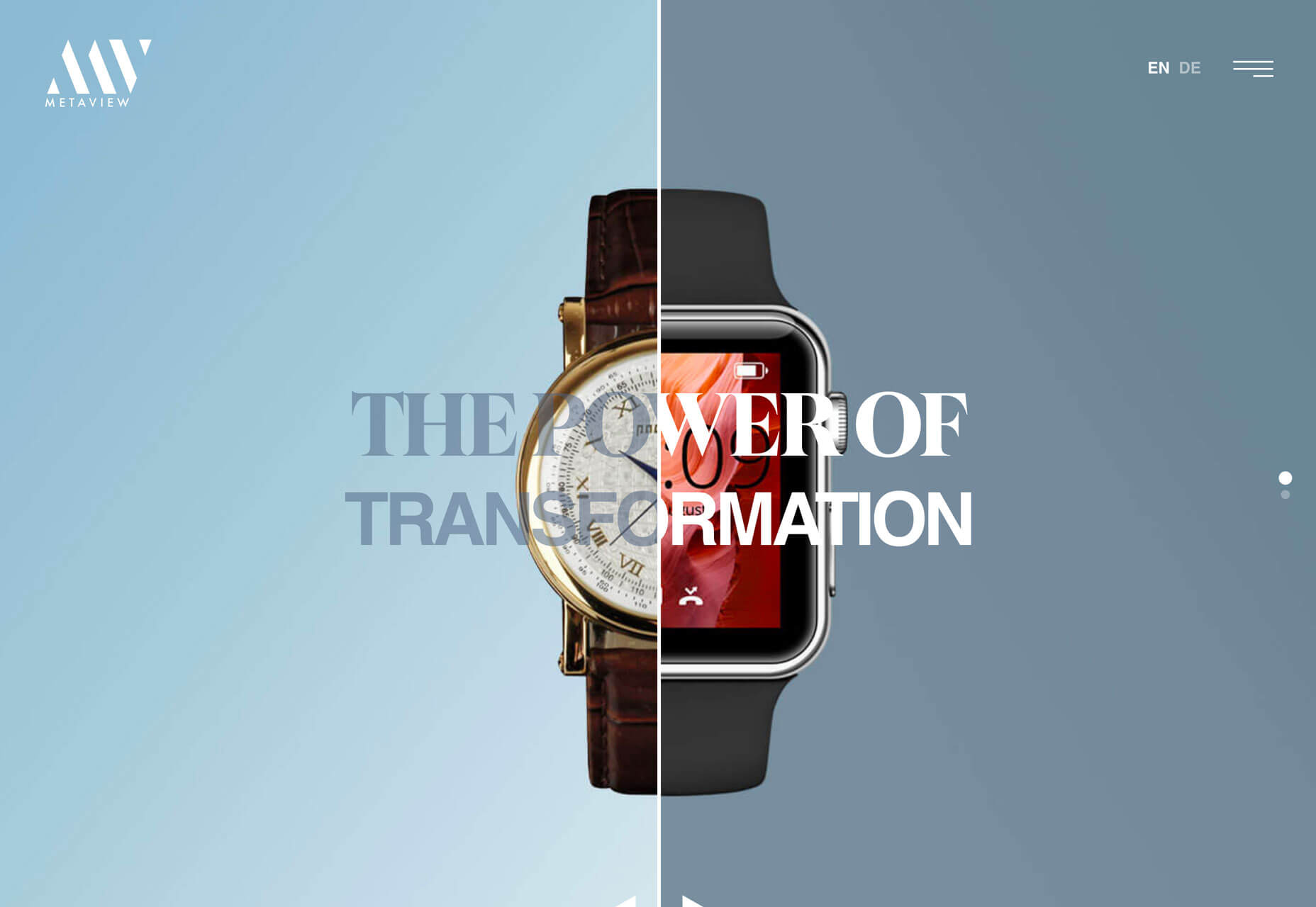
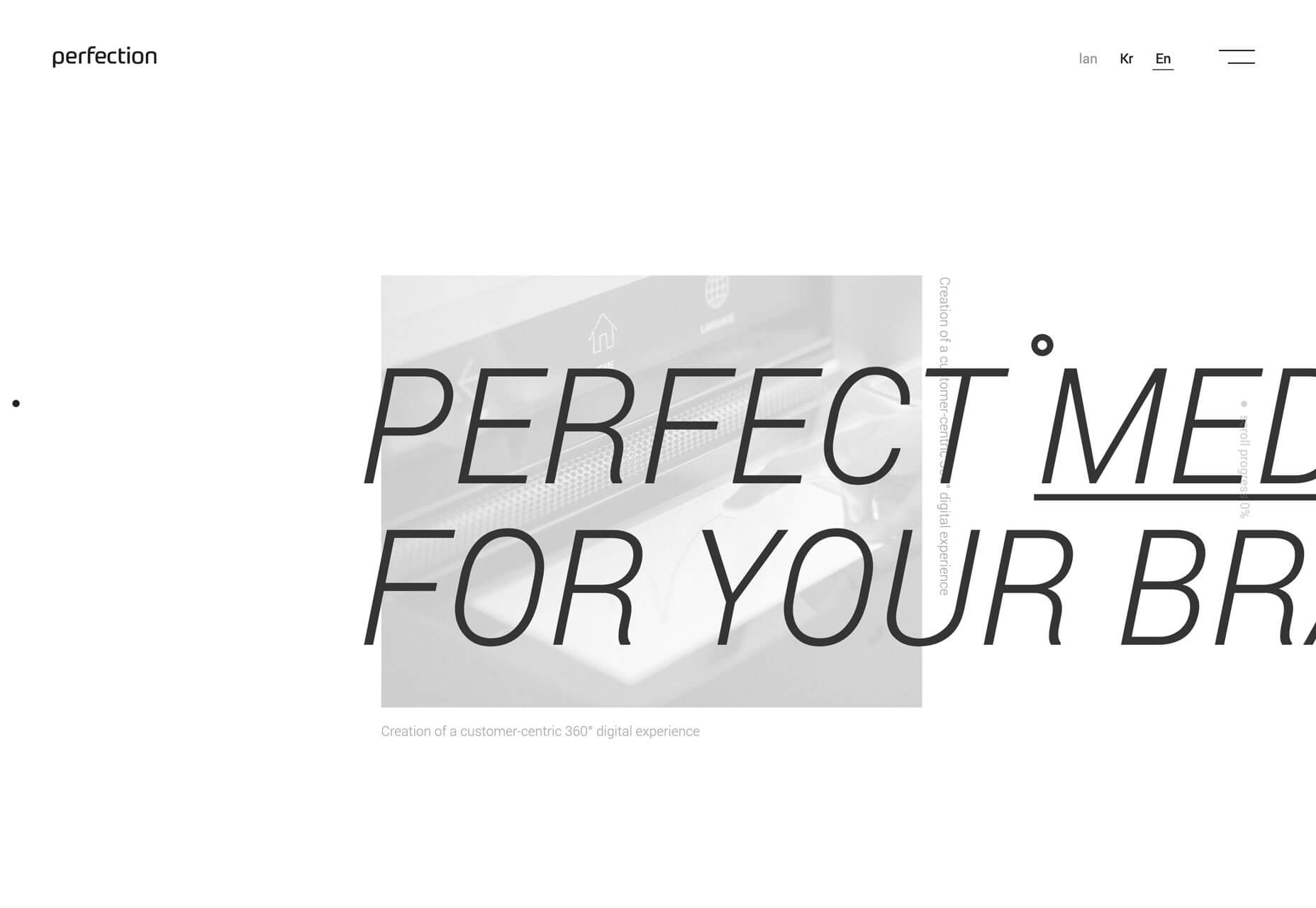
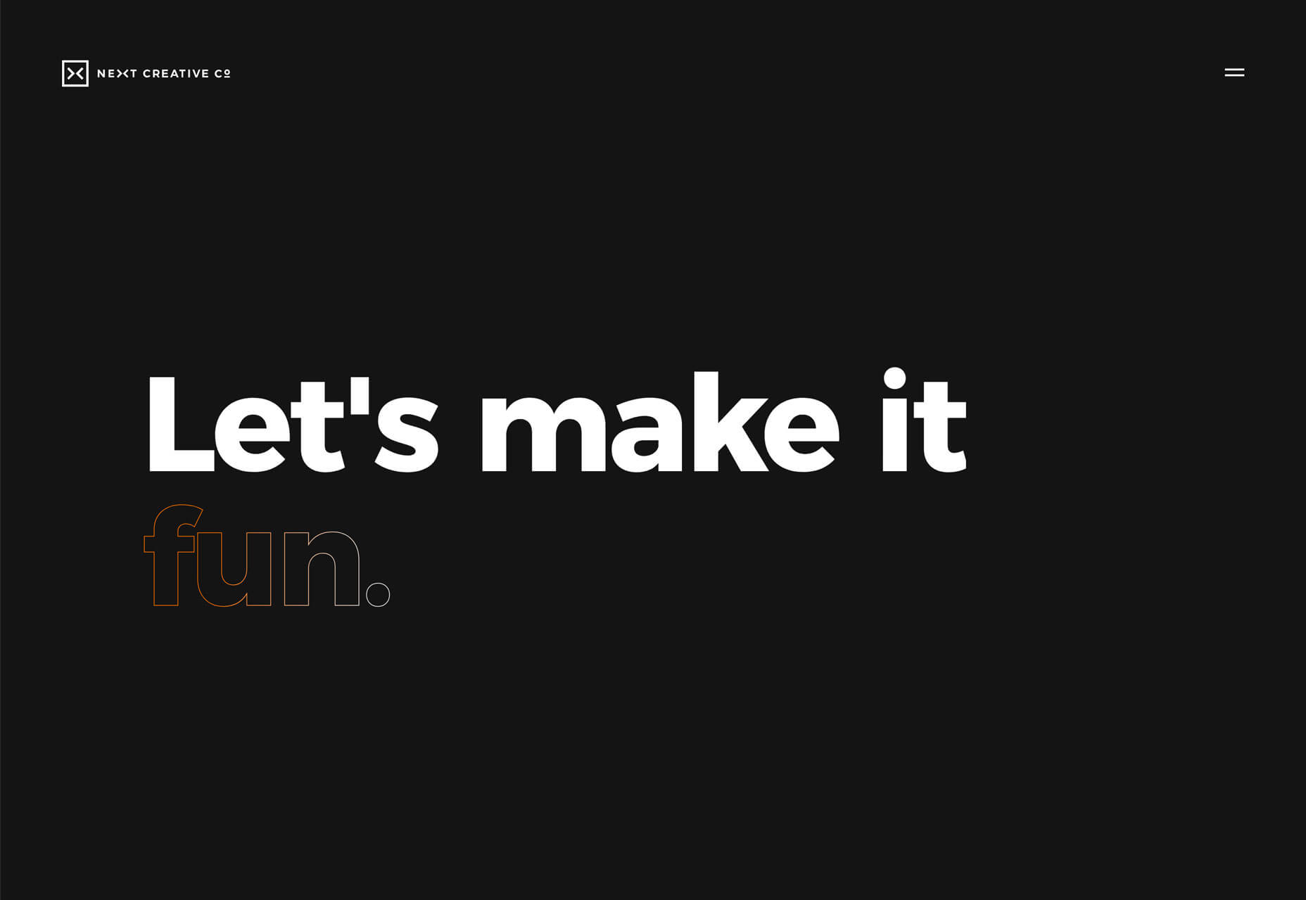
Each of the examples below does this in a slightly different way.
MetaView uses a split screen design with text elements that change color on the split screen. On the left, color is muted and more transparent while it is bolder and lacks transparency on the right. The words are readable but you definitely need a few extra seconds to process them.
Perfection includes two layers of text. An oversized foreground layer makes you think about the letters that are missing from the screen to fill in the words. A pale, soft background layer is behind it and the words are turned 90 degrees, also making you look closely to understand the message.
Next Creative Co. mixes an outline font into the mix with animation and a gradient stroke border. While this might be the least difficult to read element of this set of examples, it shows distinctly how a design like this forces you to slow down to read. Your brain processes “Let’s make it” rather quickly, and almost takes the full duration of the animation to understand the final word in the phrase.
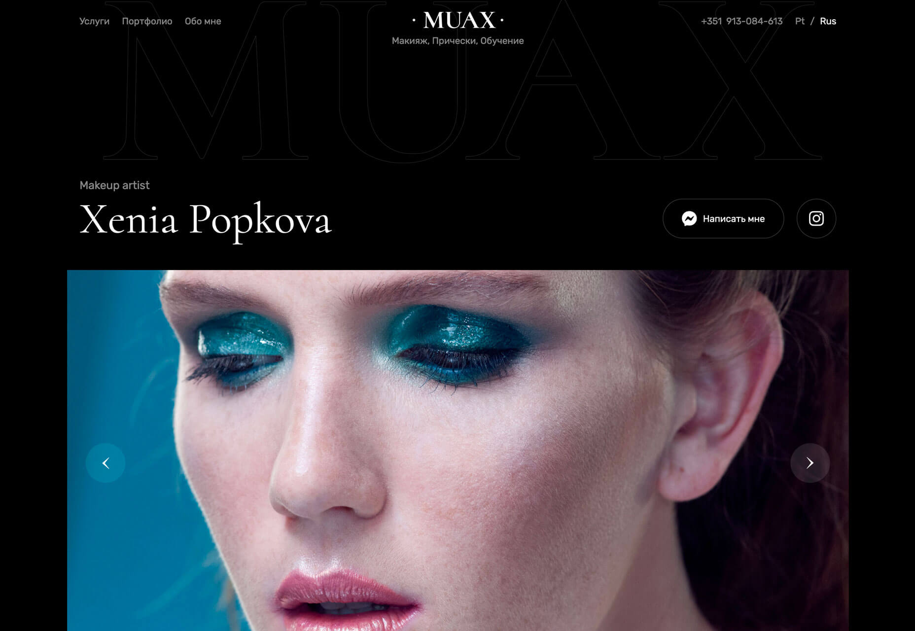
2. In Your Face Faces
It’s hard to find a more immediate way to connect with a user than with a striking image. Using a face to convey emotion creates an even more distinct connection.
The in-your-face-faces design trend does that with stunning close-up images of people. The visuals create an immediate focal point and impact. The user feels something right away before even beginning to process the words or other information on the screen.
What’s nice about this trend is that it is designed to connect users to content.
With each of the examples below, you might find it hard to look away. You look first at the face on the screen and with something like the Coulee Creative design, you may even smile a little. It piques curiosity. You start to scan the rest of the design to find out what it is about.
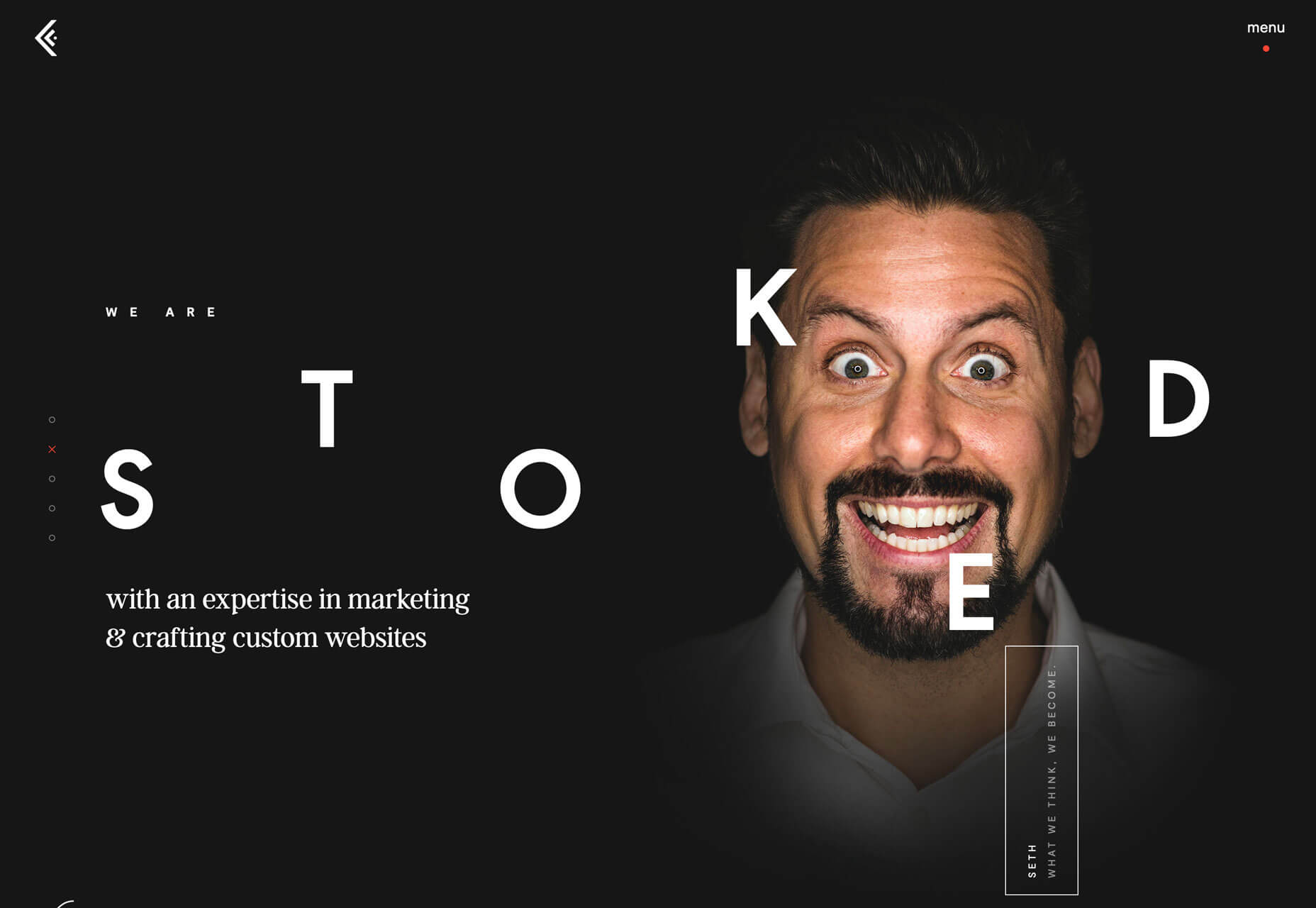
And this trend has you. It’s easy to get engulfed in a design with such a strong, striking visual from the start. Each of these examples has an extra element as well, with animation that keeps adding interest to the faces.
Coulee Creative includes multiple people making a variety of faces, Muax has a scroller of images (although the pictured image is the most in your face), and Roobinium uses a glitchy animation as the character turns to look directly at the user.
3. All the Text to the Left
For a while, the trend in hero headers was to use large text in the middle of the screen. You’ll still see a lot of that in designs. (It’s one of those concepts that never gets old.) What is beginning to gain steam is a more one-sided layout with all the text on the left side of the screen, while imagery and graphics are on the right. It’s tempting to call it left-aligned, but it’s more than that.
This layout creates a different type of symmetry when appropriately weighted. The elements on the left and right sides of the screen need to feel equal in weight so that the eye travels across the information well.
Responsive design has really powered this trend. (Visit the mobile versions of the Creact and Few designs, below, to see it in action.)
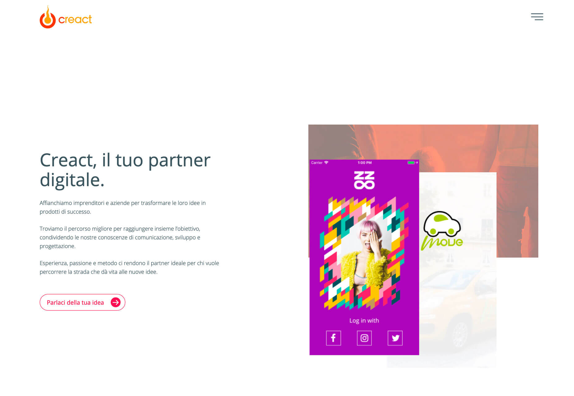
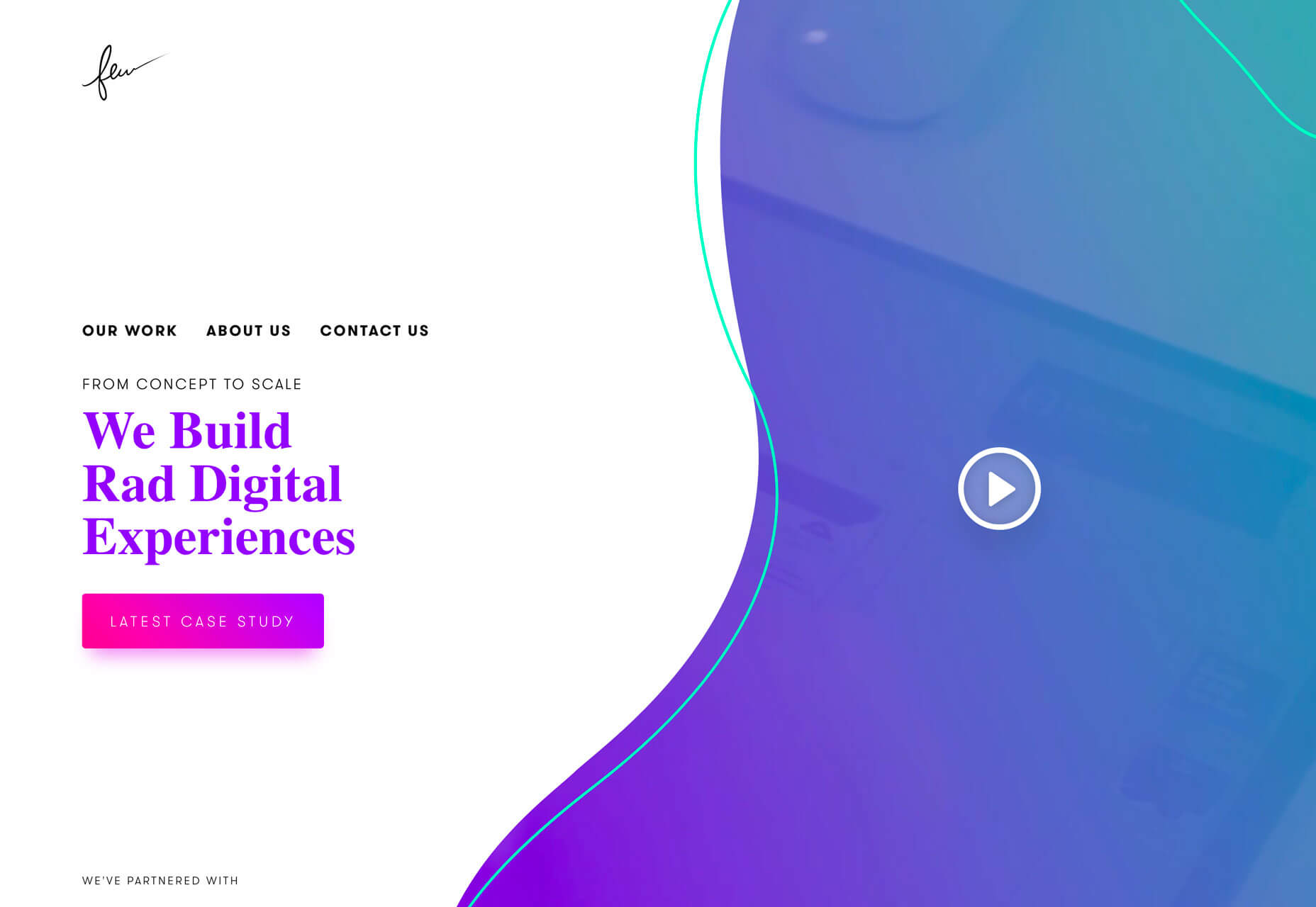
Text and image elements stack on smaller screens. The left-most element – here text – floats to the top of the design on small screens. This provides excellent display for messaging above the scroll on a small device while maintaining the consistent look and design that desktop users experience.
What really makes all this left-hand text work is that it’s not flat. Each of the websites uses stunning typography and color to make the most of what could easily be a boring display.
Conclusion
Just because something is trending doesn’t always mean that the design is “good.” It doesn’t mean that it’s bad either. Trending designs just show new techniques and visual elements that are popping up more regularly.
It can be fun to go back a few months and look at trending elements and see if the trend has grown of fizzled. Of the ones above, I expect the “in your face faces” to stick around for a while. This image style is so impactful.
p img {display:inline-block; margin-right:10px;}
.alignleft {float:left;}
p.showcase {clear:both;}
body#browserfriendly p, body#podcast p, div#emailbody p{margin:0;}