 Do you ever get bored with design projects? Feel like you keep designing the same things on repeat?
This collection of trends – from fun angles to illustrations where you wouldn’t expect them to cool three-dimensional concepts – is sure to help you think a little more out of the box. It might be just the right inspiration to cure some of that design boredom.
Here’s what’s trending in design this month.
1. Angles for Attention
Working with angles is a fun technique because you can essentially point website visitors to what you want them to see on the screen.
Angles can be aggressive and have an obvious visual goal. They can also have an easier feel without so much direct intent. This trend can look a lot of different ways, making it a versatile option for designers.
Each of the three examples here takes a different approach to angles.
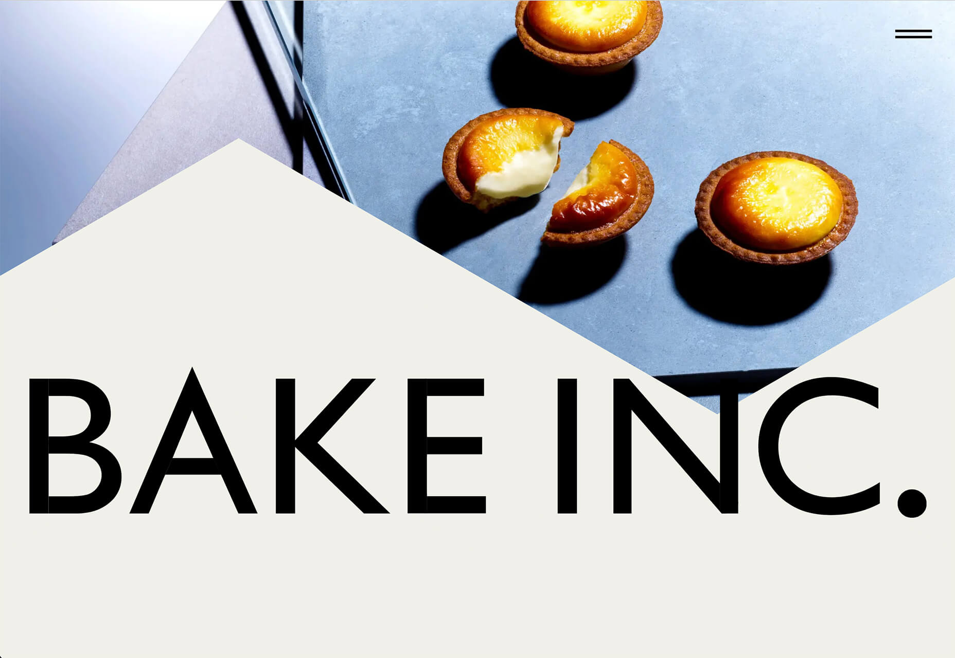
Bake Inc. uses various angles with imagery and whitespace to draw the eye past the visual elements to the brand name at the bottom of the screen. If you click through to the design, you’ll see that there isn’t just one angle-image design, but it’s a collection of changing images and angles that work beautifully in concert.
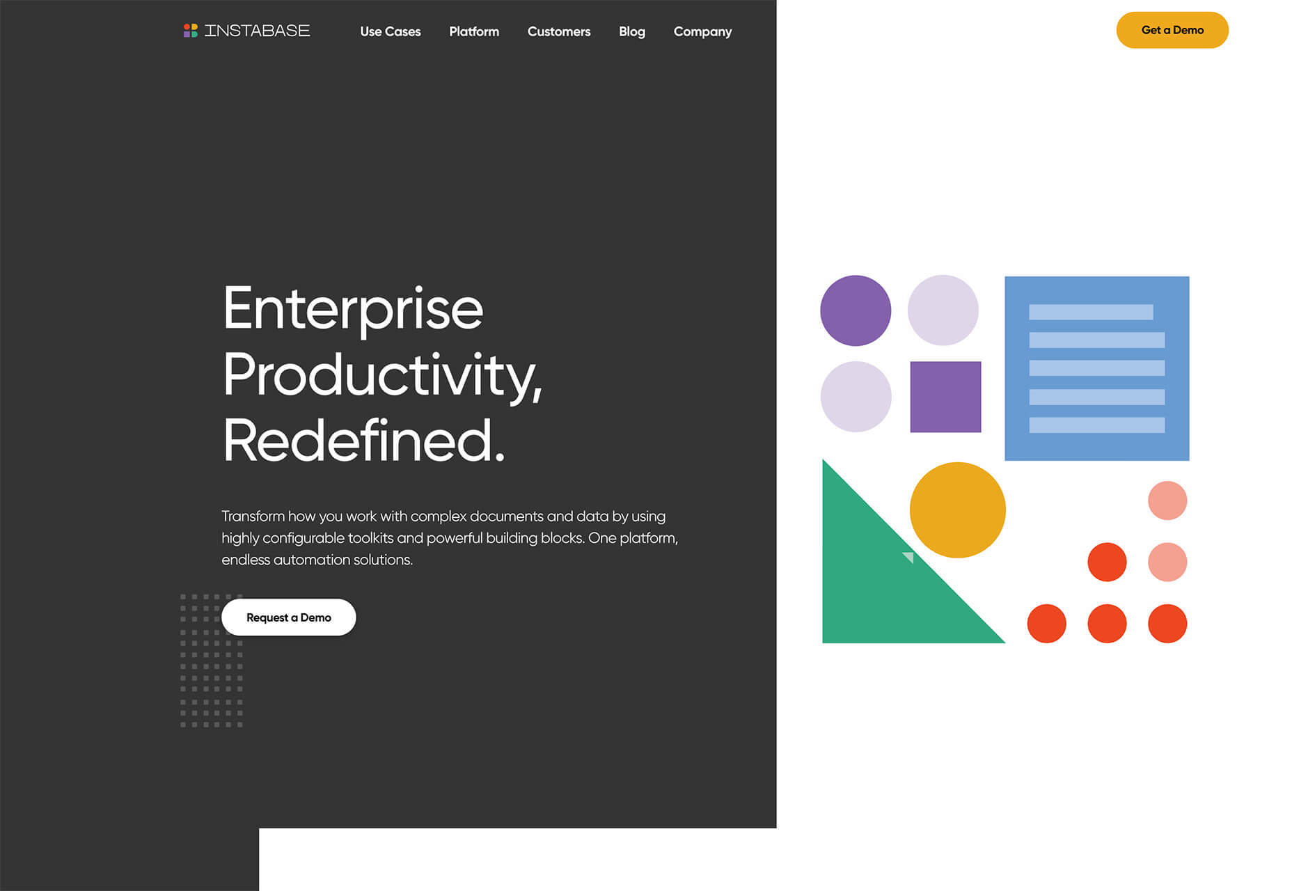
Instabase uses a collection of animated geometric shapes as the main visual element on the screen. Note the directional pull of the triangle in the bottom left of the group of shapes. It helps lead the user to the “Request a Demo” call to action on the other side of the screen.
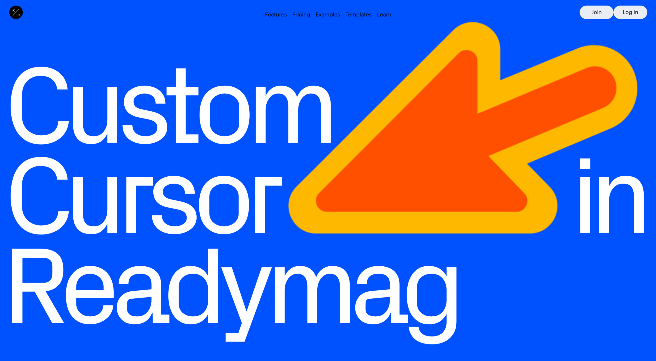
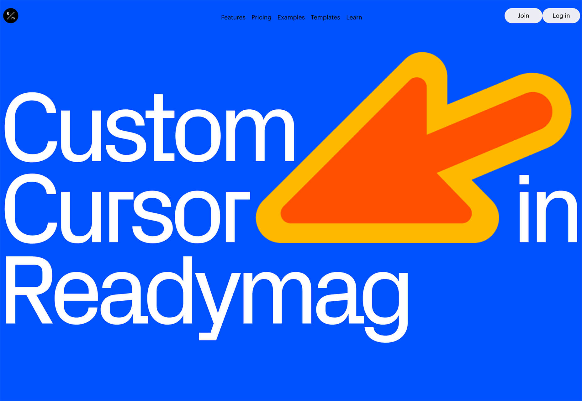
Readymag’s Custom Cursor is one of those aggressive angles. The giant cursor is what the design is about, but because of the size and shape of the object, users are directed to the word “cursor” as well. That adds extra emphasis to what the design is about. With the combination and the oversized element and giant angle that are so in your face, you can’t help but get a quick understanding of what the design is about.
2. Unexpected Illustrations
This might be the most fun we’ve seen with a website design trend in a while – projects and companies are using illustrations in some of the most unexpected places.
The design surprise happens when an industry that you don’t expect uses this type of imagery. A simple illustration takes the design to another level, or illustrations mix with other elements to paint a whimsical overall scene. Those are the things you can find with each of these three examples.
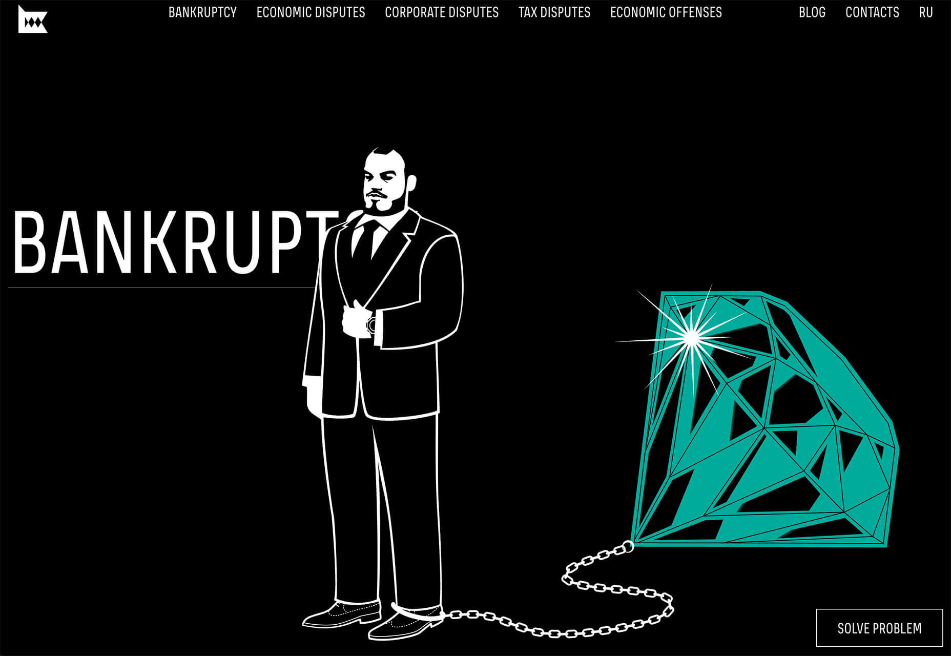
Krivitzky is a website for a business law firm. This is not at all the type of website where you’d expect illustrations (including a dragon). While the design is fun to interact with, it’s hard to say if it works. If you needed representation, would this appeal to you? In terms of legal websites, this is a total disruptor and forces your attention. That could be a good thing.
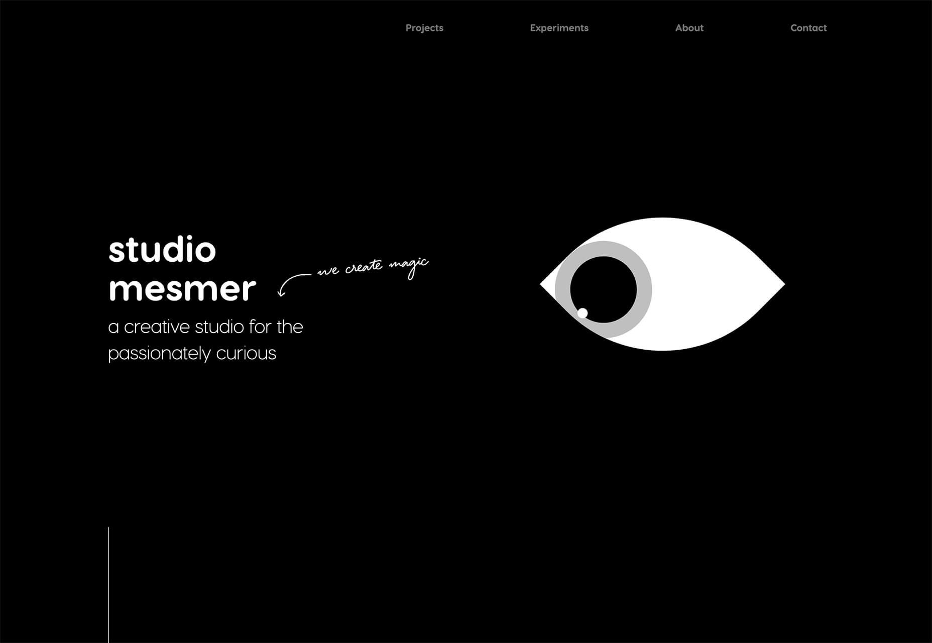
Studio Mesmer is one of those simply understated designs that’s almost perfect. The stark black background makes the simple illustration that much more striking. The eye also has a nice hover animation effect for an added surprise.
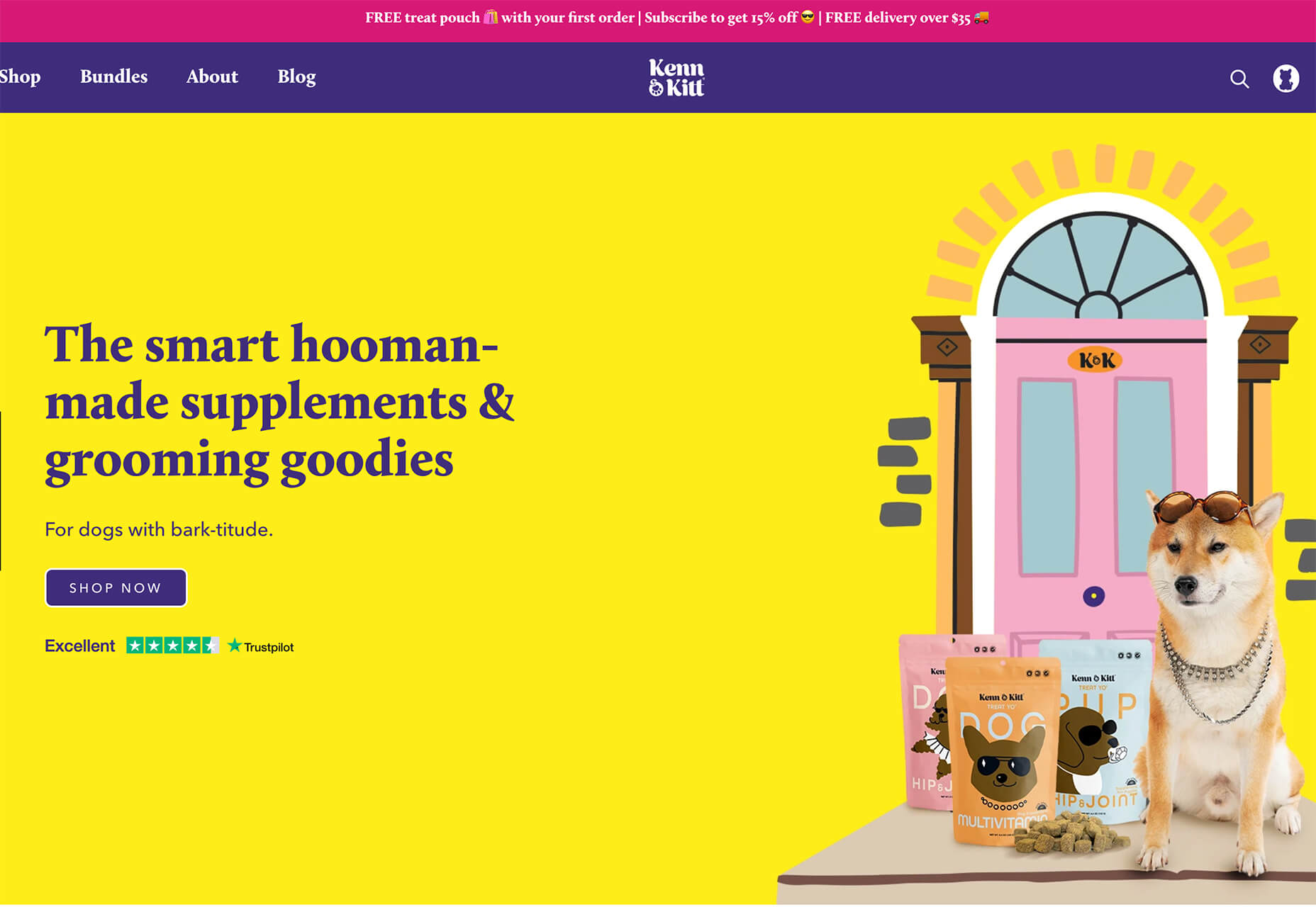
Kenn & Kitt mixes an illustration with real imagery to paint a more whimsical scene. What’s nice about the illustrated elements of the website design is that it helps connect the website to the product packaging, which uses illustrations while feeling “real” with the photo of a dog. It’s a bright and sunny combination of photos and illustrations that feels whimsical but has the right vibe for the product category.
3. 3D Depth
The three-dimensional website design trend keeps ebbing and flowing. And right now, it is flowing with full-screen 3D elements for maximum depth that makes you feel like you can almost dive into the screen.
While most of these designs use illustration with animation to create the 3D scene, you don’t have to abide by this example. The goal is to create something that looks and feels immersive so that users will want to take part in the experience.
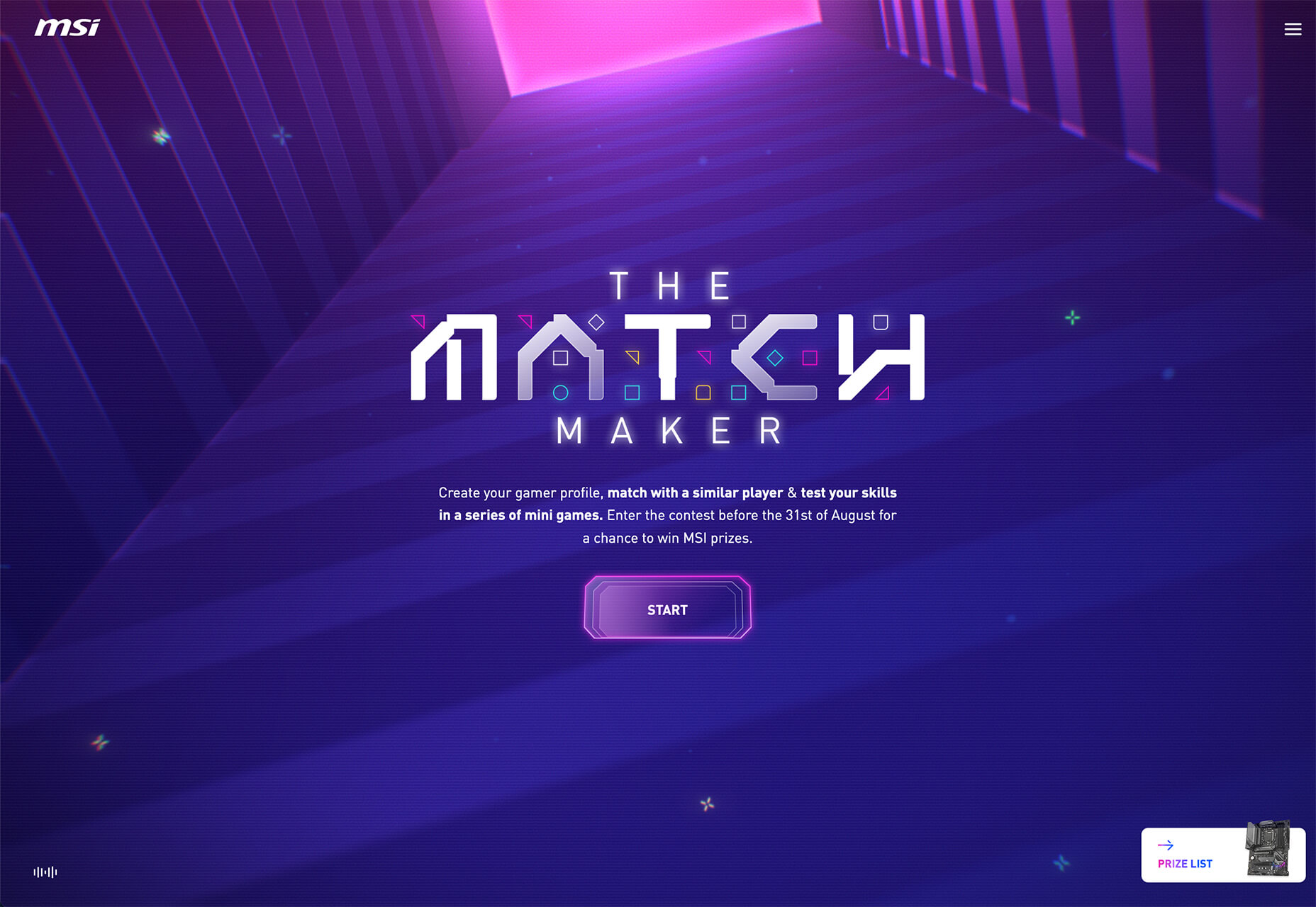
The Match Maker has an 80s gamer vibe where you can feel yourself going down the tunnel on the screen. Additional hover animations move the screen, even more to help you get into the game.
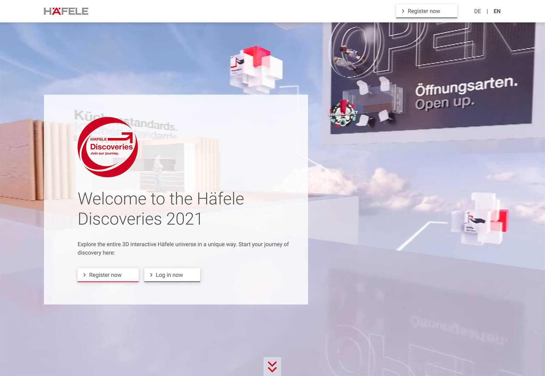
Hafele Discoveries uses a wide-angle style animation with back and forth motion. The fish-eye style of the design adds an element of depth, which is further magnified by the foreground box with text and call to action elements. The design concept is attention-getting, but the motion can be a little dizzying if you leave it on the screen too long.
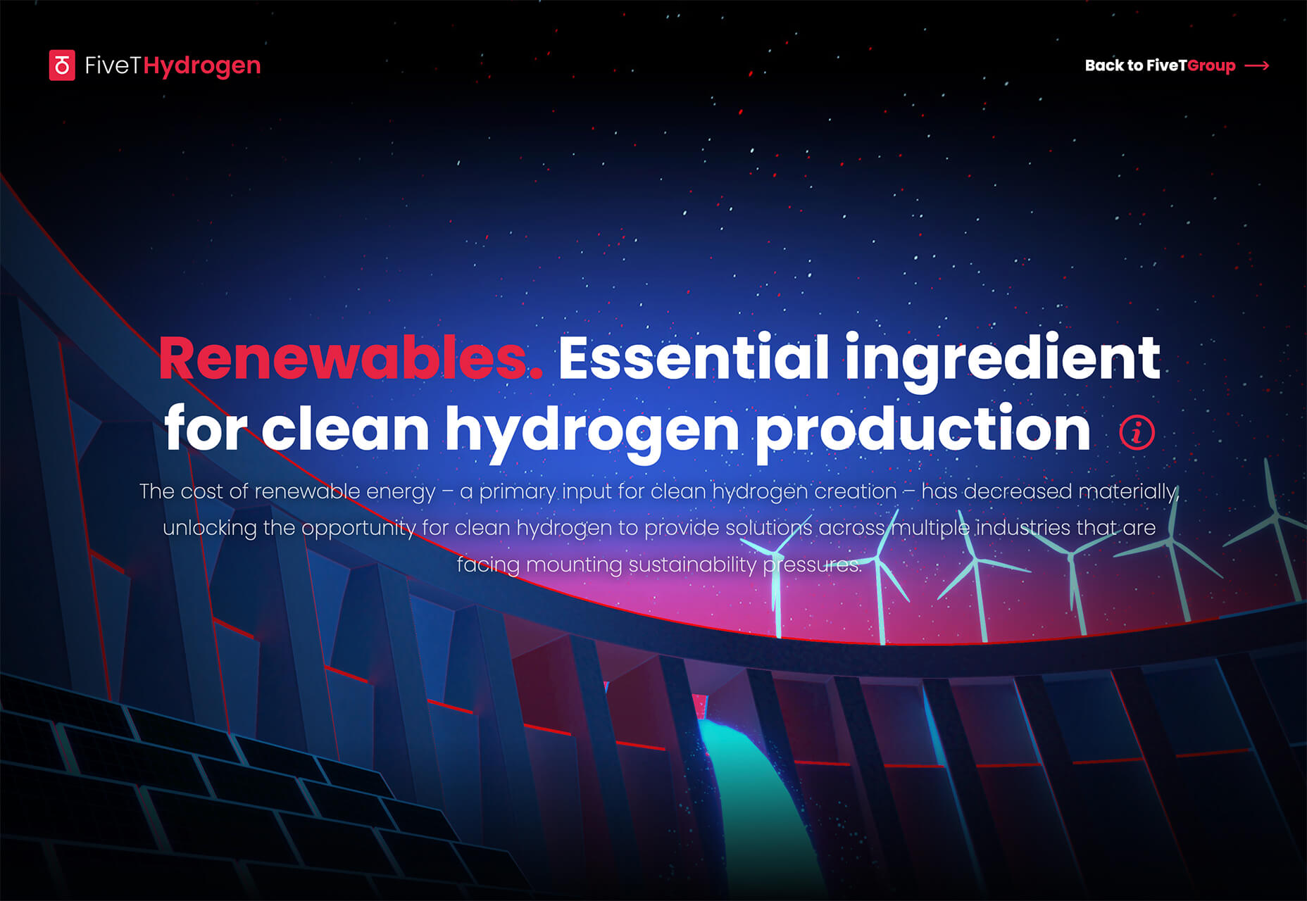
FiveT Hydrogen takes a more “traditional” approach to a three-dimensional website design with an illustration/animation that includes elements of depth. This is magnified on the scroll action of the design with shadows and layers and a variety of elements – real and illustrated – that make you feel like part of what’s happening on the screen. It’s an immersive learning experience about clean hydrogen that almost forces users to keep scrolling. The 3D effect is what takes it to another level.
Conclusion
Not every design trend is right for every project. Take a good look at what you are trying to accomplish and match it with a design concept.
If you want to try one of these trends, but they are a little too out there, experiment with a small area of the design or a landing page first. That’s a good place to test ideas and conversion rates to see if the design technique will work for your audience.
p img {display:inline-block; margin-right:10px;}
.alignleft {float:left;}
p.showcase {clear:both;}
body#browserfriendly p, body#podcast p, div#emailbody p{margin:0;}
The post 3 Essential Design Trends, September 2021 first appeared on Webdesigner Depot.
