Generally, nobody likes experiencing errors in everything. But as we are all getting more attached to digital products such as apps and websites, errors are almost inevitable.
Be it a system crash, losing internet connection or wrong inputs, each of those miscarriages can simply lead us to the ‘bitter’ part of the user journey; the errors.
But since apps and websites are best known for their interactive features we called user interface (UI), it enables the product developers to create a frontier to send users a message in times of unexpected outcomes, which we know as the ‘error message’.
The problem is, not every error message is designed ‘for human’. Quite often, they are made too technical and/or too confusing to understand. Let me give you an example.
In the older version of Android, there were times when the operating system failed to install the newly downloaded apps. In that scenario, this error message will show up:
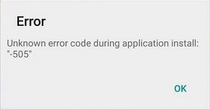
Having this showed up on my screen did not really tell me anything to solve the problem. Conversely, I got frustrated as if nothing I can do about it.
Empathizing with users
UX writing always highlights ‘empathy’ throughout its process, which is something I really like about it.
And I think that being empathetic is not only about being friendly but also being helpful towards users in different scenarios, including errors.
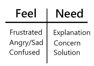
So what do users might feel and need in times like this? These could probably give us some clues:
In their great article, Marina Posniak & Tamara Hilmes share a thorough step by step on making helpful error messages, as you can read it here. But in summary, there are 3 things every writer can always do to make a better error message according to the article:
Say what happened and why
Suggest a next step
Find the right tone
The above points mean, first, the message has to be clear; explain what happened in the simplest term when possible. Second, give users a way out to resolve the problem. Third, deliver them in tonality and attitude that fit the users’ profile.
Does it seem easy to do? Let’s give it a try!
A little tweak
I began by looking at the meaning of 505 error. Doing a little research on the internet, I figured that installation failure under 505 code is commonly caused by, at least, two things:
- The downloaded app version is outdated.
- The installed operating system is outdated.
With that information in hand, I can now think about the alternative message and how to deliver it in a suitable tonality.
I set the tonality to be simple, informative, and neutral. Nothing too different from the current one, as I think it would work just as needed if I can do better on the content.
Long story short, this is what I ended up with:
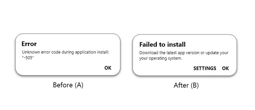
Instead of stating it as an ‘error’, I used the headline space to cut short the confusion and inform the users directly the result of that error; installation failure.
For the body copy, I squeezed in all the necessary information I had beforehand to be a clear message that gives users a suggestion on what to do next.
I also added a ‘settings’ button to the message to give the users a short cut if they wanted to check the operating system detail immediately after.
Testing the new error message
Like in my previous article, I’d like to test this new error message and find out if it could make a better experience for the users.
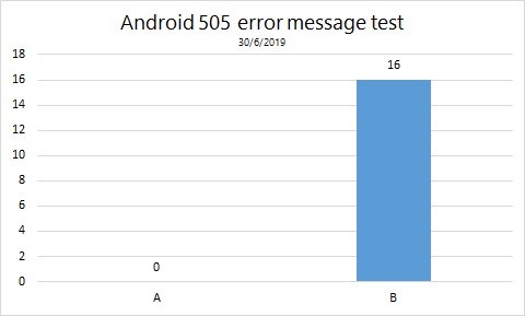
So I ran a very simple A/B testing to 16 people of random ages and background via social media. I also asked about their impressions towards their choice. And here’s the result:
“It gives a clearer reason why the app won’t work,”
“I can understand the cause without having to look for what 505 error means,”
“The word ‘error’ makes it look like nothing can be done, while ‘failed’ shows it otherwise,”