
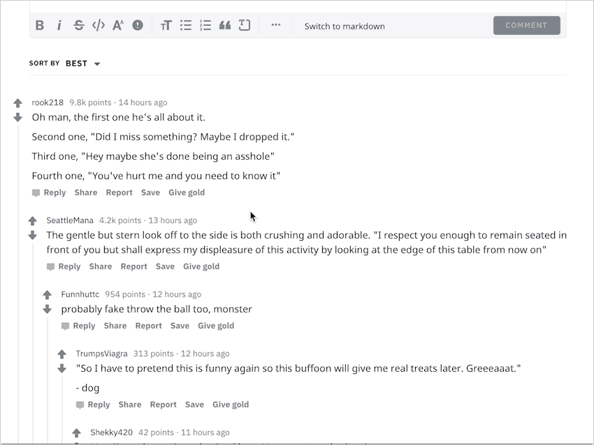
The new Reddit desktop design finally rolled out for my account recently. I love how unified it feels with the mobile site and app. However, it wasn’t long before I ran into my first user experience problem. While reading the comments on the first post, my mouse automatically moved to the left of the comment’s username to collapse the comment.
My cursor stopped moving, and I suddenly felt lost. Where did the [-] collapse button go?

Ah, they must have made the header bar clickable — just like on mobile web and app.
I moved my cursor to the empty space on the right. The cursor didn’t change into a pointer hand. I clicked. Nothing.

I felt disappointed. For a moment, I felt smart because I thought I figured it out. I googled for the solution instead.
Thankfully many people also faced the same problem, so I could find the solution quickly by visiting any of those threads and reading the top comment. On various Reddit threads submitted a month ago, users asked the same question and found out that comments are collapsed by clicking on the vertical line to the left of the comment.

I can’t believe I had to google that.
Why did Reddit make this change?
Collapse from anywhere without scrolling back up
In the old design, when scrolling through a long thread that pushes the parent comment above the viewport, the only way to collapse the thread is to scroll back up to hit the [-] icon. In the new design, the threadline solves this problem because it’s always within the viewport when scrolling through a thread.
This is also useful for the new design as the new comments have increased line-height and vertical spacing, making the same thread vertically longer than when viewed in the old layout.
Visually simplified layout
In the old design, the username is indented due to the collapse button. By removing the button and placing the action on an existing element—the threadline, the username aligns left with the comment to create a stronger vertical rhythm and cleaner look.
Problems with this change
A simple Google search for “how to collapse threads in new reddit” shows tons of posts on Reddit — mostly on r/redesign and r/help. The number of posts and upvoted comments also validate the problem. The keyword that popped up in a lot of the comments is “unintuitive.”
It’s unintuitive
The muted, narrow threadline doesn’t look clickable without hovering and seeing the active color—which I failed to do. The threadline has a similar click size in width (16px) to the [-] button from the old design, but the perceived width is small (the visible threadline width is 2px).
For returning Redditors, the threadline also resembles the old threadline element, which wasn’t clickable. Experience from using the Reddit mobile web and app doesn’t help either. On mobile web, the collapse and expand icons are clear that they are tappable. Threads are collapsed by tapping/long-pressing the parent header on the official iOS and Android apps.
The collapse and expand click position changes
After collapsing a comment, the expand icon isn’t in the same position where the cursor is. Not a big deal, but the action feels more snappy and easy in the old design.
Possible solutions (unsolicited redesigns)
Bring back the collapse icon
And on hover, highlight the threadline to educate users that it’s clickable throughout the thread:

Clickable header
On hovering the space to the left of the username (where the collapse icon used to be) and on the entire header, the bar background color changes to indicate that the entire area is clickable (minus the username). This was the first place I expected it to be.
Or perhaps a tooltip would’ve sufficed

Usability testing
To test these ideas, I created three Invision prototypes including the official new Reddit and tested with three Redditors and two non-Redditors. One of the Redditors has used the new Reddit prior to the test. I mixed up the order of prototypes for each tester and gave them the task of collapsing the comment thread after reading the post and first few comments. I measured the effectiveness of each idea by recording the time it took to collapse the comment.
Here is the average time it took to collapse a comment for each prototype:
- Official new Reddit: one tester couldn’t figure it out and gave up. For the others, it took an average of 7 seconds (8.5s excluding the Redditor who has used new Reddit before)
- Bring back the collapse icon: 1.5s
- Collapsible header: 3s
On the new Reddit and collapsible header prototypes, testers hovered over the comment to find what was clickable. When shown the collapse icon prototype, testers quickly moved the cursor to the icon without hovering anywhere else.
Afterward, I debriefed them by asking what they liked and didn’t like about the prototypes, and any suggestions for improvements. Most of them found the new Reddit threadline unintuitive and preferred the collapse icon. However, two testers said the icon looked out of place. They suggested aligning it vertically with the threadline to increase proximity, perhaps underneath or above the voting arrows. One Redditor said the collapsible header is unintuitive because she’s used to tapping on the entire comment to collapse on Apollo app. She suggested adding a label or icon on hover to make the action clearer.