Designing a system for the visually impaired to recognize color.
It’s been a year since I published my very first article and it was about solving a problem in accessibility. This problem bothered me for a good half of my life. I finally think that I’ve opened a door to its solution.
The Problem
a) Explain what color is to a person who was born blind
b) Help them further, by teaching them how to use that knowledge to design
https://medium.com/media/1cd3fc1a0852b220aab099be05ff174f/href
Years ago I challenged myself to design a system for the visually impaired to recognize color, interact with geometric shapes, and use that same technology to perform design work. This is the brief and updated version of the original article, the link of which I’ve posted at the end.
Research
Over 80% of all the information we receive is visual (source).
Admittedly, there are visually impaired artists who create amazing works of art, but nearly all of them were able to see at some point in their lives (for instance see John Bramblitt).
Thus, it is still very hard to convey the idea of color to the majority of people suffering from congenital blindness (blind at birth, like Tommy Edison’s example shown below).
There are, already, various applications that will read out loud and describe an image using AI or image recognition software, but they will not allow for designing your own work (e.g. Microsoft’s Seeing AI).
Similarly, there are braille and full tactile displays, which elevate shapes from a flat surface to trace and mimic imagery; there are also flat haptic displays, that simulate texture and bumps to a touch, via vibrations on their surface. Some even allow to “draw” shapes on them, but none of that technology allows for color recognition and complete control over design tools.
Inspiration (Tommy Edison)
https://medium.com/media/564728a855106601f9fba4c15f152449/href
Solution
At first, we will attempt to describe color to people who have never seen it, then we need to create the hardware and software to let them use their other senses to know which colors are displayed and where. If they can’t see a picture, then they must feel it!
By simply naming the color and shapes to a user through audible feedback is not enough, since it will require a lot of time to read-out the visual information, instead of providing an instant signal to the brain (this is what current screen readers do).
Hence, we need to make a way for blind users to instantly feel the color. This could be done by a combination of touch and sound.
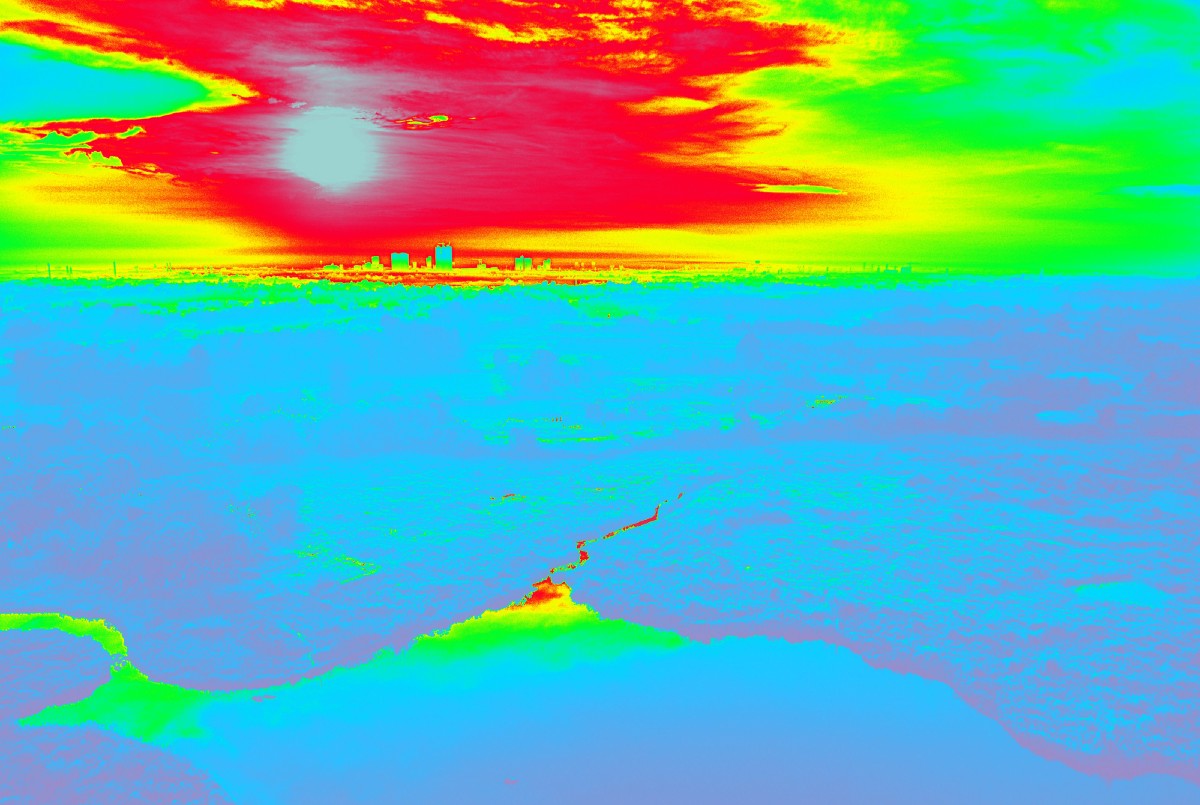
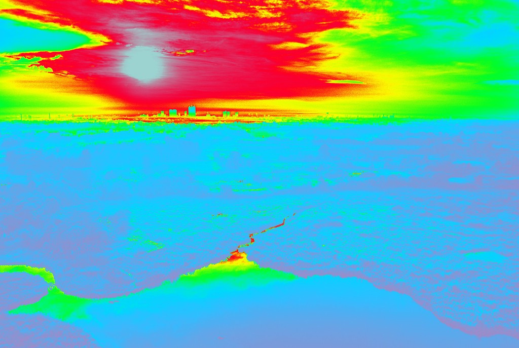
Touch: Heat-Mapping of an Image

Visually abled people describe color with temperature values — warm or cool, which means that if the users are provided with some sort of a heat map for the imagery (which they can feel by touch), they could instantly get a color value for a particular spot within that image. They can then map out the rest of it by touching all or most of the points of the heat map. This is better described in the video I show at the beginning of the article.
A few rules and principles about color should also be explained. Users need to be taught what emotions and ideas colors invoke in society, marketing and business. They also need to learn basic principles of color pairings, swatches and theory. After that, they can be trained to design basic layouts for posters, covers and other minimalist, yet beautiful works and progress further into designing more sophisticated products.
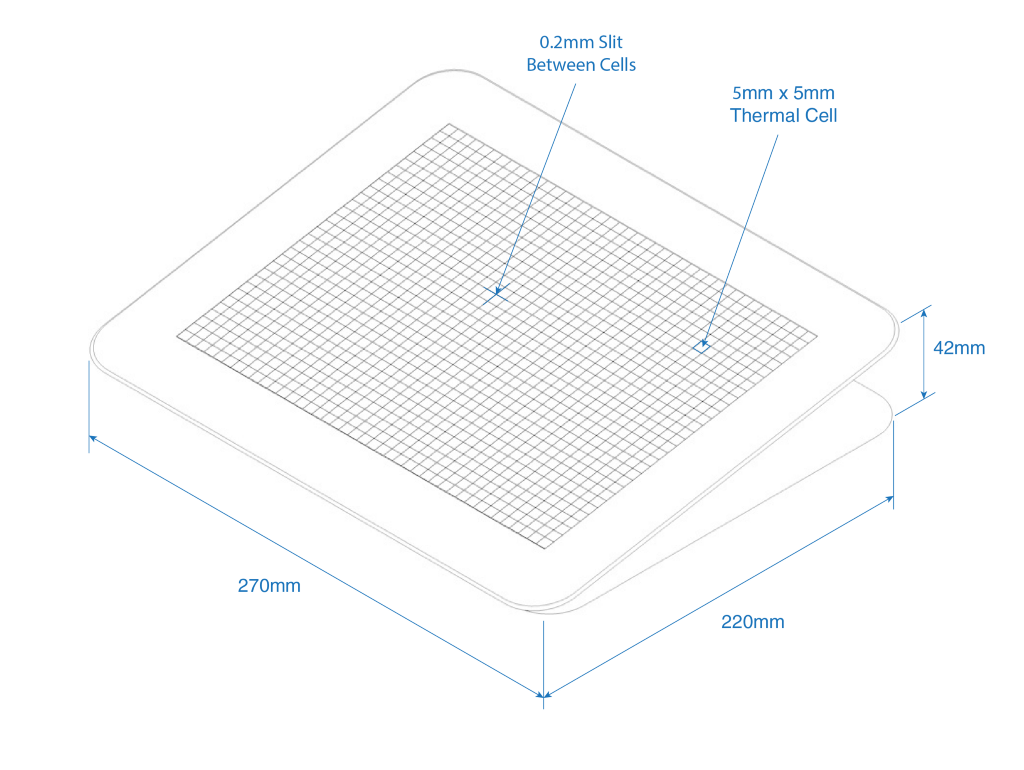
Once they have a basic understanding of color usage, they can start feeling it with the new technology. This can be achieved if the hardware has a surface divided into individual thermal points (e.g. 5mm x 5mm), which can independently change their temperature from 40° to 138° F. Then any image can be represented by cool and warm spots on this surface, and simply running their hands across users should get an initial idea of the “mood” or theme of that image.
Sound: Harmonizing & Associating with Colors
In addition to the heat mapping, each color will also have a tune. As the users run their fingers across the thermal map, they will get a general idea of the image by heat first. However, they will not hear a sound tune just yet, in order not to be overwhelmed. The sound can only be heard at one point at a time, meaning that they will need to lift all but one finger, to get the information for that point. This means, that the heat pad will also need to have multi-touch sensitivity (like a touchscreen), in order to tell the computer where the user’s fingers land. If done rapidly, like typing, users should be able to quickly touch all 10 fingers at various points and get color values at those points, by establishing a color map in their mind.
Short audible feedback can be voiced to tell the exact color value in RGB for confirmation. Moreover, the tunes will be assigned to colors based on harmonic principles. Just like certain colors conflict with one another, so do certain notes, tunes, or sounds when they are played together or in sequence.
Thus, we can teach users to recognize good and bad pairings of colors, by mapping and associating specific sounds or tunes to colors in such a way, that when users are pairing colors together and checking it with sound, the overall tune corresponding to that pairing will be harmonious if that color selection was aesthetically pleasing. If not, users will know that it “didn’t sound good” meaning that the color combination is not aesthetically pleasing.
E.g. Bad Color Pairing = Bad, Annoying Sound 😕👎
E.g Good Color Pairing = Good, Pleasant Sound 😃👍
Designing and Reading Shapes
As mentioned before, there have been numerous tactile displays designed over the years that would help one to draw and recognize shapes on a surface consisting of round-headed pins.
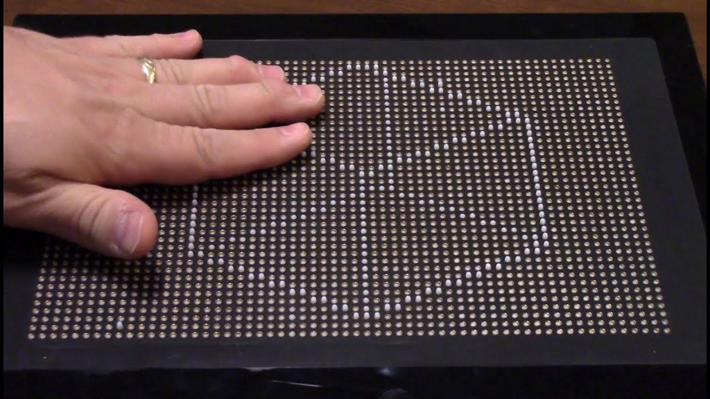
However, the high cost, heavyweight, and complex structure make them inaccessible for individuals in poor regions. Their cost and weight are usually high due to individual pneumatic or motorized systems, used to control those touchpoints (the round-headed pins).
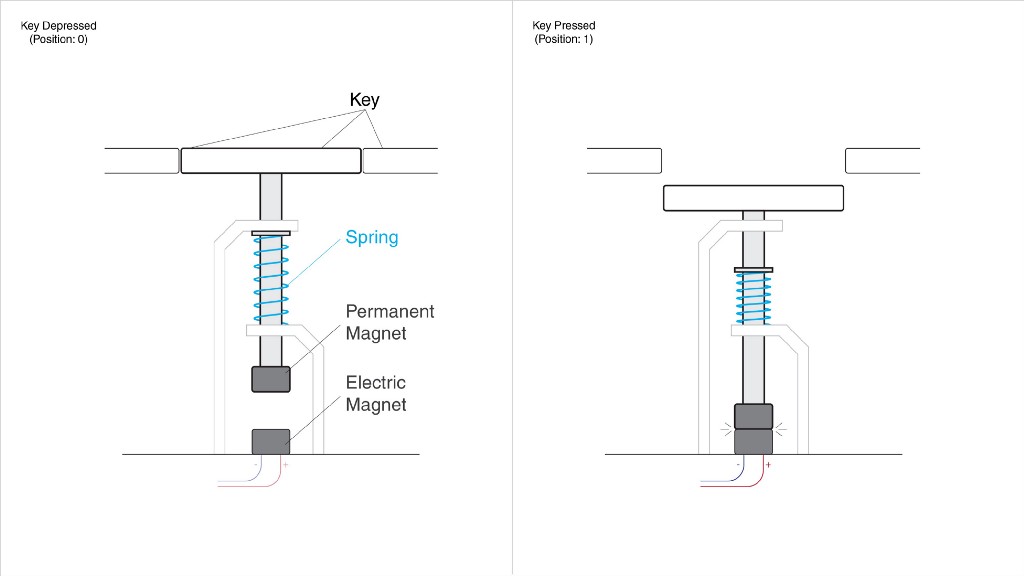
The new design, shown below, consists of a much simpler magnetic design, which is more compact, lightweight and low in production cost.
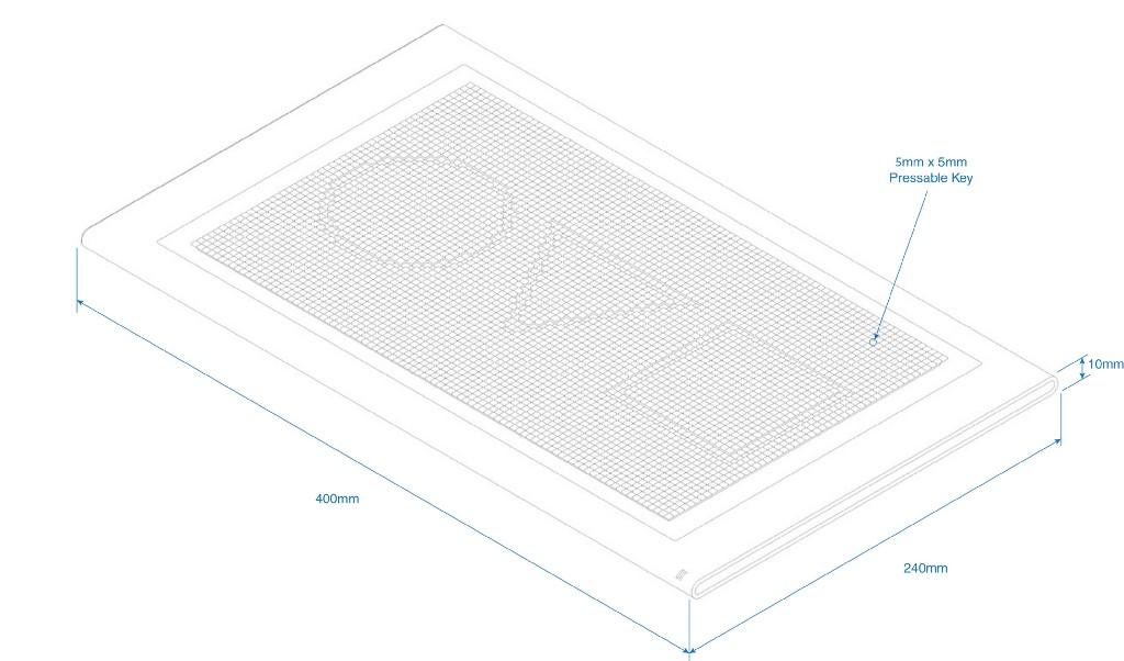
Instead of pins, it uses tightly packed small square keys, similar to the ones on a regular keyboard; and instead of elevating the pins to mimic the surface, it will lower its keys to create the shape of the image. This will allow for an easier drawing experience, since you will be indenting the shape as you draw, instead of bringing it up (which is an unnatural experience).
Making designs on the new tactile display is very simple. Most often, designers use primitive tools, such as the rectangle, ellipse or line segment tool, all of which require a simple click-and-drag input in order to be drawn (corners, stroke and other attributes can be adjusted later via voice command). As a result, you are drawing all those shapes, by dragging your hand/mouse in a straight line. Pen and spline tools are not used as frequently when designing posters, book covers, magazine layouts or even UI elements, but the tactile display can be used for drawing splines as well.
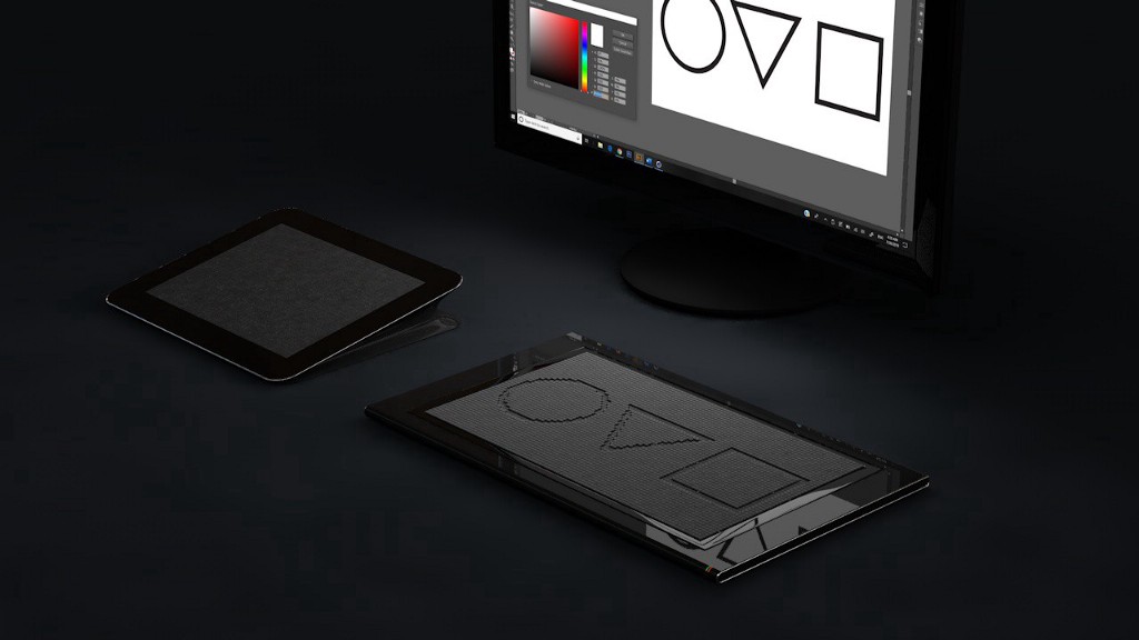
If a user needs to draw a rectangle, they will simply select the rectangle tool and drag a finger across the board, and a rectangle will be formed using the line they’ve just drawn, as its diagonal. All tools can be selected via voice command, then centered, resized or positioned in the same manner.
Typography
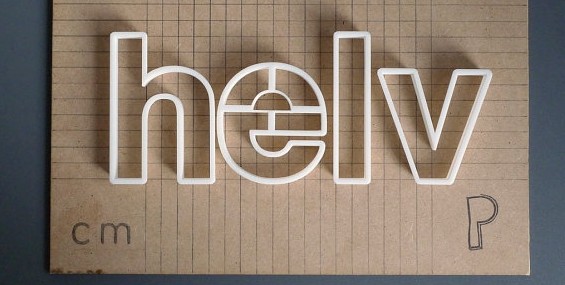
Type can be 3D-printed (serif and sans serif, italic and bold) and introduced to our users, in order for them to recognize the different styles of typography. They will then be taught which fonts to pair together to establish an appealing look. Voice input can be used here as well.
The tactile display will not have the resolution to emboss the small type, but it can indicate the size and position of the text box or the title.
In the future
The ideal solution would be to combine both panels into one, and have a tactile display with thermal points within the keys/pins. An easy approach would be to have the initial temperature at all points be at the lowest setting by default (40° F or lower) using a thermoelectric cooling device, like a Peltier cooler (see in a video below). This is because heating of those points can be done easier and faster, than cooling, hence by having all the points start at the coolest temperature, and remain so until triggered by a new image, the refresh time for updating the new information would become much faster.
https://medium.com/media/f9b0072b0d650a5f01d25f49eff46a3f/href
Similarly, we can teach blind users how to design industrial products by feeling their shape.
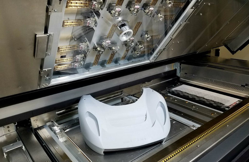
The users may be presented with 3D-printed shapes or models of any object, including vehicles, gadgets, furniture and architecture.
Again, they can be taught by feeling how some shapes are more appealing than others, what proportions work the best in design and which products and brands have the highest demand due to their design. These will establish feel-patterns for the blind designers, to shape the new cars, furniture and other objects of our future.
This idea is not perfect and was not user-tested yet, but it may inspire other solutions. It may also do the opposite and omit this option altogether. Either way, I believe that the question alone could challenge more people to think about a solution for it, because this is a real-life challenge for millions of people, whether they want to become designers or not. Happy New Year and thanks for reading!
Original Article: https://aren-k.medium.com/designing-in-the-dark-how-to-help-congenitally-blind-people-to-design-3fb1080f04d3

![]()
UX challenge: Teaching a person who is blind to design was originally published in UX Collective on Medium, where people are continuing the conversation by highlighting and responding to this story.