Do you actually think there could be any well-established brand without having a logo? Of course not! This is because there is not any such business. A logo is something that has a significant impact on how your customers perceive your business. Hence, naturally, you would want your brand to be outstanding enough to stand tall, among others. But, getting a great visual representation for brands demands much more than just graphic design. ![]()
Just like any effective work demands a proper skill set, logo design too requires plenty of experience and practice in order to be successful. However, knowledge and skill sets are definitely the power and plus point for any graphic designer.
Real Question – How to get over there?

Don’t you just fret. This post is definitely going to let you know all the things you probably require to design an effective logo for your business and you.
From determining your business’s identity and understanding what constitutes an effective logo, to making the appropriate design decisions and steering the design means, have a read to this section to discover how to create a great logo.
Here Are The Most Essential Rules For Designing A Logo – Which You Must Follow-Up:
Keep It Simple

Remember – less is always the more! Obviously, you want your business logo to be quickly recognizable and memorable. If you want your logo to be remembered by the people, you must always keep it as simple as you could. The reason being, the more difficult and complicated your brand logo will be, it will be more difficult for the people to remember and recognize it. Try dropping up as many elements as you can until you are left with something impactful and significant. This way, you will probably get surprised that your simplest idea is often the best.
Build Balance
Balance is necessary and a must for logo design. This is because our minds usually perceive a well-balanced design more visually appealing and pleasing.
Try keeping your logo well-balanced by following the weight of the colors, graphics, size equal on every part.
However, the rule of this balance can be seldom broken, just bear in mind that your logo is going to be seen by the masses of people, not only through the eyes of two or three people, thus a balanced design is certainly the go-to approach.
Always Think About The Context

Well, a logo basically encapsulates a business and exhibits what it holds for. However, it does not remain on its own. Rather a logo is incorporated with a comprehensible identity system and bounded by some great design elements like photography, voice, color, and varied other elements. Honestly, this is the major difference between identity and identification.
Creativeness
There are loads of common and easy methods to build logo designs nowadays, such as by getting logos downloaded or by utilizing the clip art or some other royalty-free figures. In a case, if you are really thinking of building a business that’s able of global influence and accomplishment, then it would be highly urged to avoid using a few of these common tactics.
In addition to this, you will require to make sure that the fonts, symbols, and colors that you incorporate in your logo design are completely different and better than your other competitors in the market.
Choose A Highly Professional Logo Designer

Till the time you are not a skilled graphic designer having a proper understanding of creative media and branding, don not just try to design a logo by yourself. The reason being, creating an unskilled logo is only going to damage your brand in the coming long run.
Typography
Using the accurate size and font is an essential choice. However, there are some of the most well-known businesses like Prada and Canon, which uses a font only logo design.
Well, if you are also planning to get a font only brand, then it is suggestible to use a customizable font. This is so because by utilizing a customized font, you can get a brand logo that is pretty different and distinguishable from other brand logos. Additionally, you may even consider hiding some shapes or can even choose to add a symbol to the typography.
Tip: You must avoid adding some common fonts into the brand logo as it may seem pretty amateur.
Make Sure To Test It On All Medias
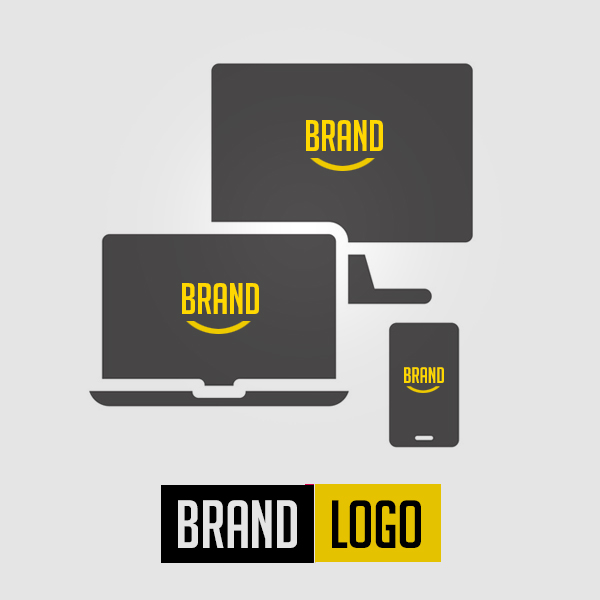
You need to ensure your brand logo seems great in all possible forms of media. There can be chances, it looks appealing and sharp on desktop screens, but did you think about the same on mobile phones? Have you ever thought about its colored, or black and white printing? If not, then you should. Note that your brand logo must be flexible enough to fit all the needs and still be able to recognizable in all the possible forms of media.
Dare To Be Different From Others

In order to stand tall and different from the opponents, you must differentiate your own self as one designer with a different and effective style. Instead of copying any other designer’s technique, try to be completely different and innovative in order to stand out completely different from the other competitors.
But how can this be possible, and how can you be different? In order to get this, you need to design something by incorporating various tactics and approaches.
Try adding a variety of different styles to see what works best for you and your client. In addition to this, try making numerous color combinations till the time you find something which seems pleasing and engaging to eyes. Ensure you are having fun with the design program you are using and just keep tweaking the colors in the design till the time you think everything has got at the right place.
Be Memorable

Of course, other than just standing out among others, you want your business logo to be something that people can instantly remember. The most fabulous and compelling business logos are those which people can easily recall; the ones which indeed seem to show the actual offerings of the business. Try to stick with the simple design which all people and customers can easily capture in their minds.
Make Use Of Symmetry
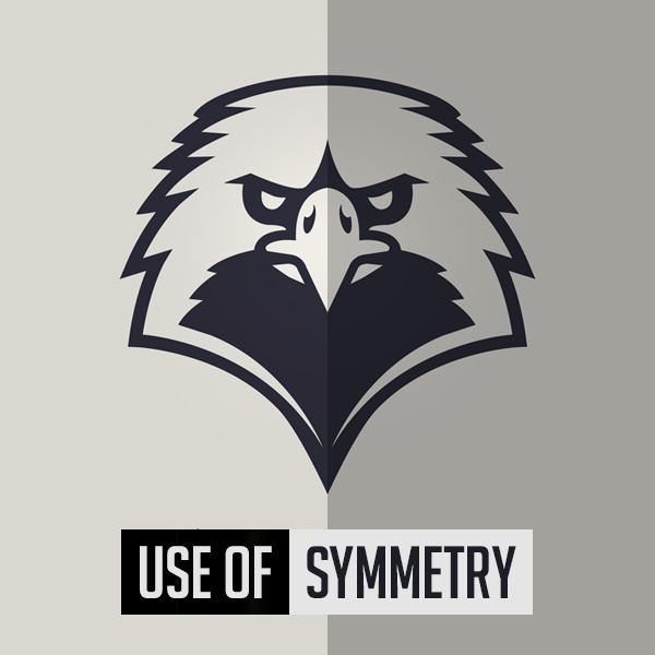
Fact – Human eyes naturally get drawn towards symmetrical images. Hence, make sure there is a proper balance in weight, colors, and lines. Try keeping your business logo symmetrical to make it recognizable, memorable, and ensure using asymmetry sparingly.
Be Flexible

Your business logo is expected to appear on a diversity of media platforms, be it in print or digital. Here what seems exceptional on a website may look awkward on a t-shirt or letterhead. You need to make sure to examine out the logo on various alternatives so that it always seems great.
Once you follow these 11 essential and important logo design rules, you will indeed be on your way to getting the perfect & engaging logo for your brand. Note – it is always a great idea, to begin with, numerous design ideas and then to narrow them down. Chances are, you may have to begin over many times, or you probably find yourself combining numerous elements from varied prototypes to get the business logo that you actually love.
