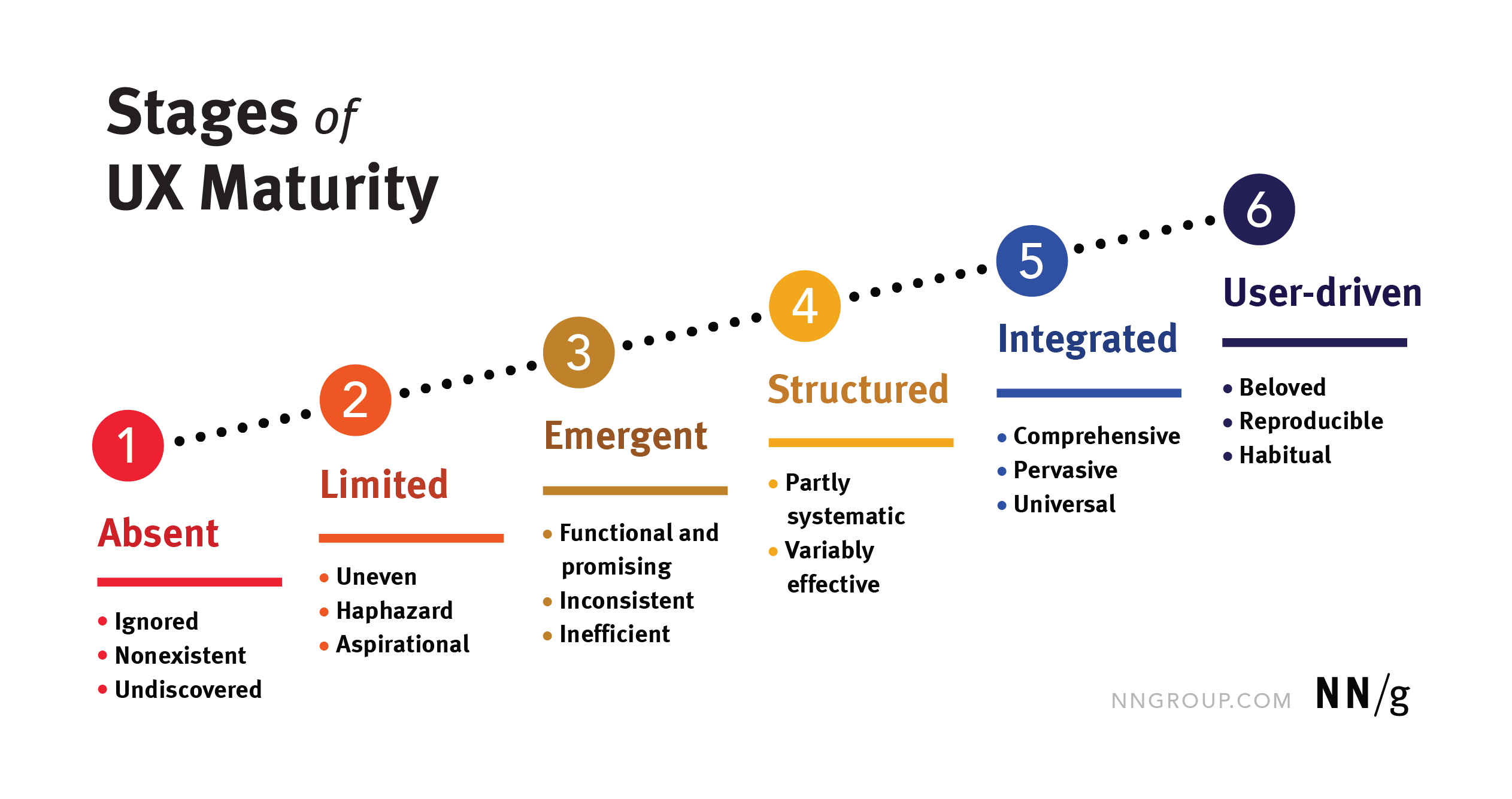
Summary: Focus on continuous reflection — not stage-hopping — to grow sustainable, resilient UX practices. Through decades of research and consulting with teams across industries at NNGroup, we’ve studied what UX looks like in real life. The result is our UX-maturity model — a framework designed to help organizations understand how UX is practiced, supported,… Continue reading UX Maturity Is a Living System, Not a Ladder
Tag: Balance
14 logic-driven UI design tips to improve any interface
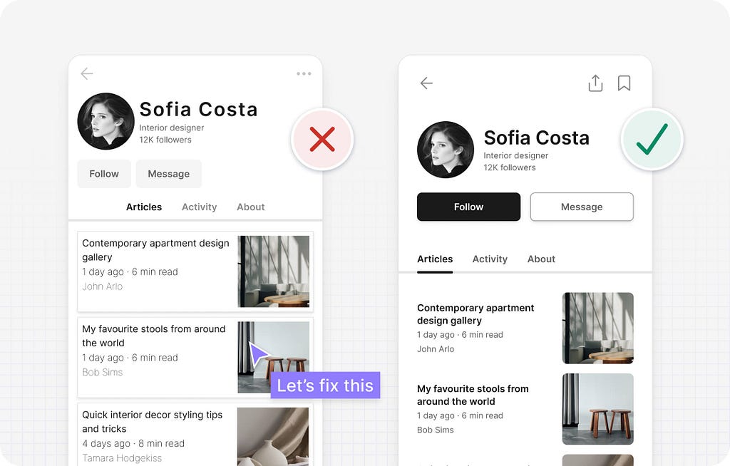
[unable to retrieve full-text content] UI design tips to improve your interface designs using logic rather than gut feel. Designing user interfaces is no easy task. With countless choices around layout, spacing, typography, and colour, it’s easy to feel overwhelmed. And when you layer in considerations like usability, accessibility, and human psychology, the challenge only grows. But… Continue reading 14 logic-driven UI design tips to improve any interface
Visual Design: Glossary
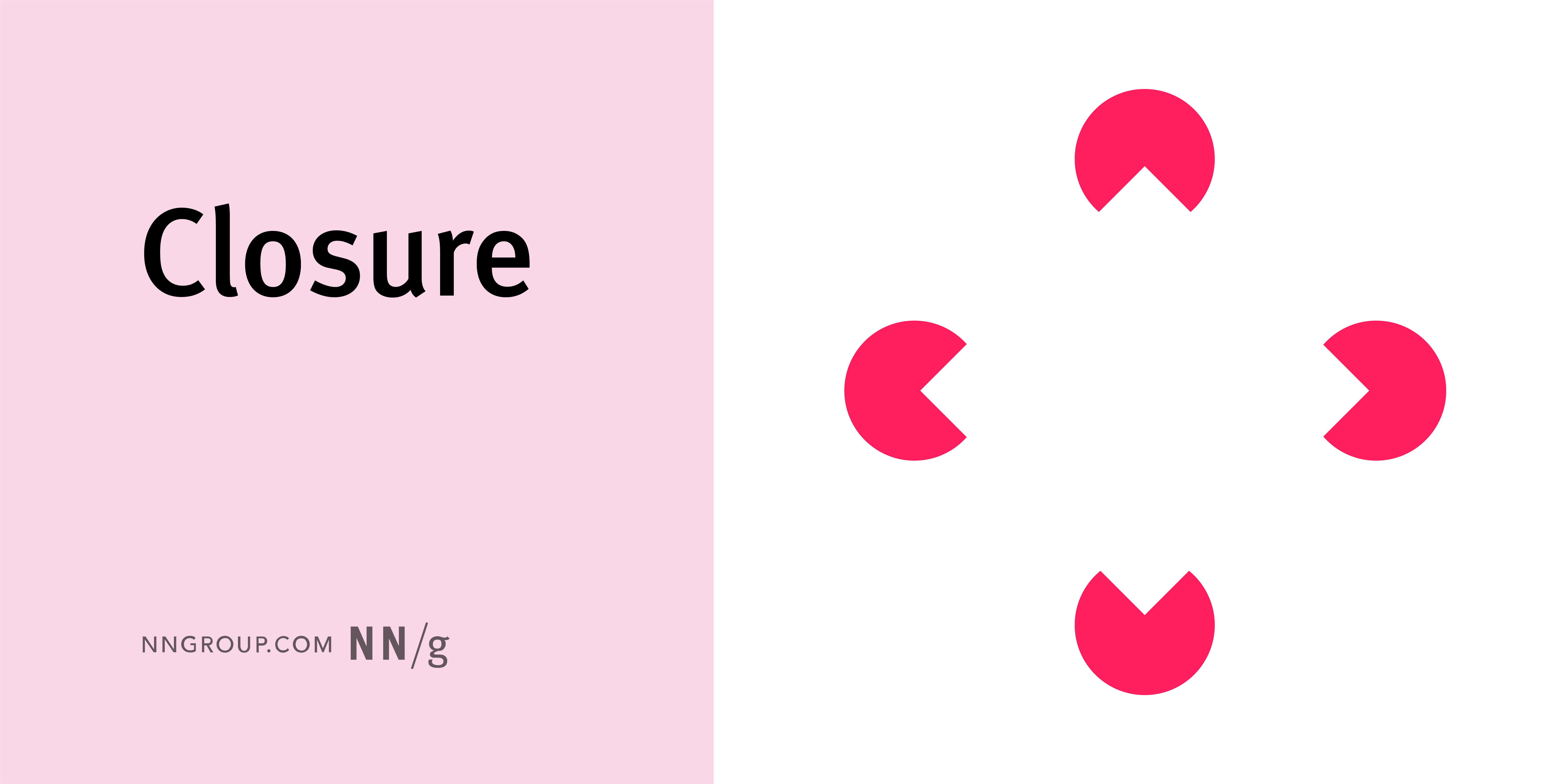
Summary: Use this glossary to quickly clarify key terms and concepts related to visual design. Visual design requires knowledge and understanding of many jargon terms. Use this glossary as a reference as you delve into visual and user interface design. Jump to a definition in the table or review the complete glossary. Aesthetic-Usability Effect Users’… Continue reading Visual Design: Glossary
What’s the Wide Fonts Trend in Web Design?
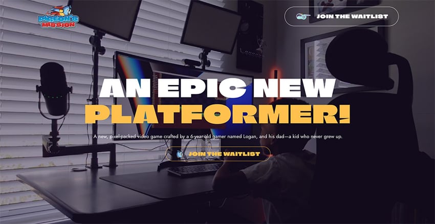
This typographic style, characterized by its extended letterforms and impactful presence, is not just a fleeting fad. It’s a revival of a classic style, now intertwined with the boldness of neubrutalism, a design movement known for its raw, unfiltered aesthetic. But more on that in a moment. pigeonsmission.com First, let’s thoroughly describe what wide fonts… Continue reading What’s the Wide Fonts Trend in Web Design?
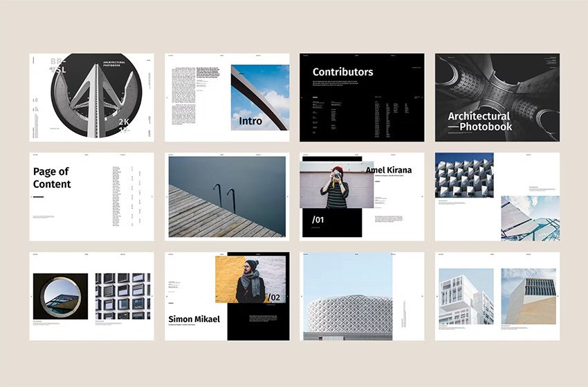
Everything You Need to Know About Book Design
Are you interested in book design but don’t know where to start? You’ve landed in the right place. If you’re a book lover and you’ve always wondered how to design a book, here you’ll find a collection of resources and tutorials that will point you in the right direction. We’ll cover what book design is,… Continue reading Everything You Need to Know About Book Design
12 Important Rules to Observe When Designing a Logo
2 Shares The logo represents the very identity of a brand. Basically, it functions as the face of the brand and it makes the first impression upon customers. Hence, its design is mandatory. The execution of a logo design needs to be perfect, succinct and has the ability to arrest the attention of the potential… Continue reading 12 Important Rules to Observe When Designing a Logo
Essential Rules To Follow When Designing a Logo
Do you actually think there could be any well-established brand without having a logo? Of course not! This is because there is not any such business. A logo is something that has a significant impact on how your customers perceive your business. Hence, naturally, you would want your brand to be outstanding enough to stand… Continue reading Essential Rules To Follow When Designing a Logo
How to Easily Edit and Improve Photos for a Website
April 30, 2019 by Spyrestudios Adding photos to your website can definitely make it more appealing and help you to draw in and engage more visitors. But regardless of whether you’re using stock photography or snapping shots of your own, the one thing you need to be able to do is edit and improve the… Continue reading How to Easily Edit and Improve Photos for a Website
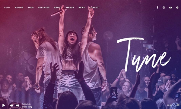
31 New Trend Website Design Examples
Creating a website for your company, firm or organization you must follow the new trends. Creative ideas and modern trends can make your web design more attractive and eye catching. In past few years web design trends improvements very amazingly and growing up too fast like flat design and retro/vintage effect, big background, video with sound are… Continue reading 31 New Trend Website Design Examples
The Ultimate Guide to Adjustment Layers – Color Balance and Selective Color
In this tutorial, we are going to have a look at the Color Balance and Selective Color adjustment layers in Photoshop. They work by balancing the percentage of primary and secondary colors in your images and can be used to fine-tune your colors. Although Color Balance and Selective Color are not used as often as… Continue reading The Ultimate Guide to Adjustment Layers – Color Balance and Selective Color
What Simplicity Really Means
When it comes to web design trends, minimalism has risen to the top and shows no signs of losing its current popularity. There are many reasons why the style has been so embraced of late: not only does it mesh well with the tenets of web design, it also can be effortlessly combined with other… Continue reading What Simplicity Really Means
Peculiar Balance Asymmetrical Website Designs
Developing website designs with a lopsided feel is a rather common approach nowadays. Majority of designers resorts to off-center landing pages in order to initially concentrate users’ attention on the most important things, recreating strong visual paths. An inability to draw a line of symmetry helps to naturally separate navigation or sidebar from the rest… Continue reading Peculiar Balance Asymmetrical Website Designs
