Escape the siloing trap when you are both part of a design team and a product team, involve people early and often, and foster the right conversation at the right time If you are a designer working in a product organization you are maybe also part of two teams at the same time: a design team… Continue reading Handling cross-team feedback loops on design work
Tag: Reflection
Type traps, design maxims, new Figma, UI tips collection
[unable to retrieve full-text content] Weekly curated resources for designers — thinkers and makers. “One of the fundamental forces behind my journey is the opportunity to connect and collaborate with other designers. Building relationships is a crucial part of what we do. I’ve always been a people person myself. That’s just part of my nature. I’m a strong believer… Continue reading Type traps, design maxims, new Figma, UI tips collection
The role of Reflection in the design process
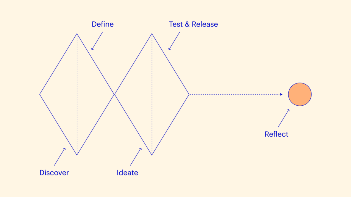
[unable to retrieve full-text content] The often-overlooked last step. In product design, when we release a feature into the wild, we can expect a degree of objectivity in the feedback we get. We can tell if our designs are helping or hurting based on the feedback and metrics after we ship. Getting my hands on these metrics… Continue reading The role of Reflection in the design process
Headlines and Taglines Set in Subtle and Slim Type
Recently we have published an article dedicated to using bold dominating type typography in website design. It definitely has its own advantages over others, but there are some cases, when powerful all-embracing fat type looks inappropriate and ruins all the harmony. So, it is more reasonable to use slim type that offers its own benefits,… Continue reading Headlines and Taglines Set in Subtle and Slim Type
Peculiar Balance Asymmetrical Website Designs
Developing website designs with a lopsided feel is a rather common approach nowadays. Majority of designers resorts to off-center landing pages in order to initially concentrate users’ attention on the most important things, recreating strong visual paths. An inability to draw a line of symmetry helps to naturally separate navigation or sidebar from the rest… Continue reading Peculiar Balance Asymmetrical Website Designs
Dominating Bold Type in Website Design: New Examples
What makes great website design great? Your answer will definitely vary: advanced animations, spectacular captivating photos, uncommon video intros, high-detailed artistic illustrations, flawless execution of popular styles, creative solutions and much more – all these aspects depend on kind and purpose of website itself, but there is undoubtedly one thing that you find in common… Continue reading Dominating Bold Type in Website Design: New Examples
Ornamental Nature – Websites featuring Handwritten Fonts
Hand drawn typography is no longer associated with doodles in average school workbook; it has firmly entrenched in print, graphic and web designs. Among all variety of adorned fonts that give opportunity not only represent content in the best light, but also play as a decorative tool – it is definitely undisputed leader. Unlike most of… Continue reading Ornamental Nature – Websites featuring Handwritten Fonts
Use of Flat Design in Mobile App Interfaces, Best Examples
Emphasis on typography, roomy widgets, muted color palette, one-colored or blurred background, grid or horizontal stripe layout, inornate graphics, 2d illustrations – all these can be easily attributed to flat style, that recently got its second rebirth. Microsoft’s “Metro” aesthetic has captured the minds of a great deal of designers, pushing them on eschewing shadows,… Continue reading Use of Flat Design in Mobile App Interfaces, Best Examples


