Among all variety of adorned fonts that give opportunity not only represent content in the best light, but also play as a decorative tool – it is definitely undisputed leader. Unlike most of types, hand-style lettering looks less serious, more fun and engaging.
When a project calls for unique and positive approach that is aimed to recreate particular style with human touch, you should certainly falls back on such type. But it has several flaws. For example, you cannot neglect the lack of readability and appropriateness matter; and, generally, it is accompanied by the rest embellishments, so design, at least, should imply presence of sketchy or doodle-themed illustrations.
Today we are going to examine fresh collection of website designs that ably utilize imaginative hand drawn typography.
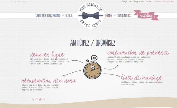
Blog Mariage Gratuit is a lively illustration-driven website that utilizes a great deal of hand drawn illustrations as well as playful doodle fonts.
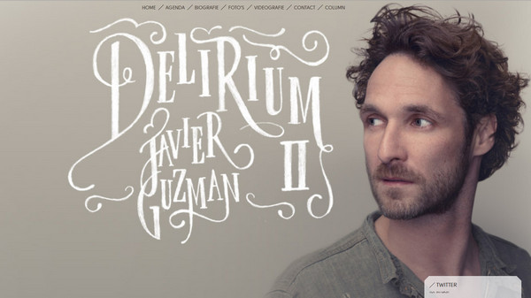
Javier Guzman beautifully leverages relatively huge headline that is made by means of chalk style type with graceful swirls.
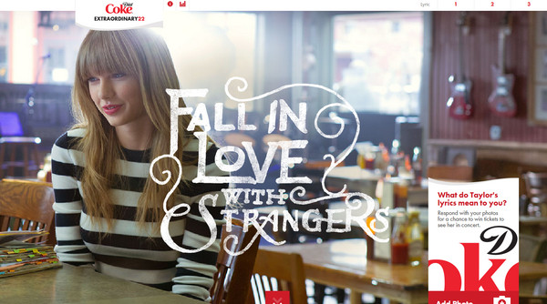
Diet Coke’s promotion page includes another gorgeous example of chalk lettering that is spiced up with slight grunge touch.
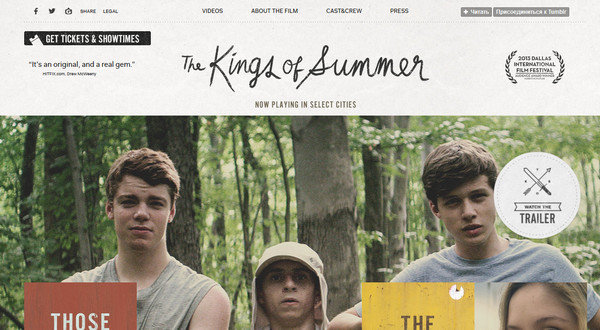
The Kings of Summer implements handwritten font in a logo in order to add to website a note of personality and friskiness.
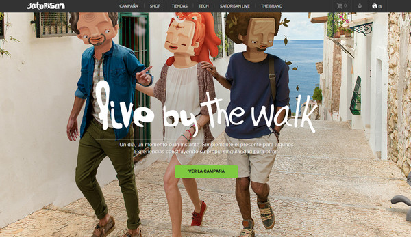
Satorisan looks truly unconventional and eye-catching. Eccentric, full screen images in conjunction with bold, slightly crooked white type adds to landing page originality.
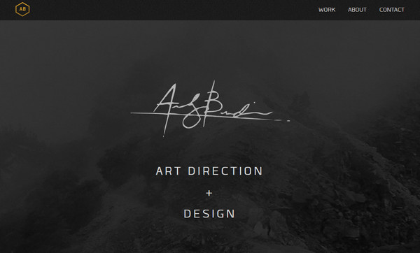
Andrew Burdin’s website is based on classy black-and-white color scheme that is bolstered by spectacular nature inspired images and smooth type. Welcome section shows off subtle digital signature of an owner.
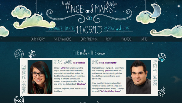
Vince and Marlene wedding website is skillfully defined by multilayerness with shallow depth, chalk-themed illustrations and handwritten letterings that all together give truly offbeat and exquisite appearance.
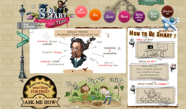
BeSmart and Team features truly busy website with a numerous graphical stuff. You can stumble upon gradient style circular navigation, complex background, vibrant sketchy illustrations and, of course, tiny and subtle script font.
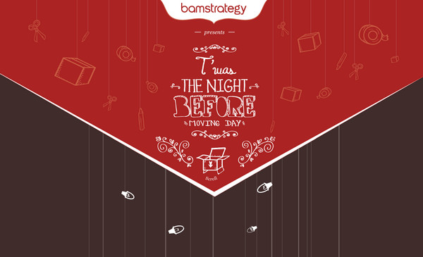
BAM Strategy relies strongly on hand drawn illustrations. Website is based on parallax effect and reveals fascinating story with marvelous pictures that are supported by various high-quality typography with human touch.
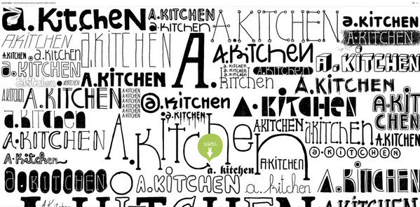
A.Kitchen’s welcome section has a strong typography vibe. It showcases a great deal of different, amazing, extraordinary types; some of them nicely mimic human writing.
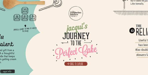
The Production Kitchen is truly attractive interactive website, which capably makes work together realistic and sketchy images, employing both elegant hand-written and ordinary fonts.
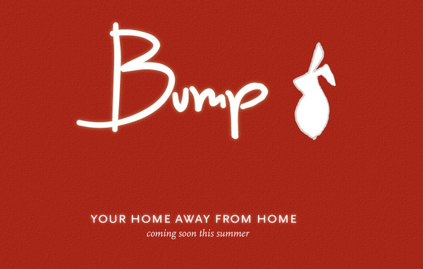
Bump Inn Hotel features huge, neat and slightly bold tagline on a landing page. Smooth lines and subtle backlight of lettering ably interact with textured red background.
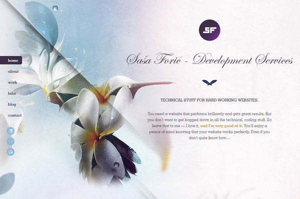
Sasa Foric puts into action refined ultra-narrow type with human touch in order to add personality to tagline.
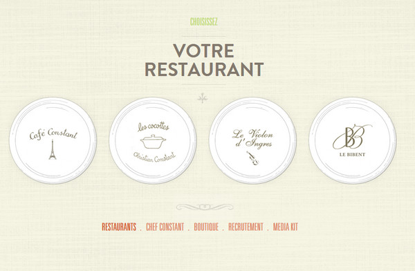
Maison Constant fascinates with subtle and accurate execution. Light color scheme, delicate thin type used in menu, and light patterned background give website sophisticated appearance.
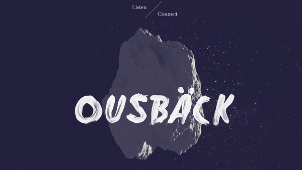
Ousback’ welcome area is marked by bold contemporary handwritten typography with wonderful brush appeal. Intricate dark photo background wonderfully sets off tagline with graphical strokes of paint.
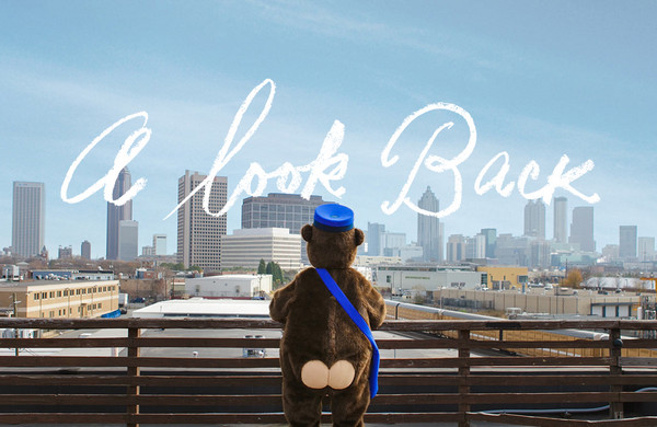
Mail Chimp does a good job of demonstrating annual report, grabbing users’ attention by funny urban image background and chalk style, slightly hooked headline.
Wanderio has clean and clear website that is founded on customary vertical parallax technique. Designer skillfully leverages three-color scale, sky-themed illustrations, grunge touch and nice slim type.
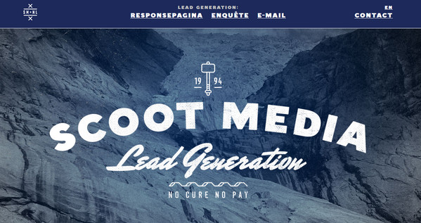
Scoot Media has an accurate and nature-inspired landing page that generates onlookers’ interest by means of beautiful bluish scene and set of different types. Designer capably and harmoniously mixes together heavy bold, empty outline and calligraphy fonts.
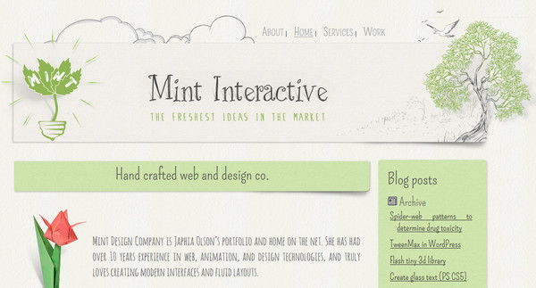
Mint Interactive has slight organic vibe with a bunch of hand drawn images and green illustrations. Tiny refined headline wonderfully fits into the whole design.
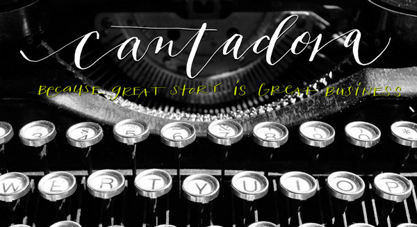
Cantadora welcomes users with lively vintage greyscale image background that wonderfully emphasizes rough handwritten letterings on a foreground.
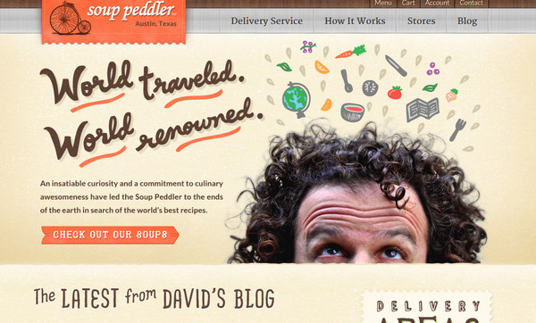
Soup Peddler exudes an image of imaginative and quite heartwarming website. Designer employs warm colors, subtle textures and a range of fantastic script fonts that definitely add notes of piquancy and uniqueness.
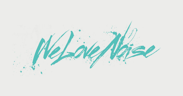
We Love Noise is marked by crisp watercolor type that is spiced up with personality. Light grey background, huge brisk tagline and paint splashes make page look clean and lucid.
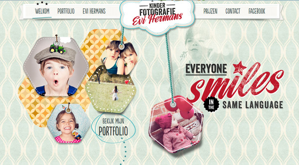
Kinder fotografie features a lot of ribbon and tag components that along with pleasantly textured background make up the style of the website. Cursive bold font with grunge appeal is a really perfect match for such embellishments.
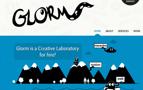
Glorm is hilarious cartoon style website that utilizes vector illustrations, and displays funny hand drawn monochromatic logotype. Intricate website design definitely lives up to its tagline.
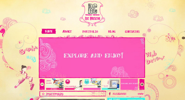
Ronaldo Cardoso plays strongly on pink and pale yellow colors. Although website looks a bit messy and teen due to bundle of sketchy, swirl-themed decorations, it beautifully incorporates modern graffiti fonts.
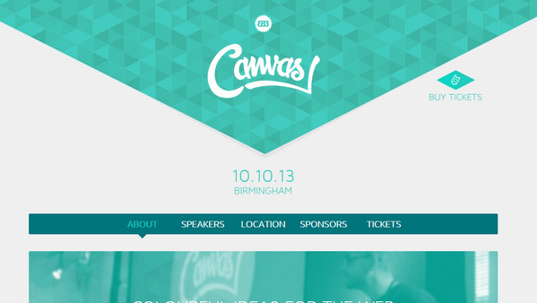
Canvas Conf makes use of handwritten font only once in a header, but its utilization skillfully complements marvelous poly-inspired background.
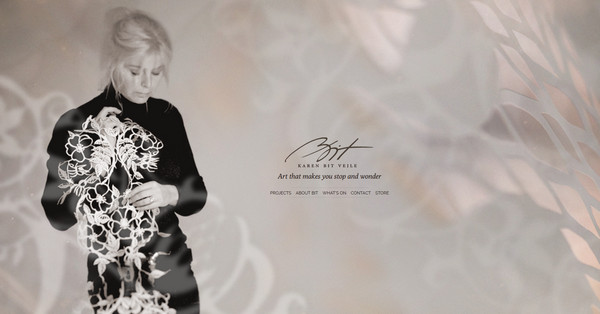
Papercutart gets the feel of personality chiefly from home page that welcomes users with image of an owner and her small elegant signature. Semi-transparent paper cut decorations together with tracery on a background capably sets the proper mood.
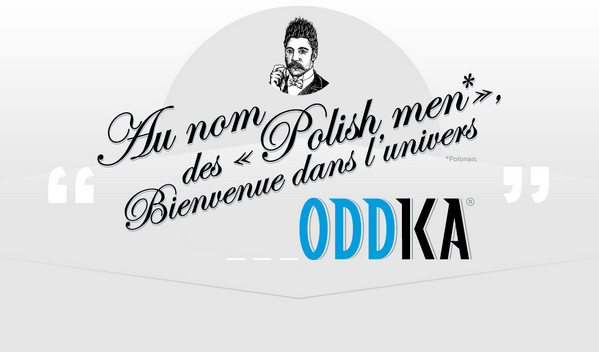
Oddka is a beverage-related website that here and there demonstrates refined slim letterings in order to add subtlety to appearance.
Reflection
Employment of handwritten font in website design is a good way to add personality, making design more elegant and delicate. It also can serve as a great ornamental tool that perfectly collaborates with various drawing illustrations, harmoniously complementing the whole website design.
Join our conversation. What do you think about handwritten fonts? Do they add personality to design?

