Today, let me introduce to you a little jQuery plugin I created to do just that called, Flat Shadow. This plugin will automatically add a beautiful shadow effect to your HTML elements without you even opening Photoshop. I’ll guide you through all the features available and how you can incorporate it in your work.

Using Flat Shadow.js
BASIC USAGE
To use this plugin, simply include the jQuery library and the jquery.flatshadow.js in your HTML files, create the markup and CSS as follows, and then call the flat shadow function, that’s it.
HTML Markup
</pre>
<div class="flat-icon">FLAT</div>
<div class="flat-icon">UI</div>
<div class="flat-icon">IS</div>
<div class="flat-icon">PRETTY</div>
<div class="flat-icon">AWESOME</div>
<pre>
CSS
.flat-icon {
    padding:23px 28px;
    font-size: 45px;
    font-weight: bold;
    display: inline-block;
    line-height: 100%;
    overflow: hidden;
    text-transform: uppercase;
    margin-right: 15px;
}
JS
$(".flat-icon").flatshadow({
color: "#3498DB",
        angle: "SE",
            fade: false,
        boxShadow: false // Accept full 6 digit hex color (#000000)
});
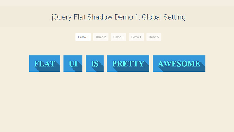
With the code above, all your elements will have a casting shadow effect like in our first demo where the shadow will cast in a south east direction.

The color option will allow you to assign a background color to all your elements at once. If you didn’t assign anything to color, the color will be randomly picked from a predefined palette.
For the angle option, you can assign the direction of the shadow that will be applied to the element inside .flat-iconcontainer. All directions are supported whether it’s N (north), E (east), or a combination such as SE (south east), NW (north west). Again, if you didn’t assign anything here, the direction will be random.
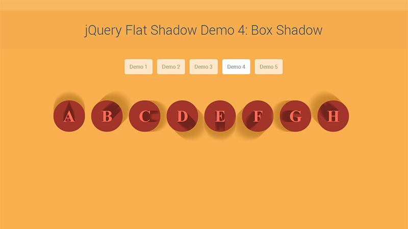
For the fade option, instead of casting a flat shadow on the element inside, you can toggle this true to create a gradient shadow effect which will fade away as it goes further from the element. You can see this option in use in our Demo #4.

For boxShadow, you can create the same shadow effect but instead of applying the element inside, the effect will be applied to the container. This field accepts full 6 character hex color to define the shadow’s color of the container, for example if you want to add a black shadow effect, simply change the false from the code above to “#000000” and the container will have a black shadow casting from the same angle as the element inside.
FURTHER CUSTOMIZATION
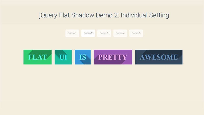
If you are in need of specifically assigning each element with its own style, you can assign each element with a markup as follows:
HTML
</pre>
<div class="flat-icon" data-color="#2ecc71" data-angle="NE">FLAT</div>
<div class="flat-icon" data-color="#1ABC9C" data-angle="NW">UI</div>
<div class="flat-icon" data-color="#3498db" data-angle="SE">IS</div>
<div class="flat-icon" data-color="#9b59b6" data-angle="SW">PRETTY</div>
<div class="flat-icon" data-color="#34495e" data-angle="NE">AWESOME</div>
<pre>
and call the function without those predefined options:
JS
$(".flat-icon").flatshadow({
            fade: false,
        boxShadow: false
});
That’s it. Now you have each element rendering differently without calling the function multiple times.

Note: The predefined data markup will always override the global options you set in your function call.
Conclusion
Pretty neat huh? This can also be applied to font icons such as Font Awesome and Elusive Icons, to create a beautiful presentation for your website with only a few lines of code and no images.
I can’t wait to see what you guys will use this plugin for. I hope you enjoy this post, and if you have any suggestions and questions, please let me know in the comments below.
