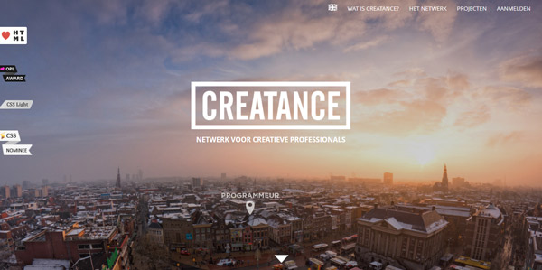
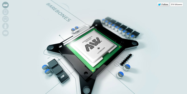
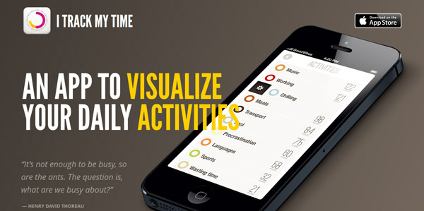
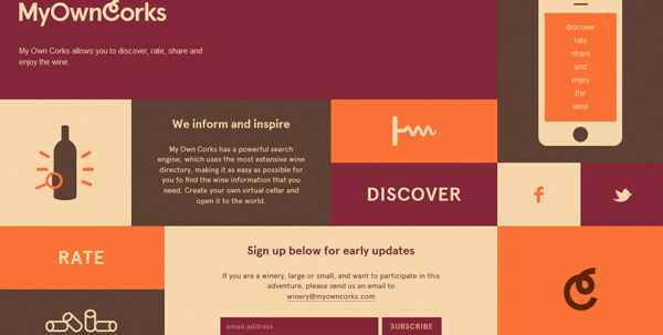
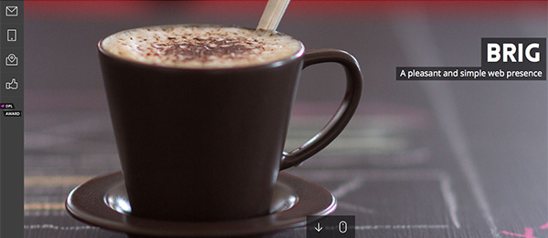
Sometimes one page is enough.
But just because you are creating a website with only one page, does not mean that it will be easy.
Developing a single-page layout can require just as much thought and planning as some more complex sites. It needs to have all the same basic parts as a bigger site and should look visually stunning, work as expected and have a clear purpose.
Here we take a look at some awesome single-page designs, which are more popular than you might expect. While you can see what these sites look like, go ahead and visit them to experience some of the great user interface features built into many of these sites.
What is Single-Page Design?
A single-page website is built in a single window.
The single-page concept is based more on scrolling rather than clicking (although clicking is not outlawed either) to see and move through the site and its contents.
A single-page website can be as simple as a “page” that fits neatly in a browser frame and is contained above the scroll. But that is not always the case. Single-page websites can scroll (although it is important not to create too deep of a page that can be overwhelming for users).
Simply, a single-page website is one that does not include links to other pages within the domain and all of the content is located in a central frame.
Why Opt for a Single-Page Design?
Single-page web design comes with a lot of caveats and is not for every project.
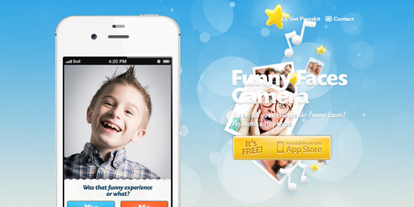
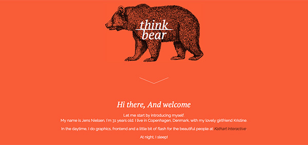
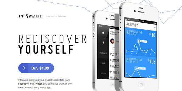
Where it is gaining popularity is as a preview to an upcoming app or site with an e-mail opt in form, as a portfolio tool, as a page that encourages you to go elsewhere or for a company that can showcase its product or message simply.
Single-page websites are often highly designed, because they get one chance – one impression – to grab a user’s attention in a cluttered visual landscape.
These types of pages only work for sites that don’t have an abundance of content – sites that sell a single product; site aimed at promotion of another site, app or item; small portfolios or simple information.
While the design of these types of pages is often highly visual, text is kept to a minimum. Single-page sites also require a clear and easy-to-understand user interface so visitors know exactly what they are supposed to do with the site.
Have a Purpose and Goal
Start the single-page website design process with a clear purpose and goals. What do you want users to do on your site or what information should they soak in while there?
If you are previewing an app, for example, you might want users to provide an e-mail address so you can tell them when it launches. If you are selling a UI kit, your goal is to convert visitors into sales.
Other actions might include, filling out a form, watching a video or clicking through to another website all together.
Know what you want users to do before you begin the design and re-emphasize this throughout the process.
Design Tips for Success
Now that you know what you want to happen with your website, use this set of simple tips to get on the road toward publication.
Create a first impression. You only get one chance to bring in new users. Your site needs to have visual appeal and tell users why they are there quickly.
Stay focused. Remember your goal and eliminate any tricks, design elements or copy that could get in the way.
Play up strong visuals. Whether it is color or images or beautiful typography, pick a great visual and use it in a big way.
Develop clear navigation. Even though you may be wondering what you need navigation for – it is only one page after all – any site that contains multiple scrolls, forms or links of any sort needs clear navigation. Tell users what different buttons will do (especially if they take you away from the site). Even sites with a small amount of content need to include clear and understandable directions or calls to action.
Stay organized. You will never be able to say everything you think of in the format (or space) of a single-page design. Stick to what’s important and order everything based on hierarchy. Write clean, clear copy and edit until the words are sharp and concise.
Have fun with the design.
Cool Tricks and Effects
There are an unlimited number of cool tricks and options out there that can help you make the most of a single-page web design. Some of these are even “stolen” from mobile concepts, where single page design is quite common.
Parallax scrolling: Scrolling effects are one of the most popular “tricks” in single page design. With the flick of the mouse, users get a new page without clicking or navigating away from the initial landing page. This type of effect can encourage users to see what comes next in the design by continuing to scroll, read and interact with the site. (You can learn even more about parallax scrolling in this previous Designmodo article.)
Mobile app landing pages: Create a specialty landing page that encourages users to download an app when visiting on your site on a mobile device or tablet. This “pop-up page” can help convert web users into regular app users.
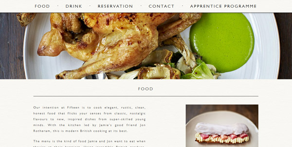
Hidden navigation: Menus that pop in and out of the frame when the mouse comes near is a way to help save space in the overall design and provide navigation in a familiar location (most commonly at the top of the page). You can also experiment with other navigation tricks such as the one on Jamie Oliver’s Fifteen page where the navigation starts in the middle of the screen and moves to the top (and locks in position) as you scroll down the page.
Animation: If parallax is not your thing, consider an animated or video background for visual interest. Movement entices users to stick around and see what happens next.
Conclusion
As with any other type of design “trick” or trend, single-page websites only work if your content is created for it.
This style works best for sites with limited content and strong visuals.
Have you created a single-page website not mentioned here? Show it off by sharing a link in the comments.

