Editor’s note:
This post is written by Julia Blake, a young passionate blogger interested in web design and everything connected with it. Currently, she works with MotoCMS – a progressive website builder.
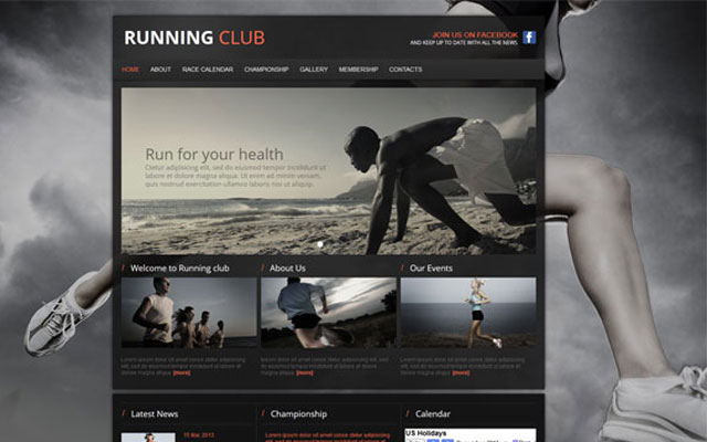
Sports-related websites are of many types: sports clubs, news portals, personal pages, fan clubs, and sportswear brands. The main factor to unite all these sites is sport, but their web designs have no limitations or strict rules. The majority of sport news sites are very content-heavy and it is a big challenge to make them look simple and attractive. Personal pages are usually modern and creative, but the balance of style and simplicity should be achieved as well.
Here are some examples of sports-related websites that you might find interesting or can inspire you for your next web design project.
Miami Heat Official Website
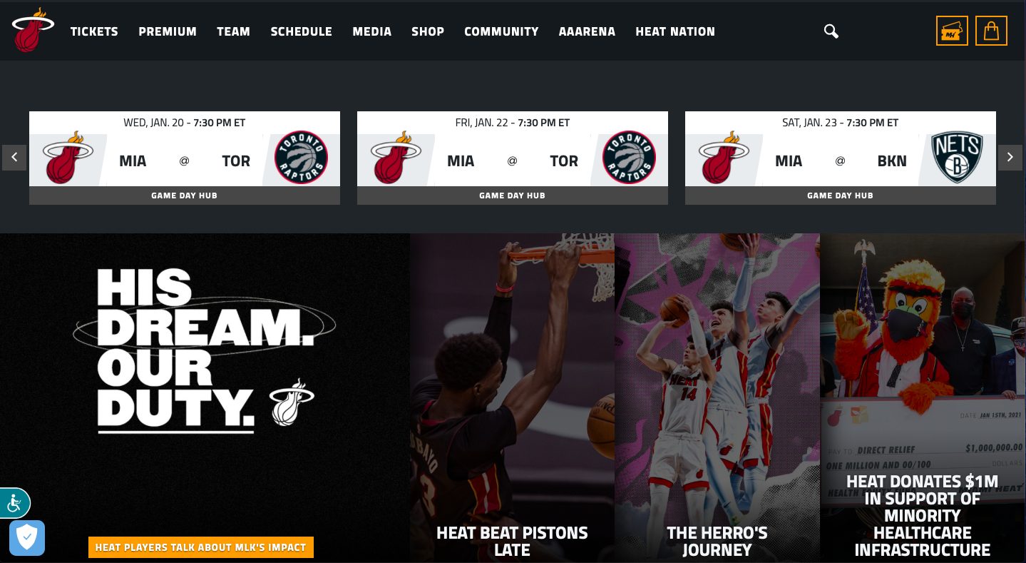
This website design is made in prevailing dark colors and uses white, capitalized fonts for emphasis. It is expressive and captivating.
Calgary Stampeders Team Site
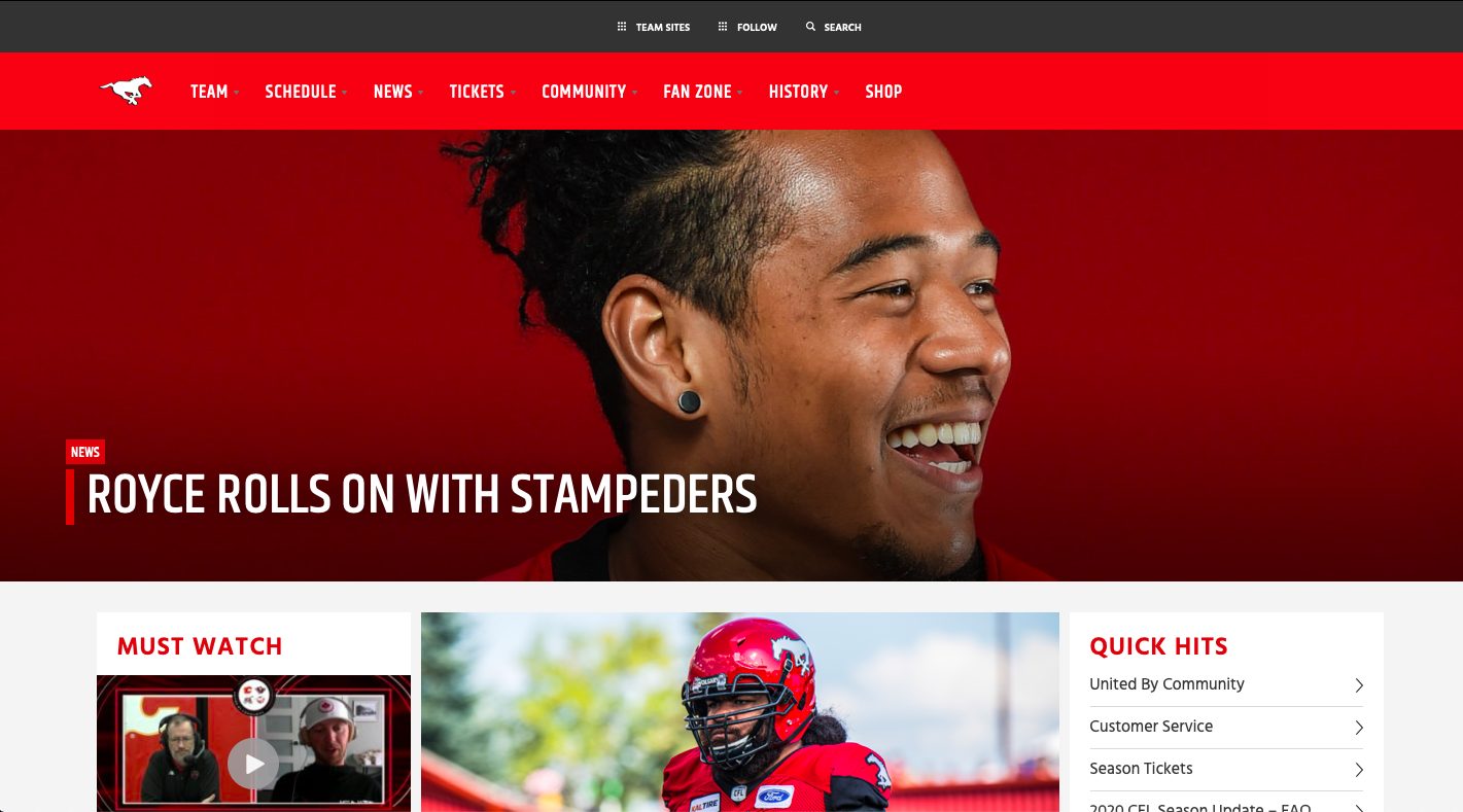
This team website features a splash page and a pretty cool overall design. The red shades add a pop of color to the overall look of the site.
Cleveland Golf Company Website
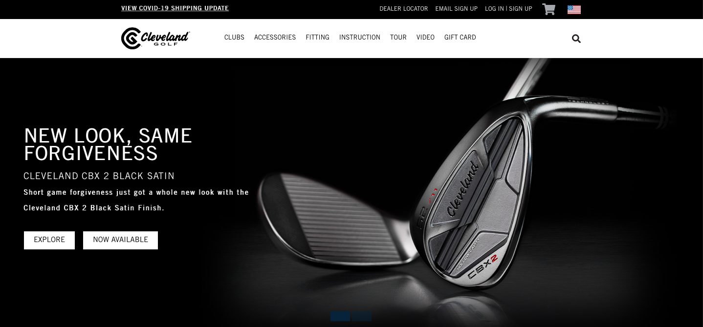
This black and white website looks like a classic. Its simplicity notwithstanding, this design makes its images distinct and eye-catching.
3n2 Sports Brand Website
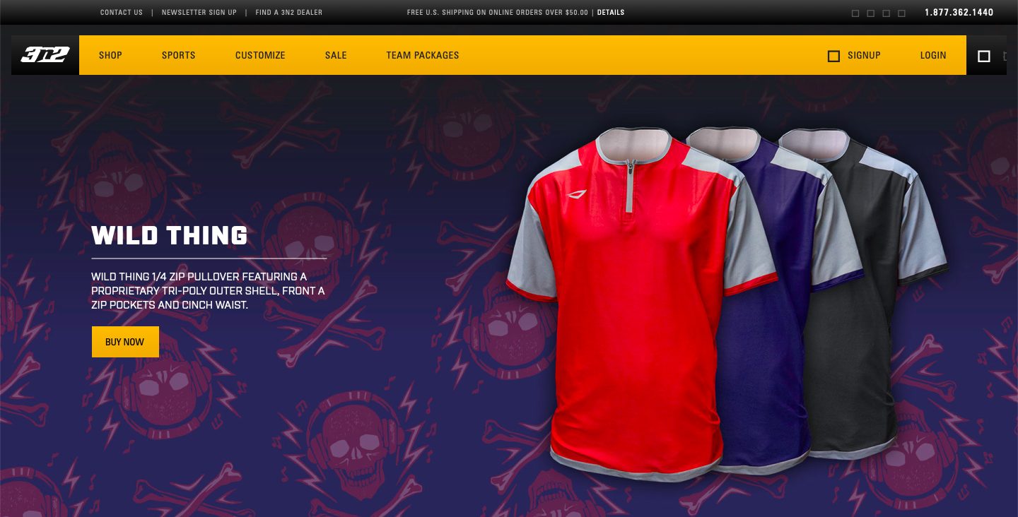
This website uses a background image with dynamic colors. The yellow bar at the top makes the page brighter and catches the eyes of the viewers.
Babe Ruth Webpage
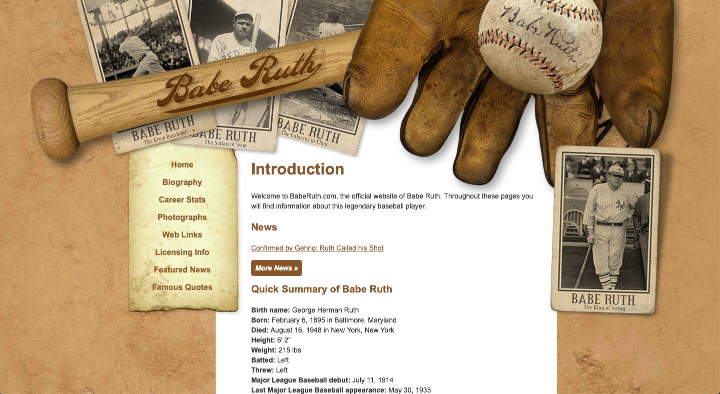
Despite its old-fashioned design, this website can capture the attention of viewers due to its specific theme. The web page features several baseball equipment pictures sprawled at the top of the site. The parchment styled pages also add a nice touch.
Cannondale Bicycle Manufacturer Website
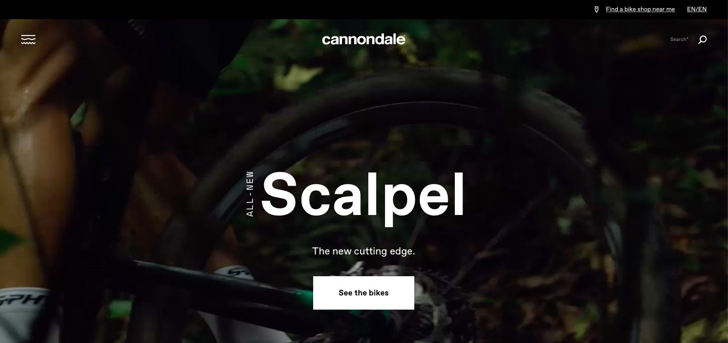
This website is beautifully designed with its background slideshow and easy-to-navigate vertical menu bar.
DMT Cycling Shoes Producer Website
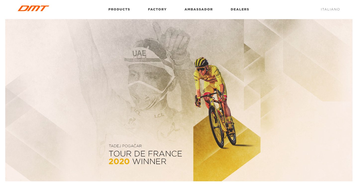
This website uses different shades of yellow and depicts Tadej Pogacar, who looks like he was drawn on paper. The image at the center definitely draws attention.
Dwyane Wade Personal Page
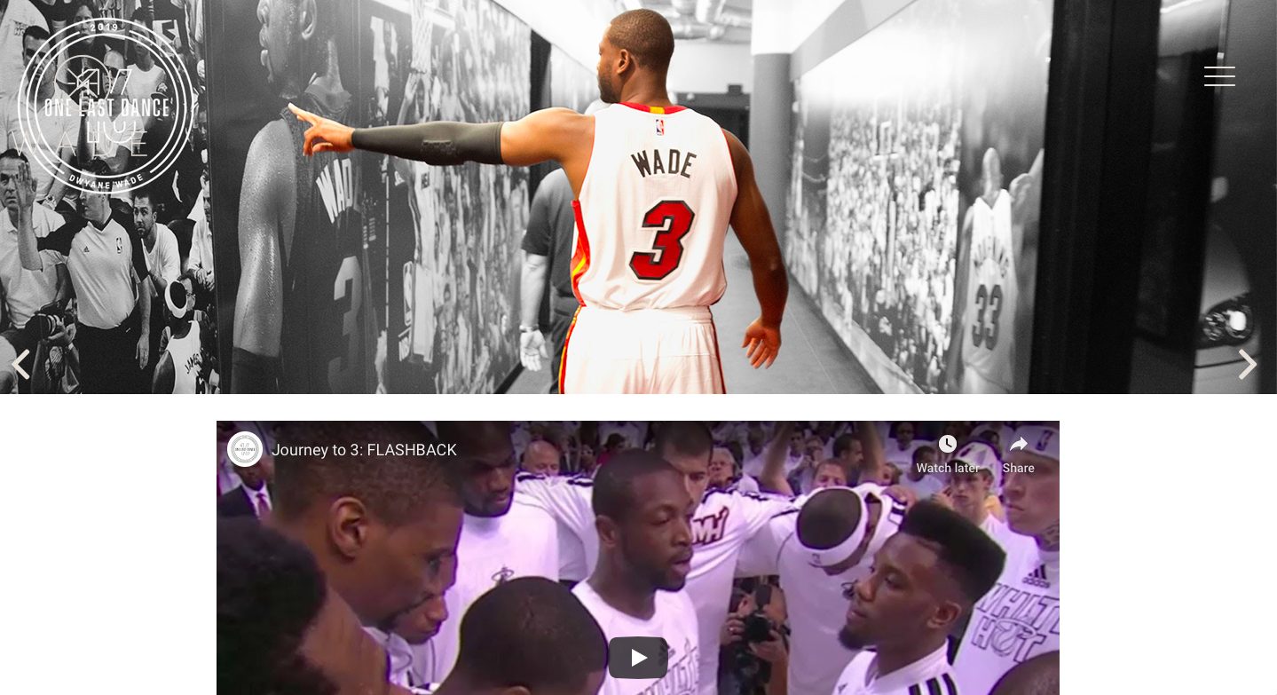
This design created as a personal page is great for the combination of a rather conservative look and awesome sense of style.
WWE Official Website
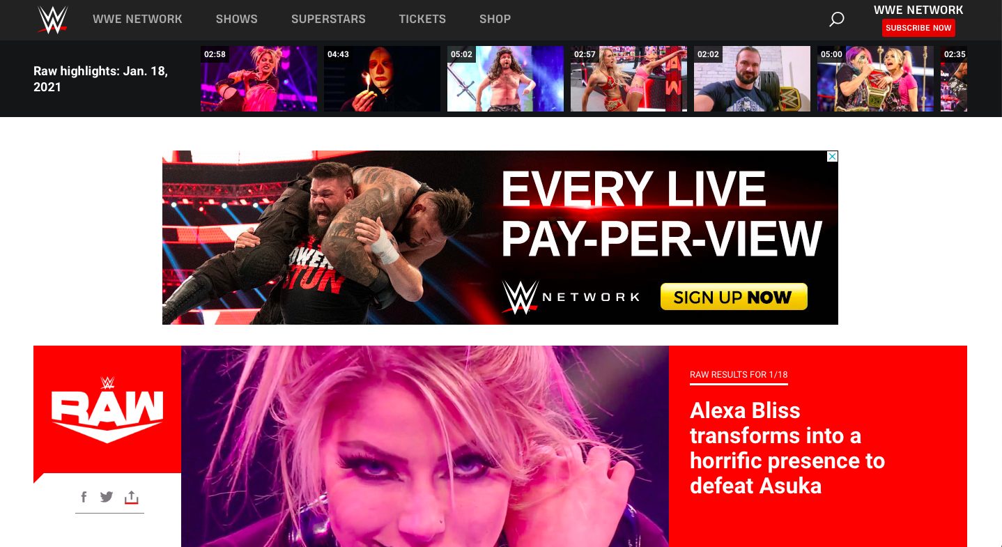
Here is a website with a powerful black and white design and a large brightly-colored Footer. Each image posted on the page is so eye-catching.
Gatorade Brand Website
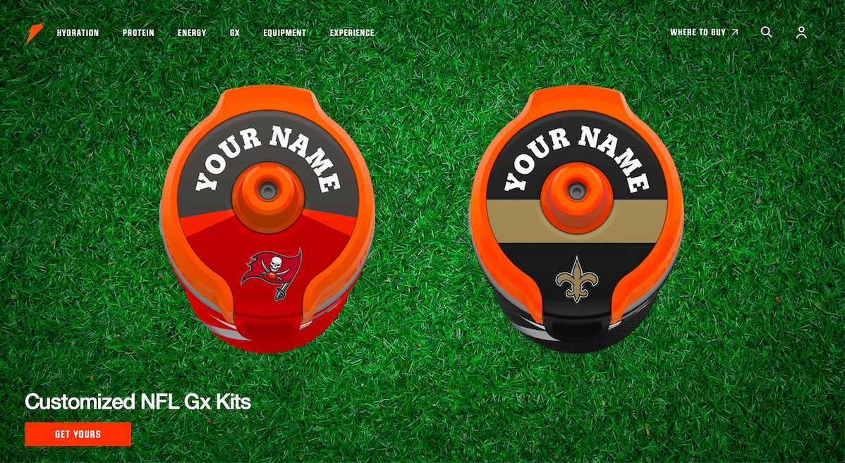
It is a truly awesome website. This web page illustrates two water bottles standing on the grass, as shown from above.
Manchester City Football Club Website
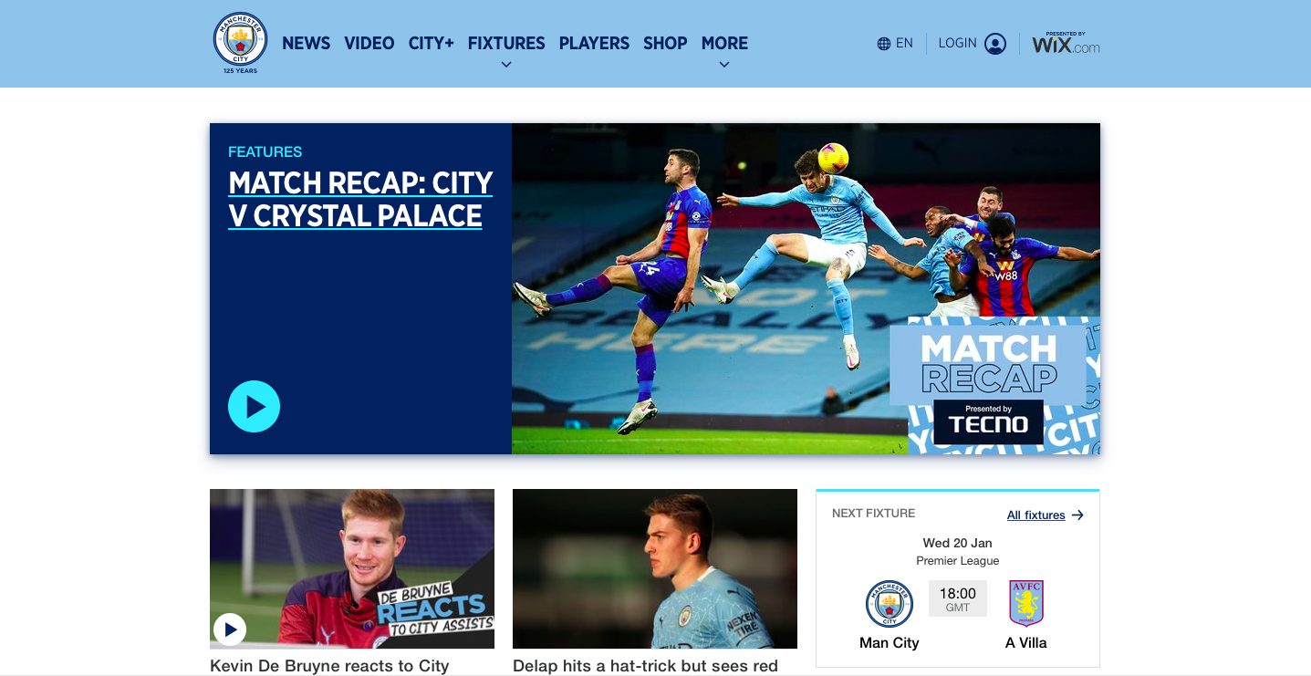
This website demonstrates a pleasing design made in different shades of blue. The site is bright and highly illustrative.
NHL Official Site
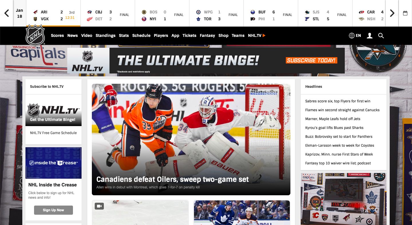
This content-rich theme is created in traditional black and white color scheme and is a true example of informative but thrilling sports websites.
HEAD
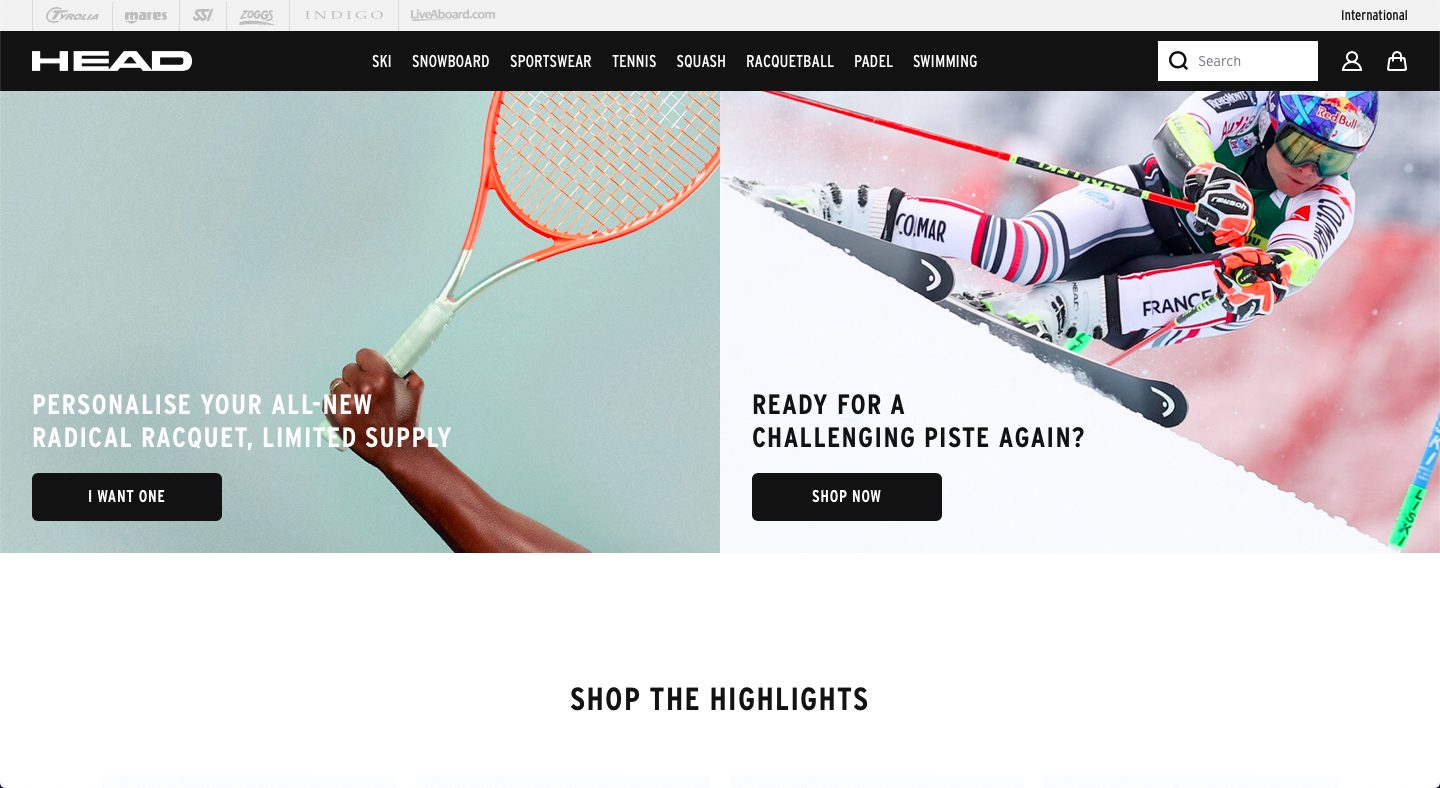
Another page with a black and white theme is this one from HEAD. The only things that depict color throughout the page are the images, which pop thanks to its plain white background.
Nike
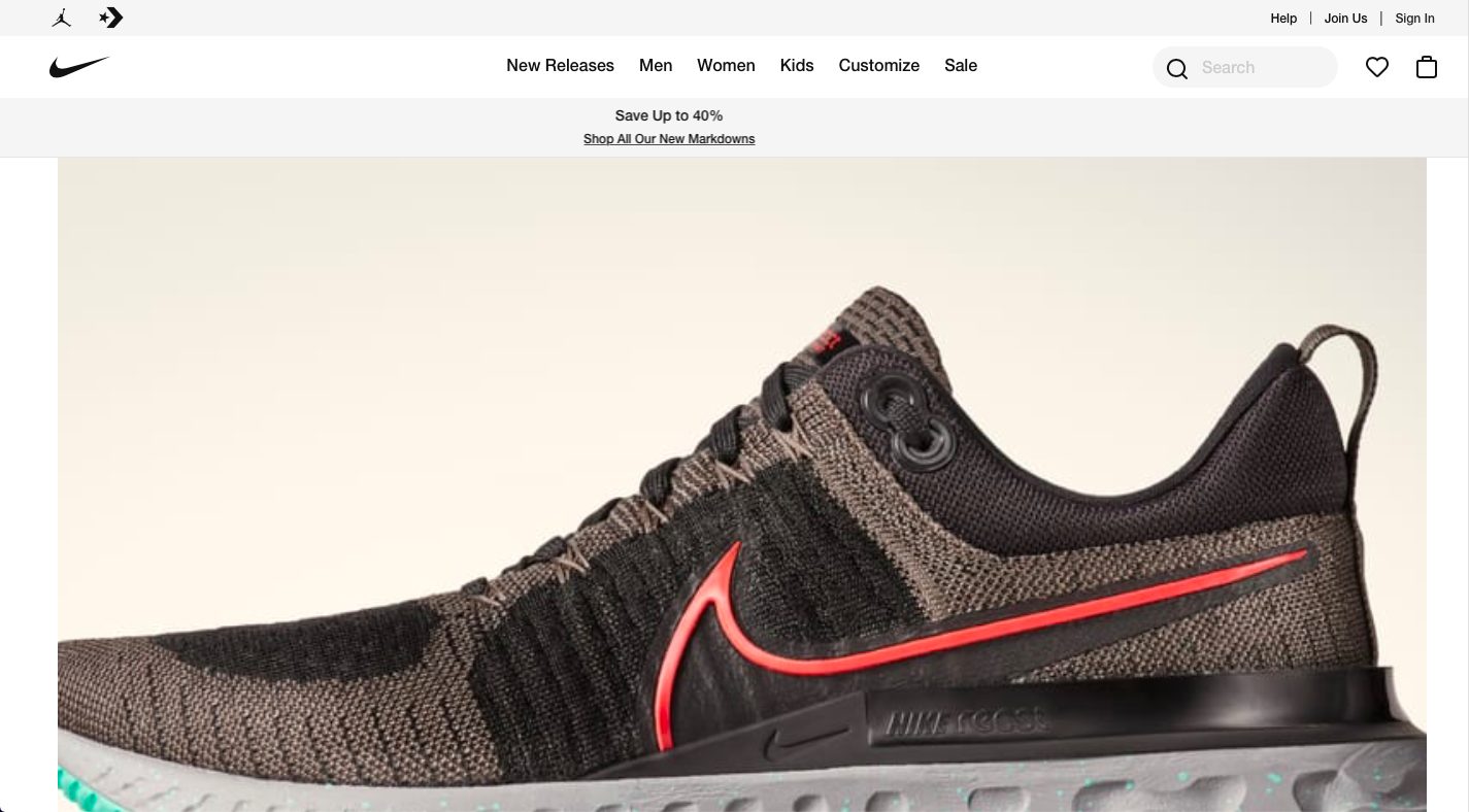
The Nike website shows a clean web page with huge images that allow you to see the details of their products.
Fischer Sports
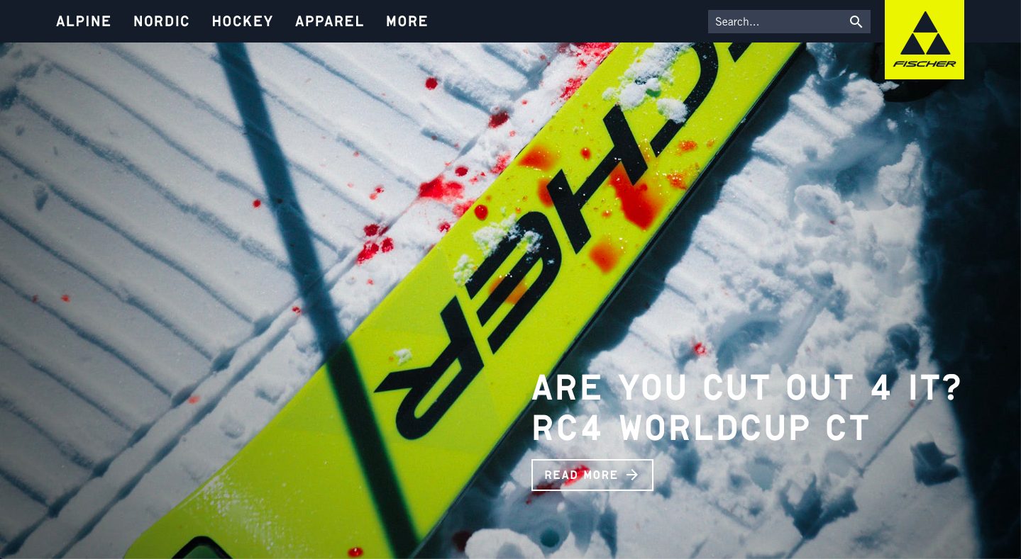
This site uses a dark theme with large images. The top bar shows a drop-down menu when you hover at each category, which is a nice feature from this site.
Adidas
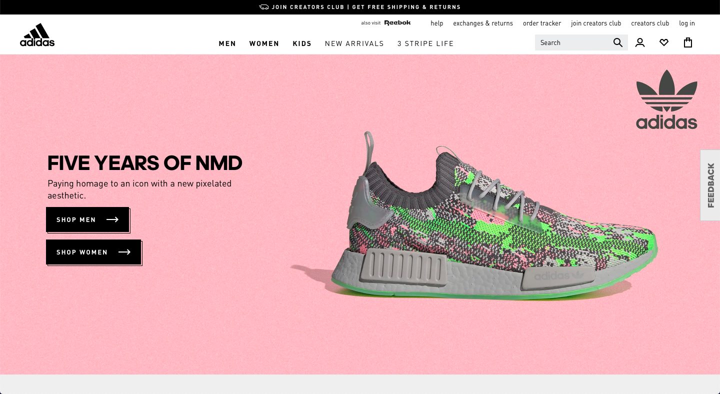
This website utilizes a blank white background that makes everything in the foreground look stand out. The large images show the different products that Adidas currently offers.
Burton
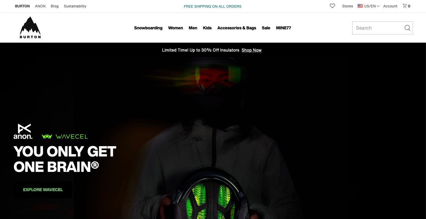
Burton’s website uses a white theme that depicts a super dark image near the top. Each category of product and each blog post below is represented by a certain photo, which is great for people who love visuals.
Old Town Canoe
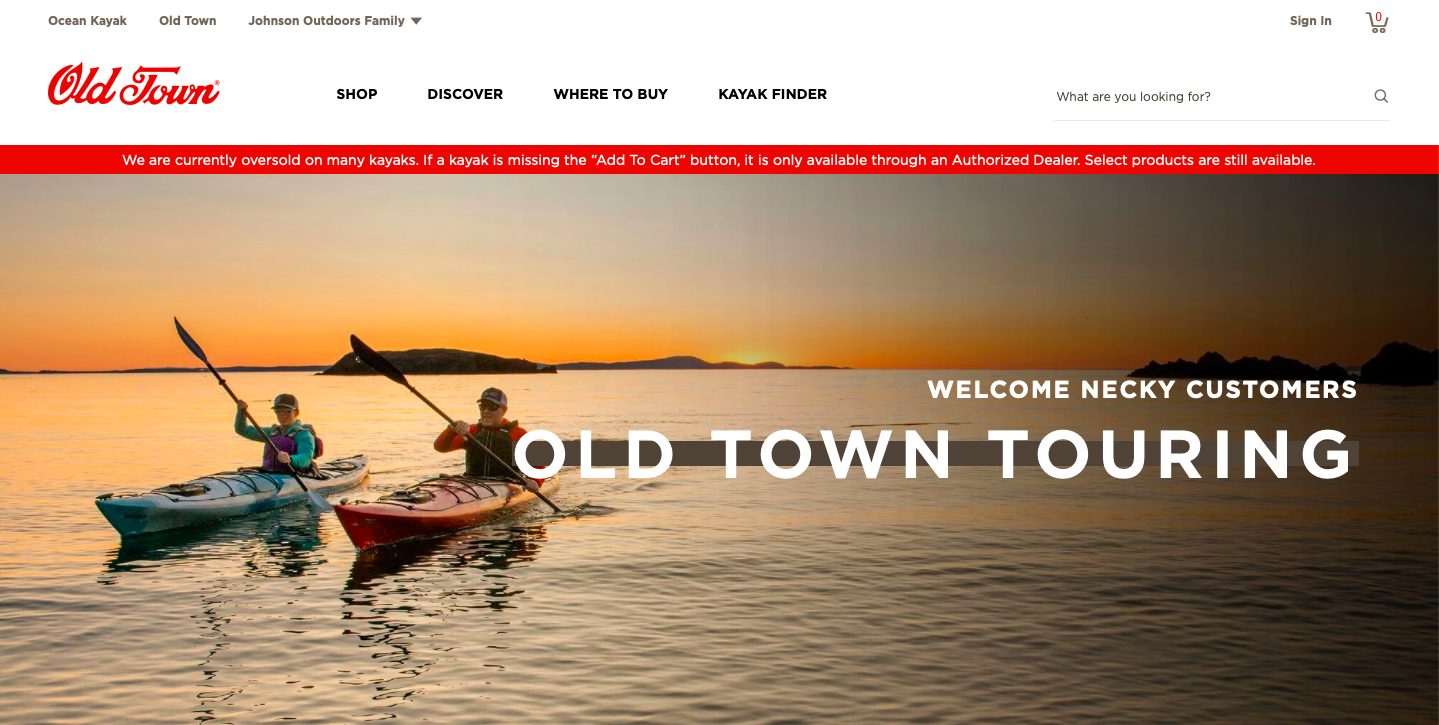
This site has a top bar menu that when hovered over, shows a drop-down menu for each category. It uses a red and white theme that looks clean but still dynamic.
Usain Bolt
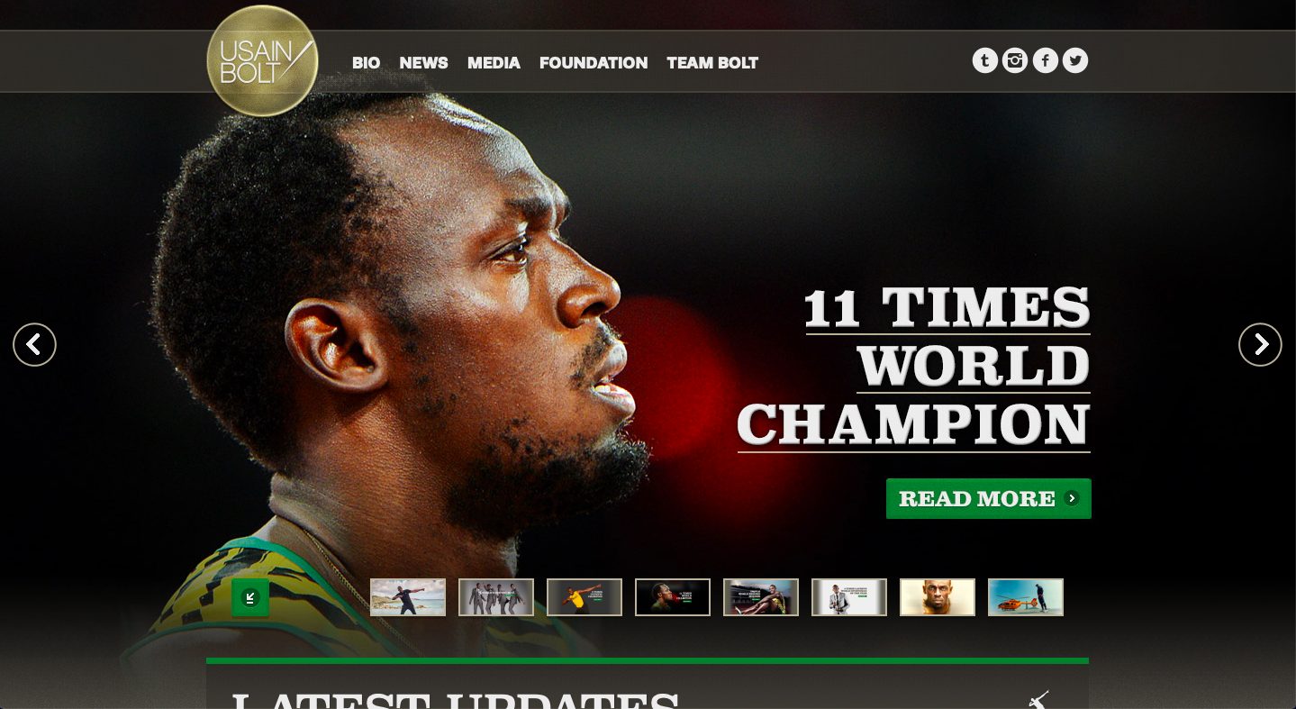
Usain Bolt’s personal website uses green and black to represent his image in the web. The front page has a slideshow of anything and everything about Usain Bolt.
Badminton-Center
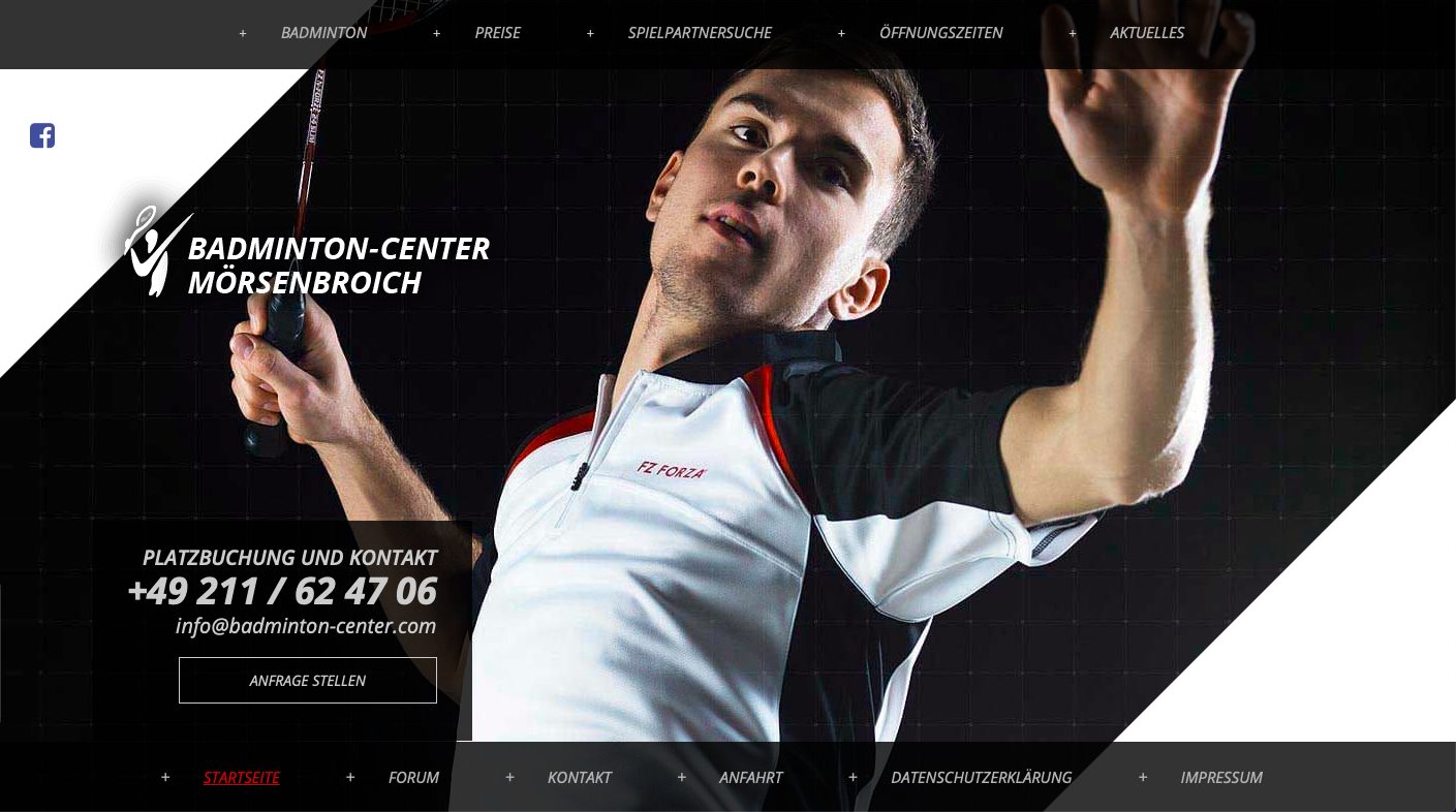
This site incorporates a dark theme with white fonts and a splash of red hues here and there. It has menus both at the top and at the bottom of the page.
Author: Noemi
Editor of Splashpress Media, writer, and geek bitten by the travel bug. You can follow her on Twitter @noemiruth.
