Flexbox alignment properties are superb and they solve lots of layout problems, especially where the common “vertical and horizontal center” layout is needed. However, there are times when aligning with auto margins is safer and more flexible. This tutorial will show you when!
Get Started with Flexbox
If you’re just stepping into the world of flexbox we have a series of comprehensive beginner’s tutorials to get you up to speed. Learn the basics of flexbox alignment, flexbox ordering, and flexbox sizing, and you’ll be perfectly equipped for more intermediate tutorials later on!
 FlexboxA Comprehensive Guide to Flexbox Alignment
-
FlexboxA Comprehensive Guide to Flexbox Ordering & Reordering
-
FlexboxA Comprehensive Guide to Flexbox Sizing
The Project
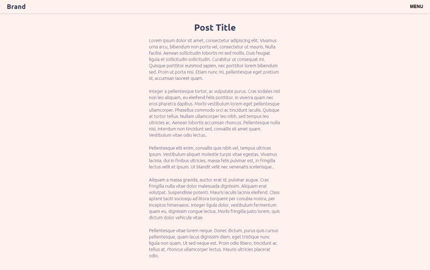
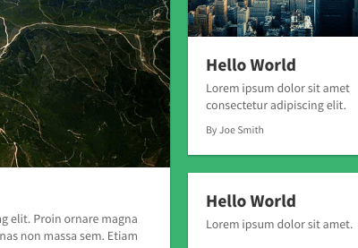
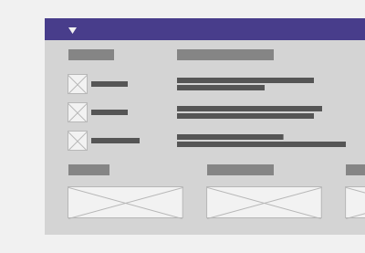
For this demonstration, we’ll assume that we’re building a minimal blog website for a client. The designer provided us the following page layout:
When the menu toggle button is clicked, the fullscreen menu will appear and look like this:
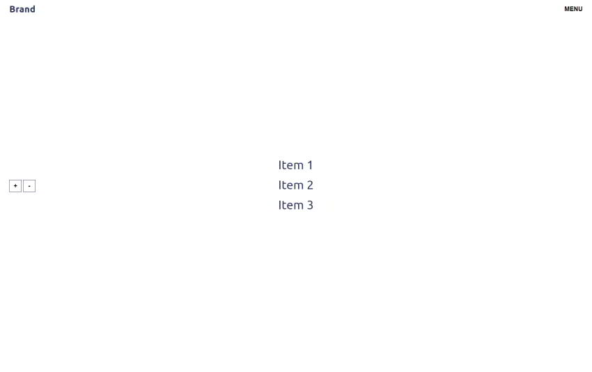
Pay attention to the following:
- The header will be fixed and remain as we scroll.
- The menu will be fullscreen and fixed. Its items will be vertically and horizontally centered. However, if their total height exceeds the menu height, a scrollbar will appear.
1. Define the HTML Markup
Let’s begin by setting out the required markup:
<header class="page-header">
  <nav>
    <div class="page-header-inner">
      <a href="" class="logo">Brand</a>
      <button type="button" class="toggle-menu">MENU</button>
    </div>

    <div class="menu-wrapper">
      <ul>
        <li>
          <a href="">...</a>
        </li>

        <!-- more list items here -->
      </ul>

      <!-- helper buttons here -->
    </div>
  </nav>
</header>
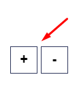
Within the nav element, we’ll define two helper buttons that will allow us to add or remove items by clicking them. The minimum number of items will be three, but we can add and remove items to make our demo clearer.
2. Specify Some CSS Styles
Here’s a part of the styles we’ll use:
/*CUSTOM VARIABLES HERE*/

.page-header,
.page-header .menu-wrapper {
  position: fixed;
  top: 0;
  left: 0;
  bottom: 0;
  right: 0;
}

.page-header .page-header-inner {
  display: flex;
  align-items: center;
  justify-content: space-between;
  height: 60px;
  padding: 0 20px;
  background: var(--beige);
  box-shadow: 0 2px 6px rgba(0, 0, 0, 0.15);
}

.page-header .page-header-inner * {
  z-index: 1;
}

.page-header .menu-wrapper {
  display: none;
  align-items: center;
  justify-content: center;
  overflow-y: auto;
  background: var(--white);
}
By default, the .menu-wrapper element will be hidden and receive display: flex as soon as we click the toggle button.
Flexbox Center
To answer a classic layout question, we’re going to use flexbox to center the menu vertically and horizontally. Flexbox makes it really easy: to align the items in the middle of the page we’ll use justify-content: center and align-items: center.
However, there’s an overflow problem. If we add enough items to make the scrollbar appear, we’ll notice that the top ones are being cut off—they disappear completely and we can’t reach them by scrolling.
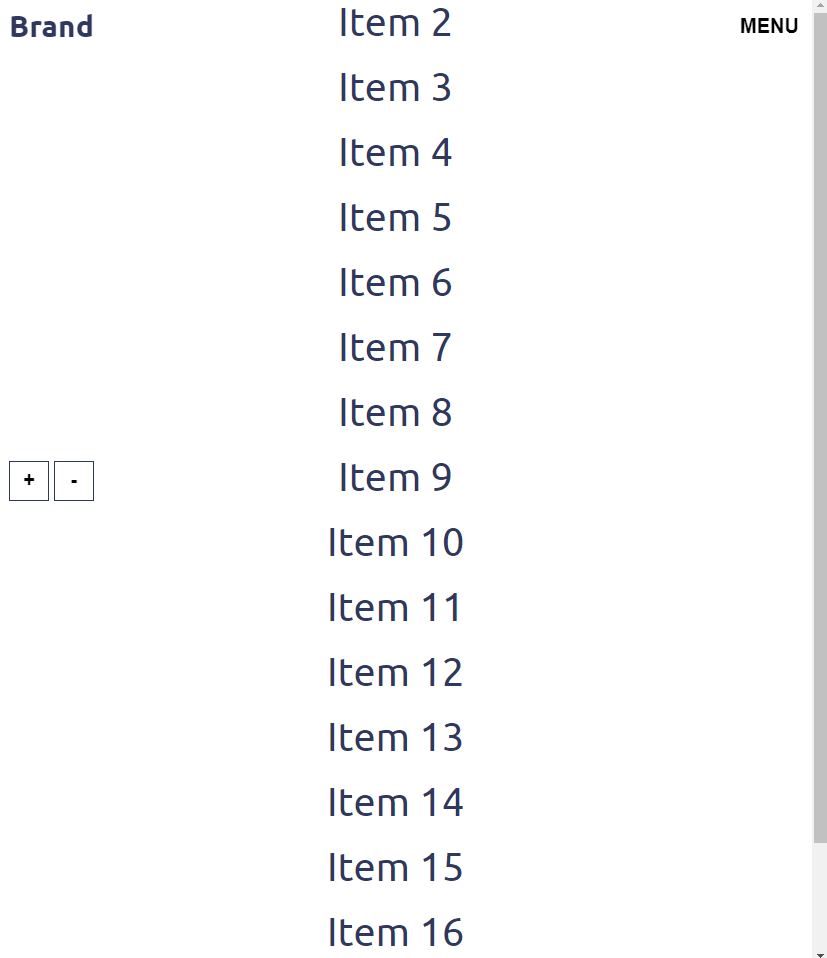
Test the demo to see yourself; add 20 or so items to the menu:
The safe Keyword
One way to overcome this issue is to take advantage of a new CSS keyword which we can use when we align items: safe.
Here’s its exact definition as taken from Mozilla Developer Network (MDN) Docs:
“Used alongside an alignment keyword. If the chosen keyword means that the item overflows the alignment container causing data loss, the item is instead aligned as if the alignment mode were
start.”
To test this new value we’ll replace align-items: center with align-items: safe center.
In plain English we would translate the safe center values as follow:
“The elements will be vertically centered, but if their height exceeds the flex container’s one, the alignment mode will change to
start. Of course, to see all the items, the flex container should have an appropriateoverflow-yvalue likeauto.”
Unfortunately, at the time of this writing, it isn’t considered a stable solution. In actual fact, it has very limited browser support and only works in recent versions of Firefox.
Check the following demo to see how the safe keyword works (be sure to do so in Firefox):
Auto Margins
Thankfully, there’s another safe solution that we can use: we’ll take advantage of auto margins. This isn’t actually a flexbox property, in fact you’ve probably already used it via the margin: 0 auto rule to center a fixed-width element inside a parent container.
In our case, the trick is to remove the align-items: center and justify-content: center rules from the flex container and give the flex item margin: auto instead.
By setting all margins to auto, all sides of our flex item will try to occupy any available space. If this space exists, they will push it into the center.
This solves our specific problem because auto margins won’t cut off parts of the flex item in the event it exceeds the size of the container.
Note: keep in mind that as soon as you use this technique, the flexbox alignment properties will have no effect.
Here’s the related demo:
3. Toggle Menu
Finally, we’ll use some straightforward JavaScript code to toggle the menu:
const toggleMenu = document.querySelector(".toggle-menu");
const pageHeader = document.querySelector(".page-header");

toggleMenu.addEventListener("click", function () {
  pageHeader.classList.toggle("menu-opened");
  document.body.classList.toggle("overflow-y-hidden");
});
The corresponding styles:
body.overflow-y-hidden {
  overflow-y: hidden;
}

.page-header.menu-opened .page-header-inner {
  box-shadow: none;
}

.page-header.menu-opened .menu-wrapper {
  display: flex;
}
Conclusion
Done! Today we discussed the effective use of auto margins for controlling the alignment of a flex layout. We covered just one specific case, but hopefully you get the idea and will be able to apply it to your own situations.
Two things you have to remember:
- Unlike flexbox alignment properties, auto margins should be defined in the flex item.
- Auto margins take precedence over the flexbox alignment properties.
As always, thanks a lot for reading!
More Flexbox Tutorials
We have lots of practical tutorials to help you learn flexbox–dive in!
-
FlexboxHow to Build a Responsive Navigation Bar With Flexbox
-
FlexboxHow to Build a Full-Screen Responsive Page With Flexbox
-
CSSHow to Build a News Website Layout with Flexbox
-
CSS Grid LayoutFlexbox vs. CSS Grid: Which Should You Use and When?
-
FlexboxHow to Build a Responsive, Multi-Level, Sticky Footer With Flexbox
-
CSSHow to Add RTL Support to Flexbox and CSS Grid
-
FlexboxHow to Build a Responsive Form With Flexbox
-
Navigation DesignHow to Build a Custom Mega Menu with Flexbox


- Safe/unsafe alignment in CSS flexbox by Stefan Judis
- align-items on MDN
