
Recently we have published an article dedicated to using bold dominating type typography in website design. It definitely has its own advantages over others, but there are some cases, when powerful all-embracing fat type looks inappropriate and ruins all the harmony. So, it is more reasonable to use slim type that offers its own benefits, adding to website appearance elegance, sophistication, subtleness and modesty.
Light fonts, being slender than regular ones, require adherence of several conditions. First of all, you should remember about contrast between font and background, if you have overlooked this aspect you will definitely encounter with problems of lack of readability and clarity. Secondly, don’t forget about proper size, small thin type will obviously go unnoticed, so the bigger font size the more it will look legible. Also, take into consideration other fonts that are used in design, they either should complement each other, or, at least, agreeably coexist.
In a collection below you will find marvelous website designs that beautifully incorporate slim delicate fonts.
Subtle and Slim Type in Web Design
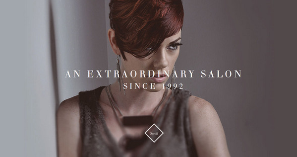
All-N-1 House of Beauty – Welcome area has stylish sophisticated look that is achieved by means of huge fashion-style photo background and slim neat type on the center.
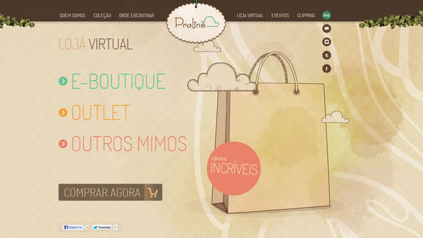
Praline is an illustration-driven website with lovely childish vibe. Colorful light font beautifully complements watercolor background and various shades of brown color.
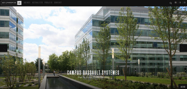
Arte Charpentier Architectes has an open urban style with minimal touch that is pulled straight from a full screen slider with spectacular images of buildings and tiny, accurate, nicely stand out headline.
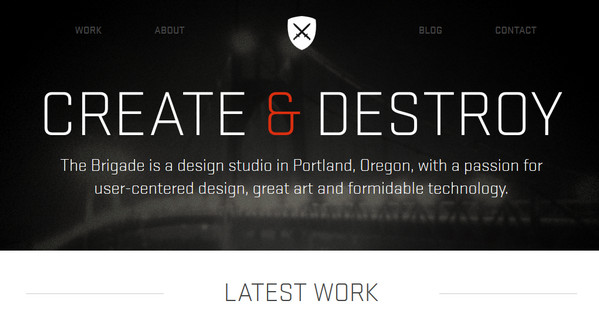
Portland Design Studio ably incorporates relatively huge but ultra-narrow type, which instantly draws users’ attention to witty slogan.
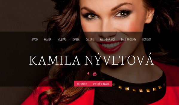
Kamila Nyvltova leverages large, subtle typeface that is placed on sleek semi-transparent central wide stripe. Introduction section with neat navigation looks simply adorable.
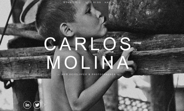
Carlos Molina skillfully establishes real life atmosphere, demonstrating heavily-noised grayscale photo background that is diluted with rigorous, rather large, white type.
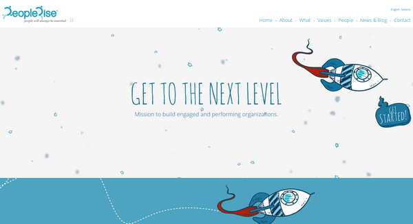
People Rise displays type that is used with vivid imagination. Slightly crooked, slim font harmoniously fits into cosmic-themed illustrated design.
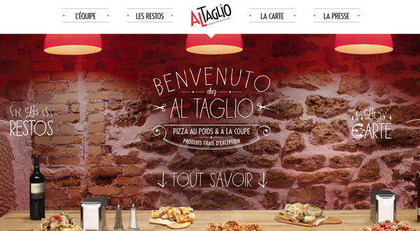
Al Taglio makes use of refined, hand-written lettering that is wonderfully supplemented by sleek outline graphics. Designer applies the same typeface to every headline on the inner pages.
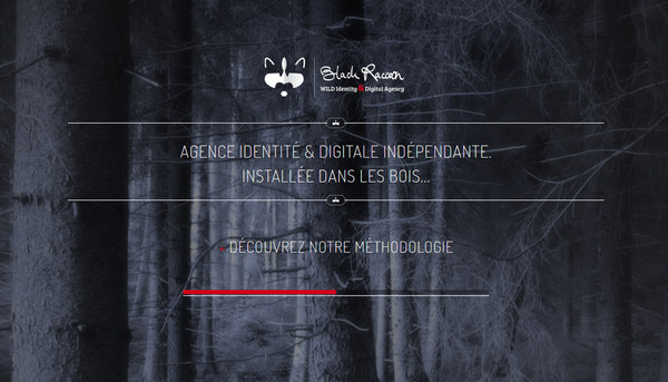
Black Raccoon Agency has a dark solemn atmosphere. Blackout, nature-inspired image background (which can be traced throughout the whole site) and almost translucent, casual typeface set the proper mood.
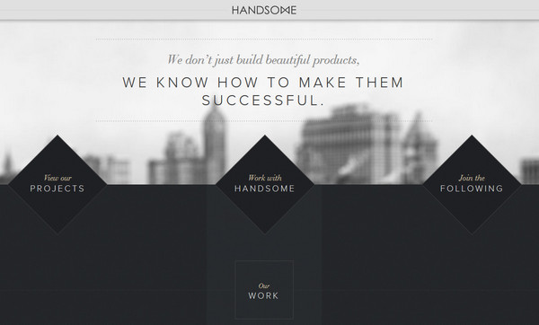
Handsome has chosen the font family, which perfectly suited for the tone and feel of the design. Black and white scheme in conjunction with regular slim lettering adds to website seriousness and business appeal.
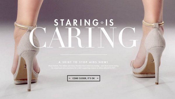
Staring is Caring ably utilizes very elegant and modish typeface, focusing users’ attention not only on clean appearance but also on tuny phrase.
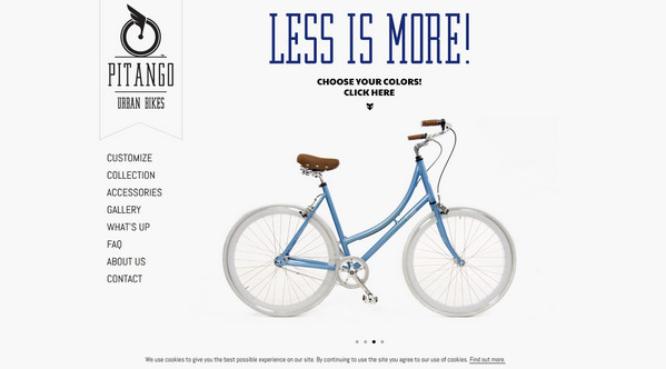
Pitango Bikes employs rough, crisp, terminal font in order to give the overall design quite specific look. Solid color background along with predominant grey colors adds to website neatness and spacious.
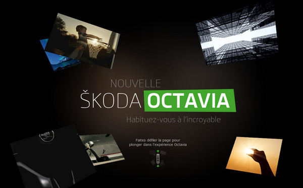
Skoda Octavia skillfully highlights name of a car, making it more bold and prominent. The rest of the text has got delicate appearance.
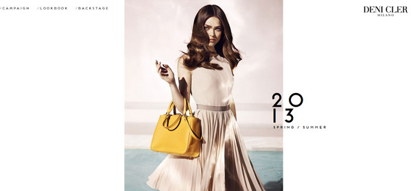
Deni Cler wonderfully adopts minimal approach, incorporating soft and smooth lettering that gives website glamorous feel. A lot of blank space and small amount of content on a home page increases feel of cleanness and spaciousness.
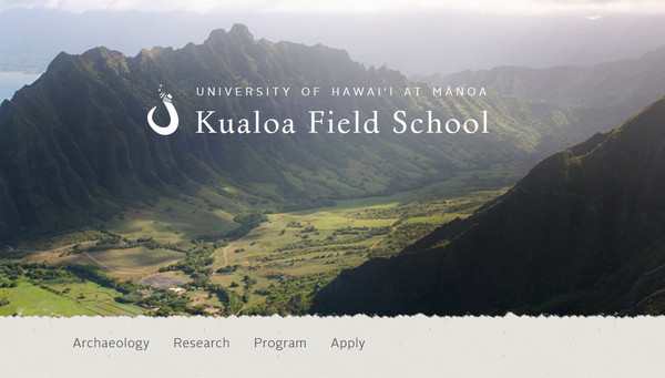
Kualoa Field School features spectacular landscape with exquisite smooth type that gives design a very unique and organic look.
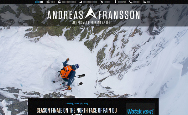
Andreas Fransson also demonstrates picturesque breathtaking winter landscape that is beautifully complemented by almost transparent highlights and powerful slim elongated font.
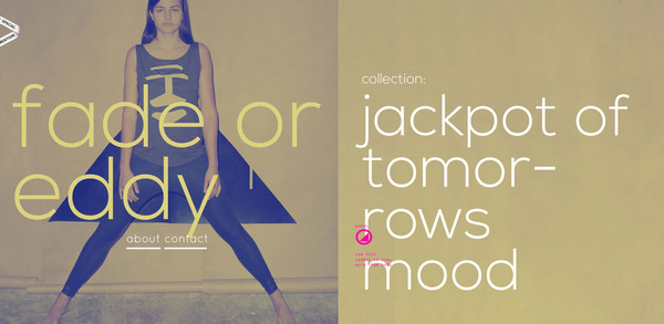
Fade or eddy easily forces you to stop and explore landing page, instantly drawing onlookers’ attention by means of enormously large polished type.
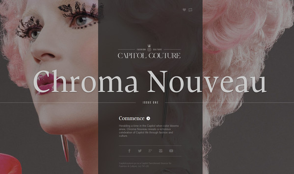
Capitol Couture recreates artistic vibe solely with the help of an offbeat image background and stylish type. The latter is really worth examining, since designer has added to its appearance a charming flower-themed animation.
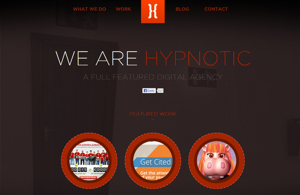
Hypnotic. The first thing that gets noticed is, of course, large ultra-thin snappy slogan that perfectly stands out among the rest content.
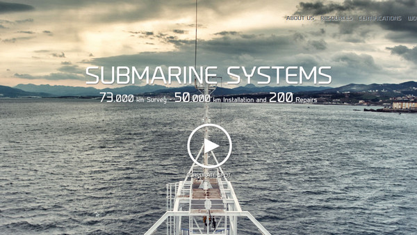
Elletra calls on naval style to set the proper mood on a website. Designer utilizes set of marine high-quality pictures that are perked up with casual but truly powerful typography.
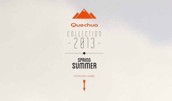
Quechua nicely blends together various delicate narrow types that are compactly located in the heart of a main page.
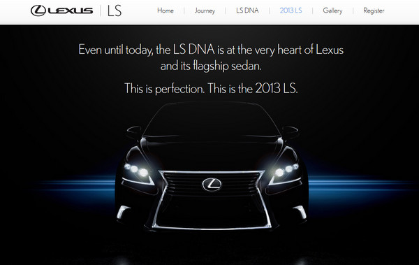
Lexus uses simple but truly effective font that is a perfect match for such a refined and elegant photo-based design, dedicated to luxury vehicle.
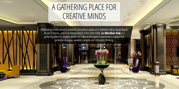
MinaSeyahi is a stylish interior-related website that is aimed to shed a light on numerous deluxe in-home design projects. Delicate solid font ideally complements each portfolio item.
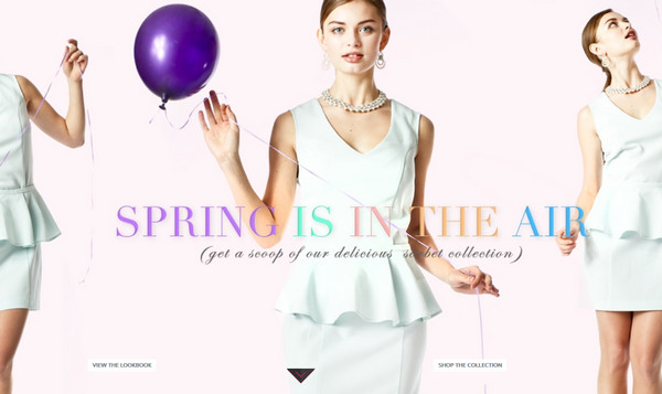
Emploi splendidly captures the feel of a spring mood through comprising vibrant complementary colors and accurate, gentle typography.
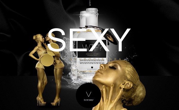
WTF? Energy Drink makes use of idiosyncratic photos that look nifty and exceptional. Designer employs huge ordinary white type in order to increase clarity and attractiveness of catchy phrases.
Wetwilly is really interesting and unconventional website that consists only of spectacular slightly darkened projects screenshots. Each slide is amply provided with casual slim title.
Ford Kuga uses a whole power of parallax effect to make website unique and advanced. Neat subtle type nicely accompanies the whole diversity of visually appealing photos.
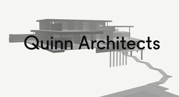
Quinn Architects has bicolor welcome page that includes 3-d rendering and plain regular typography in order to immediately reveal an idea behind a website.
Reflection
Without doubts, slim type won’t make everyone go crazy with its artistic and creative realization. Its main weapon is natural ability to add to design elegance and subtlety. It easily forges alliance with bold and regular type in order to make selected words or whole sentences look distinct and prominent, chiefly relying on the stark contrast. Also light type appeals to the minimalist style when you are supposed to eliminate all non-essential stuff.
So, it’s your turn. Tell us what do you think about use of thin type in website design? Does it make lettering stand out? What font do you prefer to utilize in web design?