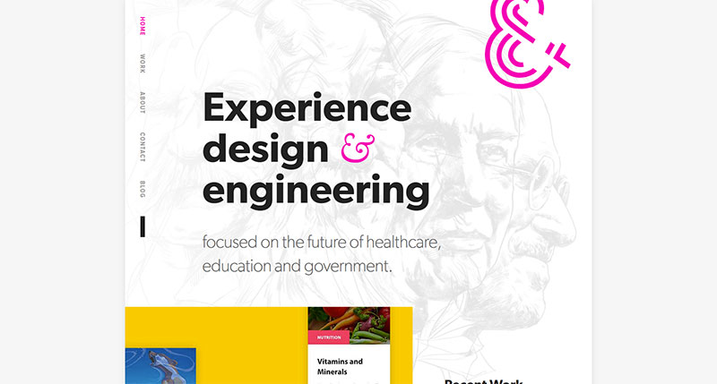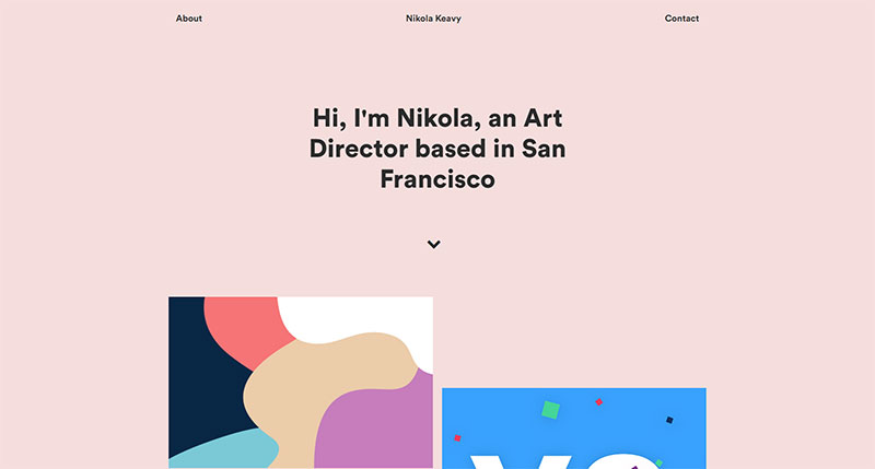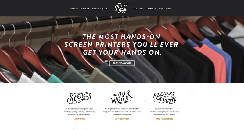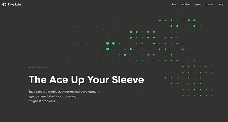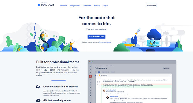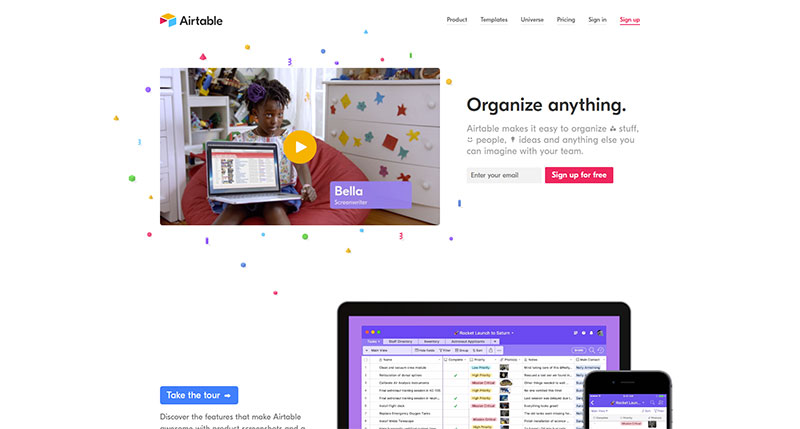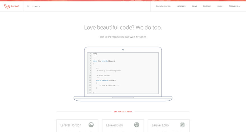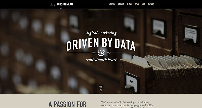
Good typography is vital to having an effective website. Visitors need to be able to read the info on a site, whether it is an eCommerce website or a purely informational website.
If they aren’t able to read it, they will quickly leave. The site will not be linked to, so it won’t show up very high in search engine listings.
Related: 21 Free Typography Tools for Web & UI Designers
Knowing the basics of good website typography are crucial to good website design. Even if you think you know what they are as a matter of intuition, a refresher can be very helpful.
It’s important to really think about good typography in web design to make sure your site design is at its best.
Hierarchy and Size
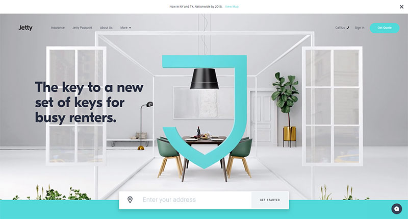
With typography, size is very, very important. Size is one of the most important elements of displaying typography on screens. Small text is hard to see and often frustrating. Massive text breaks across lines in strange ways and is confusing, especially if viewed on mobile devices.
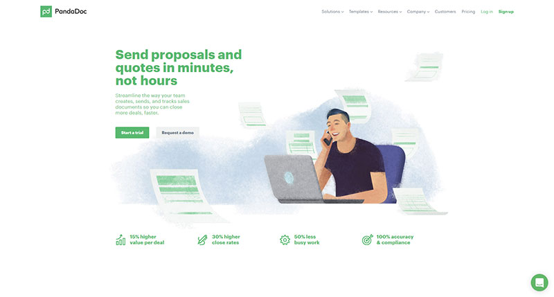
Size is important in determining the hierarchy of text—in other words, the order in which viewers should read it. More important information is displayed in larger text, and it scales down from there depending on the text.
Headlines should have one size, while breakouts and sub-headers should have another, while body text is one uniform size throughout the page.
Tracking and Kerning
These two typography elements are not, in fact, the same thing, though they are often confused.
Tracking is the adjustment of space between full sets of text characters, like paragraphs or blocks of text. Kerning is the adjustment of space between pairs of letters.
Kerning is typically applied to individual aspects in order to make them more readable and increase precision. Tracking, on the other hand, is used on a larger scale, normally to tighten up a looser typeface in the copy of the body.
Limit the Number of Typefaces You Use
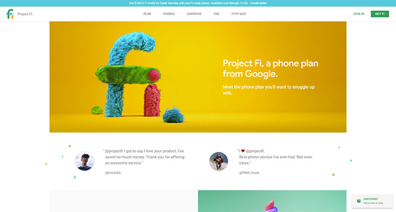
Having too many different typefaces on a page can be overwhelming and confusing. You should pick two or three typefaces for most pages you design.
When choosing a typeface, you should choose a type family that offers a lot of variation yet maintains a coherent visual relationship. Most good, quality typefaces have multiple styles, like regular, bold, italic, black, and condensed.
You might find that some typeface families include serif and sans serif options. Having these multiple options enables you to have variances in weight and style for different purposes.
Mix and Match Style
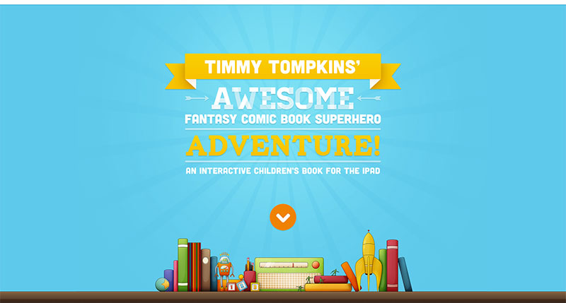
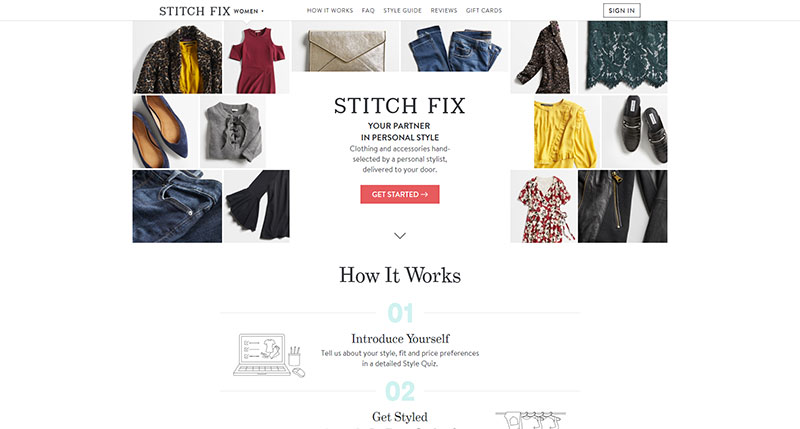
It’s very common to mix two different styles of type on professional website designs. It’s actually preferred since it creates a level of visual interest. The most common styles paired together are serif and sans serif but don’t limit yourself to this traditional option.
If you decide to pair typefaces and styles, you should make sure the lettering that a similar x-height (same lowercase x size) and a similar shape of bowls (the space inside of closed letters like a).
Those details, small as they are, make a lot of difference on whether or not a pair of typefaces work well together and how easy it is to read the text.
Visual familiarity with letters is really important for readability, which is one reason why simply changing the style of a typeface works so well.
Don’t Worry About Justification and Hyphens
Full justification and hyphens are often not necessary for website design. These techniques are often a hindrance on a webpage, making text harder to understand at a quick glance.
Hyphens break up the text and make reading it more difficult, while full justification creates odd and off-putting spacing that is hard to read. There may be a place for these elements in your web design, but you should generally avoid them.
Do Not Adjust Fonts
Trying to adjust a font is a waste of time and effort. Instead of trying to make it taller or shorter, simply pick a new typeface.
Type designers spend a lot of time creating sets of typeface characters that are both readable and fir into the font’s overall style.
You should not mess with this calculated balance. You will not improve them. You are far more likely to make a mess of the entire typeface. Just find another typeface that looks like what you need. There are a wide variety of options out there.
Limit Your Line Length
You need to make sure that there is the right number of characters on every line. This will improve readability. Line length should be influenced by legibility more than your overall design.
A website that is not readable is useless. Mobile sites should stick to 30 to 40 characters per line, for instance, for maximum coherent readability.
For web design, you can achieve the optimum number of characters by restricting the width of text blocks with em or pixels.
Utilize Font with Distinguishable Letters
Certain typefaces may look nice in previews of certain words or sentences, but they are rendered illegible when spelling other words because the letters look far too close or far too much alike.
Lowercase i and capital L are the most common letters with these issues. Some typefaces have letters set too close together, causing letters like r and n to look like an m.
See how different words and sentences look in the typeface before you settle on it. You may just want to use the typeface for a header or select, larger text.
Contrast
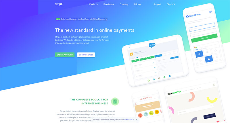
Once you’ve settled on a typeface, make sure it appears in legible colors. This will be highly dependent on the site’s background, though some colors are hard to read in mass on any kind of background, like neon pink.
Your text should stand out in the background, not blend into it. It should also not be a dizzying or painful contrast, like bright red on true blue.
Complex backgrounds with a lot of colors on them often cause issues with readability, as well, since no single text color stands out quite right.
