
An intuitive, efficient web app will always be a pleasure to use. However, in order to create a well-designed app, you need to look beyond color choice and excellent content. You also need to be aware of user experience. Otherwise, users will move on to your competition.
Understanding the rules of application design will enable you to create an effective product which will keep users coming back.
Although an attractive design and a tool like Photoshop may seem to be all you need to create an application, this does not mean your product will be effective. An application geared towards user experience should be your ultimate goal.
How do you do this?
Read on for specific steps to follow and then look at our showcase for inspiration.
How to Design a Web App: A Showcase of 20 Designs
Speak your user’s language
Using familiar language on your User Interface makes your app familiar and easy to use. If users need to learn a new language they will grow angry and frustrated.
Familiar user language includes:
Color (e.g. using red for error messages or green for ‘go’ or submit information. Color sends out messages which will speak to your users, helping them to relate.
Icons (a shopping cart for purchases, envelopes for messages). Icons are quick and easy to understand and speak a universal language. Keeping your icons standard will help your users understand how to use your app. This will make your app intuitive and easily relatable.
Placing (headings at the top, continue button below a message or instruction). When content is grouped together, and the format is familiar and easy to understand, your product will be effective.
Group information
Speaking a user’s language means that users will be able to guess how to use your device, where to find control buttons and how information is grouped together.
Connect information with color, font size or style, or group them in the same box. When the layout is easy, and users can quickly locate the information they are looking for, your app will be easy to use.
If you’re making a dashboard design, for example, structure everything where the user expects it to be.
Make your app simple to use
Your goal is to make your app simple and easy to use. Tabs may be used to separate content (e.g. different sections of a newspaper). They are familiar and simple to use. However, overusing them could make your content messy.
Instead of using tabs to break up complicated content, simplify this content instead. You could use subheadings, bullet points, and concise sentences in order to make your message simple.
Keep it consistent
If users sometimes have to click save to store information, and at other times, has to trust that information will be automatically saved, you run the risk of creating confusion.
Your users may not know when to save, or may not trust that information will automatically be saved. Choosing one way to save information will give your app consistency.
Use labels for fields
When your user has to provide information to your site, this takes commitment. Reduce the chance for errors to avoid frustration by labeling clearly.
A new trend is to use placeholders (instructions placed inside the fields) to serve as tips to users. This keeps the app clean looking. However, when the user begins to type, the placeholder will disappear, and your user may wonder what data to submit.
Use floating labels to assist your user with what do submit. This will reduce the possibility of error and subsequent user frustration.
Assess the purpose of your features
When designing your app, question what your client needs each feature for, and how to create a result which is simple and easy to use. Try to deliver a solution which will be adapted to the needs of your client.
Understanding how clients will use your app will add to your design. An app used quickly, during spare time, while a client is on a lunch break will be different to a product used to pass the time while a client is waiting around.
Ensure your app is easily used on a small screen and that the text is well placed so that it is easy to type or fill in forms.
Make use of tooltips
When you are creating an app, you want it to be simple and efficient. However, you also want an attractive and aesthetic result which will enhance user enjoyment. Using too many labels may spoil your app. Instead of using labels, apply tooltips.
Tooltips enable your user to explore icons and commit to actions, helping to find their way around the app. However, they can be disabled when a user commits to an icon. This keeps your app looking clean and uncomplicated.
Keep it together
Keep important information together, so that your user doesn’t have to try to remember information from one page to another.
If your user submits data on a page, don’t repeat the request on a different page. Instead, allow the user to follow an action in simple steps which makes it easy to achieve the desired result.
Offer many ways of achieving a result
Offering many ways of achieving a result, by clicking on an icon to assists users to navigate your app and achieve the results they want. Keeping your app dynamic or flexible will make for an efficient and enjoyable user experience.
Create an opportunity for users to achieve results at their own pace, storing information as they go along. This way your user can access the app during gaps where he has free time.
Use modals sparingly
Modals have replaced pop-ups with bringing dialogue to users. However, they can be distracting, and take up a lot of attention. This might make your user disengage.
To help users feel more in control, make sure modals are easily closed. You could place a cross in the corner of your modal window. Alternatively, give users the option to click on the main screen to close the modal.
Use modals sparingly, and only when you need the user’s attention.
Scrolls and folds in website apps
Access to information can cause web designers some anxiety. Do users understand how to find information under accordion style folds? Can they scroll in order to use find information?
If you make your information interesting enough, users will scroll to access more of the page. Leave enough content under the fold to interest the user. Once at the bottom of the page, they may be interested in exploring more information.
The end of your page is the most important space to find complex information because it is only interested users who will make their way to the bottom. Casual users will stay at the bottom of your app.
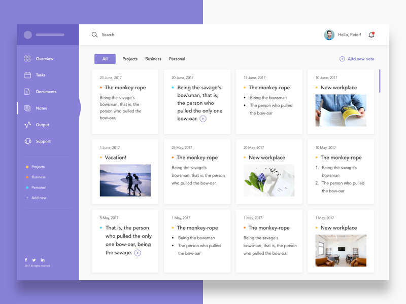
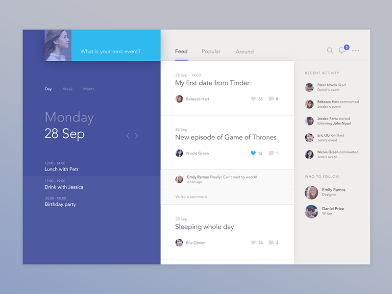
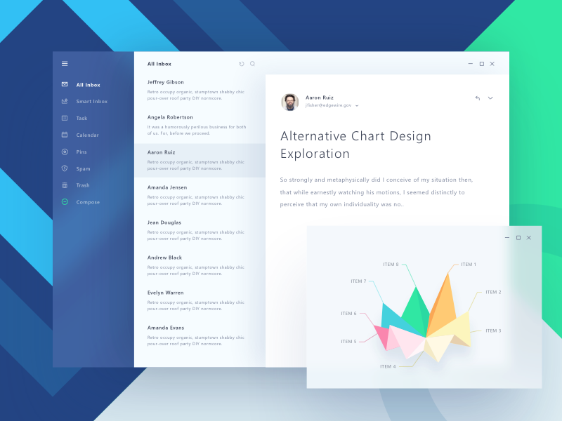
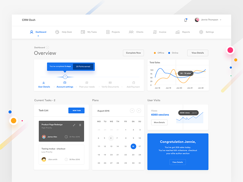
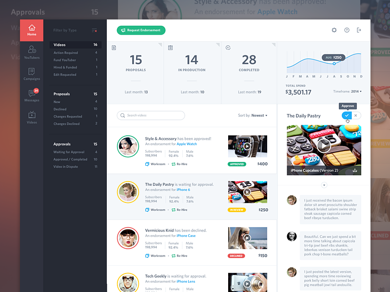
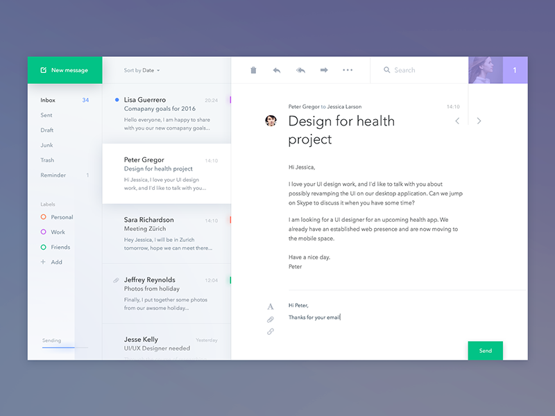
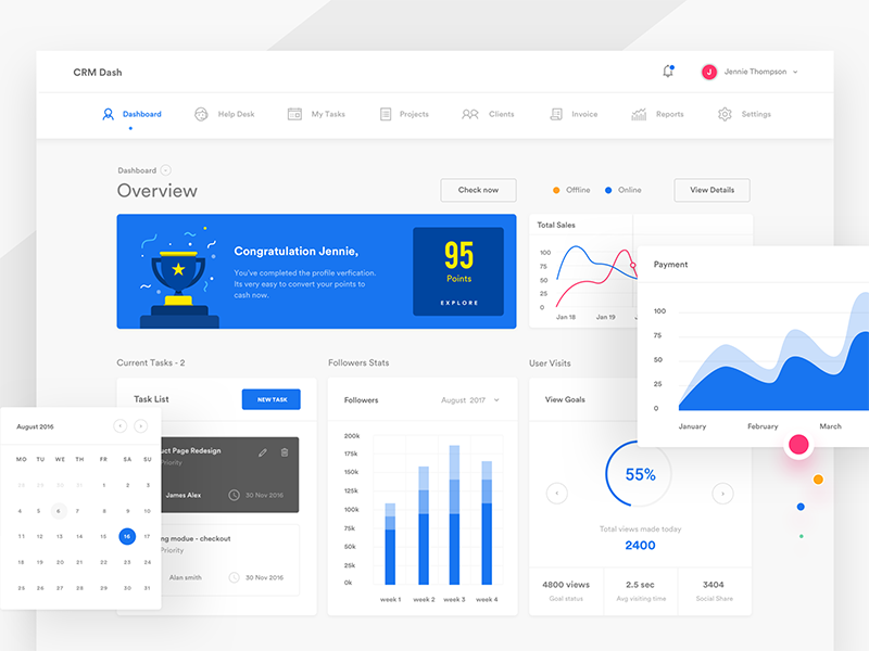
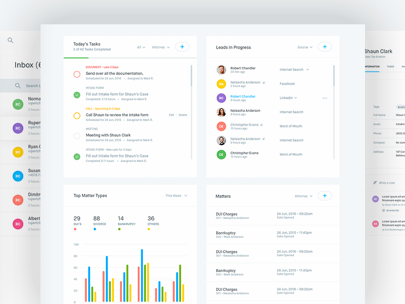
Showcase of web apps
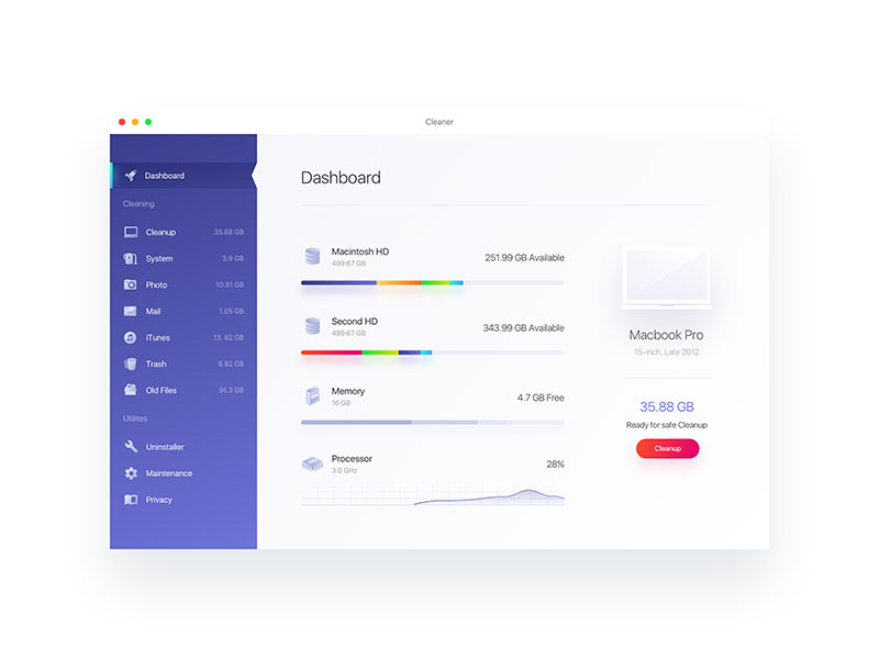
Cleaner
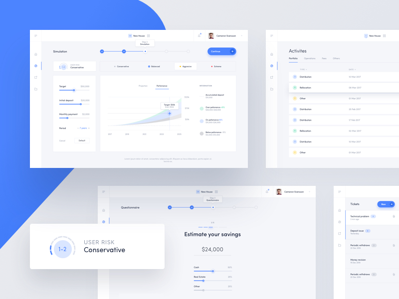
Robo Advisor
Pipeline
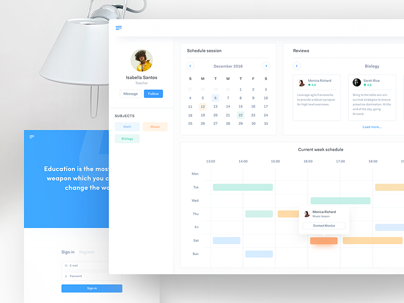
Private Lessons
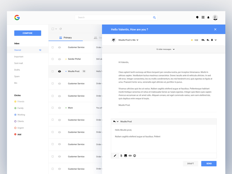
Gmail Redesign
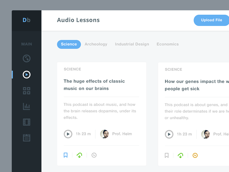
Dashboard for University Students
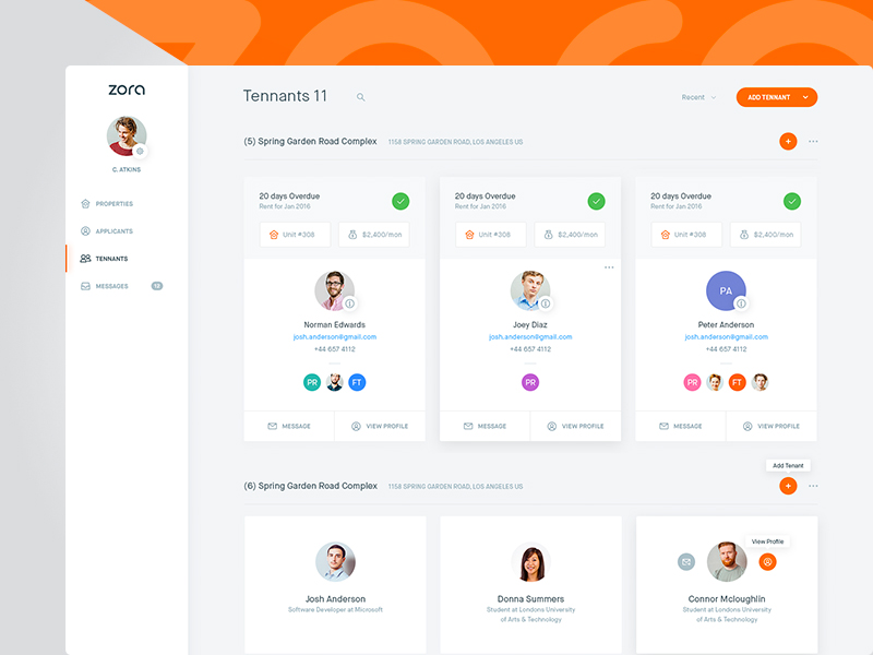
Zora
Robo Advisors Projection List
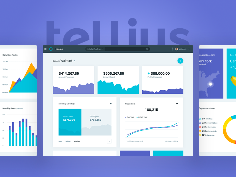
Tellius
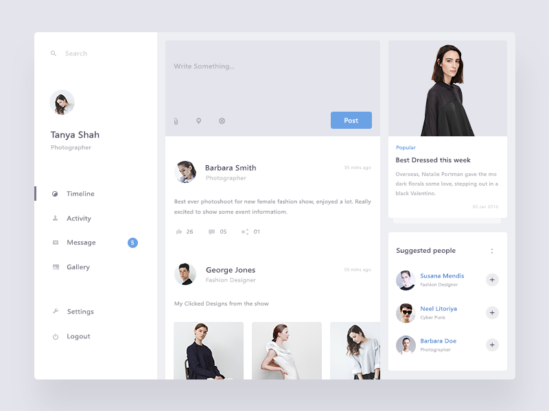
Timeline Screen
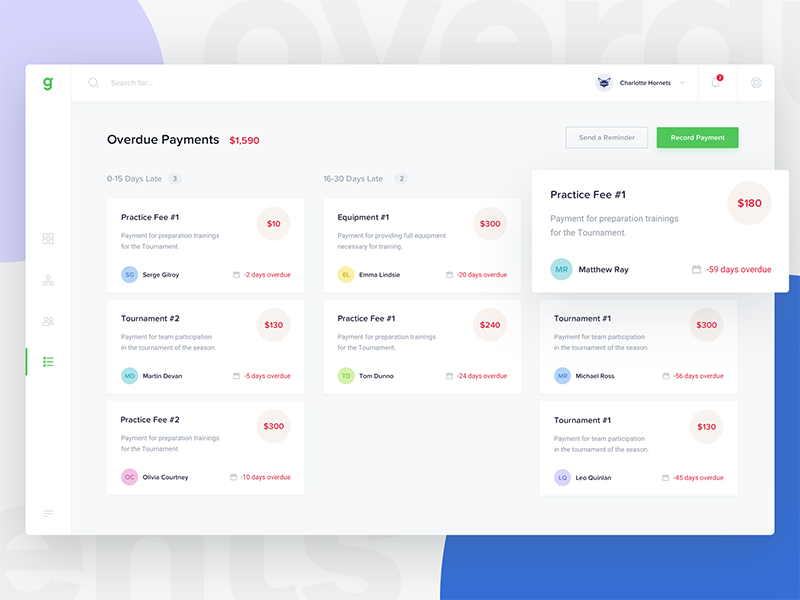
Groundwork
MTC
Ending thoughts
Designing a fast, efficient and attractive app will ensure user engagement. When designing your app, instead of simply focusing on appearance, work towards giving your users an intuitive experience from beginning to end, keeping your user in mind as you do so.
Test your app while running through a busy shopping mall, ensure you can use it with one hand and have a look at text formatting and font size.
Keep your user experience in mind, and you will create an application which is both efficient and intuitive. This will keep your user satisfied, and create loyalty to your product.