
Think website design, and the ideas and options are endless. There are thousands of website design components to explore and experiment with. There is also a significant increase in the number of personal devices are purchased around the globe. It has become all the more important to think about how websites would look on different devices and provide a consistent user experience across devices.
Over the years, website designs have evolved with changing user expectations, and so have the rules to modify and test your designs. While experimenting with your website’s look and feel is a great idea, you should ensure that this does not interfere with the user experience on your website.
So for WordPress website designers, here are five rules that you must follow while designing a new website or redesigning an old one to ensure that:
- Your live WordPress website is not impacted by slow performance or incompatibility issues
- Your website visitors continue to enjoy a seamless online experience
- You can provide a consistent website design across devices with varying display sizes.
- There is no overloading or over-utilization of your web server resources and bandwidth.
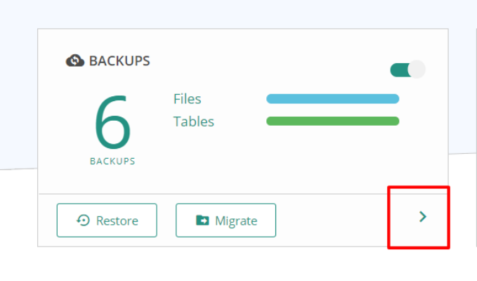
Rule No. 1 – Always maintain a website backup.
Installing a new plugin or theme on your WordPress website may sound great, but it can also cause a website crash or an incompatibility issue. The best guard against this is to take regular backups of your website. These backups ensure that in the event of any website-related problems, you can quickly revert to the original state of the website by restoring the most recent backup.
Not sure of how to make a backup?
- Opting for the backup-related plans offered by your WordPress web host service provider
- Manual backups that you perform yourself provided you have the technical know-how
- Automated backups using a WordPress backup plugin
Rule No. 2 – Avoid making any design-related changes on your live website.
No matter how confident or excited you are about a new theme or any other potential change to the website, never make any changes on your live website. The best alternative is to create a WordPress staging site that is an exact duplicate of your website.
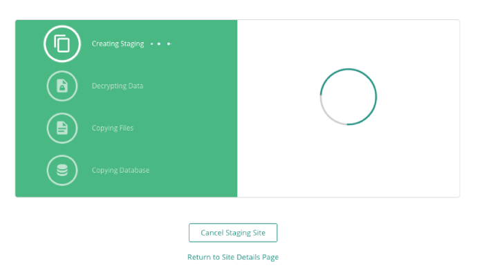
You then have a safe environment to carry out all your design-related experiments and changes. You can get a website staging environment:
- From your current web host provider if they do offer staging
- By manually setting up a staging environment yourself if you possess the technical expertise and knowledge to do so
- By using popular a staging plugin like Duplicator or BlogVault.
Rule No. 3 – Adopt a Responsive Web Design.
Ever noticed how Facebook looks the same on devices with different screen sizes, be it the desktop, smartphone, or tablet? The secret lies in a designing technique called “Responsive web design.” What this essentially does is that when a particular web page switches between devices (with different screen sizes), the web design automatically detects the change in screen resolution and adapts to the new screen size.
Why is this so important? You may have optimized your website design to look great on a laptop screen. However, that does not mean that it would look equally good on a smartphone or tablet.
As a rule, test your website design on devices with different screen sizes. You can also use your staging site to check your website changes or create different staging sites for different devices or screen sizes.
Rule No. 4 – Test your website design on different mobile phones and browsers.

In addition to adapting your website design to different screen sizes even those of mobile phones. In fact, over 50% of browsing happens on mobile devices. You must, therefore, also test if your website looks good on all mobile phones. Ensure that your design is compatible with a range of smartphones – with differences in OS, screen size and display.
Similarly, you should test your website design on popular browsers, including Mozilla, Firefox, Google Chrome, and Apple Safari. This is crucial as each browser can display your website differently, and you’d want to ensure that users have a consistent online experience irrespective of the browser they use. Top-notch browser compatibility tools for testing purposes include LambdaTest and Functionalize.
Rule No. 5 – Make your website fast and responsive.
Irrespective of the browsing device being used, a website must be fast and responsive. The latest research shows that slow-loading websites or apps frustrate most online visitors and cause them to leave websites even despite a great design.
The design of your website can have a significant impact on its page loading time and speed. For example, the use of large or unoptimized images on your website can slow it down. Similarly, heavy themes that are not optimized for faster loading can increase the loading time on any device.
Try to stick to themes like GeneratePress and Ocean WP which are light-weight and responsive. This puts minimal load on your web server and consumes less bandwidth.
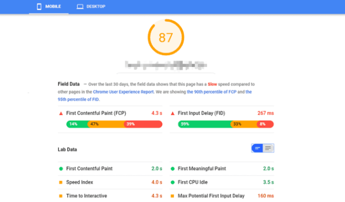
These five rules work can come in handy when you are designing and redesigning websites. Speed testing tools like Google Page Speed Insight can give you insight into your website performance (as shown above) and give you clarity on how to optimise your site. The next section lists some useful and practical tips for better website designing.
Tips for Better Website Design
Want a better website design? Who doesn’t? Here are 4 essential tips that ensure you have a fetching website!
1. Your website must be easy on the eye and consistent across all pages.
The first tip for any website designer is that the website must be easy to read. This mandates the use of color themes and backgrounds that do not block your content and are easy on the eye. As a tip, either use dark-colored text on a light background or light-colored text on a dark background. Pay special attention to the font you use and make sure you test it with a few users before you actually pick one.
Another important consideration is to maintain a consistent look across all your web pages. This includes website elements like background color scheme, graphic images, typefaces, and even link colors.
2. Your website must be easy to navigate.
A majority of visitors come to websites for a specific reason like purchasing the product or to sign up for a plan. To meet this objective, your website must be easy to navigate. If there are too many navigation steps, the user may lose interest and leave your site, and if there are too few navigation steps, the user may get suspicious and leave.
Minimise the number of navigation steps and make it easy for users to find the relevant links and Call-to-Action (or CTA) buttons. Design each of your navigational links and CTAs with clear labels and colors that can capture user attention.
3. Your website must have functional links.
Redesigning any website usually results in broken links or non-functional pages. Here are a few practices you can adopt to manage this efficiently.
- Check if all your internal and external URLs (examples, links that appear in Google search results) are functioning and are redirecting users to the right page.
- If you have pages that collect data, like a sign-up page for a monthly newsletter, or a standard “customer query” form, make sure they are easy to understand.
- Secure your website pages with an SSL certification that encrypts data is transferred between your web server and the user’s browser.
- For WordPress sites, use effective link crawler tools like W3C Checker or Screaming Frog to check for any broken links on your website.
4. Get your website design reviewed by someone else.
Before you go live, it’s always a good idea to get another set of eyes to review your site. Show it to a colleague or friend who is not part of your design team. This brings a fresh perspective and can help generate new ideas. Besides that, they can point out any glaring mistakes or errors that you may have overlooked.
In Conclusion
Every website needs to get regular make-overs to maintain a fresh look and attract more visitors. Running a website requires continuous efforts to improve the user experience, increase sales and get more visibility.
The most important tip we’ve discussed would have to be that you use a staging site to experiment. Even a minor design change can cause your website to crash. As a first step, consider investing in a backup strategy so you always have something to fall back on in case of a crashed site. With plugins like BlogVault and BackupBuddy that combine backups and staging, it’s now easier than ever to experiment with and redesign your WordPress site.
Is there anything we missed? Let us know in the comments.
This post was written by Akshat Choudhary. He has always prided himself on his ability to teach himself things. Since starting BlogVault, Akshat has transformed his side-project into a profitable venture that is scaling new heights in the Indian startup space. Being a member of the WordPress community for almost a decade, Akshat is keen on understanding the areas where users struggle. Akshat’s core belief behind building any product is making sure the end-user doesn’t need assistance and to assist them in the best possible manner if they do.
Author: Spyre Studios