
Standards come up from practitioners, not down from committees. A reasonable facsimile of L. Jeffrey Zeldman up top there. AI assisted. Jeffrey Zeldman helped end the browser wars by making the case for standards. We are starting that journey again and we should follow his example. Every team building with artificial intelligence right now believes it… Continue reading Designing with web standards: The playbook for this AI moment
Tag: Responsive Web Design
Popular Design News of the Week: March 22, 2021 – March 28, 2021

Everyday design fans submit incredible industry stories to our sister-site, Webdesigner News. Our colleagues sift through it, selecting the very best stories from the design, UX, tech, and development worlds and posting them live on the site. The best way to keep up with the most important stories for web professionals is to subscribe to… Continue reading Popular Design News of the Week: March 22, 2021 – March 28, 2021
Popular Design News of the Week: September 14, 2020 – September 20, 2020

Every week users submit a lot of interesting stuff on our sister site Webdesigner News, highlighting great content from around the web that can be of interest to web designers. The best way to keep track of all the great stories and news being posted is simply to check out the Webdesigner News site, however,… Continue reading Popular Design News of the Week: September 14, 2020 – September 20, 2020
5 Rules That Govern WordPress Site Design Testing
Think website design, and the ideas and options are endless. There are thousands of website design components to explore and experiment with. There is also a significant increase in the number of personal devices are purchased around the globe. It has become all the more important to think about how websites would look on different… Continue reading 5 Rules That Govern WordPress Site Design Testing
7 Best Practices of Responsive Web Design

Considering the rate at which the mobile web is growing, it’s becoming crucial that your website be ready to accept visitors who are coming in from a widely assorted array of different devices and screen sizes. This is where responsive design can come into the picture and save your day nicely. However, with responsive design,… Continue reading 7 Best Practices of Responsive Web Design
20 Really Helpful Responsive Web Design Tutorials

These days, making your website responsive is a MUST! With so many mobile devices out there, you’ll be missing a lot of visitors if you won’t modify your website and make it responsive too. If you are a beginner web designer or just want to improve your skills, here are 20 really helpful responsive web… Continue reading 20 Really Helpful Responsive Web Design Tutorials
Responsive Web Design: Will this bubble burst?

There is a lot of hullabaloo about Responsive Web Design (RWD). Why not? After all Google recommends Responsive Web Design. So is it time for you to join the RWD bandwagon? With mobile internet surpassing the desktop-only era, with loads of tablets and mini tablets coming up and new phenomenon called ‘phablets’ hitting the scene;… Continue reading Responsive Web Design: Will this bubble burst?
15 Cool Infographics For Web Designers and Developers 2013

Today the use of infographic is popular to convert any large and in-depth information and data into graphic visual representations that are easy to understand and much interesting to read. The use of infographics is common today in newspapers, magazines, business presentations, studying statistics, understanding maps, educational fields, etc. to interpret data. But it has… Continue reading 15 Cool Infographics For Web Designers and Developers 2013
A Simple Look Into Adaptive and Responsive Web Design

The decision for a developer to use an adaptive or responsive web design is dependent on the intended use of the web page. In a short comparison, an adaptive web design is made to deliver content accommodating to the type of browser enabled. While a responsive web design is designated to fit the original web… Continue reading A Simple Look Into Adaptive and Responsive Web Design
FROONT: Responsive Web Design in the Visual Way
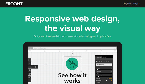
FROONT is a web-based design tool that runs in the browser and makes responsive web design accessible to all kinds of visual designers, even those without any coding skills. FROONT makes responsive web design visual. Design can be done in-browser with intuitive drag-and-drop tools. After all, humans judge design with their eyes therefore it seems… Continue reading FROONT: Responsive Web Design in the Visual Way
A Comparison of Methods for Building Mobile-Optimized Websites

There’s a debate over which technique of creating mobile-ready websites is the best. Google advocates creating responsive web designs, while Jakob Nielsen, a renowned usability consultant, endorses the creation of dedicated mobile sites (but he was subsequently slammed by some web designers). A third option is also gaining in popularity, where the web server renders… Continue reading A Comparison of Methods for Building Mobile-Optimized Websites