The decision for a developer to use an adaptive or responsive web design is dependent on the intended use of the web page. In a short comparison, an adaptive web design is made to deliver content accommodating to the type of browser enabled.
While a responsive web design is designated to fit the original web page’s contents into the specified container. Although adaptive web designs are less popular than responsive, neither style is necessarily better than the other in terms of overall viewing quality.
Discussing Responsive Web Design
When viewing a web page written with a responsive web design, the site aesthetics may vary depending on the type of device or browser the user is viewing on. For example, viewing a standard web page on a mobile phone versus on a standard computer monitor. These websites, when being viewed on a monitor, display the web page with full imagery and content normally.

Although, when being viewed on a mobile device, the web page is significantly decreased and the layout is altered to accommodate the screen’s small size. This is obtained by using media queries when writing in CSS. Code can be written to exclude certain elements that do not match a mobile browser’s pixel value by using a media type and query.
An example of this code would be:
media= “screen and (max-device-width: 480px)”.
The media type would be “screen”, while “(max-device-width: 480px)” is the inspection element. There are multiple media query conditions through CSS3; the “screen” condition is not the developer’s only media source.
So, if the resolution of the screen exceeds 480px limit the image will be passed over and not load when delivering a style sheet to a mobile browser. This element can optimize web browsing for the end user and allow the developer to tailor what information is delivered.
Another element of responsive web design is fluid images. Fluid images are meant to re-size automatically when the pixel value is decreased or increased. If a user decides to minimize their web browser to a 400px resolution, there is a code set to accommodate changes to the image or images displayed on the web page.
Setting the “float” to none forces the elements to stack creating an organized layout. By using a fluid grid, the designer can restructure the page layout to further optimize page viewing on multiple resolutions.
The fluid grid allows the page to re-size at the best dimensions to allow for better clarity and organization when viewing at a lower resolution. Fluid grids keep the proportions of the grid constant while resizing.
An example of the code for fluid grids is:
{ margin-right: 4.35%; width: 48.35%; }
Above these values are specifications for media type, meaning a developer could just as easily adjust the “max-device-width” to fit widescreen dimensions and adjust the margins and widths accordingly.
Further information on responsive web design is detailed online at A List Apart in the article “Responsive Web Design” by Ethan Marcotte.
Tools and Websites Maximizing Responsive Design
Due to the recent spike in popularity and demand for responsive web sites, there are many tools available over the internet to aid in creating a better responsive site. A useful application to easily see how content will convert from a desktop to a mobile device is Responsive Layouts, Responsively Wireframed by James Mellers. The application is helpful and easy to use. To switch between desktop and mobile, the button at the top right hand corner of the page can be clicked to toggle.
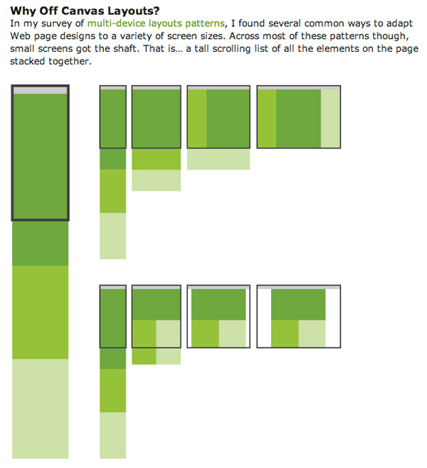
Another layout tool available to developers is Luke Wroblewski’s Multi-Device Layout web page. This tool illustrates how different common web page layouts will be displayed in different screen sizes.
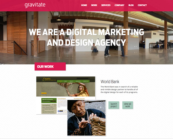
A couple websites to check out to better see how a responsive website looks in real-time are Food Sense and Gravitate. Once the browser size is minimized, the Food Sense website rearranges its format to accommodate the smaller browser size yet remains easily navigable. The menu is on the side bar when the browser is in full size, but the menu instantly moves to the top of the page in a simpler display when the browser is minimized.
The developers for Gravitate took a different approach. The Gravitate website simply optimizes viewing by scaling down its elements rather than changing the layout.
Creating Mobile Friendly Content Through Adaptive Design
Adaptive websites share many of the same coding aspects with responsive sites. Both designs integrate media sources, fluid grids and images within their layouts. Both designs have the capabilities to maintain separate full and mobile sites through this technology.
The main difference between the two designs is the display of a web page through multiple devices. While responsive sites adapt to the screen size of the device without comprising content, adaptive websites significantly alter the face of the website and content based on the device being used for web browsing.

Websites may choose to display minimal content on mobile browsers, while maintaining a fully enhanced full site for a desktop. Also, depending on the device capabilities, the matter in which the content is displayed can be manipulated for specific devices.
For example, a website may show differently in an iPhone browser than in an older model cell phone browser. A good illustration of this practice can be seen in American Airline’s website. The airline maintains a full browsing experience for desktops, but scales down their content dramatically for phone browsers.
To achieve this, a mobile-first development approach is taken. The foundation code begins with HTML5 markup to ensure accessibility on all devices. Next, the same CSS styles are applied that are used with responsive design.
Although, when setting the value for the media query, larger screen values are not initially set to maintain simplicity within the code. CSS gradients and data URLs are used as opposed to background images to create a faster download time. Finally, JavaScript can be added to enhance the web page.
A good illustration of this process can be found online at A List Apart, in Aaron Gustafson’s “Understanding Progressive Enhancement” article. JavaScript should be kept to a minimum as to not load down the page and keep code as simplistic as possible.
A time saving tool for developers in adaptive design is available on the Less Framework website. Less Framework is specifically designed for developing grids for adaptive design websites. Websites such as, Splendid and Attain Design follow an adaptive web design and have also utilized the Less Framework tool.
The Benefits and Hang-Ups of Competing Designs
Both designs have their pros and cons. Using a responsive design creates better fluidity between multiple devices and can deliver full content sites to all devices. Although, at times users would prefer simplified viewing for their mobile devices to quickly access what they need and move on.

An adaptive design would be better for this purpose. If the objective of the website is to offer adjustable content on various fronts then an adaptive design would be the better option. When running a business website, an adaptive website could be better for business. By scaling down a full site for a mobile phone to include only products, reviews, and purchase options, entrepreneurs could provide consumers an easy product comparison tool.
Consumers would be able to quickly reference the website while making a purchase decision. The downside to adaptive design is the limited layouts for mobile devices. It can be frustrating to not be able to access valuable information because the developer did not anticipate a user to use the mobile site in that manner. Sites that are built to run mobile-first usually do not display the full site well on mobile devices that can alternate between mobile and full site versions.
Developers seem to be favoring responsive design as newer technology emerges allowing users to access the Internet from many different types of media. Although, adaptive design still has its niche in the web design world because of its lightweight coding and ability to quickly load web pages. Either design has the potential to provide an enriched web experience for the user from any device.
Conclusion
There have been many debates and arguments about this two term. In short, responsive design is a subset of adaptive design. Responsive design equal to fluid layout only, while adaptive design equal to fluid layout plus progressive enhancement.
What’s your view on adaptive and responsive design? Have you implemented either method in your design? Share with us your thoughts!


