There’s a debate over which technique of creating mobile-ready websites is the best.
Google advocates creating responsive web designs, while Jakob Nielsen, a renowned usability consultant, endorses the creation of dedicated mobile sites (but he was subsequently slammed by some web designers).
A third option is also gaining in popularity, where the web server renders the appropriate HTML and CSS from the same URL depending on the device a web page on the site is being requested from (which has been referred to as responsive design + server side components).
This article will discuss each of these methods.
Real-world examples of websites using a particular method are provided under each section.
The mobile device used to test and gather data for all examples is an iPhone 4 using iOS 5.0.
Responsive Web Design (RWD)
Responsive web design (RWD) typically uses CSS3 media queries to adjust the layout of a web page based on the size of the user’s viewing area. You use the same HTML to display a different web page layout for desktops, tablets, mobile devices, TVs, etc.
Advantages of Responsive Web Design
- Content parity: Your site contains the same content and HTML markup regardless of the device being used, providing your users with a similar experience. This will grow in importance as more people rely on their smartphone as their primary means of accessing the Web.
- A single URL for web pages: This makes it easier to share and link to your content. No redirection is needed to get devices to their optimized view (compared to a dedicated mobile site).
Disadvantages of Responsive Web Design
- Content won’t be fully optimized for mobile devices: Unless you use a mobile-first approach, your web pages will contain the same information as its desktop counterpart. Compare this to a separate mobile site where you could potentially tailor the content of a web page just for mobile users.
- Slower performance: The average web page today is about 1.3 MB, according to January 2013 data from HTTP Archive. It’s possible to prevent unnecessary downloads when using RWD, but in practice, most responsive web design sites are the same or bigger in size. 86% of the sites tested by mobile performance researcher Guy Podjarny were the same or greater in size, as reported in a presentation about mobile site performance.
- It can be more difficult to navigate the site: Mobile users generally want to perform different tasks than desktop users. They may also be more accustomed to mobile-specific UI design patterns. Unless you customize the navigation structure for each device, there could be usability problems.
Examples of Responsive Web Design

The Starbucks website is an excellent example that shows the pros and cons of responsive web design. All of their content is accessible on mobile devices, each page uses the same URL, and there’s no redirection.
Unfortunately, their site is a heavy download (about 15 seconds on a 3G smartphone) and there’s a lot of scrolling needed in order to read an entire web page.
Performance results:
- Average load time: 14.99 seconds
- Average page size: 1,193.88 KB
- Number of HTTP requests: 142

The World Wildlife Fund website is a good implementation of responsive web design. Navigation is optimized for mobile tasks.
However, load time is a bit slow on a 3G smartphone (it took about 7 seconds). Also, some inner pages (e.g., their Adoption form) haven’t been optimized for mobile devices and are painful to use on my mobile device.
Performance results:
- Average load time: 6.91 seconds
- Average page size: 885.97 KB
- Number of HTTP requests: 72

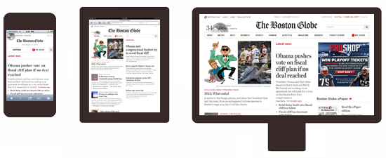
The Boston Globe website is arguably one of the best RWD implementations for a large-scale website. The site uses responsive images and optimizes JavaScript so it doesn’t kill performance on mobile devices.
Performance results:
- Average load time: 5.55 seconds
- Average page size: 605.27 KB
- Number of HTTP requests: 87
Resources on Responsive Web Design
- Responsive Web Design: What It Is and How To Use It
- Creating a Mobile-first Responsive Web Design
- Determining Breakpoints for a Responsive Design
- Which Responsive Images Solution Should You Use?
Dedicated Mobile Site
Some websites optimize the experience of mobile device users by creating a separate mobile site.
The most common implementation is for the desktop website to redirect to a subdomain (e.g., mobile.examplesite.com for examplesite.com.)
Advantages of a Dedicated Mobile Site
- Easier to make separate changes to the mobile and desktop sites: Changes can be limited to the mobile version only or desktop version only.
- Faster load time: Since you’re developing only for mobile sites, you can streamline and optimize your mobile site specifically for the mobile user experience.
- Easier to navigate: The navigation structure and content is customized for the tasks performed by mobile users.
Disadvantages of a Dedicated Mobile Site
- Multiple URLs for each page: Sharing a web page on social media becomes an issue, because mobile users will share the mobile URL, but desktop users may click the link and get the mobile version. To prevent duplicate content SEO issues, you’ll need to use the rel=”alternative” and rel=”canonical” meta tags. Also, when a mobile user searches on Google and clicks a desktop URL in the search engine’s results, they’ll either see the desktop version or be redirected to the mobile version of the page. If the mobile version of this page doesn’t exist, they’ll get an error.
- Different content and functionality: The purpose of creating a dedicated mobile website is to tailor the site specifically for mobile users. This can mean cutting out content and functionality, resulting in a different experience.
- Content forking: You have two different sets of content, which could create a content strategy nightmare.
- Requires redirection: Mobile users will need to be redirected to the optimized view, and vice versa. Redirection adds to a page’s load time. It can also have implications on your site’s SEO.
Examples of Dedicated Mobile Websites
Walmart (mobile.walmart.com)

Walmart’s dedicated mobile site clocks in at a blazingly fast 1.35-second load time.
Performance results:
- Average load time: 1.35 seconds
- Average page size: 272.29 KB
- Number of HTTP requests: 45
Amazon (www.amazon.com/gp/aw/h.html)

Much like Walmart, Amazon’s separate mobile pages are faster than the responsive web designs I tested, (it clocked in at 2.25 seconds load time).
What’s strange, however, is that not all pages in their website have mobile-optimized versions. For example, if you do a Google search from your smartphone, many of Google’s results point to desktop pages that don’t redirect to a mobile-optimized version. Additionally, if you access the mobile page directly from your desktop, you aren’t redirected to the desktop version.
Performance results:
- Average load time: 2.25 seconds
- Average page size: 103.66 KB
- Number of HTTP requests: 16
BBC (www.bbc.co.uk/mobile)

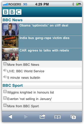
BBC’s separate mobile pages are fast compared to the responsive web pages I tested (3.40 seconds), but nearly half of that time is spent redirecting mobile users to the mobile page (1.65 seconds).
Unlike Amazon’s separate mobile pages, if you access a mobile page from a desktop you will are automatically redirected back to the desktop version.
Performance results:
- Average load time: 3.40 seconds
- Average page size: 56.04 KB
- Number of HTTP requests: 22
Resources on Dedicated Mobile Sites
- Webinar on Mobile-izing Your Organization
- Duda Mobile Website Builder
- Mobile Detect
- WURFL
- Device Atlas
RESS: Different HTML and CSS from the Same URL
This method of creating a mobile-ready website uses server-side programming to render custom CSS and HTML for different devices. Mobile users would get one set of code, while desktop users would get a different set of code.
The primary purpose of this implementation is to improve website performance.
This method works best when combined with a responsive web design.
This implementation has been referred to as responsive web design + server side components (RESS).
When using this method, it’s important to include the Vary HTTP header (read about this on Google’s guide to building smartphone-optimized websites) so that robots will crawl both the desktop and mobile versions.
Advantages of RESS
- Easier to navigate: The navigation structure can be customized for the different tasks performed by mobile and desktop users.
- Less page bloat: Instead of relying on display: none; or visibility: hidden; to hide page elements for mobile devices, they can instead be removed from the HTML or CSS. This will reduce the amount of data downloaded and speed up load time.
- Faster load time: Unnecessary JavaScript can be removed from the HTML, which frees up CPU, memory and cache on the mobile device.
Disadvantages of RESS
- More server resources: Dynamically building the HTML will increase the load on the server.
- Requires device detection: Mobile users will need to be detected. Device detection is unreliable.
Examples of RESS

The mobile version uses HTML and CSS that’s optimized for mobile performance, while the desktop version uses significantly more HTTP requests and JavaScript.
The navigation has also been tailored for mobile-specific tasks.
Performance results:
- Average load time: 3.46 seconds
- Average page size: 163.12 KB
- Number of HTTP requests: 28

Like CNN, the HTML and CSS for eHow’s mobile version is tuned for performance. The top-level navigation is the same for both sites, with an emphasis on search and their seven content channels.
Performance results:
- Average load time: 6.15 seconds
- Average page size: 188.95 KB
- Number of HTTP requests: 31

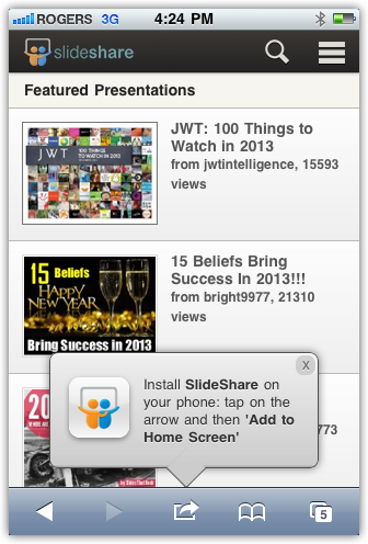
SlideShare’s mobile and desktop versions are completely different. The mobile version uses a responsive web design, while the desktop version doesn’t. Each site uses completely different HTML and CSS. There’s significantly less JavaScript in the mobile version. Each site also uses a different navigation structure.
Performance results:
- Average load time: 6.15 seconds
- Average page size: 188.95 KB
- Number of HTTP requests: 31

WordPress.com’s mobile and desktop versions are nearly identical, with a few differences:
- The mobile version has an http-equiv attribute, while the desktop version doesn’t (<meta http-equiv=”x-ua-compatible” content=”IE=10″>)
- They each use a different stylesheet
- The mobile version places the novalidate attribute within the <form> tag, while the desktop version places it within a form <input>
- The mobile version has a News link in the footer, while the desktop version doesn’t have a News link anywhere in the page
- Some JavaScript was removed from the mobile version
Performance results:
- Average load time: 2.77 seconds
- Average page size: 118.40 KB
- Number of HTTP requests: 19
Resources on RESS
- Drupal users: The Mobile Detect PHP class can be used to handle user agent detection, while Drupal Theme Switch will switch to a theme optimized for mobile devices. To add the Vary HTTP header hint into the HTTP header, use the drupal_add_http_header function.
- WordPress users: The easiest solution is to go with WPTouch, but this plugin doesn’t add the Vary HTTP header. Alternatively, you could go with Any Mobile Theme Switcher to switch to a mobile-optimized theme. Learn how to modify your HTTP headers for your WordPress site.
Summary
In theory, responsive web design is the best solution. But in practice, most RWD sites aren’t implemented optimally and result in slower load times.
According to my tests, having a dedicated mobile site results in the fastest load times, but there’s significant downsides with this implementation. I’d only go with this if performance was top priority.
My personal preference is to go with a combination of a Responsive web design and different HTML from the same URL (RESS). This provides all the benefits of RWD while overcoming its two biggest downsides (more files to download and slower load time).