A comprehensive review of popular SaaS marketplaces, including Airtable, Figma, Miro, Slack, and Zoom.
Designing a SaaS marketplace or platform? Want to understand the SaaS marketplace experience of today? You’re in the right place.
In this article, you’ll find a summary of the research I gathered to support my team in building our emerging platform. By reading it, you’ll save hours crunching through other SaaS marketplaces, making sense of it all.
Here are a few examples of how you can benefit from this research, especially for product designers and product managers:
- As inspiration on how other marketplaces have been designed (features, flows, interactions, copy, etc.)
- To run a comparison of your SaaS marketplace against it — to see what you’re doing well and where the gaps are
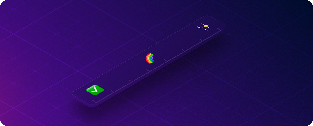
- To learn about those “must-have” experiences ✅, features that add value 🌈 , and features that delight ✨
The following review aims to uncover today’s standards. We’ll look at specific design patterns that users are accustomed to, and also what features might delight them.
The importance of familiar experiences
Users have spent hours learning how to navigate the products they frequently use. Naturally, they want your product or site to work the same way as the ones they already know.
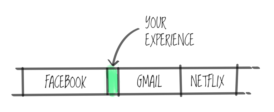
A great user experience is intuitive and aims to remove obstacles. If you aim to make the experience familiar, you lower the learning curve. Users won’t need to navigate new interfaces or learn new affordances.
Instead of reinventing the wheel, you’ll be able to deliver quality solutions that will be quicker and cheaper to design and develop. Your team will have more time to solve customer problems, differentiate, or innovate where it really matters.
So what's a SaaS marketplace?
Before we go any further, let’s first describe how SaaS marketplaces work — and explain some of the jargon you’ll come across in this article.
When you think of a marketplace, chances are you’re thinking of a place where you buy your veggies 🥕 or, in the digital world, perhaps Etsy, eBay, Apple App Store, or Google Play, right?
Let’s take Apple’s App Store as an example to get started
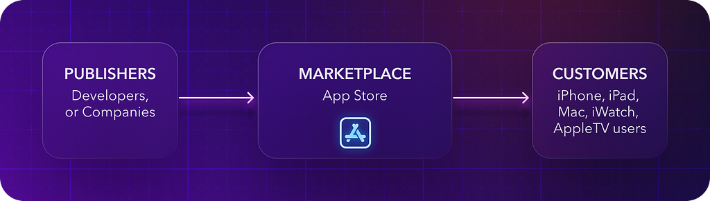
- The Apple App Store (marketplace) is a mediator between those who have a product or service (publishers) and those who want to buy it (customers).
- This is Apple’s ecosystem, built on top of its main platforms like iOS, iPadOS, macOS, watchOS, and tvOS.
- Publishers (companies or developers) create products to grow their businesses and improve experiences.
- Publishers then leverage Apple’s development toolkits, such as SDKs and APIs, to build on top.
- Customers can then download and use the resulting apps, either for free or at a cost.
And what about SaaS products?
The same applies to SaaS products. Today’s users expect a seamless experience within your software, as well as within their workflows between the SaaS products they already use.
Let’s have a look at a similar example applied in the SaaS world:
- Your SaaS platform allows other SaaS products to integrate with it. The motivation is the same — to grow your ecosystem, help others to interact with or build on your product, and improve workflows and the overall UX.
- The purpose of SaaS ecosystems should be about how the integrated apps work and fit together, and how they help users achieve certain jobs, rather than just focusing on partnerships. Given this fact, your product would typically communicate with other publishers (companies or developers) about the main use cases you are building for, ensuring that this partnership of SaaS products provides meaningful workflows for users. The opposing (cumbersome) experience would be forcing users to use other products while doing some manual workarounds (e.g. copy-pasting data between browser tabs and keeping them up-to-date between both products 🤯).
- Your SaaS platform would then provide public development toolkits (SDKs, APIs) so other companies can connect and build in your ecosystem.
- Your marketplace would then offer the app of your partners (publishers) to other customers or users (either yours or theirs).
- Apps can be paid, part of a subscription plan, or available for free. Usually, they are free as the partnerships help both SaaS businesses to grow. Win-win.
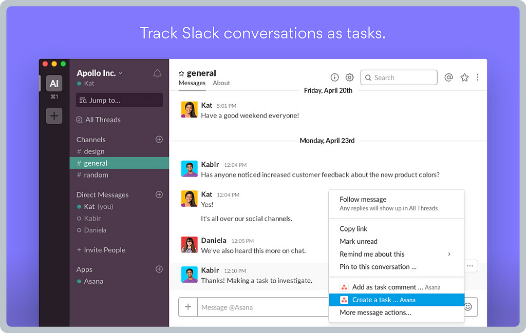
A practical example of two different SaaS products working together could be a Slack bot app. Imagine, for example, that your Figma app notifies you in Slack about a new comment on your designs, so you can seamlessly navigate there to reply to your teammate. The opposite experience would be randomly and manually checking for Figma comments or emails, etc. Slack is all about team communication and collaboration, so receiving comments from Figma in the context of team communication works nicely, meeting users where they are.
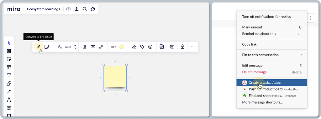
Another relatable example might be creating a task in Asana based on a Slack conversation. No need to copy-paste — just one click and you’re done.
What’s the marketplace experience of today?
Let’s have a look at the experience for each user journey phase. Ultimately, we want to learn what kind of experience is expected or must-have, what else might add value, and what might delight users. We’ll use Kano categories (those used in the Kano model framework) to help us organize the findings into those groups.
Journey phases
Stepping into the consumer’s shoes in the SaaS marketplace.
- Entry points: How can I access the marketplace?
- Search and browse: How can I discover what I need?
- Installation: How can I install the app as easily as possible?
- App onboarding: Will I need any help during the first steps?
- App usage: How is the installed app launched, and how is it surfaced?
- App management: How do I manage and configure the app?
Bonus content 🎁
- Naming conventions — a boring, yet useful topic
- Developer experience — a sneak-peek perspective of how it looks for publishers and technical users
Categories and assessment criteria
In the Kano model analysis, you usually aim to enhance your product and service based on customer emotions. For the sake of this exercise, we’ll borrow just the categories to define our common language for this review.
Note: The assessment is not based on a user study like you’d do using the Kano model (surveying users), but it is based on a thorough analysis of the SaaS products in this study. See the criteria for each Kano category below.
The following Kano categories will serve as buckets to define:
- Baseline expectations ✅ — these are must-have qualities. If the product doesn’t have them, it will be considered incomplete or just plain bad. My criteria: Frequent occurrences of certain features or design patterns.
- Linear satisfiers 🌈 — these are one-dimensional qualities. The customer satisfaction is directly proportional to the degree of improvement provided. My criteria: Typically less present in products, they are often differentiators that add value and thus are not essential for the baseline experience.
- Delighters ✨ — these are attractive qualities, with unexpected features, patterns, flows, or behaviors that elicit a positive reaction. My criteria: Delighters are often subjective — in my case, based on my product design taste, experience, and instincts.
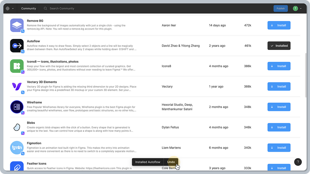
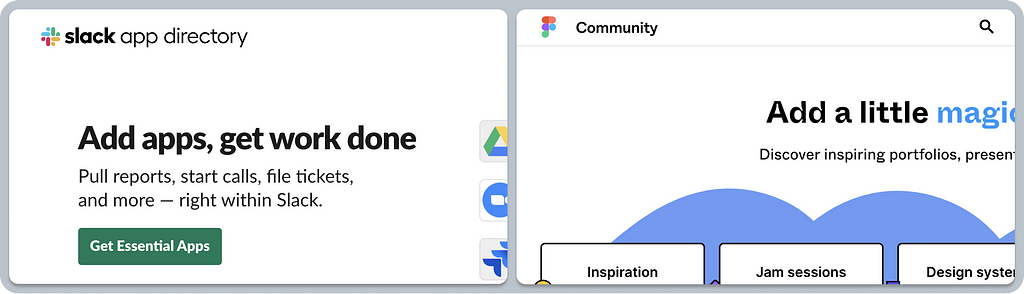
1. Entry points to the app offering
Discoverability is always crucial. If users cannot find the features you’ve built — at the right time and in the right context — those features are essentially useless.
Today, users have various ways to discover the app offering, depending on their journey and intent. Are they looking at what’s possible before subscribing? Are they current users looking at ways to streamline their workflow using other tools? Or do they have no real understanding of how their experience could be improved, yet they might get a hint in the right context and at the right time?
Baseline expectations ✅
It’s common to have all apps and integration listings available publicly as well as part of the app.
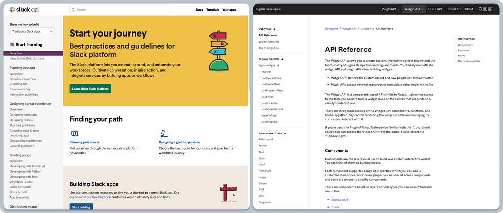
App-related content is also readily available via search engines, bringing organic traffic to the acquisition funnel. For example, asking Google “Figma app for Slack.”
Delighters ✨
Users using your product focus on the jobs they need to do. We can’t expect them to be thinking, “What app will I add today?” That said, if we invite them to use an app at the right time and in the right context, we bring the experience to another level.
Contextual in-app prompts offer well-thought-through touchpoints that will delight your users, helping them to find what they need without extra effort, often when they didn’t even know it was possible.
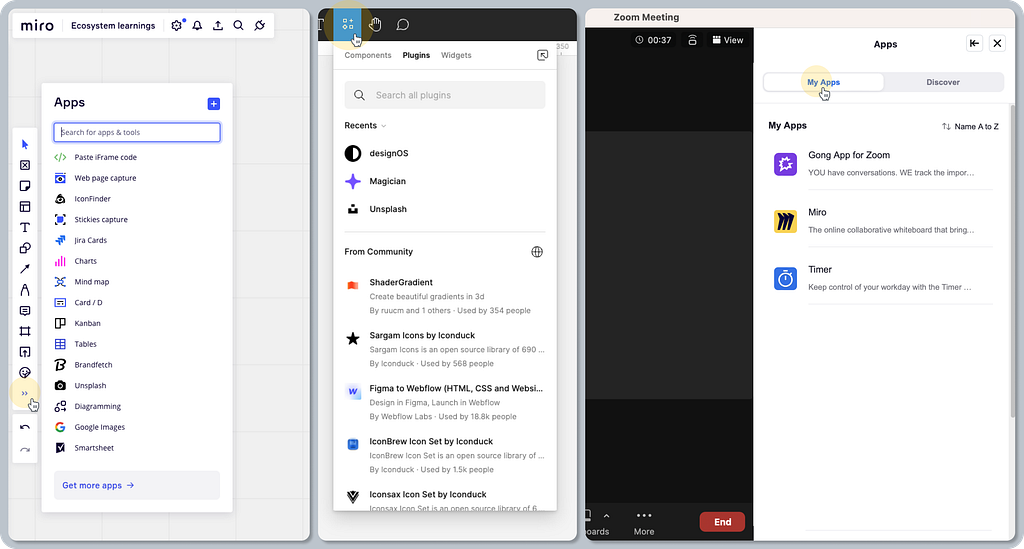
An example could be sharing a Miro board via Slack, where Miro adds a contextual prompt to share via Slack, just next to the place where you write a name, email, etc. Not integrated yet? No problem. Simply click to authorize the Slack app, and you are all set to invite others.
Onboarding coach marks can be fun — Figma uses fun copy and micro-interactions to grab your attention and pique your curiosity in FigJam.
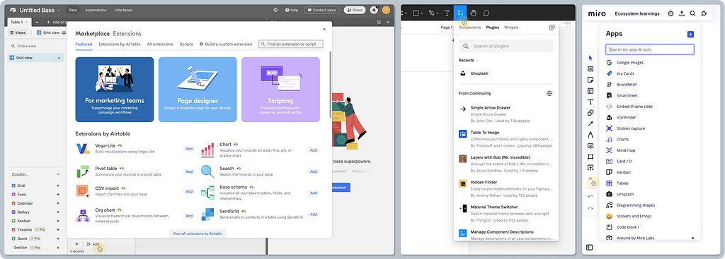
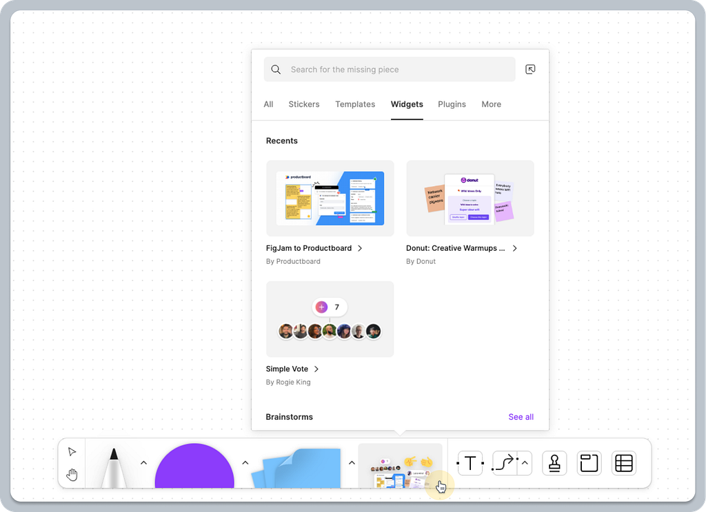
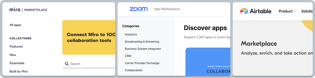
2. Search and browse apps
Helping users to discover what they are looking for is a core job for marketplaces. But to be able to navigate content effectively, you need the right information architecture, meaningful categorization, and tools like search or filters.
Baseline expectations ✅
Meaningful and consistent content and categorization on the web and in-app. What makes the experience a bit different on the web is whether the user is already logged in or not (Install vs. Sign-up, etc.), while in-app it’s always clear who the user is. Using the same content on the web and in-app makes the experience consistent for users while saving time for the business or partners managing their content only once.
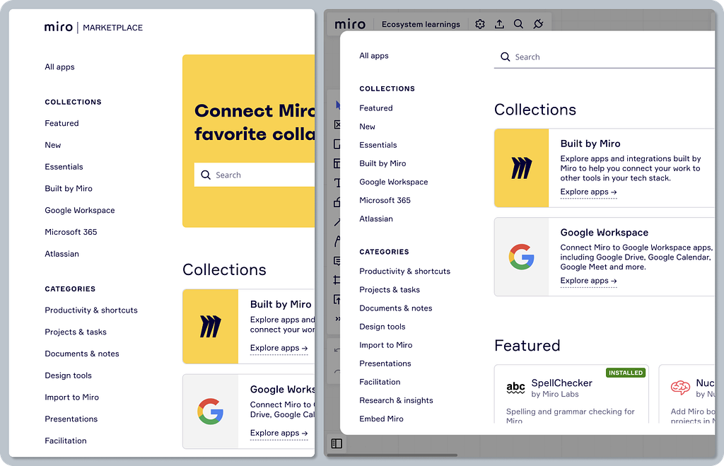
Featured apps and curated categories are usually chosen to facilitate searching for the most common needs and use cases. For example, Essential Apps to get you started, Daily Tools that are used frequently, or even Enterprise-ready apps to address the specific needs of bigger organizations. A list of featured apps usually forms the content for the marketplace homepage.
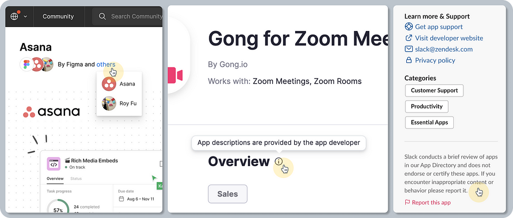
Information about the publisher/developer, often including a logo and a disclaimer. For example, “By Zoom”, “By Figma and others”, “Developer: Canva Pty Ltd”, etc. Disclaimers are important to set the right expectations around whether the app was created by a third party or by the platform itself, so users know where to ask for help, etc.
Essential app information, usually including its name, a short and long description, key features, a preview (image and/or video), publisher info, links to help articles, pricing info (available on a plan), and general metadata (last updated, etc.).
Linear satisfiers 🌈
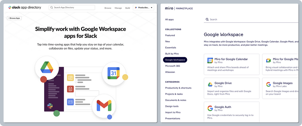
Curated app collections focused on specific use cases or known tools. For example, Google Workspace, or Work from home apps by Slack or Miro.
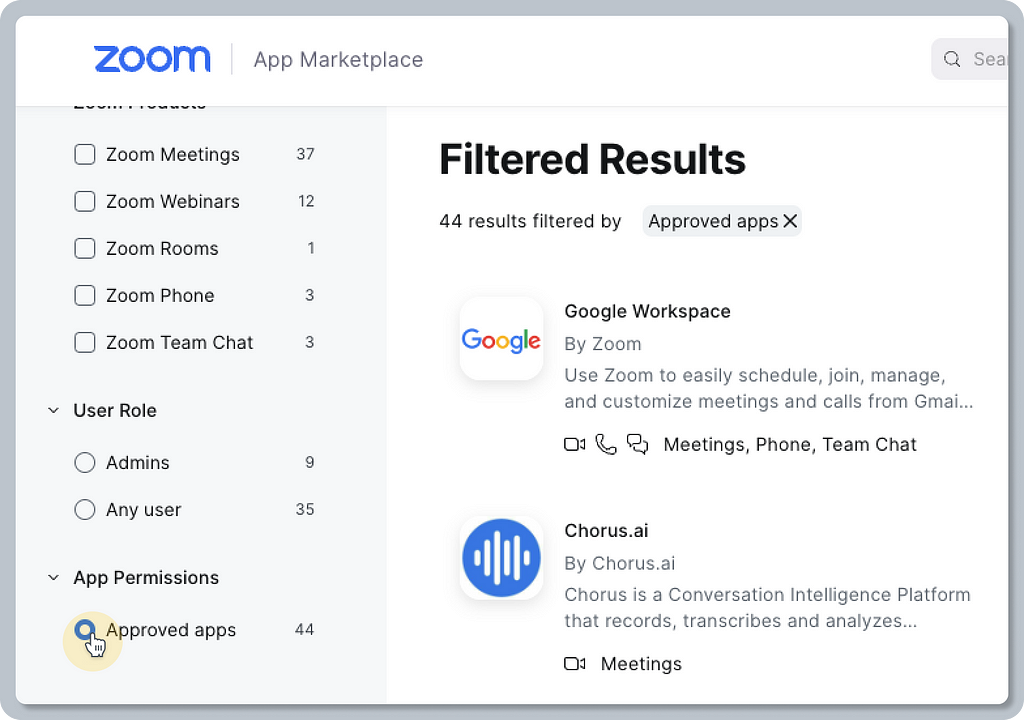
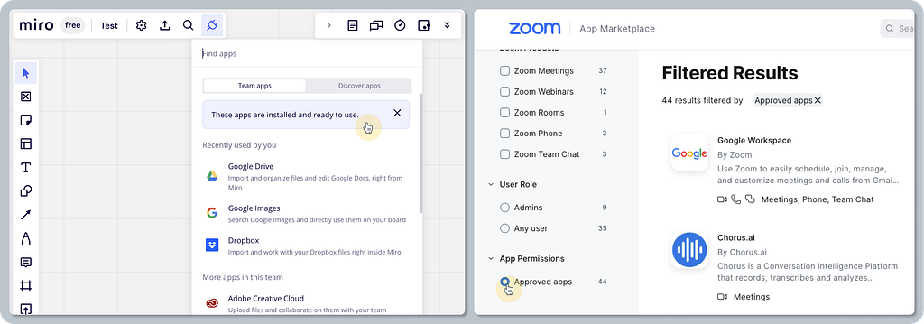
Advanced app filtering to narrow apps accessible to only admin/everyone, filtering by app type, etc.
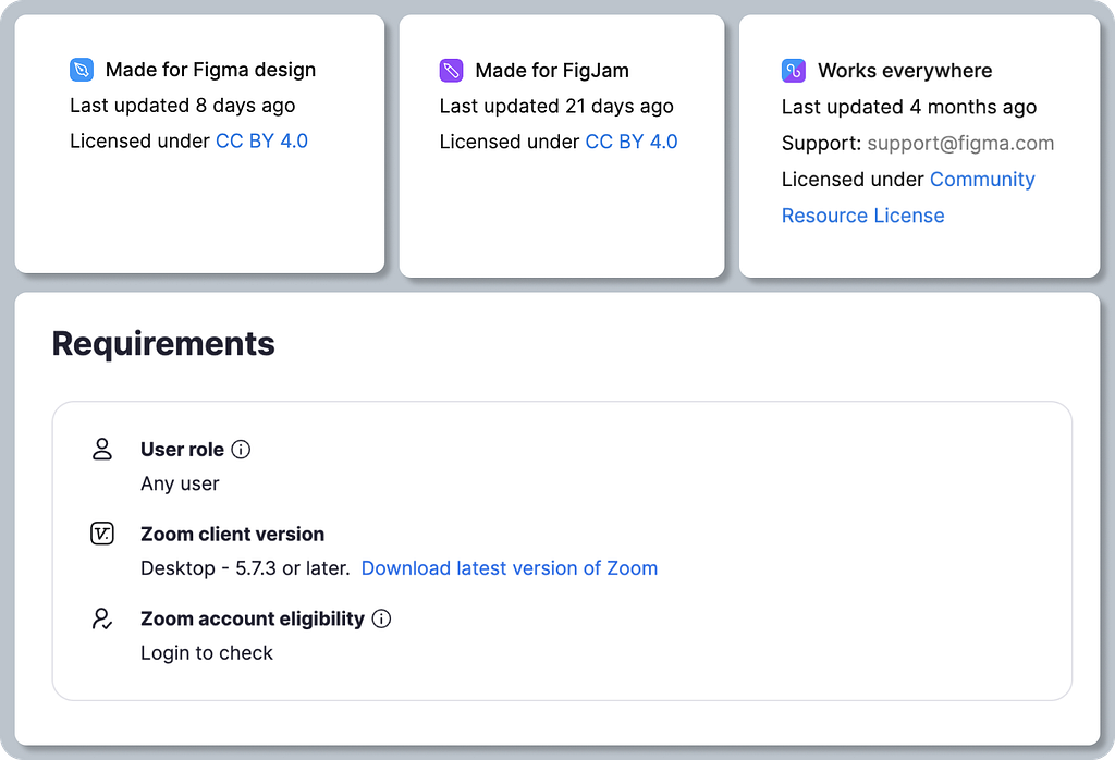
Additional information provided about the app is less common but in certain cases very useful. For example, app version history, compatibility info (e.g. “Works with Zoom meetings,” “Works with FigJam,” etc.), requirements (e.g. “Desktop client version,” “User role,” etc.), and community comments.
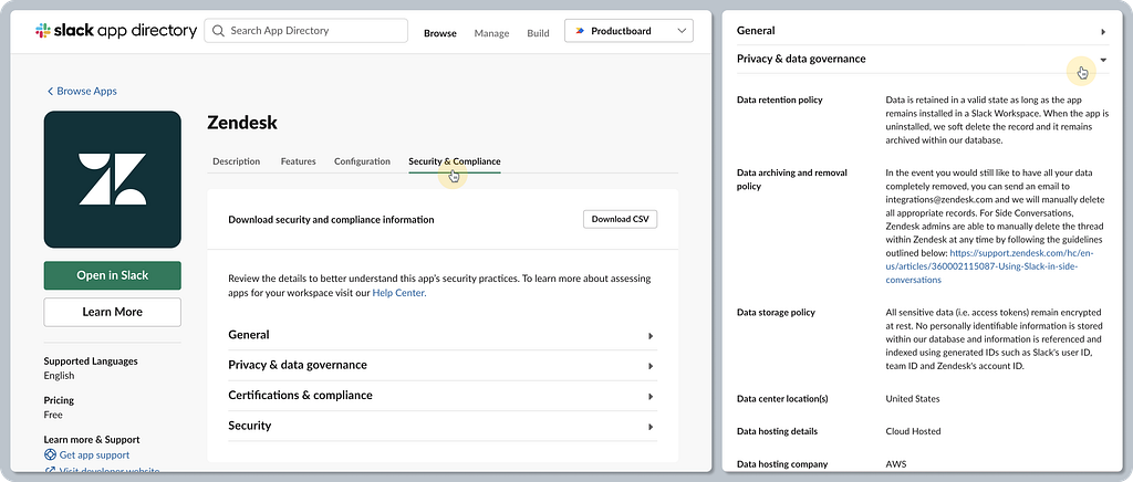
Comprehensive security and compliance info — dedicated information is appreciated mostly by enterprise customers so they can make educated decisions that meet their internal security standards. For example, Slack went the extra mile by providing very specific details such as “Data archiving and removal policy,” “Data center locations,” “Contact for security issues,” “ISO certification document previews,” etc.
Delighters ✨
Combining a list of features and “getting started” instructions — for example, Slack leverages app descriptions to provide basic help information, so users can get started and find everything in one place. Compare this to an experience where users need to navigate to another site and read through extensive documentation articles.
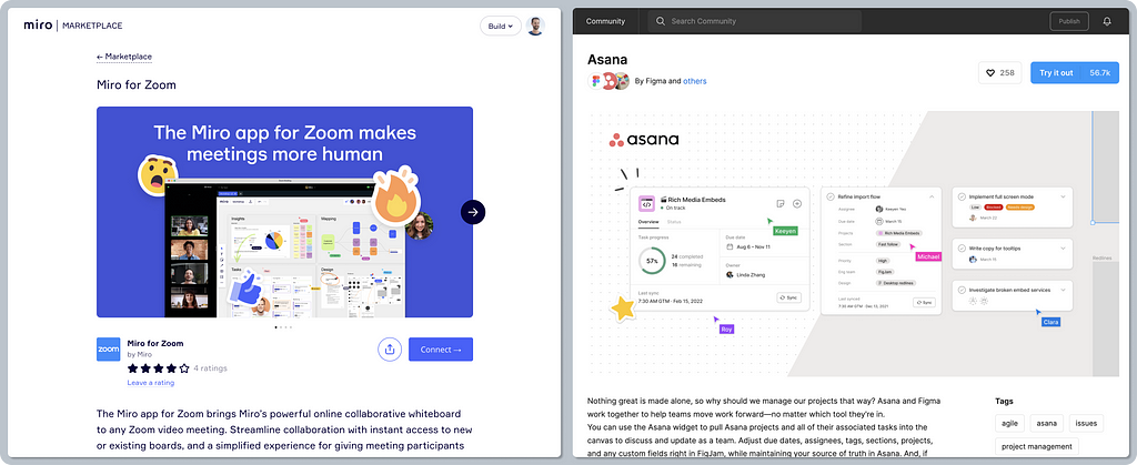
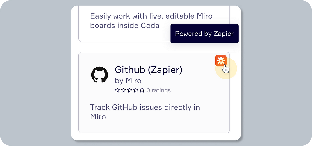
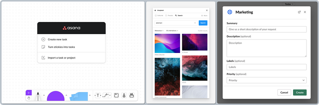
App descriptions are not only about plain copy. They’re about marketing and emotions as well. Look at Miro’s hero image for their Miro for Zoom app. The image conjures up emotions, convincing users to experience Miro’s fun UX even during Zoom calls. The same applies to Asana’s hero image in Figma. Tasks can be fun and part of your design canvas.
Marketplace always at hand — there are various ways to show the app catalog or app detail. A common pattern is to display it in-app as a full page, but that can be cumbersome. Those that use modal windows or floating pop-overs in-app bring a smoother experience, allowing users to access the app catalog in various contexts without navigating far away from their workflow.
3. Installation of the apps
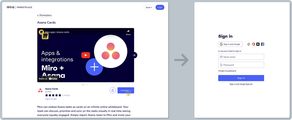
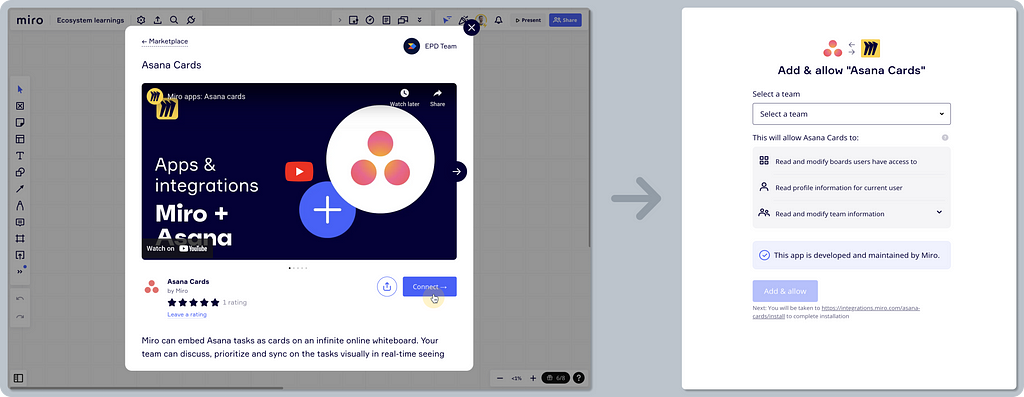
Installation marks a successful part of the funnel, with users having already explored, considered, and decided what they need. While it doesn’t guarantee they’ll adopt the app, the installation flow may help to set the right context, communicate important information, or most importantly, give the right first impression.
This stage is all about the right level of guidance, context, and most importantly, making it as easy as possible by removing obstacles.
Baseline expectations ✅
Installation starts on the web or directly in-app. An anonymous visitor is usually offered actions to log in/sign up first, whereas logged-in users continue in the installation flow.
Contextual installation flows — as the marketplace caters to different users (anonymous visitors, admin, or regular users) via different channels (web/in-app), the experience is usually served contextually. Here are the most common flows:
- Sign-up to install
- Installation is not allowed (e.g. the user must be an admin)
- Follow the manual steps — add the app by following a help article
- Continue installing on the external marketplace
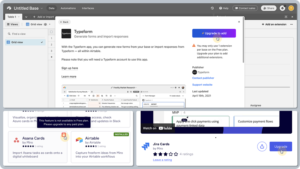
- Upgrade to add — an upsell opportunity
Contextual installation CTAs — each installation flow is different, so the text used on action buttons gives a clear expectation of what’s going to happen next. Here are a few examples:
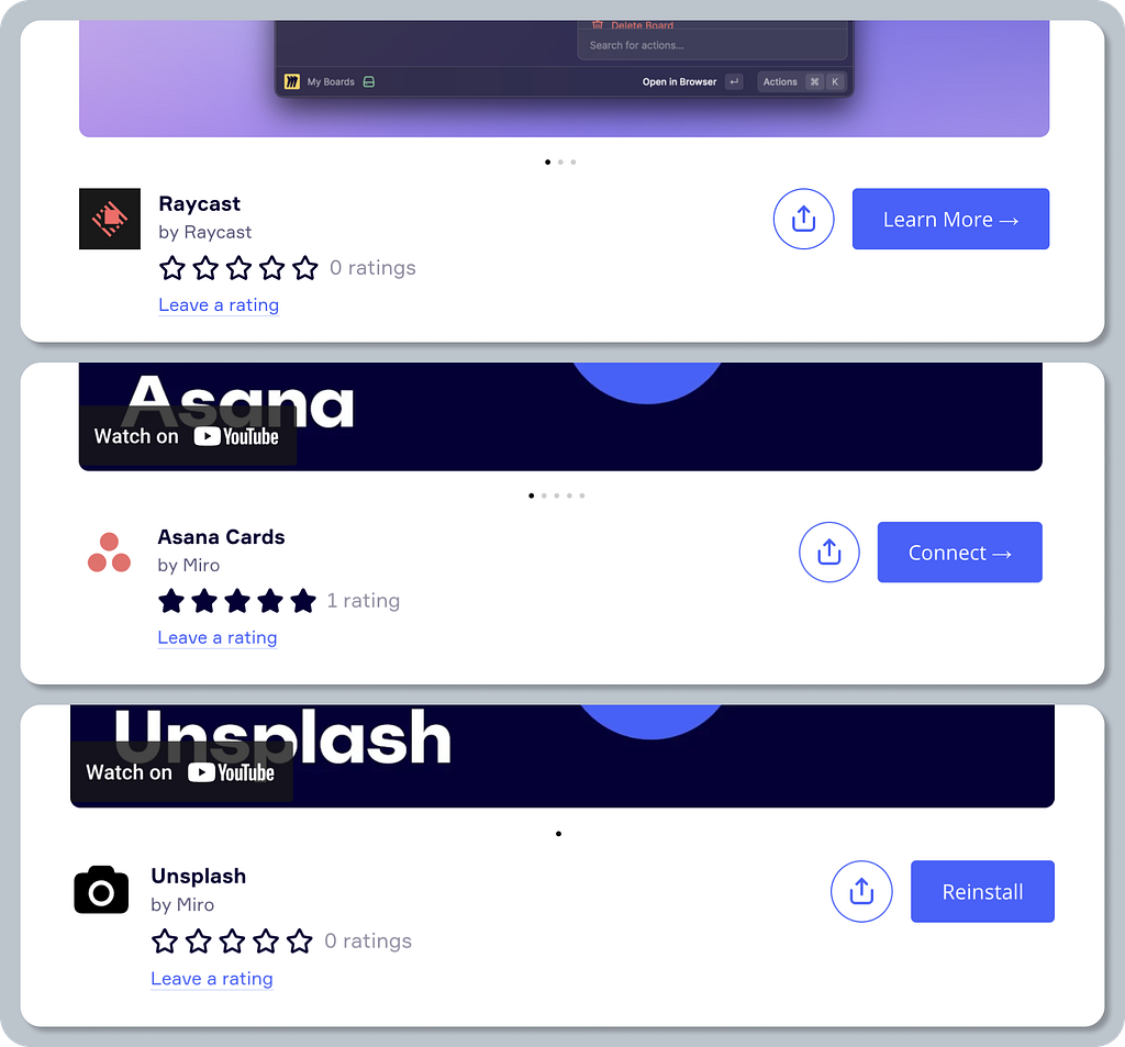
- “Add,” “Install,” “Get the app,” or “Add to Slack” — gets installed on the current platform
- “Integrate” or “Visit site to add” — continue elsewhere
- “Learn more” — read a help article to set it up
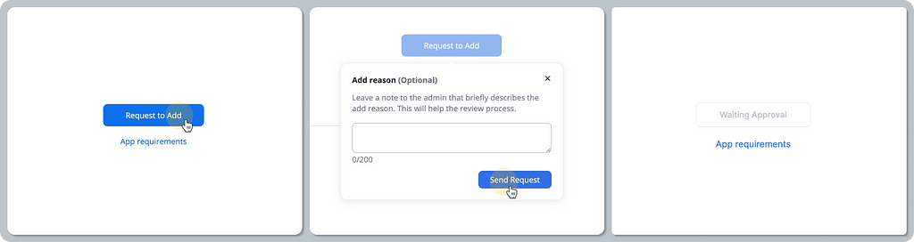
- “Request to add” or “Upgrade to add” — an additional approval or purchase is needed
- “Installed” — already done!
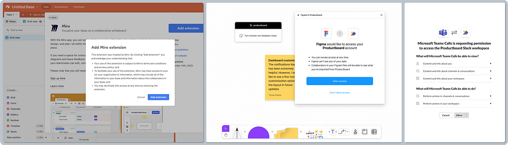
Third-party disclaimer and permissions scope — when installing an app, it’s common to learn who the publisher is and where the app has access. This serves as both important security-related information for the user as well as a liability disclaimer for the platform itself.
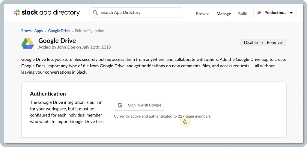
Non-admin users can install — naturally, you want everyone to install the app or integrate it, and that’s often the initial default. Of course, this often depends on the organization’s rules, and certain apps might be either pre-approved, restricted, or allowed to be installed only by admins. When installed by individual users, the OAuth 2.0 authentication protocol is usually used to authorize on a personal credential level.
Linear satisfiers 🌈
Additional installation flows — certain platforms go the extra mile to provide a richer, more seamless experience and remove obstacles.
Pre-approved apps by admin — these are listed as safe apps for the given organization. This removes any repetitive approvals and waiting time for the most frequently used apps.
Add via Zapier — surfacing more workflows supported by external providers like Zapier enriches the platform’s experience with new possibilities.
Leveraging internal social proof — this may help drive engagement and activation, promoting trust in the app within the same organization. Knowing that 298 peers from my company use this tool may help me decide to install it. This kind of detail may help the platform and its partners become more successful.
Delighters ✨
Request app — users will always need to use a specific app on top of what’s been pre-approved by their admin. A great experience removes obstacles, so providing a dedicated flow that facilitates individual app approval is a nice touch that’s contextual and saves a lot of time. The opposite would be an experience that says, “Only admin can install”.
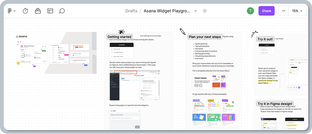
Try in an app playground — providing users with a demo space is a nice touch. Figma’s playground is a great example, showcasing how seamless it can be to onboard users to a new widget.
A fine line between web and app experience — the fact that users can undo the app installation is great. Even more, it feels surprising to have such an experience when that happens on the web (while the user is logged in).
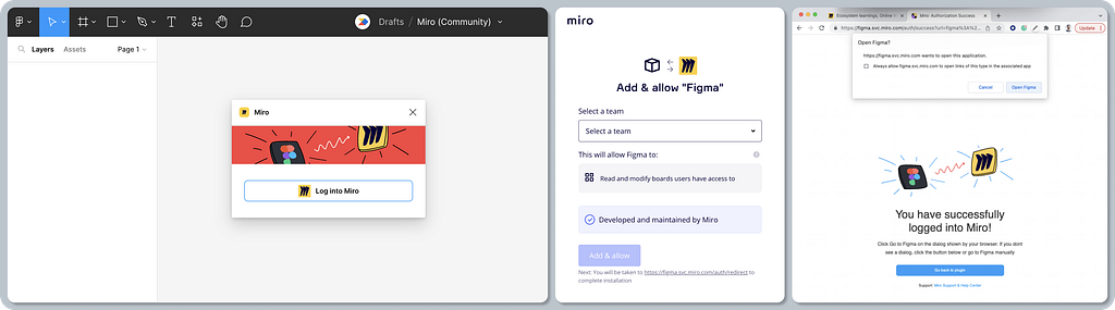
Smooth auth transitions between apps — authentication in another app may be confusing, as the user is forced to switch context elsewhere. Miro offers a nice example, keeping their app’s look and feel consistent (using illustration) while applying Figma’s brand guidelines (the CTA color). The bottom line for users is that once they’re logged in, the look and feel stays familiar, even though this part of the flow is technically hosted outside of Figma. On top of that, providing an action to go back to Figma when the user gets lost (e.g. their browser tab gets closed) is a nice touch.
4. App onboarding
While reviewing these five SaaS marketplaces, it was clear that onboarding in the form of a tour, or sharing basic instructions on how to use apps or integrations, is not common practice. There are a few exceptions, however.
Baseline expectations ✅
App onboarding in the form of a tour is not common — perhaps because most apps and plugins are very intuitive and don’t require much hand-holding.
Linear satisfiers 🌈
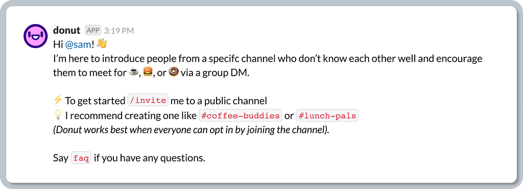
App onboarding by app bot — communication platforms like Slack leverage bots and conversational UI experiences to welcome users. There are also guidelines helping developers and designers to craft welcoming onboarding messages using the bot.
Delighters ✨
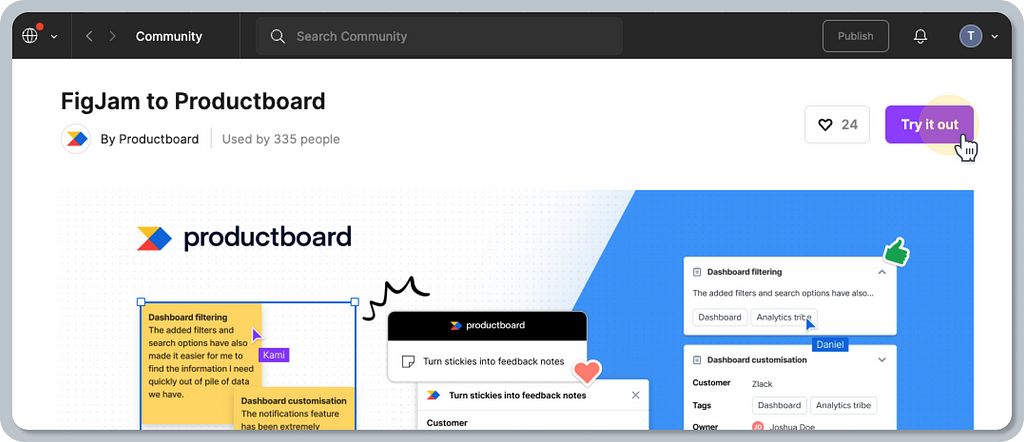
The publishers of Figma’s community can leverage Figma’s or FigJam’s templates as their onboarding playgrounds, allowing them to explain how their widget works while users try it.
5. App usage within the platform
This part of the journey is not related to building marketplaces per se, but it is important to consider when building the overall platform experience. Let’s have a look at some common patterns for launching and using apps, and how they fit into the platform’s UI.
Note: this review will focus on how apps are used within the same platform, thus excluding all interactions in apps living elsewhere (e.g. Zoom extension for Google Calendar).
Baseline expectations ✅
A dedicated app menu is a common UI pattern that allows users to browse apps without navigating to another page. Certain apps, widgets, or plugins interact with the surrounding surface, making the positioning of a toolbar crucial.
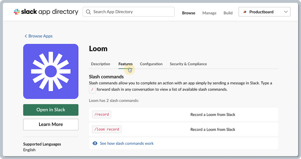
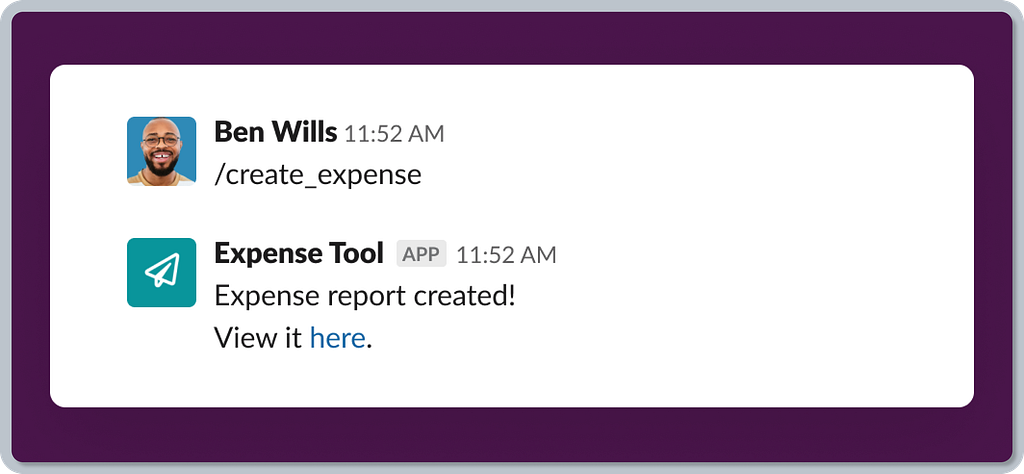
Conversational UI leverages slash commands to launch and control apps in any conversation within communication tools like Slack, etc. The baseline expectation is thus specific to such tools.
Background syncing is your invisible worker that ensures data is automatically synced with other tools. No UI is usually involved, except for the initial setup.
Linear satisfiers 🌈
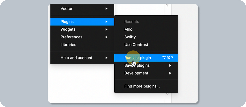
Keyboard shortcuts are good for power users. Figma, for example, allows you to run the last plugin used by hitting Option + Command + P. This adds value for routine and repetitive tasks.
Typical UI surface areas for the apps — the following UI patterns are pretty common for most of the analyzed tools. Modal windows or dialogs are the most frequent way to surface the apps. Another way is sidebars(sheets), or an app with little UI can live in the app menu popover just after you run it. Certain apps are just actions, and thus they have no (or very little) UI. Widgets or bot conversation UI is another example. The bottom line is that it often depends on the nature of the interaction, use case, flow, platform, and conversions. You will know what works best for your users.
Delighters ✨
Contextual actions streamline the user experience with other SaaS tools. Once you find the sweet spot, where it is the most natural to initiate a certain flow for your users, it will feel like part of your product even though it’s technically not.
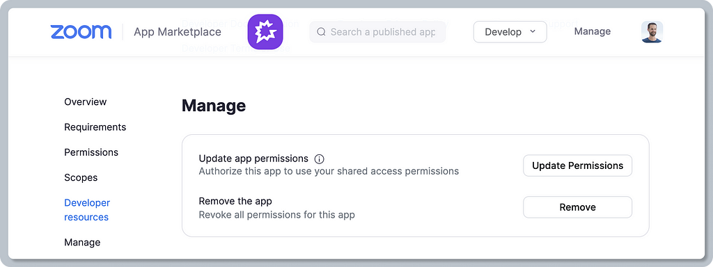
6. App management
The next stage of an app’s lifecycle is how it is managed, configured, or even uninstalled. Users probably hit this step less frequently than others, but it’s still absolutely essential.
Baseline expectations ✅
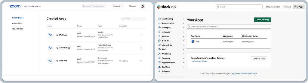
Manage apps per workspace or/and per user — app and integration settings are on the level of the team (workspace) and user. Workspaces can have pre-installed and shared apps for all users in the workspace. Those apps that were installed individually are managed on a user level (e.g. the permissions can be revoked from there). The most common approach is to find more information about granted permissions or uninstalling the app.
Linear satisfiers 🌈
Requested app approval — pending requests are visible in the manage section, so users don’t rely only on email notifications.
Delighters ✨
Contextual management experience — some marketplaces can recognize whether the user is logged in and, based on their role, display additional management actions, e.g. in the app detail. Contextual experience is always tailored for users, making it easier to find out how to manage the app. This creates a fine line between in-app and marketplace experience.
In addition to reviewing the core journey, here is some additional information to provide a complete picture when building a marketplace for your SaaS platform.
- Naming conventions — a boring, yet useful topic
- Developer experience — a sneak-peek perspective of how it looks for publishers and technical users
Naming conventions
A familiar name plays an important role in the success of a platform’s offering, ensuring that users get a clear understanding of what it’s all about and what they can find there.
Baseline expectations ✅
A clear, descriptive, and familiar name for the offering directory. Based on my evaluation of five popular SaaS tools, the name “marketplace” seems to be the most common naming convention. Other names (on top of the 5 reviewed tools) include: “Apps,” “App directory,” “App Store,” “App hub,” or just “Integrations.”
Users of a SaaS product can usually choose from apps that extend certain functionality. Note that other common names include “extensions,” “widgets,” “plugins,” “embeds,” “bots,” etc. Naming does not seem to be standardized, and SaaS companies often experiment with the right name that works for their customers and product. For example, Notion recently renamed “Integrations” to “Connections”, while Airtable changed their offering from “Apps” to “Extensions”.
- Apps — a piece of software typically installed on a platform to do a certain job, facilitating a tailored workflow. It can be added or installed to enrich the experience of the same product (e.g. managing Asana tasks directly in Miro’s board as cards), and it may help to facilitate a certain job with another product (e.g. creating a task in Asana directly from Figma’s canvas). All true platform products have UI-driven experiences that allow partners to build workflows on the target platform directly.
- Integrations — generally speaking, integrations represent a way to connect your product or internally built tools to customize your experience of the platform. Besides that, integrations allow platforms to connect to external data sources, allowing the exchange of data (e.g. Productboard imports Amplitude segments to help product managers narrow down customer feedback combined with behavioral data). Building on a platform usually happens via a standardized programming interface (API) and often uses SDK to help speed up development.
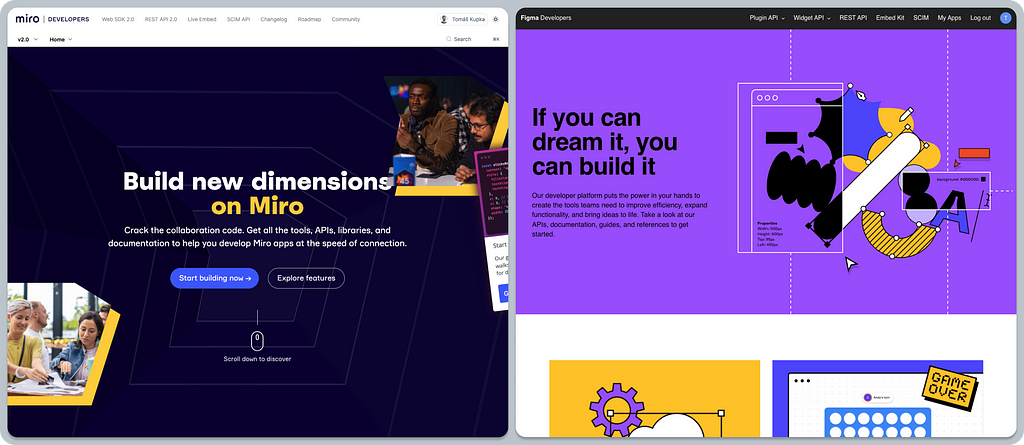
Developer experience
Developers/publishers are first-class citizens of marketplace ecosystems. They sit on the other side of the user, building the actual apps and integrations. Let’s take a sneak peek at what that experience looks like for a tech audience.
Note: Although this topic deserves its own in-depth review, the following is just a basic overview. Leave me a comment if you are interested in learning more, and I’d be happy to dig deeper.
Baseline expectations ✅
Dedicated landing pages for developers/publishers — tailoring the experience for a small yet very important audience is crucial. The platform needs marketing to convince the tech audience as well. Publishers need to learn what typical use cases they can build for and learn more about the implementation details during their technical discovery, etc.
Technical documentation — it’s fairly standard to document all the toolkits that are provided to developers (API, SKD, etc.). Without that, it would be impossible to build stuff, and it wouldn’t even be scalable enough to support any platform on a larger scale.
Manage custom apps/plugins within the product — a self-served developer experience is a must for scalable SaaS platforms. Being able to see and manage your own (non-published) apps under a personal account is an important experience to streamline basic operations during development and testing — avoid relying on customer support.
Getting started wizards — the developer experience usually reflects the fact that it relies on power users. Engineers rely on text-heavy documentation that they need to crunch through. Documentation works great when you need help and further learning, but reading “books” isn’t the best way to get people on board fast. Fortunately, there are some good examples out there that hand-hold developers through their first steps using tailored wizards, making the process easy. This is a nice touch that may help drive better adoption and scale your platform, as it mitigates the initial pains that come with getting started. Overall, it improves the developer experience.

So, what have we learned?
Leveraging familiar experiences in your SaaS marketplace will help users hit the ground running, allowing them to enjoy an intuitive experience instead of being forced to learn new patterns.
Let’s use the baseline expectations for Airtable, Figma, Slack, Miro, and Zoom’s marketplaces as an example. The main flows such as the app search, learning about app details, and installing and granting permissions are very similar. Even though these are different platforms, their interaction design patterns (layout, copy, CTAs, flows) are alike. That is what makes the experience familiar and therefore easy to get to grips with.
Think of the baseline expectations as a foundation to build on. Features that add value (linear satisfiers) and delighters will help you differentiate from your competition. Slack’s marketplace differentiates itself for enterprise customers by providing visibility into the app’s permissions, security, and compliance, which is crucial for admin decisions.
For examples of delighters, we could name Miro, with its well-thought-out contextual prompts that tell you what you need to know at the right moment. Figma rules in this category, with their demo playground showcasing how seamless it can be to onboard users to a new widget, and even explaining to them how it works (using FigJam, of course).
Use this article as a checklist of things for your team to consider, or even get inspired by — a reference to save you time while designing for your SaaS product’s marketplace.
Here are a few ideas on how to use it in practice.
- Look for inspiration for your design explorations or even for your ideation workshop
- Analyze your existing platform: See what you’re doing well and where the gaps are
- Use Kano categories to structure your product-design prioritization — and understand what’s a baseline expectation and what may differentiate your platform
The bottom line is that applying existing SaaS marketplace mental models will give your team more time to solve customer problems, differentiate, or innovate where it really matters. Remember, users have invested hours learning the experiences and flows they already use. With this in mind, is it really worth designing novel ways to achieve their goals? If a new approach is needed, make sure you always test it first.
The purpose of SaaS ecosystems is to allow apps to work together seamlessly, helping users achieve certain jobs-to-be-done. Focusing on smooth and familiar experiences within workflows across SaaS products is the key to success.
Further reading
- An extensive list of other SaaS marketplaces
- Kano categories explained
- Law of internet user experience
- Enhance your experiences by embracing the familiar
Many thanks to the Productboard design team and my colleagues for their feedback on this article. Shout out to Pavel H., Zdenek K., Martin K., Sarah J., Mia H., Malwina F., Adam A., and Nick E. for their help with putting it all together. Special thanks goes to Rewo for pair-design on the illustrations, my PM buddy Jaro T. for helping to define the research criteria for this study, and also Joshua G., our design advisor, for his help in choosing the right approach for the research.
The state of SaaS marketplace UX was originally published in UX Collective on Medium, where people are continuing the conversation by highlighting and responding to this story.