Finally! Google Maps gets a much-needed makeover… and we’re here for it.
Sometimes, a reroute is all it takes to rediscover the joy of the journey — Google Maps’ latest update is a testament to that.
What’s New Since My Last Rant
A few months back, I ripped into some serious user experience flaws in Google Maps.
Google Maps: about that left turn
My main beef? How their voice instructions at crazy highway exits left drivers, myself included, totally bamboozled.
Then there was the Lane Assist feature, playing a game of now-you-see-it, now-you-don’t across different devices, turning user experience into a guessing game.
And let’s not forget the voice prompts in city drives — they were sometimes so out of sync with what we, as drivers, actually needed, making navigating busy streets a real headache.
I threw out some ideas back then, like beefing up Lane Assist with clearer visuals and getting those voice commands to actually match what’s happening on the road. And guess what? Google’s latest update has tackled some of these issues head-on and even rolled out some snazzy new features. (And hey, Andrew, I’m with you — the new Google Maps does look a lot more like Apple’s navigation style now.)
Big upgrades in Google Maps
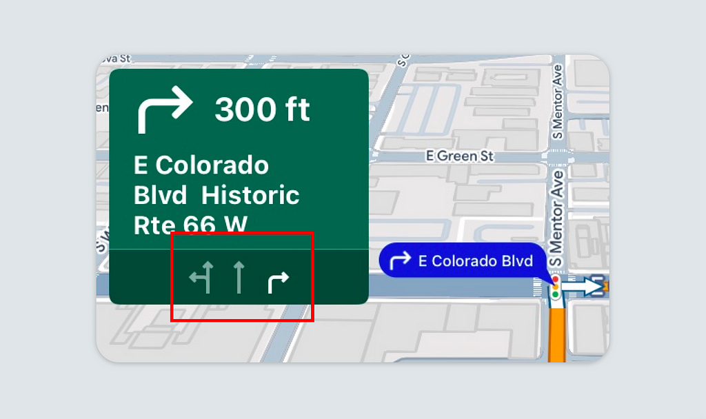
Let’s kick things off with the revamped Lane Assist feature. Back in the day, its vague hints on busy highways used to drive me nuts — wrong exits were my jam. Now, in a welcome development, the updated Lane Assist feature in Google Maps has finally made its way onto the road I’ve traveled countless times, becoming much more precise and intuitive. It offers distinct visual cues for lane changes well in advance, significantly reducing anxiety in complex traffic situations.
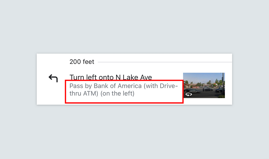
Next up, let’s talk about those voice prompts. Remember how the old “turn right in 0.3 miles” used to be more confusing than helpful, especially in the concrete jungle? Well, times have changed. Just like the “turn right after seeing this planter” example I mentioned in my earlier article, the new voice prompts in Google Maps are way more in tune with how we think and drive. They have now integrated landmark-based voice prompts in its update, such as “Pass by bank of America with Drive-through ATM,” aligning more closely with how users process information.
This advancement not only makes navigation more intuitive but also enhances the safety of the driving experience.
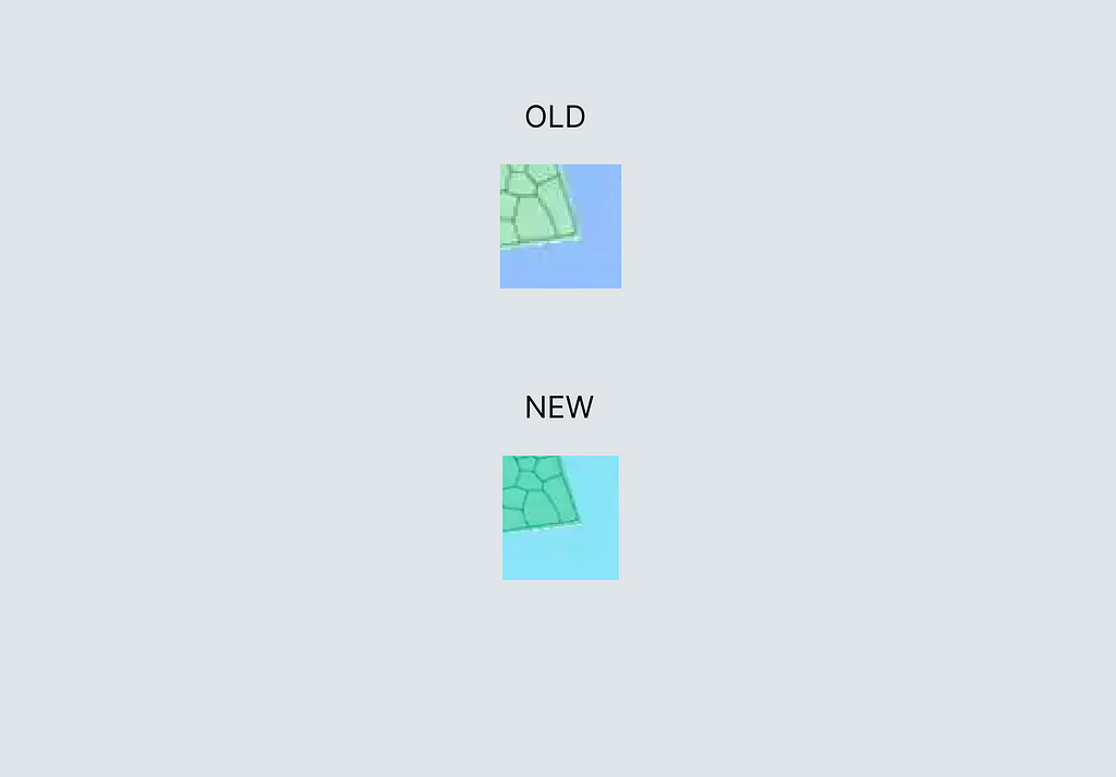
Navigating the New Hue
Beyond the optimizations of a few inherent issues we’ve previously mentioned, the most jaw-dropping improvement in the new version has got to be the enhanced color contrast — and man, has it sparked some debates over the past month.
However, it’s important to remember that product optimization always comes with its fair share of spit and spat; folks get cranky about changes to their familiar routines or when anything they need (or don’t) gets tweaked. It’s like Microsoft’s Clippy — annoying when around, oddly missed when gone.
Based on my own usage experience over the past month, I am quite satisfied with the color improvements in this version.
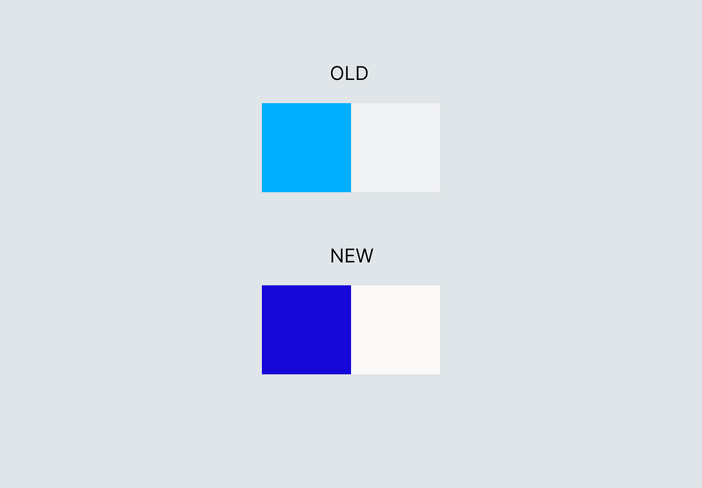
The high-contrast color design has significantly boosted the interface’s readability. Now, under direct sunlight, users can quickly discern essential route information, thanks to the stark contrast between the navigation path and its background. From the previous pale gray land and light blue paths to the current white-gray land with deep blue paths, this subtle yet crucial change makes navigating under bright light conditions much easier.
Sure, the new map colors have the grass and water hues looking more alike. But in my book, they’re nowhere near indistinguishable. I just need to tell them apart from the roads, and that’s plenty. In fact, categorizing these two “absolutely-do-not-drive-on” zones into similar hues makes total sense to me cognitively. Let’s be real: when I’m driving, I couldn’t care less what that weird body of water next to the highway looks like (unless I’m walking around, but that also means I’ve got plenty of time to figure out water from grass). I just wanna know which of the three lanes is mine.
Lastly, setting aside my personal views on this version’s improvements, there’s another aspect that’s incredibly heartening to see — the sheer volume of user feedback on the new Google Maps update, both positive and negative. As I mentioned earlier, it’s this very engagement that drives a product towards greatness.
After all, it’s the users’ voices that keep the digital world spinning and evolving.
Source
Google Maps: about that left turn
https://9to5google.com/2023/08/31/google-maps-new-colors/
![]()
Google Maps: a refreshing turn in the right direction was originally published in UX Collective on Medium, where people are continuing the conversation by highlighting and responding to this story.